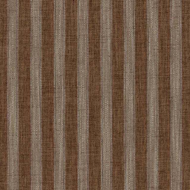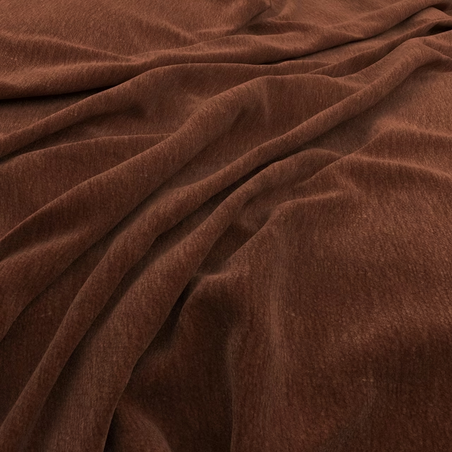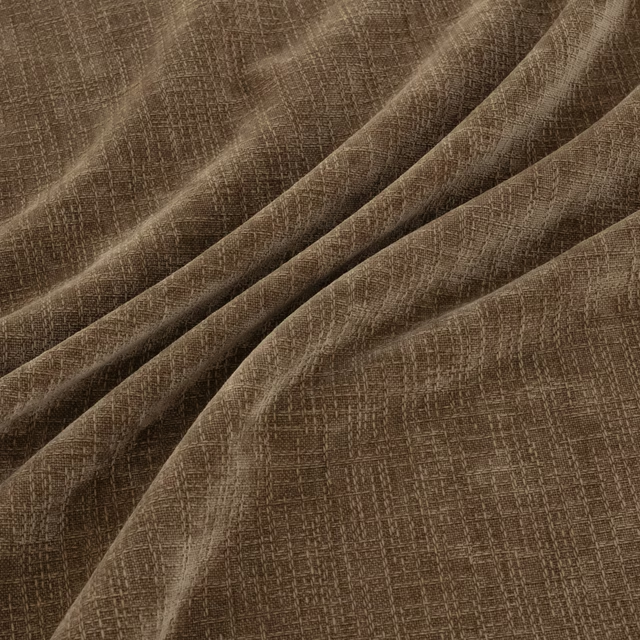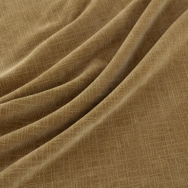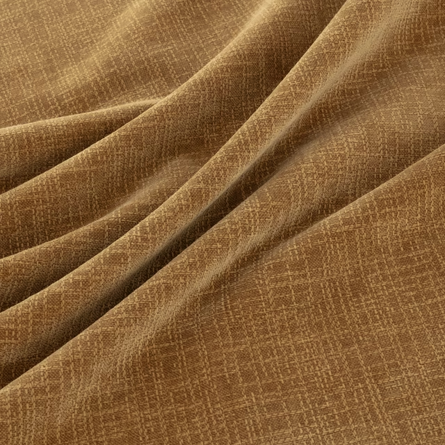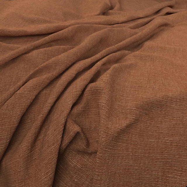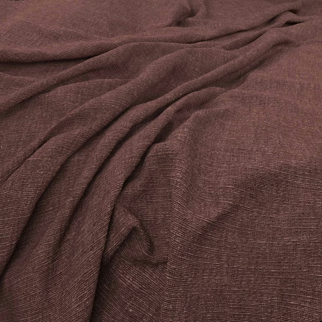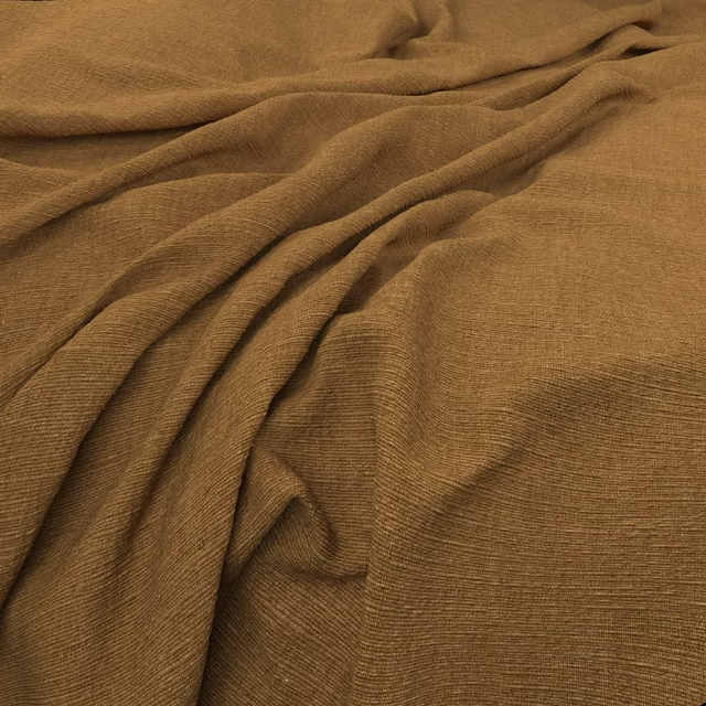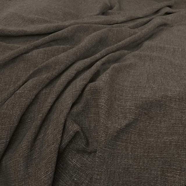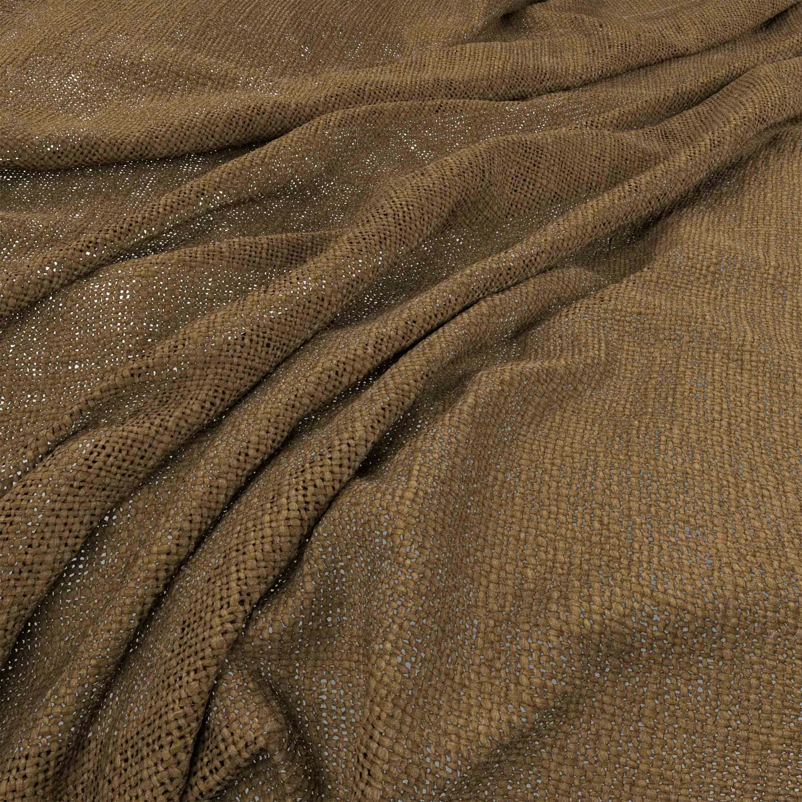

Tap the swatch to see it full screen. Hover it to magnify the weave. Colours on a screen are a guide, not a match, so come and feel the real cloth.
Scroll up or down to zoom in and out.
Bruges Jute
Bruges Fabric
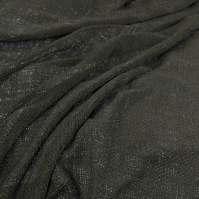
Bruges Jute has a warm, earthy brown tone with a softly varied surface that shifts gently across the folds. Its open woven texture gives the colour a natural, tactile depth rather than a flat finish.
You have used your previews for today. Send one to Simon and you can carry on.
Your board
0 fabrics
See this fabric on Warwick's own site, then order it through us.
See Bruges Jute in your own room
A photograph of the piece you want re-covered. Straight on is best, and daylight helps. It is used to make your picture and nothing else.
Looking at your room
We found things here Bruges Jute could go on. Tap one on the photograph, or choose below.
We could not see anything to re-cover
, s
Bruges Jute, on your
Drag to compare. AI impression, colours indicative: ask us for a cutting before you decide.
About this fabric
The swatch shows a jute-brown ground with subtle taupe and olive-like shading created by the uneven woven texture. Small, closely set threads form a softly irregular grid, while the gathered sections reveal a more open, airy weave and catch points of light. The substantial-looking textile is best suited to upholstery, where its relaxed texture can remain visible across cushions, chair seats or headboards.
How to use it
Use Bruges Jute on relaxed seating or a headboard, pairing its warm brown tone with oak, aged leather, woven baskets and muted stone upholstery.
Its warm jute-brown tone and tactile weave suit relaxed upholstery with natural timber and earthy accents.
More from Bruges
The same book, other colourways.
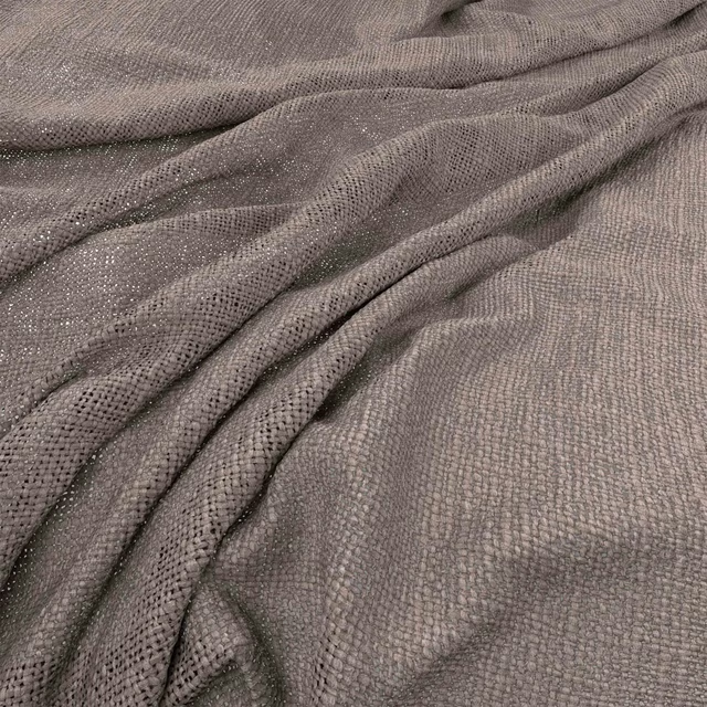
Bruges Quartz
Bruges
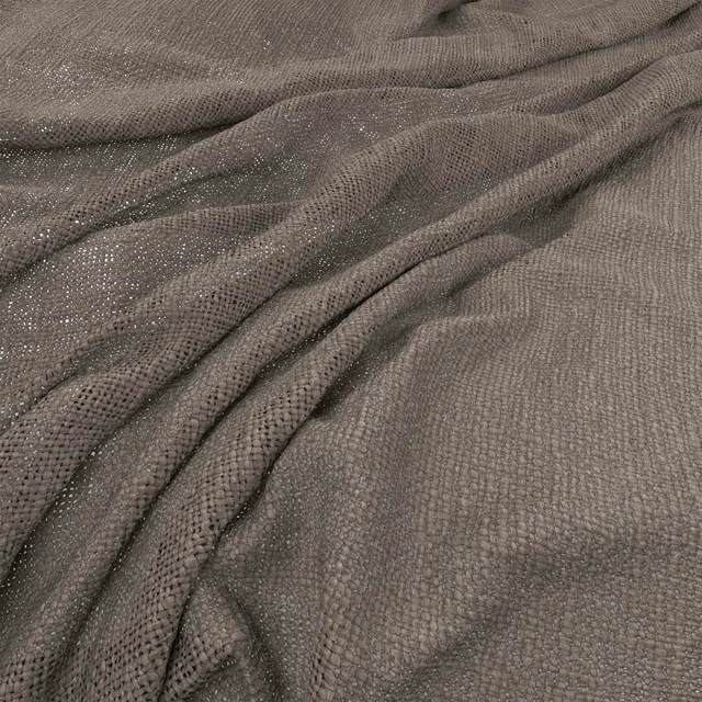
Bruges Flagstone
Bruges
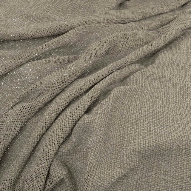
Bruges Hessian
Bruges
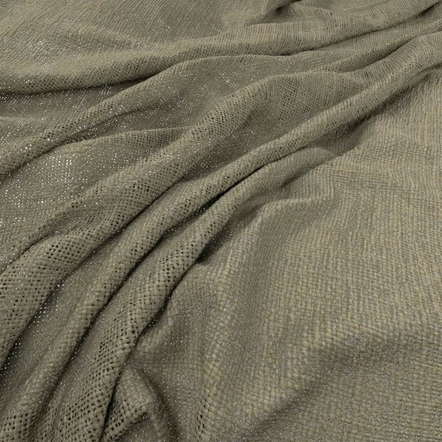
Bruges Bayleaf
Bruges
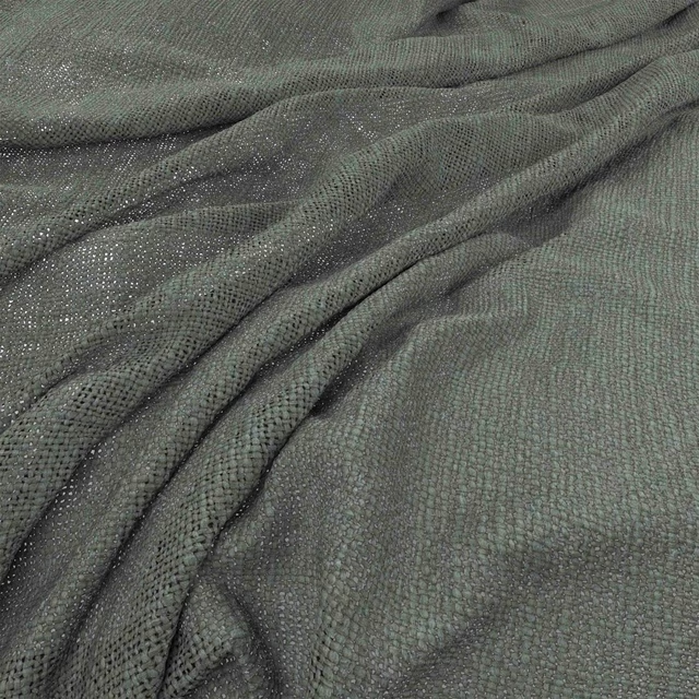
Bruges Fjord
Bruges
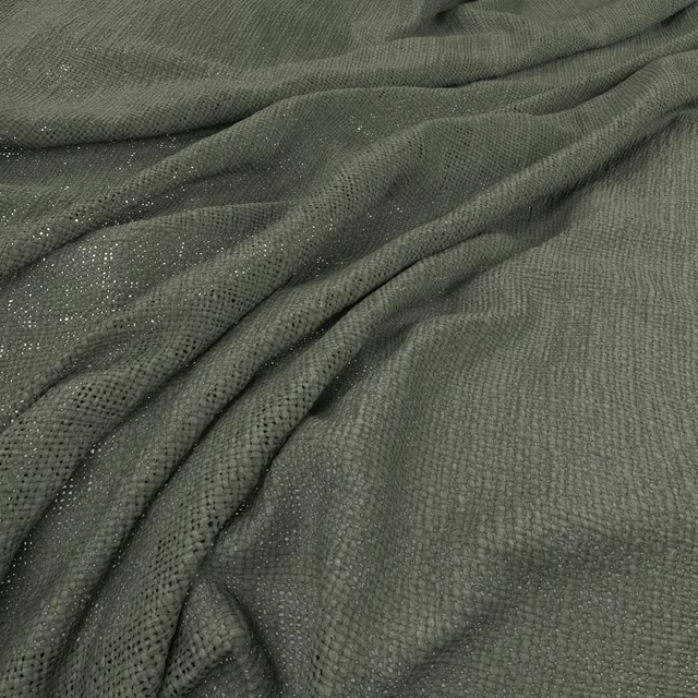
Bruges Thyme
Bruges
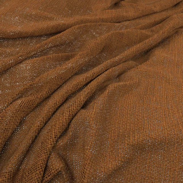
Bruges Henna
Bruges
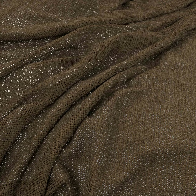
Bruges Olive
Bruges
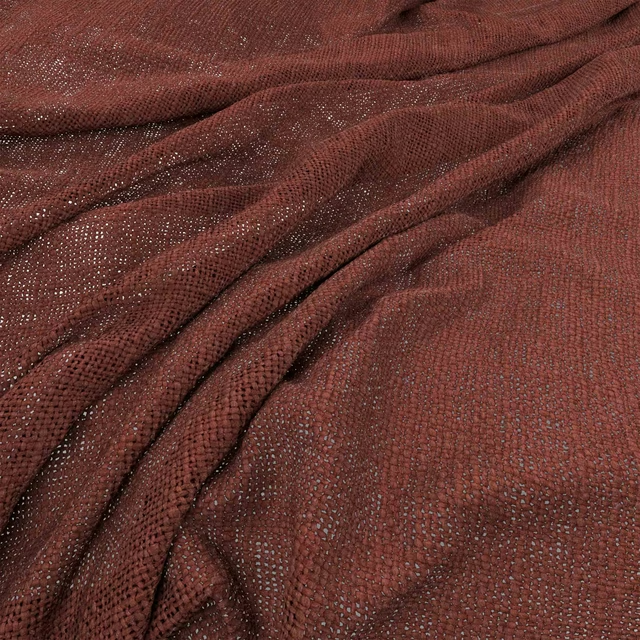
Bruges Brick
Bruges
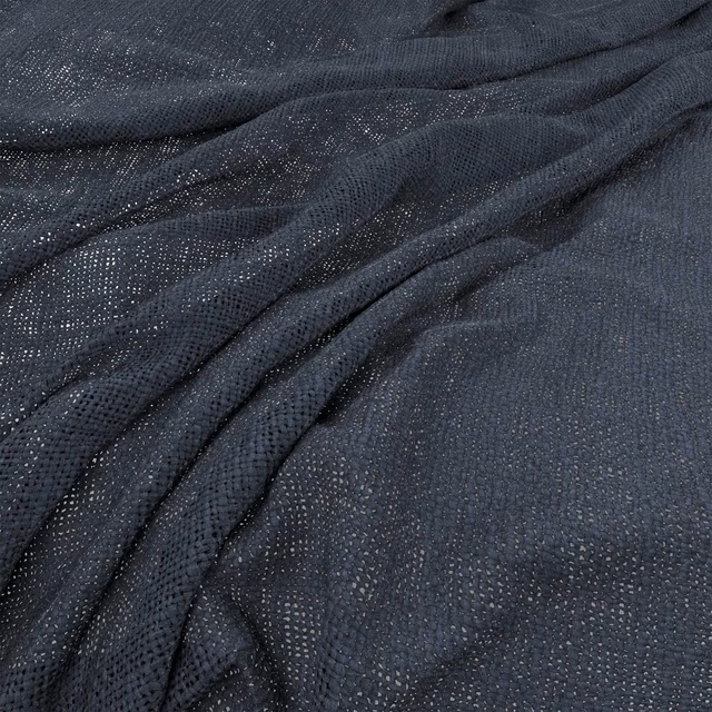
Bruges Ink
Bruges
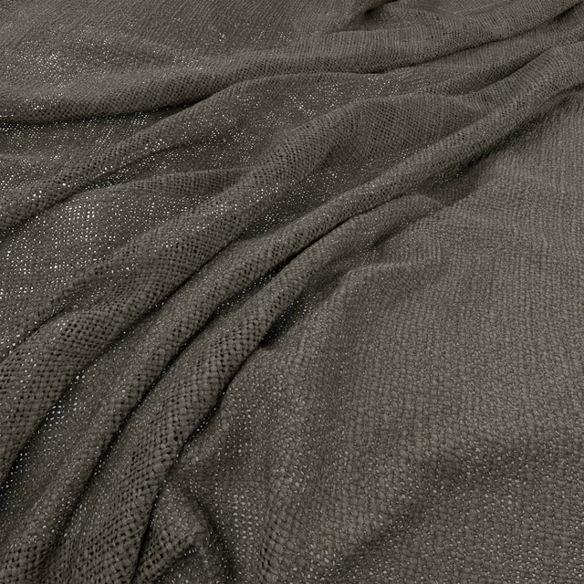
Bruges Magnet
Bruges
Bruges Bitter
Bruges
Pairs well with
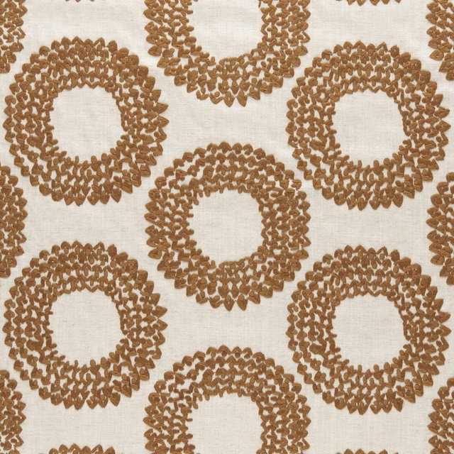
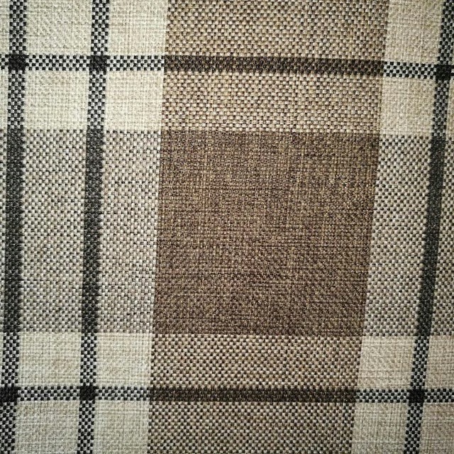
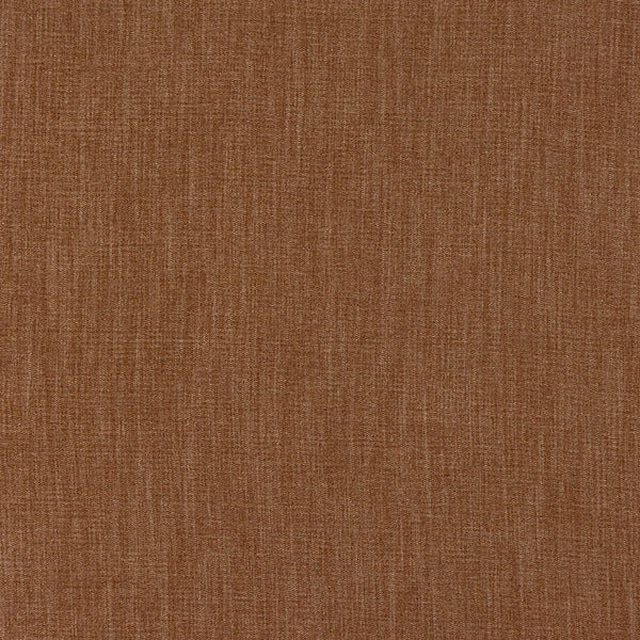
Bruges Jute is a quiet cloth, so it carries a pattern beside it: one of these on the curtains and this on the chair. Mixed across the houses we hold, which is the part a single supplier's book cannot do.
Dashiki Cinnamon
Amara
Kintyre FR Chestnut
Alderney
Monza Rust
Arezzo
Marble Wide Width Sulphur
Reflect Wallcoverings 2
Chambray Cinnamon
Chambray
Nino Wallpaper Teak
Anju Wallcoverings
Corda Wallcovering Tobacco
Duna
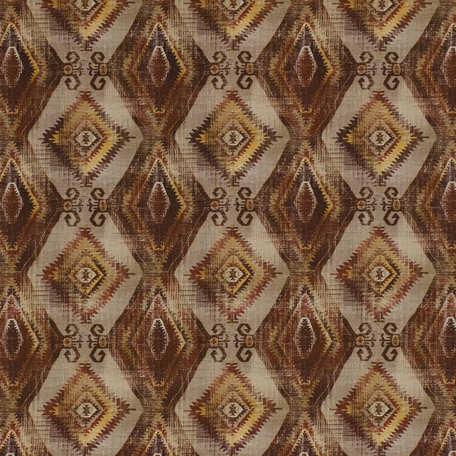
Santa Cruz Rosso
Digital Prints
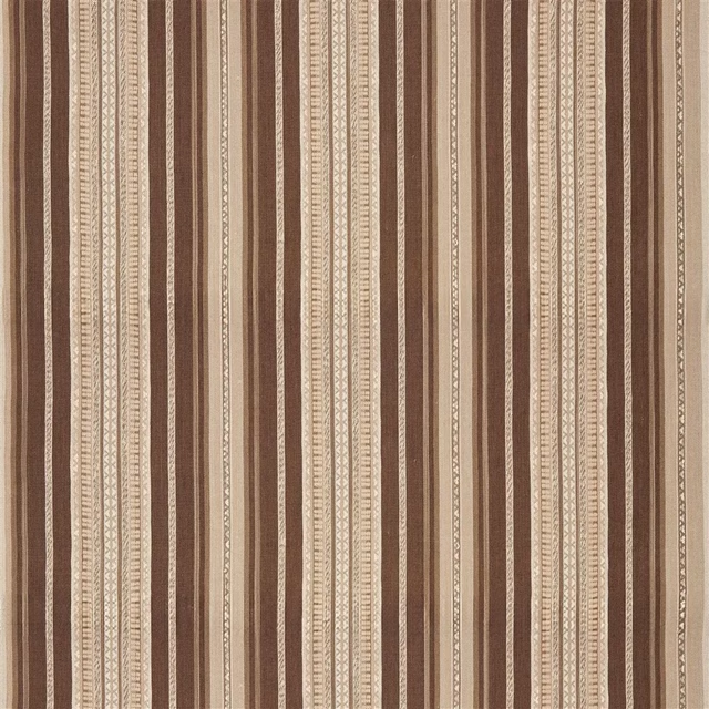
Summit Stripe Acorn
Canyon Road Fabrics
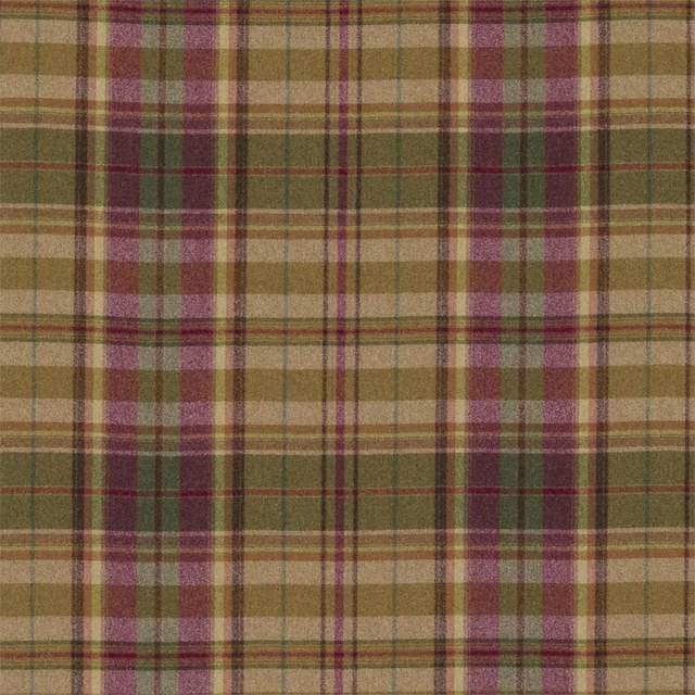
Byron Caramel/Burgundy
Country House Fabrics
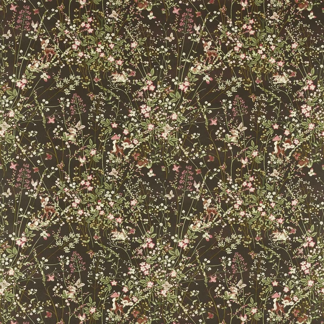
Bambi Chocolate
Disney Home X Sanderson Fabrics
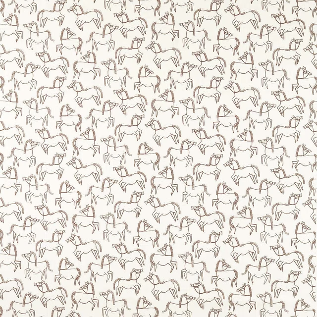
Canter Print Chestnut
Oakham Fabrics
Paint that goes with it
Two ways to take the room. Both colours are from houses we hold, so a pot can come off the same order as the cloth. Screens shift colour, so treat these as a direction and bring the cloth to the shelf before you buy the paint.
To sit quietly behind it
Scullery
Little Greene · #624b3b
To stand against it
Masquerade
Little Greene · #d2b6a0
Other brown fabrics
Across the houses we hold. See all 2,063.