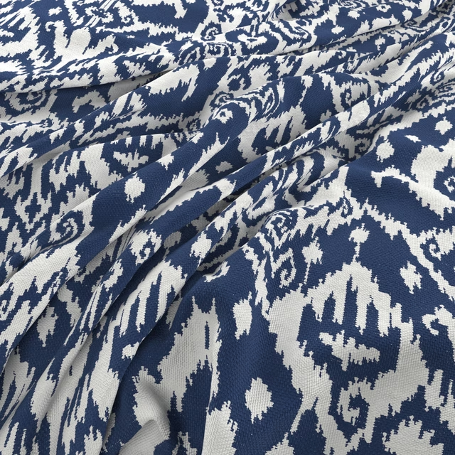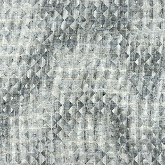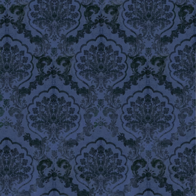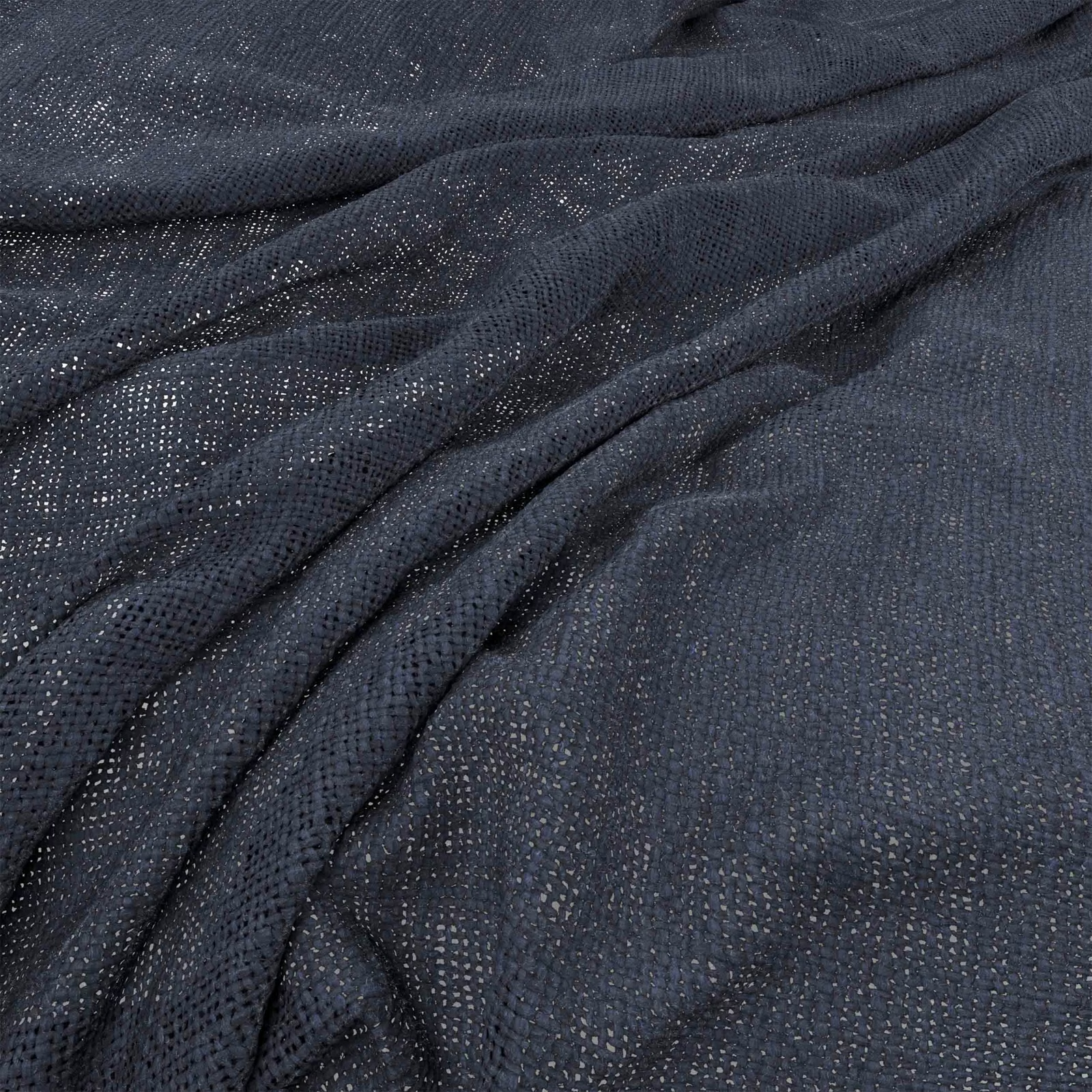

Tap the swatch to see it full screen. Hover it to magnify the weave. Colours on a screen are a guide, not a match, so come and feel the real cloth.
Scroll up or down to zoom in and out.
Bruges Ink
Bruges Fabric
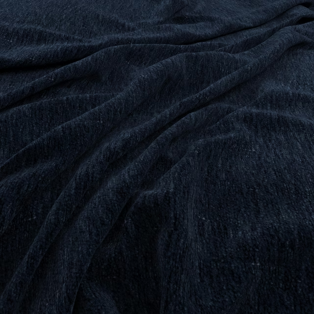
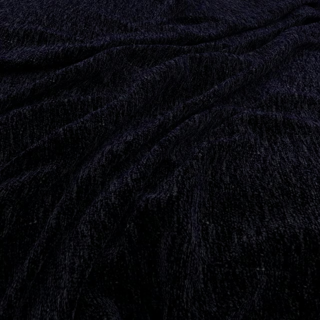
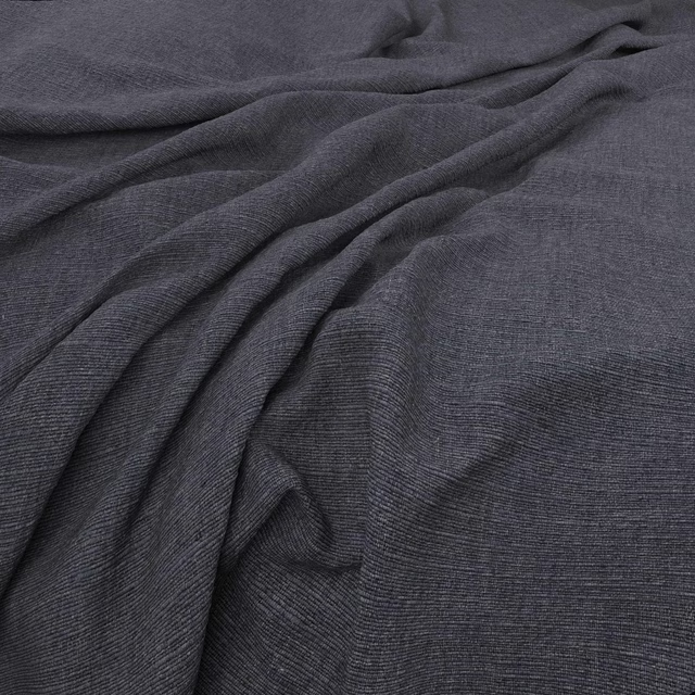
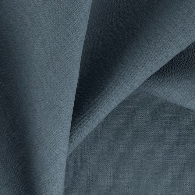
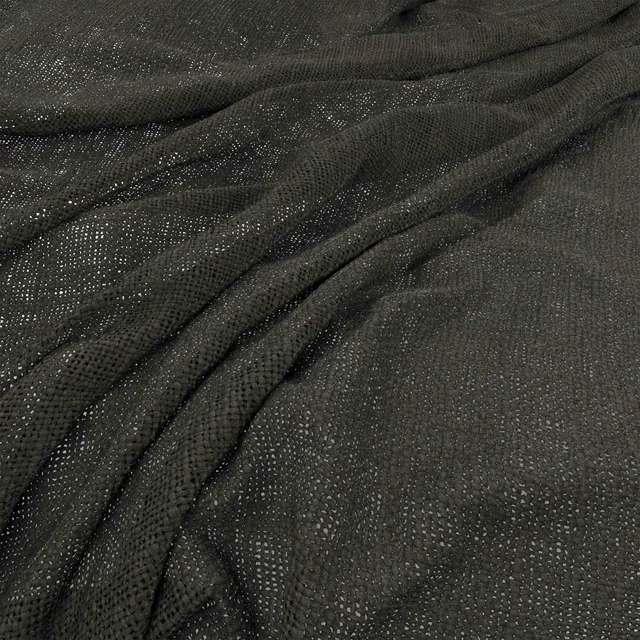
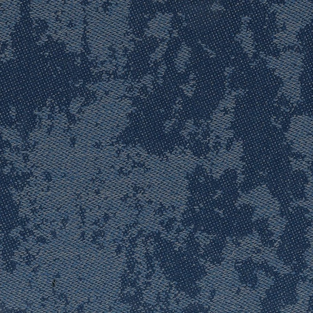
Bruges Ink has a deep, cool blue tone that shifts between navy and charcoal across the folds. Its fine woven surface creates a subtle, softly grained finish rather than a printed motif.
You have used your previews for today. Send one to Simon and you can carry on.
Your board
0 fabrics
See this fabric on Warwick's own site, then order it through us.
See Bruges Ink in your own room
A photograph of the piece you want re-covered. Straight on is best, and daylight helps. It is used to make your picture and nothing else.
Looking at your room
We found things here Bruges Ink could go on. Tap one on the photograph, or choose below.
We could not see anything to re-cover
, s
Bruges Ink, on your
Drag to compare. AI impression, colours indicative: ask us for a cutting before you decide.
About this fabric
The close-up shows a fine, open-looking weave with tiny tonal variations across the ink-blue ground. Areas caught by the light appear slightly lighter and more textured, while the gathered folds deepen to an almost charcoal navy. The cloth falls into soft, fluid pleats in the photograph, making its drapery character particularly clear. This is the Bruges colourway for a quietly dramatic, cool-toned scheme.
How to use it
Pair Bruges Ink with pale grey, chalk or warm timber to balance its cool depth. Used as curtains, its dark navy-charcoal tone will frame a window with a calm, tailored presence.
Use this deep ink-blue weave for full-length curtains or relaxed layered window treatments.
More from Bruges
The same book, other colourways.
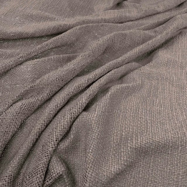
Bruges Quartz
Bruges
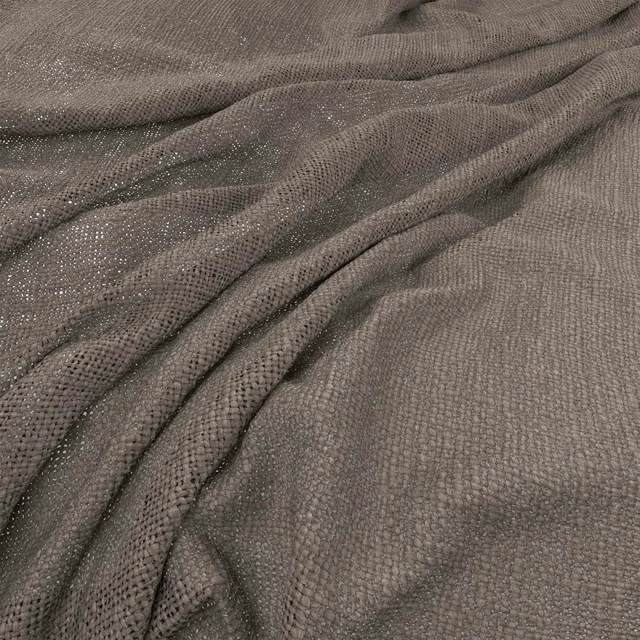
Bruges Flagstone
Bruges
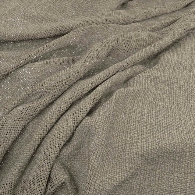
Bruges Hessian
Bruges
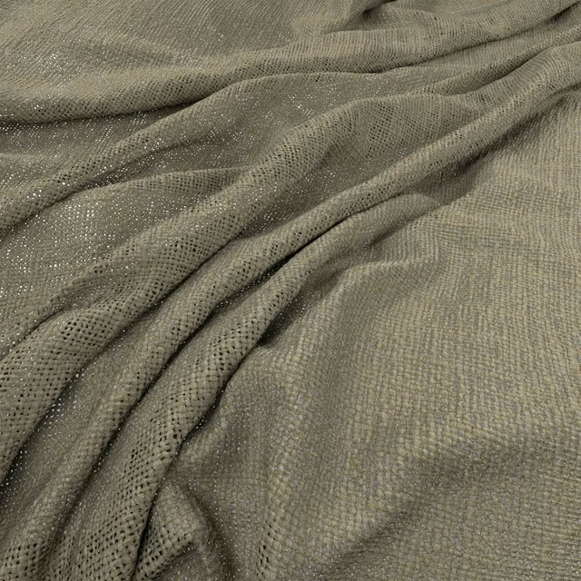
Bruges Bayleaf
Bruges
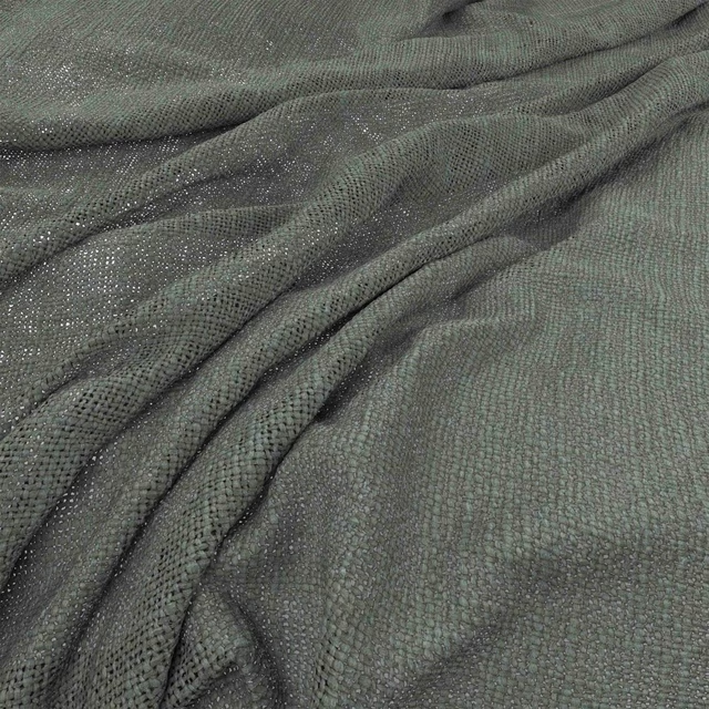
Bruges Fjord
Bruges
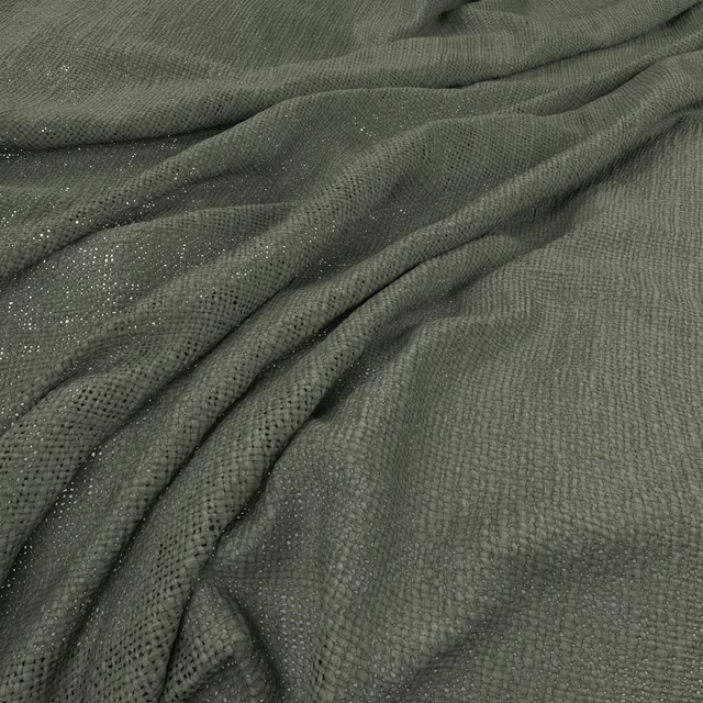
Bruges Thyme
Bruges
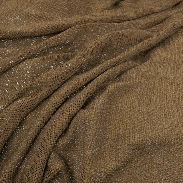
Bruges Jute
Bruges
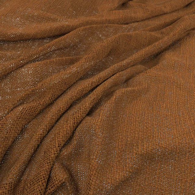
Bruges Henna
Bruges
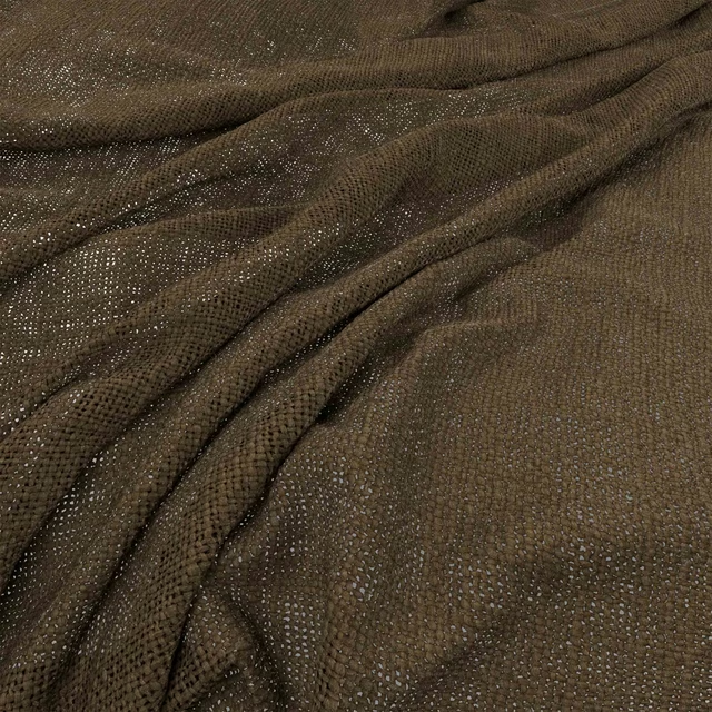
Bruges Olive
Bruges
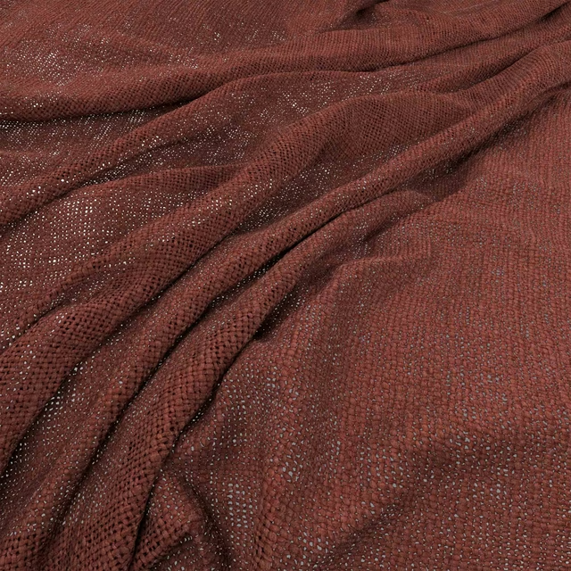
Bruges Brick
Bruges
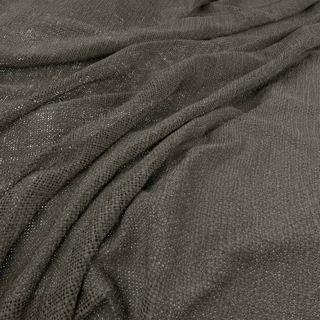
Bruges Magnet
Bruges
Bruges Bitter
Bruges
Pairs well with
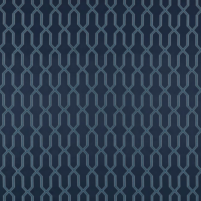
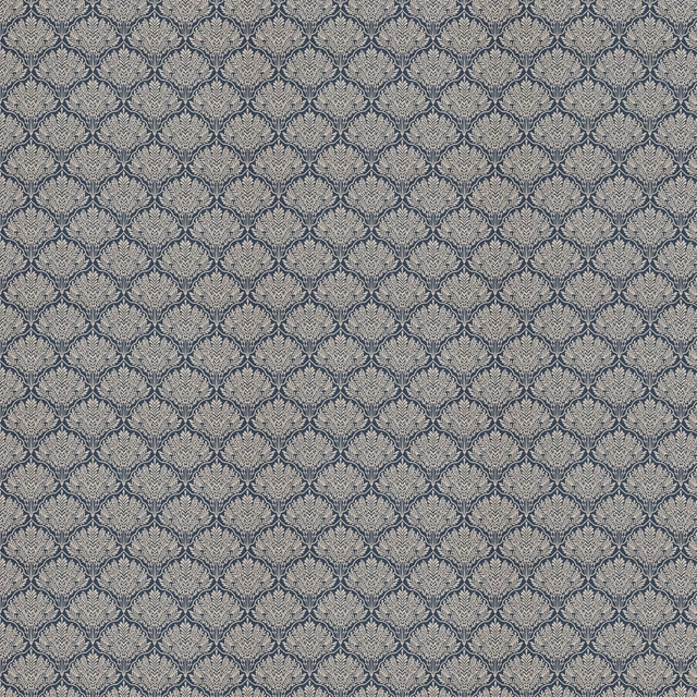
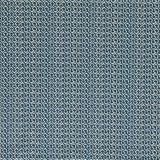
Bruges Ink is a quiet cloth, so it carries a pattern beside it: one of these on the curtains and this on the chair. Mixed across the houses we hold, which is the part a single supplier's book cannot do.
Titan Ink
Comet Collection
Caribou Ink
Eden Collection
Kalpa Ink
Indira Fabrics
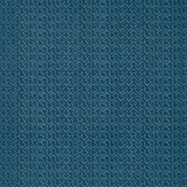
Kalpa Ink
Indira Wallcoverings
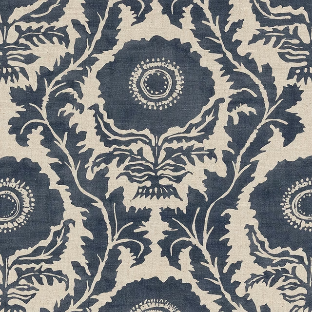
Holybourne Ink
Digital Prints
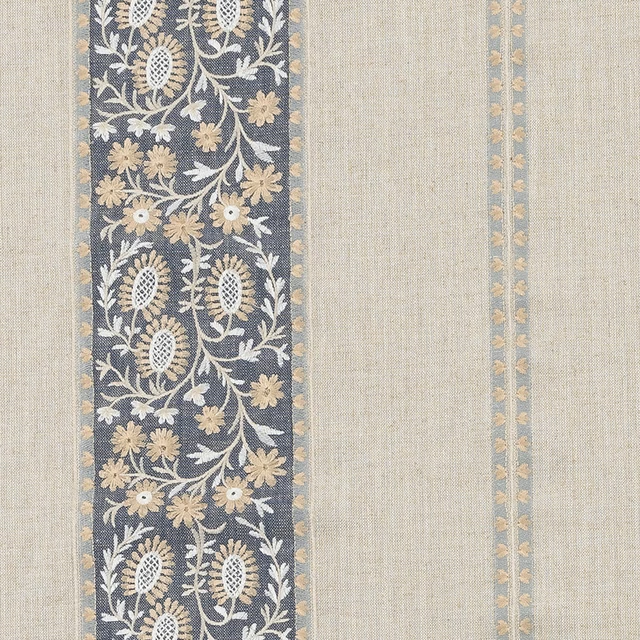
Brockenhurst Ink
Other Fabrics & Weaves
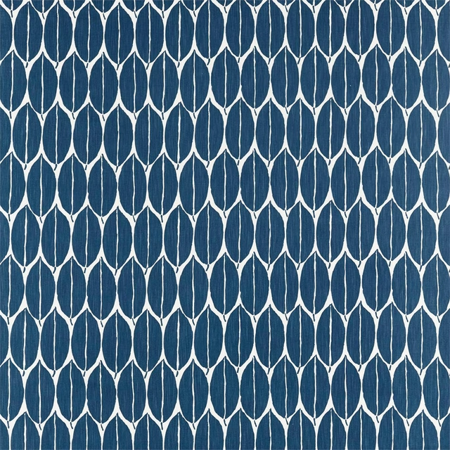
Rie Ink
Atelier Fabrics
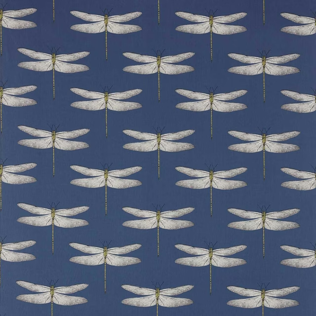
Demoiselle Ink/Chartreuse
Colour 2 Fabrics
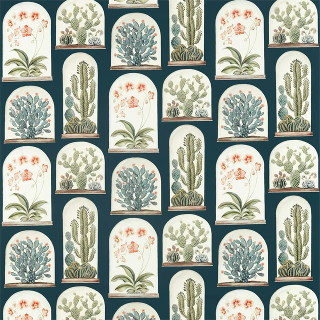
Terrariums Ink/Papaya
Glasshouse Fabrics
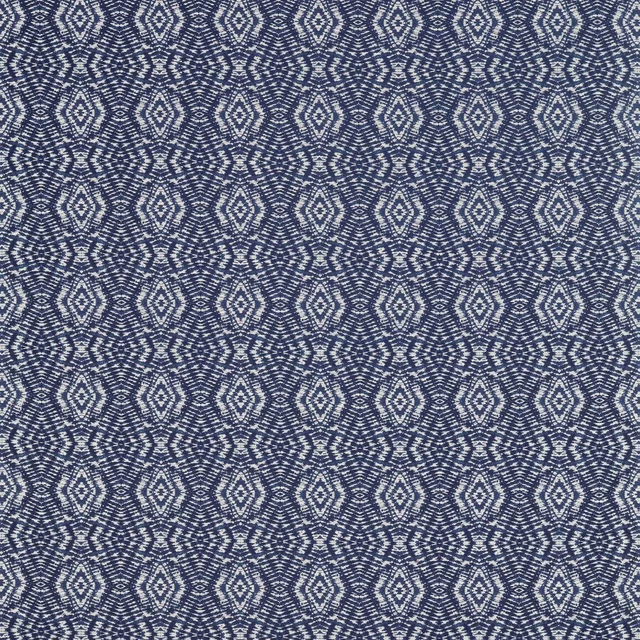
Kazue Ink
Japandi Fabrics
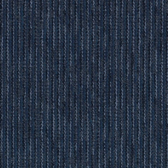
Ashton Stripe Ink Blue
Ashton Lane
Ashton Texture Ink Blue
Ashton Lane
Paint that goes with it
Two ways to take the room. Both colours are from houses we hold, so a pot can come off the same order as the cloth. Screens shift colour, so treat these as a direction and bring the cloth to the shelf before you buy the paint.
To sit quietly behind it
Dock Blue
Little Greene · #2e3742
To stand against it
Grey Violet
Zoffany · #a199a6
Other blue fabrics
Across the houses we hold. See all 7,566.