
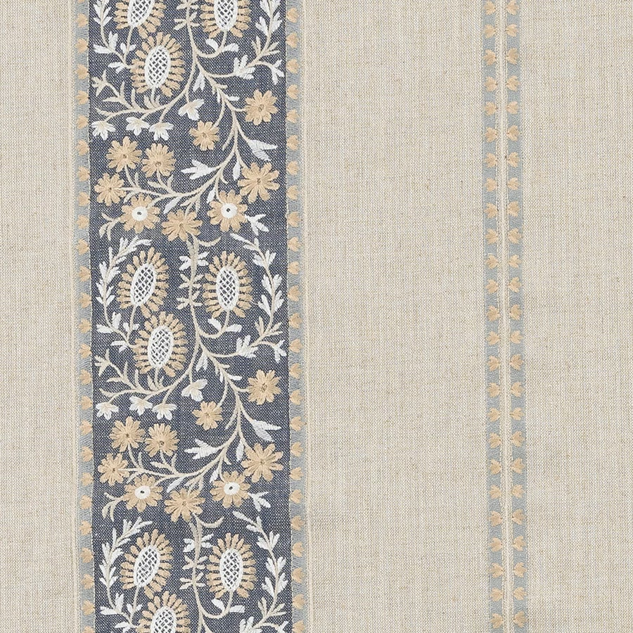

Tap the swatch to see it full screen. Hover it to magnify the weave. Colours on a screen are a guide, not a match, so come and feel the real cloth.
Scroll up or down to zoom in and out.
Brockenhurst Ink
Other Fabrics & Weaves Fabric
Brockenhurst Ink pairs a deep ink-blue ground with a trailing botanical stripe in soft cream and muted gold. The overall effect is classic but grounded, with the patterned border giving the fabric a strong vertical rhythm.
You have used your previews for today. Send one to Simon and you can carry on.
Your board
0 fabrics
See this fabric on Fryett's Fabrics's own site, then order it through us.
See Brockenhurst Ink in your own room
A photograph of the piece you want re-covered. Straight on is best, and daylight helps. It is used to make your picture and nothing else.
Looking at your room
We found things here Brockenhurst Ink could go on. Tap one on the photograph, or choose below.
We could not see anything to re-cover
, s
Brockenhurst Ink, on your
Drag to compare. AI impression, colours indicative: ask us for a cutting before you decide.
About this fabric
This Fryett's Fabrics design is woven in 76% viscose and 26% linen, giving the surface a gently textured, cloth-like handle that suits both upholstery and drapery. The 137cm width makes it practical for larger projects, while the 15.5cm vertical repeat keeps the floral border well proportioned and easy to plan around. In this colourway, the ink ground reads cool and saturated, which throws the pale leaf work and small flowerheads into crisp contrast. The cream motifs and muted ochre accents soften the darkness of the blue, so the fabric feels tailored rather than heavy.
How to use it
Use Brockenhurst Ink to bring structure to curtains, cushions or a statement armchair where the vertical stripe can be shown off. It works especially well with pale oak, chalky neutrals and aged brass, which lift the depth of the ink base.
Pair with warm neutrals and natural wood to balance the rich ink ground.
More from Other Fabrics & Weaves
The same book, other colourways.
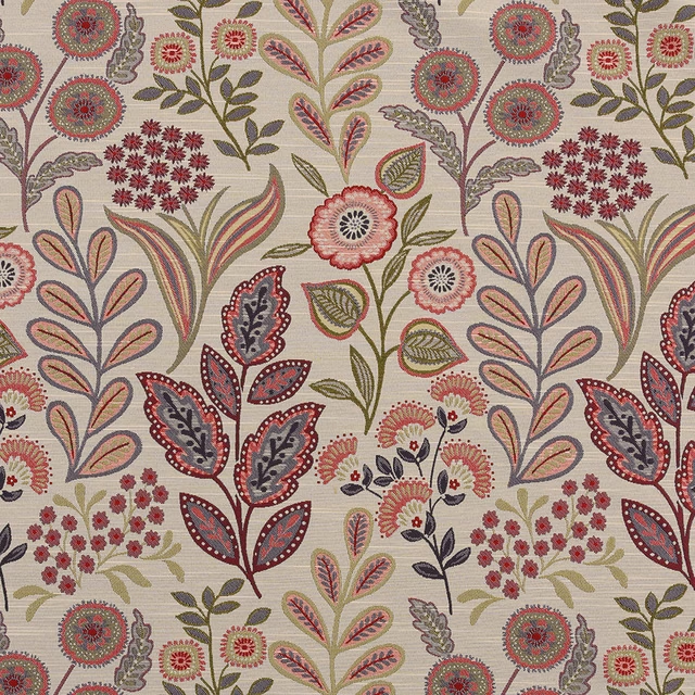
Arrelia Amethyst
Other Fabrics & Weaves
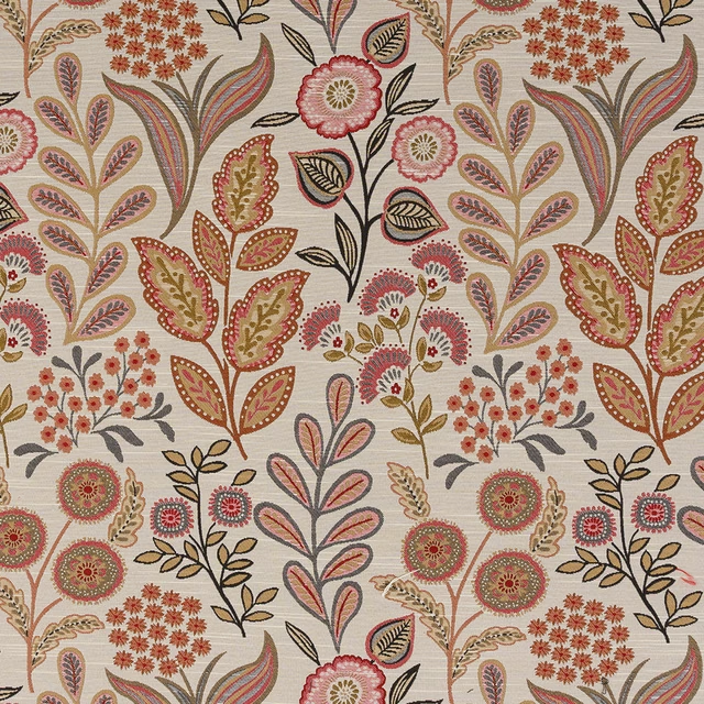
Arrelia Crimson
Other Fabrics & Weaves
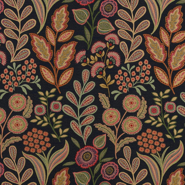
Arrelia Indigo
Other Fabrics & Weaves
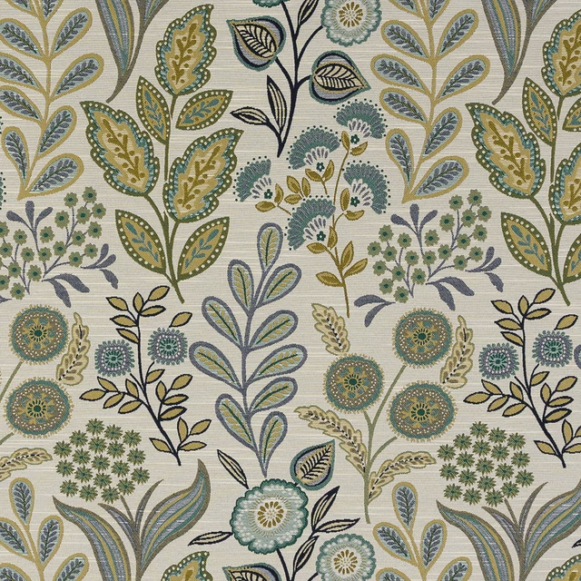
Arrelia Jade
Other Fabrics & Weaves
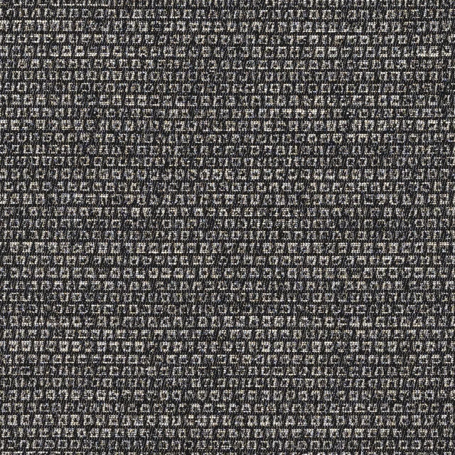
Bolero Mono
Other Fabrics & Weaves
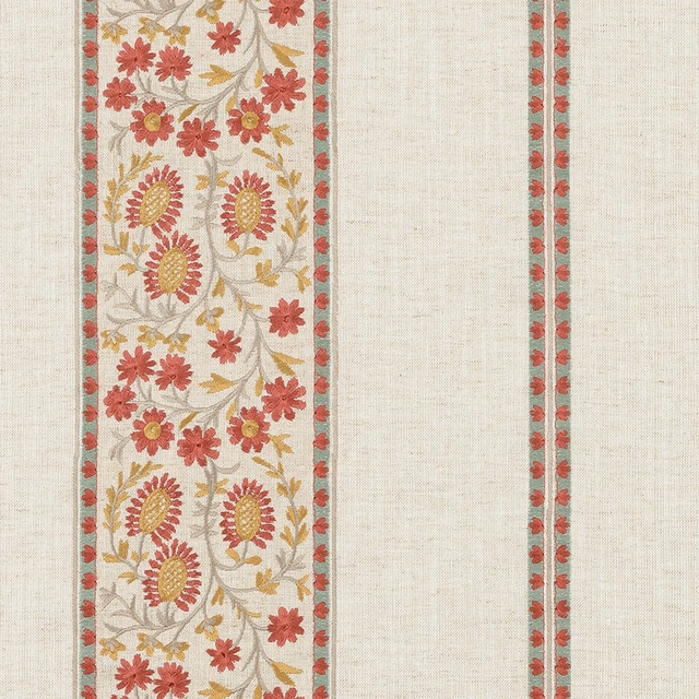
Brockenhurst Bordeaux
Other Fabrics & Weaves
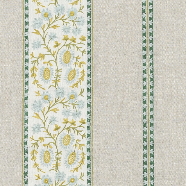
Brockenhurst Jade
Other Fabrics & Weaves
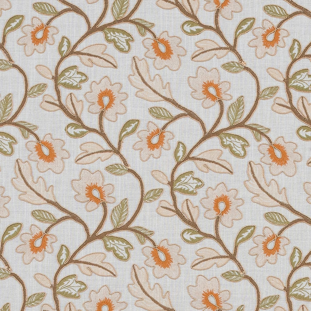
Brookland Natural
Other Fabrics & Weaves
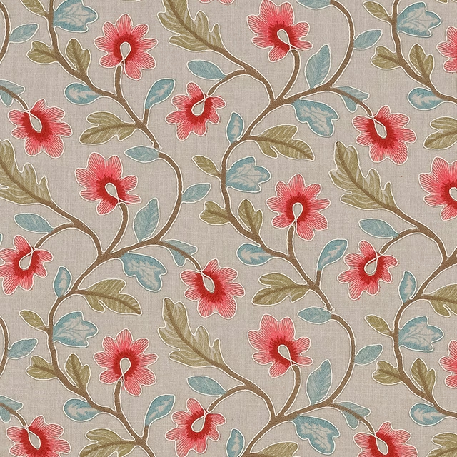
Brookland Rouge
Other Fabrics & Weaves
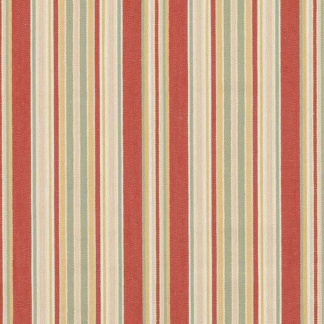
Burley Stripe Bordeaux
Other Fabrics & Weaves
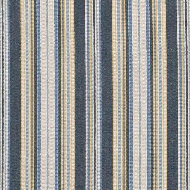
Burley Stripe Ink
Other Fabrics & Weaves
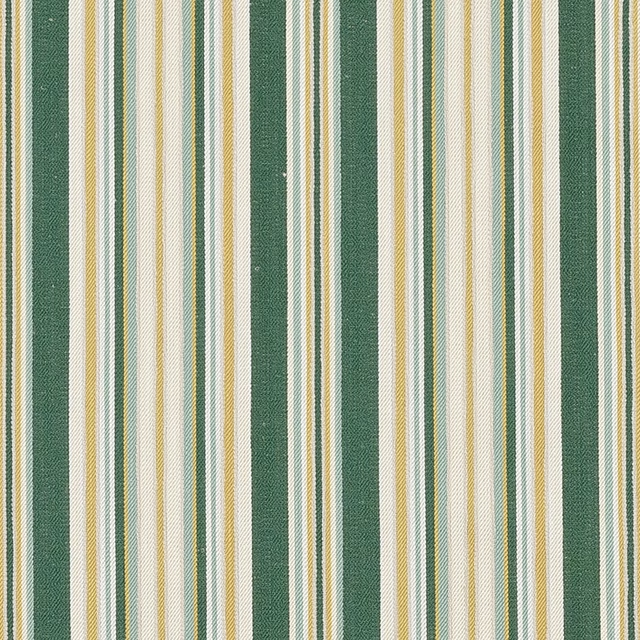
Burley Stripe Jade
Other Fabrics & Weaves
Pairs well with
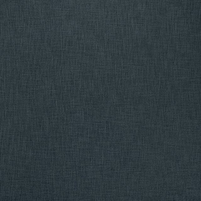
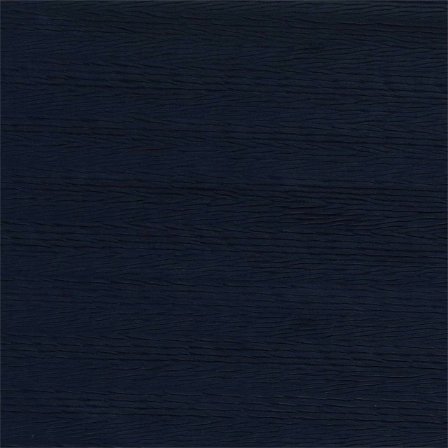
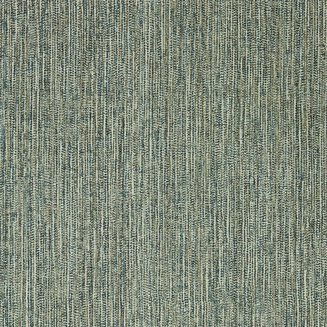
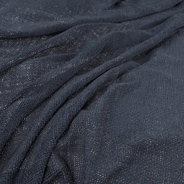
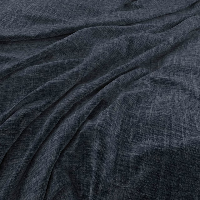
A pattern needs somewhere for the eye to rest, so these are the plains and textures that sit beside Brockenhurst Ink without fighting it. Mixed across the houses we hold, which is the part a single supplier's book cannot do.



Paint that goes with it
Two ways to take the room. Both colours are from houses we hold, so a pot can come off the same order as the cloth. Screens shift colour, so treat these as a direction and bring the cloth to the shelf before you buy the paint.
To sit quietly behind it
Owlswick
Sanderson · #bfbbb2
To stand against it
Wardle Wine
Morris & Co. · #7b5250
Other blue fabrics
Across the houses we hold. See all 7,566.
Lucca FR Navy
Modena FR
Lucca FR Wood
Modena FR
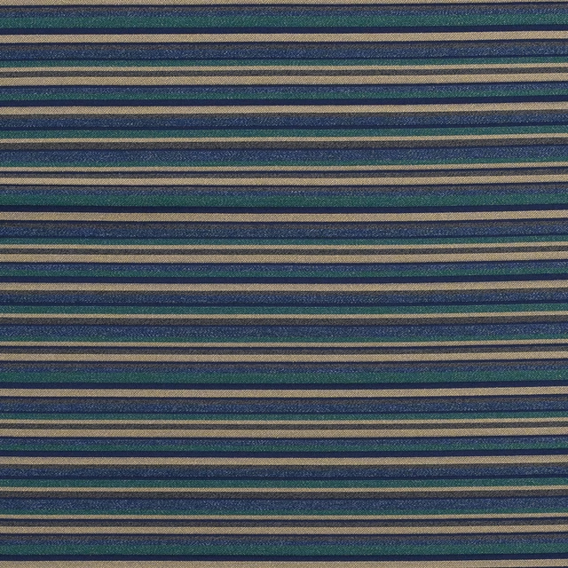
Modena FR Navy
Modena FR
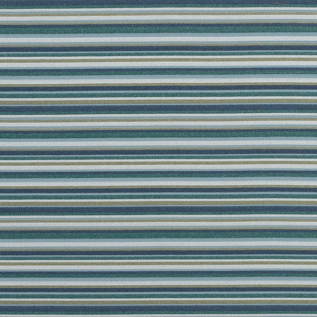
Modena FR Wedgewood
Modena FR
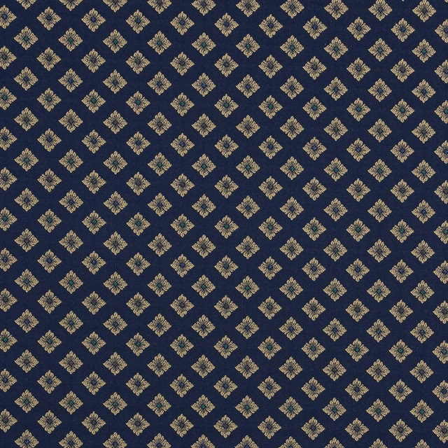
Pisa FR Navy
Modena FR
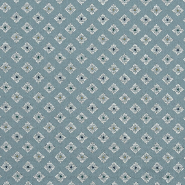
Pisa FR Wood
Modena FR
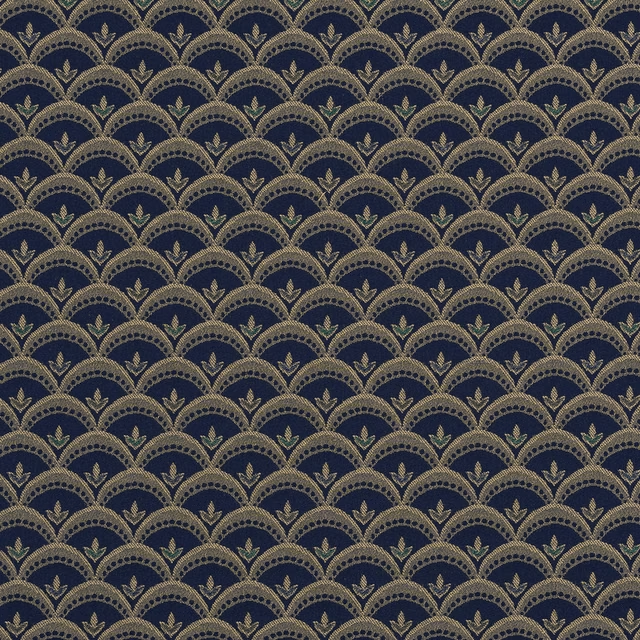
Viareggio FR Navy
Modena FR
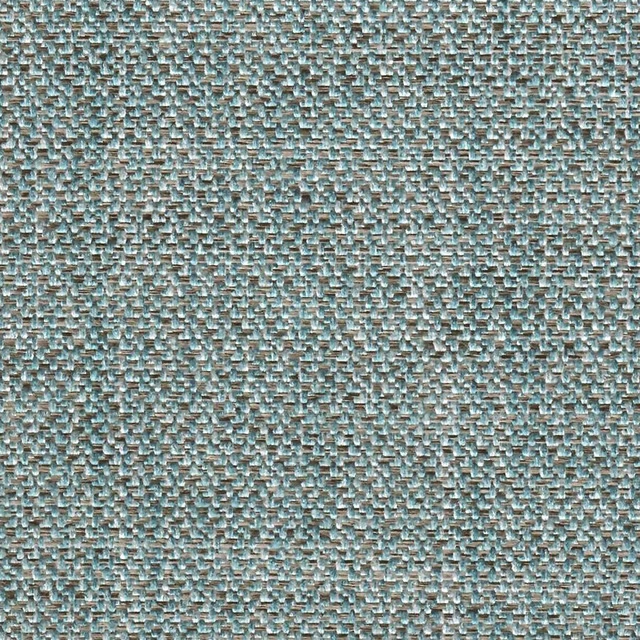
Monmouth FR Aqua
Monmouth FR
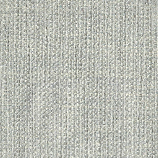
Monmouth FR Duckegg
Monmouth FR
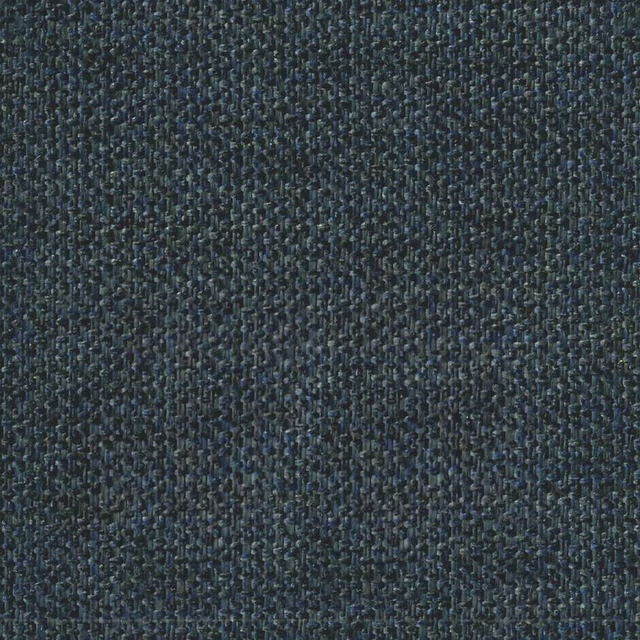
Monmouth FR Indigo
Monmouth FR
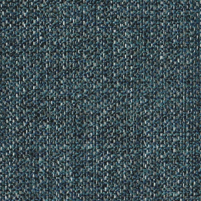
Monmouth FR Midnight
Monmouth FR
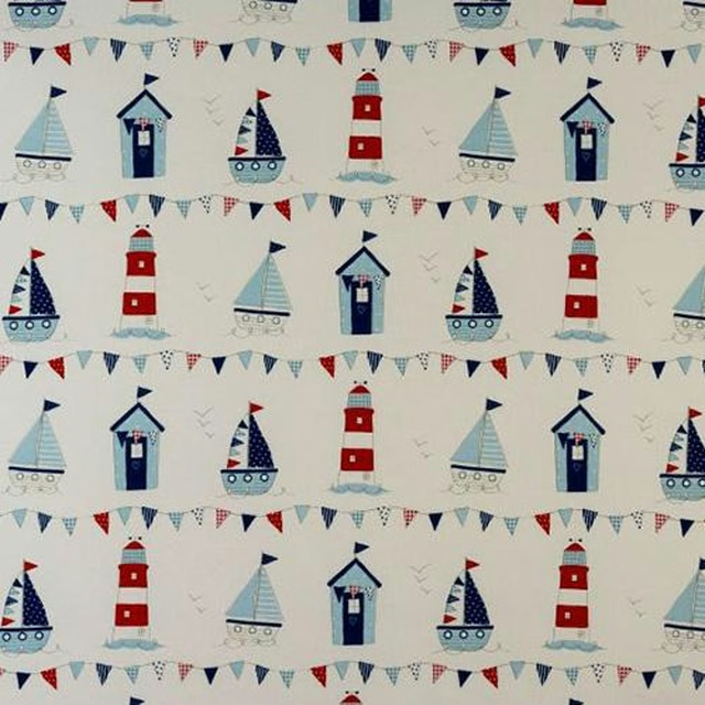
Maritime Blue
Novelty Time