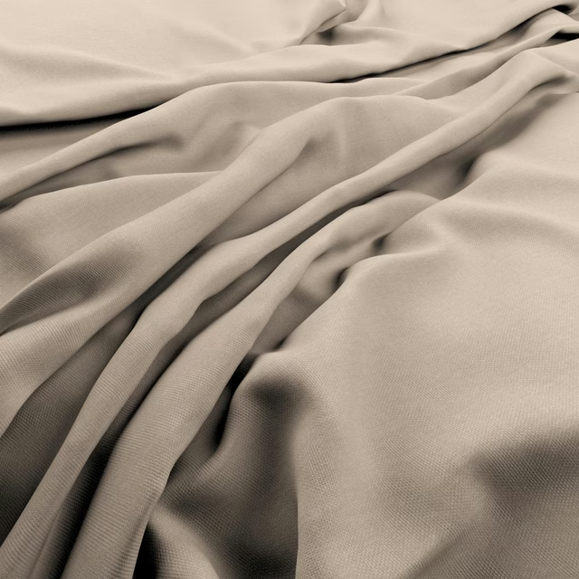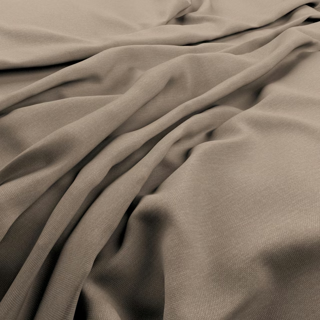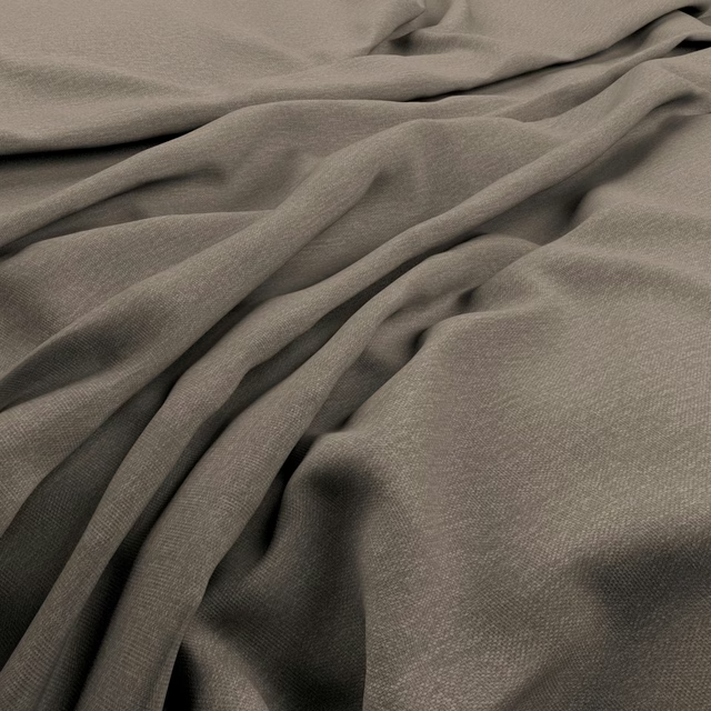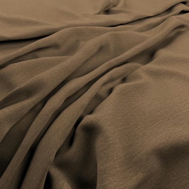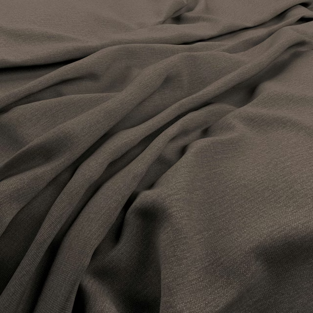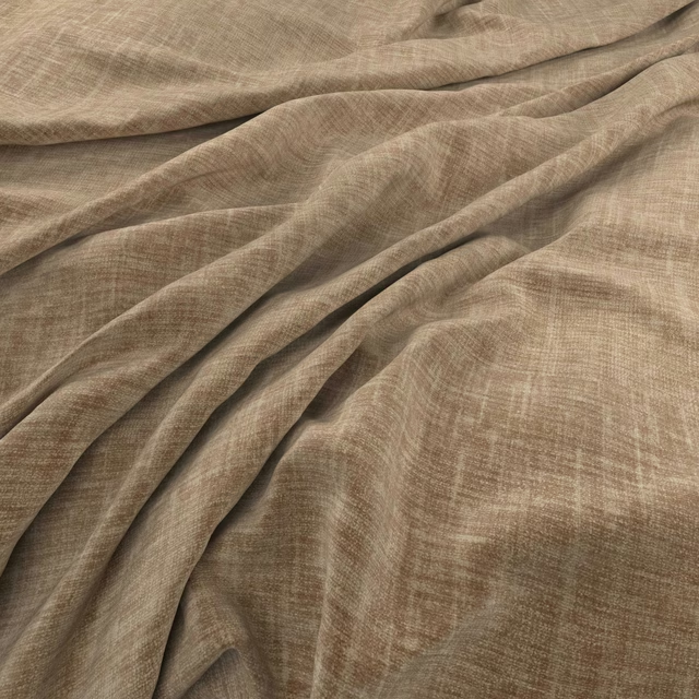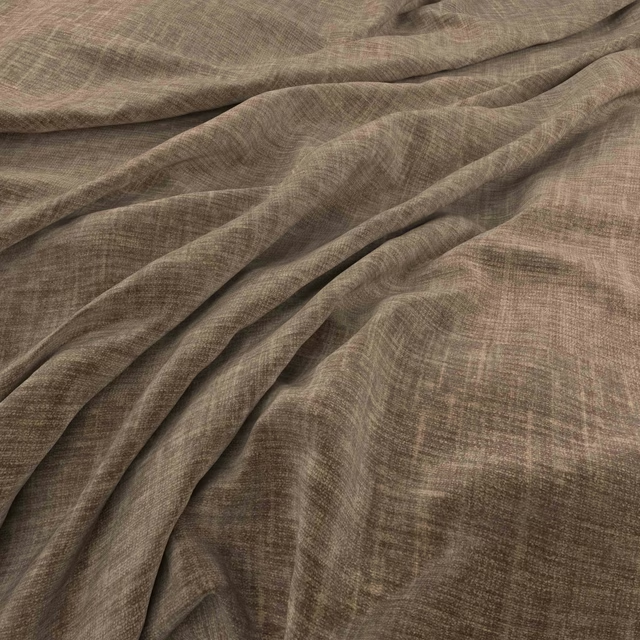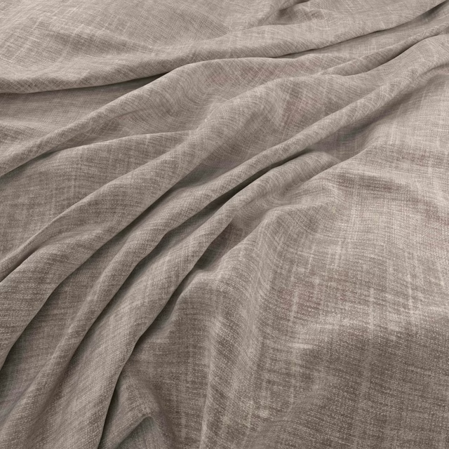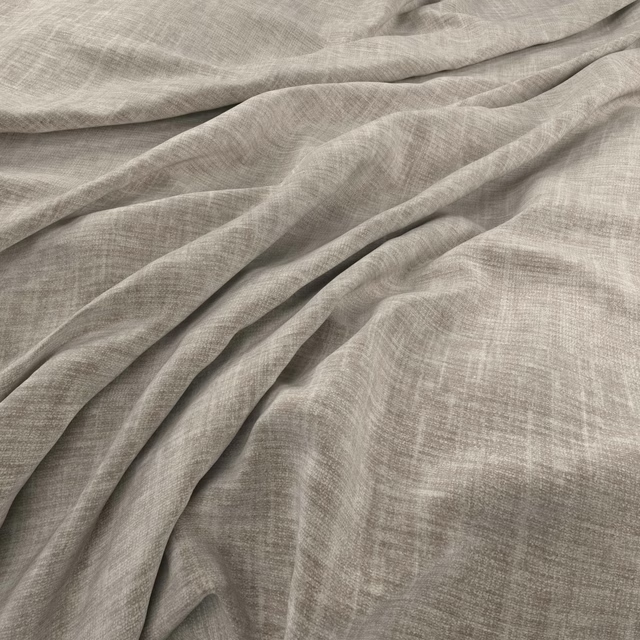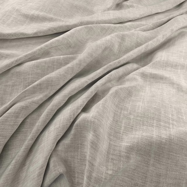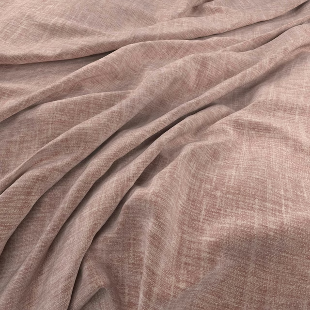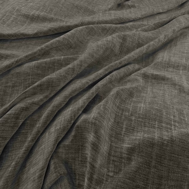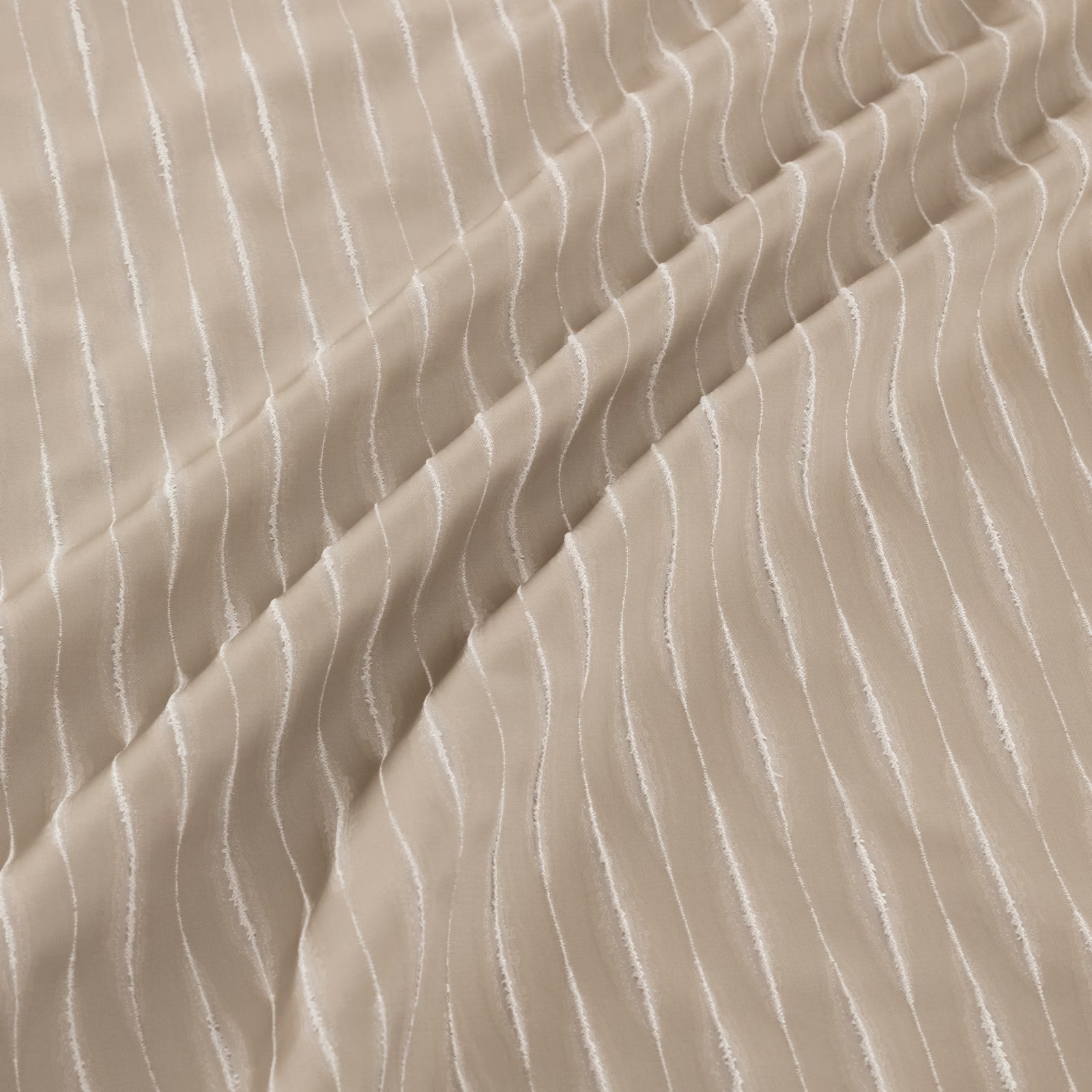

Tap the swatch to see it full screen. Hover it to magnify the weave. Colours on a screen are a guide, not a match, so come and feel the real cloth.
Scroll up or down to zoom in and out.
Khalifa Bronze
Khalifa Fabric
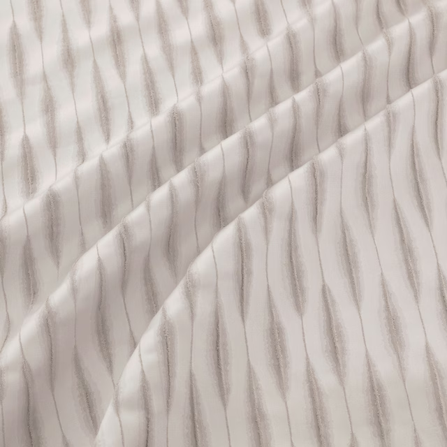
Khalifa Bronze has a warm bronze-taupe ground crossed by slender, irregular vertical lines. The pattern shifts gently as the fabric folds, giving the surface a fluid, softly reflective character.
You have used your previews for today. Send one to Simon and you can carry on.
Your board
0 fabrics
See this fabric on Warwick's own site, then order it through us.
See Khalifa Bronze in your own room
A photograph of the piece you want re-covered. Straight on is best, and daylight helps. It is used to make your picture and nothing else.
Looking at your room
We found things here Khalifa Bronze could go on. Tap one on the photograph, or choose below.
We could not see anything to re-cover
, s
Khalifa Bronze, on your
Drag to compare. AI impression, colours indicative: ask us for a cutting before you decide.
About this fabric
The muted bronze tone sits between taupe and warm beige, with enough depth to avoid looking flat while remaining light and understated. Fine, wavering lines run vertically across the cloth, varying subtly in width and spacing rather than forming a rigid stripe. The close view shows a delicate woven texture, while the diagonal fold demonstrates how the pattern bends naturally with the fabric. The supplied record lists no composition, width or performance rating for this fabric.
How to use it
Use Khalifa Bronze at a window where its warm taupe-bronze tone can soften daylight without introducing a strong colour accent. Full-length curtains will emphasise the vertical movement of the irregular lines and the fabric’s flowing folds.
Use this warm bronze-taupe colourway for softly gathered curtains where its fine, undulating lines can follow the movement of the cloth.
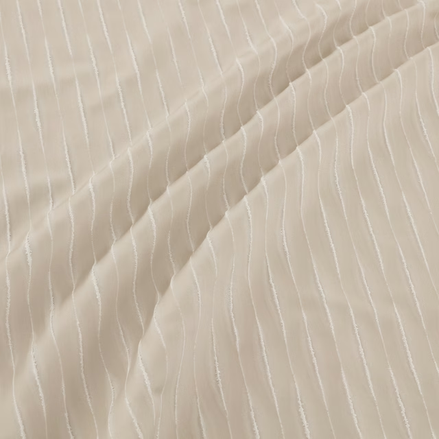
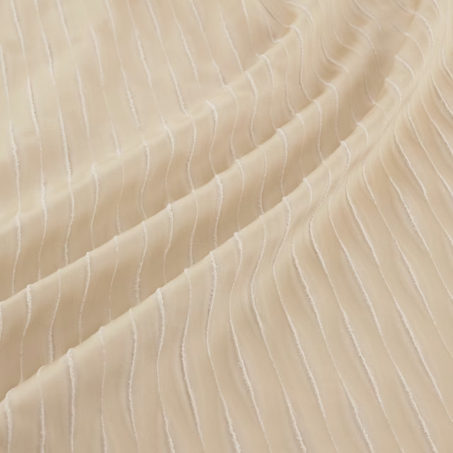
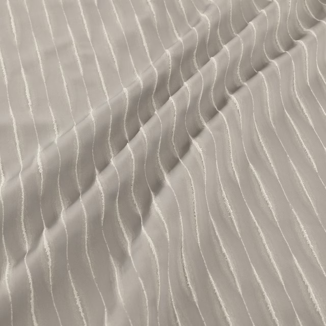
Pairs well with
A pattern needs somewhere for the eye to rest, so these are the plains and textures that sit beside Khalifa Bronze without fighting it. Mixed across the houses we hold, which is the part a single supplier's book cannot do.
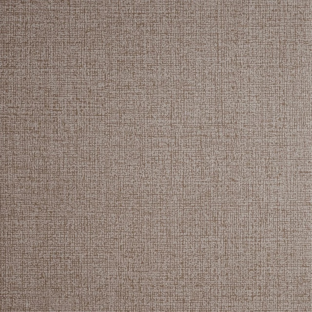
Nico Bronze
Reflections Wallpaper
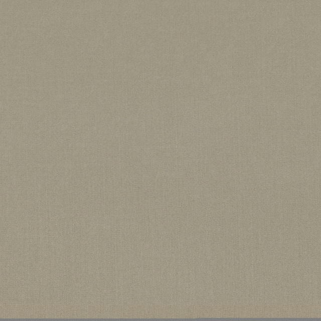
Jazz Bronze
Jazz Iii
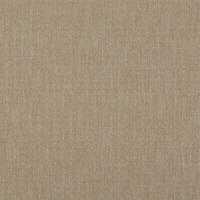
Canyon Bronze
Essential Colours

Alaska Mole
Alaska Collection

Alaska Otter
Alaska Collection
Albany Mink
Albany and Moray
Marldon Taupe
Albeck
Croft Silver
Chester
Marcello Cappuccino
Contract Essentials II Fabrics
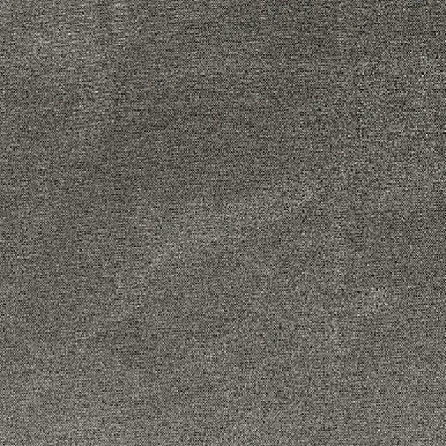
Sahara Zinc
Kalahari Fabrics
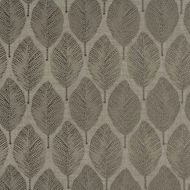
Acacia Taupe
Acacia
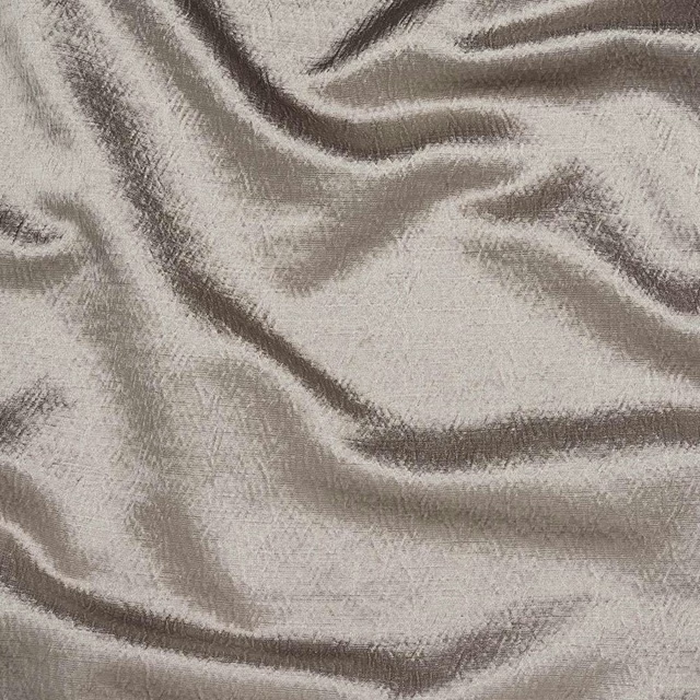
Alchemy Mushroom
Alchemy
Paint that goes with it
Two ways to take the room. Both colours are from houses we hold, so a pot can come off the same order as the cloth. Screens shift colour, so treat these as a direction and bring the cloth to the shelf before you buy the paint.
To sit quietly behind it
Double Harbour Grey
Zoffany · #b8a898
To stand against it
The Drink
Coat Paints · #3d5058
Other taupe fabrics
Across the houses we hold. See all 4,148.