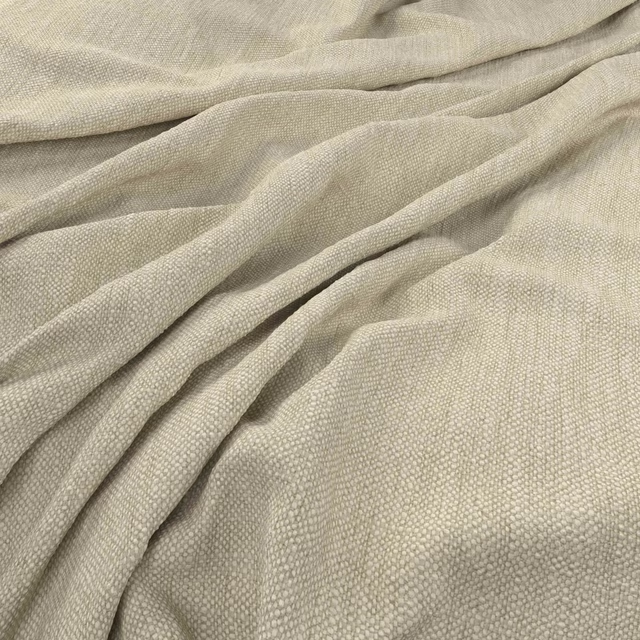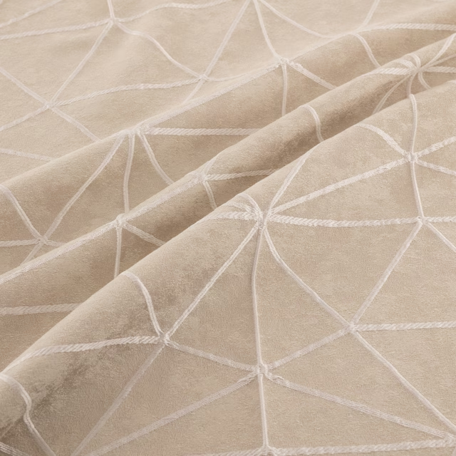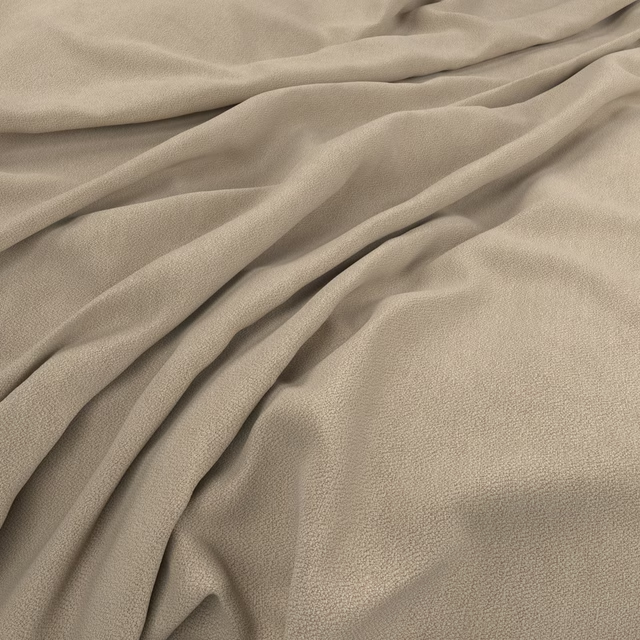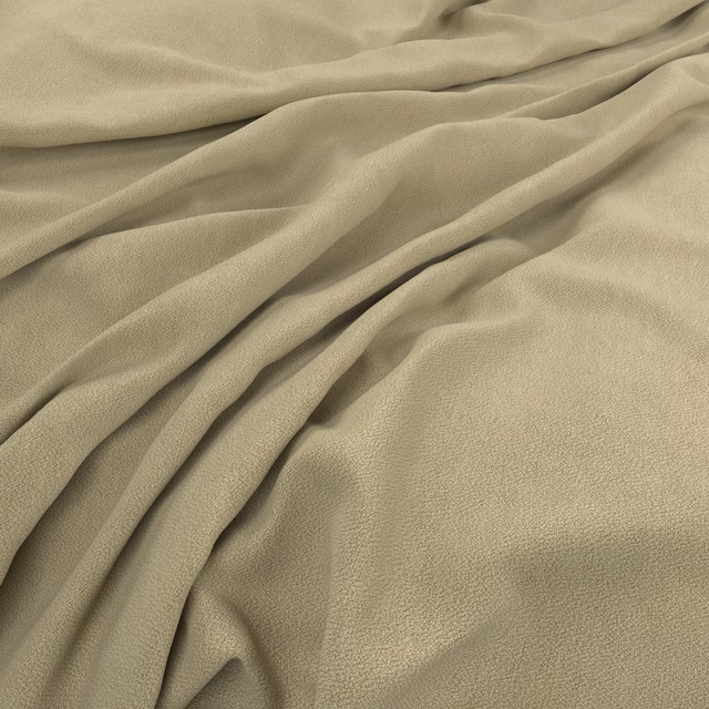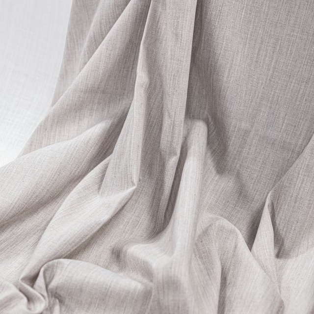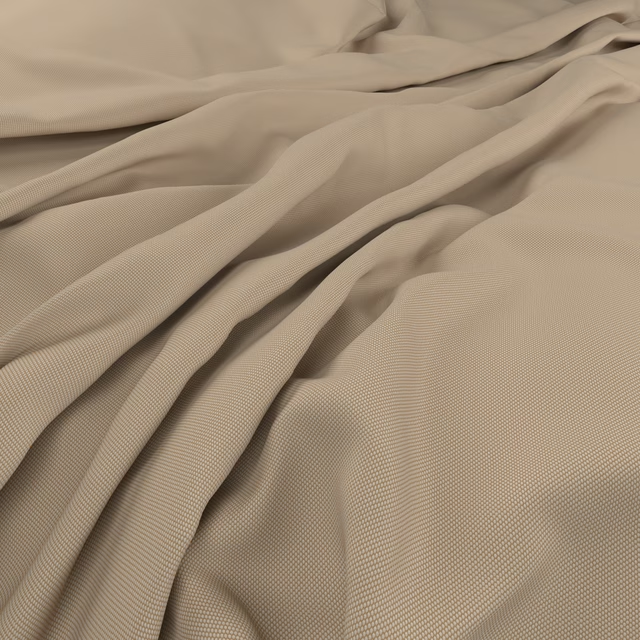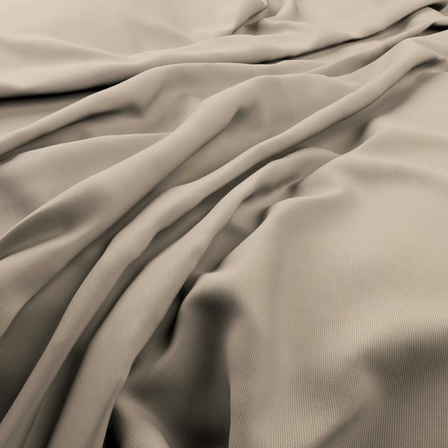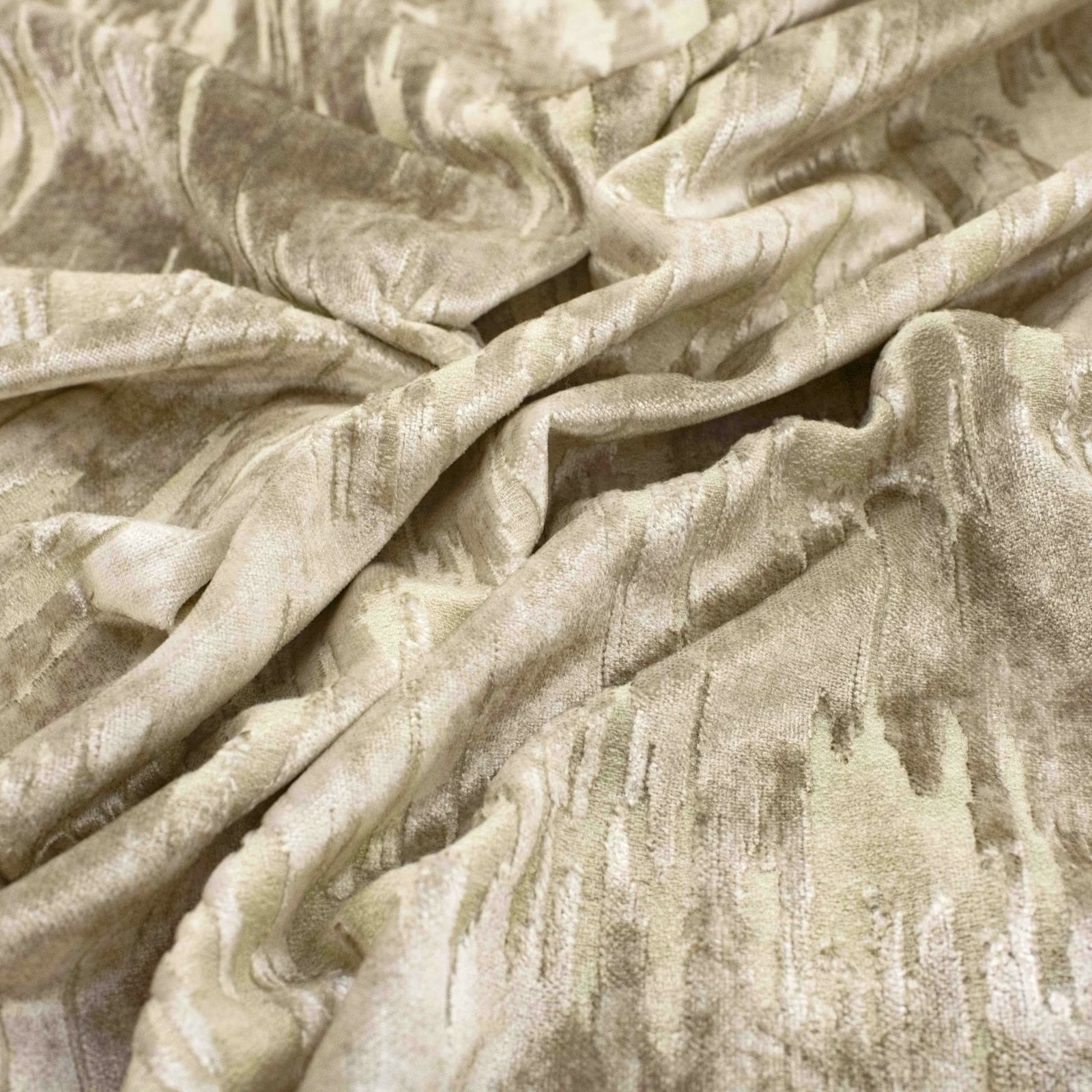

Tap the swatch to see it full screen. Hover it to magnify the weave. Colours on a screen are a guide, not a match, so come and feel the real cloth.
Scroll up or down to zoom in and out.
Percier Oyster
Percier Fabric
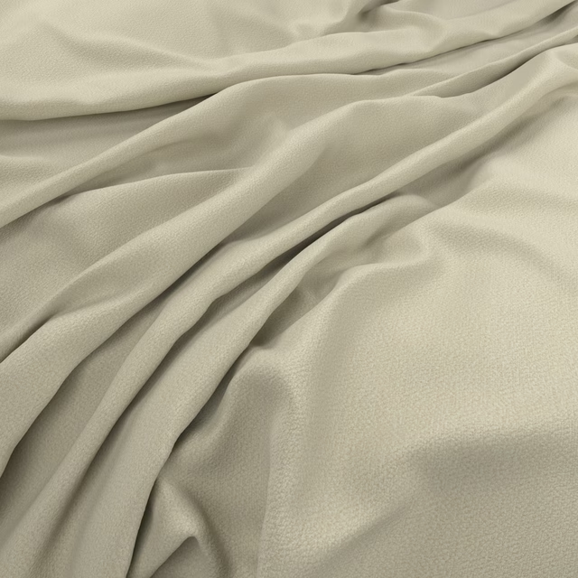
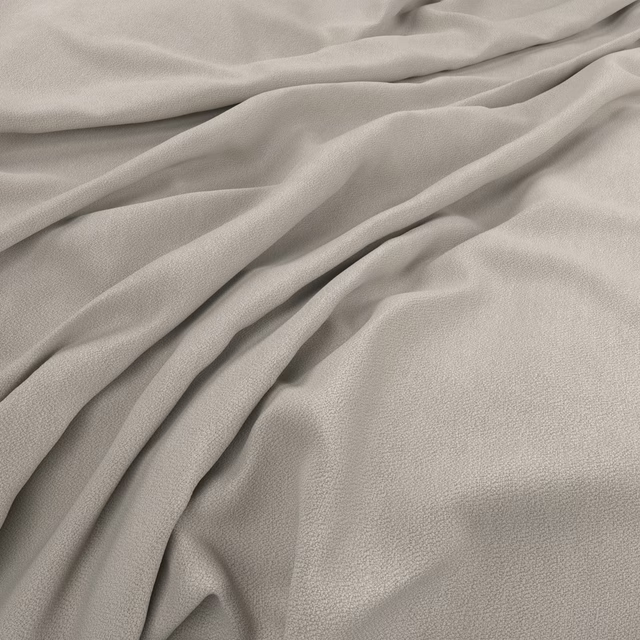
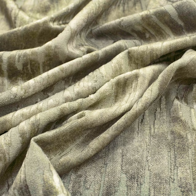
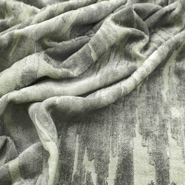
Percier Oyster has a pale oyster-beige ground with soft taupe shading and an irregular, painterly surface. Its subtle sheen catches across the raised folds, giving the colourway quiet depth rather than a flat neutral appearance.
You have used your previews for today. Send one to Simon and you can carry on.
Your board
0 fabrics
See this fabric on Warwick's own site, then order it through us.
See Percier Oyster in your own room
A photograph of the piece you want re-covered. Straight on is best, and daylight helps. It is used to make your picture and nothing else.
Looking at your room
We found things here Percier Oyster could go on. Tap one on the photograph, or choose below.
We could not see anything to re-cover
, s
Percier Oyster, on your
Drag to compare. AI impression, colours indicative: ask us for a cutting before you decide.
About this fabric
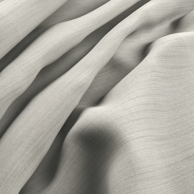
The design is formed from elongated, abstract striations that drift across the cloth in pale cream, oyster and muted taupe tones. A softly reflective finish highlights the changing texture, particularly where the fabric bends and gathers in the swatch. The fluid folds suggest a fabric with enough movement for curtains while retaining a tactile presence suited to upholstery and cushions. Its low-contrast colouring keeps the expressive marks refined and understated.
How to use it
Pair Percier Oyster with warm ivory, stone and pale timber for a calm, layered scheme, or use it against deeper taupe to bring out the shaded striations. The gentle oyster tone works especially well on relaxed curtains, occasional chairs and cushions.
Use this softly lustrous oyster shade to bring gentle contrast and tactile depth to upholstery, cushions or flowing curtains.
Pairs well with
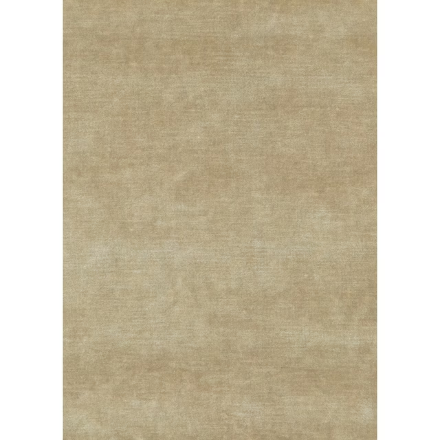
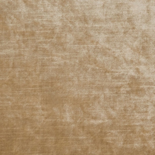
A pattern needs somewhere for the eye to rest, so these are the plains and textures that sit beside Percier Oyster without fighting it. Mixed across the houses we hold, which is the part a single supplier's book cannot do.

Glamour Oyster
Glamour
King's Velvet Oyster
Historic Royal Palaces
Allure Dune
Allure

Lucerne Pale Bronze
Lucerne Silks
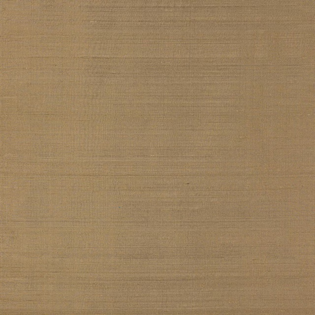
Pamina Sable
Pamina Silks

Glamour Latte
Glamour

Regina Shell
Belvedere Velvets

Montpellier Oyster
Montpellier Plains
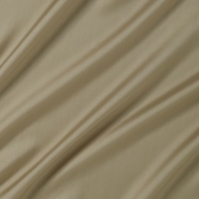
Connaught Silk Macaroon
Connaught Silk

Reflection Stucco
Elements

Astral Wallpaper Oyster
Azzura Wallpapers
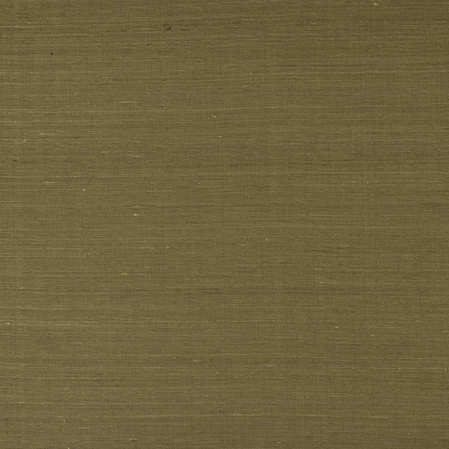
Lazare Havane
Lazare
Paint that goes with it
Two ways to take the room. Both colours are from houses we hold, so a pot can come off the same order as the cloth. Screens shift colour, so treat these as a direction and bring the cloth to the shelf before you buy the paint.
To sit quietly behind it
Rolling Fog - Dark
Little Greene · #b1a48a
To stand against it
Hardback
Coat Paints · #4e433a
Other beige fabrics
Across the houses we hold. See all 4,485.