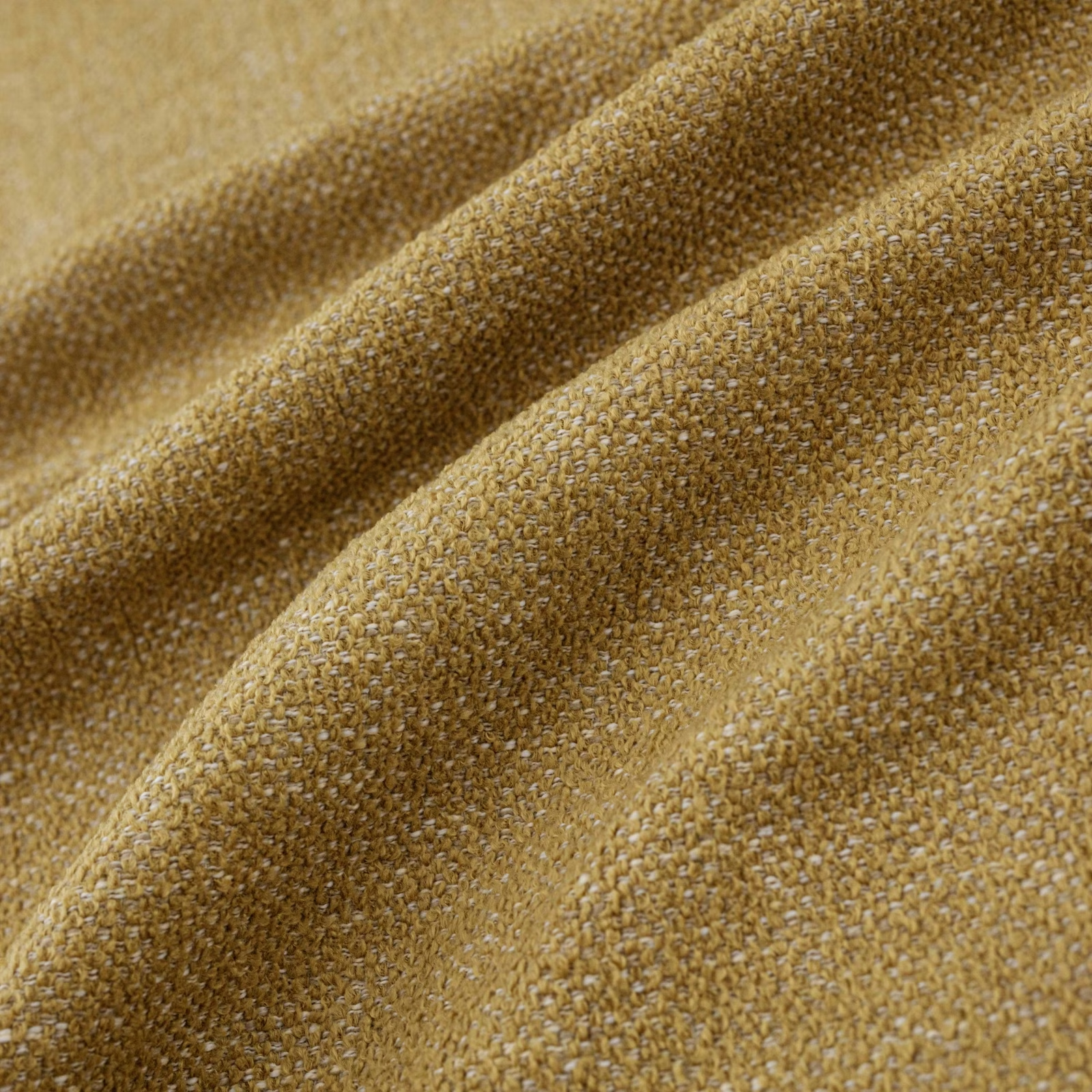

Tap the swatch to see it full screen. Hover it to magnify the weave. Colours on a screen are a guide, not a match, so come and feel the real cloth.
Scroll up or down to zoom in and out.
Verona Ochre
Verona Fabric
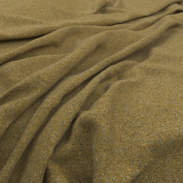
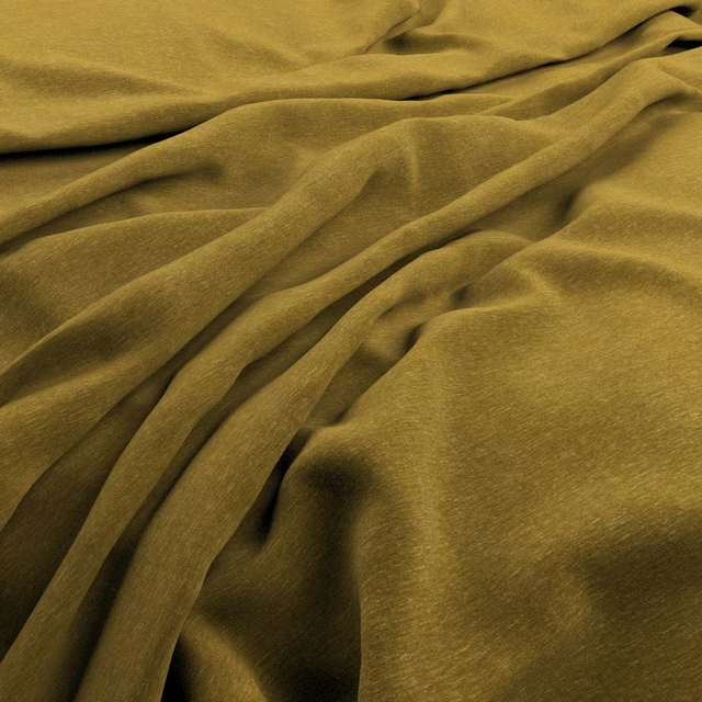
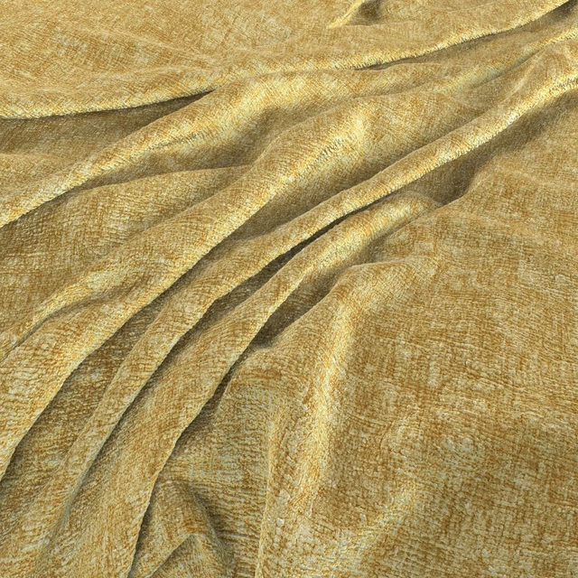
Verona Ochre presents a warm, earthy ochre tone with golden and brown variation across its closely woven surface. The softly nubby texture catches the light across the draped folds, giving the colour a gently shifting depth.
You have used your previews for today. Send one to Simon and you can carry on.
Your board
0 fabrics
See this fabric on Warwick's own site, then order it through us.
See Verona Ochre in your own room
A photograph of the piece you want re-covered. Straight on is best, and daylight helps. It is used to make your picture and nothing else.
Looking at your room
We found things here Verona Ochre could go on. Tap one on the photograph, or choose below.
We could not see anything to re-cover
, s
Verona Ochre, on your
Drag to compare. AI impression, colours indicative: ask us for a cutting before you decide.
About this fabric
This colourway is a rich ochre textile, balanced by honeyed highlights and deeper golden-brown flecks visible throughout the weave. Its compact, tactile construction has a small-scale irregularity rather than a printed motif, creating visual interest without a formal pattern. The dense-looking surface and pronounced folds make it read naturally as an upholstery fabric, particularly where texture is intended to be part of the design. The supplied catalogue identifies it as a fabric, with no performance features noted.
How to use it
Pair Verona Ochre with warm timber, aged brass and soft cream upholstery for a grounded, sunlit scheme. Its golden-brown depth also works well as an accent on a statement chair or ottoman against quieter neutral tones.
Use this warm ochre weave to bring golden depth and tactile softness to upholstered seating.
More from Verona
The same book, other colourways.
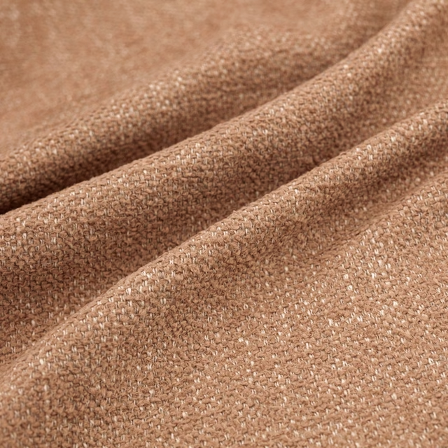
Verona Clay
Verona
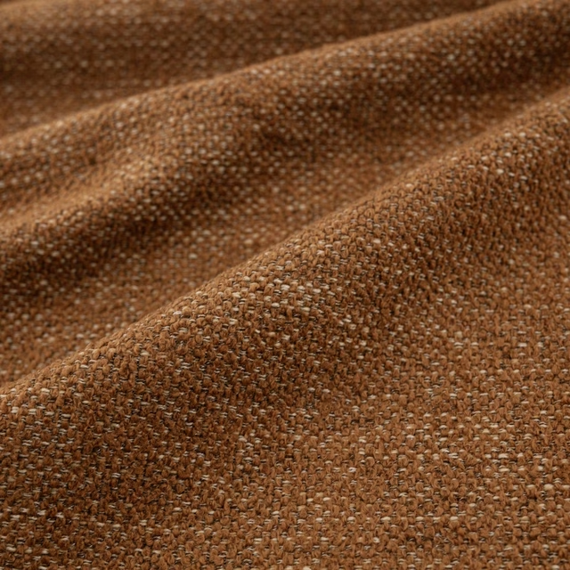
Verona Kiln
Verona
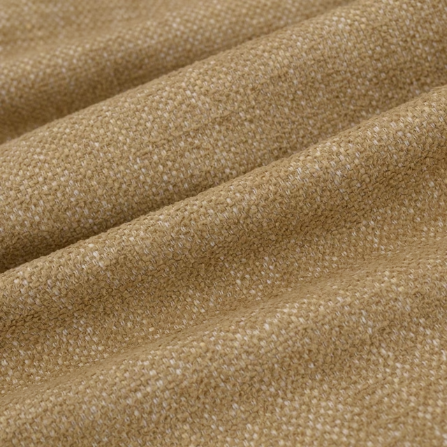
Verona Dune
Verona
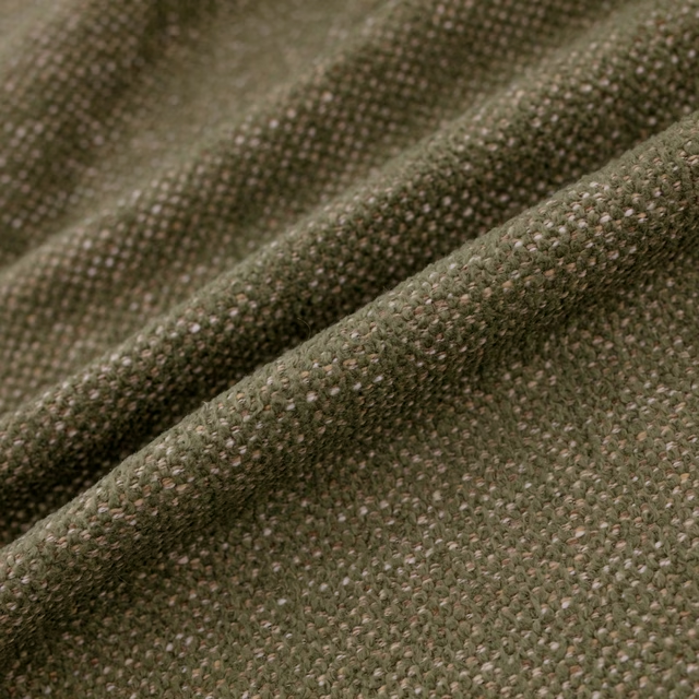
Verona Moss
Verona
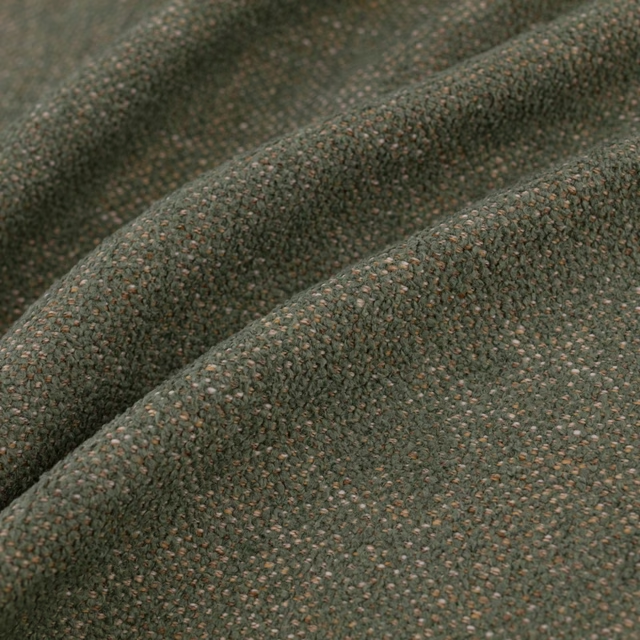
Verona Seafoam
Verona
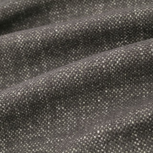
Verona Granite
Verona
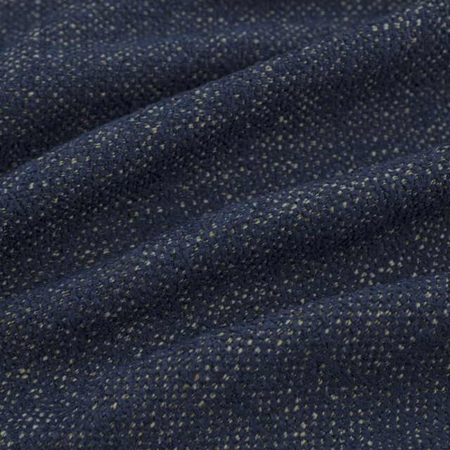
Verona Indigo
Verona
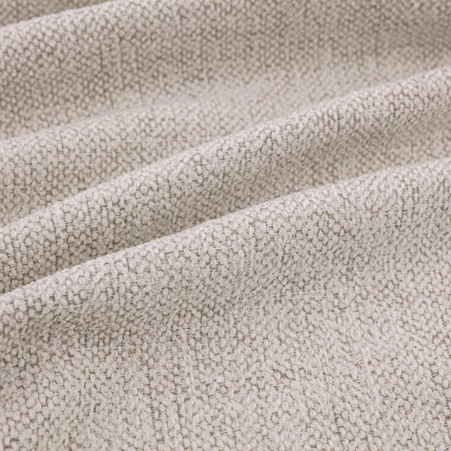
Verona Ecru
Verona
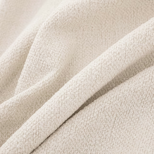
Verona Ivory
Verona
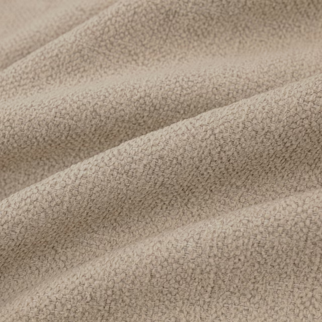
Verona Oatmeal
Verona
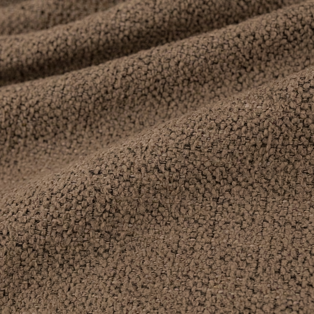
Verona Mocha
Verona
Pairs well with
Verona Ochre is a quiet cloth, so it carries a pattern beside it: one of these on the curtains and this on the chair. Mixed across the houses we hold, which is the part a single supplier's book cannot do.
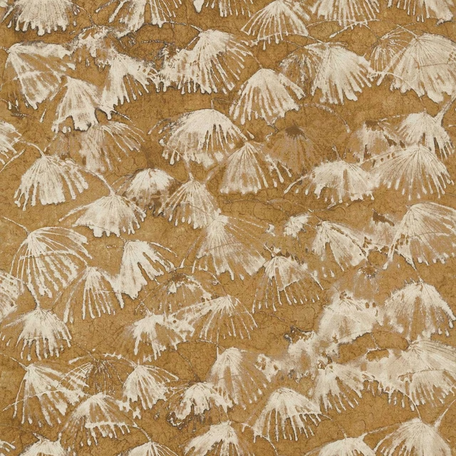
Iliad Gold
Indienne Fabrics
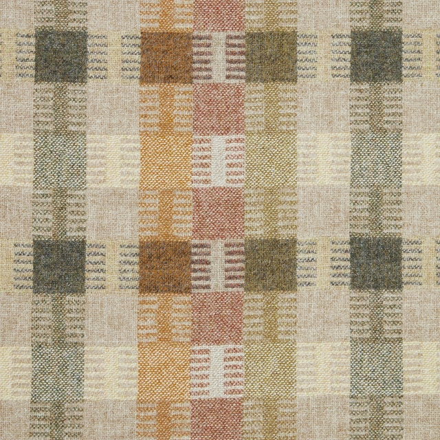
Salk - Gold
Misc
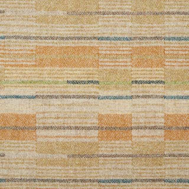
Sears - Gold
Misc
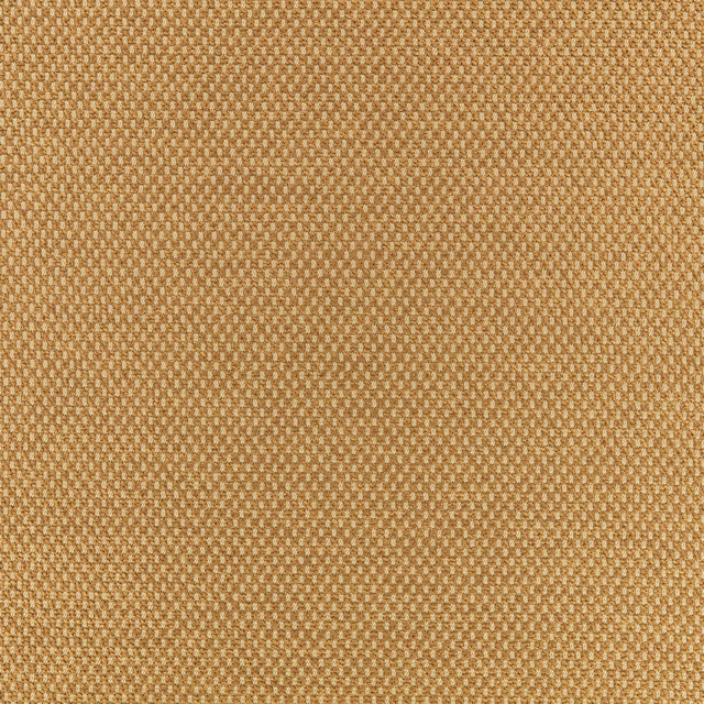
Net Harvest Gold
Clubhouse
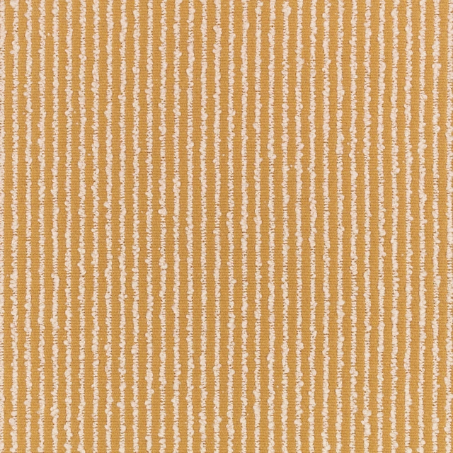
Feel Ochre
4d Upholstery
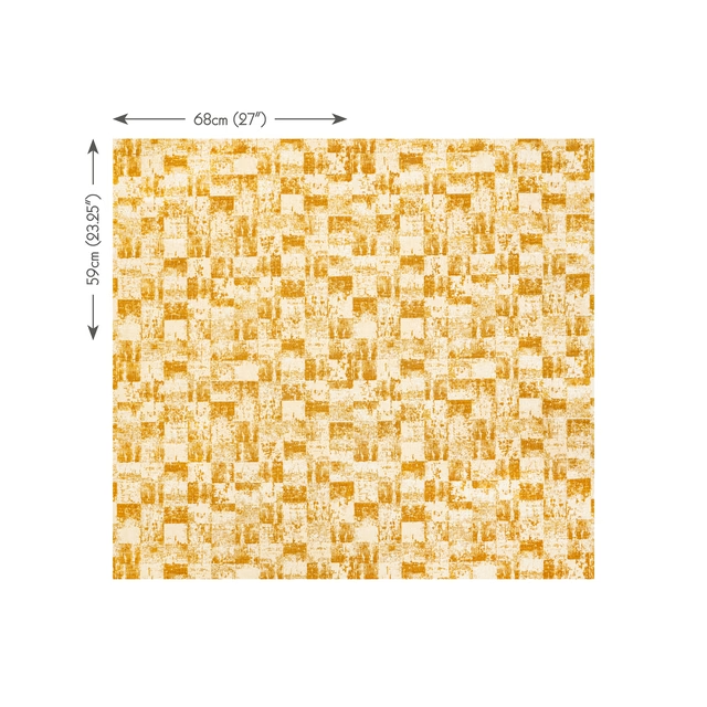
Ingrid Ochre
Superstars
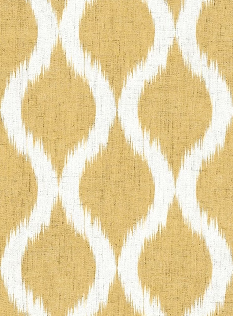
GIA4261
Giardino
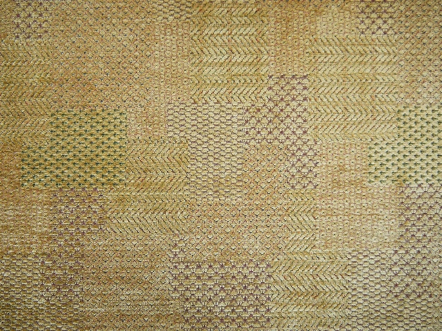
NOS2032
Nostalgia
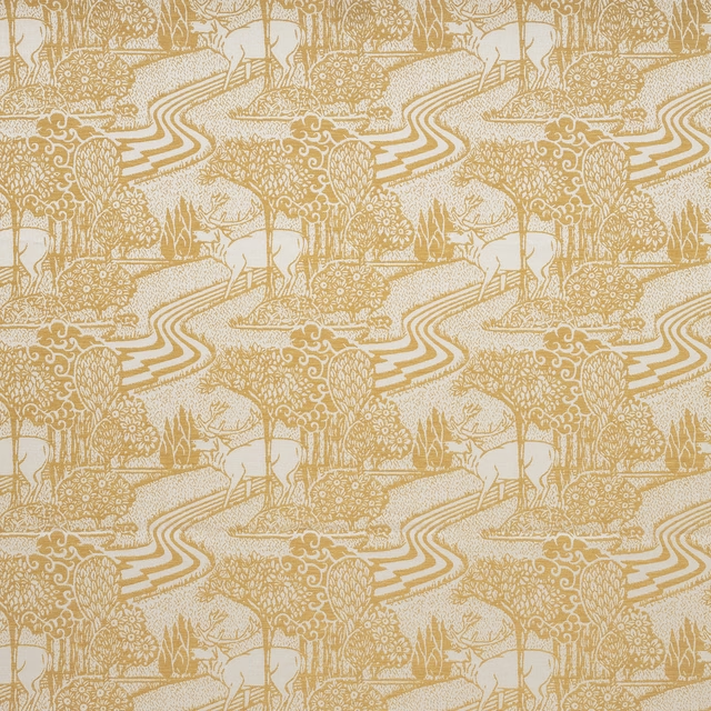
Trecastle Ochre
Country Charm Collection
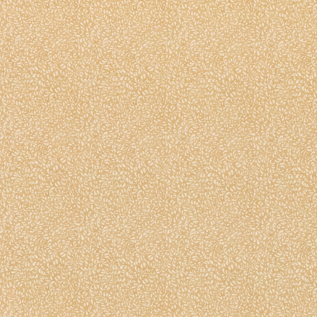
Tansy Ochre
House Small Prints
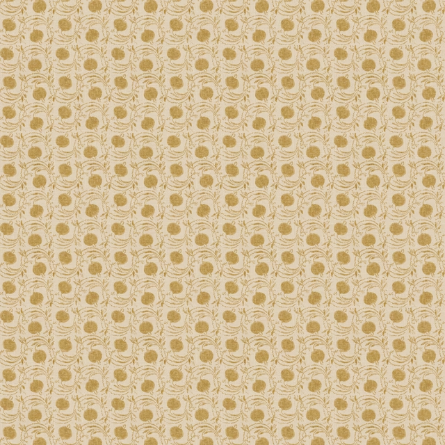
Seed Pod Ochre
House Small Prints Wallpaper
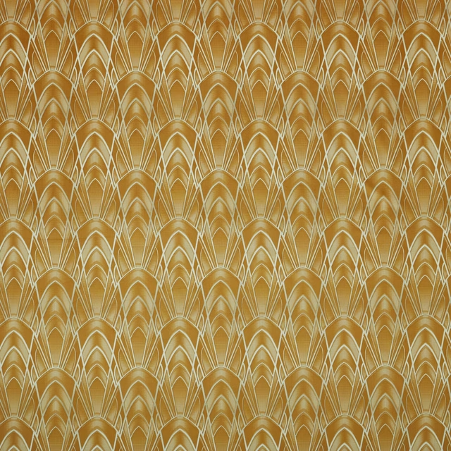
Delaunay Ochre
Visage Collection
Paint that goes with it
Two ways to take the room. Both colours are from houses we hold, so a pot can come off the same order as the cloth. Screens shift colour, so treat these as a direction and bring the cloth to the shelf before you buy the paint.
To sit quietly behind it
Galette
Little Greene · #957246
To stand against it
Driftwood Grey Light
Sanderson · #cbccba
Other gold fabrics
Across the houses we hold. See all 1,418.