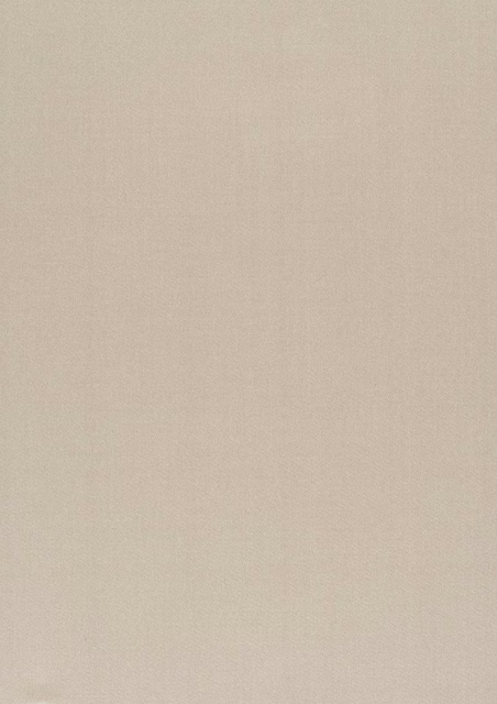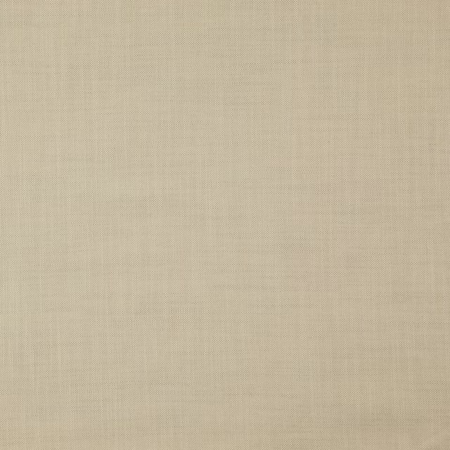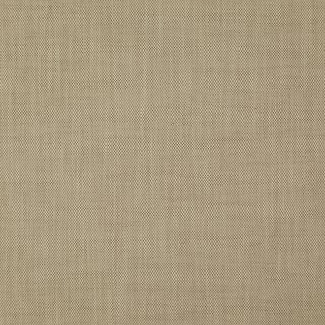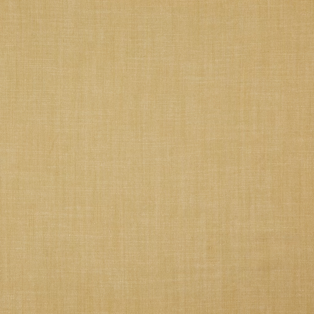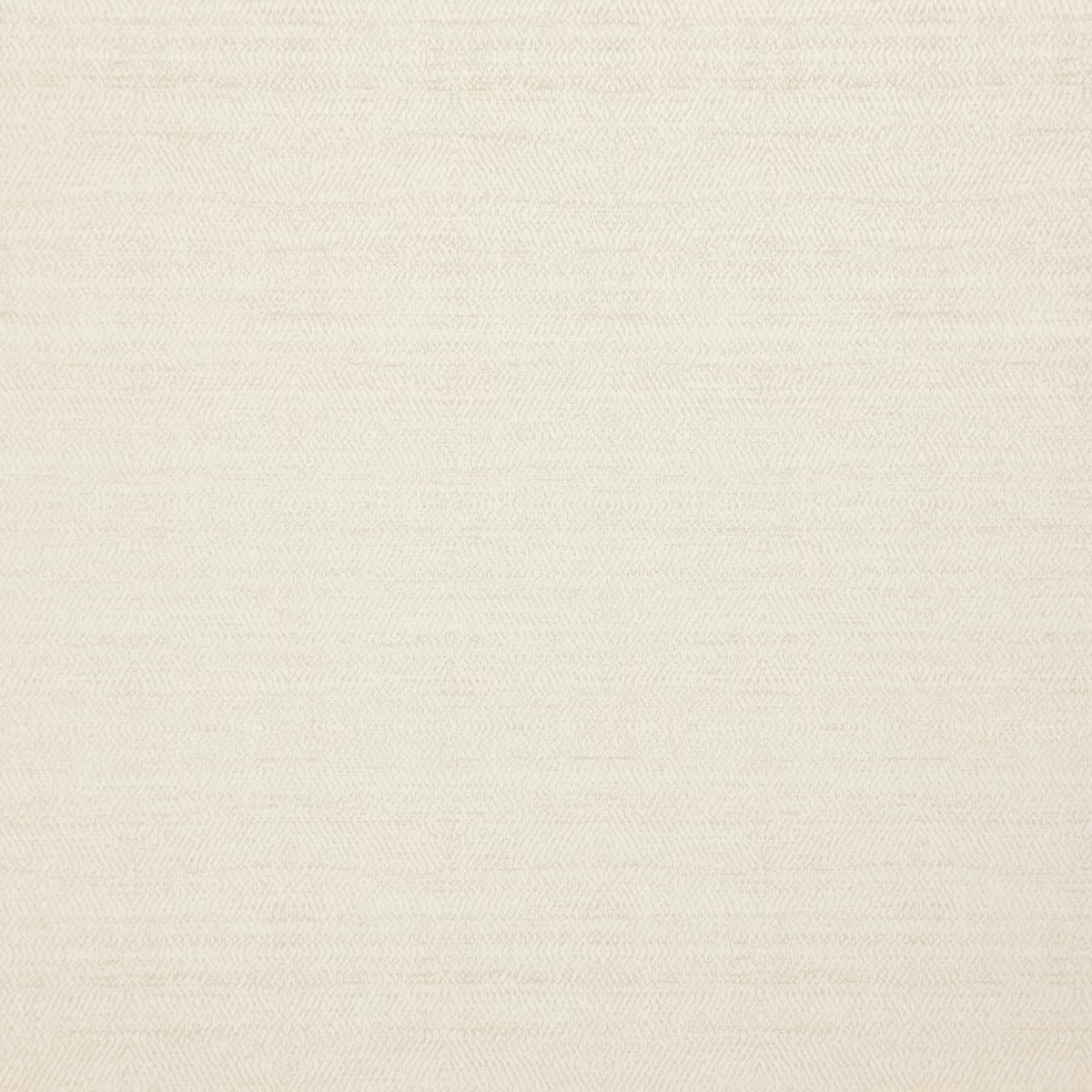

Tap the swatch to see it full screen. Hover it to magnify the weave. Colours on a screen are a guide, not a match, so come and feel the real cloth.
Scroll up or down to zoom in and out.
19 Oatmeal
Matterhorn Fabric19
Matterhorn 19 Oatmeal is a pale, warm-toned woven fabric with a softly textured surface. Its light oatmeal shade reads calm and understated across the swatch.
You have used your previews for today. Send one to Simon and you can carry on.
Your board
0 fabrics
See this fabric on Wemyss's own site, then order it through us.
See 19 Oatmeal in your own room
A photograph of the piece you want re-covered. Straight on is best, and daylight helps. It is used to make your picture and nothing else.
Looking at your room
We found things here 19 Oatmeal could go on. Tap one on the photograph, or choose below.
We could not see anything to re-cover
, s
19 Oatmeal, on your
Drag to compare. AI impression, colours indicative: ask us for a cutting before you decide.
About this fabric
The colour sits between creamy ivory and gentle beige, with a muted warmth rather than a yellow or grey cast. A fine, softly irregular horizontal texture gives the otherwise quiet surface subtle depth as the light moves across it. The even mid-weight appearance makes it suitable for both upholstery and drapery. No performance features are noted for this fabric.
How to use it
Pair this pale oatmeal colourway with natural timber, chalky whites and warm stone tones for a light, relaxed scheme. Its restrained texture is well suited to softly tailored seating, curtains or blinds where a plain fabric would benefit from added depth.
Use this softly warm oatmeal weave to bring lightness and quiet texture to upholstery, curtains or blinds.
More from Matterhorn
The same book, other colourways.
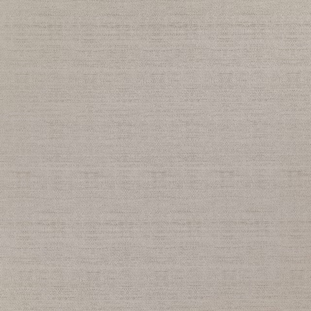
01 Frost
Matterhorn

07 Jet
Matterhorn
10 Steeple Grey
Matterhorn

13 Diamond
Matterhorn

15 Winter White
Matterhorn
28 Khaki
Matterhorn
31 Hemp
Matterhorn
34 Blush
Matterhorn
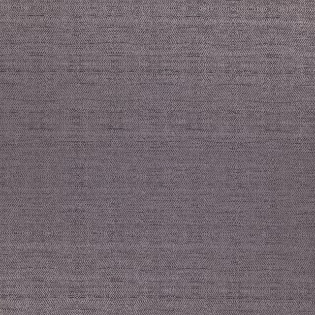
60 Dusk
Matterhorn
Pairs well with
19 Oatmeal is a quiet cloth, so it carries a pattern beside it: one of these on the curtains and this on the chair. Mixed across the houses we hold, which is the part a single supplier's book cannot do.
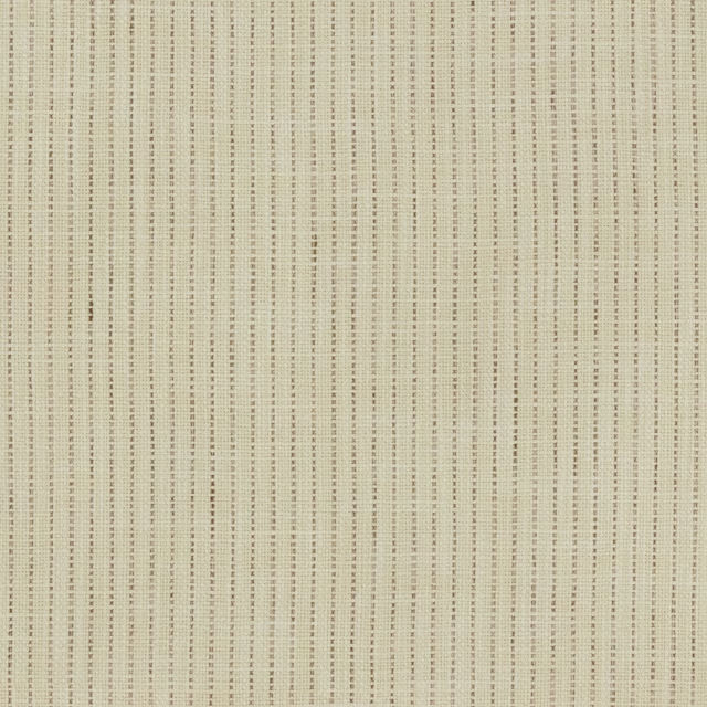
Halmstad Fallow
Halmstad
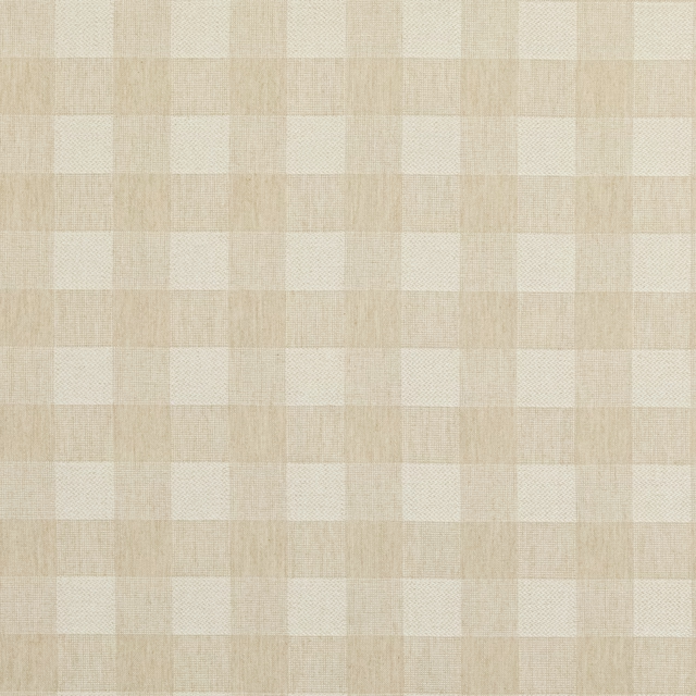
Block Check Linen
Block Weaves
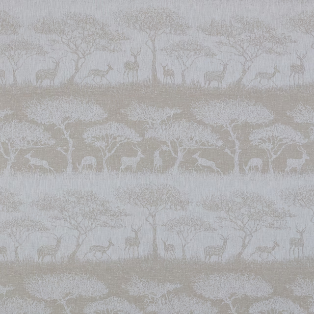
Hastings Fawn
Belvoir Collection
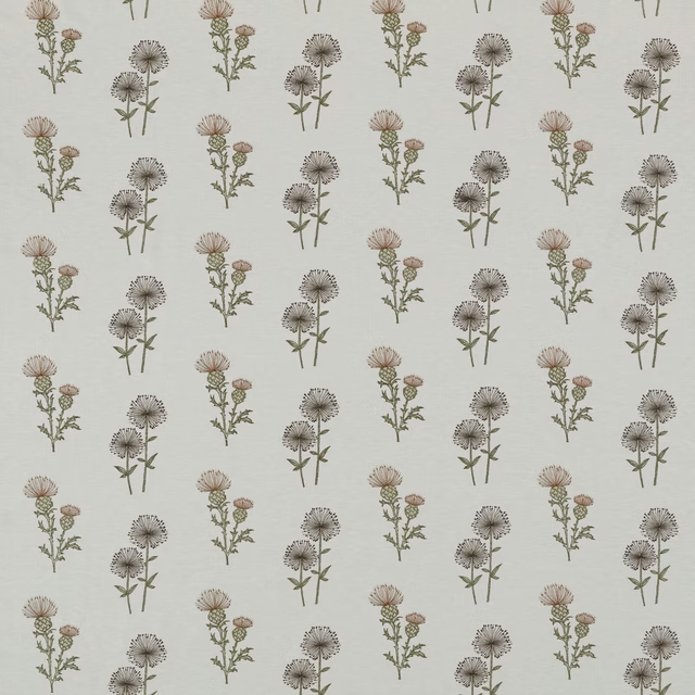
Lismore Caramel
Belvoir Collection
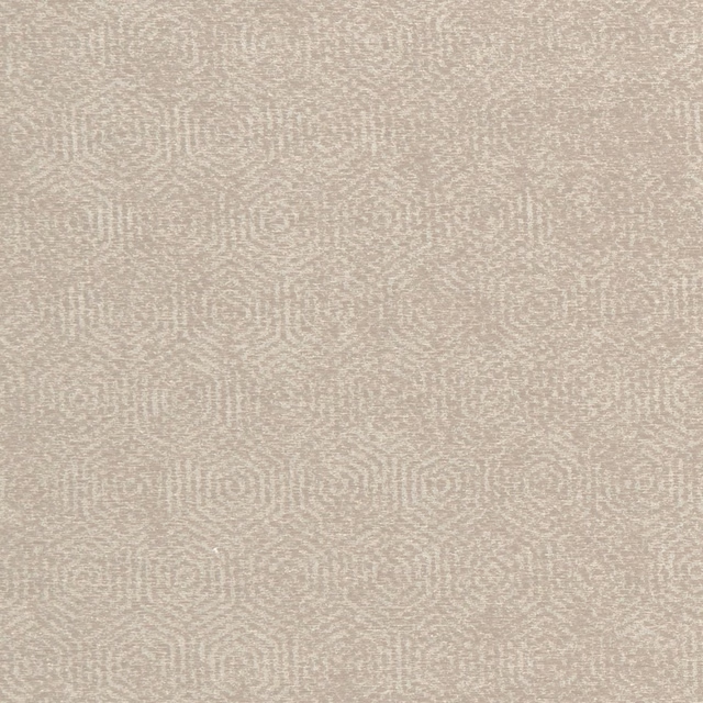
Yoruba Natural
Amara
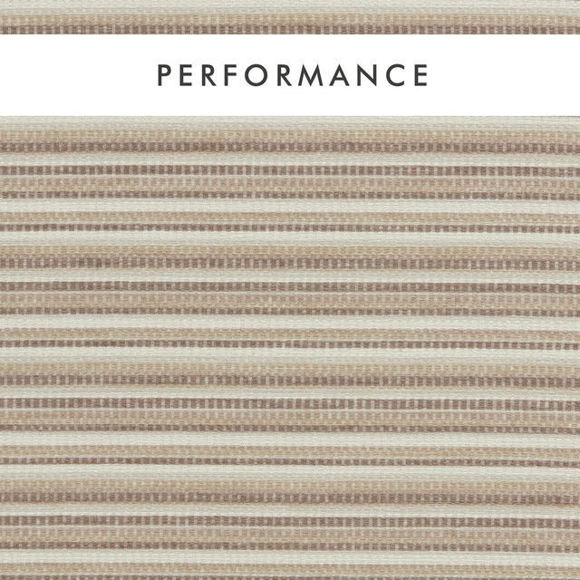
Integer Natural
Aqueous Performance
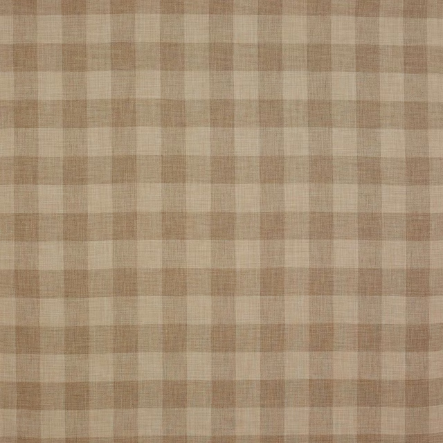
Appledore Check Beige
Appledore
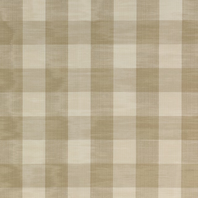
Eaton Check Flax
Eaton Checks and Stripes

Roumier Vanilla
Carlu WALLPAPER
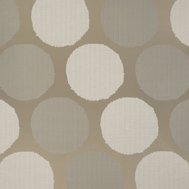
Amalfi Dove
Cecilia Fabrics
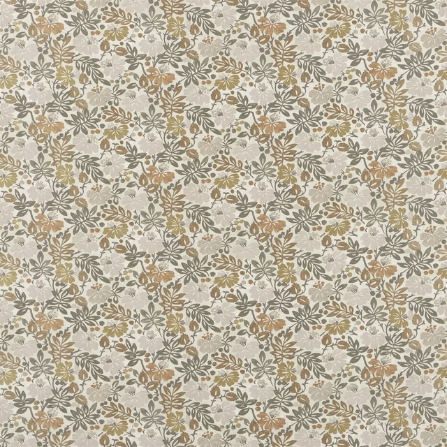
Carlisle Fauna Woodland
Heritage Prints
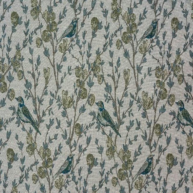
Audley Pampas
Brodsworth
Paint that goes with it
Two ways to take the room. Both colours are from houses we hold, so a pot can come off the same order as the cloth. Screens shift colour, so treat these as a direction and bring the cloth to the shelf before you buy the paint.
To sit quietly behind it
Linen
Zoffany · #ebe4d4
To stand against it
Pan
Coat Paints · #857d5b
Other beige fabrics
Across the houses we hold. See all 4,485.