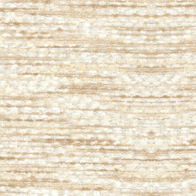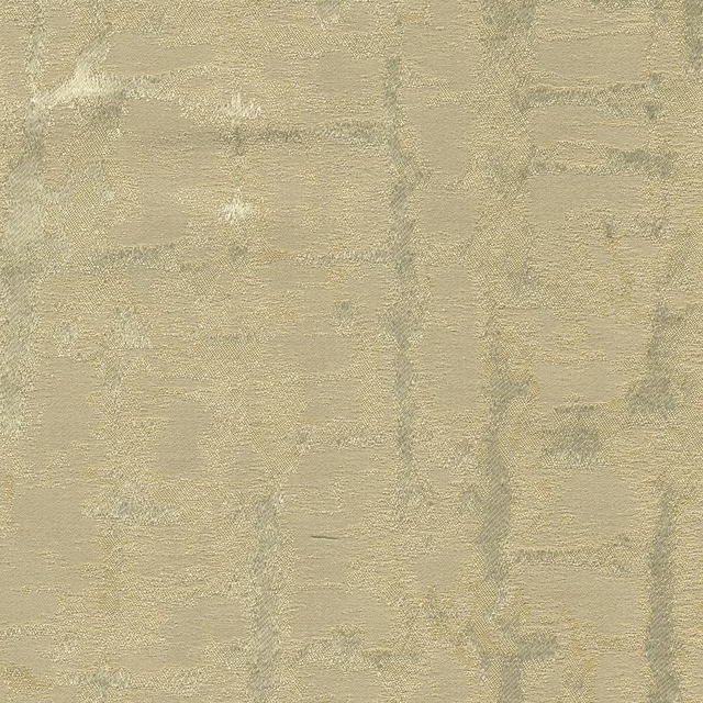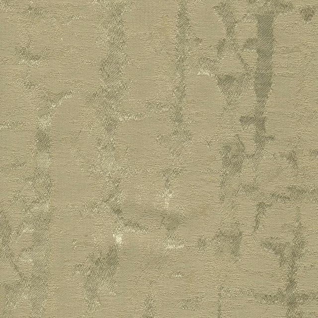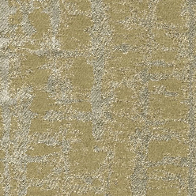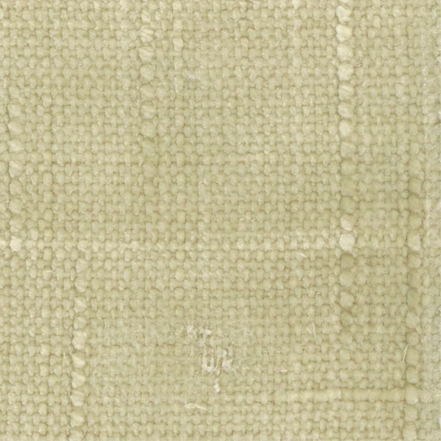

Tap the swatch to see it full screen. Hover it to magnify the weave. Colours on a screen are a guide, not a match, so come and feel the real cloth.
Scroll up or down to zoom in and out.
24 Loch
Ottilie Fabric24
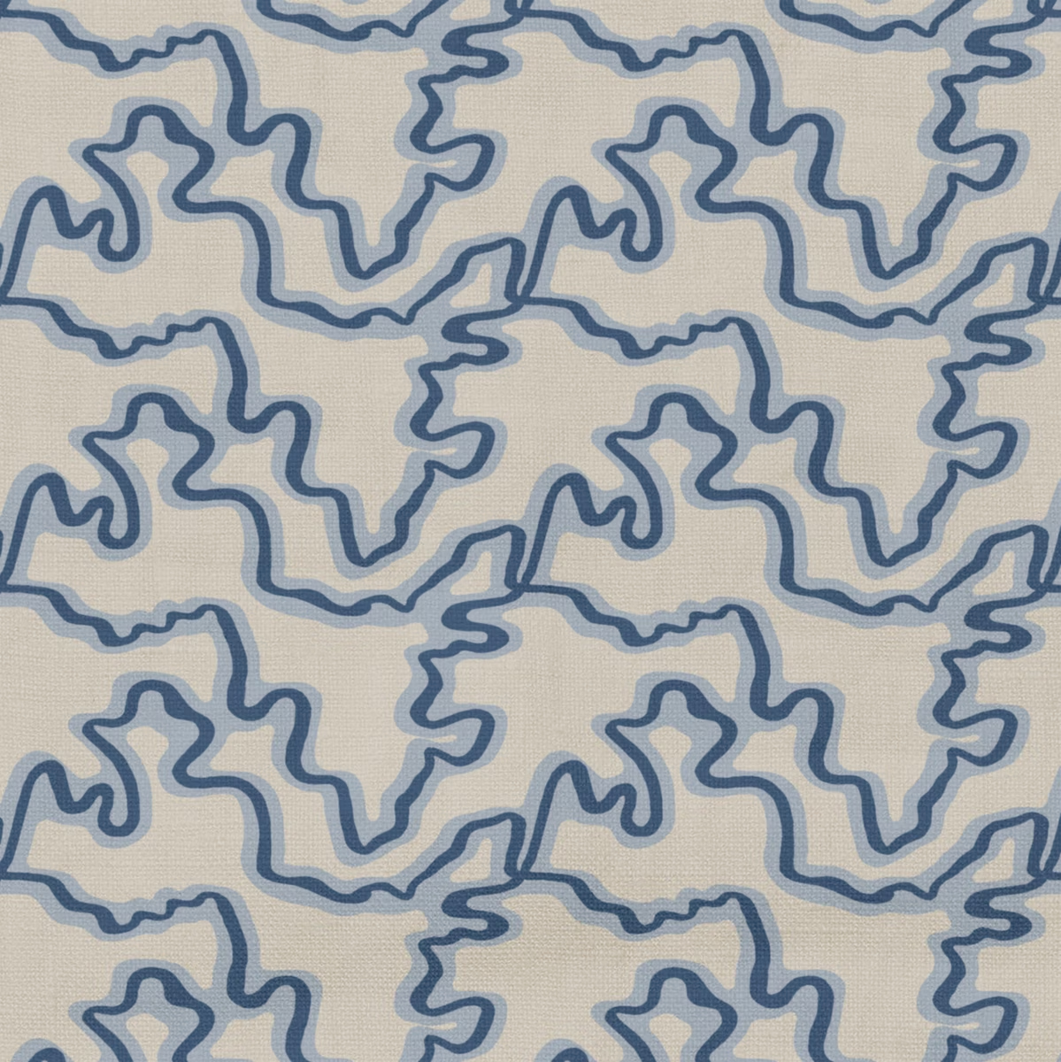
Ottilie 24 Loch combines a warm cream ground with looping slate-blue and softer powder-blue lines. The irregular motif creates a lively, hand-drawn effect across the fine, even-looking surface.
You have used your previews for today. Send one to Simon and you can carry on.
Your board
0 fabrics
See this fabric on Wemyss's own site, then order it through us.
See 24 Loch in your own room
A photograph of the piece you want re-covered. Straight on is best, and daylight helps. It is used to make your picture and nothing else.
Looking at your room
We found things here 24 Loch could go on. Tap one on the photograph, or choose below.
We could not see anything to re-cover
, s
24 Loch, on your
Drag to compare. AI impression, colours indicative: ask us for a cutting before you decide.
About this fabric
The supplied information catalogues 24 Loch as a fabric, with no performance features noted. Visually, the ground is a pale creamy beige, crossed by sinuous blue outlines that vary from muted slate to a lighter blue-grey. The narrow lines form an organic, maze-like repeat rather than a regular geometric pattern, giving the surface an easy, informal character. Fine surface texture is visible beneath the print, adding a subtle tactile quality without competing with the graphic design.
How to use it
Pair this cool blue-and-cream colourway with chalky whites, pale timber and soft grey-blue accents for a relaxed coastal or contemporary scheme. Its medium-scale meandering pattern would work particularly well on a statement chair, loose cushions or relaxed curtains.
Use this cool cream and blue colourway to bring graphic movement to upholstery, cushions or softly tailored window treatments.
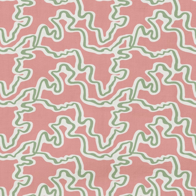
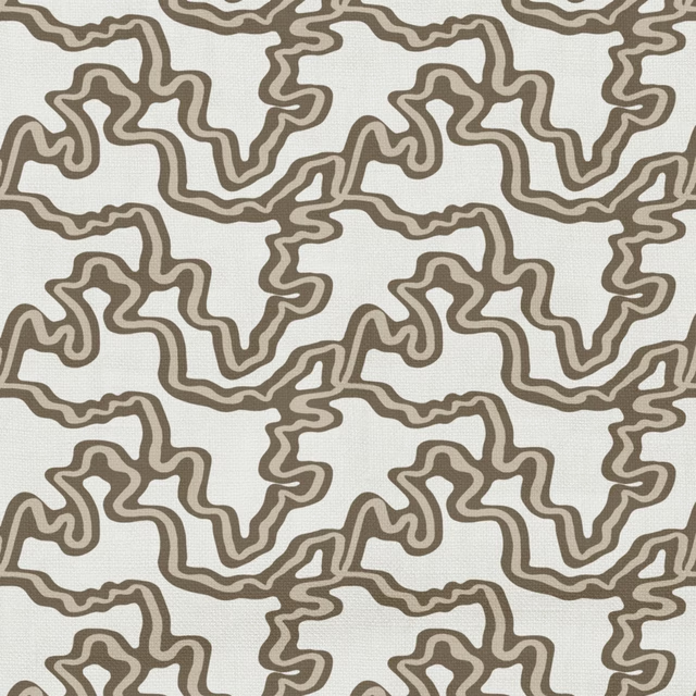
Pairs well with
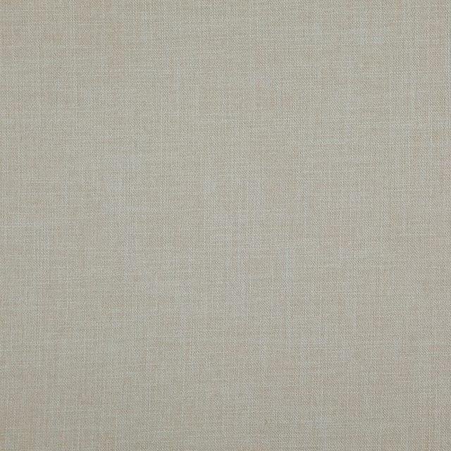
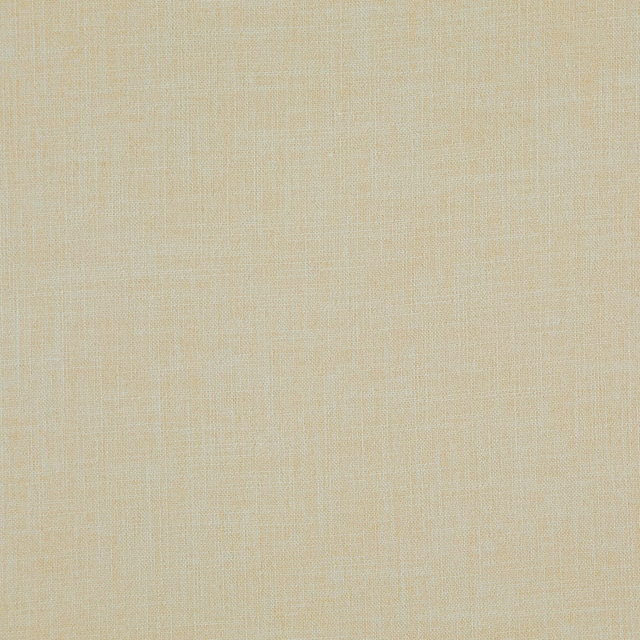
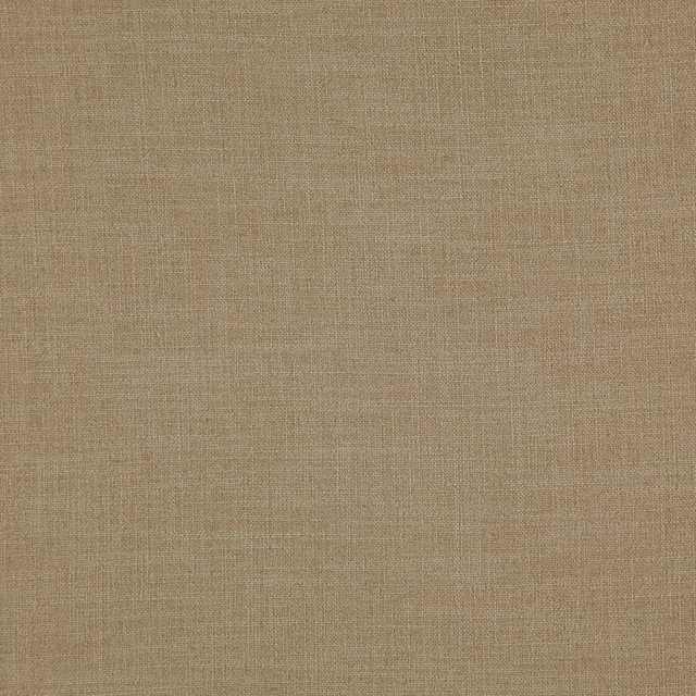
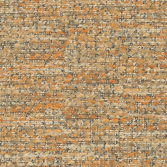
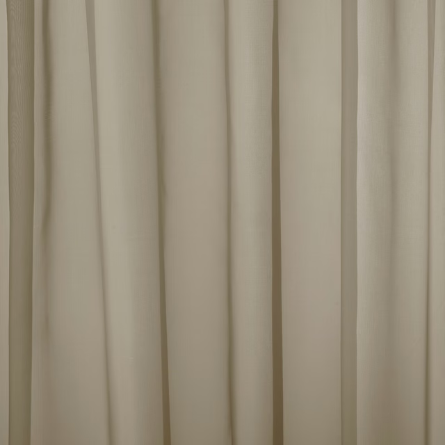
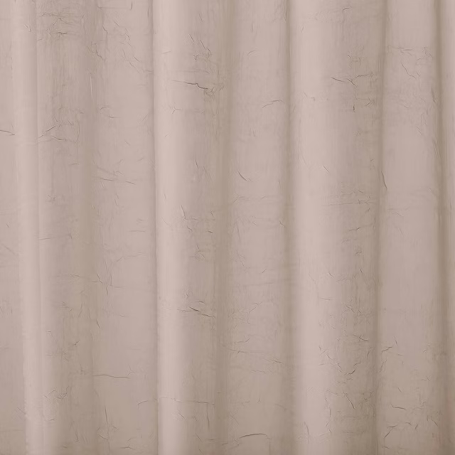
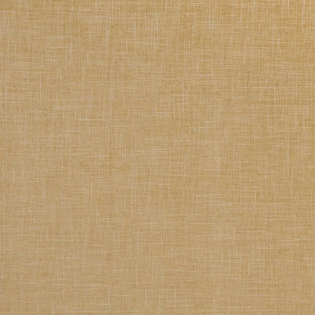
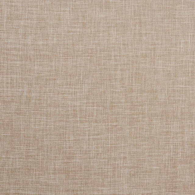
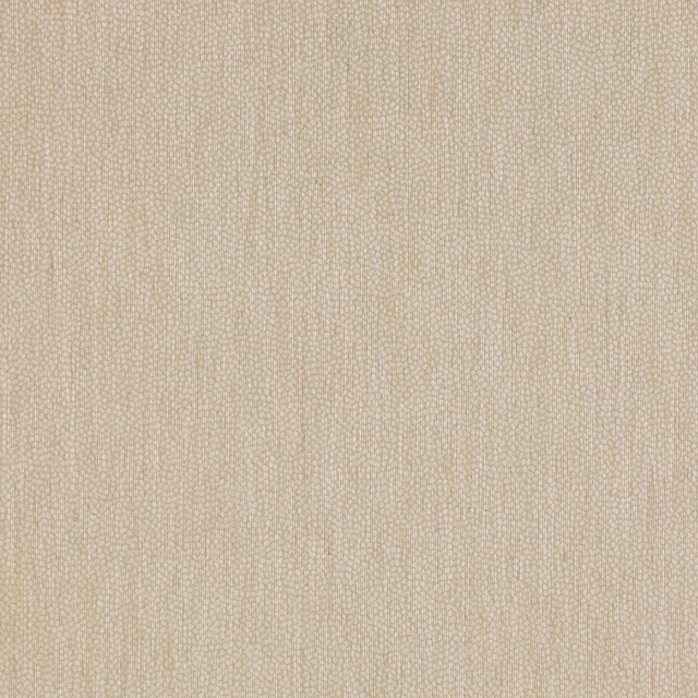
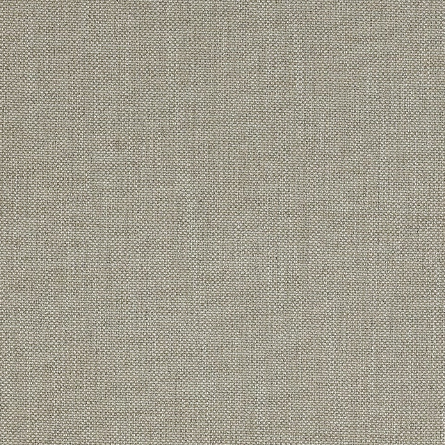
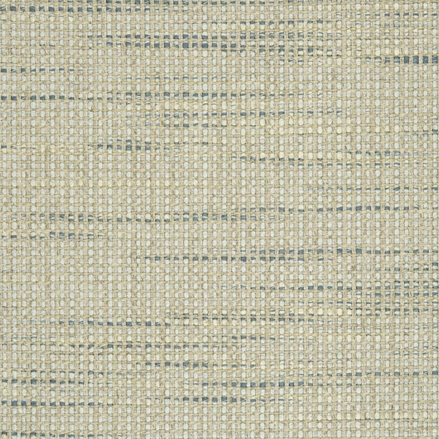
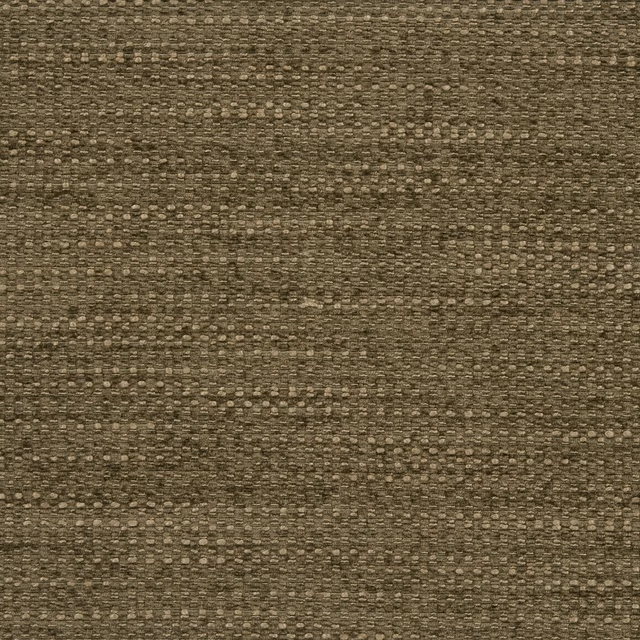
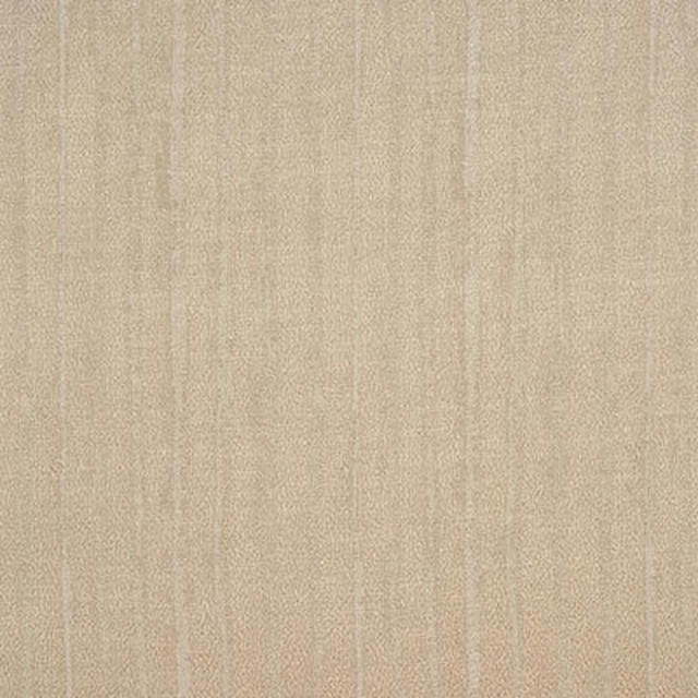
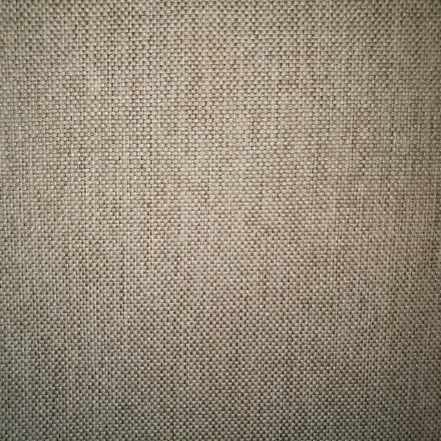
A pattern needs somewhere for the eye to rest, so these are the plains and textures that sit beside 24 Loch without fighting it. Mixed across the houses we hold, which is the part a single supplier's book cannot do.


Paint that goes with it
Two ways to take the room. Both colours are from houses we hold, so a pot can come off the same order as the cloth. Screens shift colour, so treat these as a direction and bring the cloth to the shelf before you buy the paint.
To sit quietly behind it
Iron Grey
Sanderson · #a9a9a9
To stand against it
Ming Gold
Sanderson · #e6ca89
Other beige fabrics
Across the houses we hold. See all 4,485.