
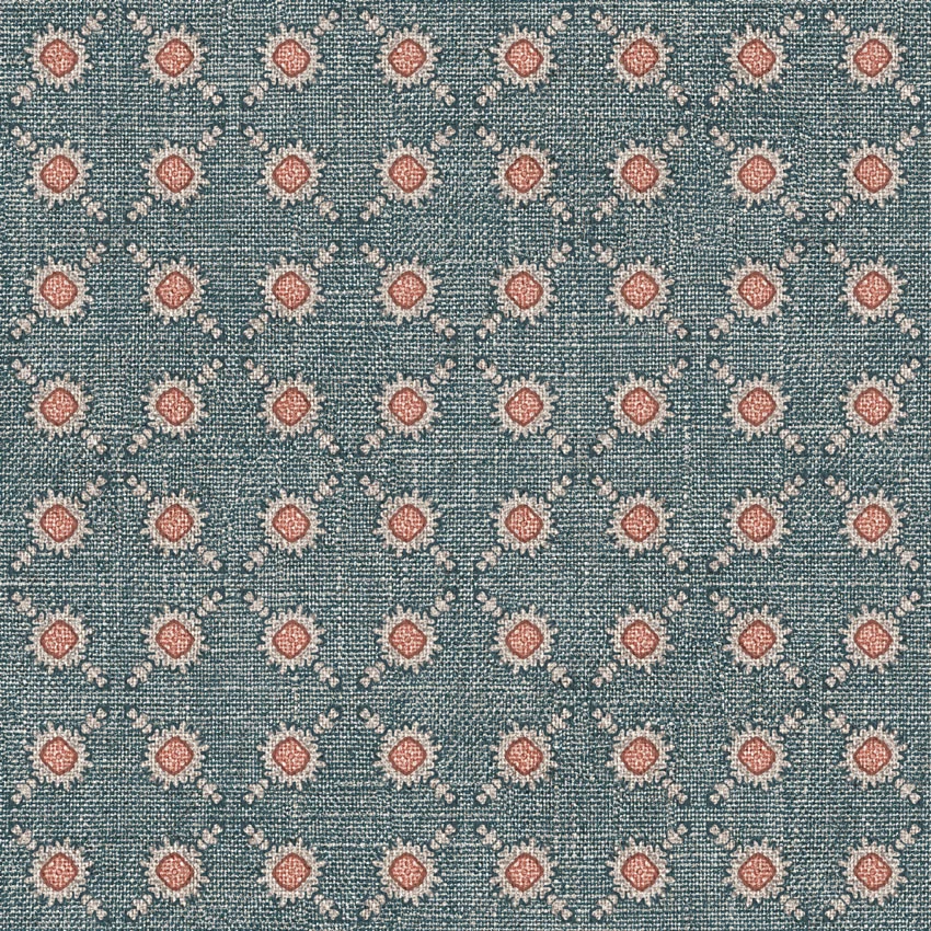

Tap the swatch to see it full screen. Hover it to magnify the weave. Colours on a screen are a guide, not a match, so come and feel the real cloth.
Scroll up or down to zoom in and out.
Battersea Spot Colour 9
Battersea FabricBatterseaSpot-9
Battersea Spot Colour 9 combines a cool blue-grey teal ground with regularly spaced dusty terracotta-pink spot motifs. Fine cream details soften the pattern, while the closely woven surface gives the colourway a quietly textured appearance.
You have used your previews for today. Send one to Simon and you can carry on.
Your board
0 fabrics
See this fabric on Art of the Loom's own site, then order it through us.
See Battersea Spot Colour 9 in your own room
A photograph of the piece you want re-covered. Straight on is best, and daylight helps. It is used to make your picture and nothing else.
Looking at your room
We found things here Battersea Spot Colour 9 could go on. Tap one on the photograph, or choose below.
We could not see anything to re-cover
, s
Battersea Spot Colour 9, on your
Drag to compare. AI impression, colours indicative: ask us for a cutting before you decide.
About this fabric
The fabric is woven in a blue-grey teal shade that reads cool and softly muted rather than bright or saturated. Small diamond-like spot motifs repeat across the ground, each centred with a dusty terracotta-pink detail and edged with pale cream marks. The close, grainy weave gives the surface gentle visual depth, allowing the pattern to remain distinct without feeling loud. This balanced mid-scale design can work across upholstery and drapery, particularly where a cool ground with warm rose accents is wanted.
How to use it
Use this colourway on a reading chair, bench or relaxed curtain scheme, balancing its cool teal-blue ground with warm oak, terracotta pottery and unbleached linen. The dusty pink motifs also pick up muted rose or clay accents without making the room feel overly colourful.
Pair the cool blue-grey ground with warm timber, dusty rose and natural linen.
More from Battersea
The same book, other colourways.
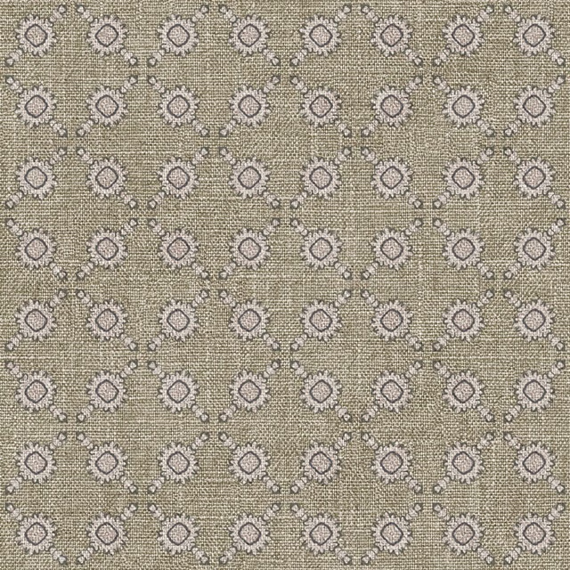
Battersea Spot Colour 3
Battersea
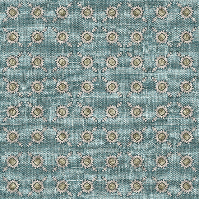
Battersea Spot Colour 4
Battersea
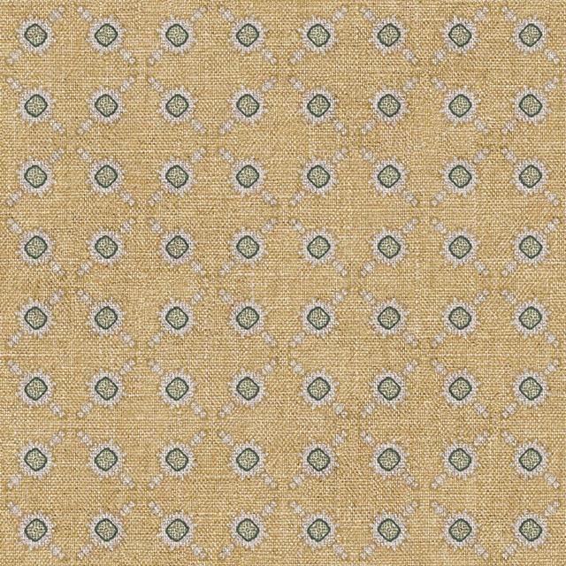
Battersea Spot Colour 5
Battersea
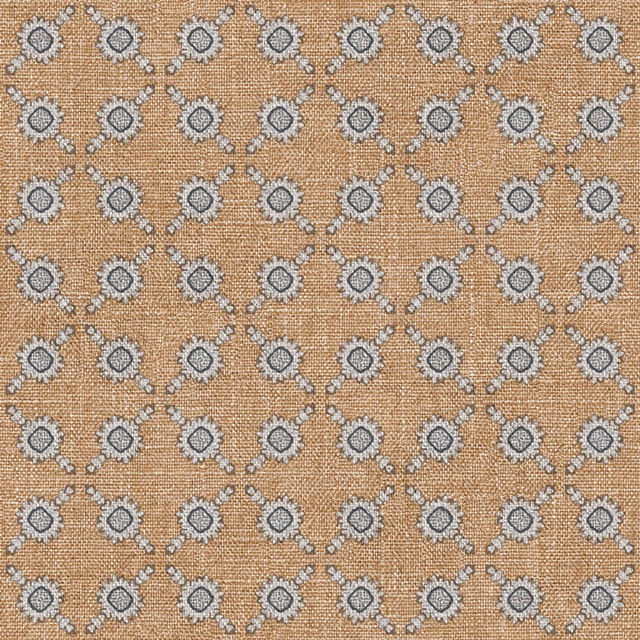
Battersea Spot Colour 6
Battersea
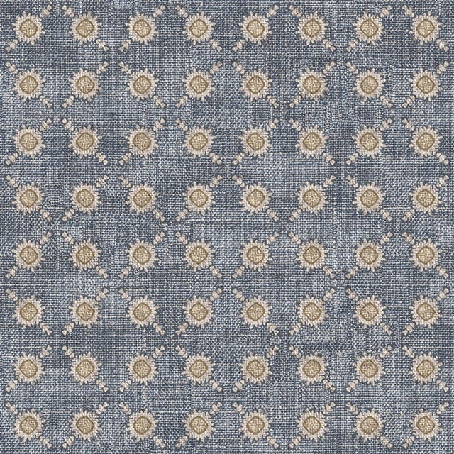
Battersea Spot Colour 7
Battersea
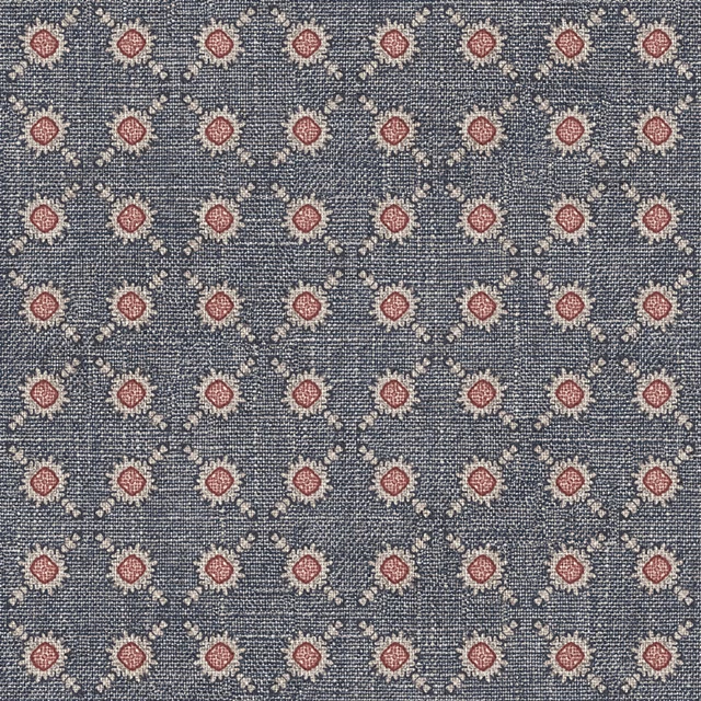
Battersea Spot Colour 8
Battersea
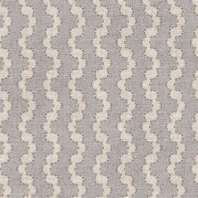
Battersea Wave Colour 1
Battersea
Battersea Wave Colour 10
Battersea
Battersea Wave Colour 11
Battersea
Battersea Wave Colour 12
Battersea
Battersea Wave Colour 13
Battersea
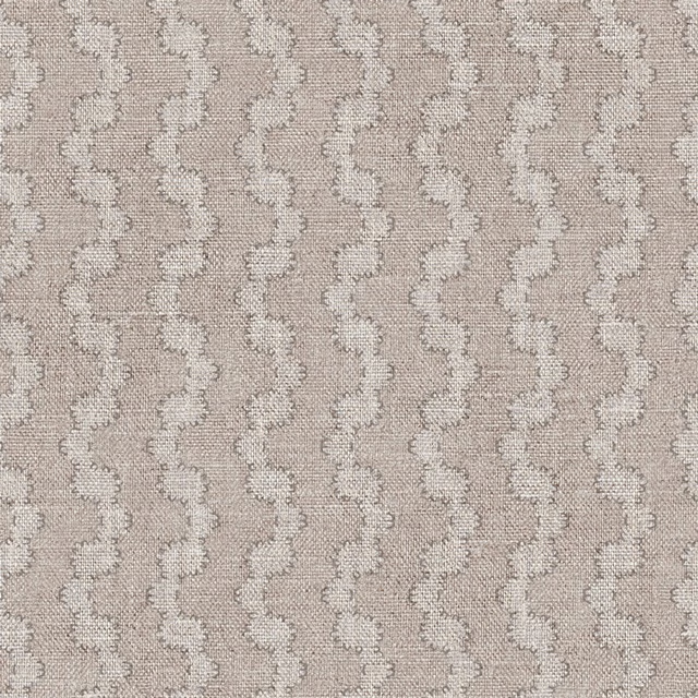
Battersea Wave Colour 2
Battersea
Pairs well with
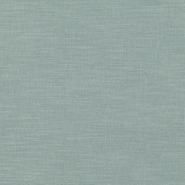
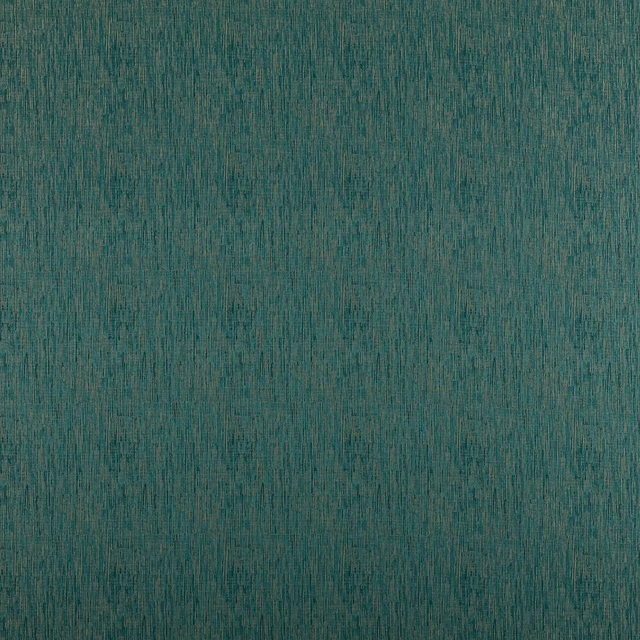
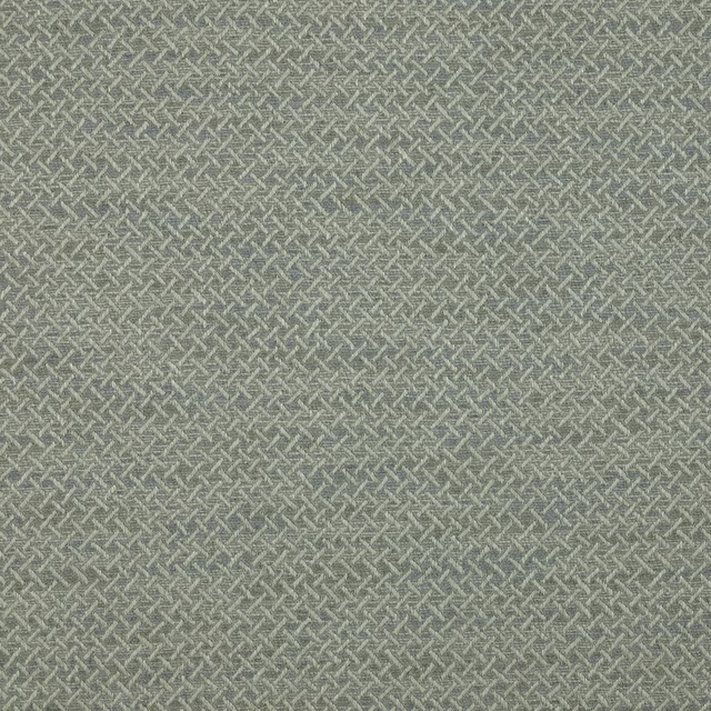
A pattern needs somewhere for the eye to rest, so these are the plains and textures that sit beside Battersea Spot Colour 9 without fighting it. Mixed across the houses we hold, which is the part a single supplier's book cannot do.









Paint that goes with it
Two ways to take the room. Both colours are from houses we hold, so a pot can come off the same order as the cloth. Screens shift colour, so treat these as a direction and bring the cloth to the shelf before you buy the paint.
To sit quietly behind it
Wren Feather
Sanderson · #868583
To stand against it
La Magnolia
Coat Paints · #f8e9dd
Other teal fabrics
Across the houses we hold. See all 2,990.
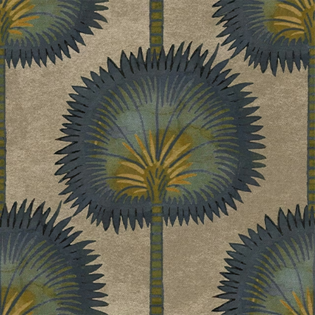
Rajasthan Co-ord Aqua
Archive Collection
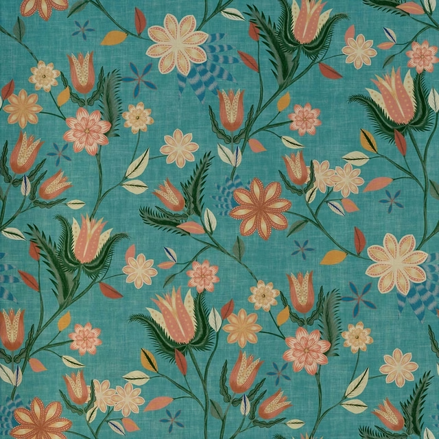
Avignon Colour 10
Avignon
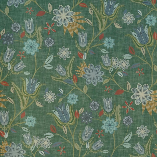
Avignon Colour 11
Avignon
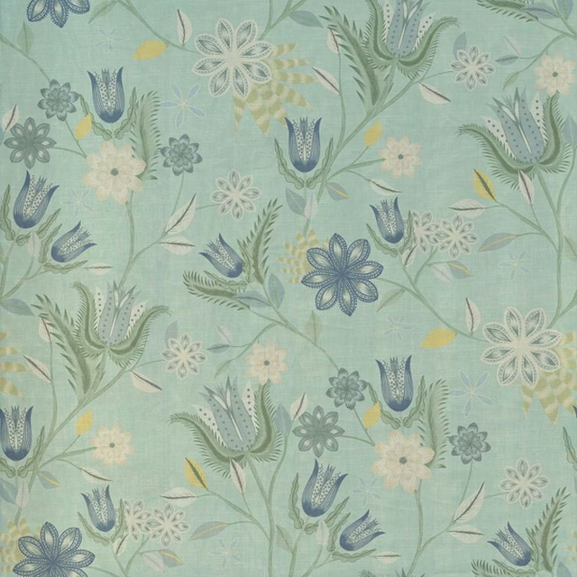
Avignon Colour 12
Avignon
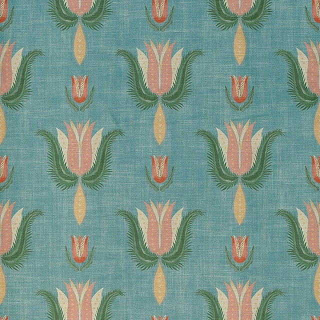
Benezet Colour 10
Avignon
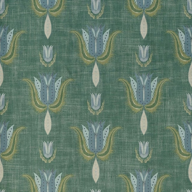
Benezet Colour 11
Avignon
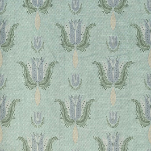
Benezet Colour 12
Avignon
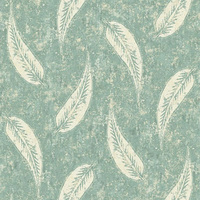
Gina Colour 6
Brindisi
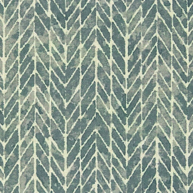
Lucia Colour 1
Brindisi

Lucia Colour 6
Brindisi
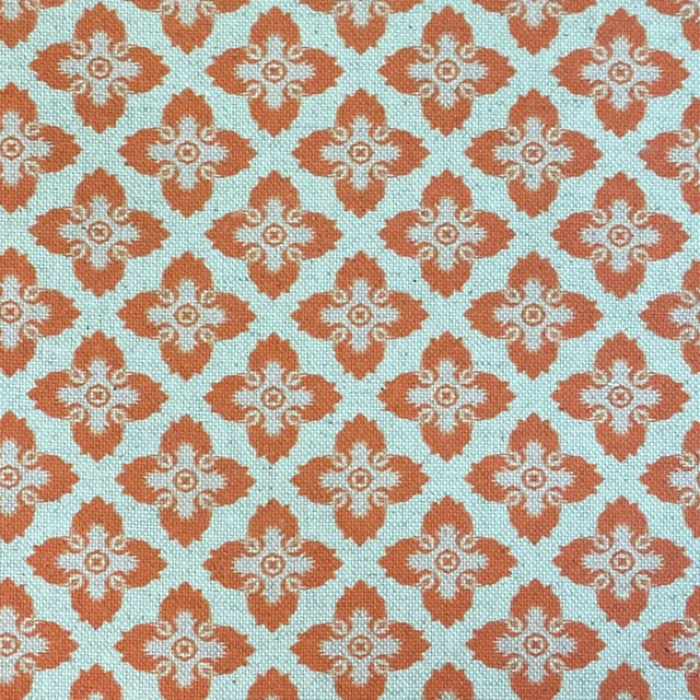
Design 2 Col Capri
Burford
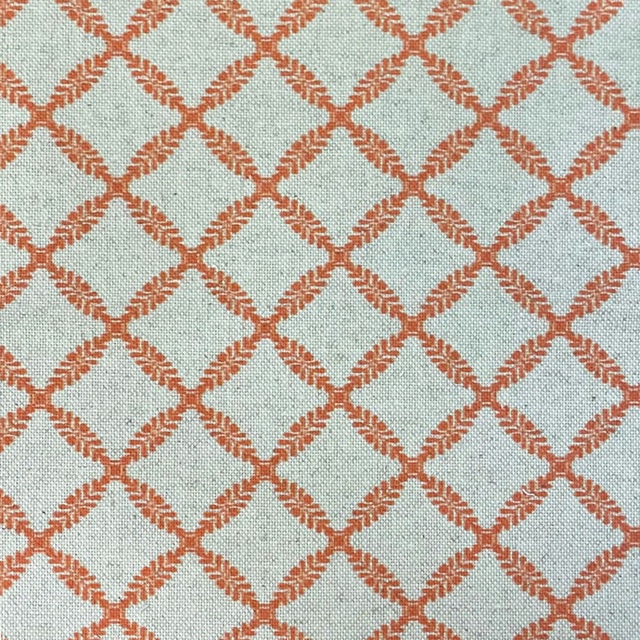
Design 3 Col Capri
Burford