
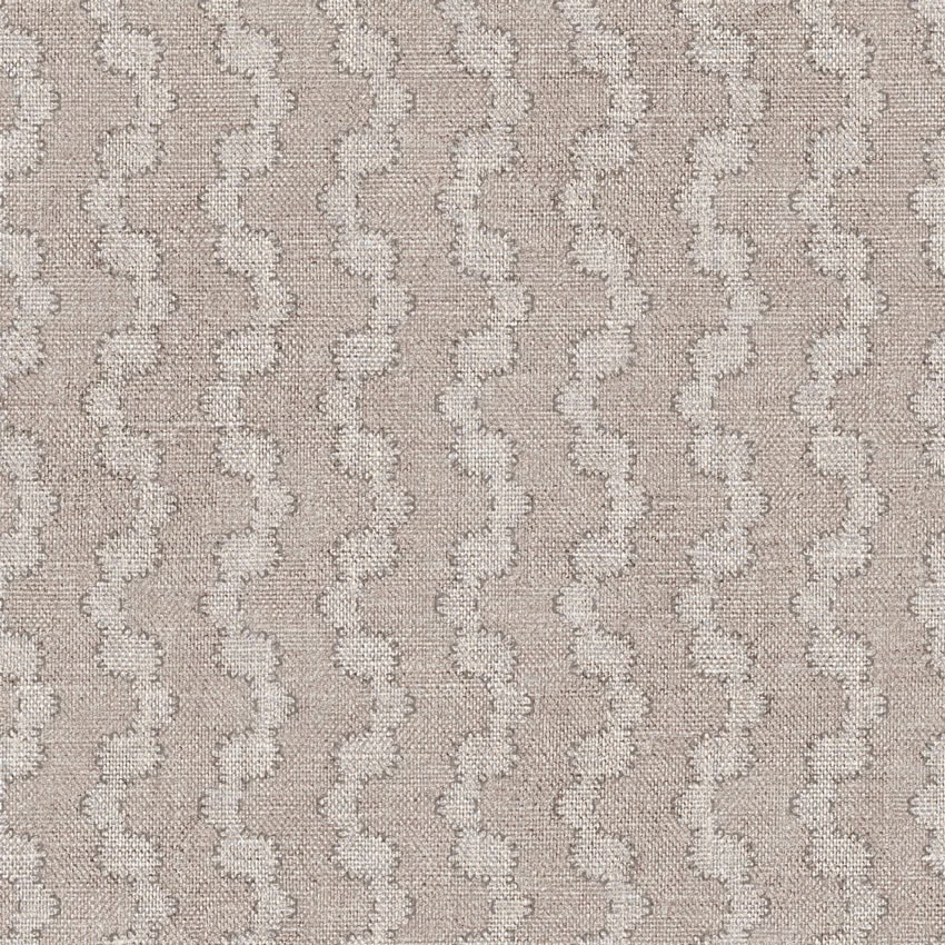

Tap the swatch to see it full screen. Hover it to magnify the weave. Colours on a screen are a guide, not a match, so come and feel the real cloth.
Scroll up or down to zoom in and out.
Battersea Wave Colour 2
Battersea FabricBatterseaWave-2
Battersea Wave Colour 2 pairs a pale greige-taupe ground with softly contrasting, repeating wave rows. Its woven surface gives the neutral colourway a quiet tactile depth.
You have used your previews for today. Send one to Simon and you can carry on.
Your board
0 fabrics
See this fabric on Art of the Loom's own site, then order it through us.
See Battersea Wave Colour 2 in your own room
A photograph of the piece you want re-covered. Straight on is best, and daylight helps. It is used to make your picture and nothing else.
Looking at your room
We found things here Battersea Wave Colour 2 could go on. Tap one on the photograph, or choose below.
We could not see anything to re-cover
, s
Battersea Wave Colour 2, on your
Drag to compare. AI impression, colours indicative: ask us for a cutting before you decide.
About this fabric
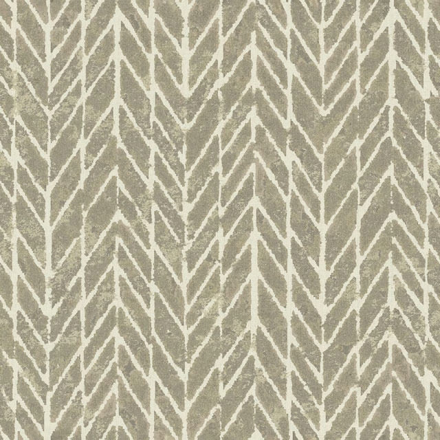
The ground reads as a light greige taupe, balanced between warm beige and cool grey rather than strongly favouring either. Pale ivory-grey wave motifs travel vertically across the cloth in closely repeated, undulating rows. Fine woven texture and small tonal irregularities soften the pattern edges, giving the surface a tactile, textile-led character. The low-contrast palette keeps the design understated while the rhythmic waves add gentle visual movement.
How to use it
Use this pale greige-taupe colourway on a relaxed armchair, ottoman or full-length curtain, pairing it with chalky whites, soft stone and weathered wood. Its quiet wave rhythm works particularly well where a neutral scheme needs texture without a strong contrast.
Use this softly neutral greige-taupe weave to bring gentle movement to upholstery, cushions or curtains.
More from Battersea
The same book, other colourways.
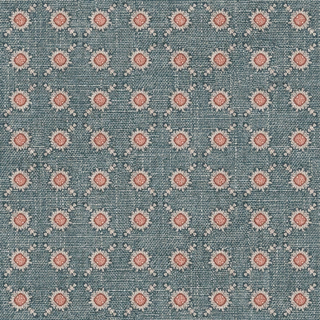
Battersea Spot Colour 9
Battersea
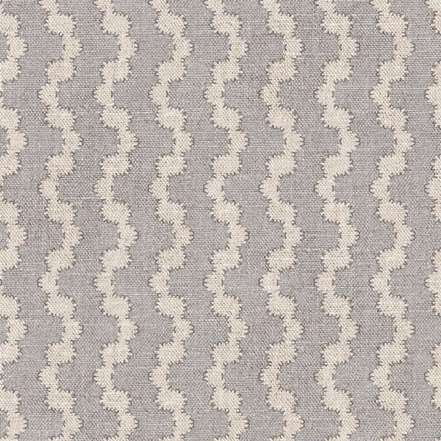
Battersea Wave Colour 1
Battersea
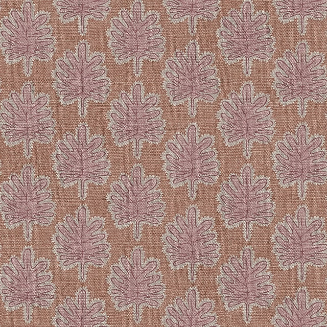
Battersea Wave Colour 10
Battersea
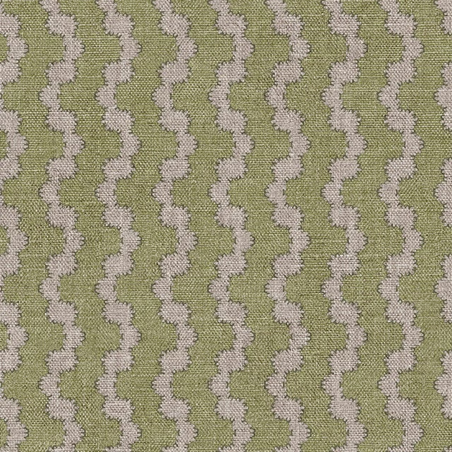
Battersea Wave Colour 11
Battersea
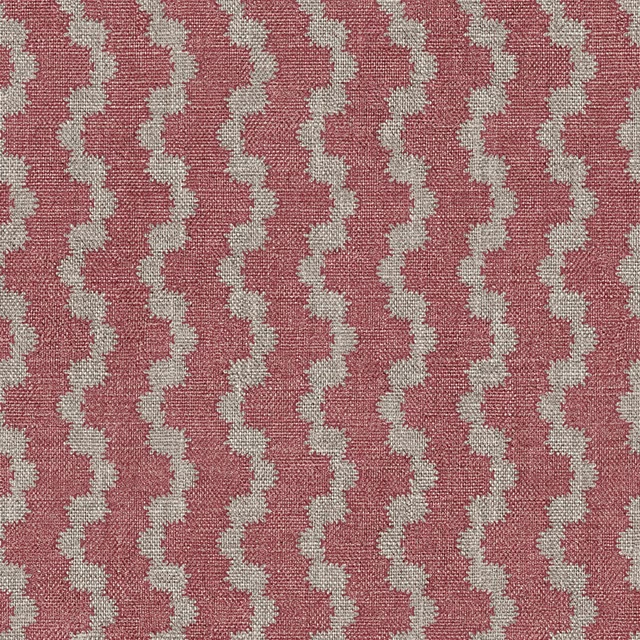
Battersea Wave Colour 12
Battersea
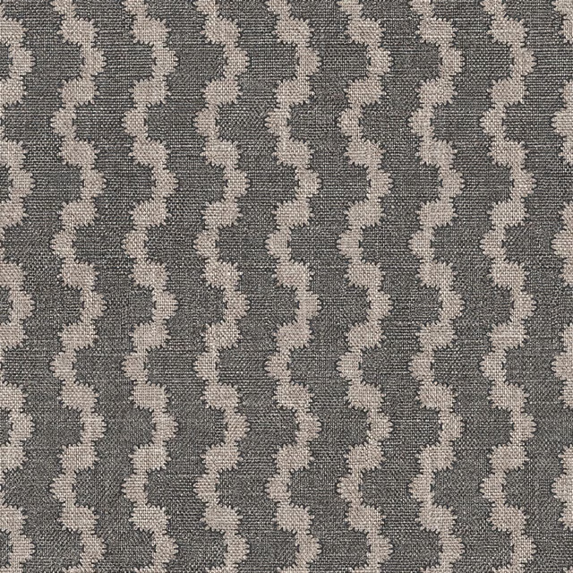
Battersea Wave Colour 13
Battersea
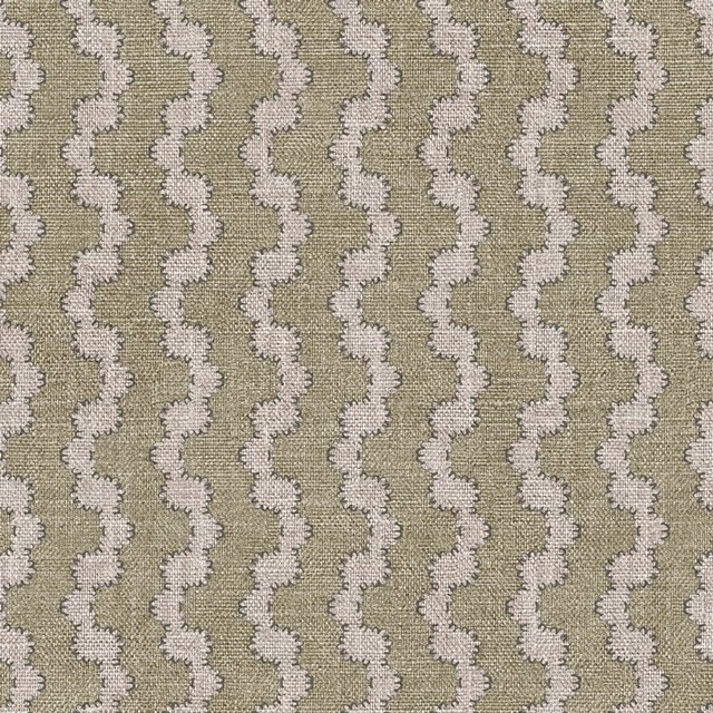
Battersea Wave Colour 3
Battersea
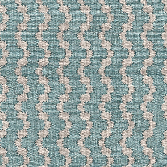
Battersea Wave Colour 4
Battersea
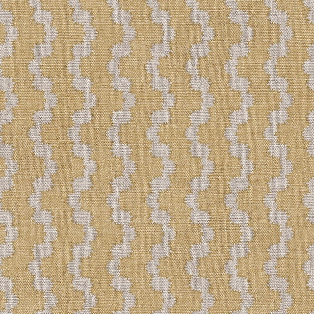
Battersea Wave Colour 5
Battersea
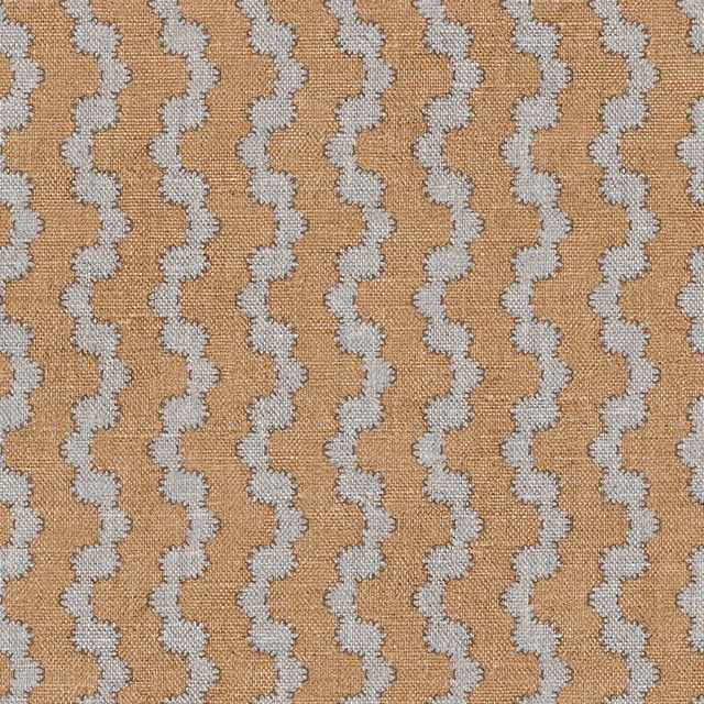
Battersea Wave Colour 6
Battersea
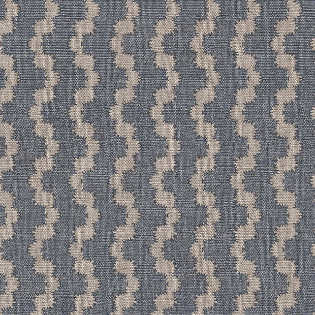
Battersea Wave Colour 7
Battersea
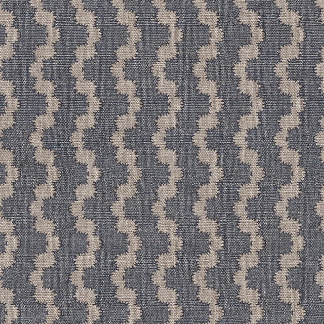
Battersea Wave Colour 8
Battersea
Pairs well with
Battersea Wave Colour 2 is a quiet cloth, so it carries a pattern beside it: one of these on the curtains and this on the chair. Mixed across the houses we hold, which is the part a single supplier's book cannot do.
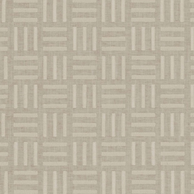
Parallel Linen
Origins
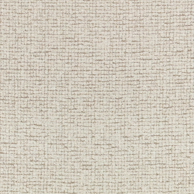
Barbudi Spacedust
Checkmate
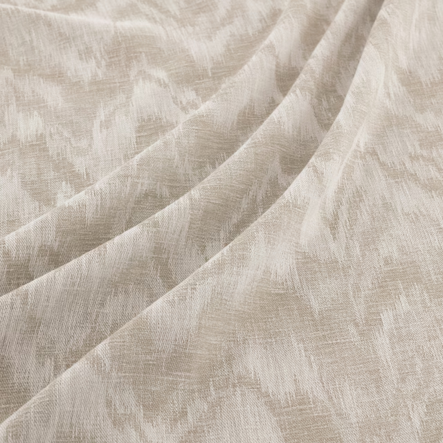
Latifa Mercury
Latifa
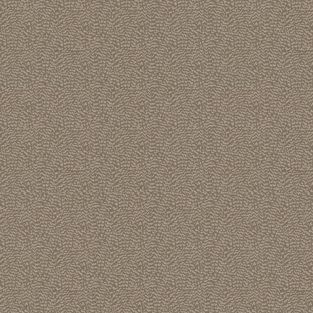
Ontario Mole
Eden Collection
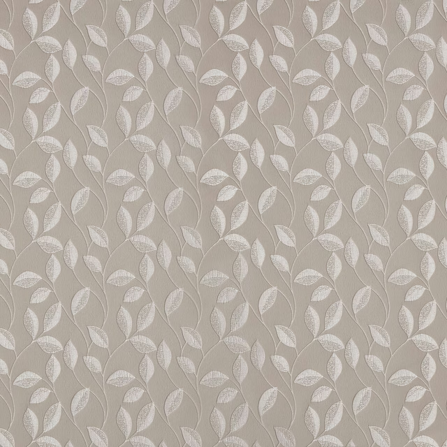
Thurlow Taupe
Essential Weaves Vol 1
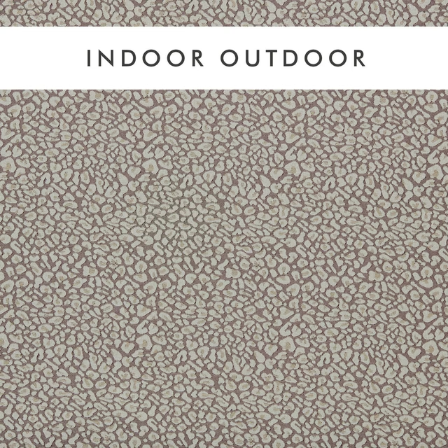
Arcata Linen
Alfresco Indoor Outdoor Weaves
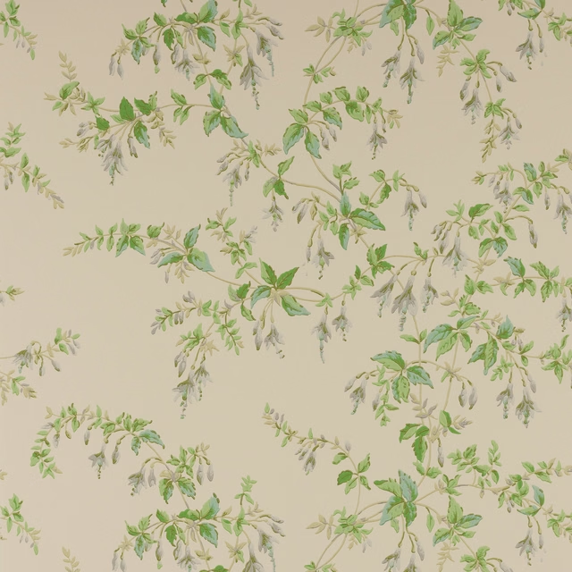
Fuchsia Wallpaper Grey/Green
Ashdown Wallpaper
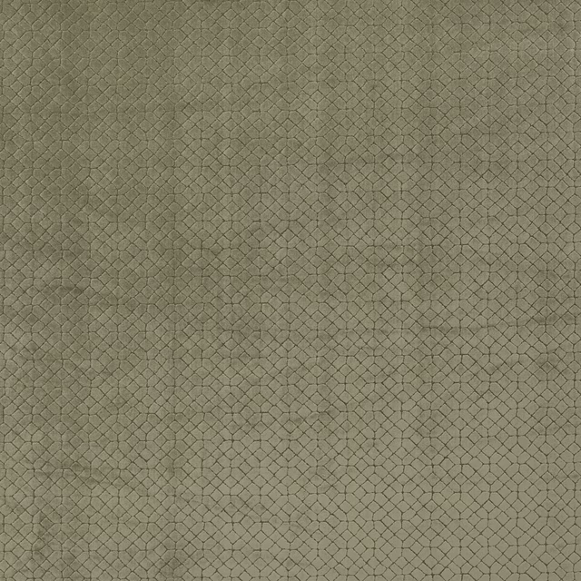
Riolo Linen
Canossa Fabrics
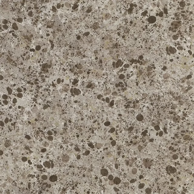
Lustro Tbc
Majolica Wallpaper
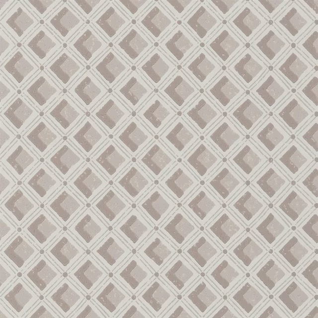
Amsee Geometric Castle Wall
Heritage Wallpaper
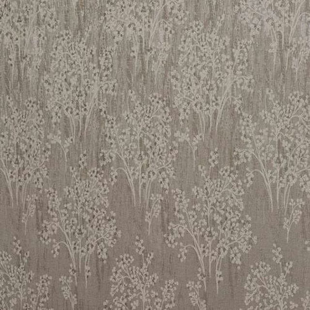
Chantilly Natural
Acacia
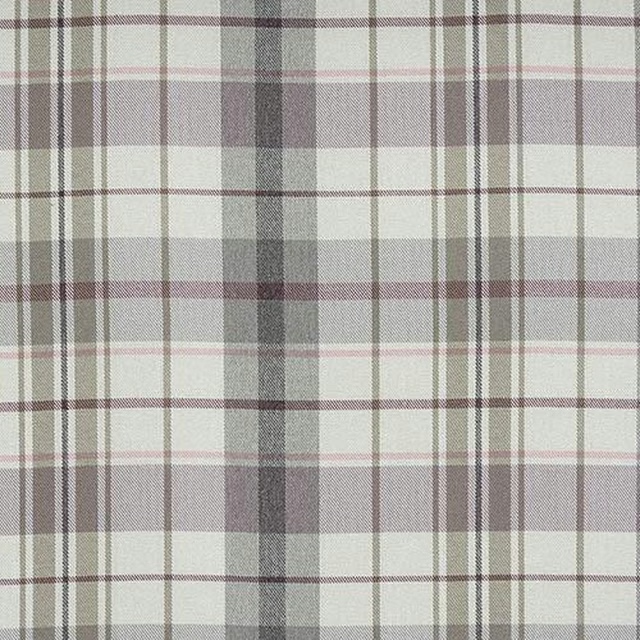
Nevis Check Heather
Other Fabrics & Weaves
Paint that goes with it
Two ways to take the room. Both colours are from houses we hold, so a pot can come off the same order as the cloth. Screens shift colour, so treat these as a direction and bring the cloth to the shelf before you buy the paint.
To sit quietly behind it
Starling
Sanderson · #b9b0a9
To stand against it
Blackthorn
Morris & Co. · #5c4a3c
Other taupe fabrics
Across the houses we hold. See all 4,148.
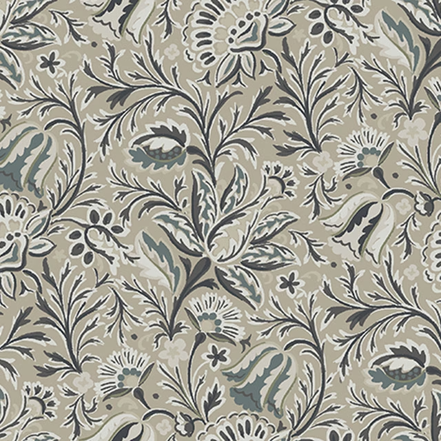
Jaipur Floral Oyster
Archive Collection
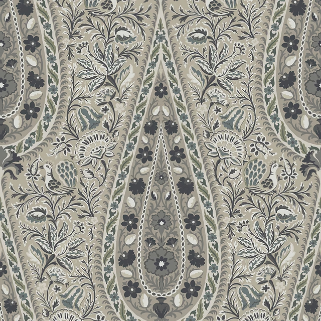
Jaipur Oyster
Archive Collection
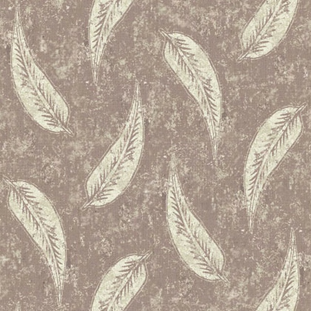
Gina Colour 10
Brindisi
Gina Colour 3
Brindisi
Isabella Colour 10
Brindisi
Isabella Colour 3
Brindisi
Lucia Colour 10
Brindisi
Lucia Colour 3
Brindisi
Mia Colour 10
Brindisi
Swansong Taffeta
Curious Creatures by Becca Who

Dandy 5
Dandy

Dandy 6
Dandy