
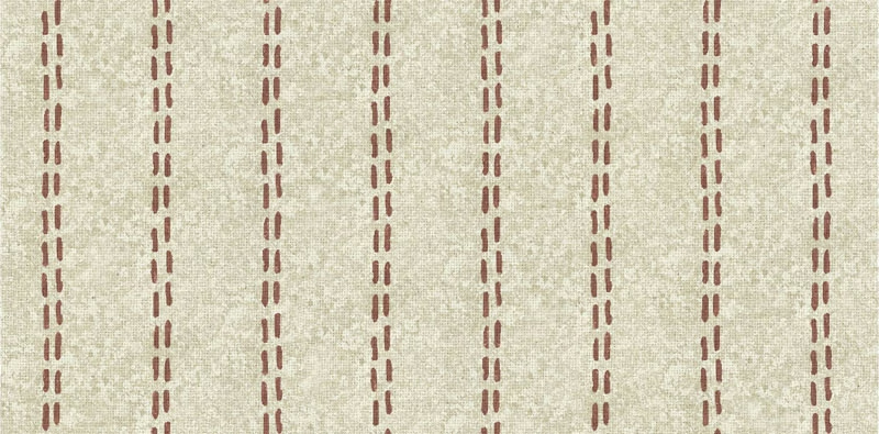

Tap the swatch to see it full screen. Hover it to magnify the weave. Colours on a screen are a guide, not a match, so come and feel the real cloth.
Scroll up or down to zoom in and out.
Mia Colour 9
Brindisi FabricMIACOL9
Mia Colour 9 pairs a pale, warm cream ground with regularly spaced vertical dashed stripes in a muted clay-brown tone. Its softly uneven surface gives the colourway a quietly tactile appearance.
You have used your previews for today. Send one to Simon and you can carry on.
Your board
0 fabrics
See this fabric on Art of the Loom's own site, then order it through us.
See Mia Colour 9 in your own room
A photograph of the piece you want re-covered. Straight on is best, and daylight helps. It is used to make your picture and nothing else.
Looking at your room
We found things here Mia Colour 9 could go on. Tap one on the photograph, or choose below.
We could not see anything to re-cover
, s
Mia Colour 9, on your
Drag to compare. AI impression, colours indicative: ask us for a cutting before you decide.
About this fabric
The design is built from slim vertical columns of broken clay-coloured marks, with the irregular edges and gentle tonal variation clearly visible against the cream background. The ground has a lightly grainy woven appearance rather than a completely flat finish, adding subtle depth without making the stripe feel bold. This is catalogued as Fabric, and no performance features are noted in the supplied specification. The restrained contrast keeps the colourway relaxed and understated.
How to use it
Use the warm cream base to soften a room, while the muted clay stripes introduce a small amount of earthy colour through upholstery, curtains or coordinated cushions. It works particularly well with natural timber, chalky neutrals and warm off-whites.
A softly textured cream ground with understated clay dashed stripes for calm, versatile schemes.
More from Brindisi
The same book, other colourways.
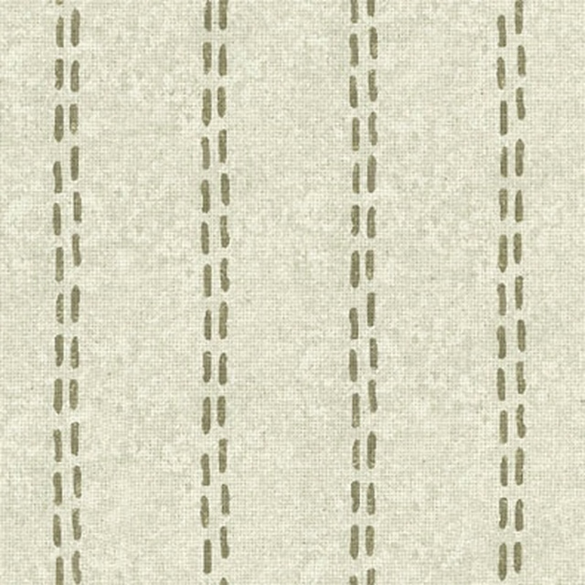
Mia Colour 3
Brindisi
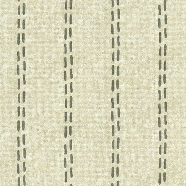
Mia Colour 4
Brindisi
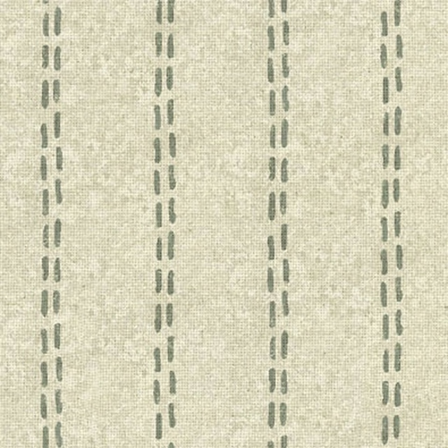
Mia Colour 5
Brindisi
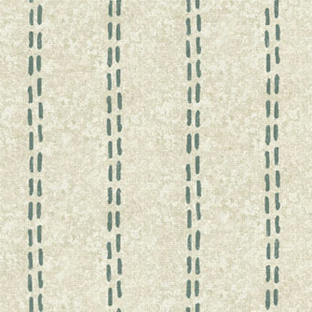
Mia Colour 6
Brindisi
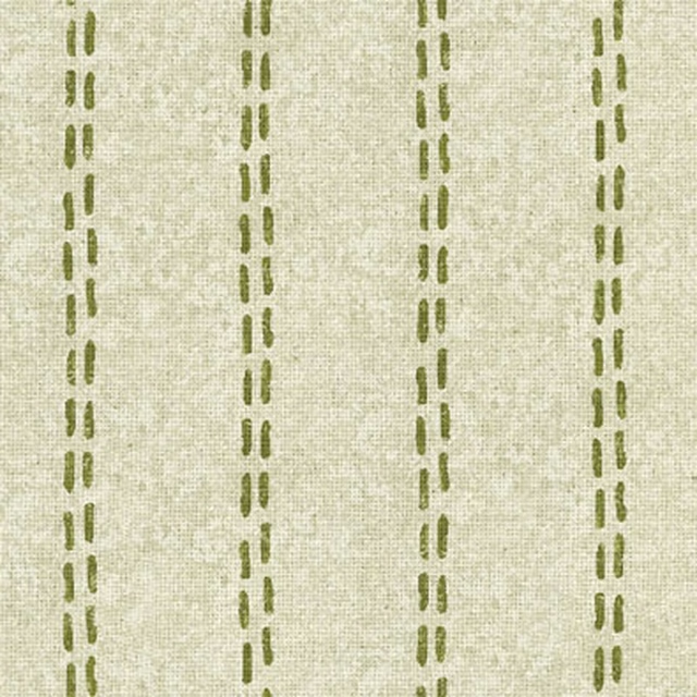
Mia Colour 7
Brindisi
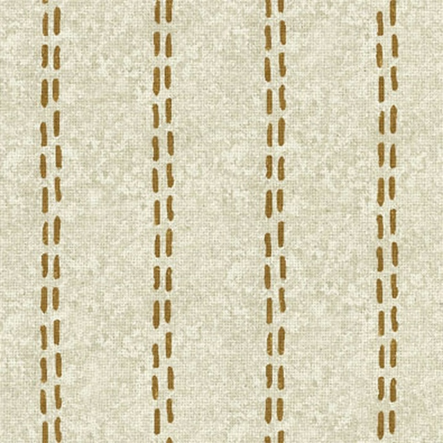
Mia Colour 8
Brindisi
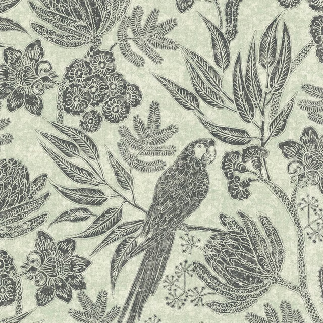
Sophia Colour 1
Brindisi
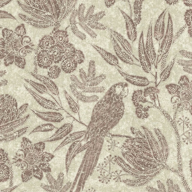
Sophia Colour 10
Brindisi
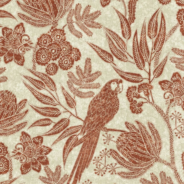
Sophia Colour 11
Brindisi
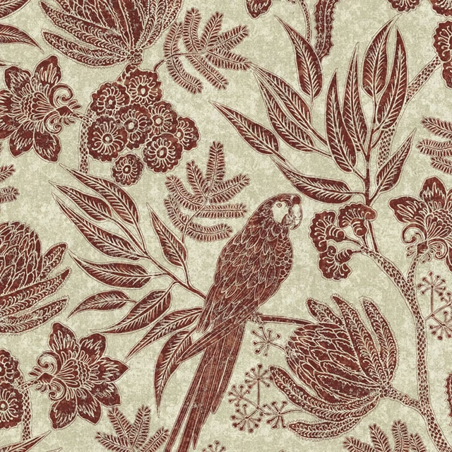
Sophia Colour 12
Brindisi
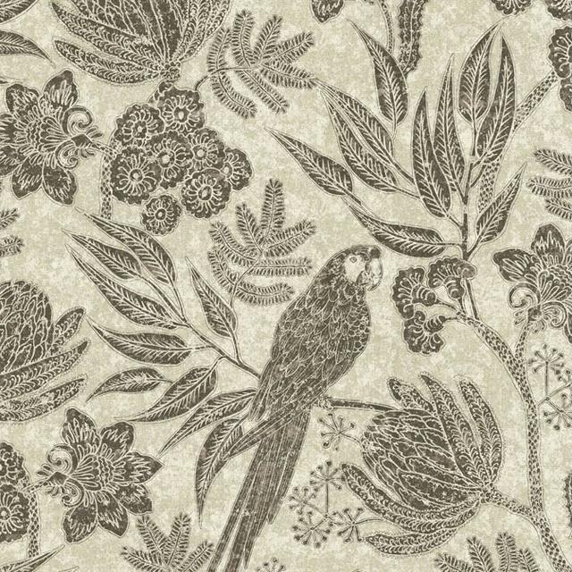
Sophia Colour 2
Brindisi
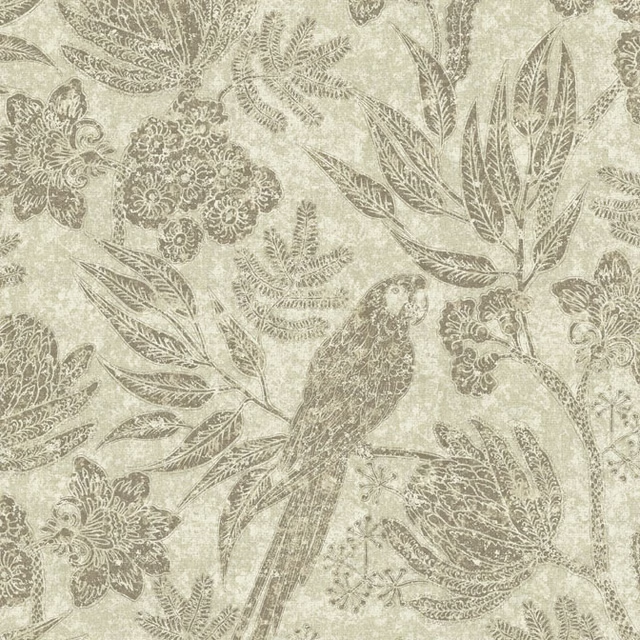
Sophia Colour 3
Brindisi
Pairs well with
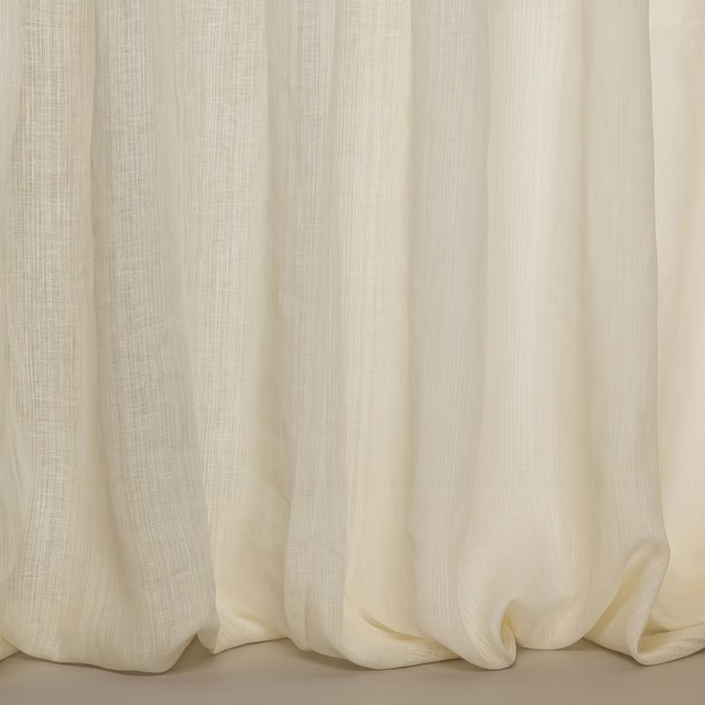
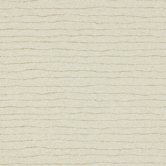
A pattern needs somewhere for the eye to rest, so these are the plains and textures that sit beside Mia Colour 9 without fighting it. Mixed across the houses we hold, which is the part a single supplier's book cannot do.










Paint that goes with it
Two ways to take the room. Both colours are from houses we hold, so a pot can come off the same order as the cloth. Screens shift colour, so treat these as a direction and bring the cloth to the shelf before you buy the paint.
To sit quietly behind it
Green Stone
Little Greene · #d2ceb8
To stand against it
Russet
Zoffany · #a36860
Other cream fabrics
Across the houses we hold. See all 4,572.
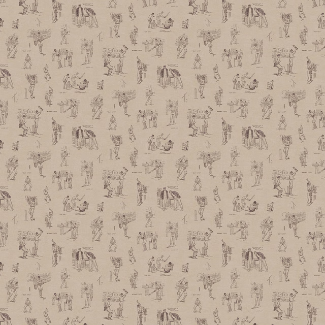
Howzat
Wallpapers
Westray Egg Shell
Westray

Faroe Eggshell
Faroe
Pendleton Pig Optic
Misc
Pendleton Sheep Optic
Misc
Dalmation
Animal Prints
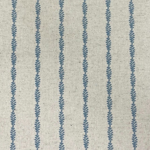
Design 1 Col Marina
Burford

Design 4 Col Spider
Burford
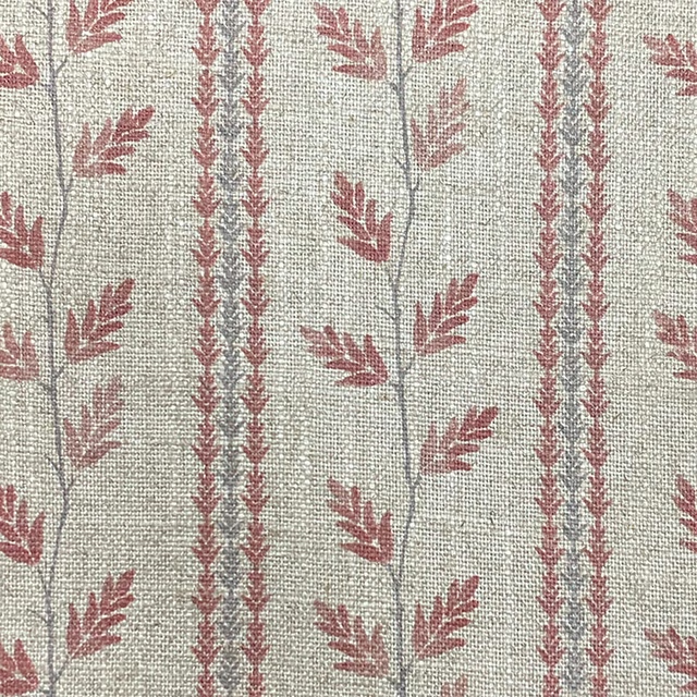
Trailing Vine Colour 6
Greenacres
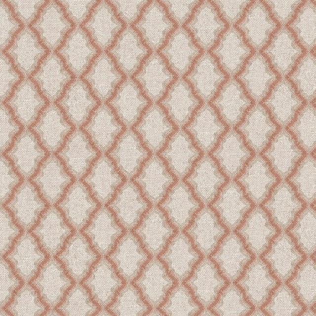
Victoria Trellis Col 4
Heirloom
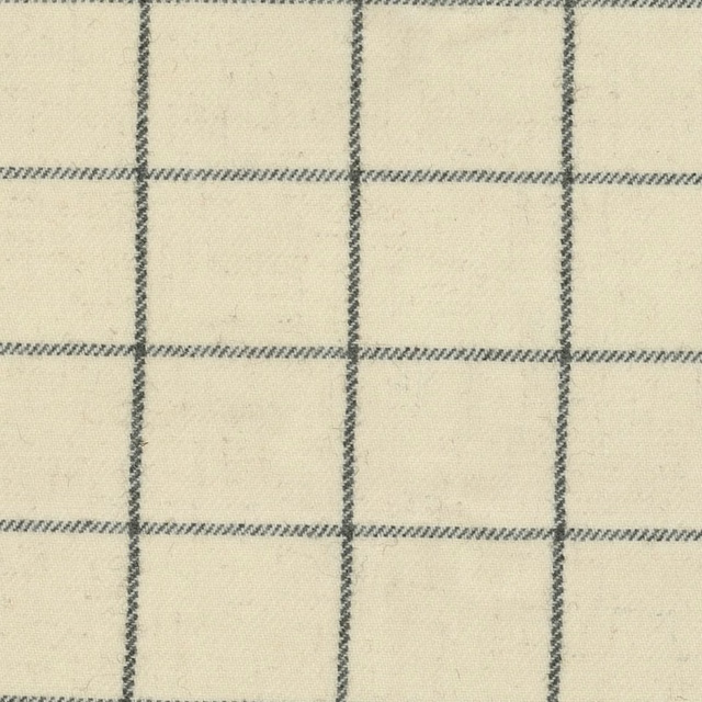
Siegfried Check Ivory
Herriot

Tristan Herringbone Ivory
Herriot