
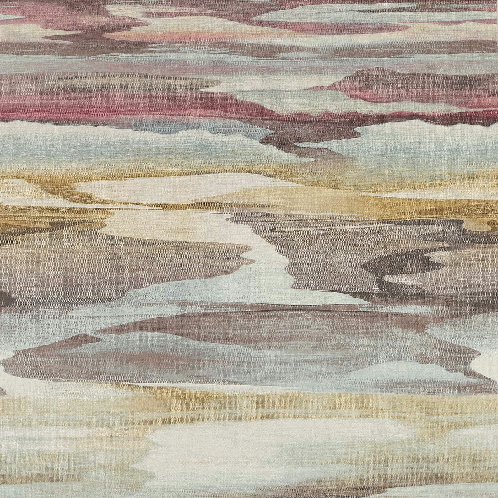

Tap the swatch to see it full screen. Hover it to magnify the weave. Colours on a screen are a guide, not a match, so come and feel the real cloth.
Scroll up or down to zoom in and out.
Cloudscape Wallpaper Purple/Gold
Atmosphere IV W/P WallpaperJ8003-03
Cloudscape Wallpaper Purple/Gold depicts a broad, painterly sky and landscape in softened mauve, lilac, grey, cream and antique gold. The layered, cloud-like bands create a calm sense of distance, with a pale winding opening drawing the eye through the design.
You have used your previews for today. Send one to Simon and you can carry on.
Your board
0 fabrics
See this wallpaper on Jane Churchill's own site, then order it through us.
See Cloudscape Wallpaper Purple/Gold in your own room
A photograph of the piece you want re-covered. Straight on is best, and daylight helps. It is used to make your picture and nothing else.
Looking at your room
We found things here Cloudscape Wallpaper Purple/Gold could go on. Tap one on the photograph, or choose below.
We could not see anything to re-cover
, s
Cloudscape Wallpaper Purple/Gold, on your
Drag to compare. AI impression, colours indicative: ask us for a cutting before you decide.
About this wallpaper
This colourway has a distinctly muted, cool-to-neutral character: dusty purple and mauve sit alongside blue-grey and creamy ground tones, while restrained gold bands add warmth. The large-scale image is formed from irregular horizontal washes and cloud-like shapes rather than a regular geometric motif, giving the wallcovering a softly atmospheric appearance. Supplied as 100% vinyl on paper, it has an approximate vertical repeat of 76cm and horizontal repeat of 68.5cm. The pale central channel and darker mauve forms give the design visible depth across the repeat, while the gold areas gently lift the lower and middle sections.
How to use it
Use this purple-and-gold colourway on a feature wall where its layered horizon-like bands can be seen at full scale. Pair it with warm ivory, weathered grey and muted brass to echo the paper’s pale ground, cool mauves and understated gold accents.
Use this atmospheric purple-and-gold mural effect to bring layered colour and painterly movement to a feature wall.
More from Atmosphere IV W/P
The same book, other colourways.
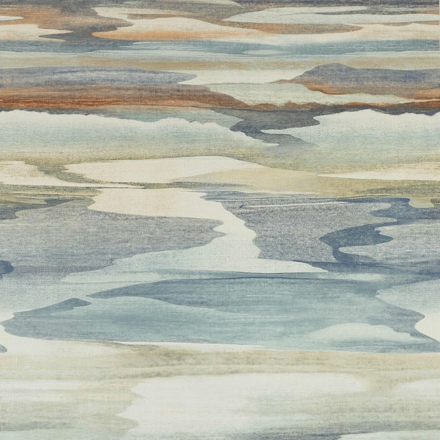
Cloudscape Wallpaper Blue/Copper
Atmosphere IV W/P
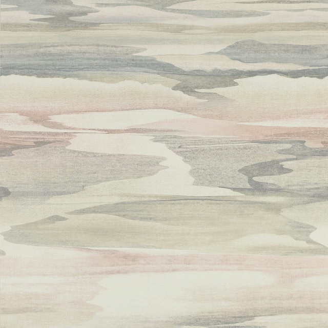
Cloudscape Wallpaper Pink
Atmosphere IV W/P
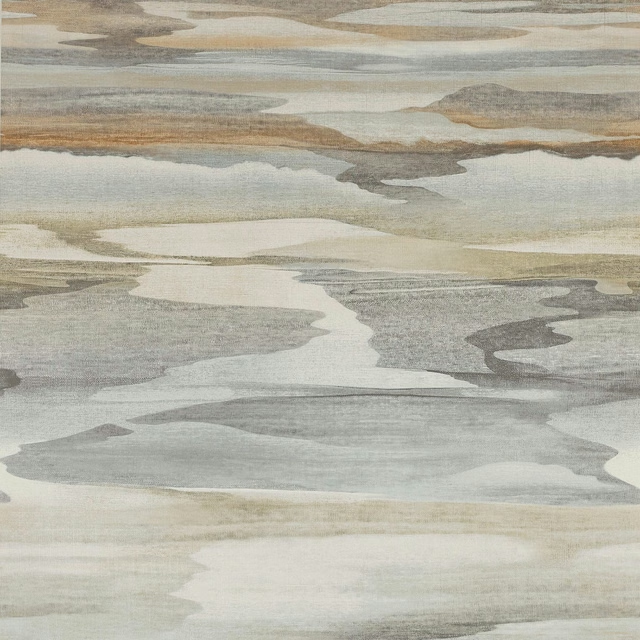
Cloudscape Wallpaper Sand
Atmosphere IV W/P
Klint Wallpaper Charcoal
Atmosphere IV W/P
Klint Wallpaper Copper
Atmosphere IV W/P

Klint Wallpaper Indigo
Atmosphere IV W/P
Klint Wallpaper Teal
Atmosphere IV W/P
Pairs well with
A pattern needs somewhere for the eye to rest, so these are the plains and textures that sit beside Cloudscape Wallpaper Purple/Gold without fighting it. Mixed across the houses we hold, which is the part a single supplier's book cannot do.

Alaska Aubergine
Alaska Collection

Alaska Mauve
Alaska Collection
Albany Damson
Albany and Moray

Albany Grape
Albany and Moray

Flynn Aubergine
Flynn Linen

Genoa Aubergine
Genoa
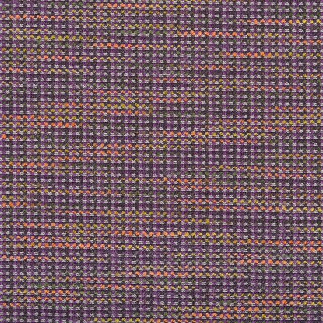
Breccia Damson
Casablanca Fabrics

Belloni Plum
Contract Essentials II Fabrics
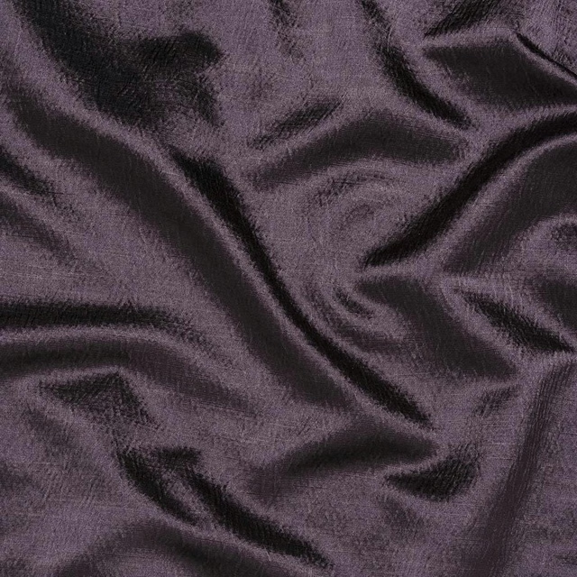
Alchemy Aubergine
Alchemy
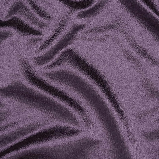
Alchemy Heather
Alchemy
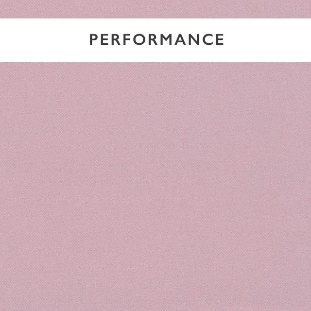
Allegra Lilac
Allegra
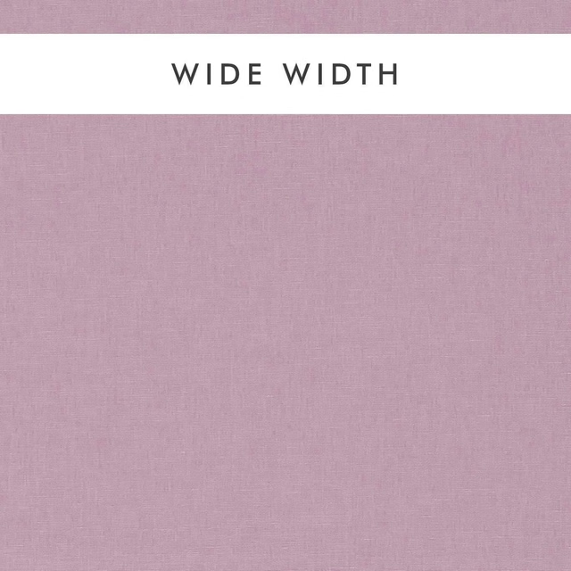
Ario Wide Width Lilac
Ario
Paint that goes with it
Two ways to take the room. Both colours are from houses we hold, so a pot can come off the same order as the cloth. Screens shift colour, so treat these as a direction and bring the cloth to the shelf before you buy the paint.
To sit quietly behind it
Beech Grey
Sanderson · #b3aa99
To stand against it
Carmen Light
Sanderson · #a7565d
Other purple fabrics
Across the houses we hold. See all 1,094.
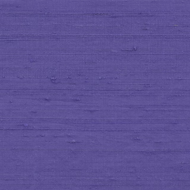
Orissa Silk Wallcovering Iris
Wallcoverings

Orissa Silk Wallcovering Lavender
Wallcoverings
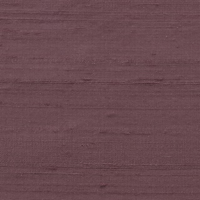
Orissa Silk Wallcovering Myrtle
Wallcoverings

Orissa Silk Wallcovering Purple Red
Wallcoverings

Orissa Silk Wallcovering Rose Black
Wallcoverings
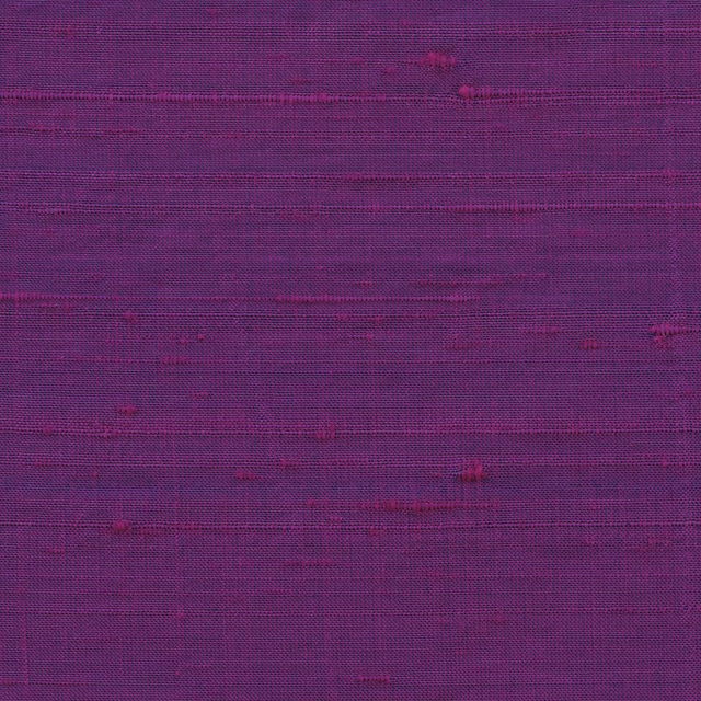
Orissa Silk Wallcovering Rosebud
Wallcoverings
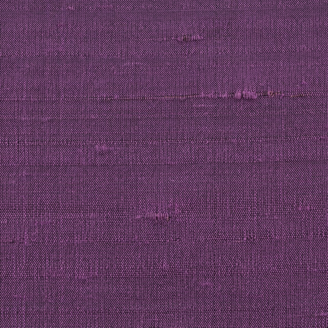
Orissa Silk Wallcovering Royal Lilac
Wallcoverings

Orissa Silk Wallcovering Sorbet
Wallcoverings

Orissa Silk Wallcovering Wild Rose
Wallcoverings
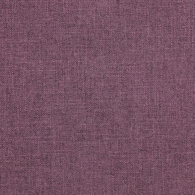
Asta Amethyst
Asta
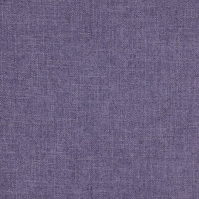
Asta Iris
Asta
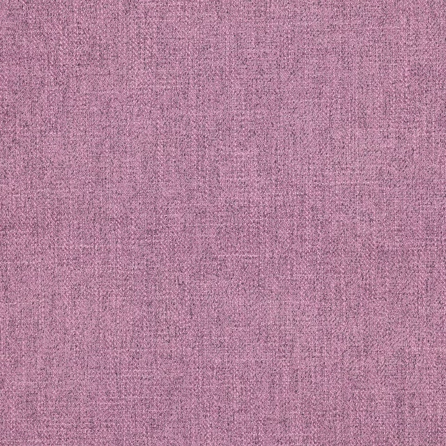
Asta Lilac
Asta