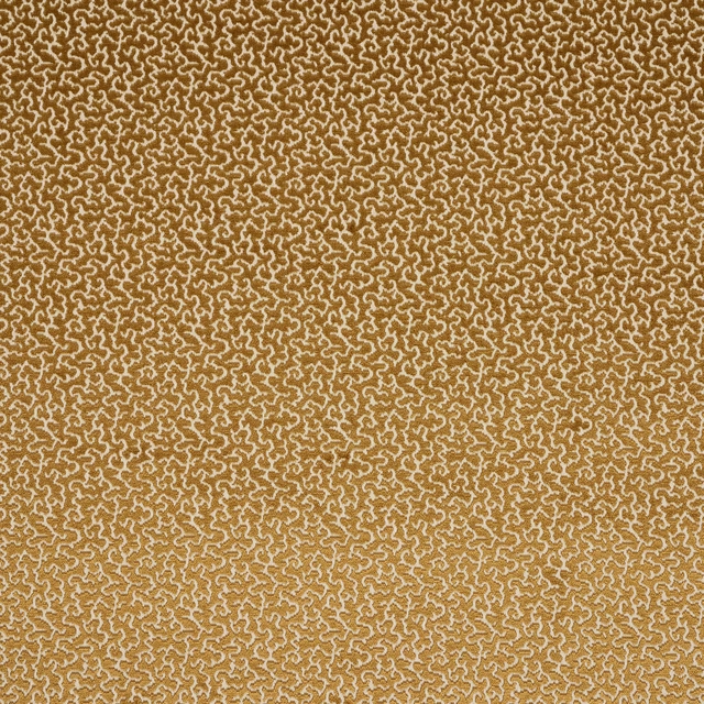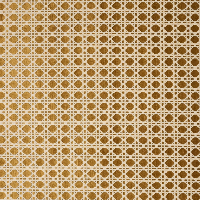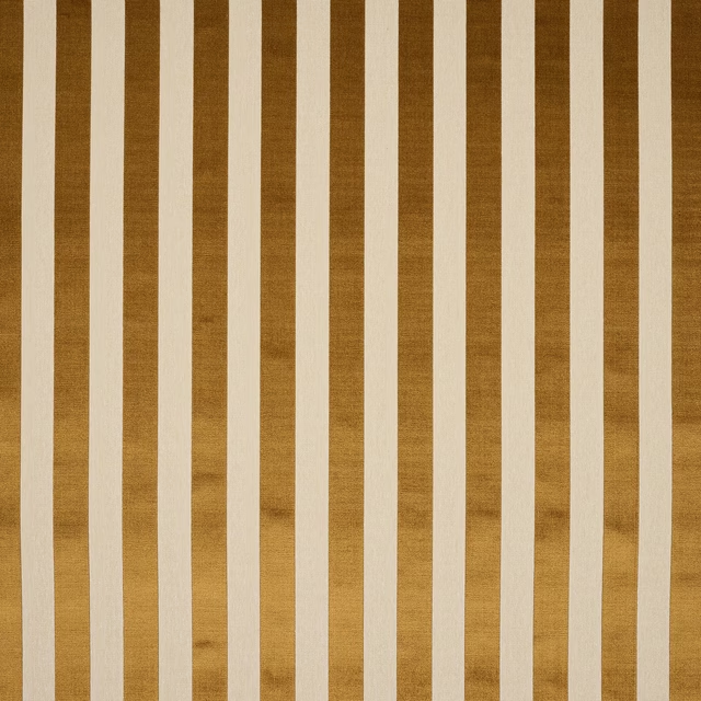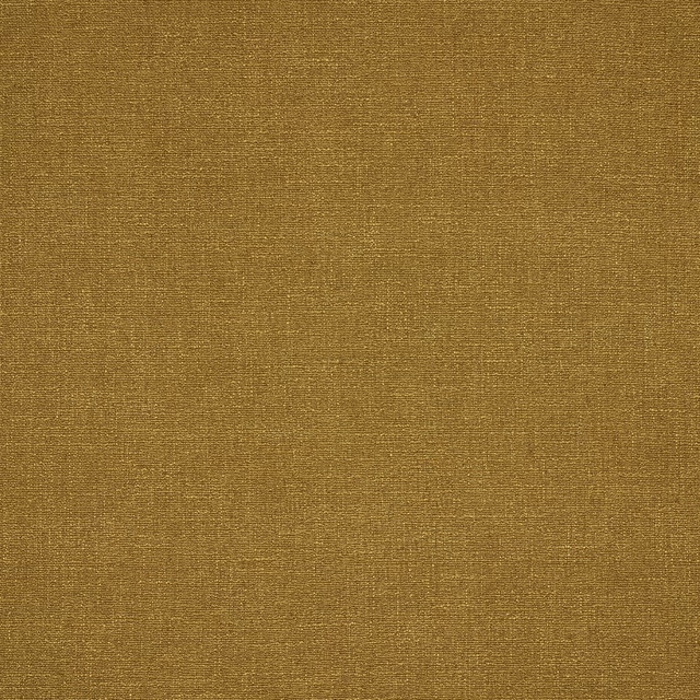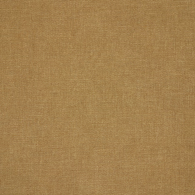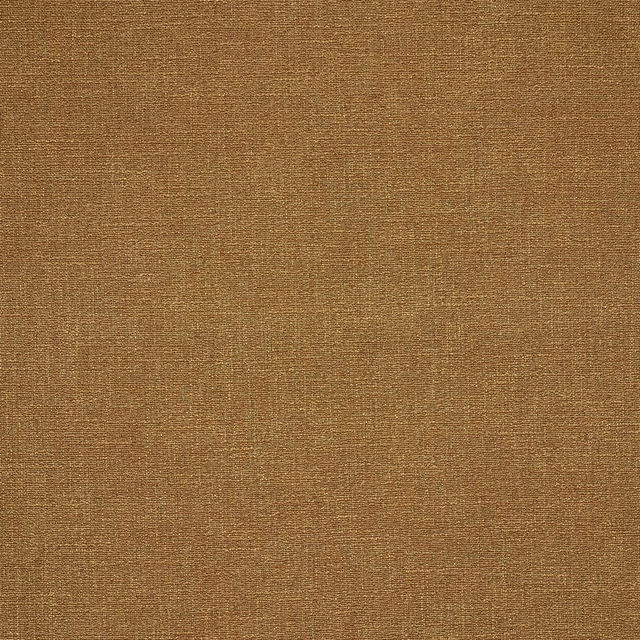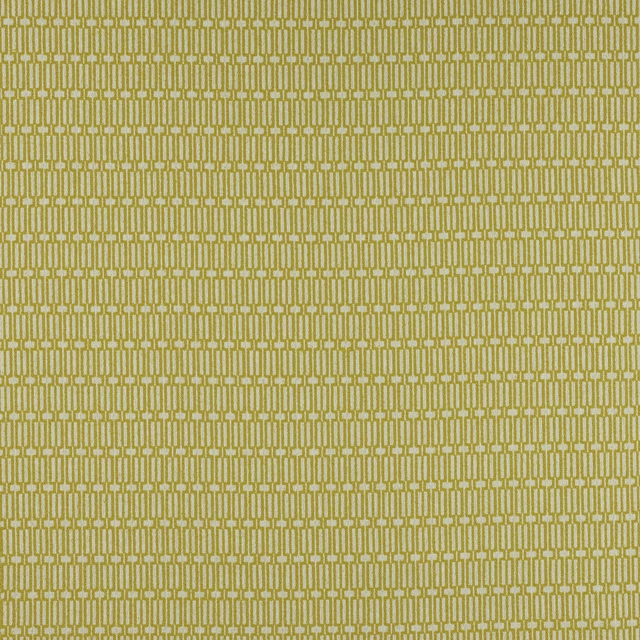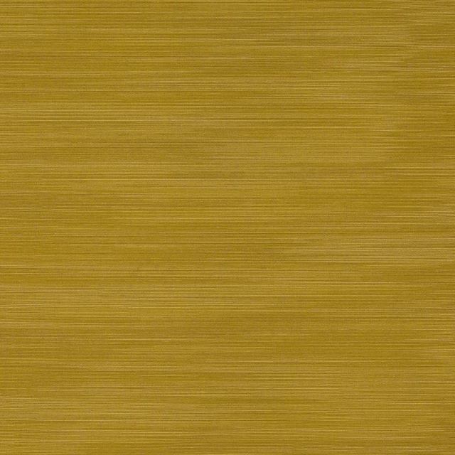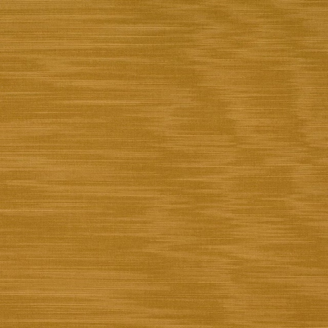

Tap the swatch to see it full screen. Hover it to magnify the weave. Colours on a screen are a guide, not a match, so come and feel the real cloth.
Scroll up or down to zoom in and out.
Khora Curry
Giverny FabricM4213-01
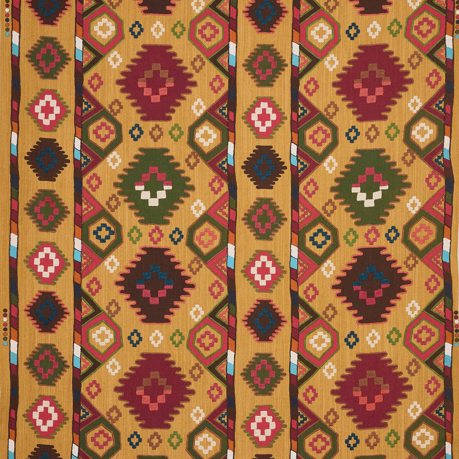
Khora Curry brings Giverny’s geometric motif to life in a rich curry-gold ground. The colour reads warm and sunbaked, with burgundy, olive, teal and pink accents picking out the woven pattern.
You have used your previews for today. Send one to Simon and you can carry on.
Your board
0 fabrics
See this fabric on Manuel Canovas's own site, then order it through us.
See Khora Curry in your own room
A photograph of the piece you want re-covered. Straight on is best, and daylight helps. It is used to make your picture and nothing else.
Looking at your room
We found things here Khora Curry could go on. Tap one on the photograph, or choose below.
We could not see anything to re-cover
, s
Khora Curry, on your
Drag to compare. AI impression, colours indicative: ask us for a cutting before you decide.
About this fabric
Woven in 80% Cotton and 20% Jute, this fabric has a natural, slightly slubby surface that suits both upholstery and drapery. The design shows a large-scale geometric repeat, with stepped diamond forms and smaller medallions arranged in vertical bands across the 132cm width. In this Khora Curry colourway, the mustard-gold ground feels earthy rather than bright, so the reds and greens sit comfortably without looking overly sharp. The 93cm vertical repeat gives the pattern a strong, rhythmic presence, and the √CM fire code supports residential use.
How to use it
This curry-toned version works well with walnut, aged brass and textured neutrals, where its warmth can carry the room. It is especially effective on a statement chair, ottoman or relaxed curtains when you want pattern with a grounded, autumnal feel.
Use with dark timber and earthy accents to let the warm curry ground the bolder motif.
More from Giverny
The same book, other colourways.
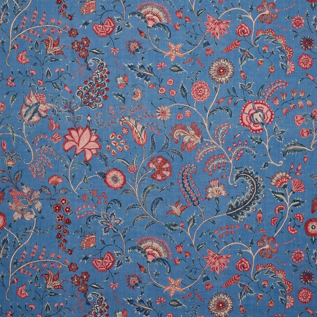
Celestine Mer
Giverny
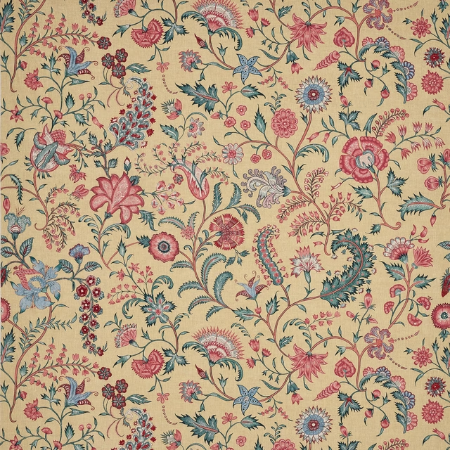
Celestine Moutarde
Giverny
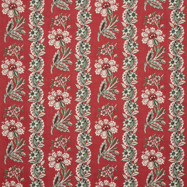
Giverny Carmin
Giverny
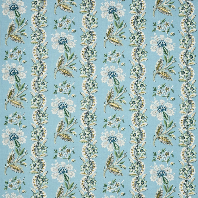
Giverny Ciel
Giverny
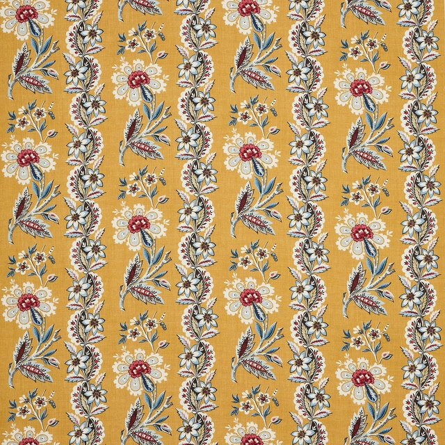
Giverny Soleil
Giverny
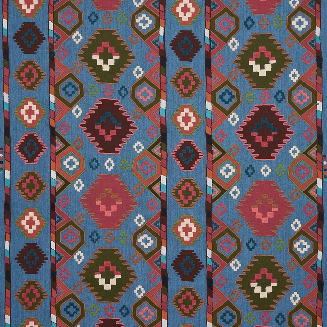
Khora Azur
Giverny

Les Cavaliers Lin Ciel
Giverny
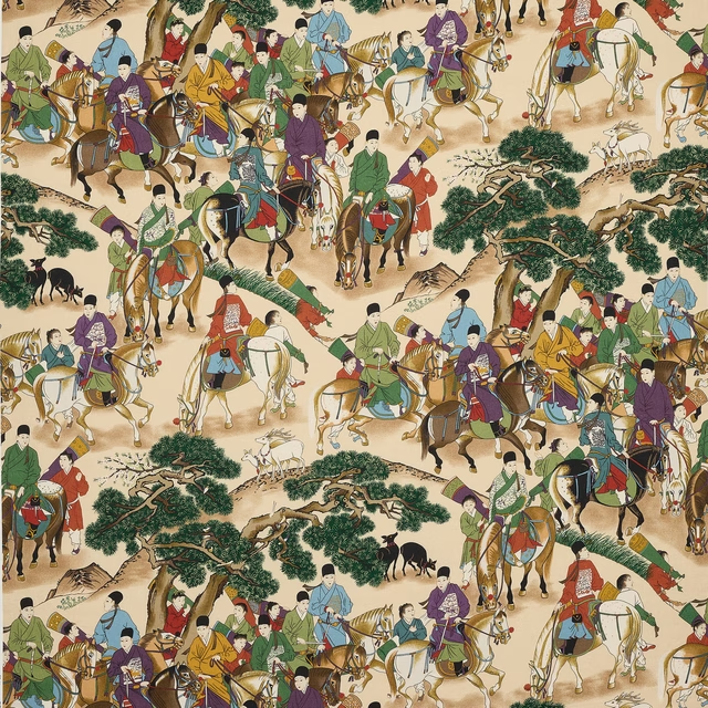
Les Cavaliers Lin Naturel
Giverny
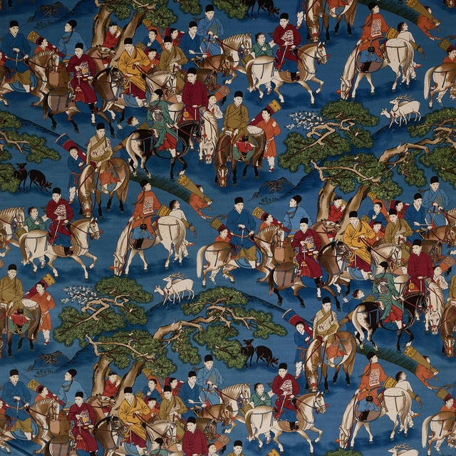
Les Cavaliers Velours Azur
Giverny

Les Cavaliers Velours Chamois
Giverny
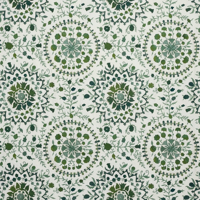
Neela Agave
Giverny
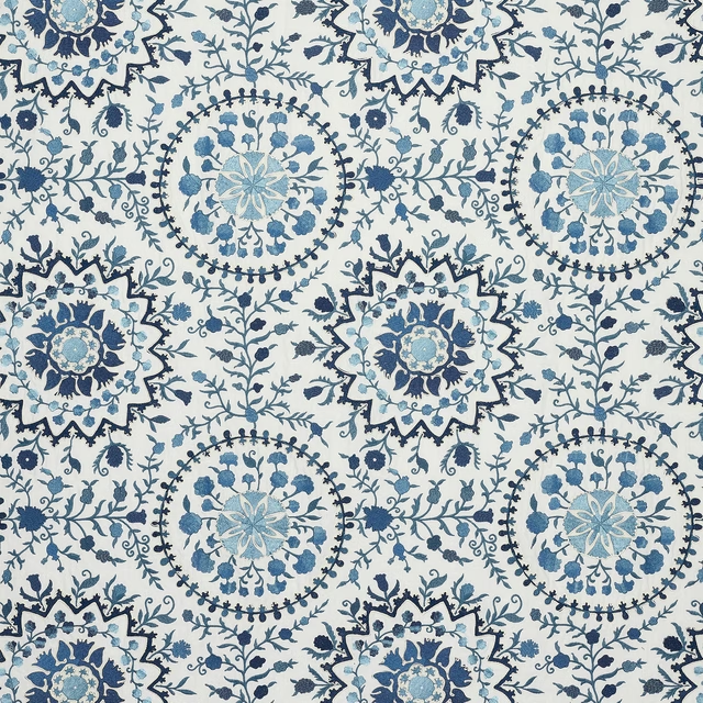
Neela Indigo
Giverny
Pairs well with
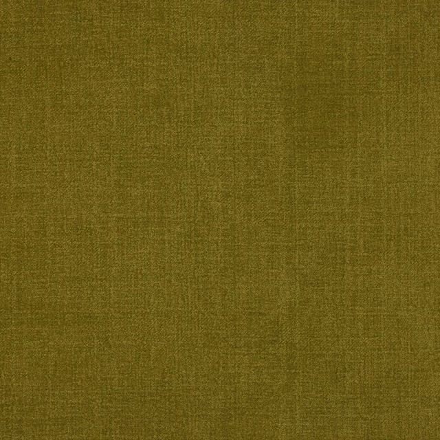
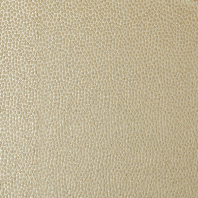
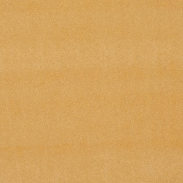
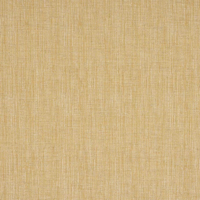
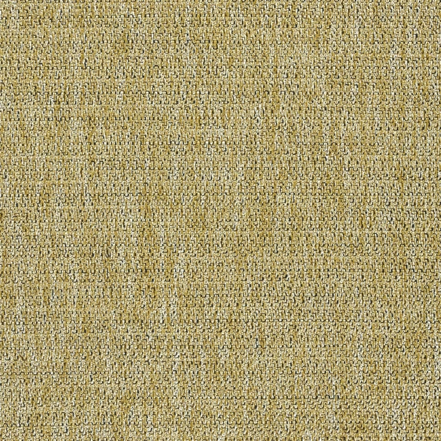
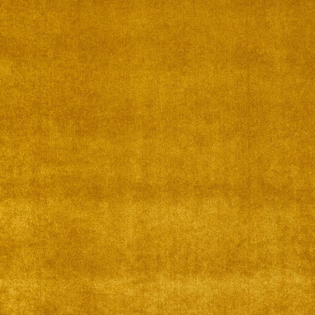
A pattern needs somewhere for the eye to rest, so these are the plains and textures that sit beside Khora Curry without fighting it. Mixed across the houses we hold, which is the part a single supplier's book cannot do.





Paint that goes with it
Two ways to take the room. Both colours are from houses we hold, so a pot can come off the same order as the cloth. Screens shift colour, so treat these as a direction and bring the cloth to the shelf before you buy the paint.
To sit quietly behind it
Affogato
Little Greene · #926a49
To stand against it
Stone-Pale-Warm
Little Greene · #f3d5af
Other gold fabrics
Across the houses we hold. See all 1,418.