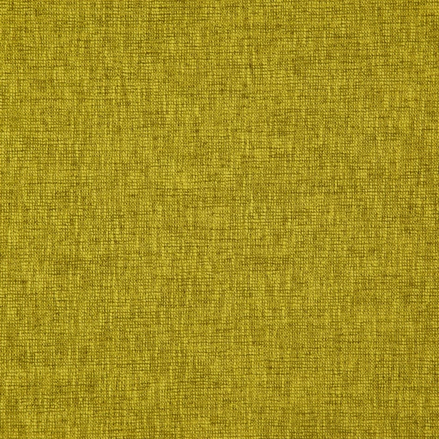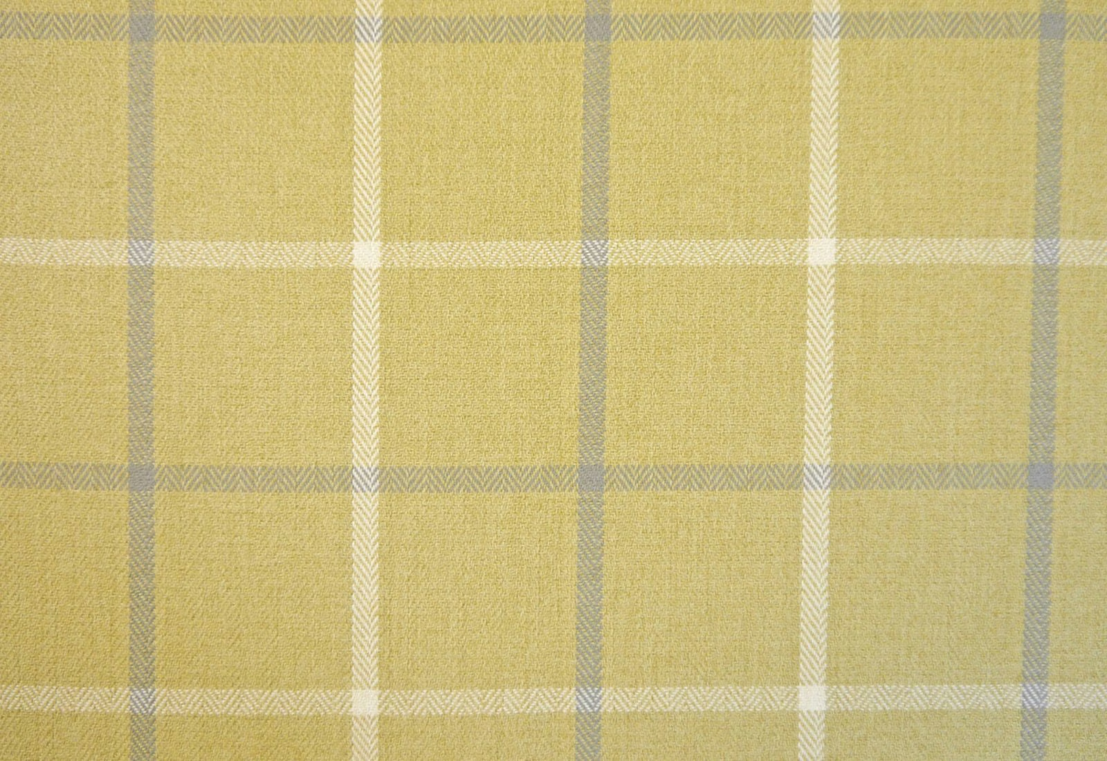
Tap the swatch to see it full screen. Hover it to magnify the weave. Colours on a screen are a guide, not a match, so come and feel the real cloth.
Scroll up or down to zoom in and out.
PIA1620
Piazza FabricPIA1620
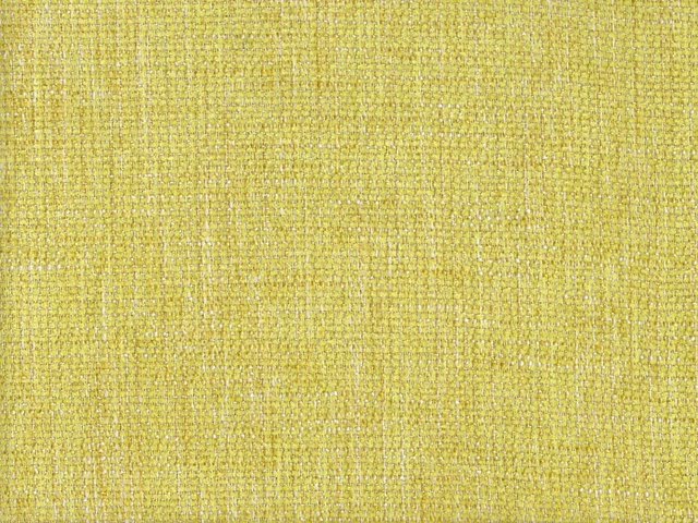
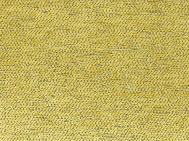
PIA1620 brings a softened ochre-yellow check to the Piazza collection, crossed with chalky cream and cool grey lines. Its closely textured chenille face gives the colourway a gently tactile, understated character.
You have used your previews for today. Send one to Simon and you can carry on.
Your board
0 fabrics
See this fabric on Cristina Marrone's own site, then order it through us.
See PIA1620 in your own room
A photograph of the piece you want re-covered. Straight on is best, and daylight helps. It is used to make your picture and nothing else.
Looking at your room
We found things here PIA1620 could go on. Tap one on the photograph, or choose below.
We could not see anything to re-cover
, s
PIA1620, on your
Drag to compare. AI impression, colours indicative: ask us for a cutting before you decide.
About this fabric
The design is a medium-scale check formed from broad muted ochre fields, narrow grey bands and crisp cream stripes with a subtle chevron-like weave. The warm yellow base is softened rather than bright, while the grey lines add a cooler, slightly weathered contrast. As a chenille made from 100% polyester, it has a closely woven, lightly dimensional surface that catches the light across the checks. At 138cm wide, PIA1620 is suitable for contract and domestic upholstery, with machine-washable aftercare; it has Domestic Cig & Match flame retardancy and can be treated to Crib 5 contract grade.
How to use it
Use the mellow ochre ground on a sofa, headboard or dining chair, pairing it with warm timber, stone neutrals and the fabric’s own grey-blue lines. Cream upholstery piping or cushions will pick up the lighter check stripes without making the scheme feel stark.
A muted ochre check with cream and grey lines, suited to relaxed seating and country-inspired interiors.
More from Piazza
The same book, other colourways.
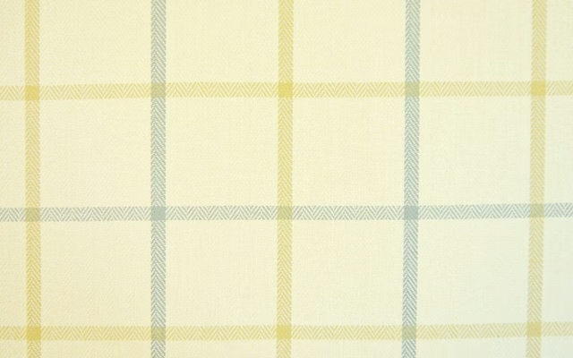
PIA1625
Piazza
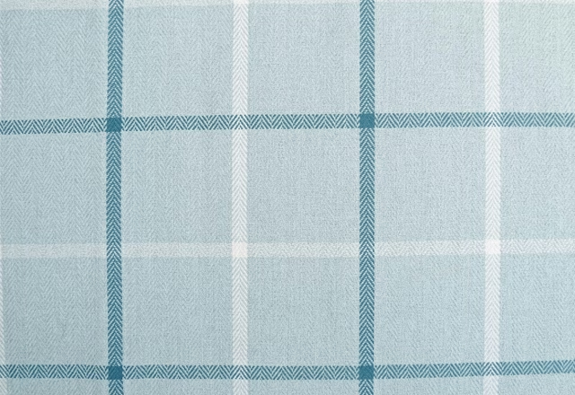
PIA1616
Piazza
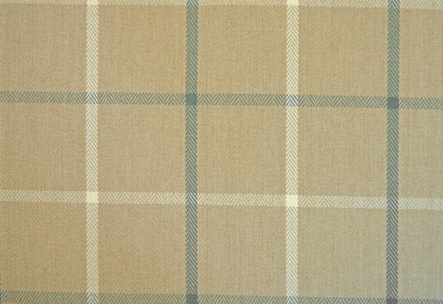
PIA1617
Piazza
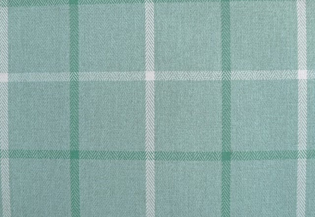
PIA1618
Piazza
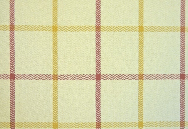
PIA1619
Piazza
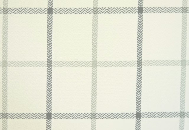
PIA1621
Piazza
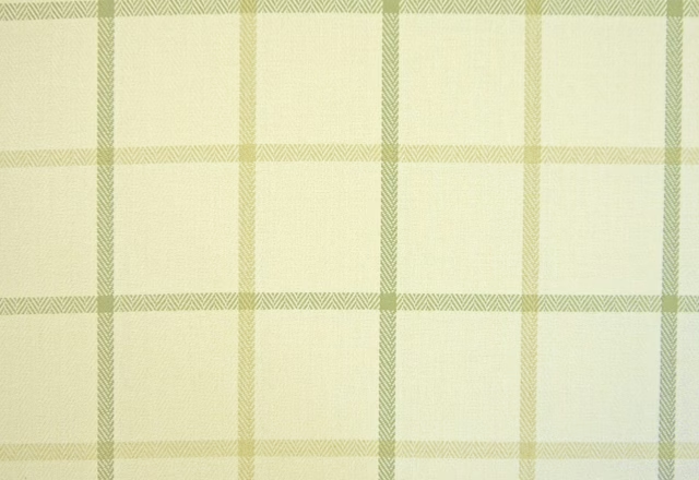
PIA1622
Piazza
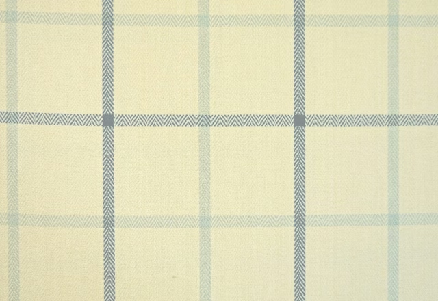
PIA1623
Piazza
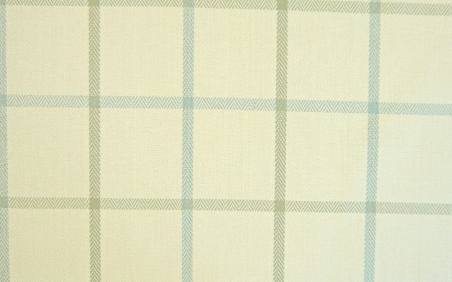
PIA1624
Piazza
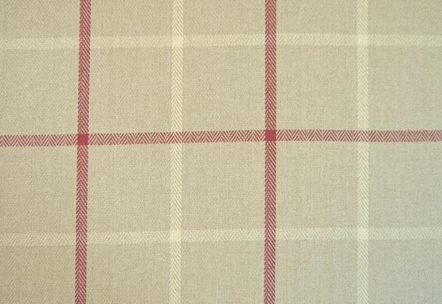
PIA1615
Piazza
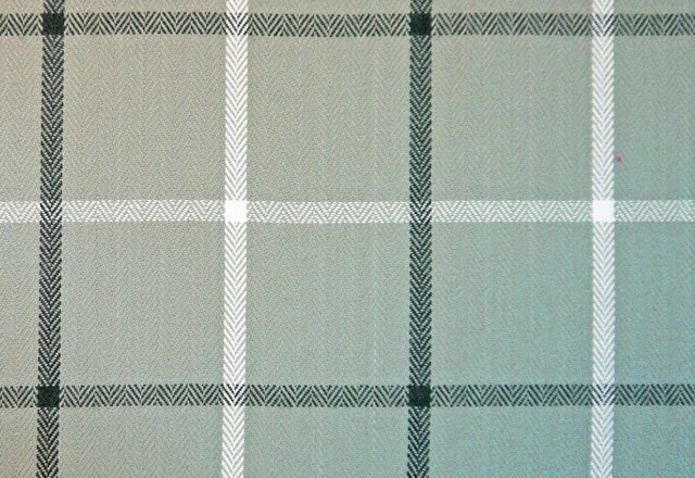
PIA1626
Piazza
PIA1633
Piazza
Pairs well with
A pattern needs somewhere for the eye to rest, so these are the plains and textures that sit beside PIA1620 without fighting it. Mixed across the houses we hold, which is the part a single supplier's book cannot do.
Capri Recycled Ochre
Eco -Friendly Ranges

Austen Sunflower
Darwin Collection

Bronte Sunflower
Darwin Collection
Albany Citron
Albany and Moray
Amalfi Chartreuse
Amalfi
Aragona Gold
Sicilia Fabrics
Heritage Panama Willow
Helix
Foxy Wide Width Citrus
Reflect 3 Wallpaper

Palla Bamboo
Reflect Wallcoverings 1
Camden Lemongrass
Camden

Chamonix Lemon
Chamonix
Orissa Silk Wallcovering Apollo
Wallcoverings
Paint that goes with it
Two ways to take the room. Both colours are from houses we hold, so a pot can come off the same order as the cloth. Screens shift colour, so treat these as a direction and bring the cloth to the shelf before you buy the paint.
To sit quietly behind it
Oak Apple
Little Greene · #cdc185
To stand against it
Double Quartz Grey
Zoffany · #979ea6
Other yellow fabrics
Across the houses we hold. See all 1,033.