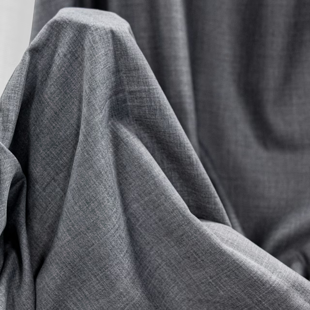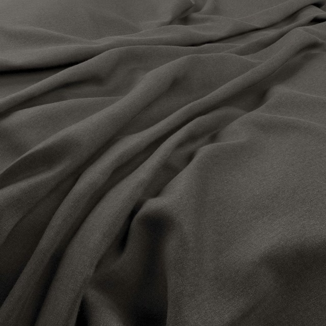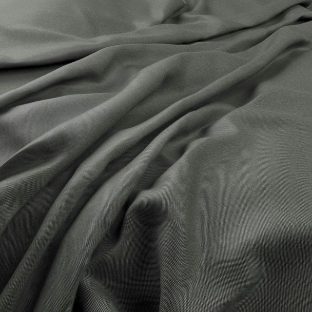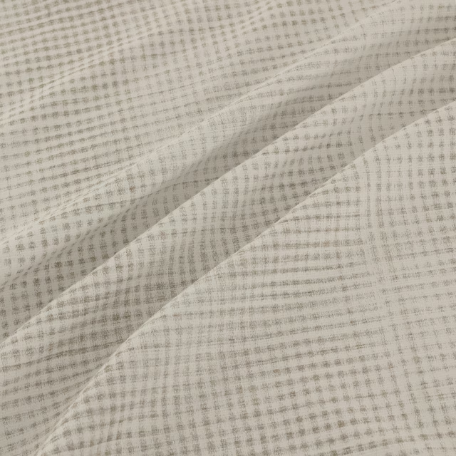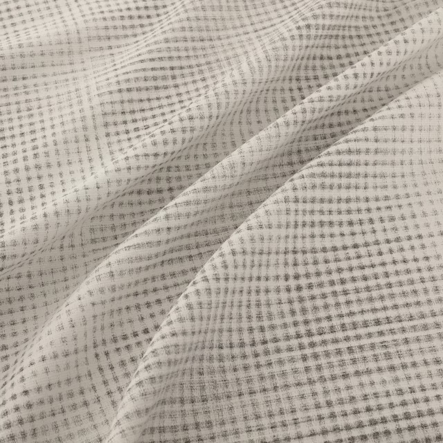

Tap the swatch to see it full screen. Hover it to magnify the weave. Colours on a screen are a guide, not a match, so come and feel the real cloth.
Scroll up or down to zoom in and out.
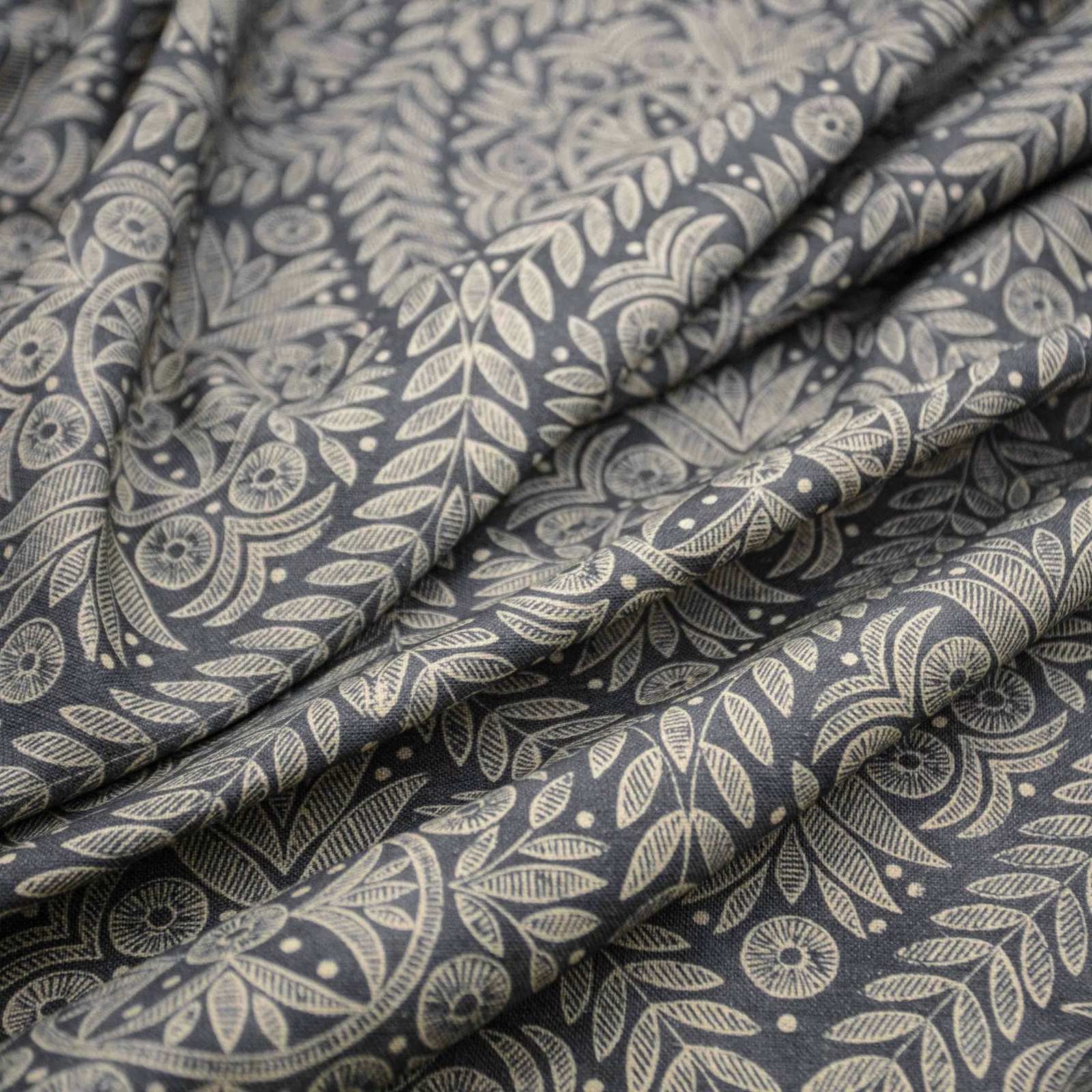
Portia Charcoal
Portia Fabric
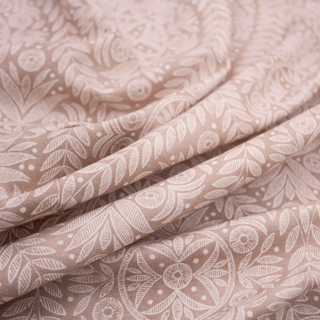
Portia Charcoal combines a deep charcoal ground with an intricate pale botanical pattern of curling leaves, stylised flowers and seed-head details. The close tonal contrast gives the design a quietly graphic presence while keeping its overall impression muted.
You have used your previews for today. Send one to Simon and you can carry on.
Your board
0 fabrics
See this fabric on Warwick's own site, then order it through us.
See Portia Charcoal in your own room
A photograph of the piece you want re-covered. Straight on is best, and daylight helps. It is used to make your picture and nothing else.
Looking at your room
We found things here Portia Charcoal could go on. Tap one on the photograph, or choose below.
We could not see anything to re-cover
, s
Portia Charcoal, on your
Drag to compare. AI impression, colours indicative: ask us for a cutting before you decide.
About this fabric
The charcoal background reads cool and softly mottled, while the light stone-grey motif brings out individual petals, stems and finely drawn leaf veins across the surface. Folds in the swatch show a supple, mid-weight handle with a softly textured, non-shiny finish. The repeated botanical arrangement is detailed enough to reward close viewing without becoming visually bright or busy in this restrained colourway. No composition, width, rub-test or performance specification has been supplied for this exact fabric.
How to use it
Use Portia Charcoal on a reading chair, bench or full-length curtains where its cool charcoal depth can anchor a room. Balance the pale botanical tracery with ivory upholstery, warm grey walls, aged wood or brushed metal.
Use the charcoal ground with warm ivory, stone and muted timber tones for a composed, layered scheme.
Pairs well with
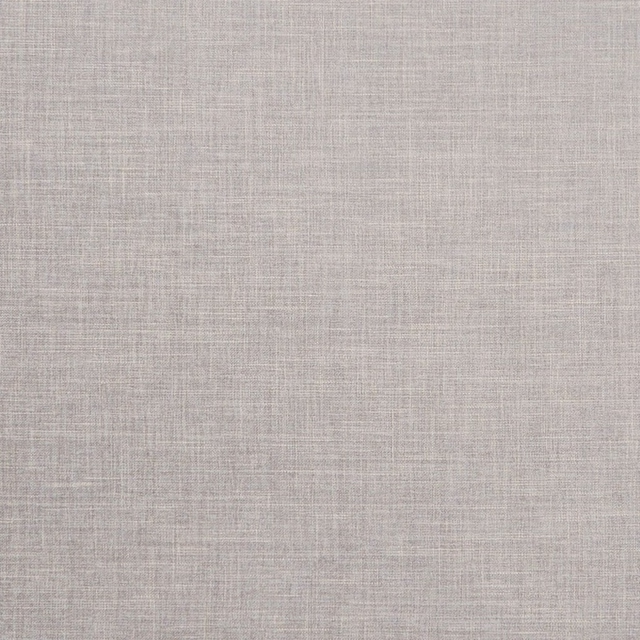
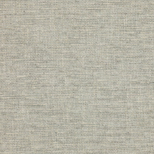
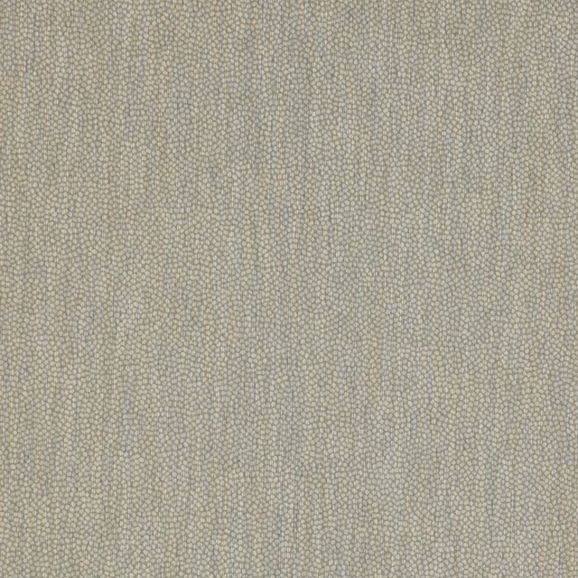
A pattern needs somewhere for the eye to rest, so these are the plains and textures that sit beside Portia Charcoal without fighting it. Mixed across the houses we hold, which is the part a single supplier's book cannot do.

Alaska Dove
Alaska Collection

Alaska Fog
Alaska Collection

Albany Charcoal
Albany and Moray
Albany Dove
Albany and Moray
Brandon Silver
Albeck
Lyncombe Silver
Albeck

Aunelle Platinum
AALTER FABRICS

Oparu Graphite
Amaya Fabrics
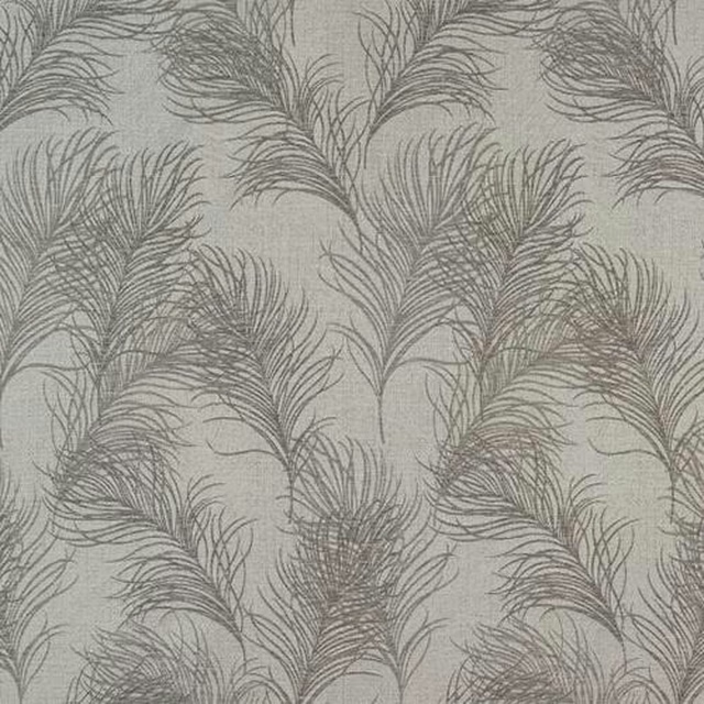
Feather Dove
Acacia
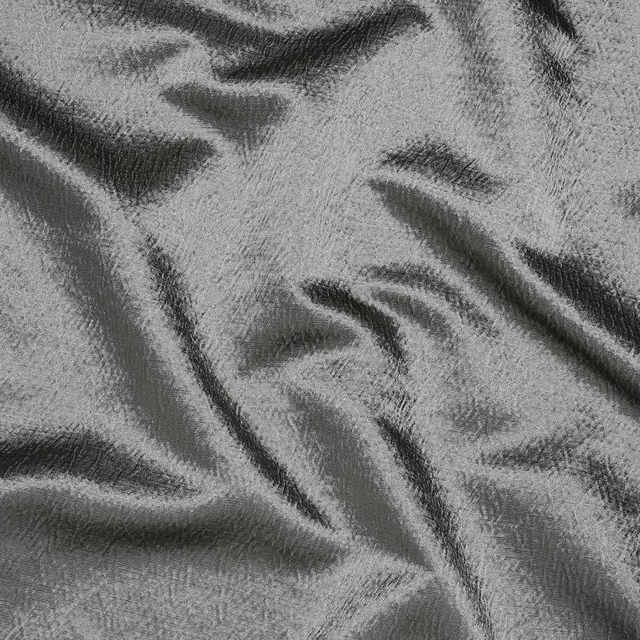
Alchemy Slate
Alchemy

Allegra Dove
Allegra

Allegra Eclipse
Allegra
Paint that goes with it
Two ways to take the room. Both colours are from houses we hold, so a pot can come off the same order as the cloth. Screens shift colour, so treat these as a direction and bring the cloth to the shelf before you buy the paint.
To sit quietly behind it
Bastille
Sanderson · #717171
To stand against it
Duvet Day
Coat Paints · #e2daca