
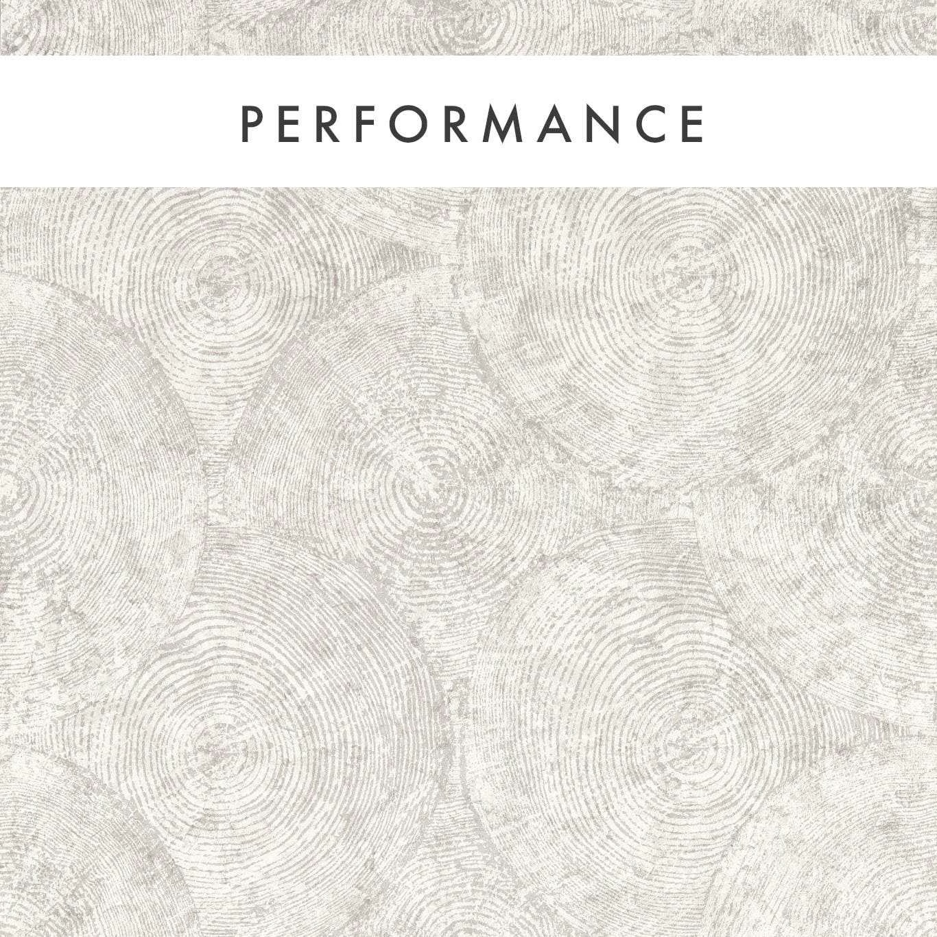

Tap the swatch to see it full screen. Hover it to magnify the weave. Colours on a screen are a guide, not a match, so come and feel the real cloth.
Scroll up or down to zoom in and out.
Silvan Putty
Expressions Performance Wallcoverings WallpaperCCW0131-04
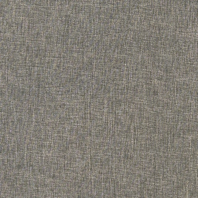
Silvan Putty presents a quiet, pale putty ground overlaid with closely drawn circular rings that resemble sliced timber or softly weathered grain. Its low-contrast taupe and off-white colouring keeps the organic pattern light and understated.
You have used your previews for today. Send one to Simon and you can carry on.
Your board
0 fabrics
Part of the range we hold from Clarke & Clarke.
See Silvan Putty in your own room
A photograph of the piece you want re-covered. Straight on is best, and daylight helps. It is used to make your picture and nothing else.
Looking at your room
We found things here Silvan Putty could go on. Tap one on the photograph, or choose below.
We could not see anything to re-cover
, s
Silvan Putty, on your
Drag to compare. AI impression, colours indicative: ask us for a cutting before you decide.
About this wallpaper
The wallpaper’s surface is defined by overlapping circular motifs, each formed from fine, irregular concentric lines in soft grey-beige against the putty background. Subtle changes in line density give the pattern a gently tactile, layered appearance, while the restrained colour keeps the overall effect airy rather than graphic. With a usable width of 53 cm and a standard length of 10.05 m, it is specified with a 53 cm vertical pattern repeat and no horizontal repeat. The supplied weight is 460 gsm, giving this wallcovering a substantial specification alongside its delicate visual drawing.
How to use it
Pair Silvan Putty with chalky whites, pale oak and warm grey upholstery for a softly natural scheme; its muted taupe depth also works behind darker walnut or charcoal accents. Use it across a full wall where the repeating rings can read as a calm, textural backdrop rather than a bold feature print.
Use this softly tonal wallpaper to bring subtle, organic movement to calm neutral interiors without strong contrast.
More from Expressions Performance Wallcoverings
The same book, other colourways.
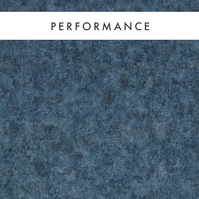
Marmor Midnight
Expressions Performance Wallcoverings
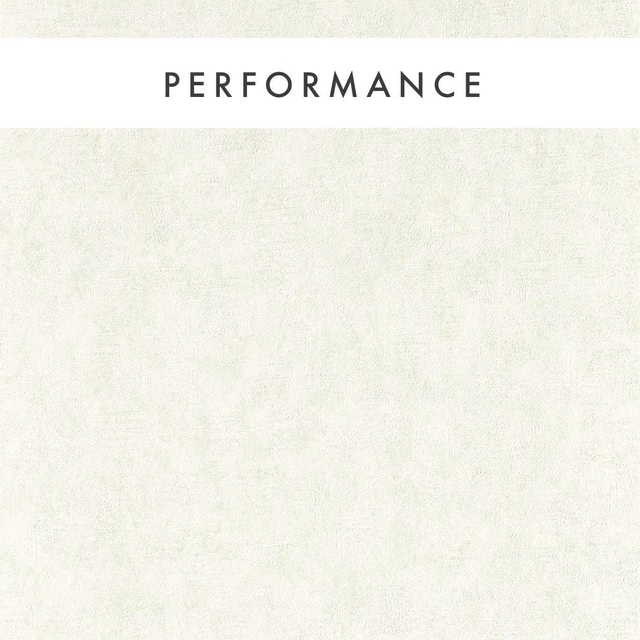
Marmor Parchment
Expressions Performance Wallcoverings
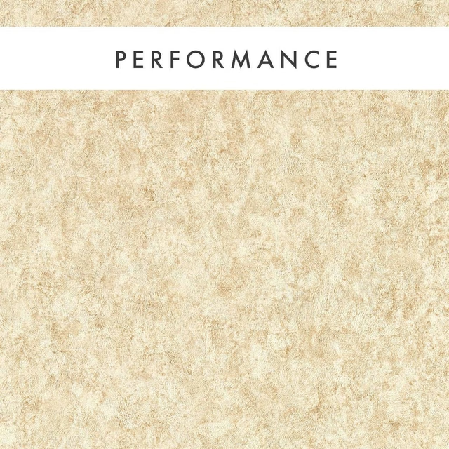
Marmor Sahara
Expressions Performance Wallcoverings

Rafi Granite
Expressions Performance Wallcoverings
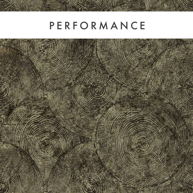
Silvan Charcoal/Gilver
Expressions Performance Wallcoverings
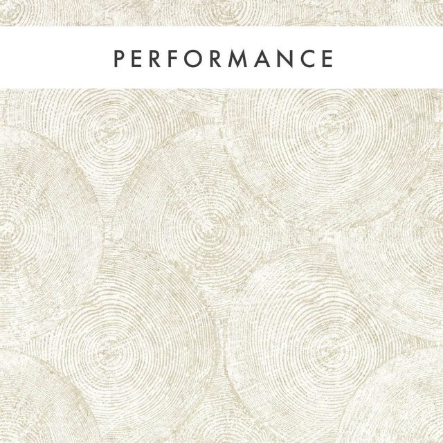
Silvan Gilver
Expressions Performance Wallcoverings
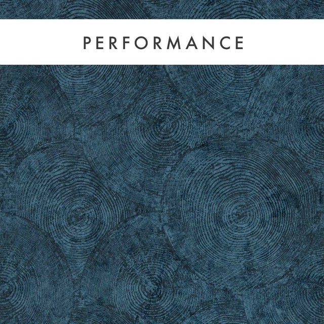
Silvan Midnight
Expressions Performance Wallcoverings
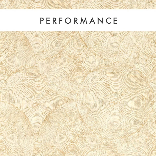
Silvan Sahara
Expressions Performance Wallcoverings
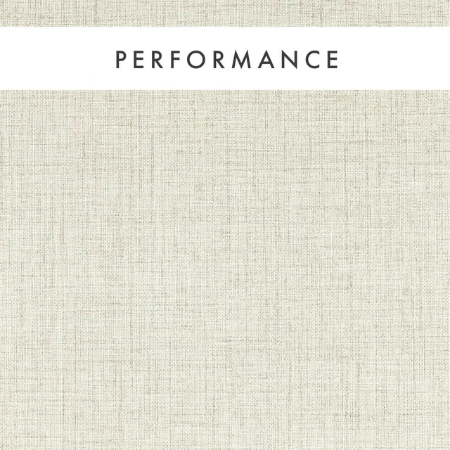
Sirpo Ash
Expressions Performance Wallcoverings
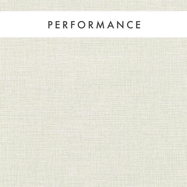
Sirpo Linen
Expressions Performance Wallcoverings
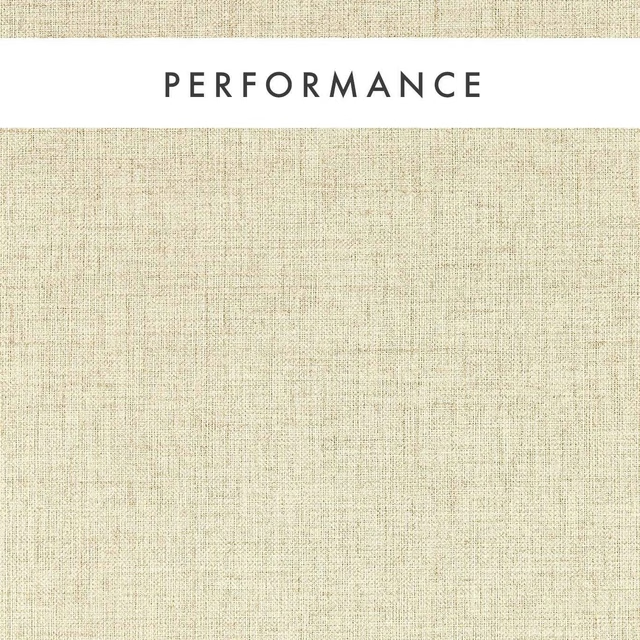
Sirpo Oatmeal
Expressions Performance Wallcoverings
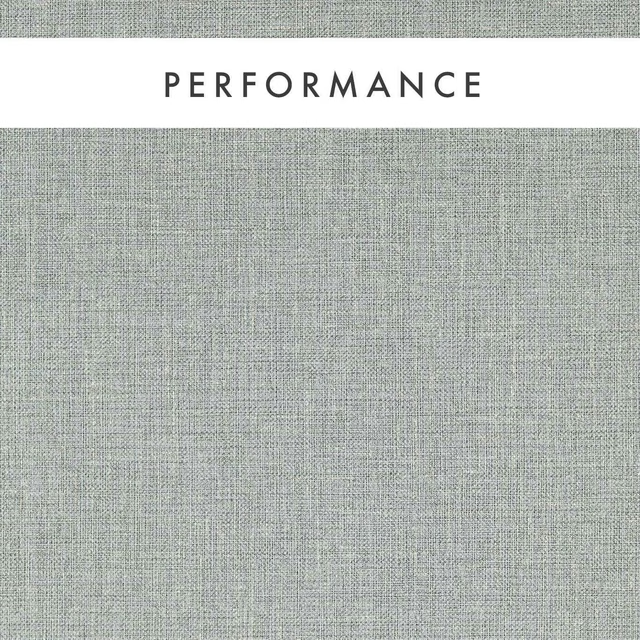
Sirpo Slate
Expressions Performance Wallcoverings
Pairs well with
A pattern needs somewhere for the eye to rest, so these are the plains and textures that sit beside Silvan Putty without fighting it. Mixed across the houses we hold, which is the part a single supplier's book cannot do.

Alaska Mole
Alaska Collection

Alaska Otter
Alaska Collection
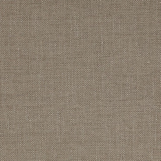
Marldon Taupe
Albeck
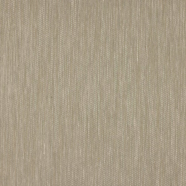
Croft Silver
Chester
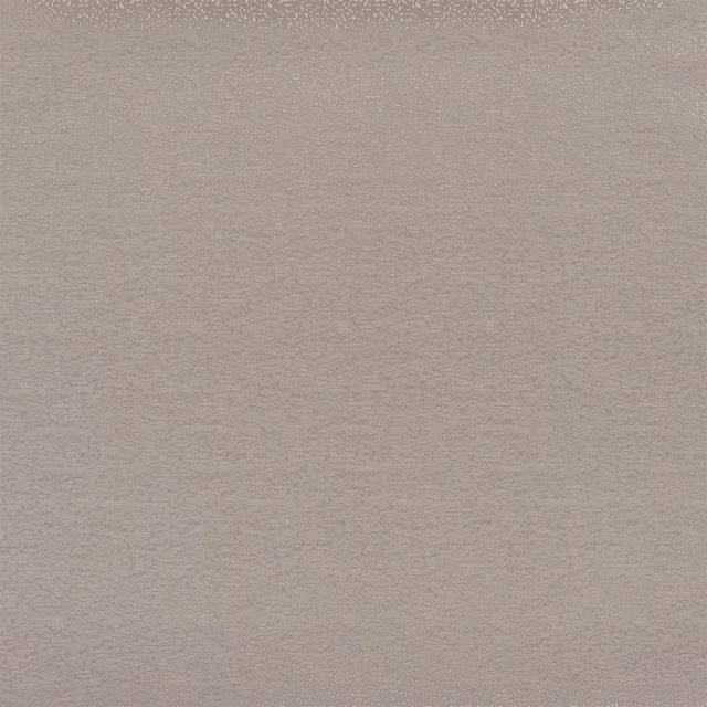
Marcello Cappuccino
Contract Essentials II Fabrics

Sahara Zinc
Kalahari Fabrics
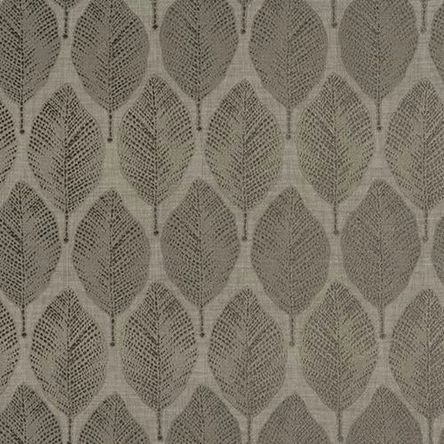
Acacia Taupe
Acacia

Alchemy Mushroom
Alchemy
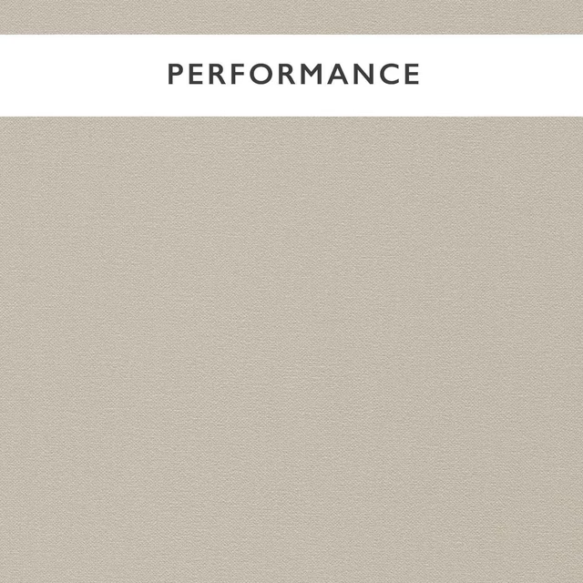
Allegra Avery
Allegra
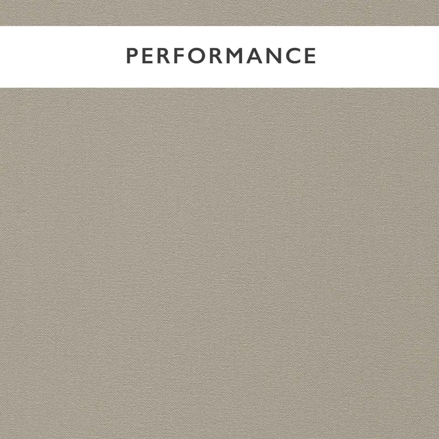
Allegra Fog
Allegra

Amalfi Cobblestone
Amalfi

Amalfi Regency Grey
Amalfi
Paint that goes with it
Two ways to take the room. Both colours are from houses we hold, so a pot can come off the same order as the cloth. Screens shift colour, so treat these as a direction and bring the cloth to the shelf before you buy the paint.
To sit quietly behind it
Sweatpants
Coat Paints · #e3e3de
To stand against it
Livid
Little Greene · #6d7d78
Other taupe fabrics
Across the houses we hold. See all 4,148.
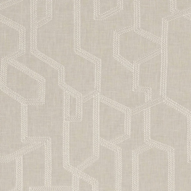
Labyrinth Linen
Exotica
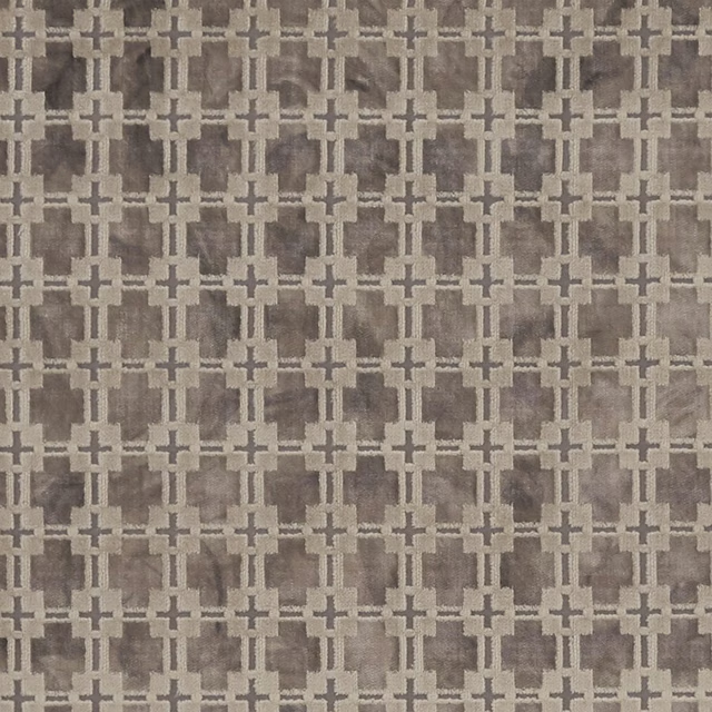
Maui Natural
Exotica
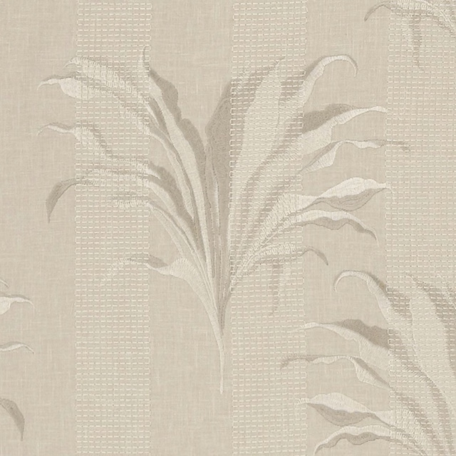
Palma Linen
Exotica
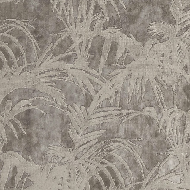
Tropicale Mocha
Exotica
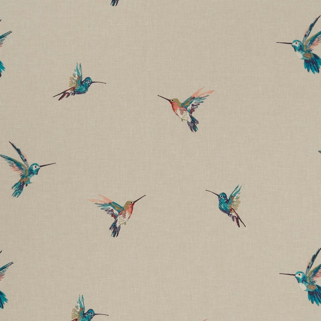
Woodstar Tropical
Exotica
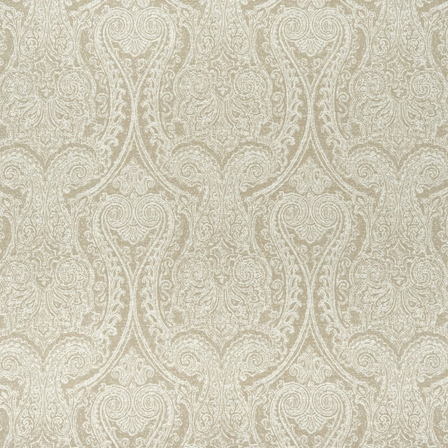
Pastiche Mist
Halcyon
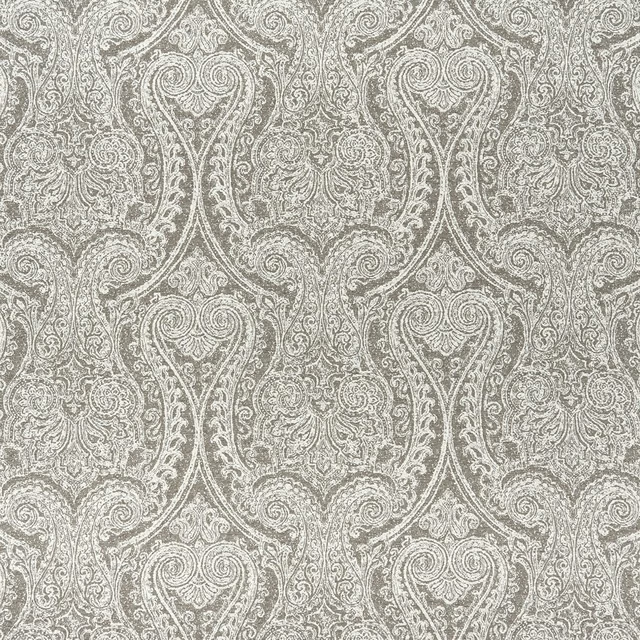
Pastiche Mocha
Halcyon
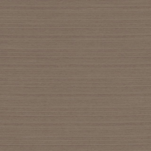
Havana Beaver
Havana and Nevada

Havana Natural
Havana and Nevada
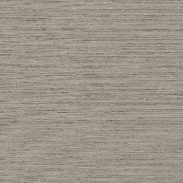
Havana Storm
Havana and Nevada
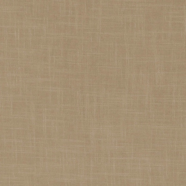
Nevada Harvest
Havana and Nevada
Nevada Truffle
Havana and Nevada