
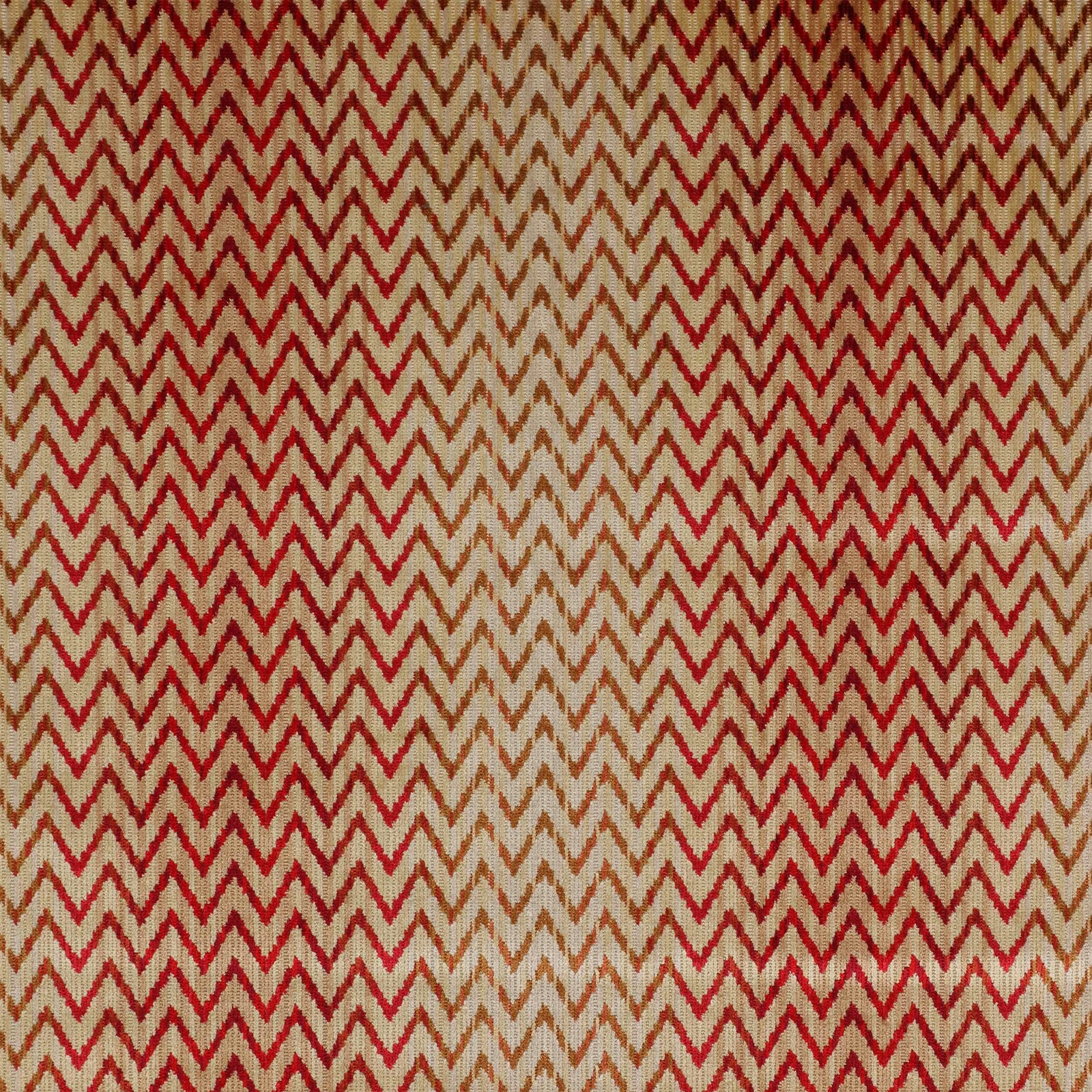

Tap the swatch to see it full screen. Hover it to magnify the weave. Colours on a screen are a guide, not a match, so come and feel the real cloth.
Scroll up or down to zoom in and out.
Jerome Red
Valentina Velvets P/B VelvetF4013-03
Jerome Red pairs a lively zigzag pattern with the plush depth of velvet, giving the swatch a rich, tailored look. The red reads bright and saturated against a warm neutral ground, with a slightly golden cast in the lighter areas.
You have used your previews for today. Send one to Simon and you can carry on.
Your board
0 fabrics
See this fabric on Colefax and Fowler's own site, then order it through us.
See Jerome Red in your own room
A photograph of the piece you want re-covered. Straight on is best, and daylight helps. It is used to make your picture and nothing else.
Looking at your room
We found things here Jerome Red could go on. Tap one on the photograph, or choose below.
We could not see anything to re-cover
, s
Jerome Red, on your
Drag to compare. AI impression, colours indicative: ask us for a cutting before you decide.
About this fabric
This Colefax and Fowler velvet is woven in 100% viscose and has an approximate width of 136cm, with a vertical repeat of 3cm and a horizontal repeat of 34cm. The surface shows a dense, cut-pile velvet handle that catches the light softly, while the chevron pattern keeps the overall effect crisp and graphic. In Jerome Red, the zigzags are rendered in a vivid crimson that contrasts with the warm beige ground, creating a clear two-tone rhythm across the cloth. The colour feels warm rather than cool, with the red appearing saturated and confident rather than dark or muted. With no performance features noted, this is a decorative velvet best chosen for its colour and texture as much as its pattern.
How to use it
Use Jerome Red on a compact armchair, ottoman or cushion where the chevron can be seen up close and the red can warm up a neutral room. It also works well against walnut, brass or cream upholstery, where the beige ground and bright red motif will stand out clearly.
A vivid chevron velvet that brings crisp energy to tailored seating and accent pieces.
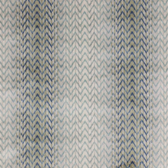
Pairs well with
A pattern needs somewhere for the eye to rest, so these are the plains and textures that sit beside Jerome Red without fighting it. Mixed across the houses we hold, which is the part a single supplier's book cannot do.
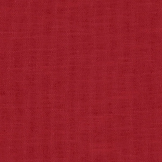
Amalfi Rouge
Amalfi
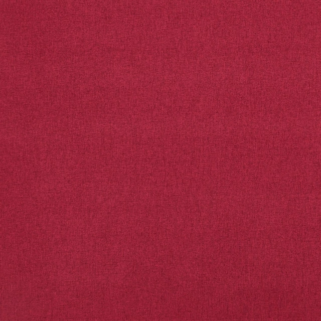
Highlander Crimson
Highlander 2
Cheviot Pimento
Cheviot Fabrics
Corsica Juniper
Plains & Semi Plains
Asta Dark Red
Asta
Capella Red
Gustav
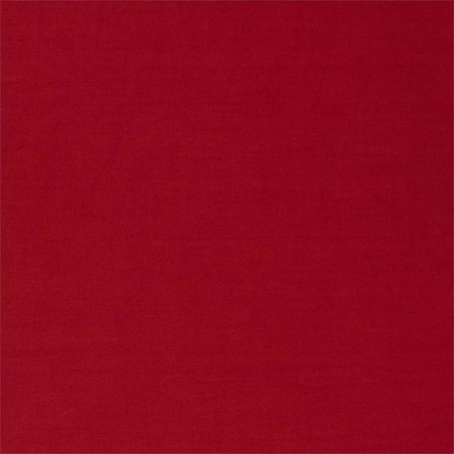
Ruskin Crimson
Ruskin Weaves
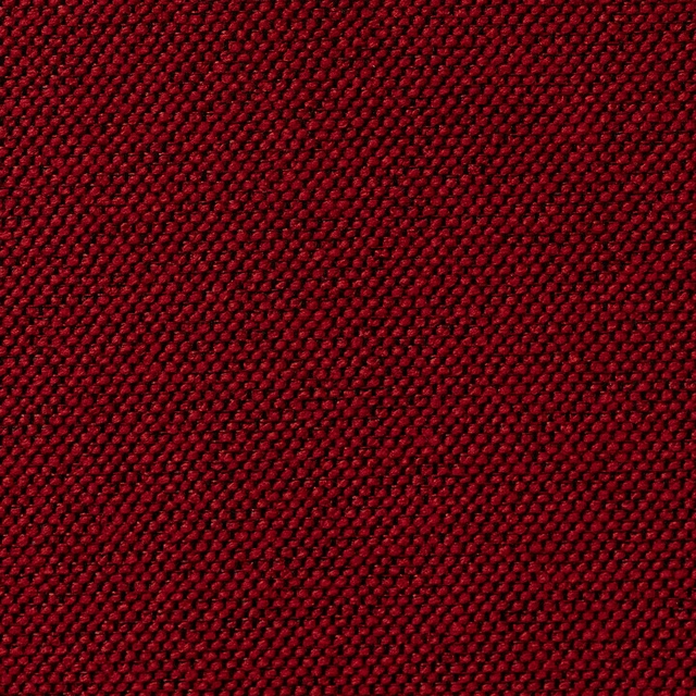
Carson Jalapeno
Carson FR Recycled Weave
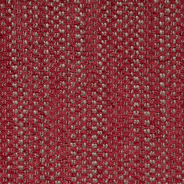
Watson Vixen
Watson FR Recycled Chenille
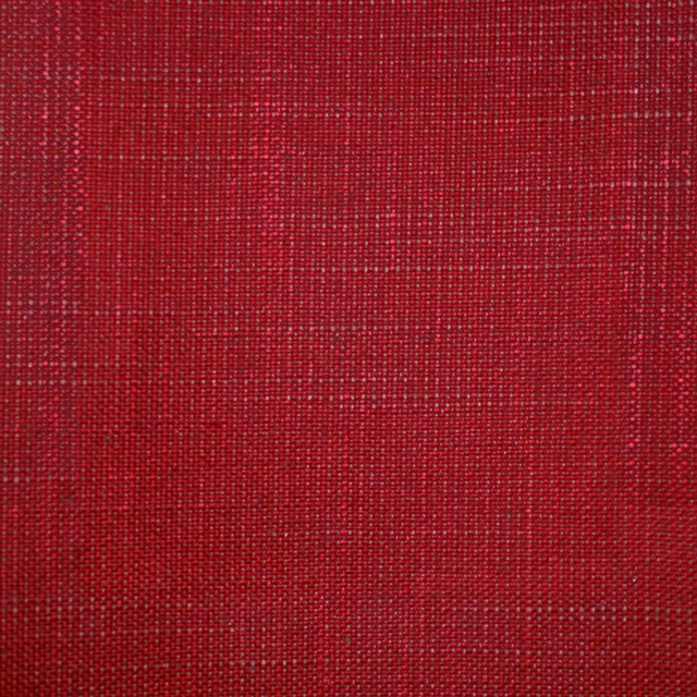
Acer 18* - Crimson
Plain
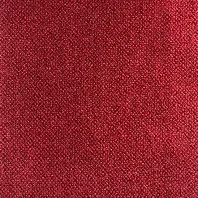
Duo 212
Weave
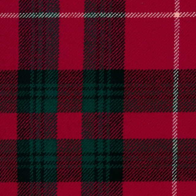
Stuart Of Bute, Mod
Tartans
Paint that goes with it
Two ways to take the room. Both colours are from houses we hold, so a pot can come off the same order as the cloth. Screens shift colour, so treat these as a direction and bring the cloth to the shelf before you buy the paint.
To sit quietly behind it
Red House
Morris & Co. · #a36c57
To stand against it
Farringdon Grey
Morris & Co. · #cbc8c1
Other red fabrics
Across the houses we hold. See all 2,196.
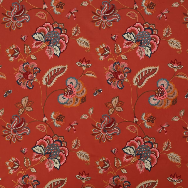
Ashlar Red
Theodore
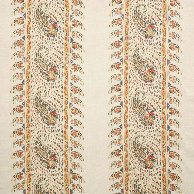
Esta Red/Forest
Theodore
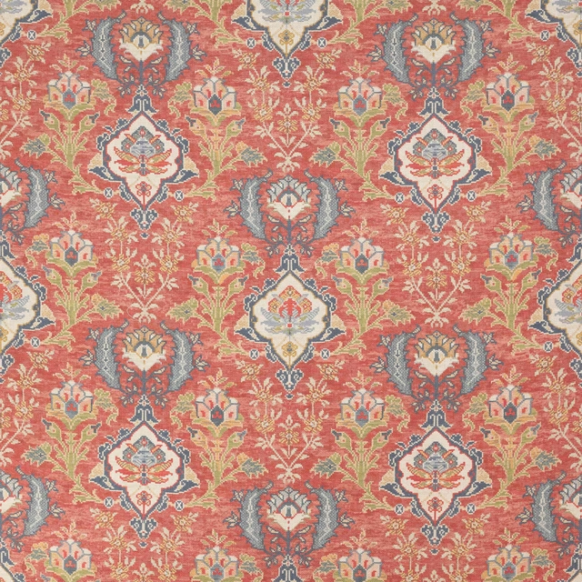
Floriana Red
Theodore
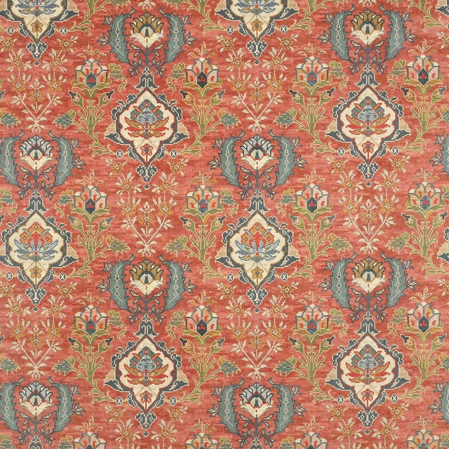
Floriana Velvet Red
Theodore
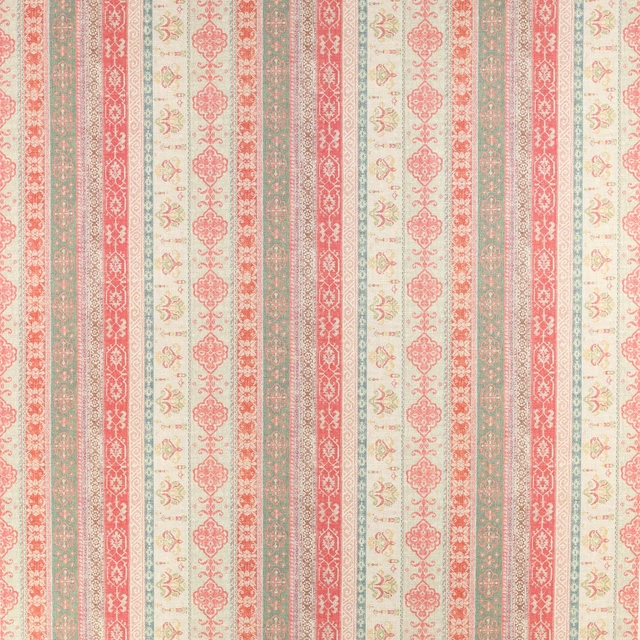
Kempsey Red/Green
Theodore
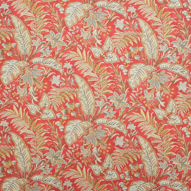
Paisley Leaf Red
Theodore
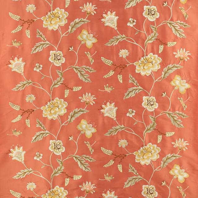
Passerine Red
Theodore
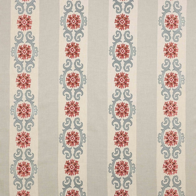
Theodore Tomato/Blue
Theodore
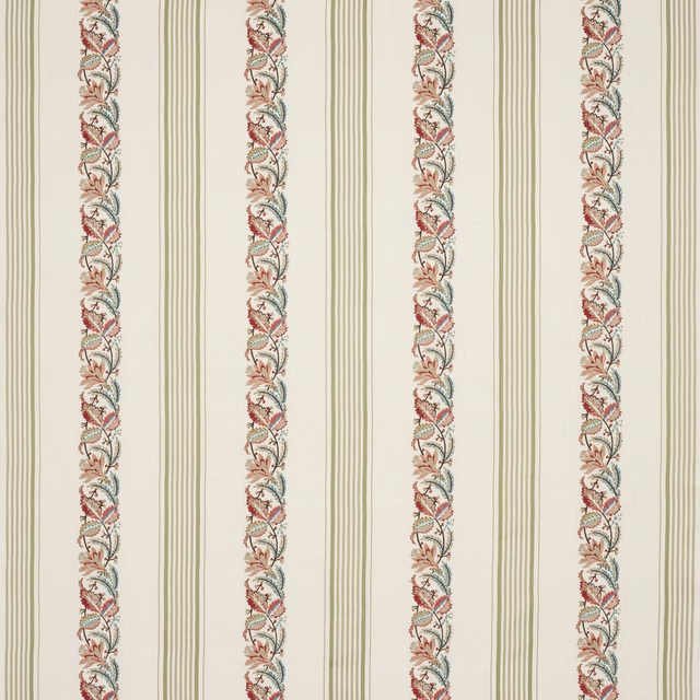
Chesham Red/Green
Tilbury
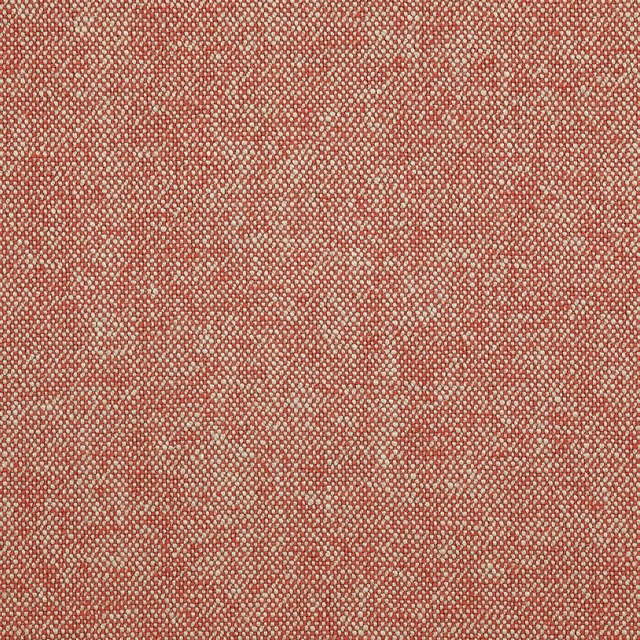
Tyndall Red
Tyndall Linen
Tyndall Tomato
Tyndall Linen
Purachina Scarlet
Amaya Fabrics