
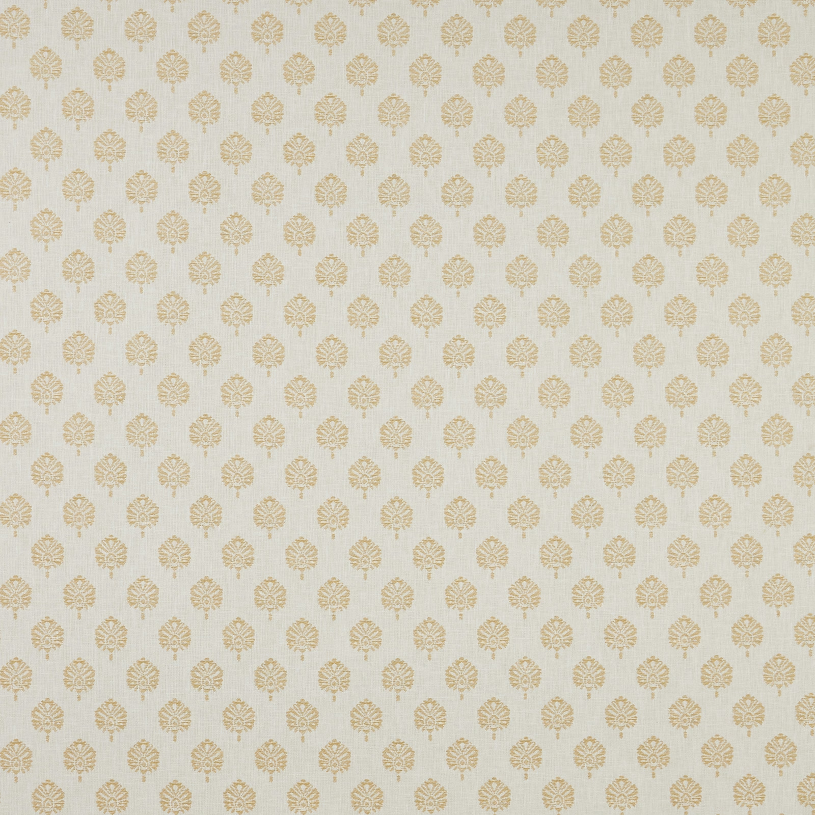

Tap the swatch to see it full screen. Hover it to magnify the weave. Colours on a screen are a guide, not a match, so come and feel the real cloth.
Scroll up or down to zoom in and out.
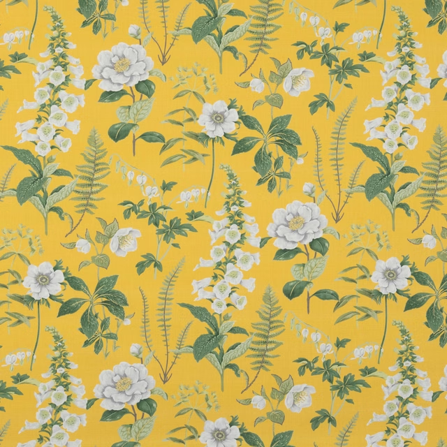
Verini Segoa Ochre Flat
SS25 Images - Verini & Rewilding Fabric
Verini Segoa Ochre Flat shows a small repeating damask motif in a soft ochre gold on a pale, lightly textured ground. The overall effect is refined and airy, with the pattern sitting gently rather than reading as high contrast.
You have used your previews for today. Send one to Simon and you can carry on.
Your board
0 fabrics
See this fabric on iliv's own site, then order it through us.
See Verini Segoa Ochre Flat in your own room
A photograph of the piece you want re-covered. Straight on is best, and daylight helps. It is used to make your picture and nothing else.
Looking at your room
We found things here Verini Segoa Ochre Flat could go on. Tap one on the photograph, or choose below.
We could not see anything to re-cover
, s
Verini Segoa Ochre Flat, on your
Drag to compare. AI impression, colours indicative: ask us for a cutting before you decide.
About this fabric
This colourway from the SS25 Images - Verini & Rewilding collection combines 59% Polyester, 24% Cotton, 13% Viscose and 3% Linen, giving the cloth a balanced handle and a subtly natural surface. The design is set on a usable width of 142cm and has a 35cm horizontal repeat by 23cm vertical repeat, which suits both furnishing panels and tailored upholstery applications. Its 20,000 Martindale rating and General Domestic upholstery grade make it suitable for everyday seating, while the Treatable for FR Drapery and Upholstery specification adds flexibility across the home. Visually, the ochre motif is warm but restrained, with a pale background that keeps the pattern light and elegant rather than heavy. The small-scale repeat and soft woven texture give it a neat, composed finish that feels more tailored than rustic.
How to use it
Use this ochre colourway to bring warmth to linen-toned upholstery, Roman blinds or full-length curtains where you want pattern without darkness. It works especially well with oak, aged brass and chalky paint colours.
Pairs beautifully with warm woods and quiet neutrals for a polished, heritage feel.
More from SS25 Images - Verini & Rewilding
The same book, other colourways.
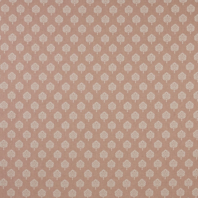
Verini Segoa Blush Flat
SS25 Images - Verini & Rewilding
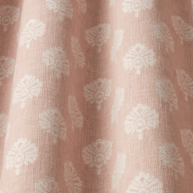
Verini Segoa Blush Wavy
SS25 Images - Verini & Rewilding
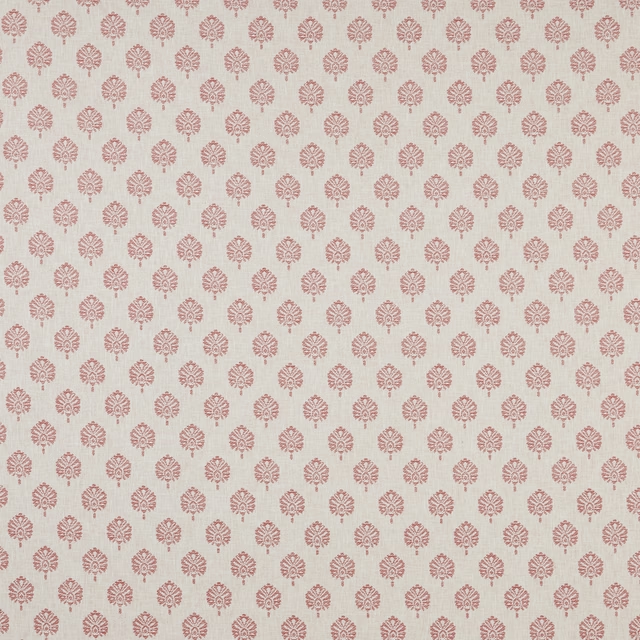
Verini Segoa Dark Coral Flat
SS25 Images - Verini & Rewilding
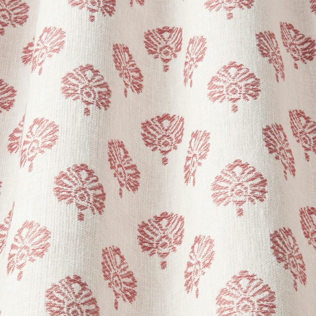
Verini Segoa Dark Coral Wavy
SS25 Images - Verini & Rewilding
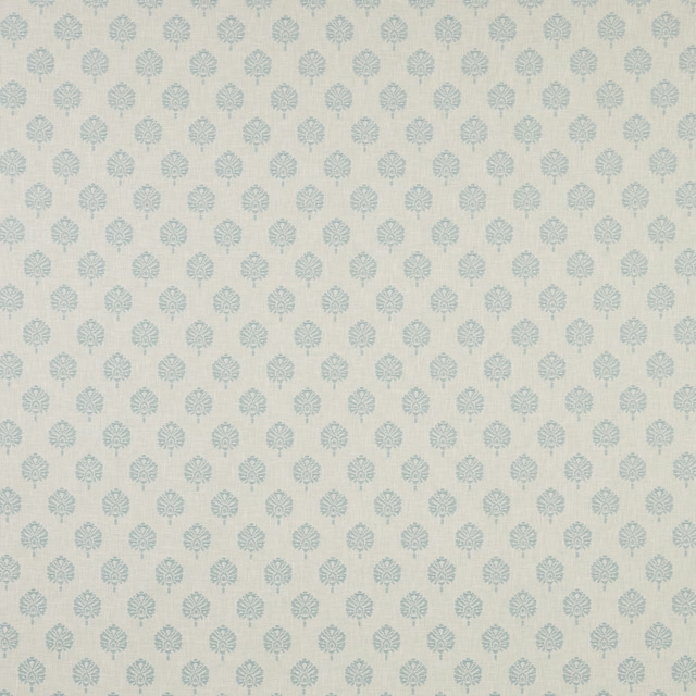
Verini Segoa Glacier Flat
SS25 Images - Verini & Rewilding
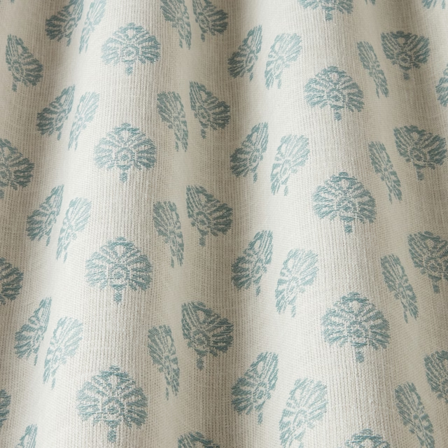
Verini Segoa Glacier Wavy
SS25 Images - Verini & Rewilding
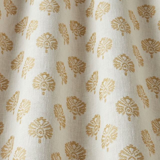
Verini Segoa Ochre Wavy
SS25 Images - Verini & Rewilding
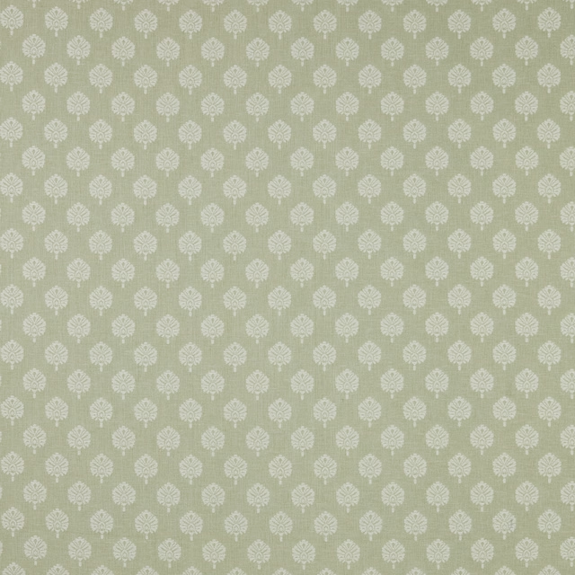
Verini Segoa Sage Flat
SS25 Images - Verini & Rewilding
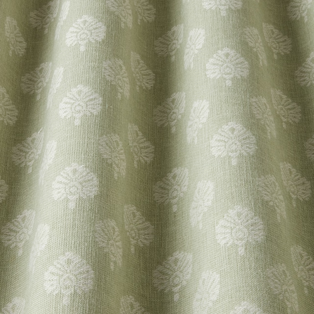
Verini Segoa Sage Wavy
SS25 Images - Verini & Rewilding
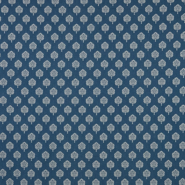
Verini Segoa Sapphire Flat
SS25 Images - Verini & Rewilding
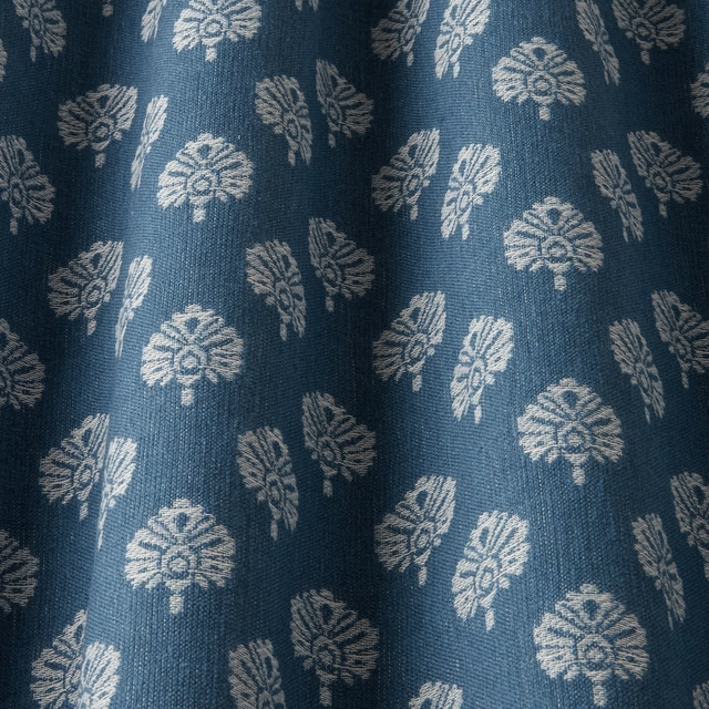
Verini Segoa Sapphire Wavy
SS25 Images - Verini & Rewilding
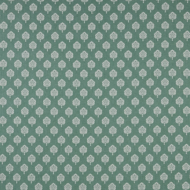
Verini Segoa Sea Green Flat
SS25 Images - Verini & Rewilding
Pairs well with
A pattern needs somewhere for the eye to rest, so these are the plains and textures that sit beside Verini Segoa Ochre Flat without fighting it. Mixed across the houses we hold, which is the part a single supplier's book cannot do.
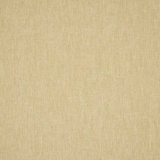
Royce Ochre
Royce
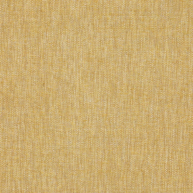
Lloyd Ochre
Sansa
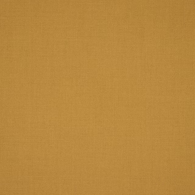
Malo Ocre
Corti

Austen Ochre
Darwin Collection

Alie Sunflower
Essential Weaves Vol 2
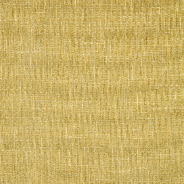
Albany Chartreuse
Albany and Moray
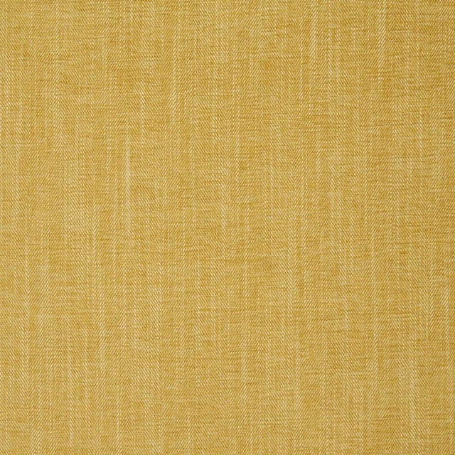
Moray Chartreuse
Albany and Moray

Eaton Plain Maize
Eaton Checks and Stripes

Pavane Gold
Racine Fabrics
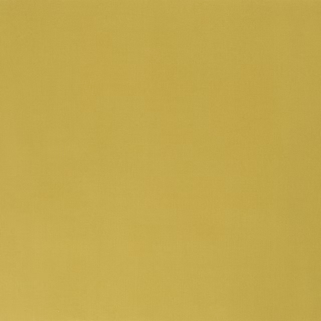
Vienne Butterscotch
Vienne
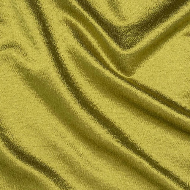
Alchemy Pampas
Alchemy
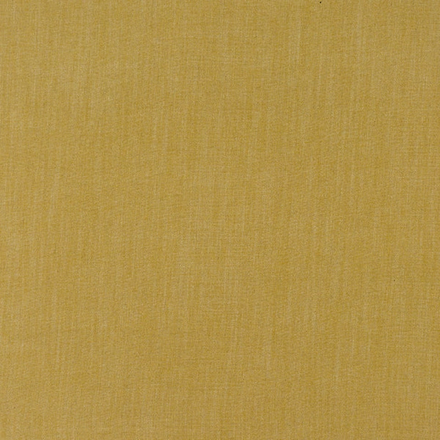
Monza Ochre
Arezzo
Paint that goes with it
Two ways to take the room. Both colours are from houses we hold, so a pot can come off the same order as the cloth. Screens shift colour, so treat these as a direction and bring the cloth to the shelf before you buy the paint.
To sit quietly behind it
Country Linen
Sanderson · #d4cdbd
To stand against it
City Grey
Zoffany · #6c6666
Other yellow fabrics
Across the houses we hold. See all 1,033.
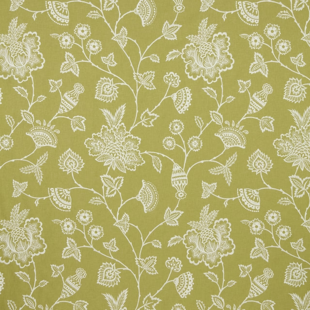
Litha Spring Flat
SS23 Images - Babooshka
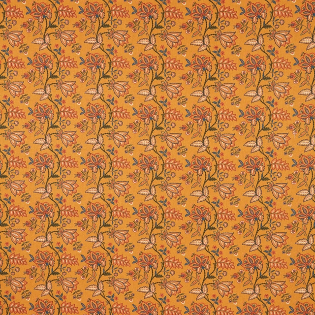
Maharishi Tapestry Flat
SS23 Images - Babooshka
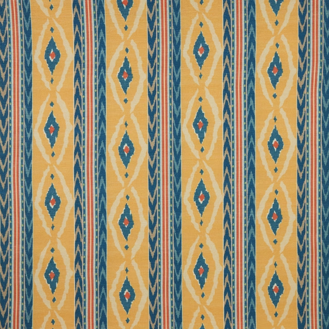
Santana Saffron Flat
SS23 Images - Babooshka
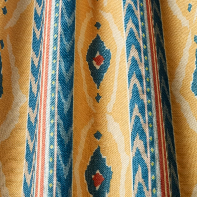
Santana Saffron Wavy
SS23 Images - Babooshka
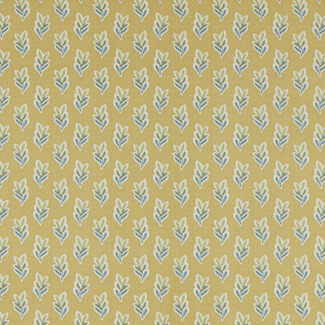
Jardine Lalita Quince Flat
SS24 Images - Jardine, Luxoria & Orissa
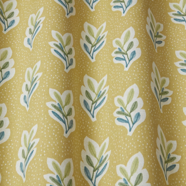
Jardine Lalita Quince Wavy
SS24 Images - Jardine, Luxoria & Orissa
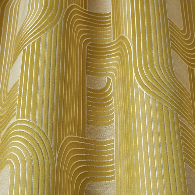
Luxoria Ritzy Topaz Wavy
SS24 Images - Jardine, Luxoria & Orissa
Botanical Archive Glenhaven Primrose
SS26 Images - Botanical Archive, Terrana & Hartland
Calobra Tumeric
Weave
Anna Ticking Tumeric
Weave
Acer 42 - Citron
Plain
Floren Linen - Mustard