
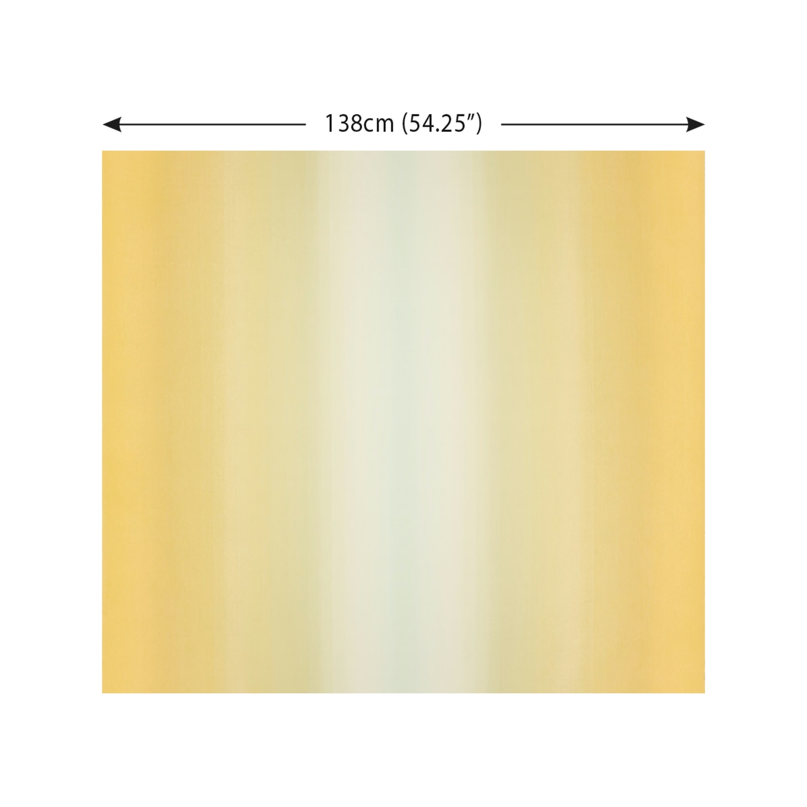

Tap the swatch to see it full screen. Hover it to magnify the weave. Colours on a screen are a guide, not a match, so come and feel the real cloth.
Scroll up or down to zoom in and out.
Dip Oasis
Graphic Nature Fabric
Dip Oasis brings a soft, sunlit palette to the Graphic Nature collection, with golden yellow shading into a pale mint centre. Its vertical bands are deliberately blurred, giving the colour movement without a hard stripe.
You have used your previews for today. Send one to Simon and you can carry on.
Your board
0 fabrics
See this fabric on Kirkby Design's own site, then order it through us.
See Dip Oasis in your own room
A photograph of the piece you want re-covered. Straight on is best, and daylight helps. It is used to make your picture and nothing else.
Looking at your room
We found things here Dip Oasis could go on. Tap one on the photograph, or choose below.
We could not see anything to re-cover
, s
Dip Oasis, on your
Drag to compare. AI impression, colours indicative: ask us for a cutting before you decide.
About this fabric
The swatch shows warm golden yellow and ochre concentrated towards the outer areas, fading through creamy tones into a quiet pale mint-green centre. Broad vertical bands are visible, but their edges feather gently rather than forming a crisp geometric stripe. The surface appears smooth and even in the photograph, with the tonal shifts creating more depth than a flat solid colour. A 138cm (54.25") width is marked across the swatch.
How to use it
Bring Dip Oasis into a relaxed sitting room with pale timber, warm ivory and muted sage, allowing the ochre edges to add gentle warmth while the mint centre keeps the scheme fresh.
Use the warm ochre edges to anchor pale, airy schemes, or echo the mint centre with cool green and chalky neutrals.
More from Graphic Nature
The same book, other colourways.
Arenite Blossom
Graphic Nature
Arenite Fern
Graphic Nature
Arenite Hazelwood
Graphic Nature
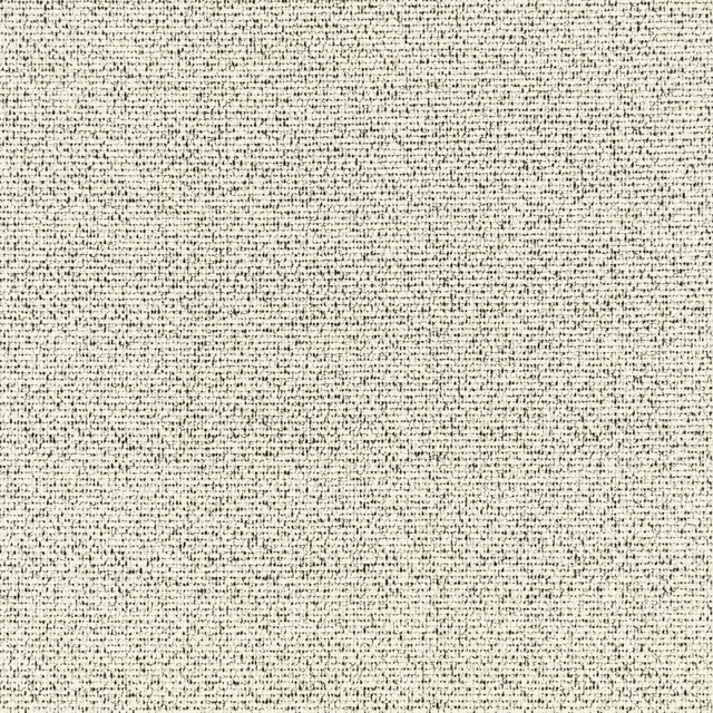
Arenite Monochrome
Graphic Nature
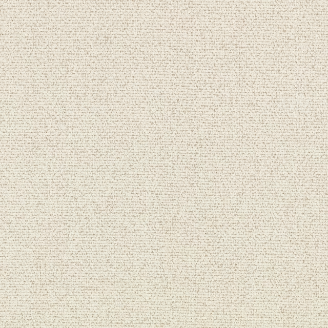
Arenite Natural
Graphic Nature
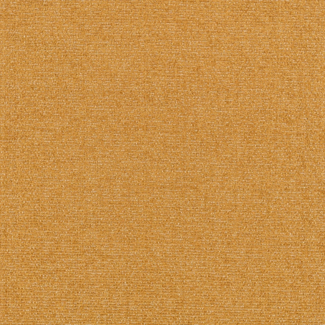
Arenite Ochre
Graphic Nature
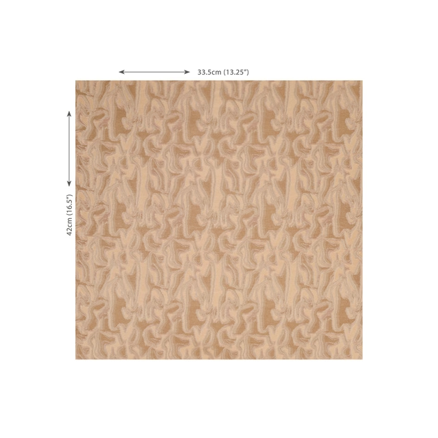
Glint Patina
Graphic Nature
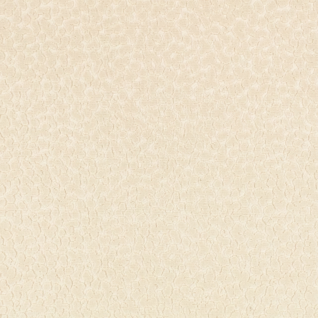
Pop Chalk
Graphic Nature
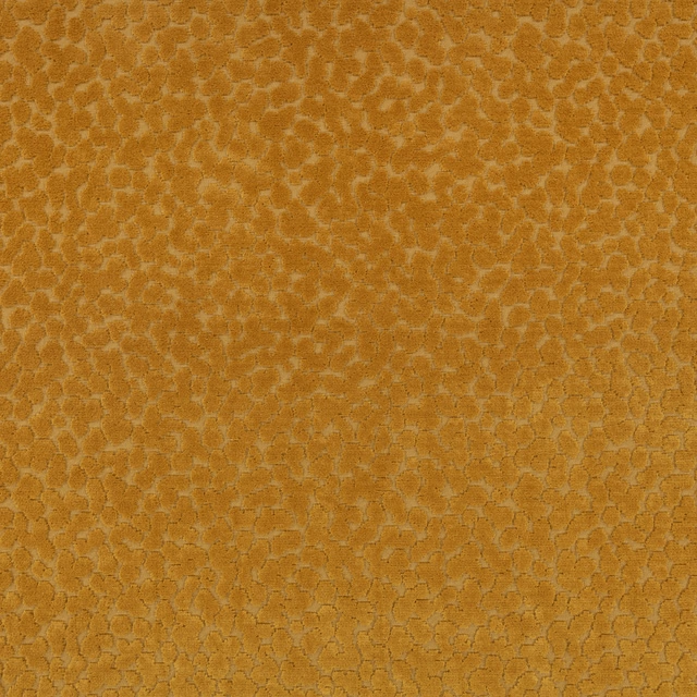
Pop Tobacco
Graphic Nature
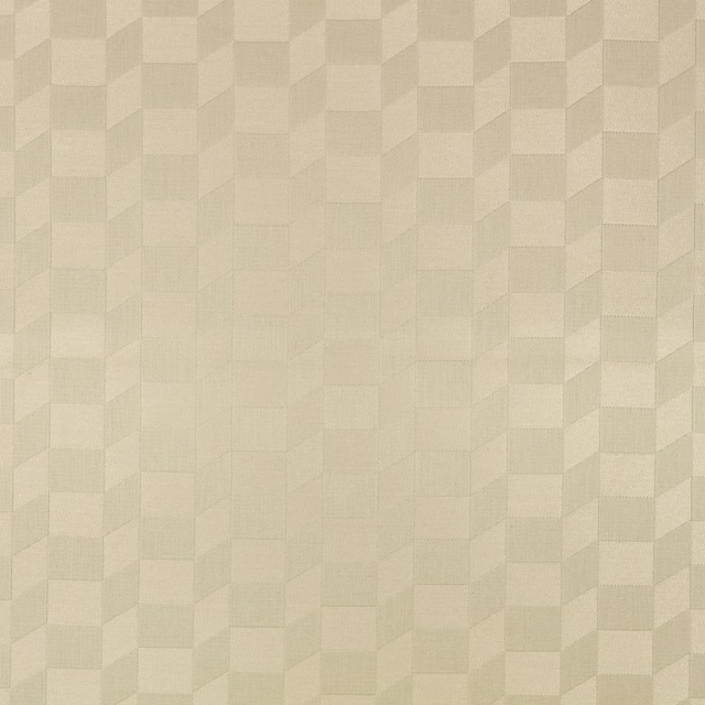
Racer Buff
Graphic Nature
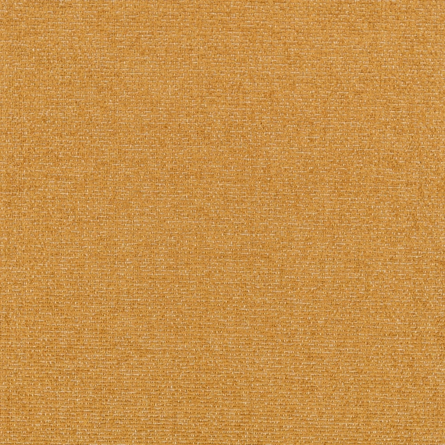
Racer Ochre
Graphic Nature

Racer Oyster
Graphic Nature
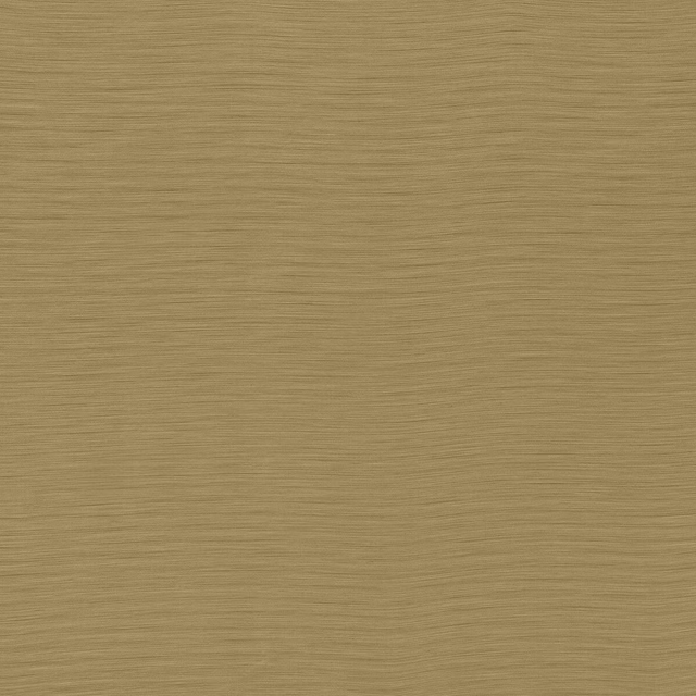
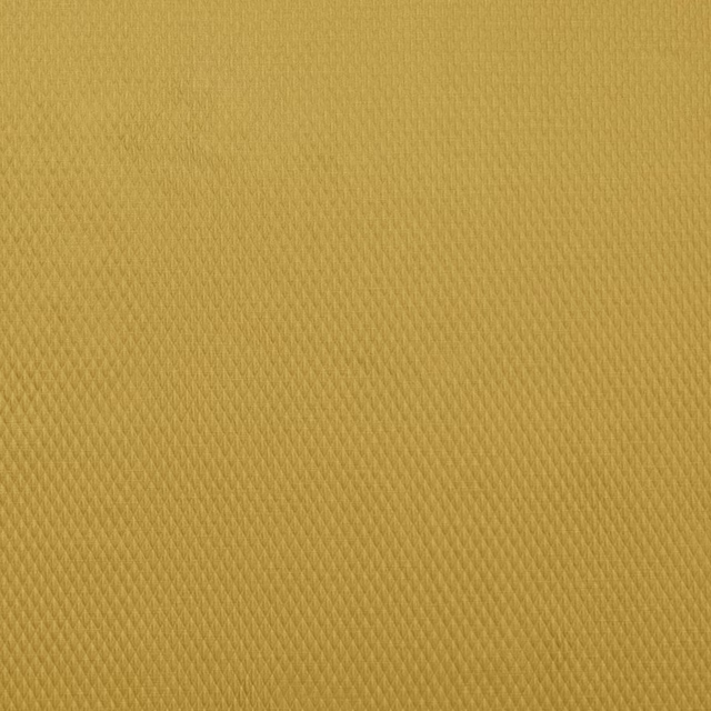
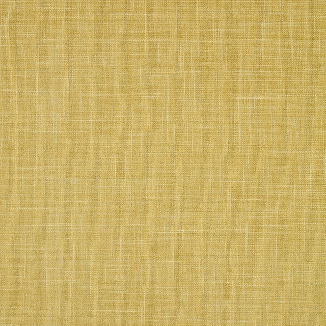
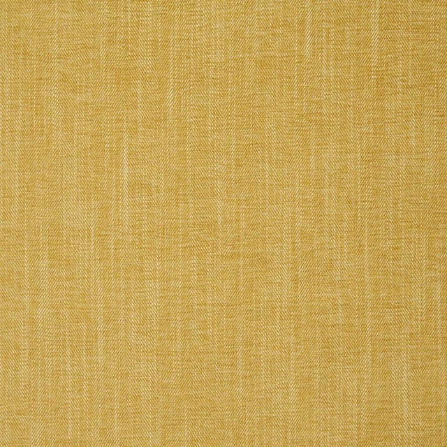
Pairs well with
A pattern needs somewhere for the eye to rest, so these are the plains and textures that sit beside Dip Oasis without fighting it. Mixed across the houses we hold, which is the part a single supplier's book cannot do.
Austen Ochre
Darwin Collection
Alie Sunflower
Essential Weaves Vol 2
Albany Chartreuse
Albany and Moray
Moray Chartreuse
Albany and Moray
Eaton Plain Maize
Eaton Checks and Stripes
Eaton Plain Ochre
Eaton Checks and Stripes
Pavane Gold
Racine Fabrics
Vienne Butterscotch
Vienne
Alchemy Pampas
Alchemy
Monza Ochre
Arezzo
Ario Wide Width Buttermilk
Ario
Silene Honey/First Light/Ochre
Idyllic Fabrics
Paint that goes with it
Two ways to take the room. Both colours are from houses we hold, so a pot can come off the same order as the cloth. Screens shift colour, so treat these as a direction and bring the cloth to the shelf before you buy the paint.
To sit quietly behind it
Asparagus
Zoffany · #efeacd
To stand against it
Baked
Coat Paints · #c18469
Other yellow fabrics
Across the houses we hold. See all 1,033.
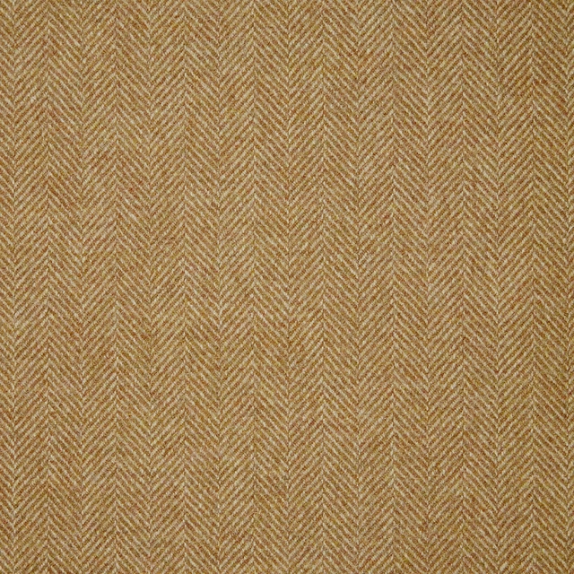
Herringbone - Mustard
Misc
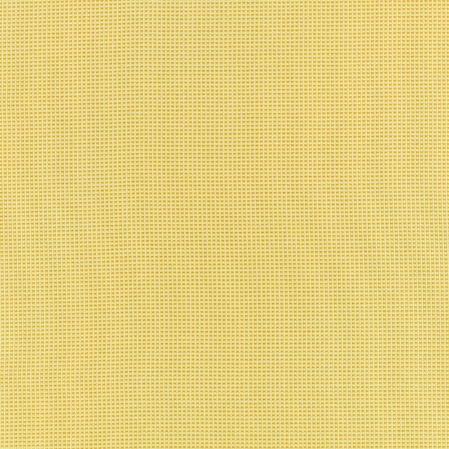
Picnic Dijon
Picnicoutdoor
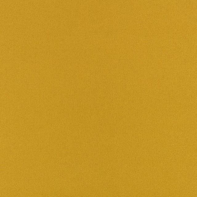
Sol Dijon
Picnicoutdoor
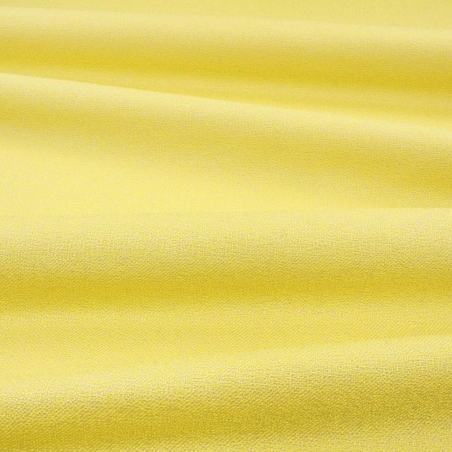
Sol Lemonade
Picnicoutdoor
Unwind Dijon
Picnicoutdoor
Code Ochre
4d Upholstery
Stack Ochre
Flow
Merlon Custard
Heir

Visionfr Butter
Vision Fr
Chelsea Mustard
Chelsea Ii
Chelsea Yuzu
Chelsea Ii
Crush Fr Easyclean Mustard
Crush Iii