

Tap the swatch to see it full screen. Hover it to magnify the weave. Colours on a screen are a guide, not a match, so come and feel the real cloth.
Scroll up or down to zoom in and out.
Sprinkles Pacific
Diffusion Fabricsprinkl/fa1/pac
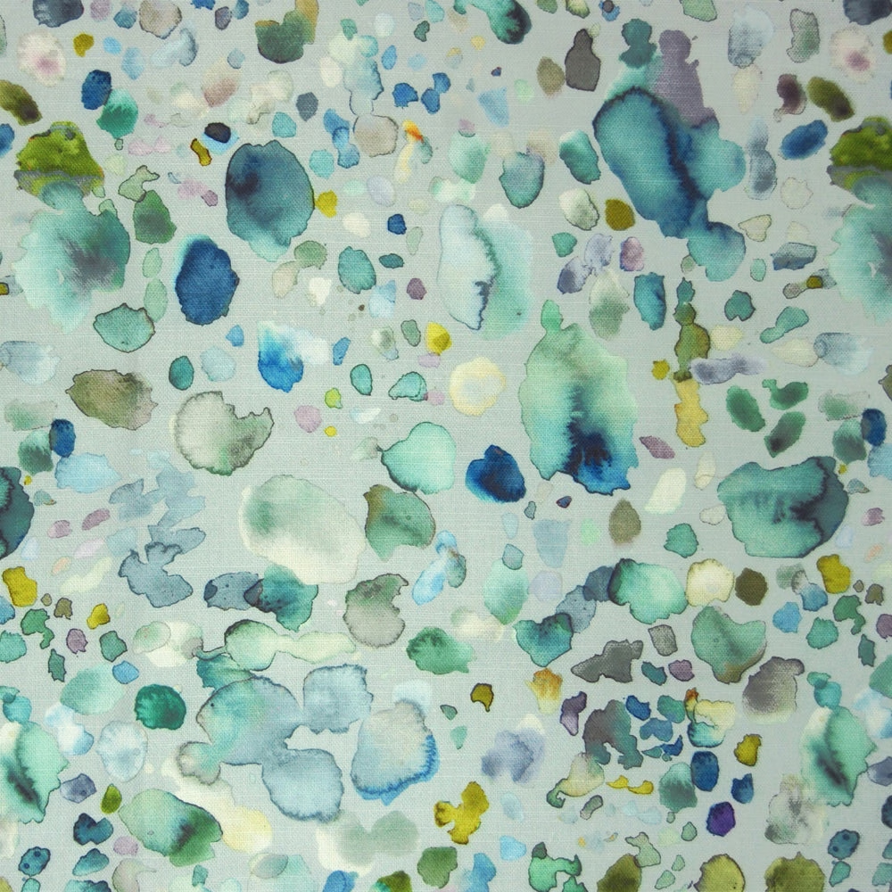
Sprinkles Pacific reads as a softly scattered, watercolour-style print in fresh mint, sea-glass and blue-green shades over a pale ground. The irregular spots give the fabric a light, painterly movement that feels airy rather than busy.
You have used your previews for today. Send one to Simon and you can carry on.
Your board
0 fabrics
Part of the range we hold from Voyage Maison.
See Sprinkles Pacific in your own room
A photograph of the piece you want re-covered. Straight on is best, and daylight helps. It is used to make your picture and nothing else.
Looking at your room
We found things here Sprinkles Pacific could go on. Tap one on the photograph, or choose below.
We could not see anything to re-cover
, s
Sprinkles Pacific, on your
Drag to compare. AI impression, colours indicative: ask us for a cutting before you decide.
About this fabric
Woven in 95% cotton and 5% linen, this 230gsm fabric has enough substance for soft furnishings and relaxed window treatments, while the usable width is 140cm from a full width of 145cm. The print shows a misty mix of mint, aqua, teal and occasional yellow-green accents, with cooler blue notes adding depth against the pale background. Its scattered, pebble-like marks create a lively but softened surface, and the overall effect stays fresh and cool rather than saturated. Dry clean only care and a cool iron finish make it a practical decorative textile for curtains, blinds and cushions. The horizontal pattern repeat is 35cm and the vertical repeat is 41.2cm.
How to use it
This colourway works well in light, coastal or botanical schemes where its cool green tones can sit against white paint, limestone and pale timber. Pair it with linen upholstery or brushed brass accents to keep the room feeling crisp and gently layered.
Use with pale woods and chalky neutrals to let the watery green palette stay fresh and light.
More from Diffusion
The same book, other colourways.
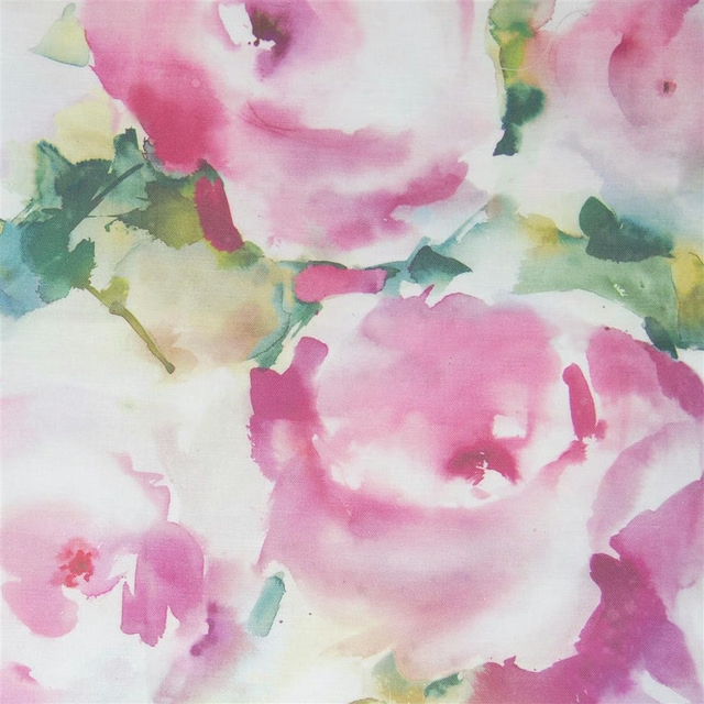
Rosa Peony
Diffusion
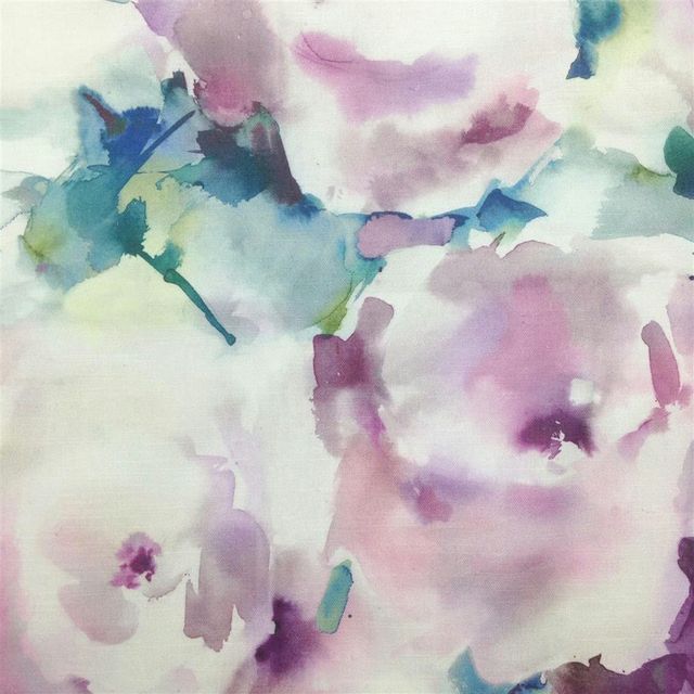
Rosa Orchid
Diffusion
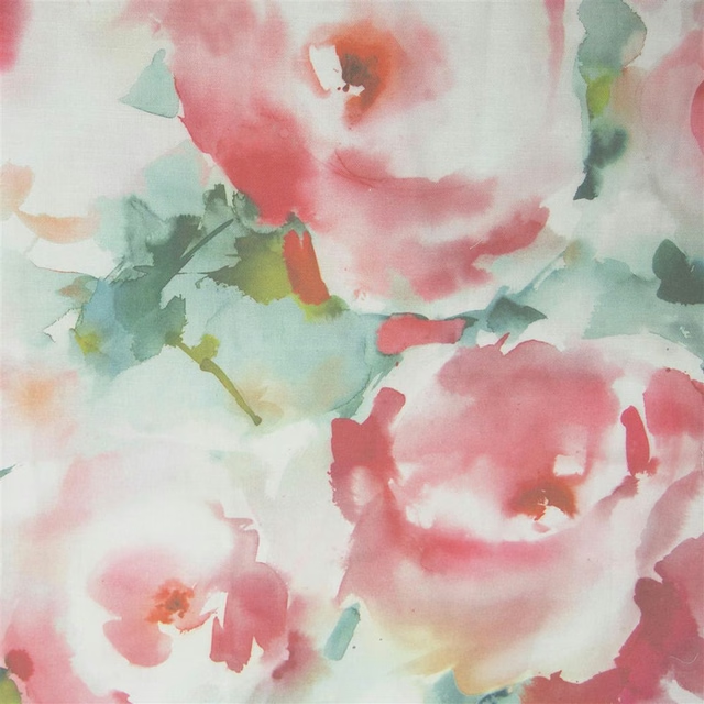
Rosa Russet
Diffusion
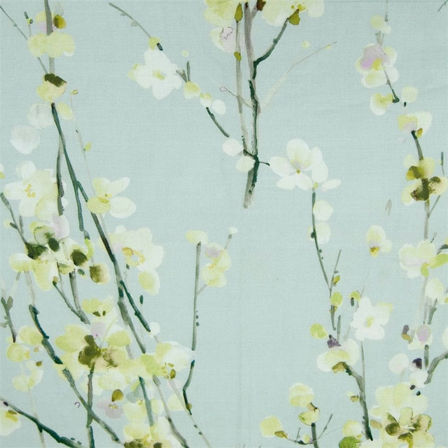
Seville Spring Meadow
Diffusion
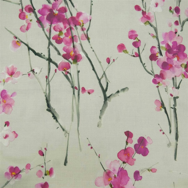
Seville Blossom Slate
Diffusion
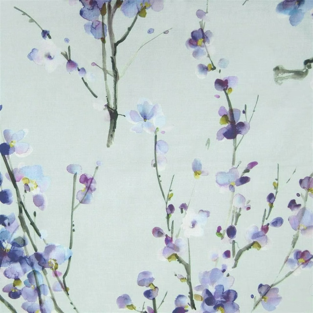
Seville Violet Duck Egg
Diffusion
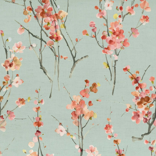
Seville Russet
Diffusion
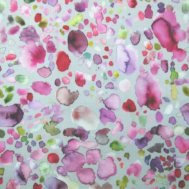
Sprinkles Raspberry
Diffusion
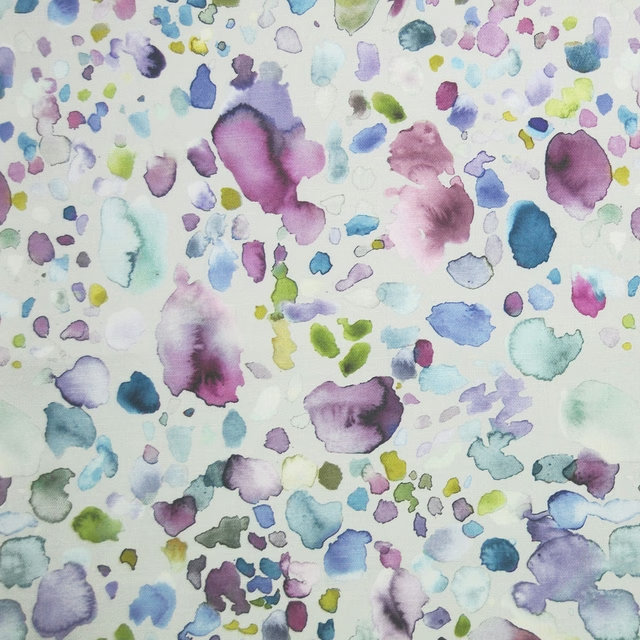
Sprinkles Damson
Diffusion
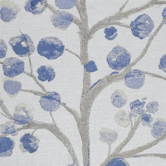
Topola Bluebell
Diffusion
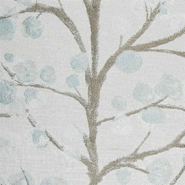
Topola Slate
Diffusion
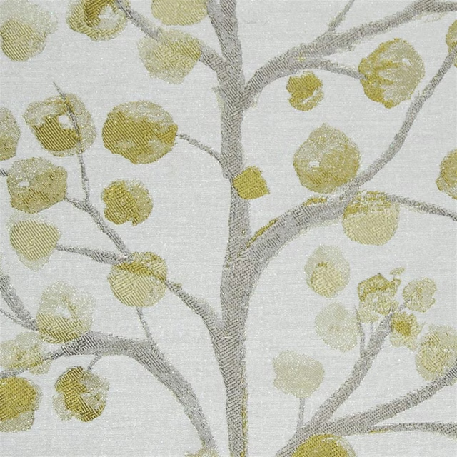
Topola Spring
Diffusion
Pairs well with
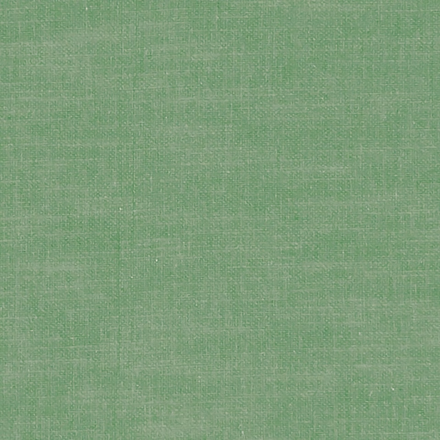
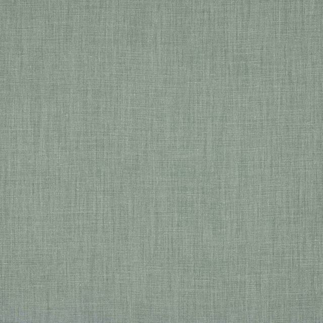
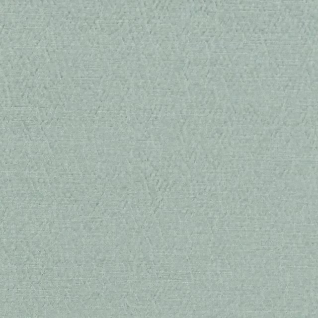
A pattern needs somewhere for the eye to rest, so these are the plains and textures that sit beside Sprinkles Pacific without fighting it. Mixed across the houses we hold, which is the part a single supplier's book cannot do.



Paint that goes with it
Two ways to take the room. Both colours are from houses we hold, so a pot can come off the same order as the cloth. Screens shift colour, so treat these as a direction and bring the cloth to the shelf before you buy the paint.
To sit quietly behind it
Mumingtons Stem
Morris & Co. · #9eb0a2
To stand against it
Newby Green
Sanderson · #425564
Other green fabrics
Across the houses we hold. See all 4,855.
Elai Sage
Country Folk
Juna Sage
Country Folk
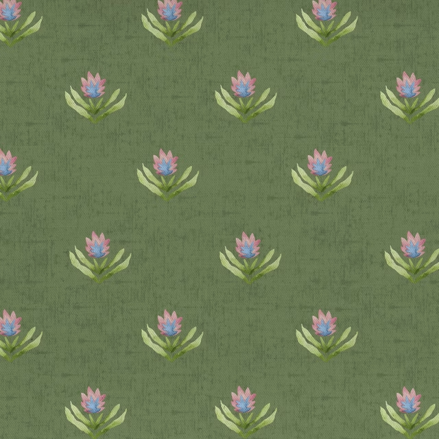
Raja Sage
Country Folk
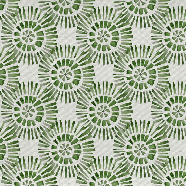
Vali Sage
Country Folk
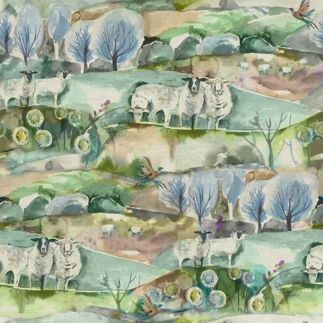
Buttermere Sage
Countryimpressions
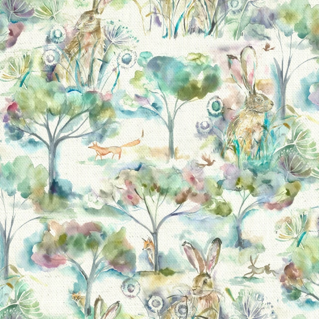
Grassmere Sweetpea
Countryimpressions
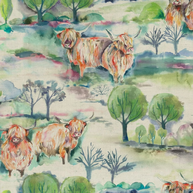
Heilanherd Sage
Countryimpressions
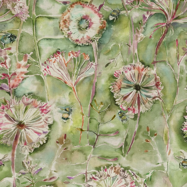
Langdale Sweetpea
Countryimpressions
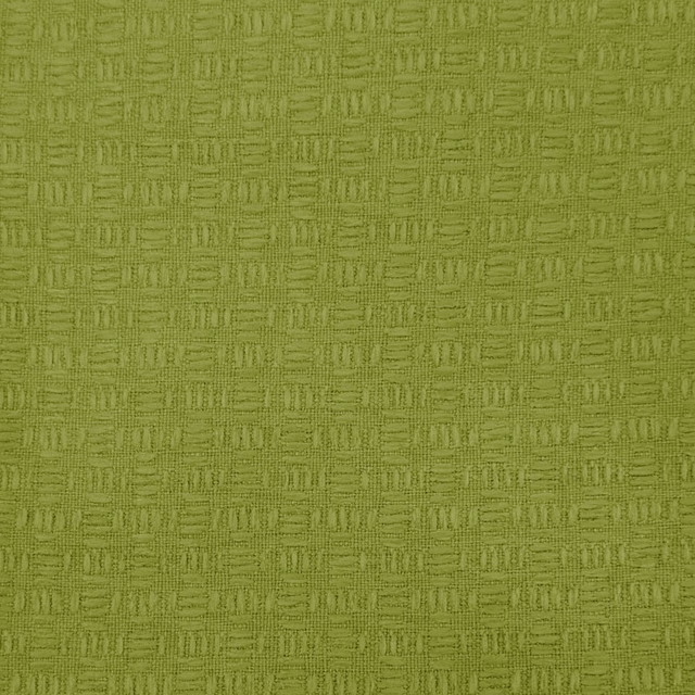
Nessa Citrus
Countryimpressions
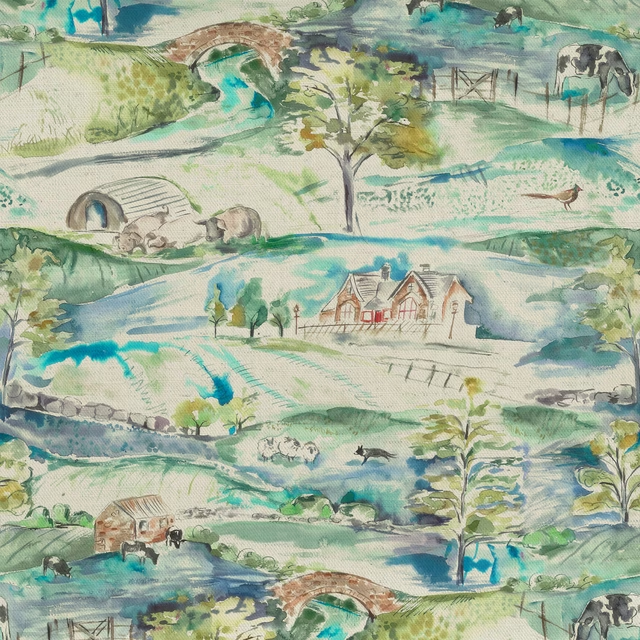
Ullswater Multi
Countryimpressions
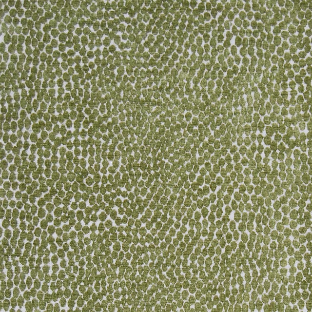
Pebble Peridot
Diffusionweaves
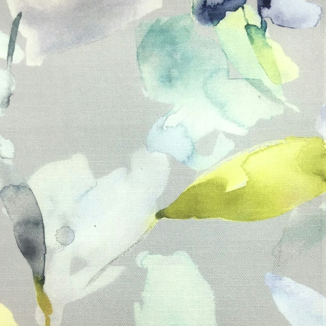
Naura Zest
Equator