
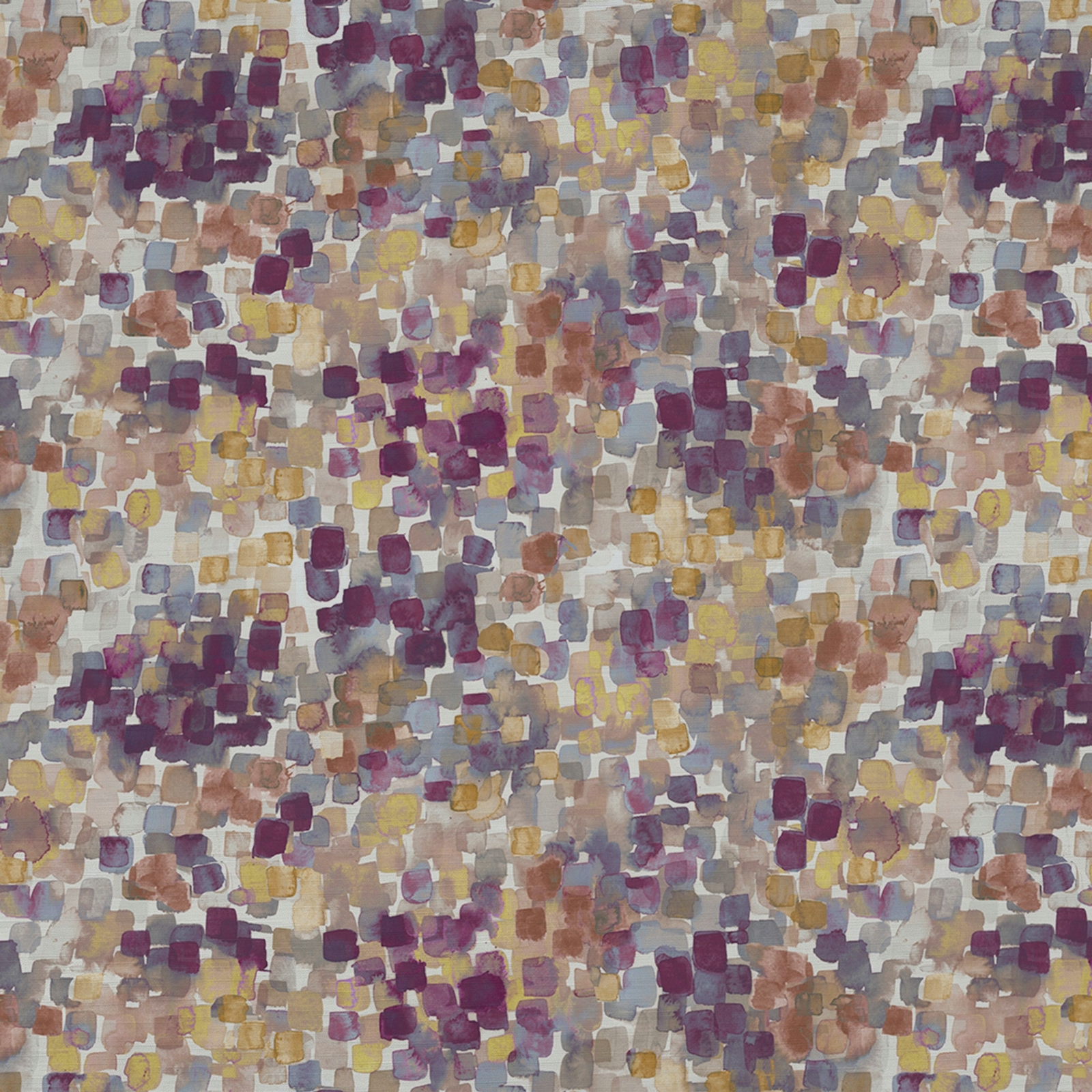

Tap the swatch to see it full screen. Hover it to magnify the weave. Colours on a screen are a guide, not a match, so come and feel the real cloth.
Scroll up or down to zoom in and out.
Vicente Elderberry
Quintessence Fabricvicente/fa1/eld
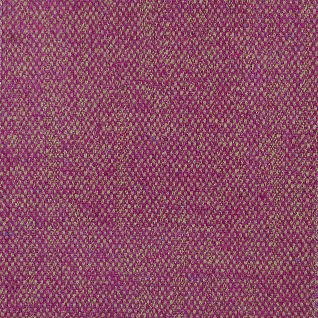
Vicente Elderberry has a painterly, mosaic-like surface of small brushy squares in mulberry, blush, taupe and soft gold. The overall effect is softly mottled and lively, with the pinks reading more plum-toned than sugary.
You have used your previews for today. Send one to Simon and you can carry on.
Your board
0 fabrics
Part of the range we hold from Voyage Maison.
See Vicente Elderberry in your own room
A photograph of the piece you want re-covered. Straight on is best, and daylight helps. It is used to make your picture and nothing else.
Looking at your room
We found things here Vicente Elderberry could go on. Tap one on the photograph, or choose below.
We could not see anything to re-cover
, s
Vicente Elderberry, on your
Drag to compare. AI impression, colours indicative: ask us for a cutting before you decide.
About this fabric
Woven as a fabric, Vicente Elderberry in the Quintessence collection combines 65% viscose and 35% polyester for a fluid but substantial handle at 270gsm. The design shows an abstract scattering of blocky marks, with deep berry accents set against misty grey, pale beige and washed yellow tones. This colourway feels warm and layered rather than bright, with the mauve and mulberry notes giving it a richer, more mature pink impression. It is supplied at 140cm wide with a 46cm horizontal repeat and 30.5cm vertical repeat, and is suitable for curtains, blinds and soft furnishings. Dry clean only and do not iron.
How to use it
This muted pink palette works well with oat, stone and antique brass, especially where you want the pattern to add movement without overpowering the room. It also sits comfortably with timber finishes and soft grey upholstery.
Use with warm neutrals or muted metallics to let the plum and blush tones stand out.


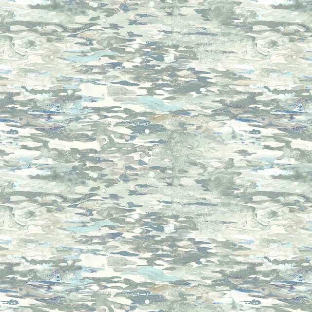
Pairs well with
A pattern needs somewhere for the eye to rest, so these are the plains and textures that sit beside Vicente Elderberry without fighting it. Mixed across the houses we hold, which is the part a single supplier's book cannot do.
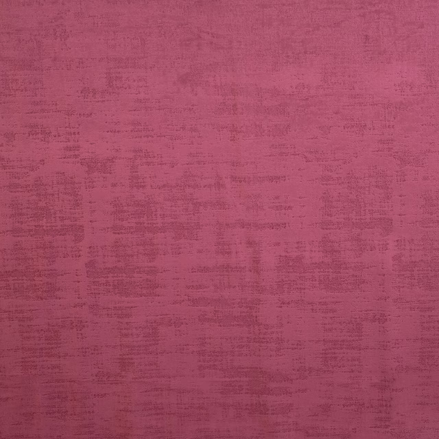
Dakota Berry
Dakota Collection

Galaxy Blush
Galaxy Collection
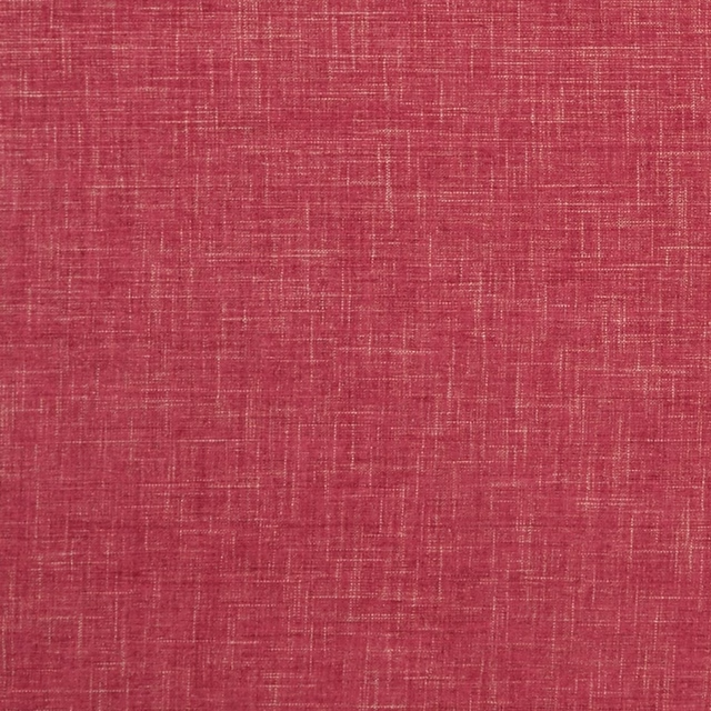
Albany Raspberry
Albany and Moray
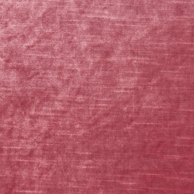
Allure Candy
Allure

Marldon Pink
Albeck
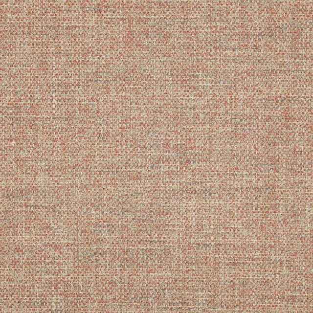
Foley Pink
Brett Weaves
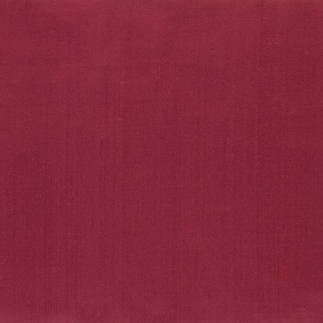
Amboise Crhysantemum
Amboise

Reverdy Magenta
Carlu WALLPAPER
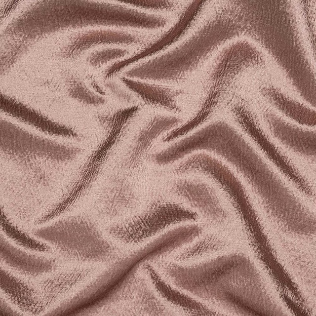
Alchemy Dusky Pink
Alchemy

Kensington Antique Rose
Brodsworth
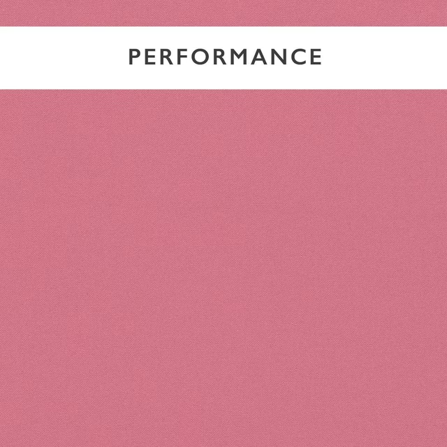
Allegra Peony
Allegra
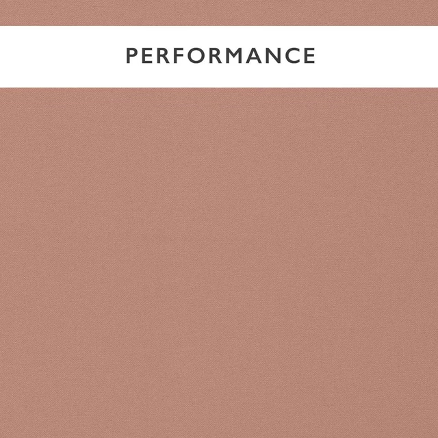
Allegra Postiano
Allegra
Paint that goes with it
Two ways to take the room. Both colours are from houses we hold, so a pot can come off the same order as the cloth. Screens shift colour, so treat these as a direction and bring the cloth to the shelf before you buy the paint.
To sit quietly behind it
Pheasant
Zoffany · #908780
To stand against it
Carmine
Little Greene · #d5666c
Other pink fabrics
Across the houses we hold. See all 2,519.
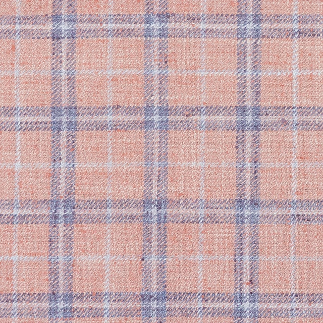
Painswick Blush
Painswick
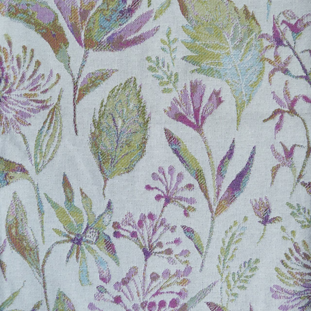
Elder Lilac
Pennington
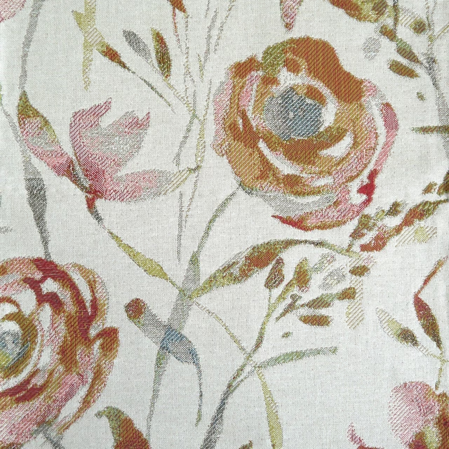
Meerwood Rose
Penningtonweaves
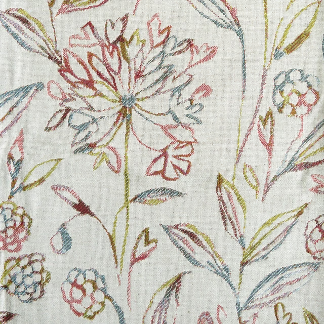
Pennington Coral
Penningtonweaves
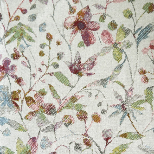
Rydal Rose
Penningtonweaves
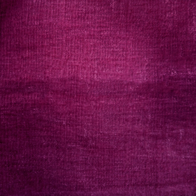
Rimini Tulip
Rimini
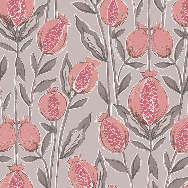
Rithani Mauve
Rithani
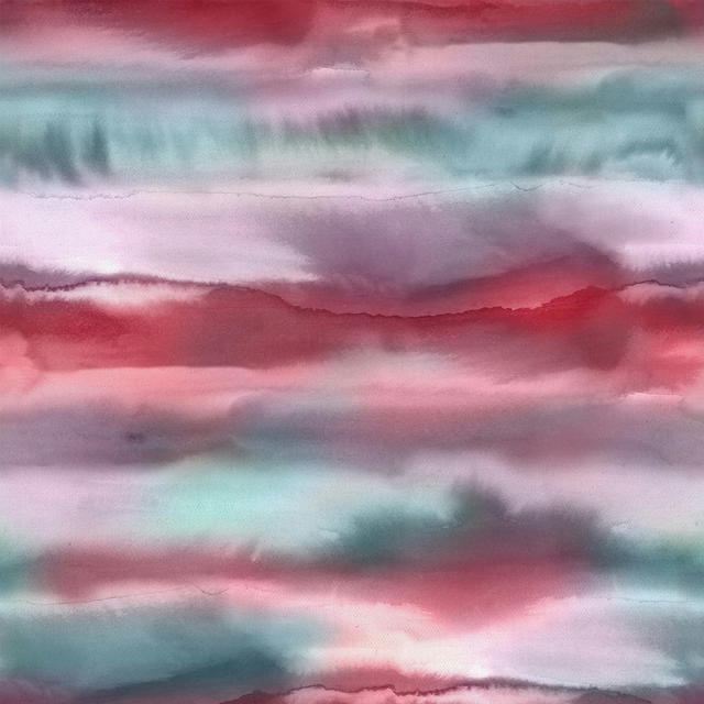
Fjord Abalone
Riviera
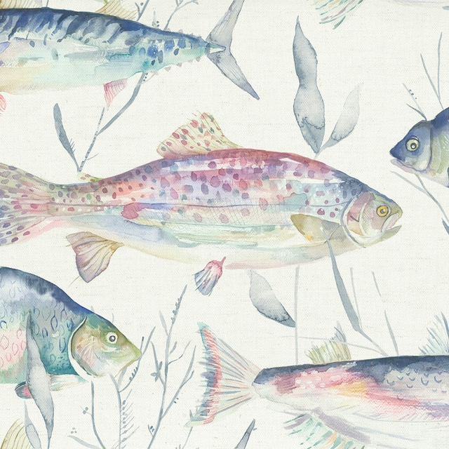
Iveswaters Abalone
Riviera
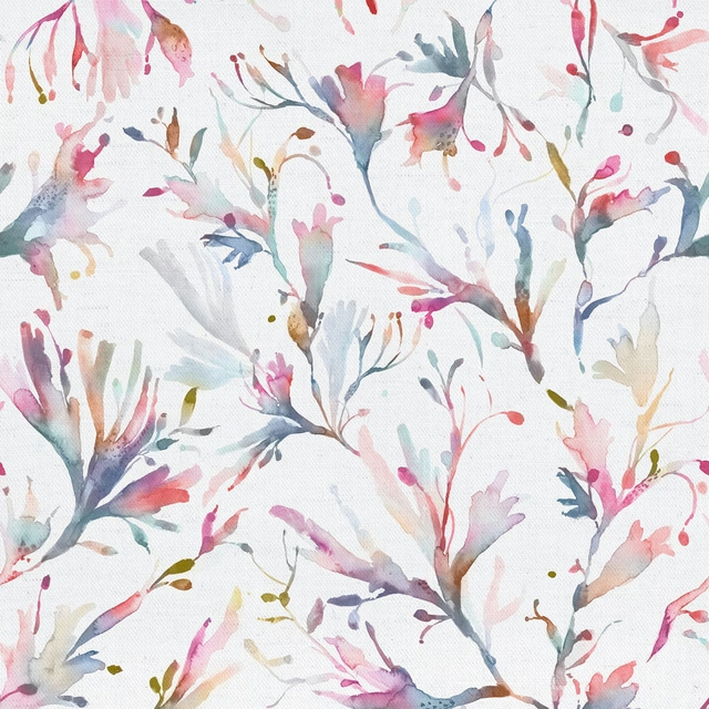
Seaweed Abalone
Riviera
Selkirk Grape
Selkirk

Bellmeadow Rosewood
Springsolstice