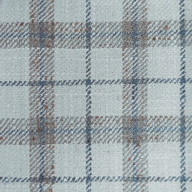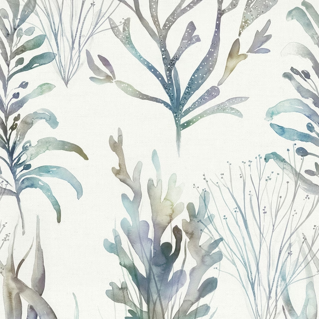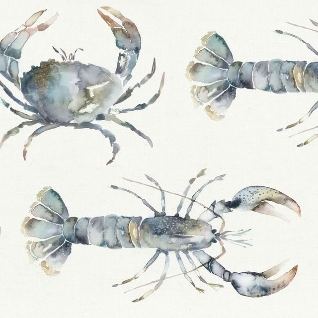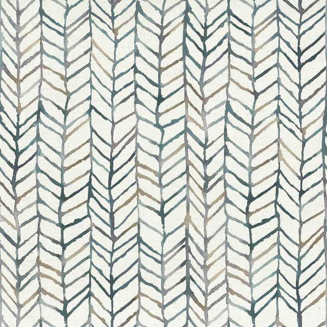

Tap the swatch to see it full screen. Hover it to magnify the weave. Colours on a screen are a guide, not a match, so come and feel the real cloth.
Scroll up or down to zoom in and out.
Olitski Frost
Quintessence Fabricolitski/fa1/fro
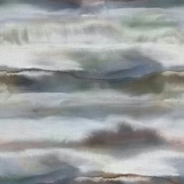
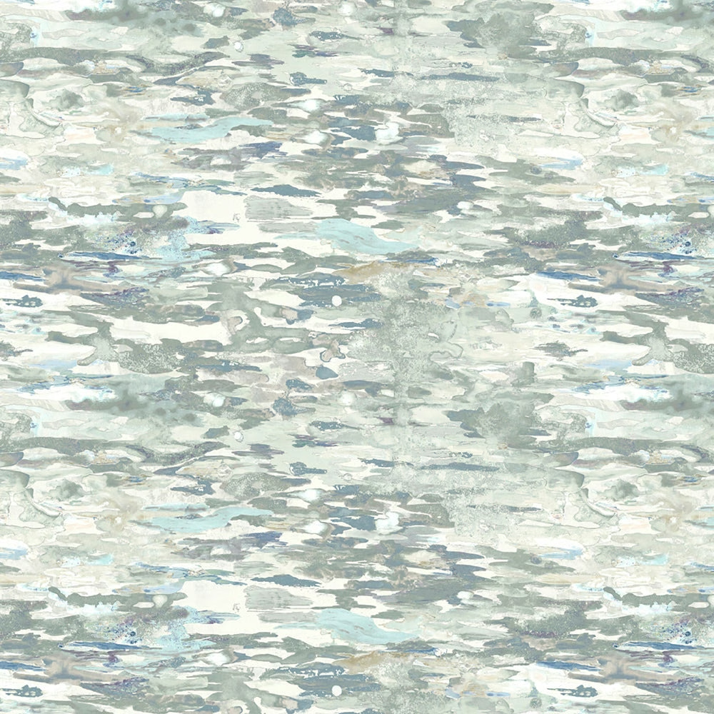
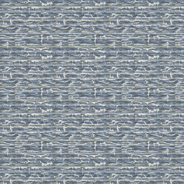
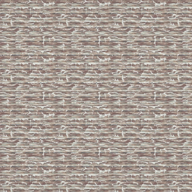
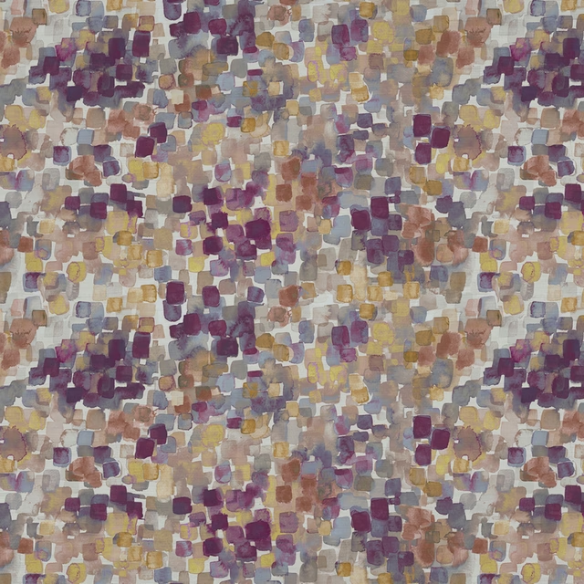
Olitski Frost shows a soft, clouded wash of pale grey, mist and icy blue across an abstract painterly ground. The effect is airy and diffused, with a gentle watercolour movement that keeps the design feeling light rather than heavy.
You have used your previews for today. Send one to Simon and you can carry on.
Your board
0 fabrics
Part of the range we hold from Voyage Maison.
See Olitski Frost in your own room
A photograph of the piece you want re-covered. Straight on is best, and daylight helps. It is used to make your picture and nothing else.
Looking at your room
We found things here Olitski Frost could go on. Tap one on the photograph, or choose below.
We could not see anything to re-cover
, s
Olitski Frost, on your
Drag to compare. AI impression, colours indicative: ask us for a cutting before you decide.
About this fabric
Woven in 65% viscose and 35% polyester, this 270gsm fabric has enough substance for curtains, blinds and soft furnishings while still feeling fluid enough for versatile interior use. The surface reads as a layered, brushy composition of cool grey, chalky white and faint blue-green tones, with the pattern settling into a calm, weathered rhythm rather than a sharp contrast. Its 46.5cm horizontal repeat and 32.7cm vertical repeat support the large-scale, softly directional look visible in the swatch. Dry clean only and suitable for cool ironing, it is a practical decorative fabric with a polished but understated finish.
How to use it
Use Olitski Frost where you want movement in a restrained palette: it works beautifully as drapery against white walls, pale timber and brushed metal. The cool misty tones also layer well with deeper slate, taupe or soft sea-glass accents.
A cool, atmospheric neutral that adds movement without overpowering a room.
Pairs well with
A pattern needs somewhere for the eye to rest, so these are the plains and textures that sit beside Olitski Frost without fighting it. Mixed across the houses we hold, which is the part a single supplier's book cannot do.

Dapple Grey Mist
Timeless Linen Sheers
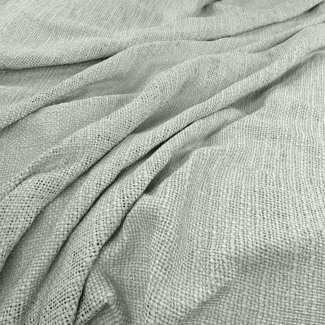
Bruges Mist
Bruges
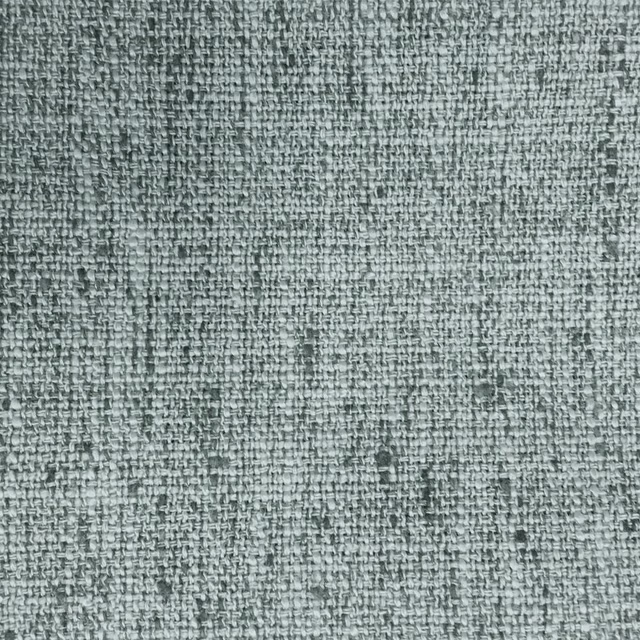
Helmsley Aluminium
Misc
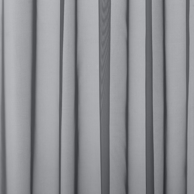
Baltic Fog
Atlantic Collection

Alvar Dove
Alvar 2

Alvar Mist
Alvar 2
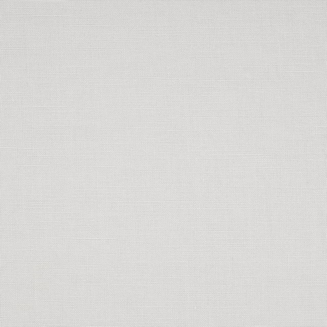
Foss Ash Grey
Foss Linen II

Foss Dove
Foss Linen II

Filigrana Cloud
Boratti WALLPAPER
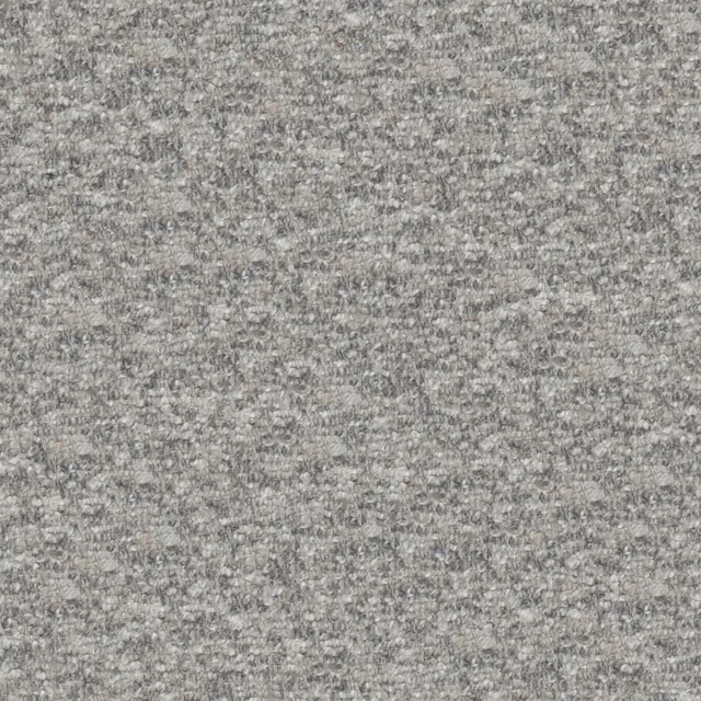
Cadenza Silver
Cadenza Fabrics
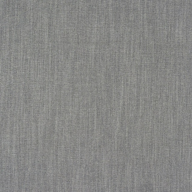
Monza Soft Grey
Arezzo
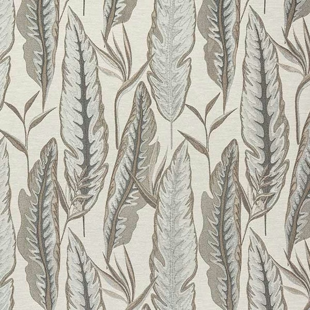
Brodsworth Dove
Brodsworth
Paint that goes with it
Two ways to take the room. Both colours are from houses we hold, so a pot can come off the same order as the cloth. Screens shift colour, so treat these as a direction and bring the cloth to the shelf before you buy the paint.
To sit quietly behind it
Whitstable Blue
Sanderson · #c3cec8
To stand against it
Woodland Yellow
Sanderson · #bfac60
Other grey fabrics
Across the houses we hold. See all 7,198.