
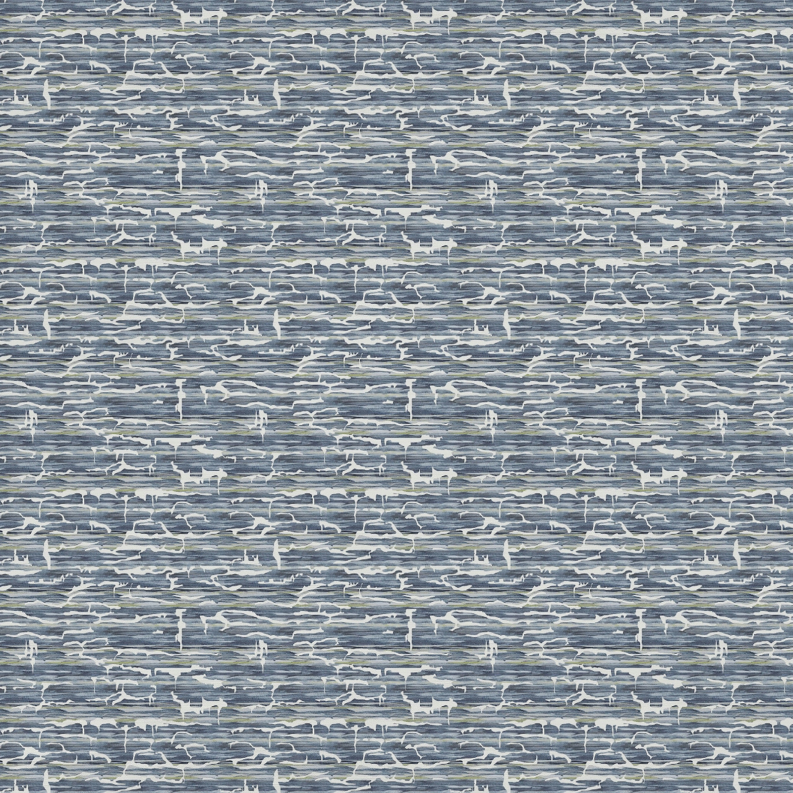

Tap the swatch to see it full screen. Hover it to magnify the weave. Colours on a screen are a guide, not a match, so come and feel the real cloth.
Scroll up or down to zoom in and out.
Camilo Bluebell
Quintessence Fabriccamilo/fa1/blu
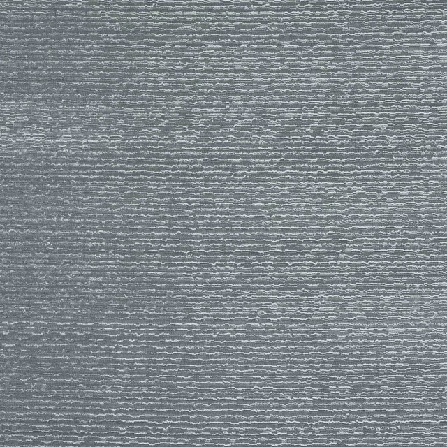
Camilo Bluebell shows a layered slate-blue ground with scattered ivory marks that give the surface a calm, slightly weathered look. The repeated motif reads as a rhythmic abstract pattern rather than a bold print.
You have used your previews for today. Send one to Simon and you can carry on.
Your board
0 fabrics
Part of the range we hold from Voyage Maison.
See Camilo Bluebell in your own room
A photograph of the piece you want re-covered. Straight on is best, and daylight helps. It is used to make your picture and nothing else.
Looking at your room
We found things here Camilo Bluebell could go on. Tap one on the photograph, or choose below.
We could not see anything to re-cover
, s
Camilo Bluebell, on your
Drag to compare. AI impression, colours indicative: ask us for a cutting before you decide.
About this fabric
This colourway has a cool, muted blue base with pale, chalky detailing that sits lightly across the surface and lifts the pattern without making it harsh. The 65% cotton, 35% polyester composition gives it the feel of a woven decorative fabric, and at 270gsm it sits in a reassuring mid-weight that is well suited to curtains, blinds and soft furnishings. Its 136cm horizontal repeat and 85cm vertical repeat create a generous large-scale rhythm, while the iron-safe finish and dry-clean-only care keep it practical for made-to-measure work. The overall effect is smart and composed, with the ivory accents breaking up the blue enough to keep the design fresh.
How to use it
Pair this soft slate blue with pale oak, brushed nickel and crisp white for a calm, tailored scheme. It works especially well where you want pattern, but prefer a cooler, quieter colour statement rather than a saturated blue.
Use it for tailored curtains or statement upholstery where the cool blue ground can take centre stage.
Pairs well with
A pattern needs somewhere for the eye to rest, so these are the plains and textures that sit beside Camilo Bluebell without fighting it. Mixed across the houses we hold, which is the part a single supplier's book cannot do.
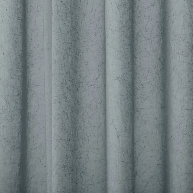
Pacific River
Atlantic Collection
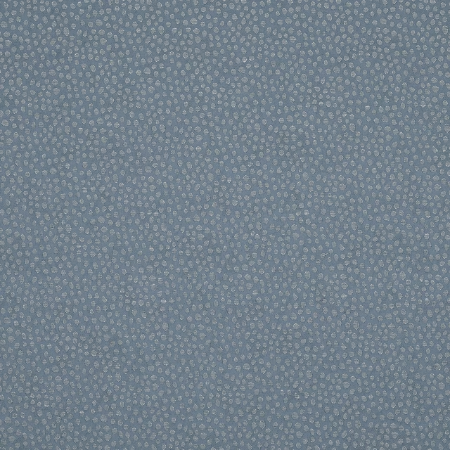
Furley Danube
Essential Weaves Vol 2

Morton Slate Blue
Bampton
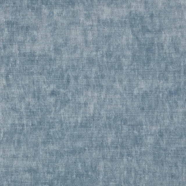
Cosima Slate
Cosima Velvet II
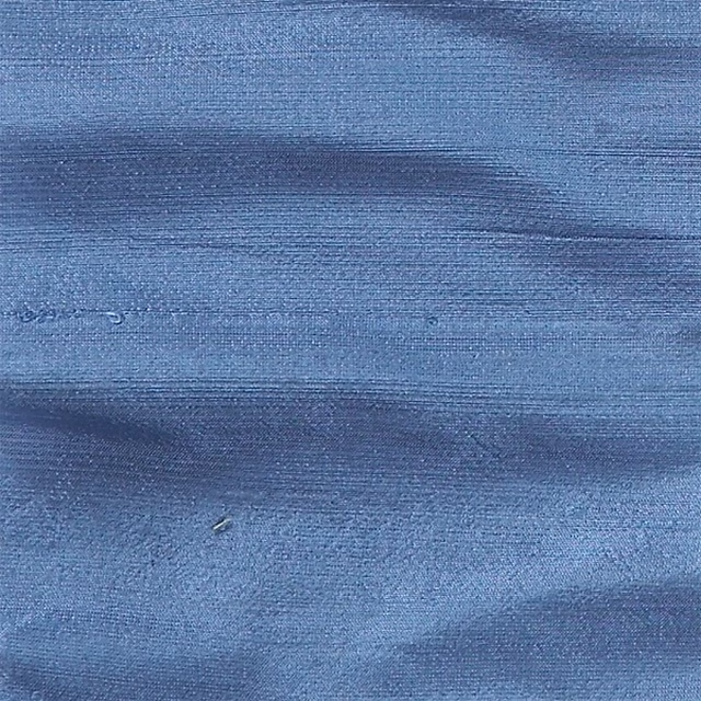
Orissa Silk Gulf
Orissa Silk
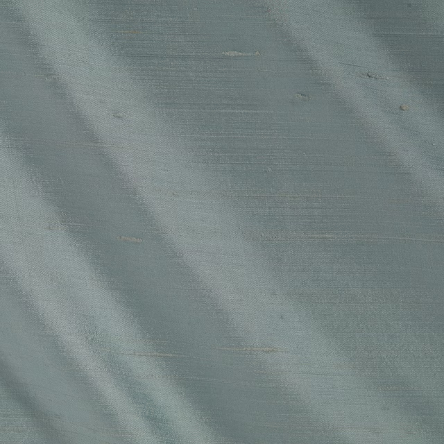
Orissa Silk Sky
Orissa Silk
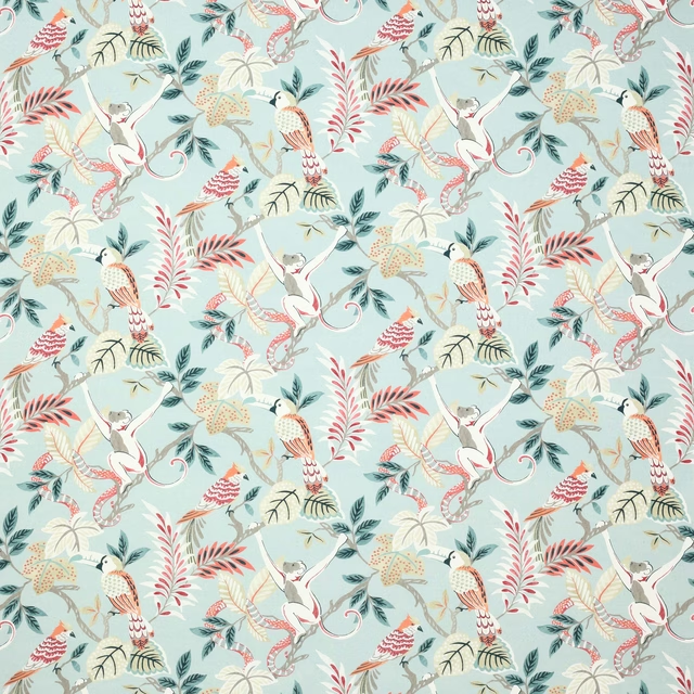
Indira Slate
Indira
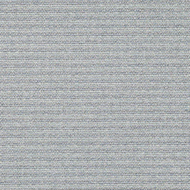
Roxam Dark Blue
Roxam
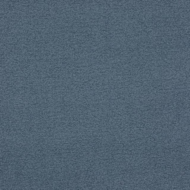
Arizona Sky
Arizona
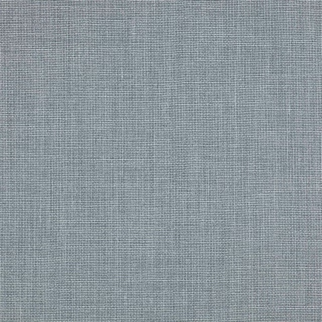
Tome Sea Blue
Tome
Cabris Ocean
Cabris II

Juno Mineral
Juno
Paint that goes with it
Two ways to take the room. Both colours are from houses we hold, so a pot can come off the same order as the cloth. Screens shift colour, so treat these as a direction and bring the cloth to the shelf before you buy the paint.
To sit quietly behind it
Rain Lake
Sanderson · #8e979e
To stand against it
The Tobacconist
Coat Paints · #62502a
Other blue fabrics
Across the houses we hold. See all 7,566.
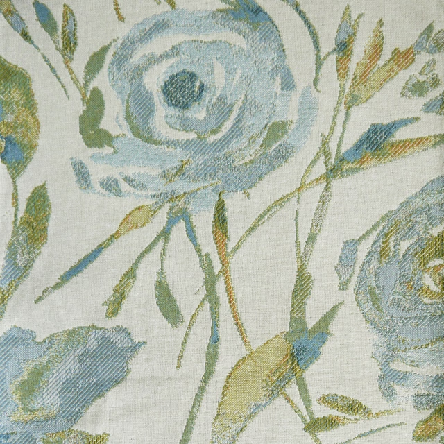
Meerwood Sky
Penningtonweaves
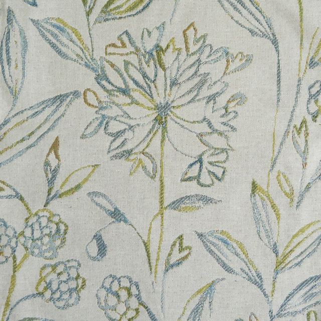
Pennington Sky
Penningtonweaves
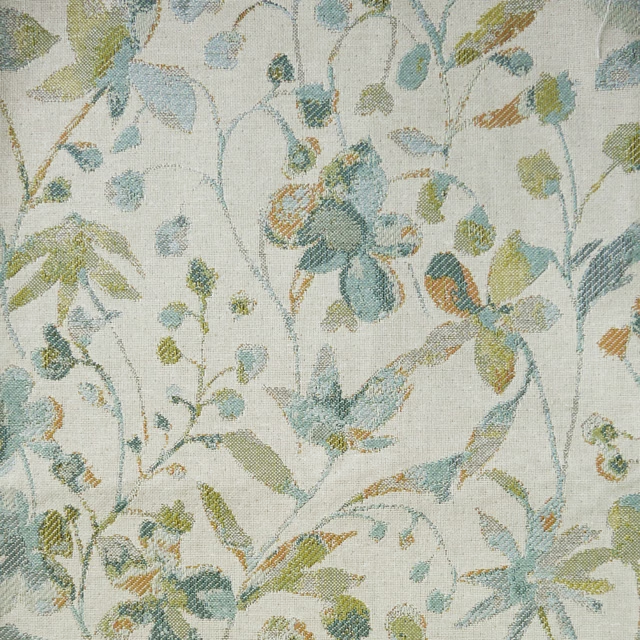
Rydal Sky
Penningtonweaves
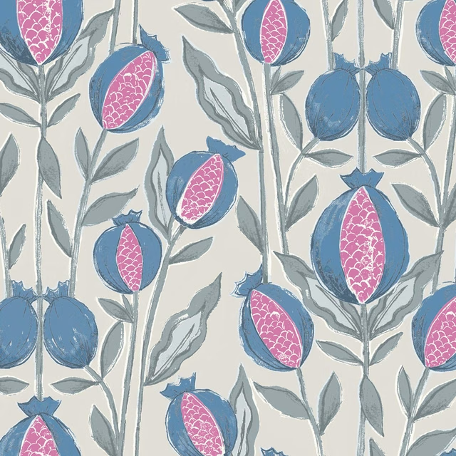
Rithani Bluebell Cream
Rithani
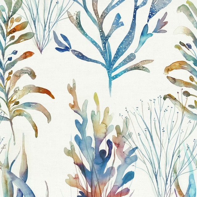
Coralreef Cobalt
Riviera
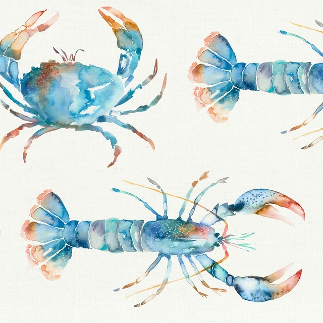
Crustaceans Cobalt
Riviera
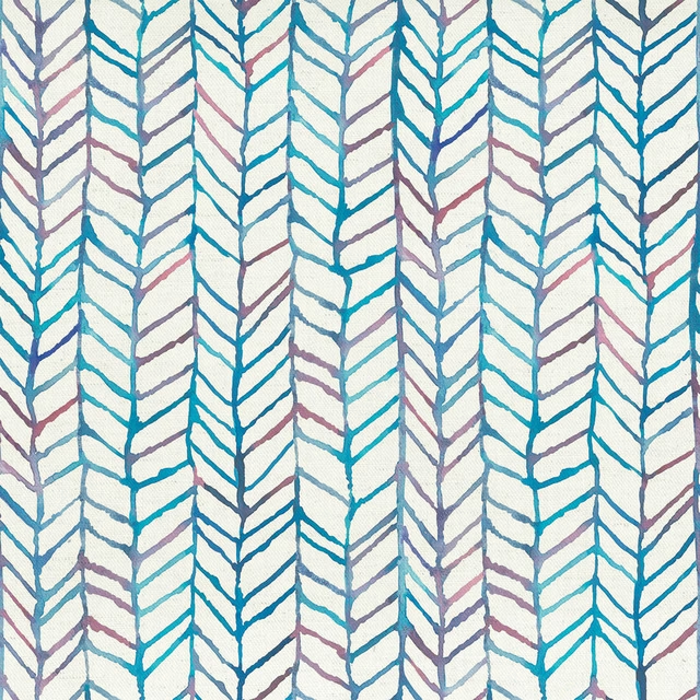
Fishingnet Abalone
Riviera
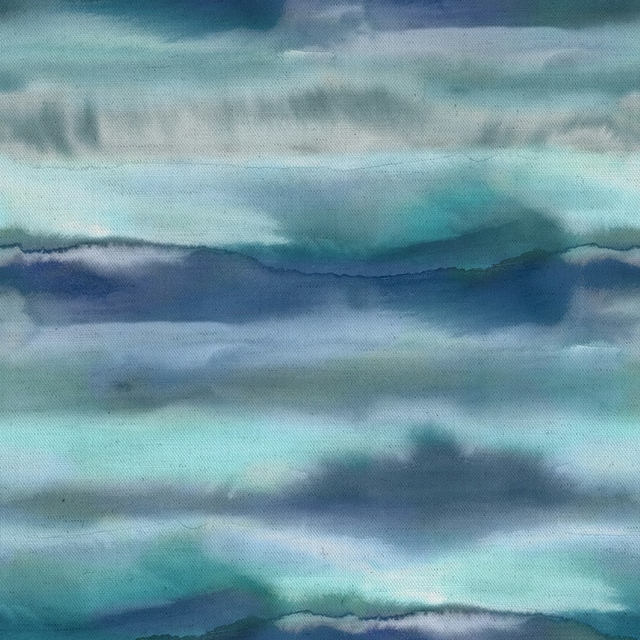
Fjord Cobalt
Riviera
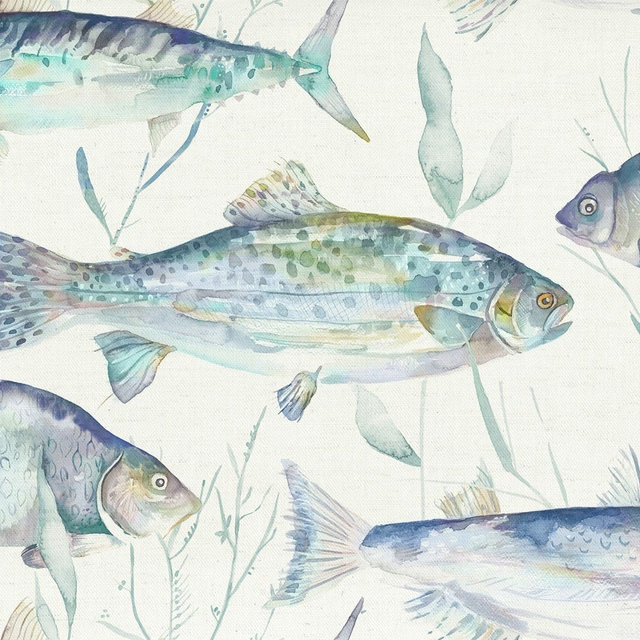
Iveswaters Cobalt
Riviera
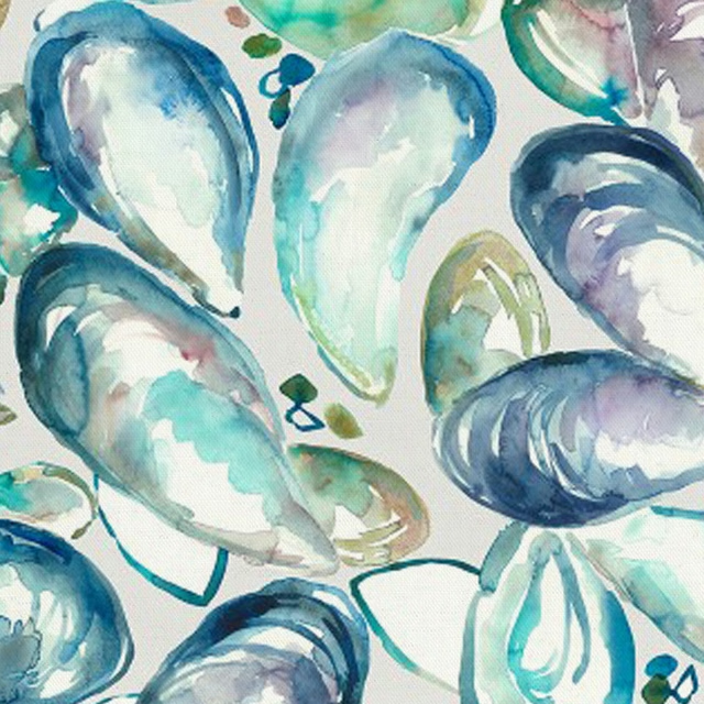
Musselshells Marine
Riviera
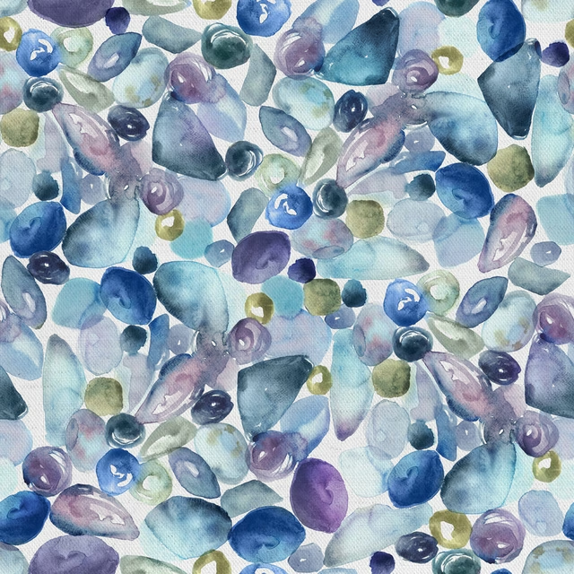
Pebbles Marine
Riviera
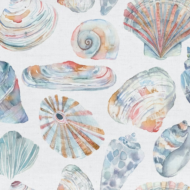
Rockpool Cobalt
Riviera