
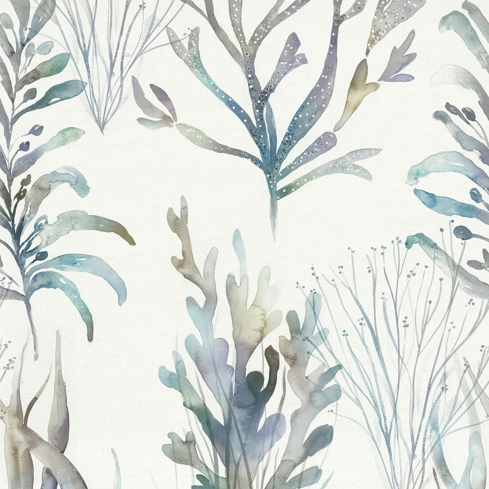

Tap the swatch to see it full screen. Hover it to magnify the weave. Colours on a screen are a guide, not a match, so come and feel the real cloth.
Scroll up or down to zoom in and out.
Coralreef Slate
Riviera Fabriccoralre/fa1/sla
Coralreef Slate shows an airy underwater-inspired botanical design on a clean, pale ground. The print reads as cool and misty, with blue-grey and seafoam tones that keep the motif light rather than heavy.
You have used your previews for today. Send one to Simon and you can carry on.
Your board
0 fabrics
Part of the range we hold from Voyage Maison.
See Coralreef Slate in your own room
A photograph of the piece you want re-covered. Straight on is best, and daylight helps. It is used to make your picture and nothing else.
Looking at your room
We found things here Coralreef Slate could go on. Tap one on the photograph, or choose below.
We could not see anything to re-cover
, s
Coralreef Slate, on your
Drag to compare. AI impression, colours indicative: ask us for a cutting before you decide.
About this fabric
This colourway is woven in 100% cotton and has a usable width of 136cm, with a 45.33cm horizontal repeat and 68.5cm vertical repeat, making the large-scale pattern feel measured across curtains or blinds. The surface has a soft, natural cotton hand rather than a glossy finish, which suits the washed-back, watery quality of the print. In Coralreef Slate, the leaves and fronds are brushed in translucent blue-grey, pale sage and muted aqua, with just enough depth in the darker strokes to define the shapes without darkening the cloth. The overall effect is fresh and restrained, with the grey influence cooling the palette and the white ground giving it plenty of breathing space. It is dry clean only and iron safe, and Voyage Maison recommends it for curtains, blinds and soft furnishings.
How to use it
Use Coralreef Slate where you want pattern with a quiet, coastal feel: it works well at a window with limestone, pale timber and brushed nickel. The cool grey base also layers neatly with denim blues, mist greens and chalky off-whites.
Pair with pale oak, chalky neutrals and soft blue-greys for an airy coastal scheme.
More from Riviera
The same book, other colourways.
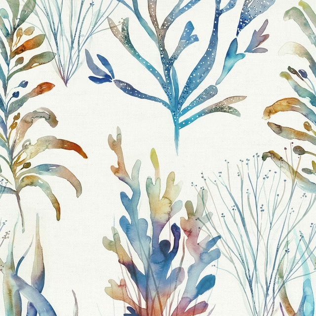
Coralreef Cobalt
Riviera
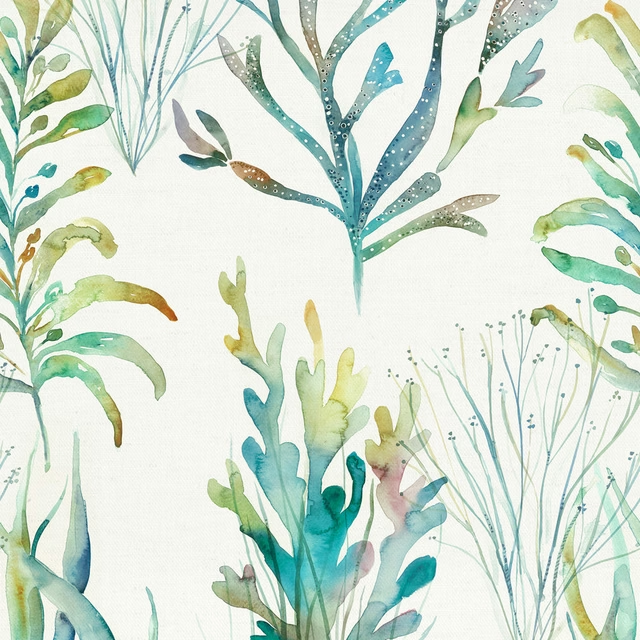
Coralreef Kelpie
Riviera
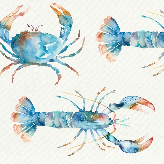
Crustaceans Cobalt
Riviera
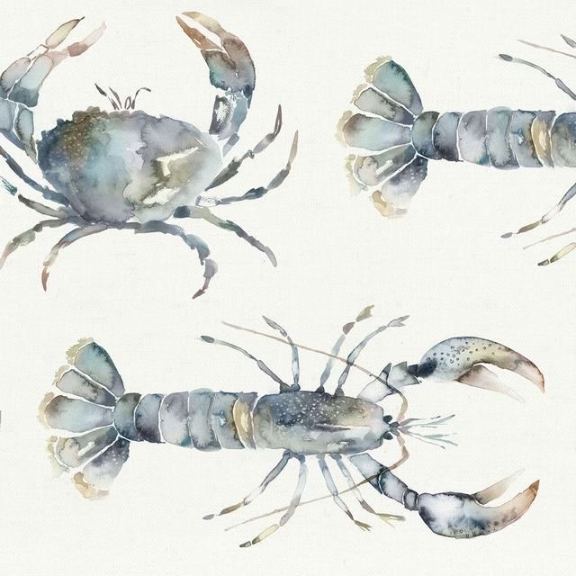
Crustaceans Slate
Riviera
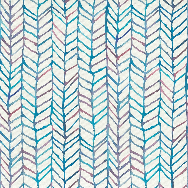
Fishingnet Abalone
Riviera
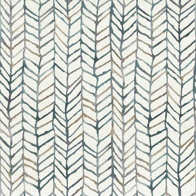
Fishingnet Slate
Riviera
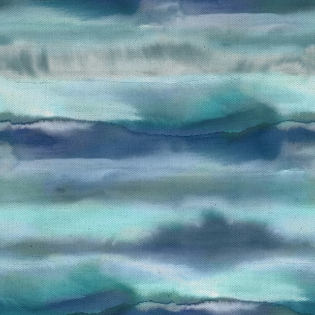
Fjord Cobalt
Riviera
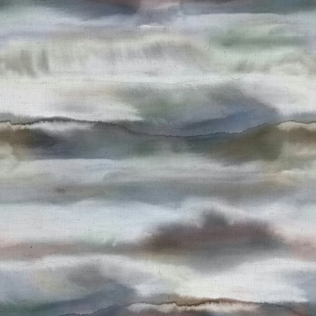
Fjord Slate
Riviera
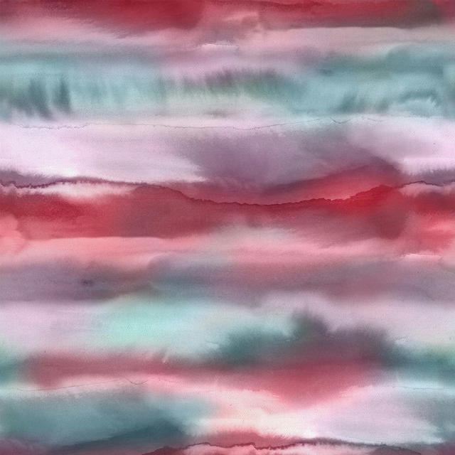
Fjord Abalone
Riviera
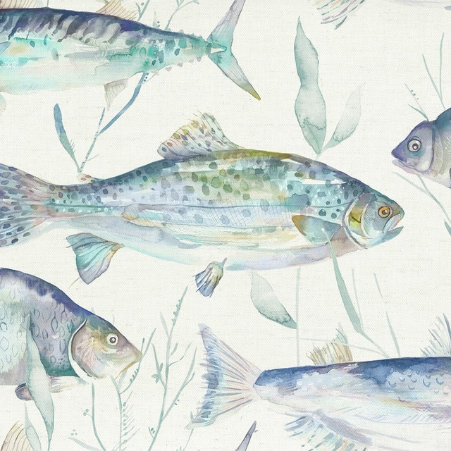
Iveswaters Cobalt
Riviera
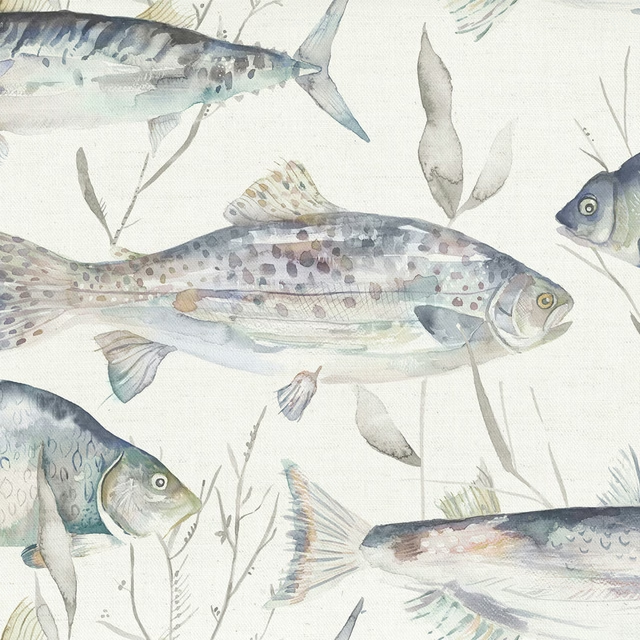
Iveswaters Slate
Riviera
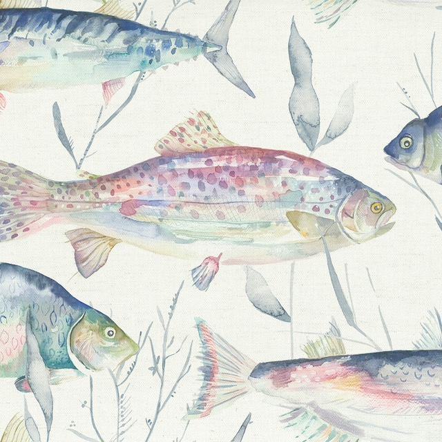
Iveswaters Abalone
Riviera
Pairs well with
A pattern needs somewhere for the eye to rest, so these are the plains and textures that sit beside Coralreef Slate without fighting it. Mixed across the houses we hold, which is the part a single supplier's book cannot do.
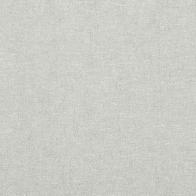
Dapple Grey Mist
Timeless Linen Sheers
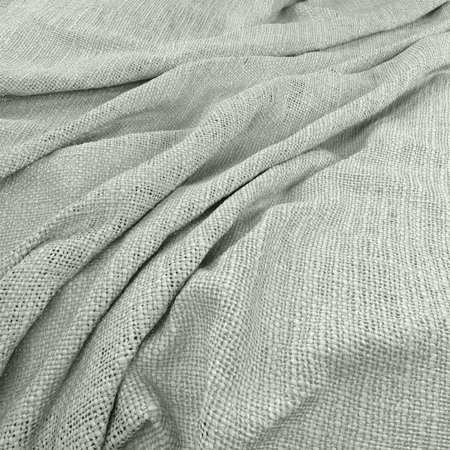
Bruges Mist
Bruges
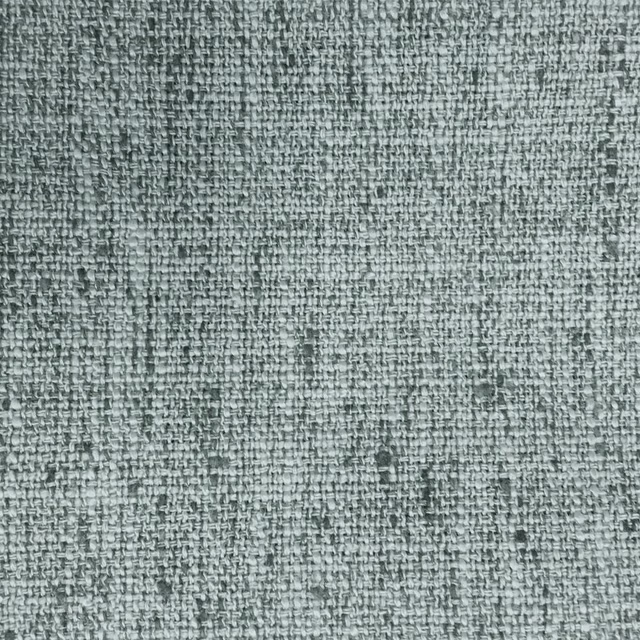
Helmsley Aluminium
Misc
Baltic Fog
Atlantic Collection
Alvar Dove
Alvar 2
Alvar Mist
Alvar 2
Foss Ash Grey
Foss Linen II
Foss Dove
Foss Linen II

Filigrana Cloud
Boratti WALLPAPER
Cadenza Silver
Cadenza Fabrics
Monza Soft Grey
Arezzo
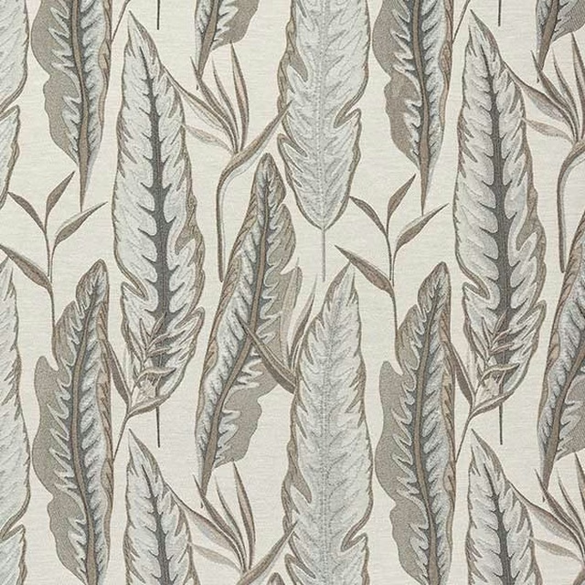
Brodsworth Dove
Brodsworth
Paint that goes with it
Two ways to take the room. Both colours are from houses we hold, so a pot can come off the same order as the cloth. Screens shift colour, so treat these as a direction and bring the cloth to the shelf before you buy the paint.
To sit quietly behind it
Cosmic Grey
Sanderson · #d8dad7
To stand against it
Sage Green
Little Greene · #77815c
Other grey fabrics
Across the houses we hold. See all 7,198.
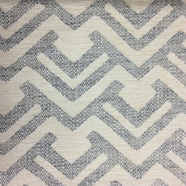
Lucius Natural
Naturalhistory
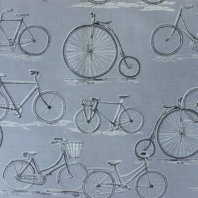
Pennyfarthing Antique
Naturalhistory

Pocketwatch Charcoal
Naturalhistory
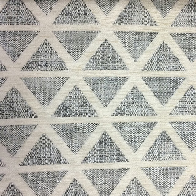
Priscus Natural
Naturalhistory
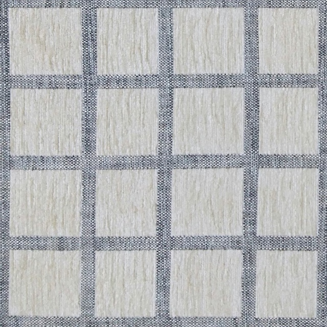
Salvian Natural
Naturalhistory
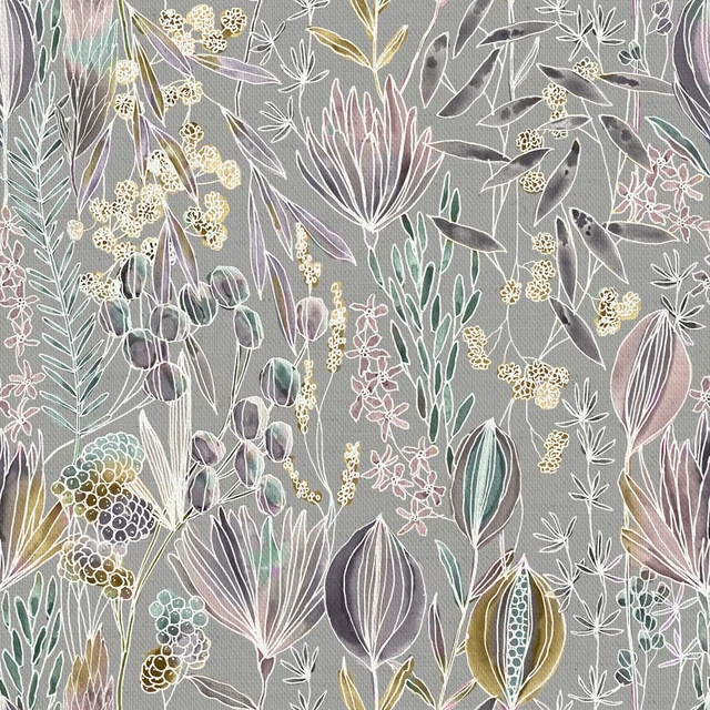
Masina Dawn
Oceania
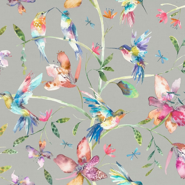
Tafuna Duck Egg
Oceania
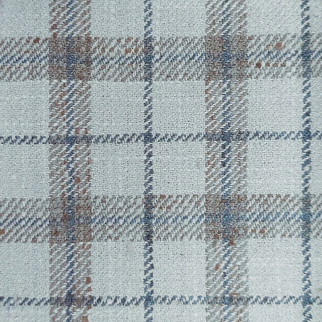
Painswick Steel
Painswick
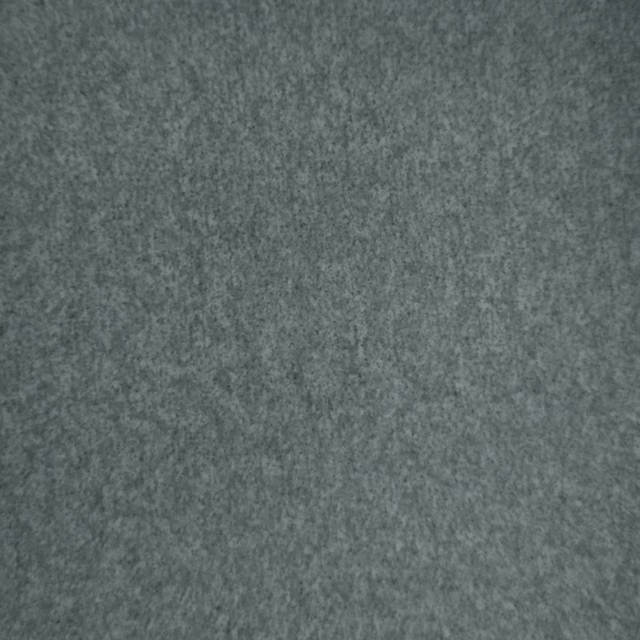
Palermo Mist
Palermo
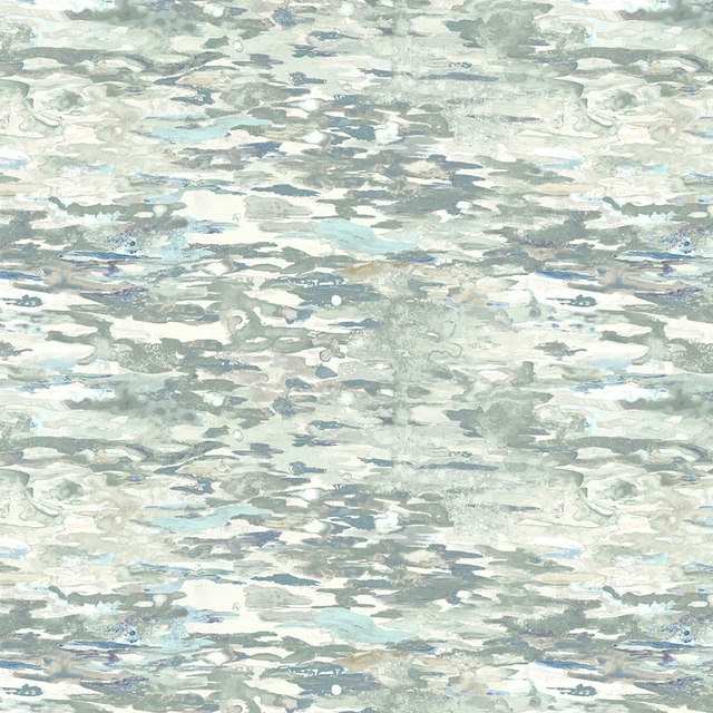
Olitski Frost
Quintessence
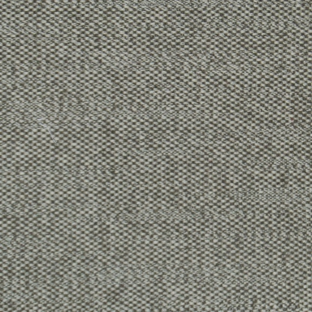
Selkirk Birch
Selkirk
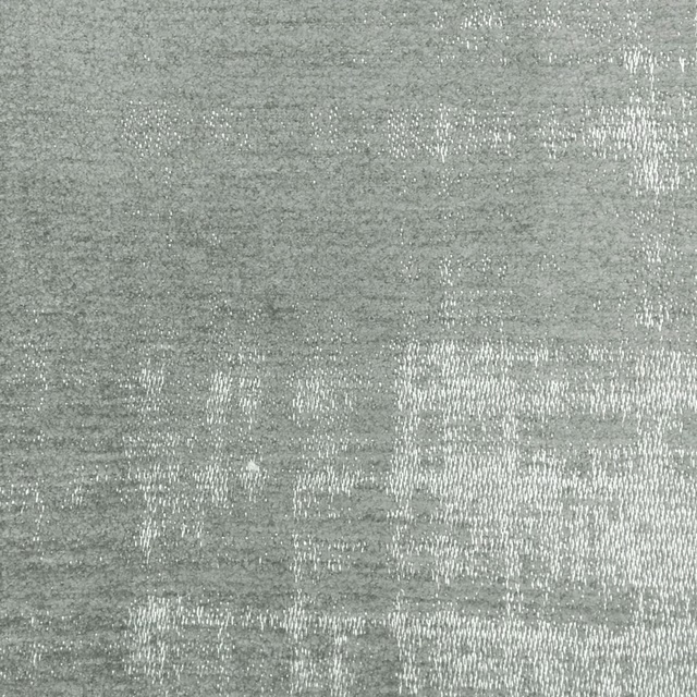
Stratos Ice
Stratos