
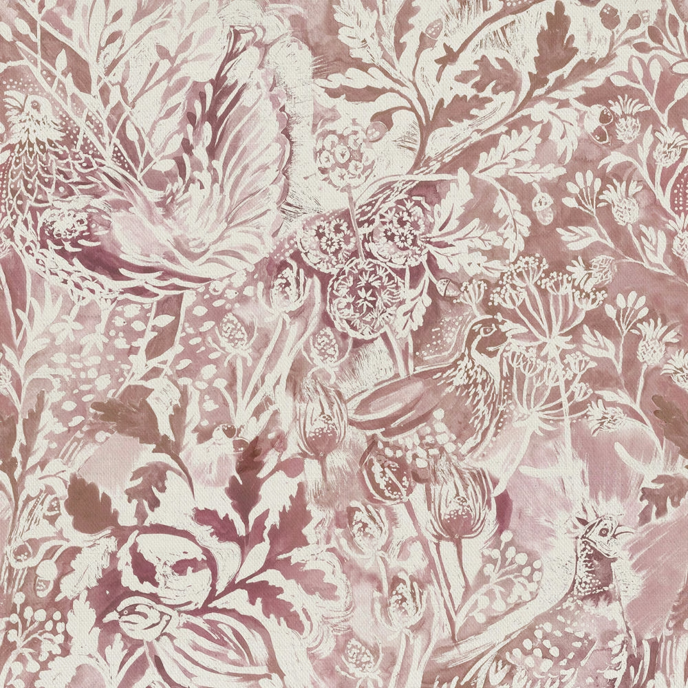

Tap the swatch to see it full screen. Hover it to magnify the weave. Colours on a screen are a guide, not a match, so come and feel the real cloth.
Scroll up or down to zoom in and out.
Rothesay Coral
Wilderness Fabricrothesa/fa1/cor
Rothesay Coral in the Wilderness collection shows a painterly botanical scene in layered blush, rose and chalky ivory tones. The print feels soft and dreamy, with the pale ground allowing the detail to sit gently rather than shout.
You have used your previews for today. Send one to Simon and you can carry on.
Your board
0 fabrics
Part of the range we hold from Voyage Maison.
See Rothesay Coral in your own room
A photograph of the piece you want re-covered. Straight on is best, and daylight helps. It is used to make your picture and nothing else.
Looking at your room
We found things here Rothesay Coral could go on. Tap one on the photograph, or choose below.
We could not see anything to re-cover
, s
Rothesay Coral, on your
Drag to compare. AI impression, colours indicative: ask us for a cutting before you decide.
About this fabric
Woven in 95% cotton and 5% linen, this 230gsm fabric has the easy handle of a decorative mid-weight textile and is suitable for curtains, blinds and soft furnishings. The image shows a large-scale botanical design with feathery leaves, seed heads and a little bird motif worked in warm blush pinks, muted rose and soft ivory. Its 46cm horizontal repeat and 50cm vertical repeat will create a bold but elegant rhythm across wider window treatments. The overall effect is gently faded and romantic, with the darker pink accents adding depth against the lighter printed ground.
How to use it
Use this dusty pink colourway where you want pattern without heaviness: it would look особенно good as full-length curtains or Roman blinds in a light bedroom or sitting room. Combine it with putty, parchment and natural wood so the blush notes stay soft and airy.
Pair with soft linens and pale timber to keep the pretty, painterly print feeling fresh.
More from Wilderness
The same book, other colourways.
Chaffinch Cream
Wilderness
Cirisum Damson
Wilderness
Cirsium Damson
Wilderness
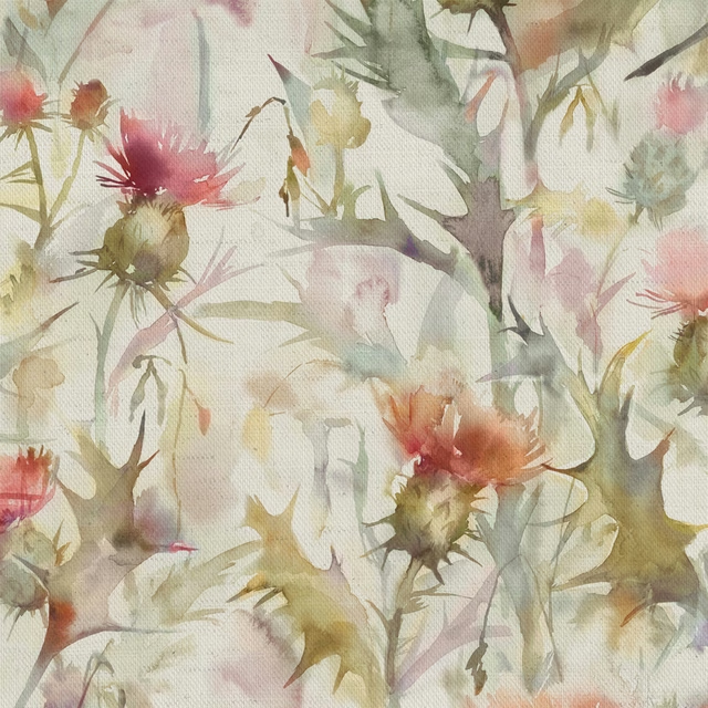
Cirsium orange
Wilderness
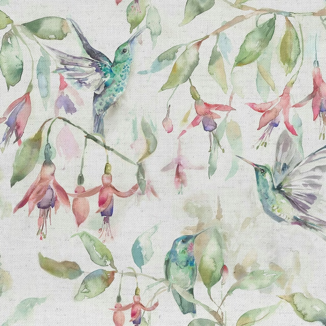
Fuchsiaflight Cream
Wilderness
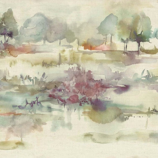
Heathermoors green
Wilderness
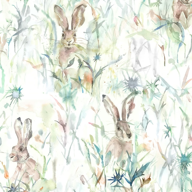
Jackrabbit Cream
Wilderness
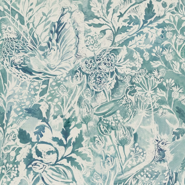
Rothesay Duck Egg
Wilderness
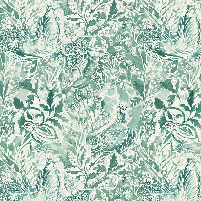
Rothesay Meadow
Wilderness
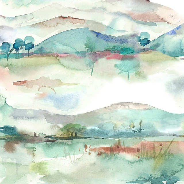
Russetshores Cream
Wilderness
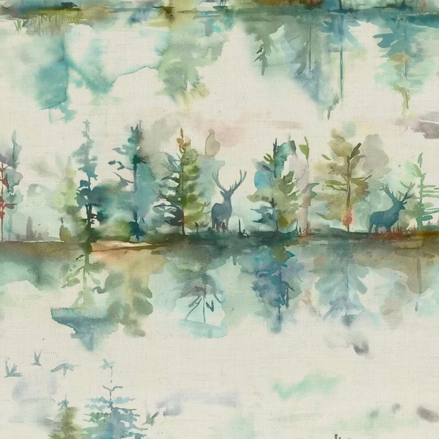
Wilderness Topaz Cream
Wilderness
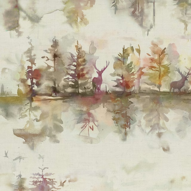
Wilderness Plum Cream
Wilderness
Pairs well with
A pattern needs somewhere for the eye to rest, so these are the plains and textures that sit beside Rothesay Coral without fighting it. Mixed across the houses we hold, which is the part a single supplier's book cannot do.
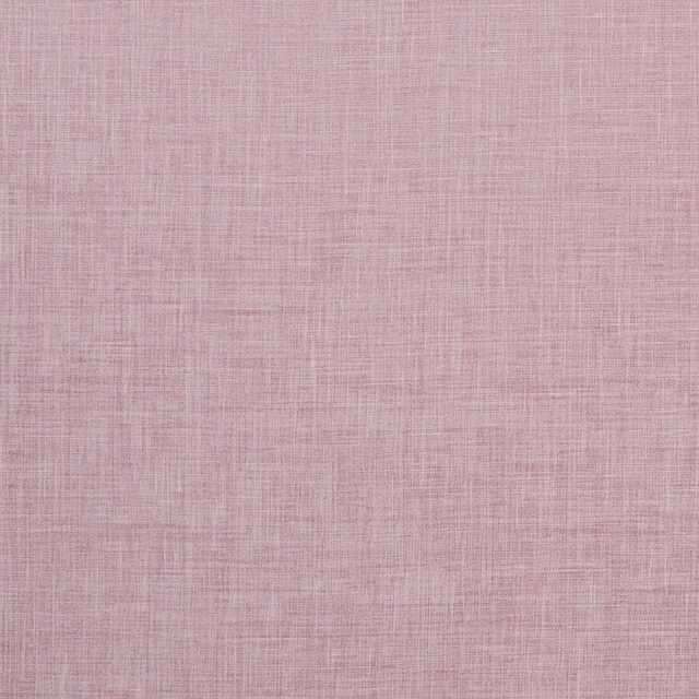
Albany Blush
Albany and Moray
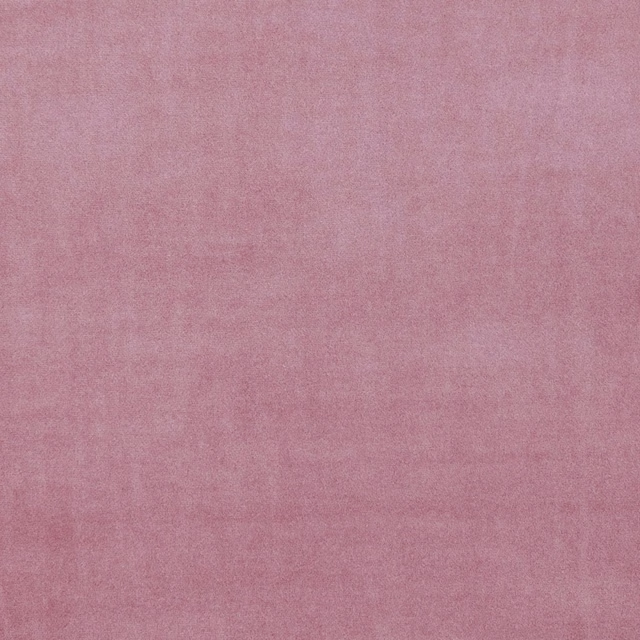
Alvar Blush
Alvar 2
Allegra Heather
Allegra

Ario Melba
Ario
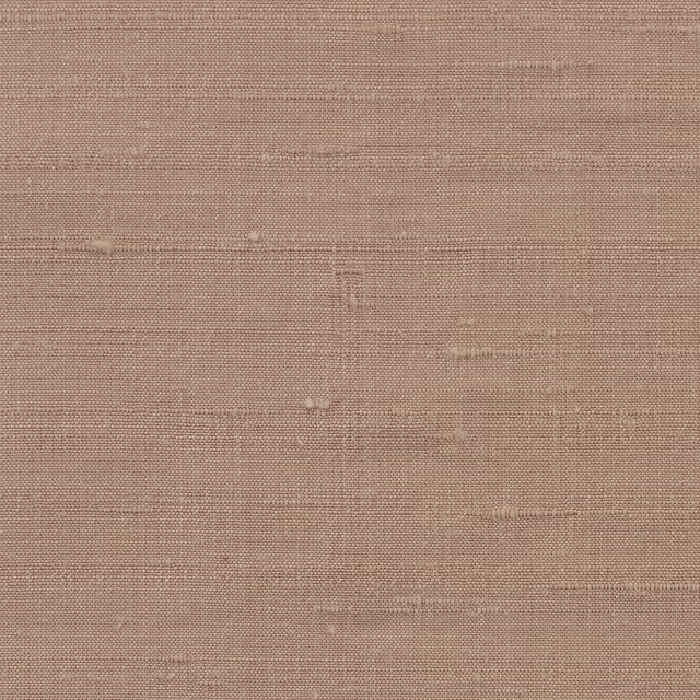
Orissa Silk Wallcovering Blush Pink
Wallcoverings
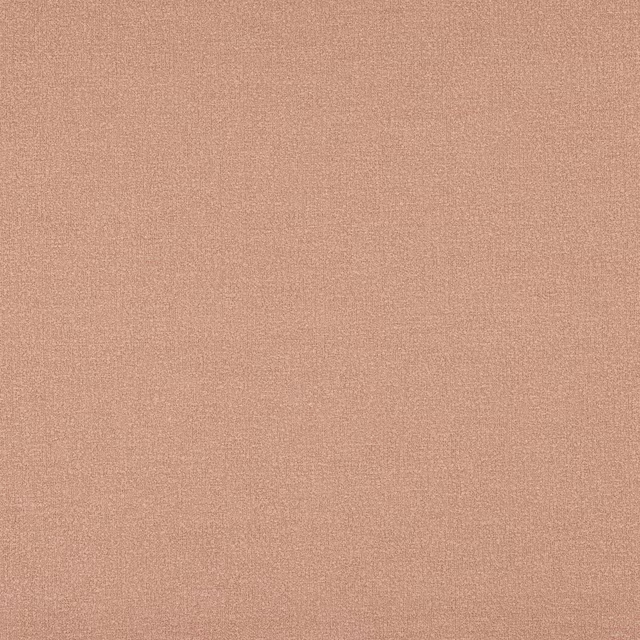
Kline Dusky Pink
Kline
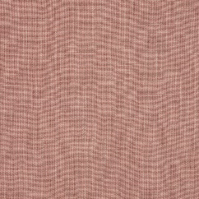
Mia Dragee
Mia
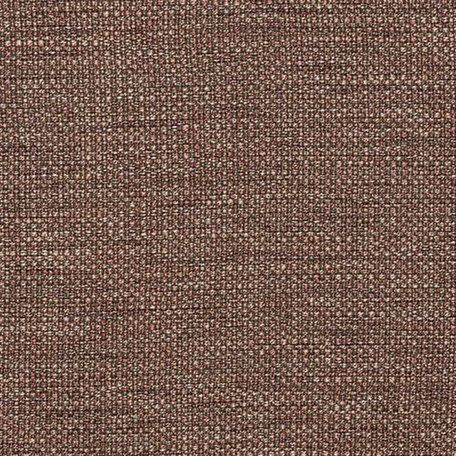
Sparta FR Blush
Flavia FR
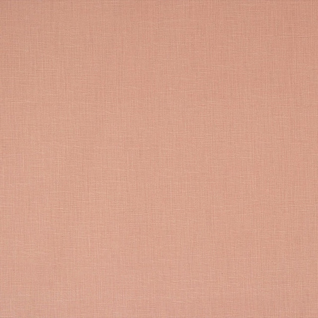
Savanna Dusky Pink
Plains & Semi Plains
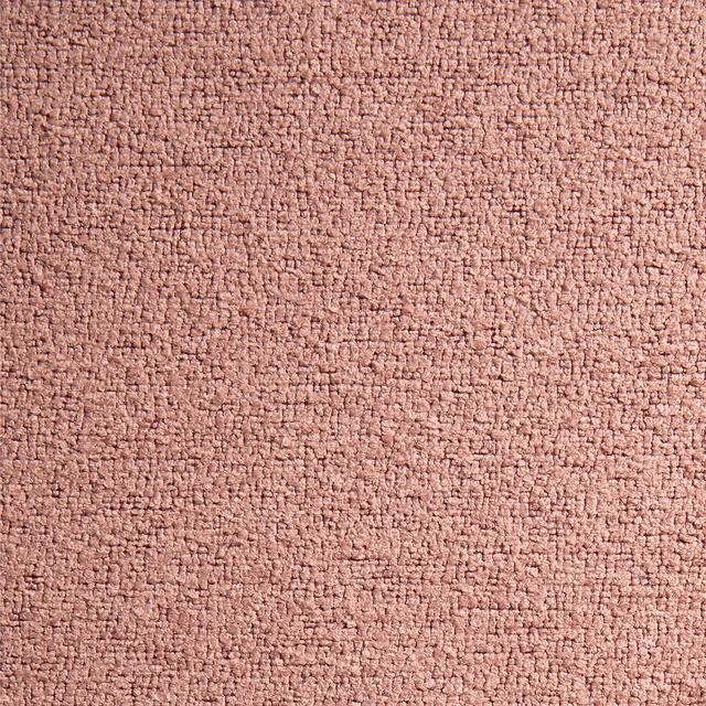
Leopold Blush
Leopold FR Recycled Boucle
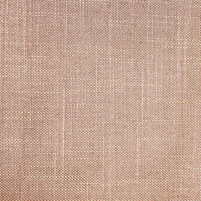
Acer 15* - Dusty Pink
Plain
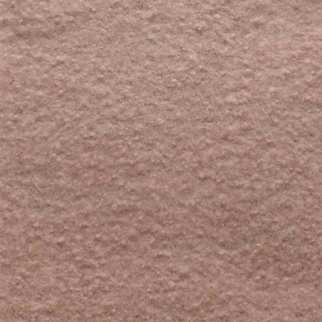
Orkney Chiffon
Orkney Boucle
Paint that goes with it
Two ways to take the room. Both colours are from houses we hold, so a pot can come off the same order as the cloth. Screens shift colour, so treat these as a direction and bring the cloth to the shelf before you buy the paint.
To sit quietly behind it
Evening, Ethel
Coat Paints · #cbb2a9
To stand against it
Attic II
Little Greene · #5a5247
Other pink fabrics
Across the houses we hold. See all 2,519.
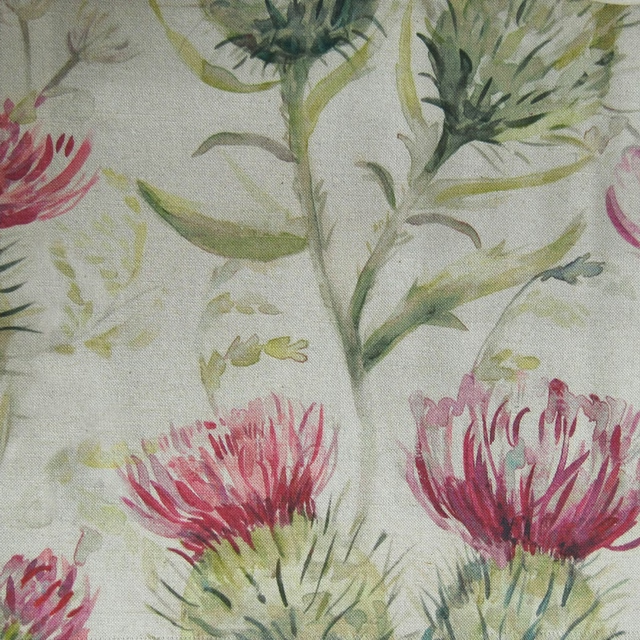
Thistleglen Summer
Voyagecountry
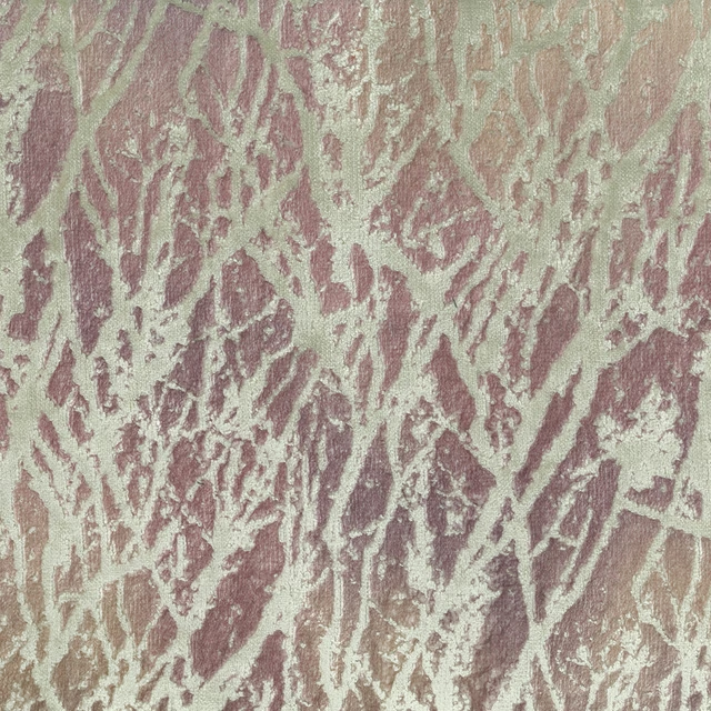
Kline Quartz
Winterskies
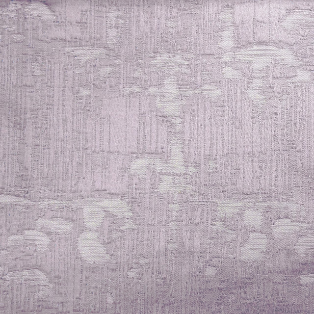
Orta Blush
Winterskies
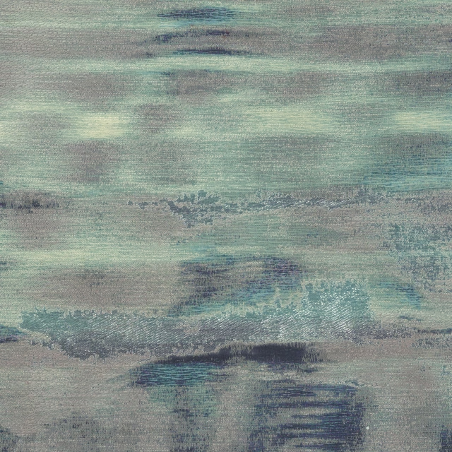
Rothko Blush
Winterskies
Fairytalebristles Dawn
Woodlandtales
Leapingintothefauna Blush
Woodlandtales
Primrose Blush
Woodlandtales
Whimsicaltale Blush
Woodlandtales
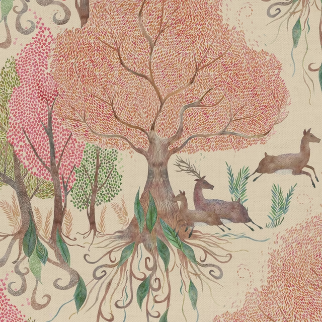
Willowwoods Blush
Woodlandtales

Sapphire Chiffon
Zircon
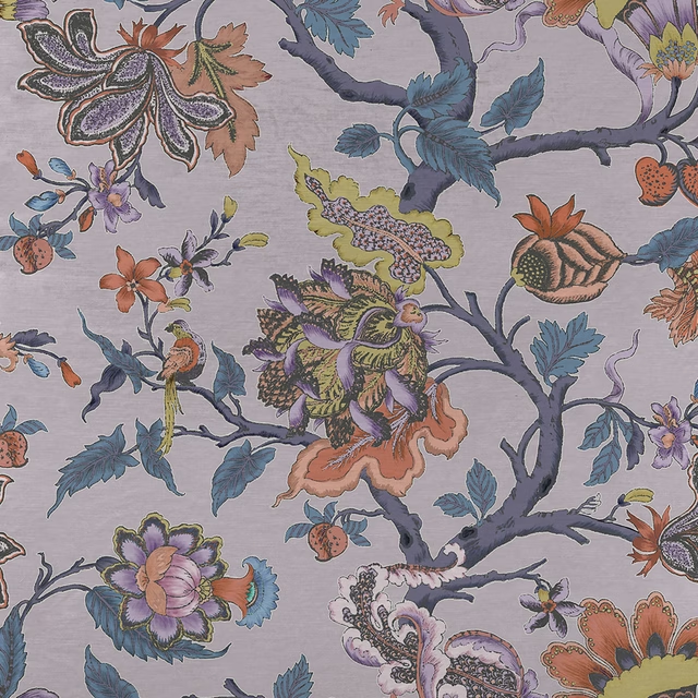
Adhira Blush
iKon
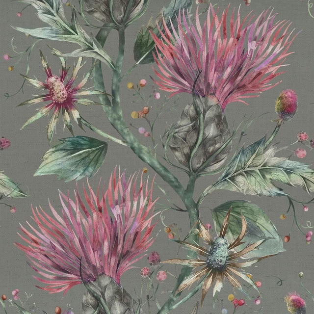
Elysium Onyx
iKon