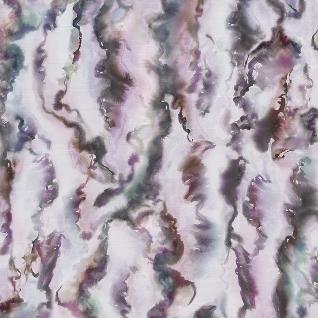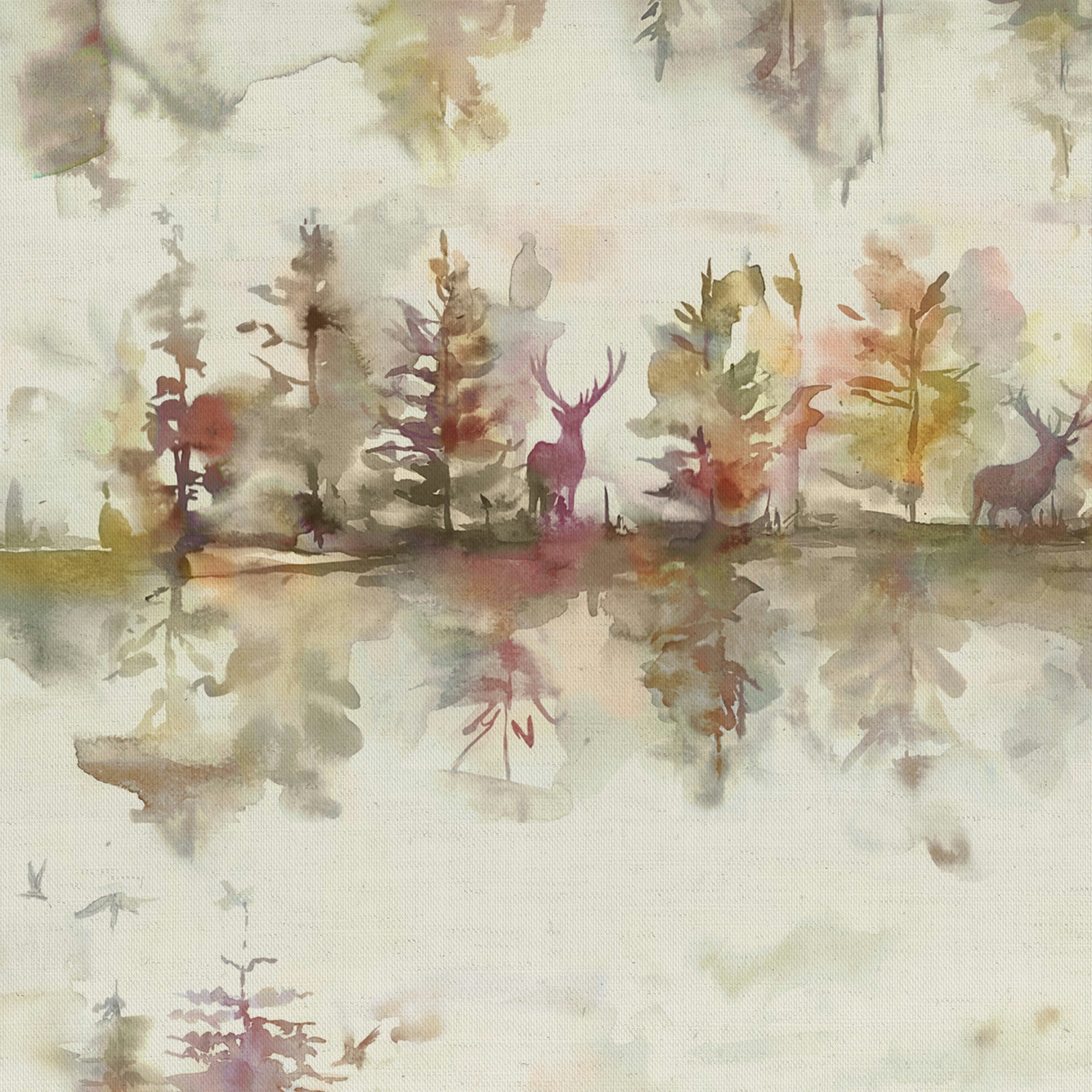

Tap the swatch to see it full screen. Hover it to magnify the weave. Colours on a screen are a guide, not a match, so come and feel the real cloth.
Scroll up or down to zoom in and out.
Wilderness Plum Cream
Wilderness Fabricwildern/fao/plu
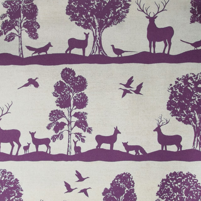
Wilderness Plum Cream has a soft, washed look, with mauve and plum notes drifting across an ivory ground. The painterly trees and deer silhouettes feel atmospheric rather than bold, giving the fabric a gentle, misted finish.
You have used your previews for today. Send one to Simon and you can carry on.
Your board
0 fabrics
Part of the range we hold from Voyage Maison.
See Wilderness Plum Cream in your own room
A photograph of the piece you want re-covered. Straight on is best, and daylight helps. It is used to make your picture and nothing else.
Looking at your room
We found things here Wilderness Plum Cream could go on. Tap one on the photograph, or choose below.
We could not see anything to re-cover
, s
Wilderness Plum Cream, on your
Drag to compare. AI impression, colours indicative: ask us for a cutting before you decide.
About this fabric
Wilderness Plum Cream from Voyage Maison is a fabric with a 95% cotton and 5% linen composition, a weight of 230gsm, and a usable width of 138cm. It is suitable for curtains, blinds and soft furnishings, with a horizontal pattern repeat of 69cm and a vertical repeat of 67.5cm. In this colourway, the woodland scene is rendered in muted purple, rose and earthy taupe tones, so the deer and trees appear to dissolve softly into the background. The overall effect is light, airy and slightly romantic, with the colour sitting closer to dusty mauve than a saturated violet.
How to use it
This shade works beautifully in calm, layered interiors where the soft purple can sit against flax, oatmeal and weathered timber. Use it for curtains or a blind where the painterly print can be seen at a distance and its hazy colour mix will feel most atmospheric.
Use with natural woods and soft neutrals to let the painterly purple accents stand out.
More from Wilderness
The same book, other colourways.
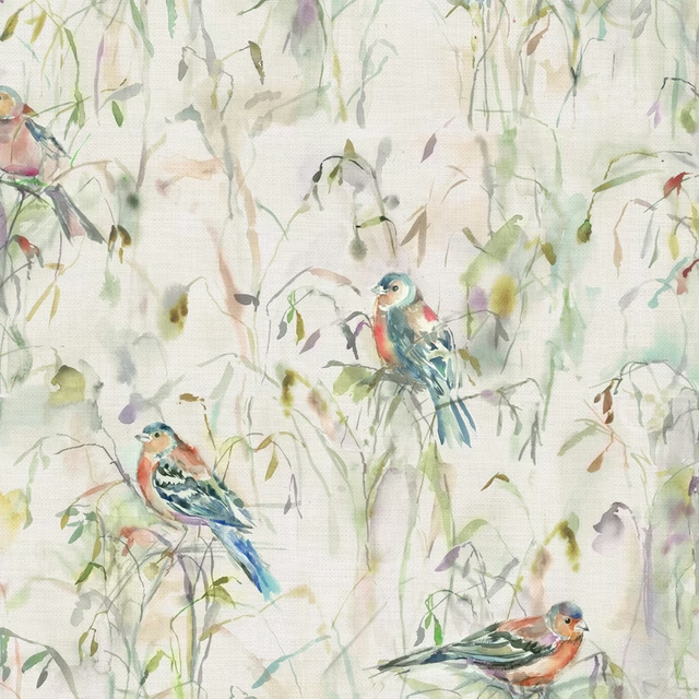
Chaffinch Cream
Wilderness
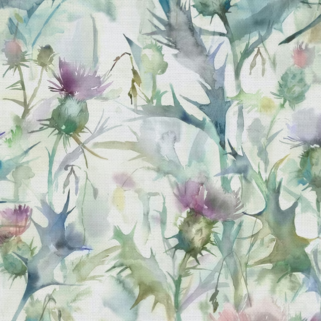
Cirisum Damson
Wilderness
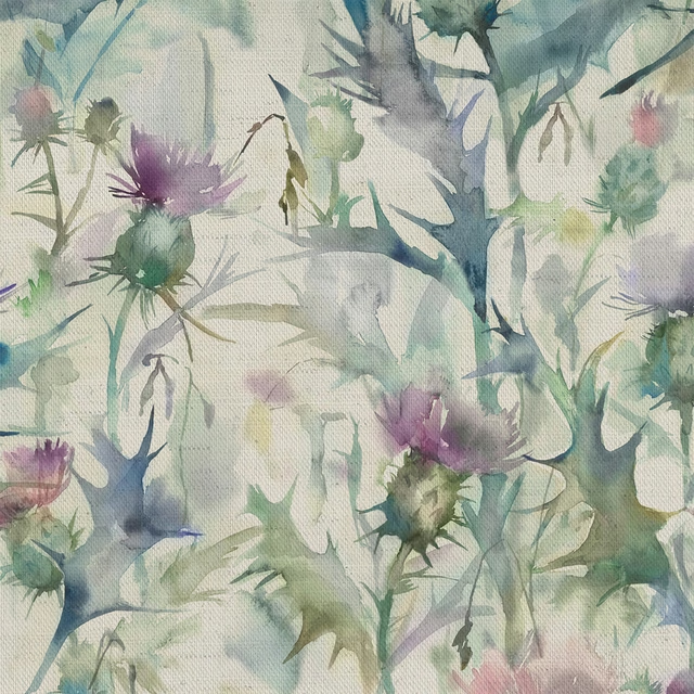
Cirsium Damson
Wilderness
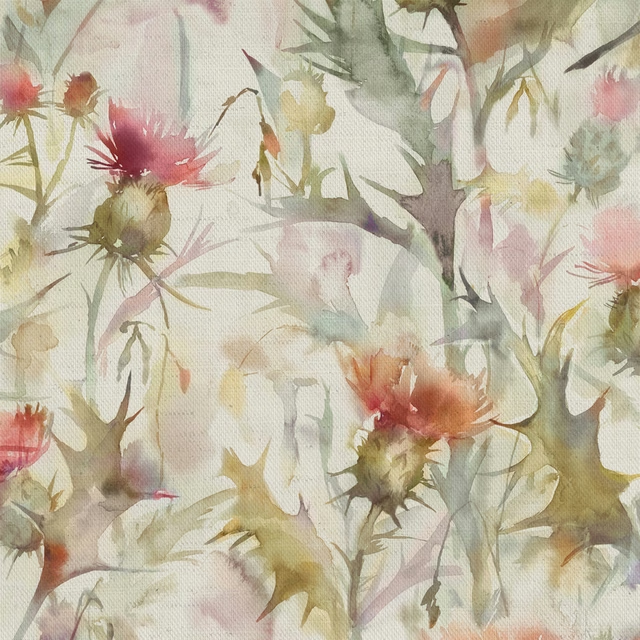
Cirsium orange
Wilderness
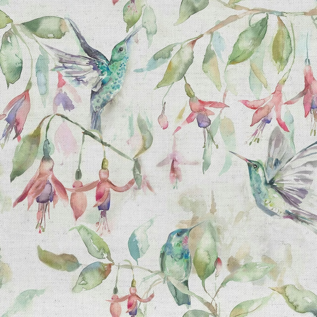
Fuchsiaflight Cream
Wilderness
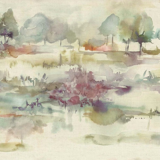
Heathermoors green
Wilderness
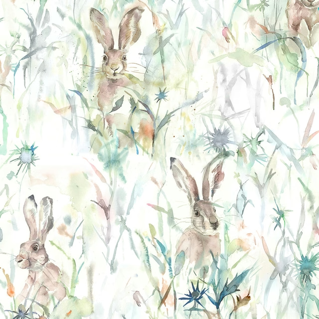
Jackrabbit Cream
Wilderness
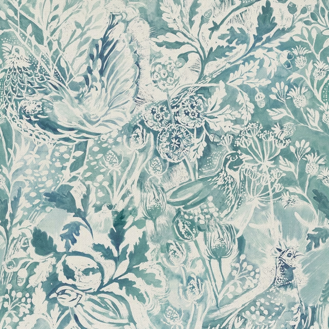
Rothesay Duck Egg
Wilderness
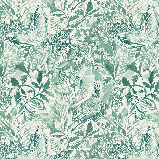
Rothesay Meadow
Wilderness
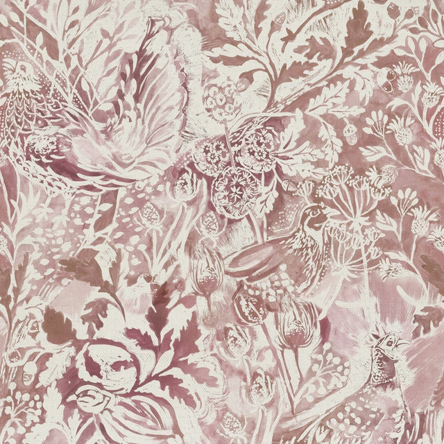
Rothesay Coral
Wilderness
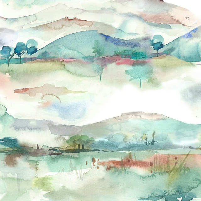
Russetshores Cream
Wilderness
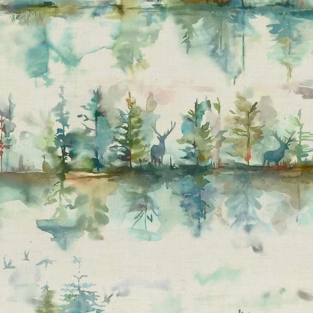
Wilderness Topaz Cream
Wilderness
Pairs well with
A pattern needs somewhere for the eye to rest, so these are the plains and textures that sit beside Wilderness Plum Cream without fighting it. Mixed across the houses we hold, which is the part a single supplier's book cannot do.

Linara Dewberry
Linara
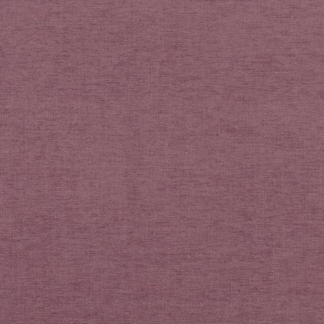
Rocco Cassis
Rocco

Isla Thistle
Textures 2 Collection
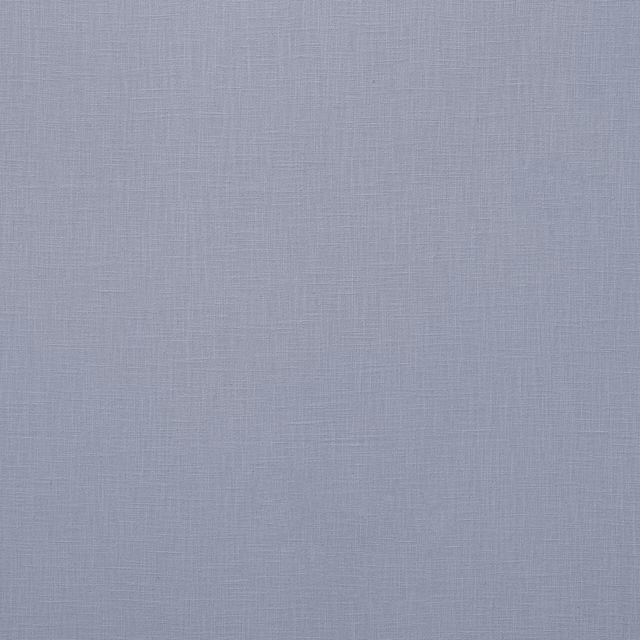
Loire Lavender
Verona Collection
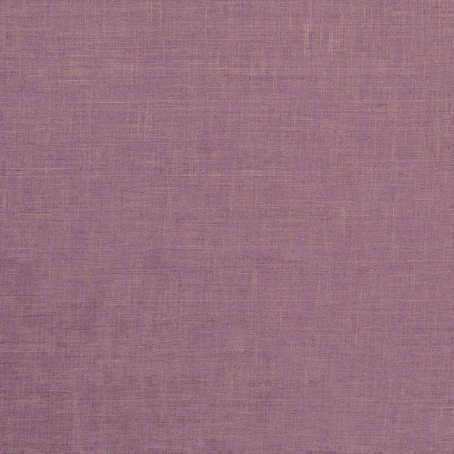
Albany Heather
Albany and Moray
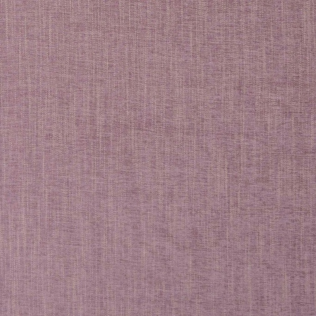
Moray Heather
Albany and Moray
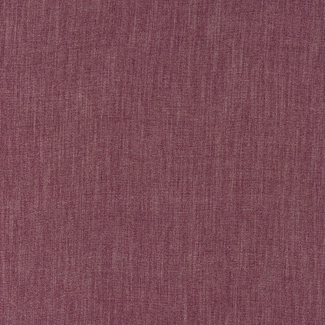
Monza Heather
Arezzo

Capri Recycled Heather
Eco -Friendly Ranges

Ario Lilac
Ario
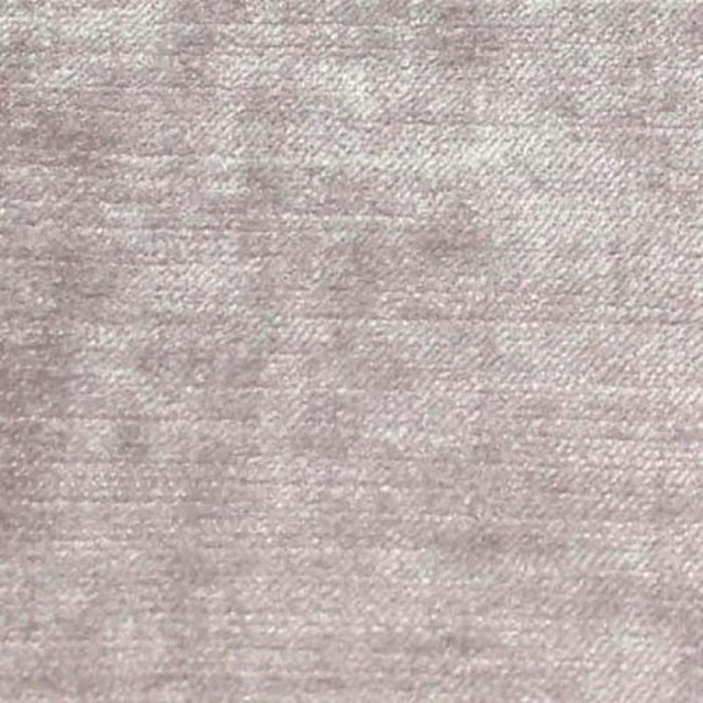
Carrera Lavender
Carrera
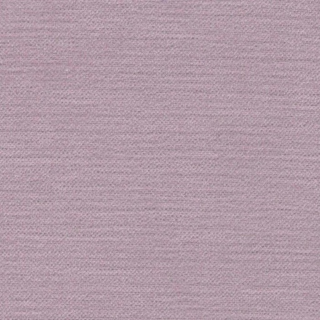
Cayman Lilac
Cayman
Astor Wallcovering Crocus
Astor Fr
Paint that goes with it
Two ways to take the room. Both colours are from houses we hold, so a pot can come off the same order as the cloth. Screens shift colour, so treat these as a direction and bring the cloth to the shelf before you buy the paint.
To sit quietly behind it
Rolling Fog
Little Greene · #c5bba8
To stand against it
Private Matters
Coat Paints · #9b5e45
Other purple fabrics
Across the houses we hold. See all 1,094.