

Tap the swatch to see it full screen. Hover it to magnify the weave. Colours on a screen are a guide, not a match, so come and feel the real cloth.
Scroll up or down to zoom in and out.
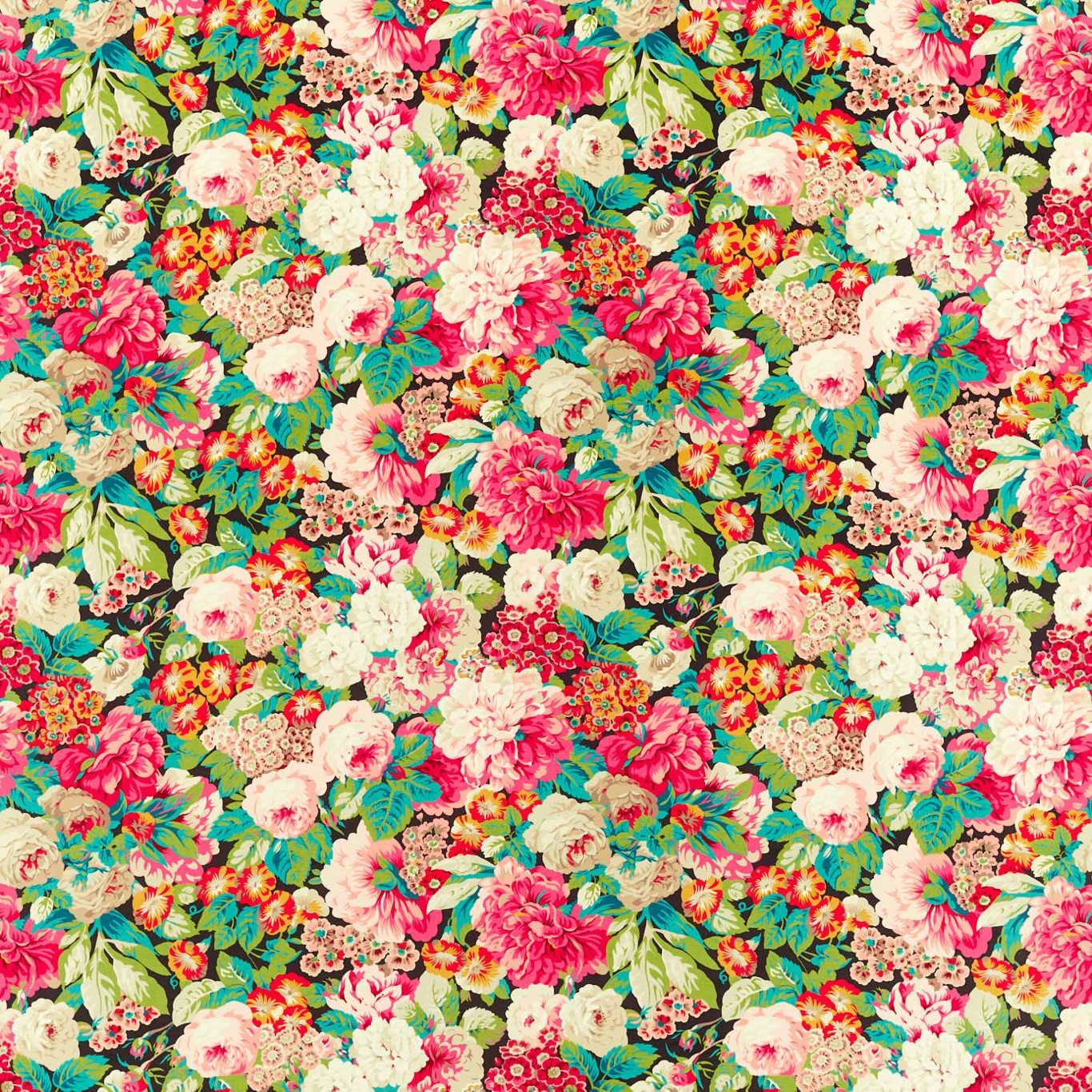
Rose & Peony Cerise/ Veridian
Sanderson One Sixty Fabrics FabricSAF0361-01
Rose & Peony Cerise/ Veridian is an exuberant floral packed with layered blooms, leafy sprigs and a dark ground that makes the colours flare. The mix of hot pink, cream, turquoise and fresh green gives this colourway a particularly jewel-bright, high-impact feel.
You have used your previews for today. Send one to Simon and you can carry on.
Your board
0 fabrics
See this fabric on Sanderson's own site, then order it through us.
See Rose & Peony Cerise/ Veridian in your own room
A photograph of the piece you want re-covered. Straight on is best, and daylight helps. It is used to make your picture and nothing else.
Looking at your room
We found things here Rose & Peony Cerise/ Veridian could go on. Tap one on the photograph, or choose below.
We could not see anything to re-cover
, s
Rose & Peony Cerise/ Veridian, on your
Drag to compare. AI impression, colours indicative: ask us for a cutting before you decide.
About this fabric
This upholstery-weight fabric has a substantial 416 gsm handle and a dense weave at 57.7 threads per cm, giving the design a rich, full-bodied presence. The 137 cm usable width and 52 cm vertical repeat support large-scale pattern placement, which suits the abundant rose and peony clusters shown here. In this Cerise/ Veridian colourway, the pinks read vivid and energetic against the deep ground, while the teal and leaf greens add a cool contrast that keeps the whole surface lively rather than sugary. It is a bold decorative textile with strong visual depth, made to stand out on larger pieces where the pattern can spread.
How to use it
Use it on an occasional chair, ottoman or a pair of accent cushions to let the cerise and veridian tones lead the room. It also works well against painted woodwork, dark timbers or plain linens that give the busy floral room to breathe.
A vivid statement fabric that brings instant colour and energy to classic or eclectic interiors.
More from Sanderson One Sixty Fabrics
The same book, other colourways.
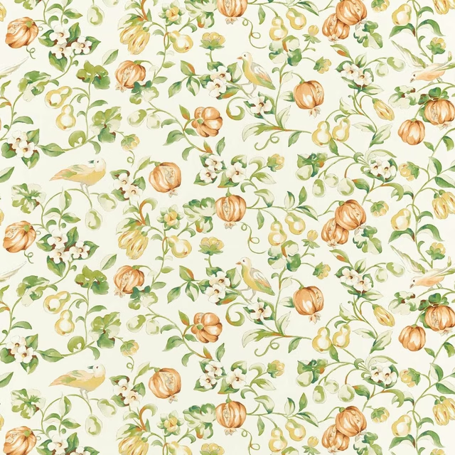
Pear and Pomegranate Teal/ Papaya
Sanderson One Sixty Fabrics
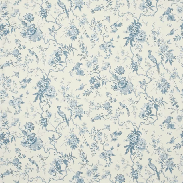
Pillemont Toile Ivory/China Blue
Sanderson One Sixty Fabrics
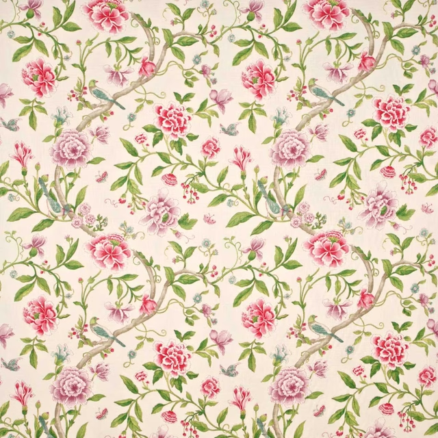
Porcelain Garden Magenta/Leaf Green
Sanderson One Sixty Fabrics
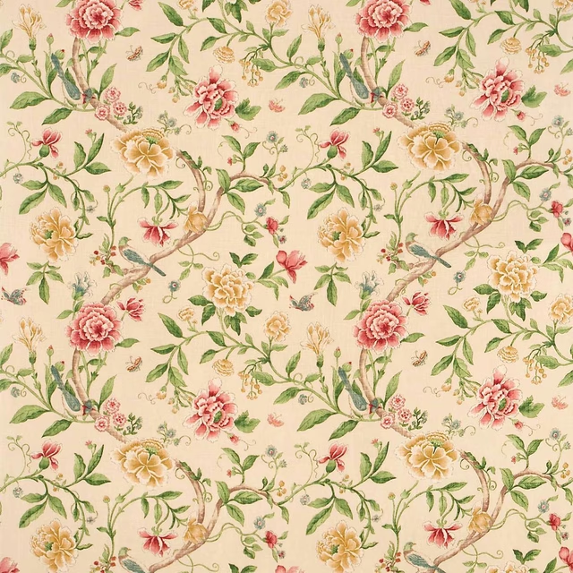
Porcelain Garden Red/Beige
Sanderson One Sixty Fabrics
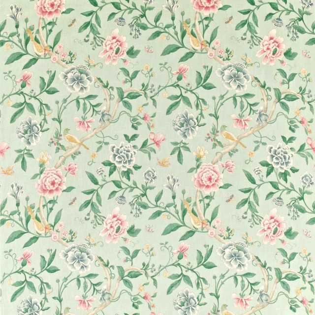
Porcelain Garden Rose/Duck Egg
Sanderson One Sixty Fabrics
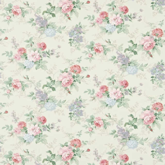
Rosamund Cream/Lilac
Sanderson One Sixty Fabrics
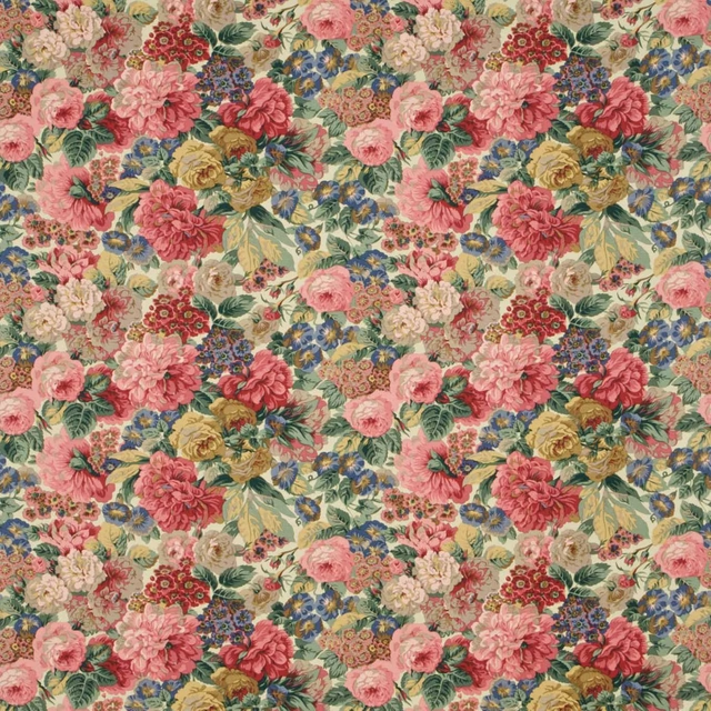
Rose And Peony Red
Sanderson One Sixty Fabrics
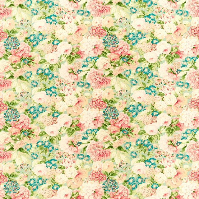
Rose And Peony Sage/ Coral
Sanderson One Sixty Fabrics
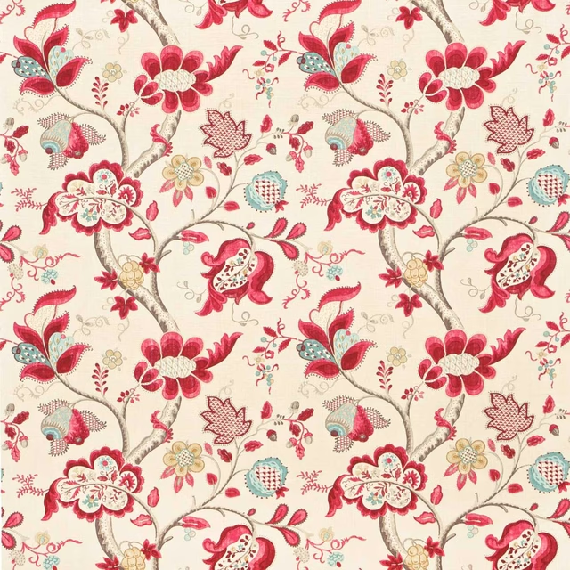
Roslyn Berry/Slate
Sanderson One Sixty Fabrics
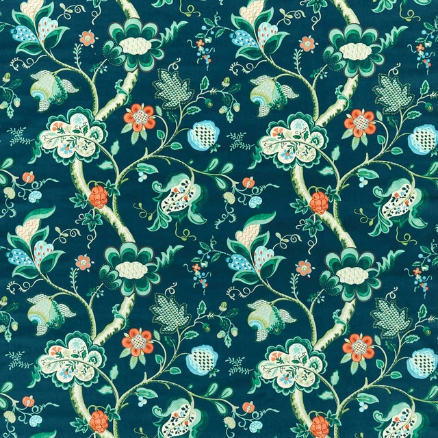
Roslyn Eucalyptus/Rowan Berry
Sanderson One Sixty Fabrics
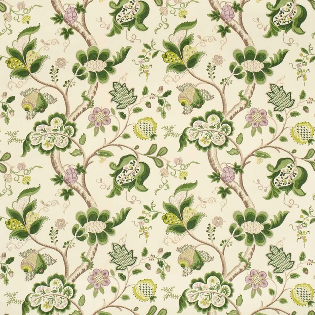
Roslyn Green
Sanderson One Sixty Fabrics
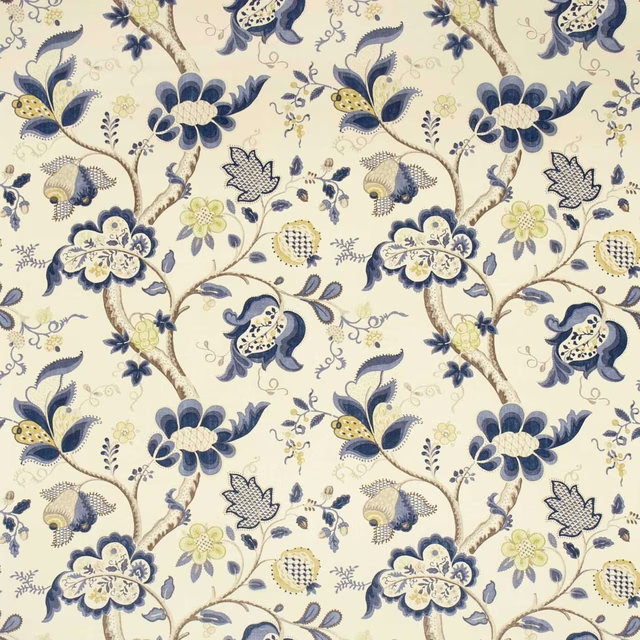
Roslyn Indigo/Gold
Sanderson One Sixty Fabrics
Pairs well with
A pattern needs somewhere for the eye to rest, so these are the plains and textures that sit beside Rose & Peony Cerise/ Veridian without fighting it. Mixed across the houses we hold, which is the part a single supplier's book cannot do.

Alaska Fuschia
Alaska Collection

Alaska Hollyhock
Alaska Collection
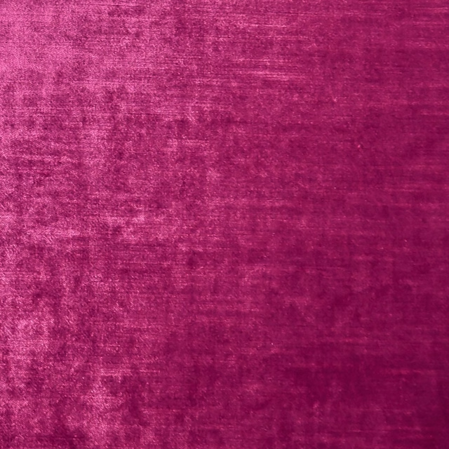
Allure Magenta
Allure

Alvar Fuchsia
Alvar 2

Lucerne Bloom
Lucerne Silks
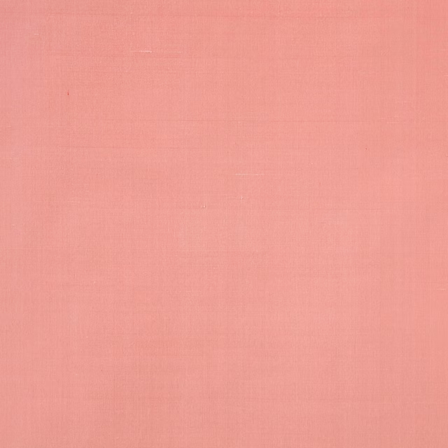
Lucerne Camellia
Lucerne Silks
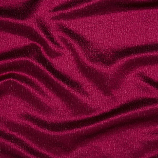
Alchemy Fuchsia
Alchemy

Glamour Blush
Glamour

Issoria Blush
Momentum Velvets Edit

Performance Velvets Coral
Performance Velvet
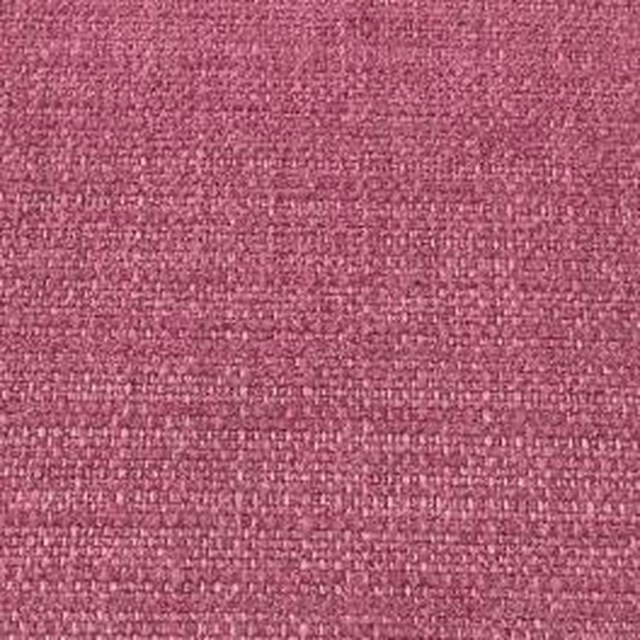
Hendrix Fuchsia
Hendrix
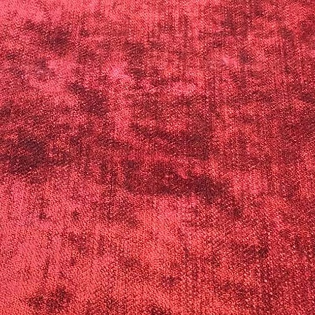
Modena Fuchsia
Modena
Paint that goes with it
Two ways to take the room. Both colours are from houses we hold, so a pot can come off the same order as the cloth. Screens shift colour, so treat these as a direction and bring the cloth to the shelf before you buy the paint.
To sit quietly behind it
Sybil
Coat Paints · #c1a18c
To stand against it
Papavera
Sanderson · #e2c15a
Other pink fabrics
Across the houses we hold. See all 2,519.
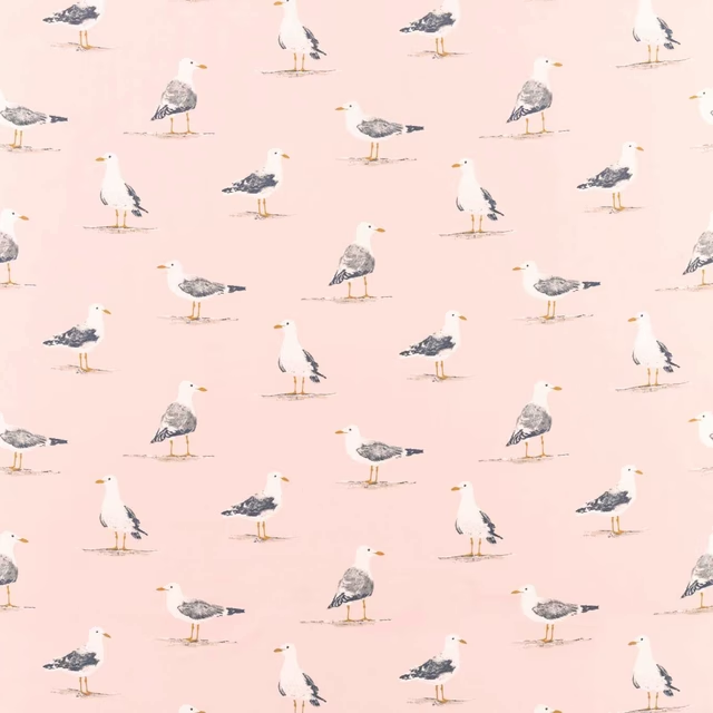
Shore Birds Blush
Sanderson Home Fabrics
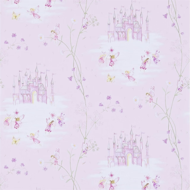
Fairy Castle Pink
Sanderson Home Wallpapers
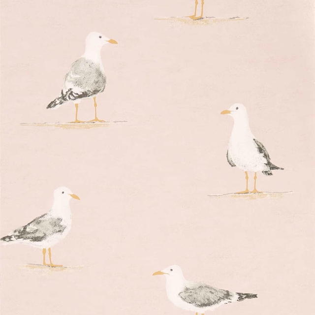
Shore Birds Blush
Sanderson Home Wallpapers
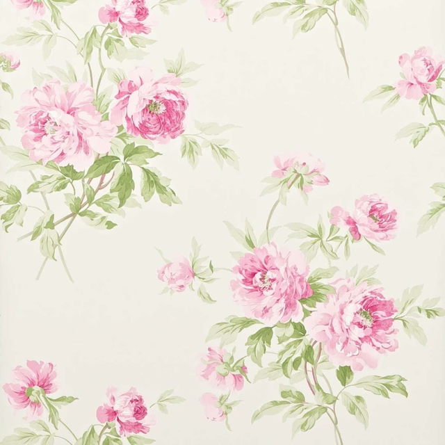
Adele Raspberry/Ivory
Sanderson One Sixty Wallpapers
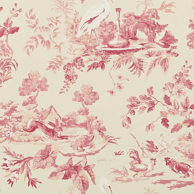
Aesops Fables Pink
Sanderson One Sixty Wallpapers
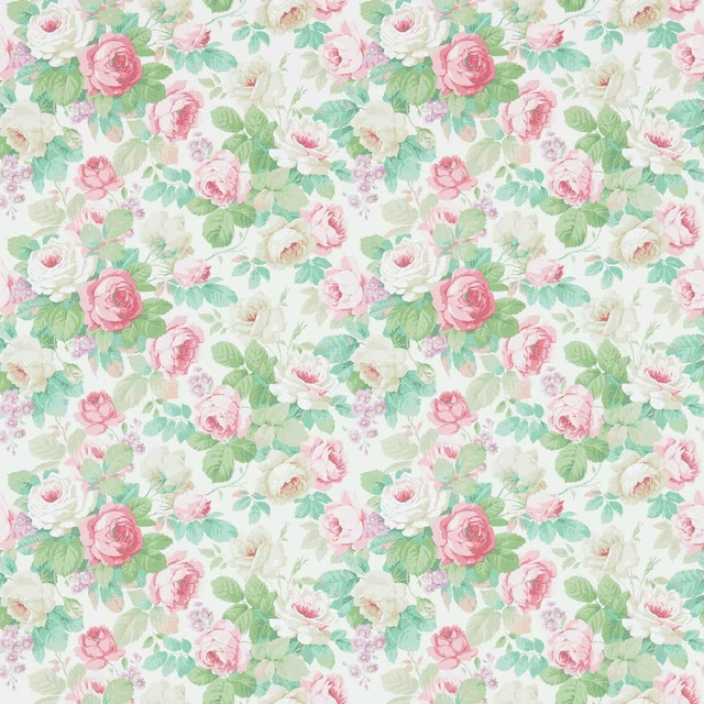
Chelsea Pink/Celadon
Sanderson One Sixty Wallpapers
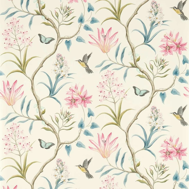
Clementine Dusky Pink
Sanderson One Sixty Wallpapers
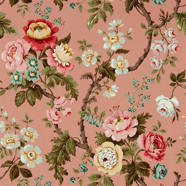
Hykenham French Rose
Sanderson One Sixty Wallpapers

New Tiger Stripe Rose/Ivory
Sanderson One Sixty Wallpapers

Dazzle Conch/Madder
Sanderson x Giles Deacon Fabric

Fringed Tulip Toile Putty
Sanderson x Giles Deacon Fabric
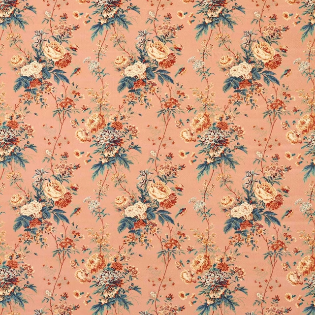
Lakeland Paradis Velvet Sandstone
Sanderson x Giles Deacon Fabric