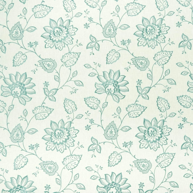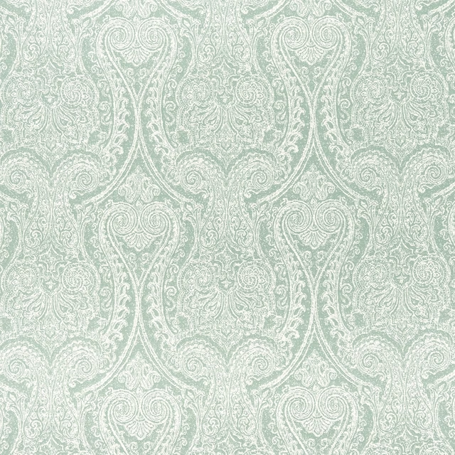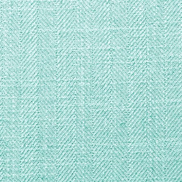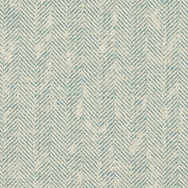

Tap the swatch to see it full screen. Hover it to magnify the weave. Colours on a screen are a guide, not a match, so come and feel the real cloth.
Scroll up or down to zoom in and out.
Scintilla Teal/Spice
Fusion Wallpaper WallpaperCCW0068-04
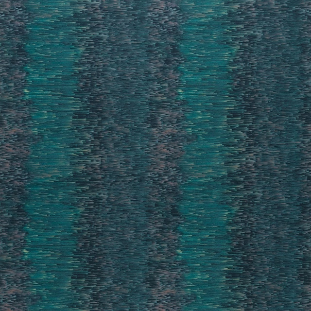
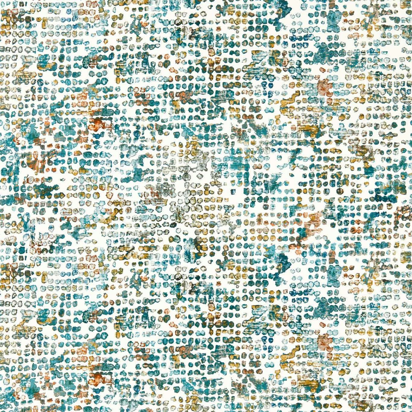
Scintilla Teal/Spice is a densely stippled wallpaper with a cool teal and blue-green field, scattered with warm spice, ochre and charcoal marks. Its pale ground keeps the intricate surface feeling light while the varied flecks add depth.
You have used your previews for today. Send one to Simon and you can carry on.
Your board
0 fabrics
Part of the range we hold from Clarke & Clarke.
See Scintilla Teal/Spice in your own room
A photograph of the piece you want re-covered. Straight on is best, and daylight helps. It is used to make your picture and nothing else.
Looking at your room
We found things here Scintilla Teal/Spice could go on. Tap one on the photograph, or choose below.
We could not see anything to re-cover
, s
Scintilla Teal/Spice, on your
Drag to compare. AI impression, colours indicative: ask us for a cutting before you decide.
About this wallpaper
The design is formed from closely packed small loops, speckles and irregular printed marks, creating a tactile-looking, almost woven mosaic across the surface. Cool teal and blue-green tones dominate, while rust-spice and ochre accents provide flashes of warmth against the pale ground. At 150 gsm, this wallpaper has a defined but lightweight specification. It is supplied in a 10.05 m standard length with a 52 cm usable width, and the vertical pattern repeat is 32 cm with a 0 cm horizontal repeat.
How to use it
Use this cool teal colourway across a study, dining room or feature wall where its fine, energetic pattern can sit alongside warm timber, brass and rust-coloured upholstery. Pale flooring and chalky neutrals will emphasise the light ground without losing the spice accents.
Pair the cool teal ground with warm timber, pale neutrals and rust-toned accents to draw out the spice flecks.
More from Fusion Wallpaper
The same book, other colourways.
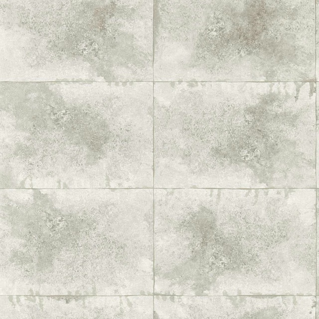
Igneous Pearl
Fusion Wallpaper
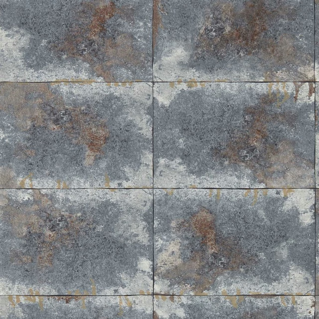
Igneous Slate
Fusion Wallpaper
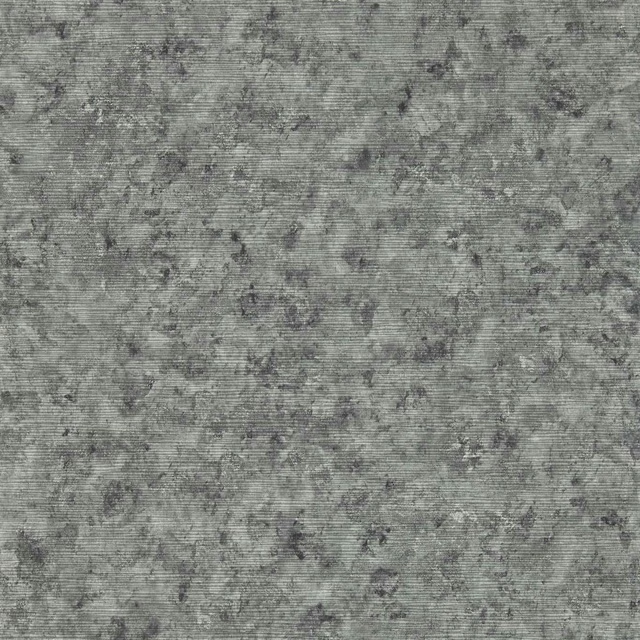
Impression Charcoal
Fusion Wallpaper
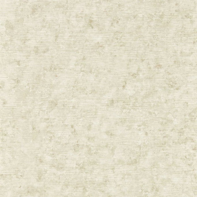
Impression Natural
Fusion Wallpaper

Impression Stone
Fusion Wallpaper
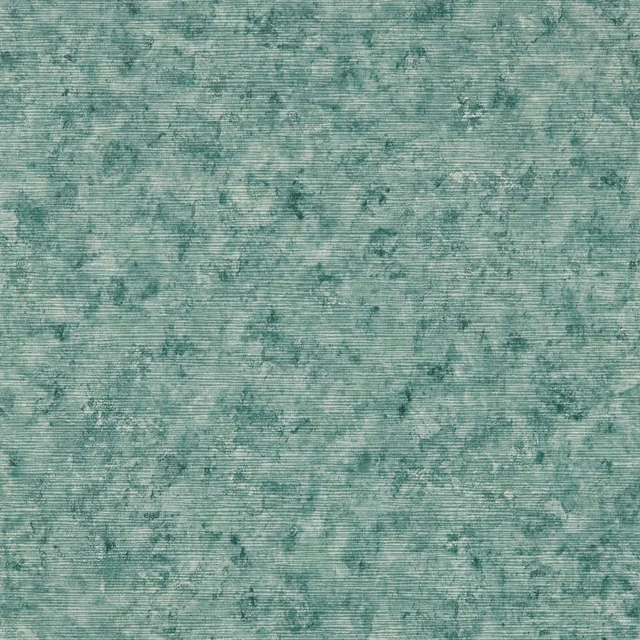
Impression Teal
Fusion Wallpaper
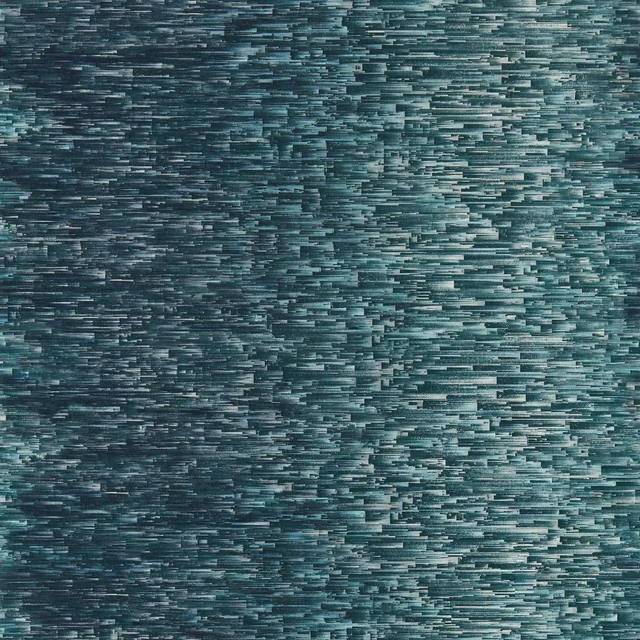
Ombre Denim
Fusion Wallpaper
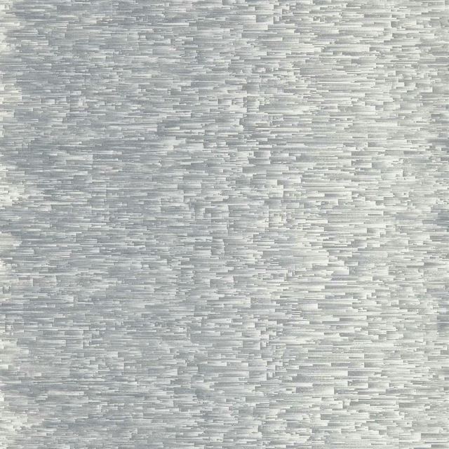
Ombre Slate
Fusion Wallpaper
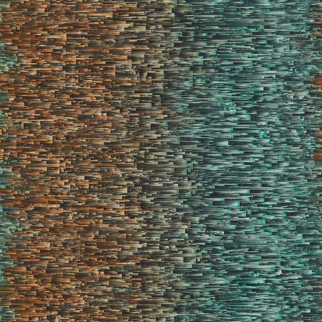
Ombre Teal/Spice
Fusion Wallpaper
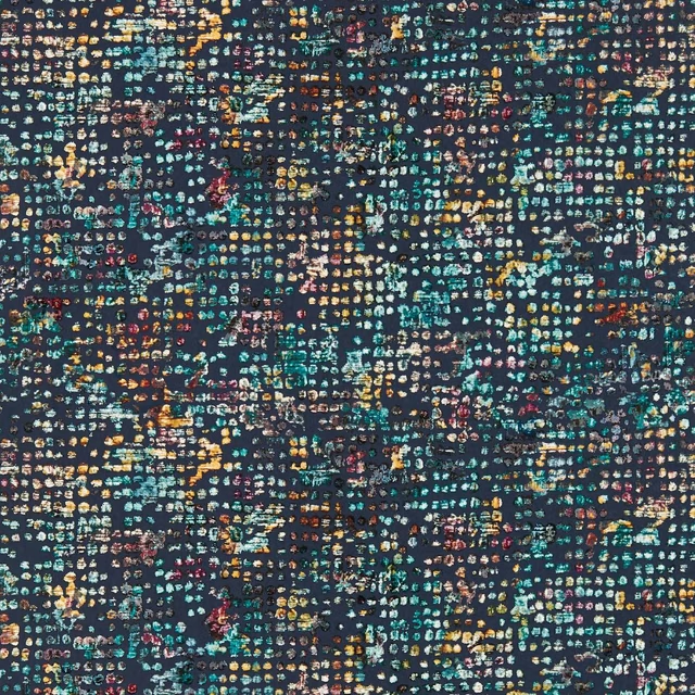
Scintilla Midnight
Fusion Wallpaper
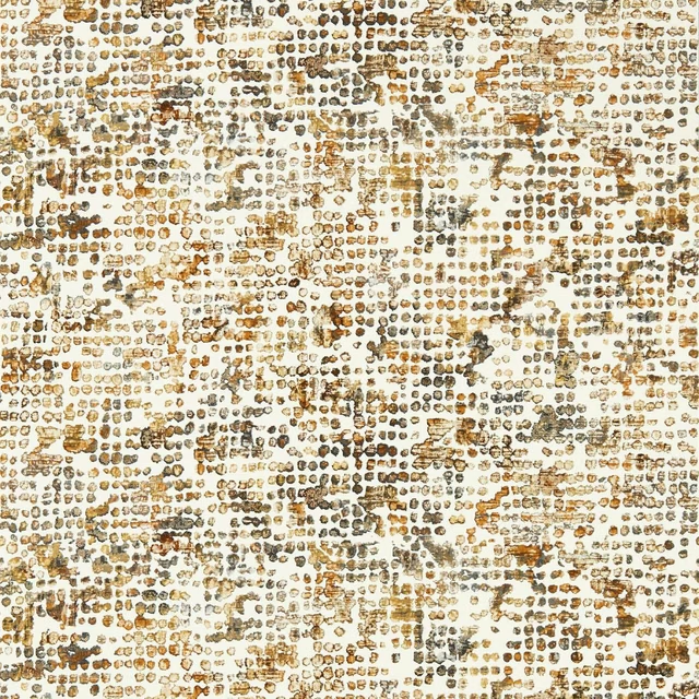
Scintilla Ochre
Fusion Wallpaper
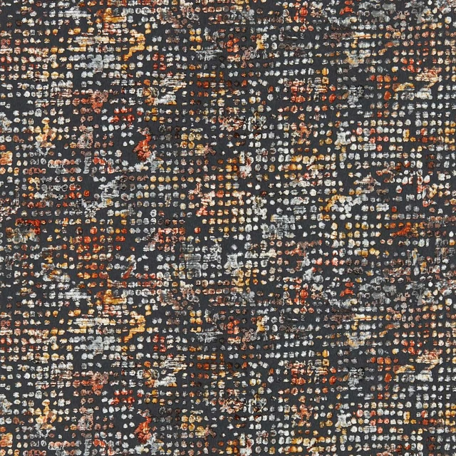
Scintilla Spice/Dusk
Fusion Wallpaper
Pairs well with
A pattern needs somewhere for the eye to rest, so these are the plains and textures that sit beside Scintilla Teal/Spice without fighting it. Mixed across the houses we hold, which is the part a single supplier's book cannot do.

Alaska Teal
Alaska Collection
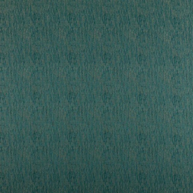
Alula Peacock
Comet Collection

Marldon Aqua
Albeck
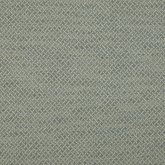
Medway Aqua
Brett Weaves
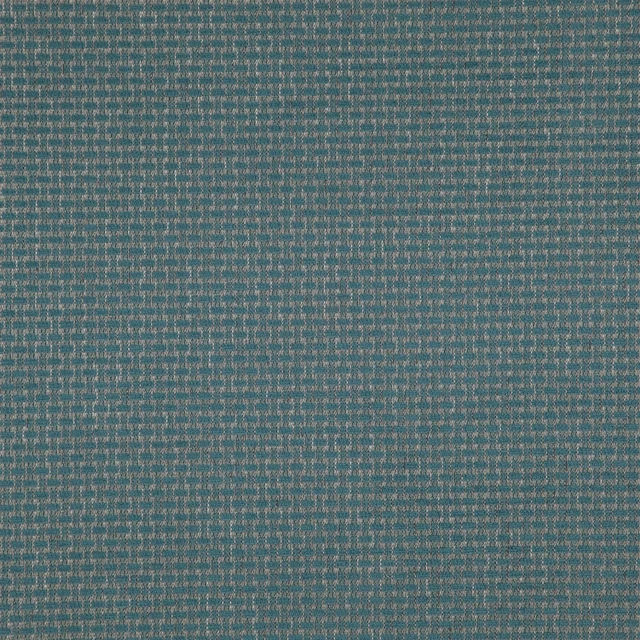
Barden Sea
Birkett easyclean Fabrics

Corda FR SR Petrol
Corda FR SR
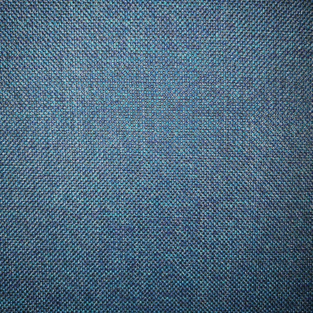
Arran FR Teal
Alderney

Naples FR Turquoise
Alderney

Allegra Lagoon
Allegra

Allegra Mallard
Allegra

Amalfi Blue Grass
Amalfi
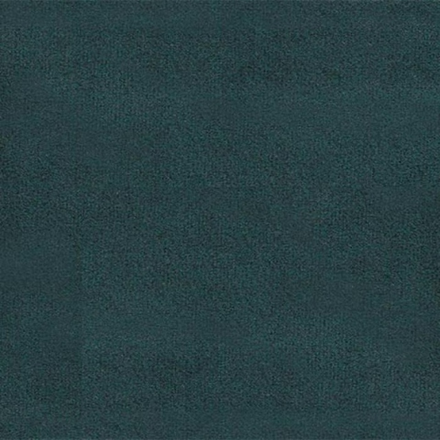
Amalfi Peacock
Amalfi
Paint that goes with it
Two ways to take the room. Both colours are from houses we hold, so a pot can come off the same order as the cloth. Screens shift colour, so treat these as a direction and bring the cloth to the shelf before you buy the paint.
To sit quietly behind it
Pearl Colour - Dark
Little Greene · #bec5b8
To stand against it
Wortle Light
Sanderson · #715c63
Other teal fabrics
Across the houses we hold. See all 2,990.