

Tap the swatch to see it full screen. Hover it to magnify the weave. Colours on a screen are a guide, not a match, so come and feel the real cloth.
Scroll up or down to zoom in and out.
Igneous Pearl
Fusion Wallpaper WallpaperCCW0063-03
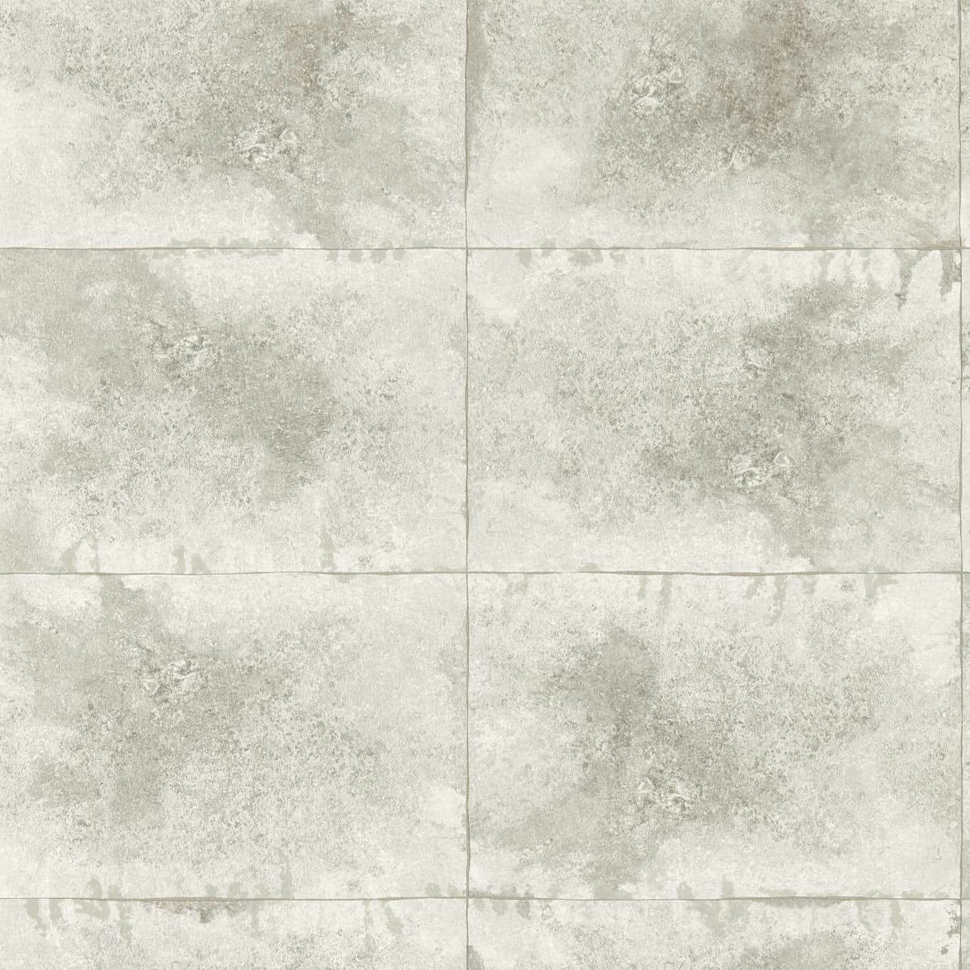
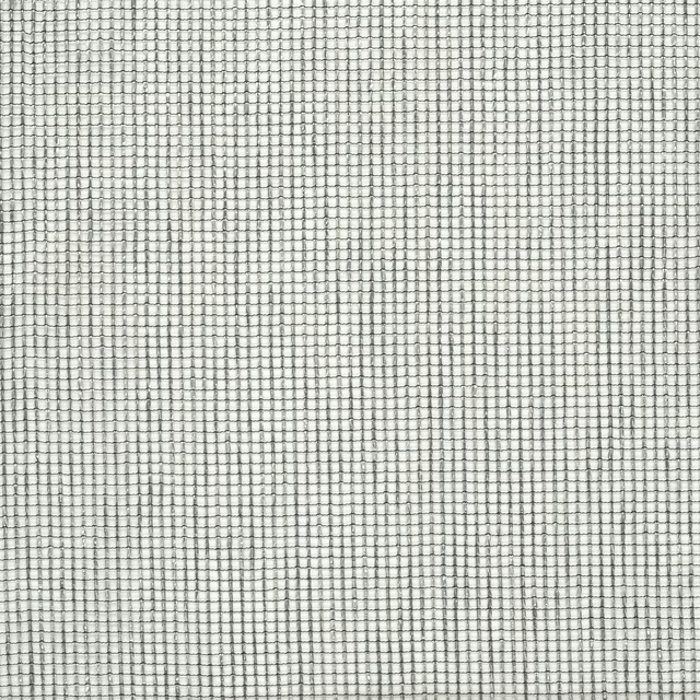
Igneous Pearl presents a pale pearl-grey ground overlaid with cloudy mineral mottling and softly squared panel lines. Its cool, washed tone gives the design a light architectural presence rather than a bold graphic statement.
You have used your previews for today. Send one to Simon and you can carry on.
Your board
0 fabrics
Part of the range we hold from Clarke & Clarke.
See Igneous Pearl in your own room
A photograph of the piece you want re-covered. Straight on is best, and daylight helps. It is used to make your picture and nothing else.
Looking at your room
We found things here Igneous Pearl could go on. Tap one on the photograph, or choose below.
We could not see anything to re-cover
, s
Igneous Pearl, on your
Drag to compare. AI impression, colours indicative: ask us for a cutting before you decide.
About this wallpaper
The surface combines off-white pearl, soft grey and a restrained green-grey cast in irregular, clouded patches that resemble weathered mineral or gently distressed plaster. Fine horizontal and vertical lines divide the visible design into broad square sections, adding structure beneath the diffuse tonal variation. With a supplied weight of 150 gsm, a 52 cm usable width and a 52 cm vertical pattern repeat, it is specified as a wallpaper with a 10.05 m standard length. The low-contrast colouring keeps the panel effect subtle, while the mottled areas provide enough depth to prevent the pale ground from looking flat.
How to use it
Pair Igneous Pearl with chalky whites, pale greys and muted sage accents to echo its cool mineral colouring. It suits a calm bedroom, refined sitting room or softly contemporary hallway where its square divisions can read as understated architectural detail.
Use this pale mineral-effect design to bring quiet, architectural texture to walls without adding strong colour.
More from Fusion Wallpaper
The same book, other colourways.
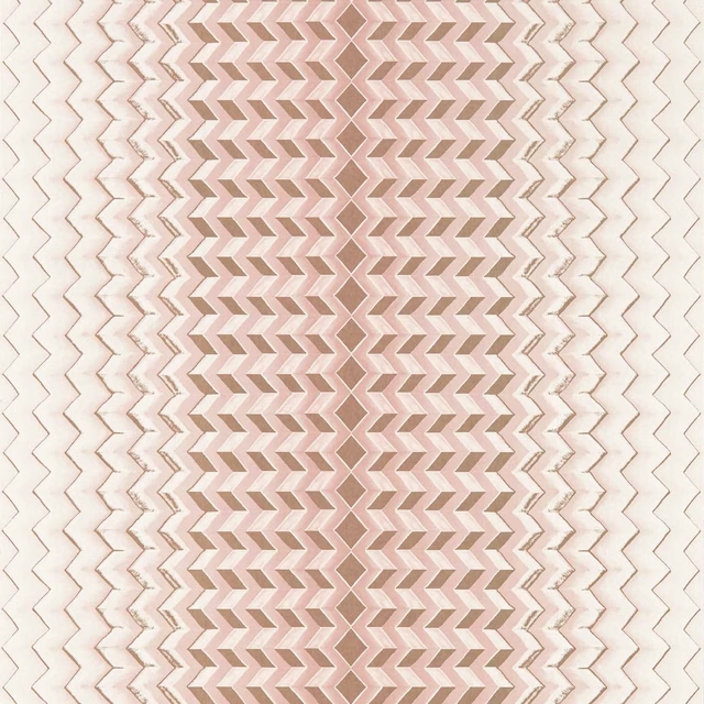
Fragment Blush/Gold
Fusion Wallpaper
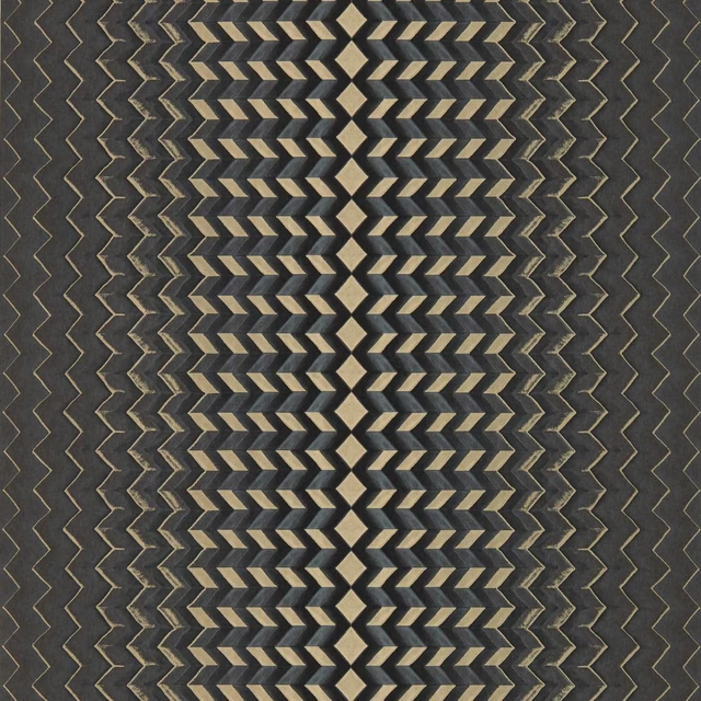
Fragment Charcoal/Gold
Fusion Wallpaper
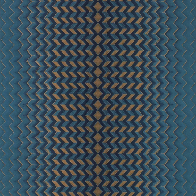
Fragment Midnight/Copper
Fusion Wallpaper
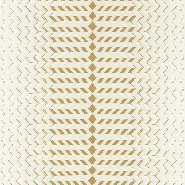
Fragment Natural/Gold
Fusion Wallpaper
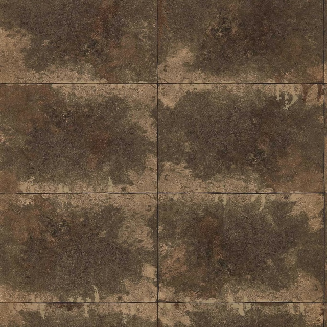
Igneous Bronze
Fusion Wallpaper
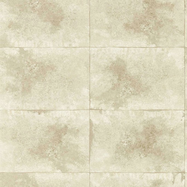
Igneous Champagne
Fusion Wallpaper
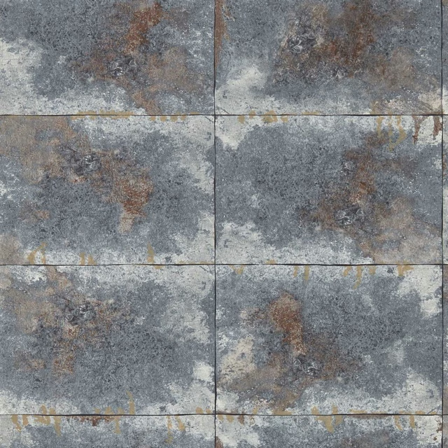
Igneous Slate
Fusion Wallpaper
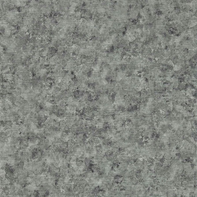
Impression Charcoal
Fusion Wallpaper
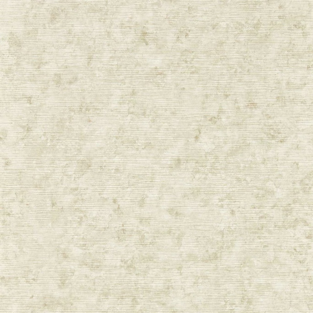
Impression Natural
Fusion Wallpaper
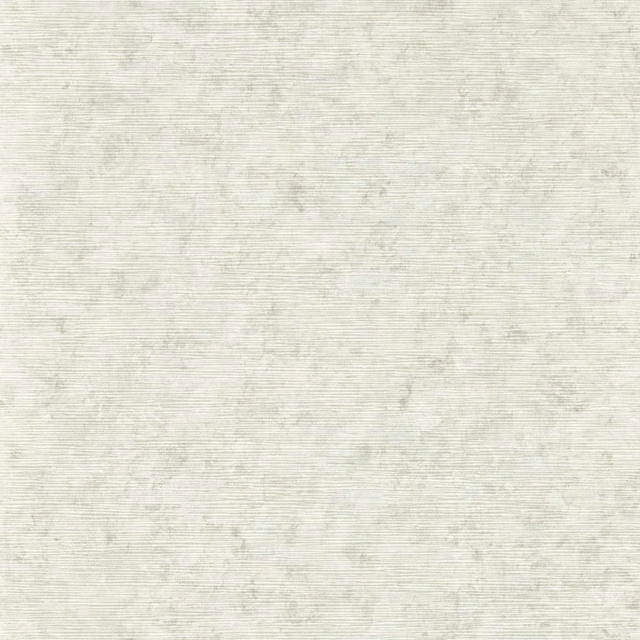
Impression Stone
Fusion Wallpaper
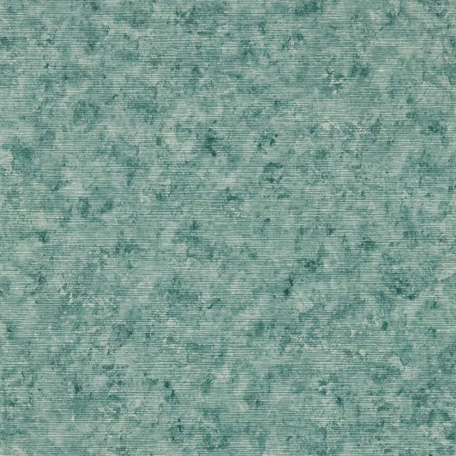
Impression Teal
Fusion Wallpaper
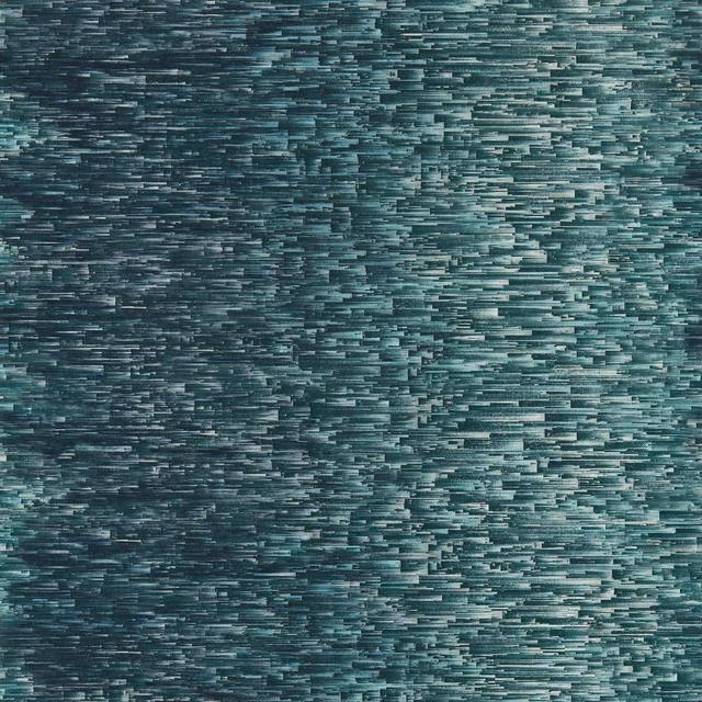
Ombre Denim
Fusion Wallpaper
Pairs well with
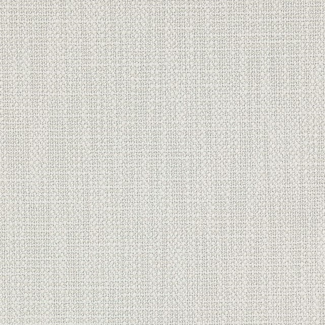
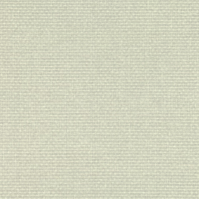
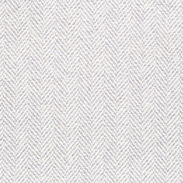
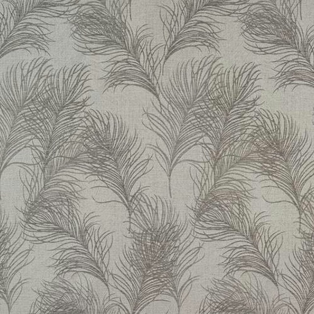
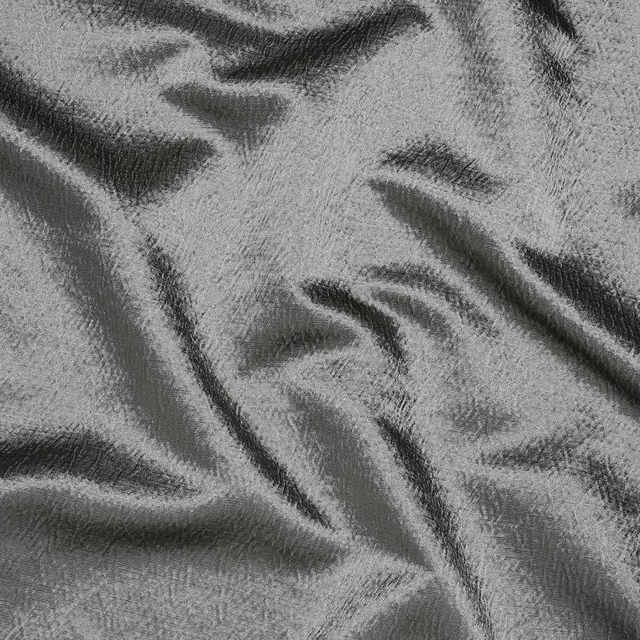
A pattern needs somewhere for the eye to rest, so these are the plains and textures that sit beside Igneous Pearl without fighting it. Mixed across the houses we hold, which is the part a single supplier's book cannot do.


Paint that goes with it
Two ways to take the room. Both colours are from houses we hold, so a pot can come off the same order as the cloth. Screens shift colour, so treat these as a direction and bring the cloth to the shelf before you buy the paint.
To sit quietly behind it
French Grey - Mid
Little Greene · #d6d6ca
To stand against it
Sussex Rush
Morris & Co. · #a37d4e
Other grey fabrics
Across the houses we hold. See all 7,198.
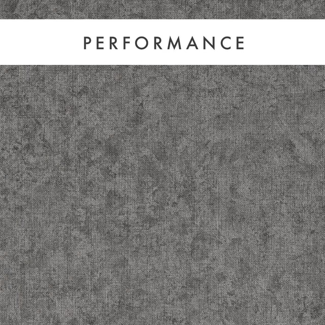
Texo Steel
Expressions Performance Wallcoverings
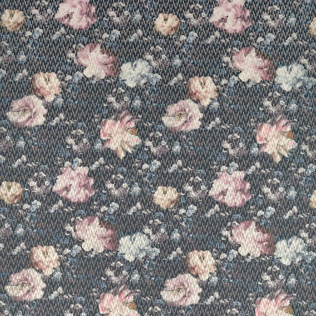
Camile Blush/Charcoal
Fusion
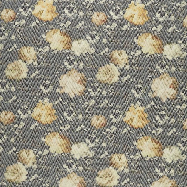
Camile Chartreuse/Charcoal
Fusion
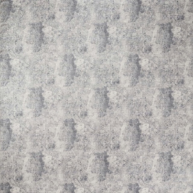
Impression Pewter
Fusion
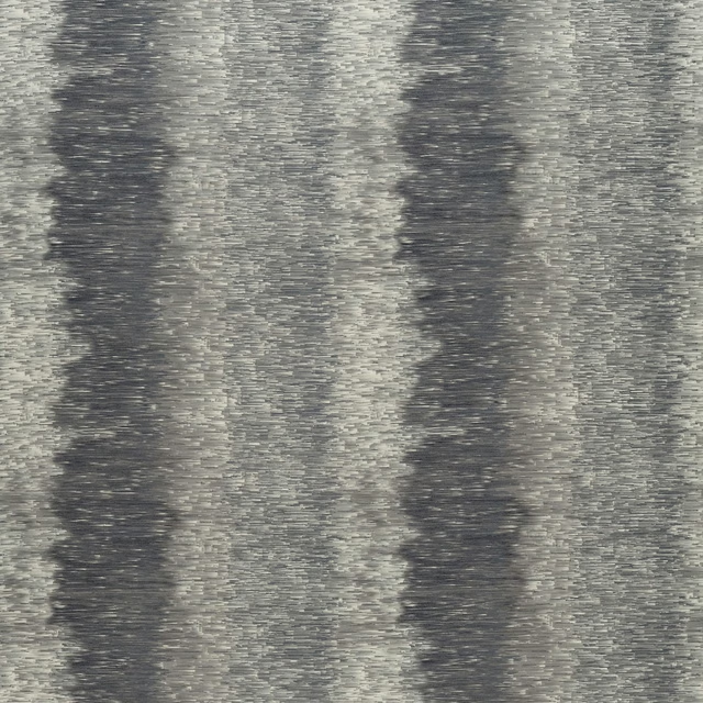
Ombre Charcoal
Fusion
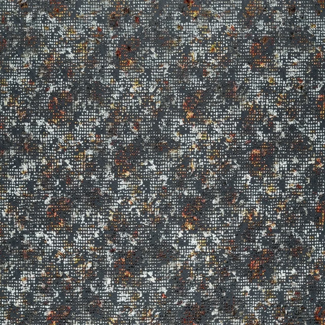
Scintilla Spice/Dusk
Fusion
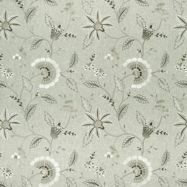
Delamere Natural
Halcyon
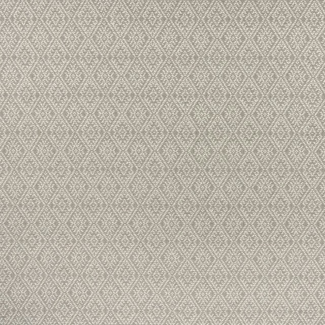
Hampstead Charcoal
Halcyon
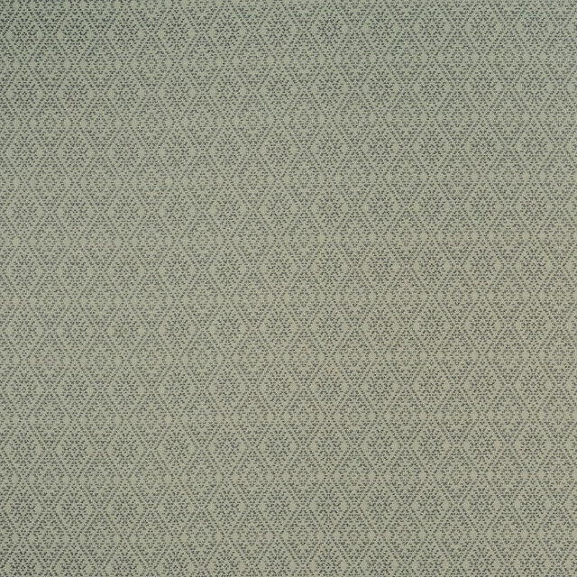
Hampstead Storm
Halcyon
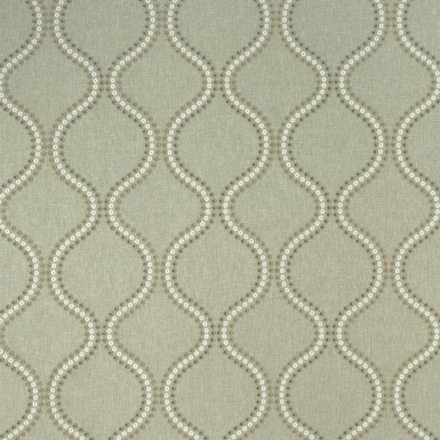
Layton Dove
Halcyon
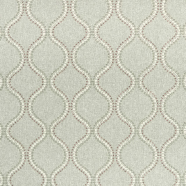
Layton Heather
Halcyon
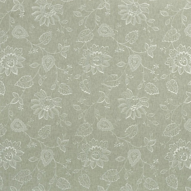
Liliana Dove
Halcyon