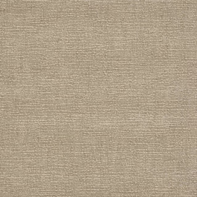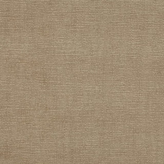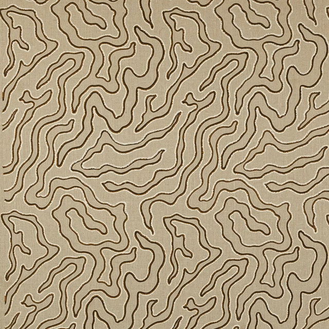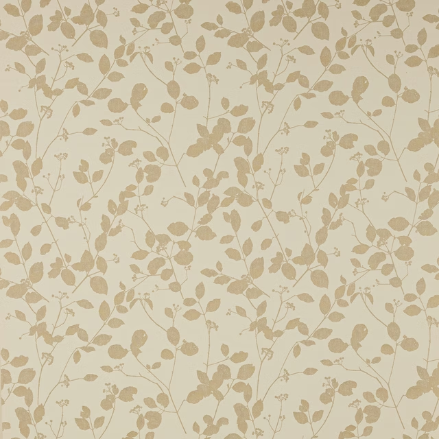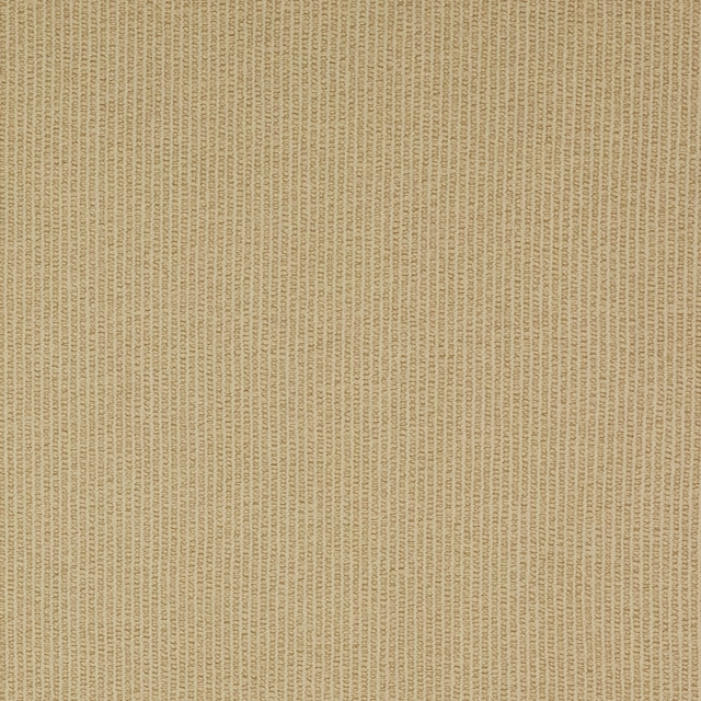

Tap the swatch to see it full screen. Hover it to magnify the weave. Colours on a screen are a guide, not a match, so come and feel the real cloth.
Scroll up or down to zoom in and out.
Pietro Clay
Asti FabricL9547-03
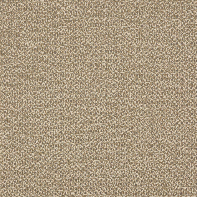
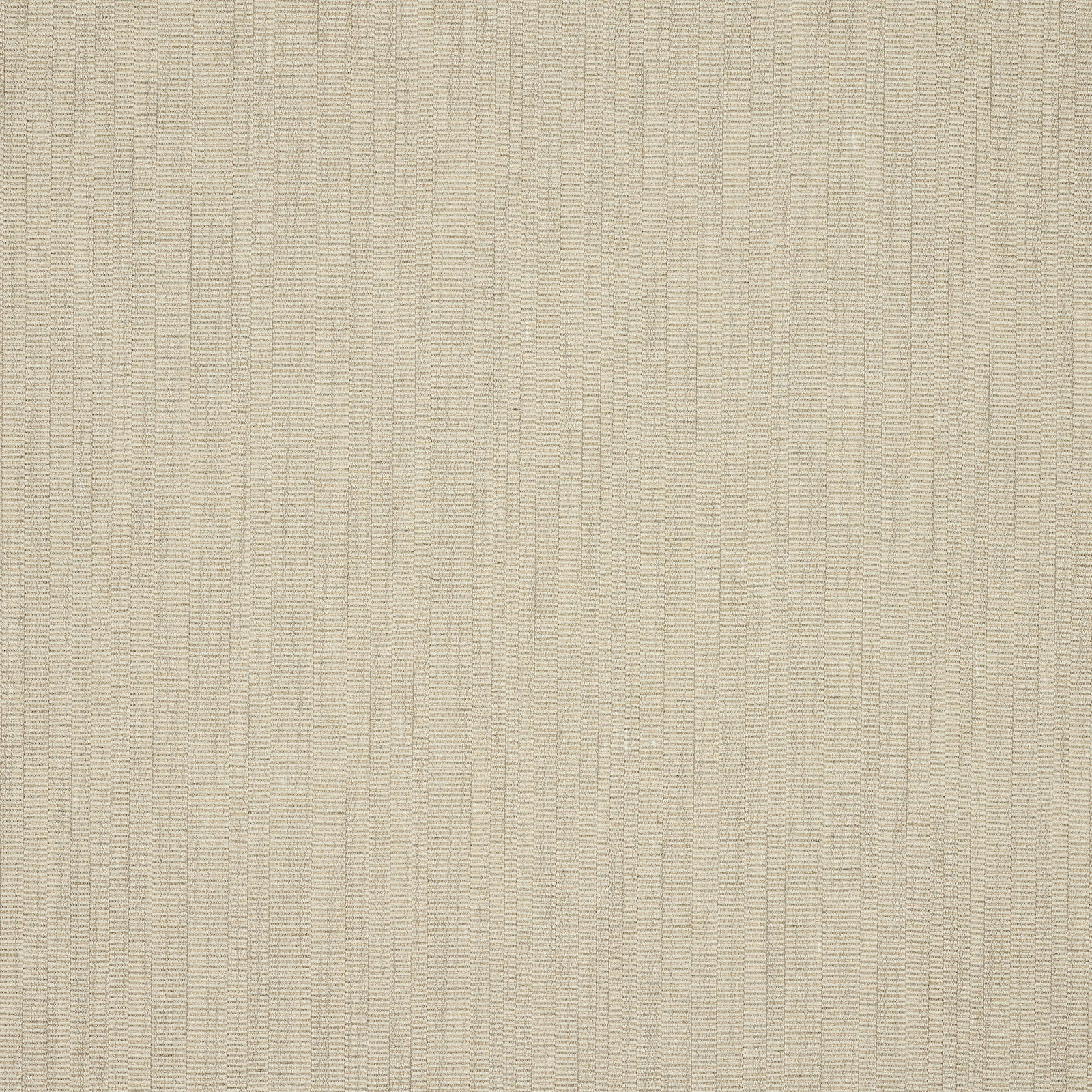
Pietro Clay is a quietly textured weave in a soft clay beige that reads warm, pale and understated across the swatch. Its fine vertical structure gives the colour a gentle rhythm rather than a flat solid finish.
You have used your previews for today. Send one to Simon and you can carry on.
Your board
0 fabrics
See this fabric on Larsen's own site, then order it through us.
See Pietro Clay in your own room
A photograph of the piece you want re-covered. Straight on is best, and daylight helps. It is used to make your picture and nothing else.
Looking at your room
We found things here Pietro Clay could go on. Tap one on the photograph, or choose below.
We could not see anything to re-cover
, s
Pietro Clay, on your
Drag to compare. AI impression, colours indicative: ask us for a cutting before you decide.
About this fabric
Part of Larsen’s Asti collection, Pietro Clay is a fabric with a 140cm approximate width and a simple, non-figurative construction with no repeat (V 0cm / H 0cm approx). The composition brings together 28% Cotton, 26% Virgin Wool, 23% Viscose, 20% Linen and 3% Polyamide, which suits the dry, natural handle suggested by the visible weave. In this colourway the tone sits between cream and beige with a muted clay warmth, so it feels softer than a taupe and less yellow than a biscuit shade. The fine vertical striation catches the light subtly, giving the surface a tailored, textile depth without becoming busy.
How to use it
Use Pietro Clay where you want a warm neutral that won’t dominate, especially on relaxed seating, ottomans or simple drapery with crisp lines. Its pale clay tone pairs well with timber, stone, olive accents and other natural textures.
A calm clay-beige weave that works beautifully as either upholstery or tailored curtains.
More from Asti
The same book, other colourways.
Massi Charcoal
Asti
Massi Linen
Asti
Massi Ocean
Asti
Massi Sand
Asti
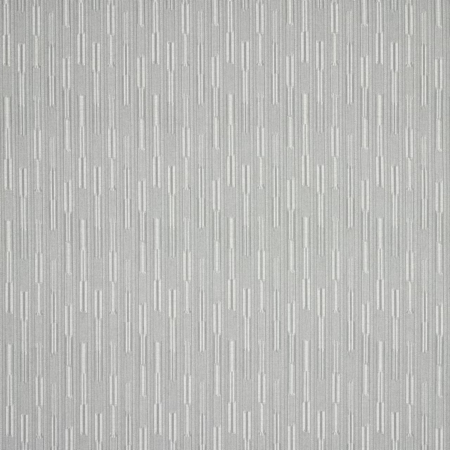
Massi Sea Glass
Asti
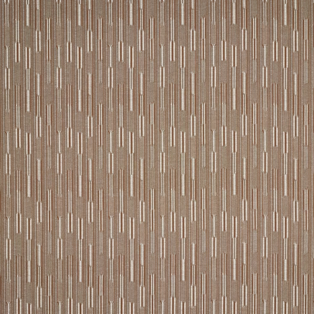
Massi Wood
Asti

Pietro Cream
Asti
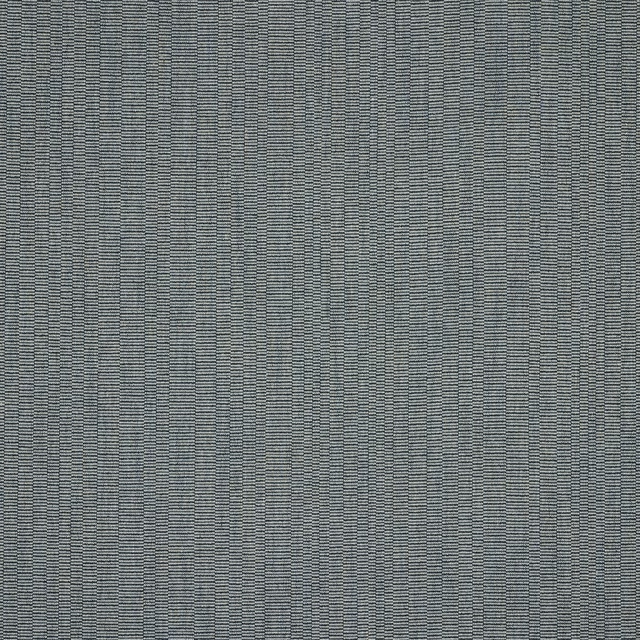
Pietro Ocean
Asti

Pietro Pearl
Asti
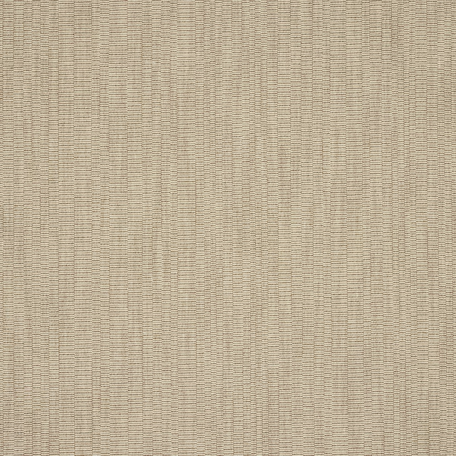
Pietro Sand
Asti
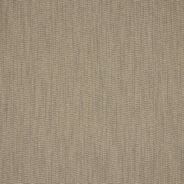
Pietro Taupe
Asti
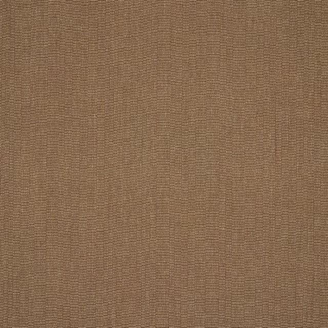
Pietro Tobacco
Asti
Pairs well with
A pattern needs somewhere for the eye to rest, so these are the plains and textures that sit beside Pietro Clay without fighting it. Mixed across the houses we hold, which is the part a single supplier's book cannot do.

Alessi Clay
Carlo

Senso Clay
Senso

Alaska Latte
Alaska Collection
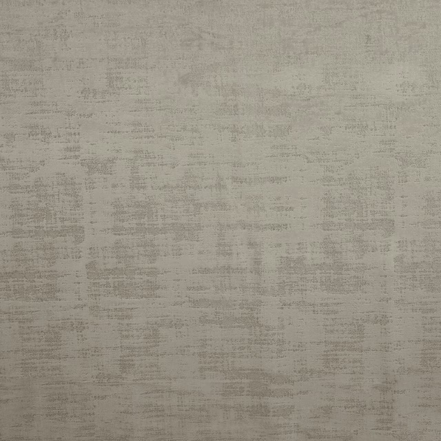
Dakota Putty
Dakota Collection
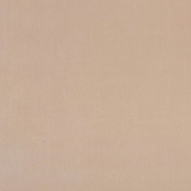
Alvar Nude
Alvar 2
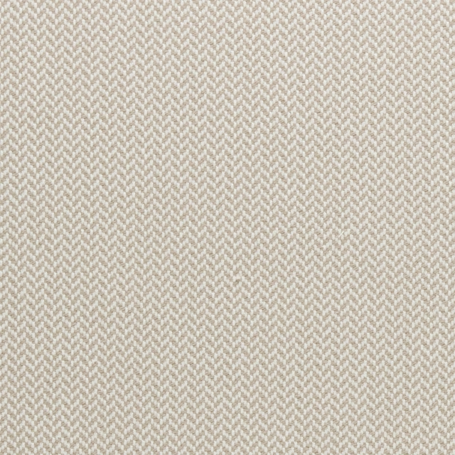
Zalika Natural
Amara
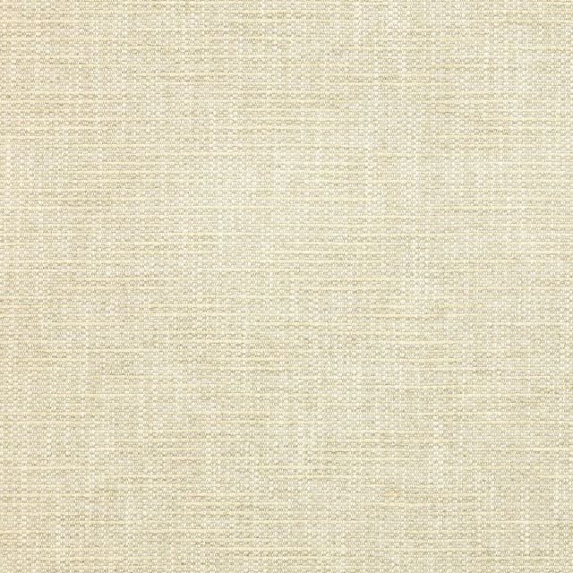
Brandon Beige
Albeck
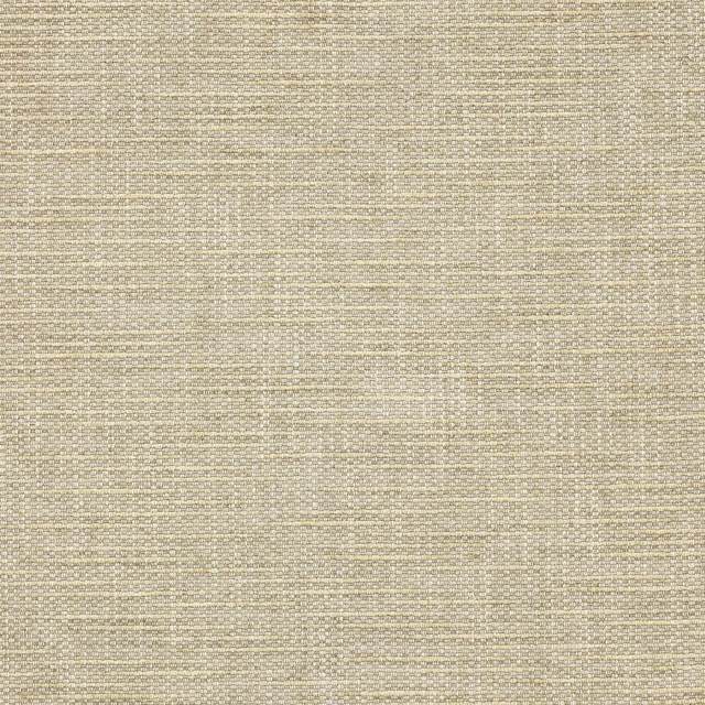
Brandon Stone
Albeck
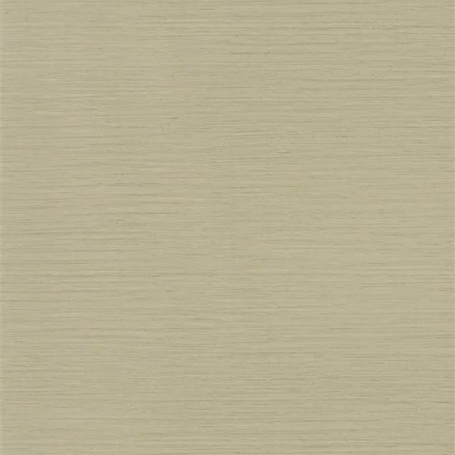
Kyushu Flax
Casablanca Textured Wallpaper

Keswick Greige
Keswick Fabrics
Arran FR Praline
Alderney
Kensington Caramel
Brodsworth
Paint that goes with it
Two ways to take the room. Both colours are from houses we hold, so a pot can come off the same order as the cloth. Screens shift colour, so treat these as a direction and bring the cloth to the shelf before you buy the paint.
To sit quietly behind it
And Breathe
Coat Paints · #cbc5b1
To stand against it
Ashes of Roses
Little Greene · #945e5c
Other beige fabrics
Across the houses we hold. See all 4,485.