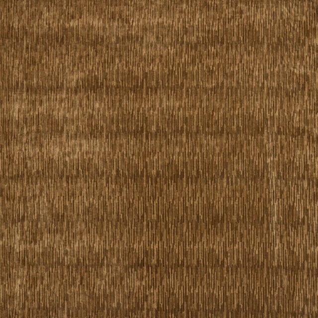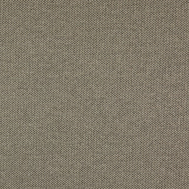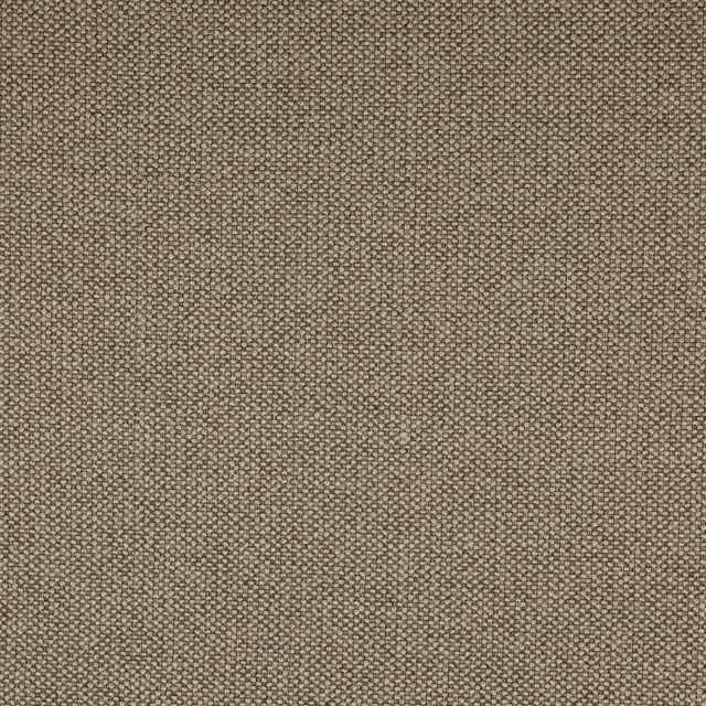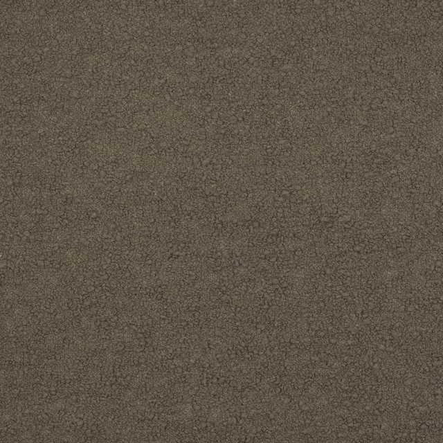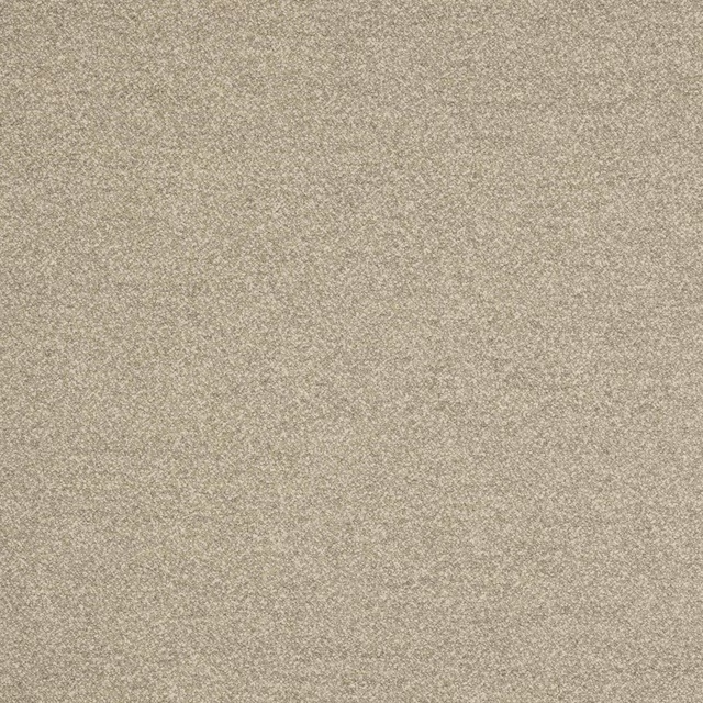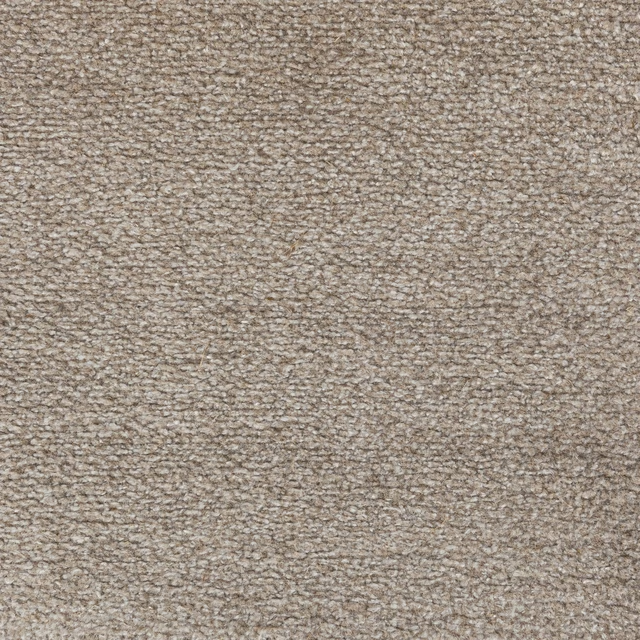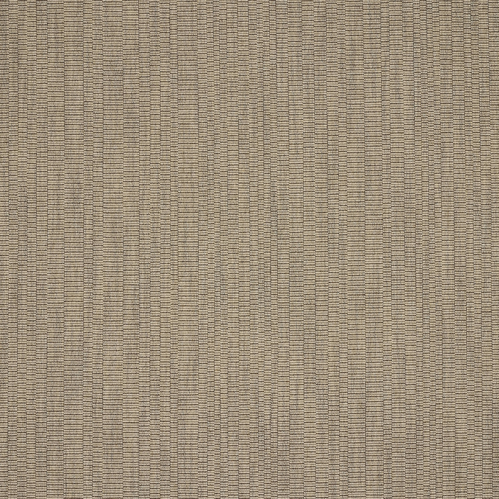

Tap the swatch to see it full screen. Hover it to magnify the weave. Colours on a screen are a guide, not a match, so come and feel the real cloth.
Scroll up or down to zoom in and out.
Pietro Taupe
Asti FabricL9547-05
Pietro Taupe shows Asti as a finely textured, tonal weave in a restrained warm taupe. The surface reads calm and tailored, with subtle horizontal striations that add depth without introducing a pattern.
You have used your previews for today. Send one to Simon and you can carry on.
Your board
0 fabrics
See this fabric on Larsen's own site, then order it through us.
See Pietro Taupe in your own room
A photograph of the piece you want re-covered. Straight on is best, and daylight helps. It is used to make your picture and nothing else.
Looking at your room
We found things here Pietro Taupe could go on. Tap one on the photograph, or choose below.
We could not see anything to re-cover
, s
Pietro Taupe, on your
Drag to compare. AI impression, colours indicative: ask us for a cutting before you decide.
About this fabric
This colourway blends 28% cotton, 26% virgin wool, 23% viscose, 20% linen and 3% polyamide, giving the cloth a natural, softly crisp handle with a refined matte finish. At approximately 140cm wide and with no repeat, it presents as a clean, versatile plain rather than a decorative motif. The taupe shade sits between beige and grey, with a warm undertone that feels grounded and easy to pair. The woven texture is visible up close, creating a gentle rhythm across the surface and lending the fabric a smart, understated character. With fire code √BH and care code Q 8 + T 3, it is a practical upholstery-and-curtain option for elegant interiors.
How to use it
Use Pietro Taupe on a tailored armchair, headboard or loose cover where its warm neutrality can soften timber, stone and darker accents. It also works well as curtains in rooms that need a muted, textural backdrop rather than a strong colour statement.
A quietly tailored neutral that sits comfortably in both upholstery and drapery schemes.
More from Asti
The same book, other colourways.
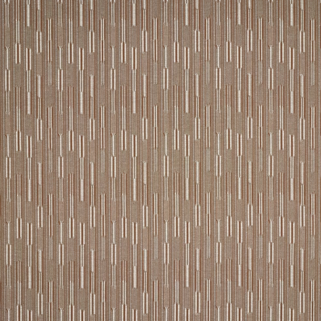
Massi Wood
Asti
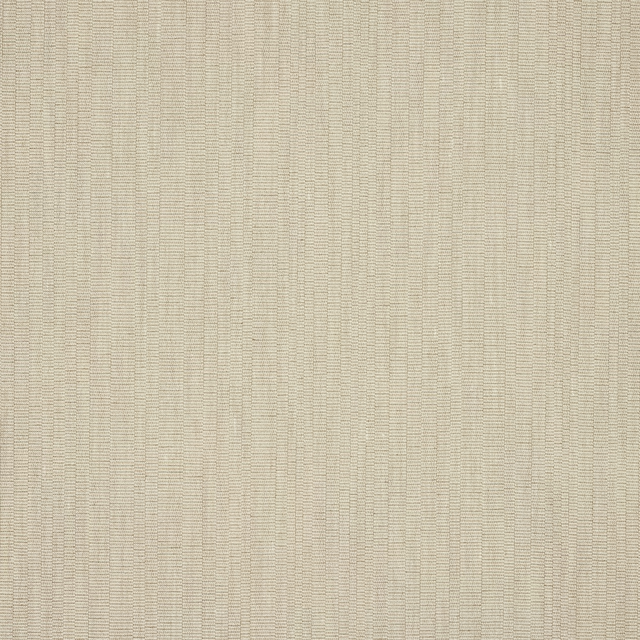
Pietro Clay
Asti

Pietro Cream
Asti
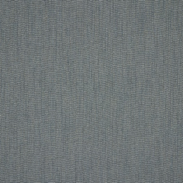
Pietro Ocean
Asti

Pietro Pearl
Asti
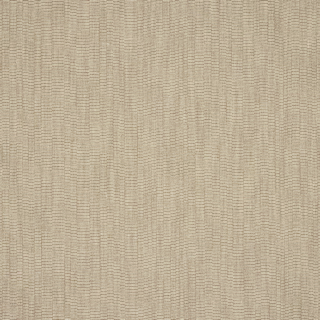
Pietro Sand
Asti
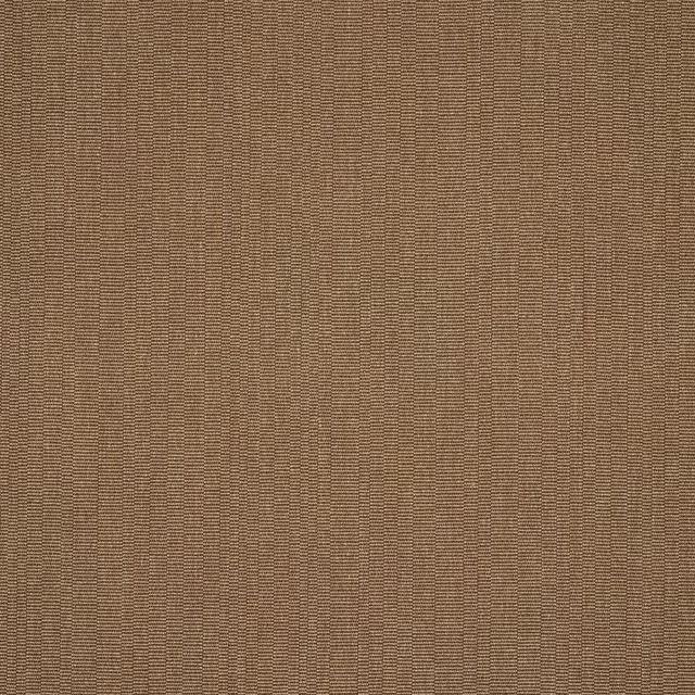
Pietro Tobacco
Asti
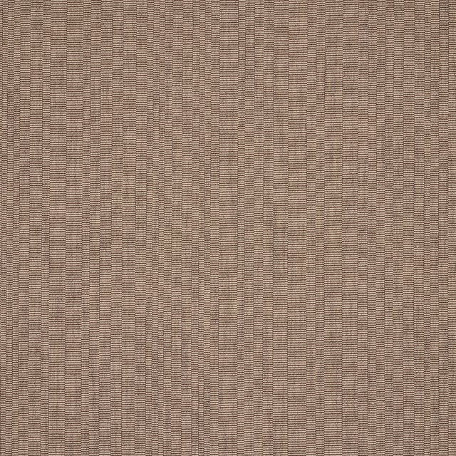
Pietro Wood
Asti
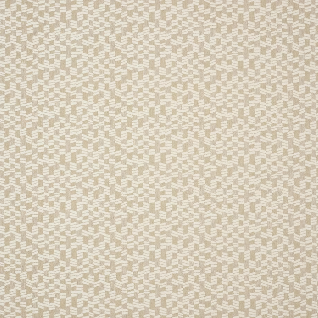
Tomas Clay
Asti
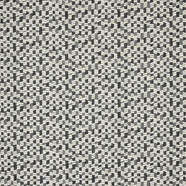
Tomas Ebony
Asti
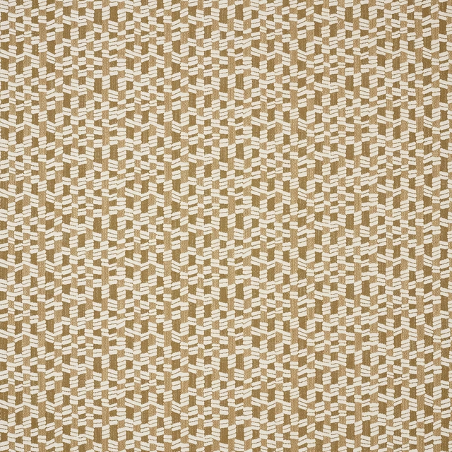
Tomas Honey
Asti
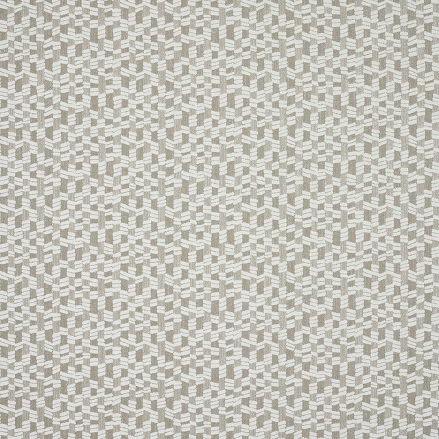
Tomas Linen
Asti
Pairs well with
Pietro Taupe is a quiet cloth, so it carries a pattern beside it: one of these on the curtains and this on the chair. Mixed across the houses we hold, which is the part a single supplier's book cannot do.
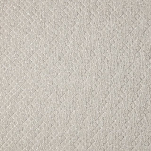
Atwood Taupe
Essential Weaves Vol 1
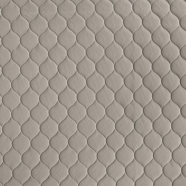
Bazely Taupe
Essential Weaves Vol 1
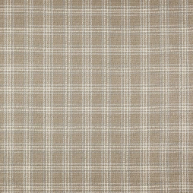
Bowen Check Taupe
Magnus Checks

Ascot Taupe
Misc
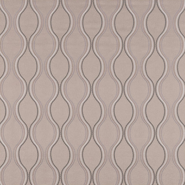
Metro Taupe
Other Fabrics & Weaves
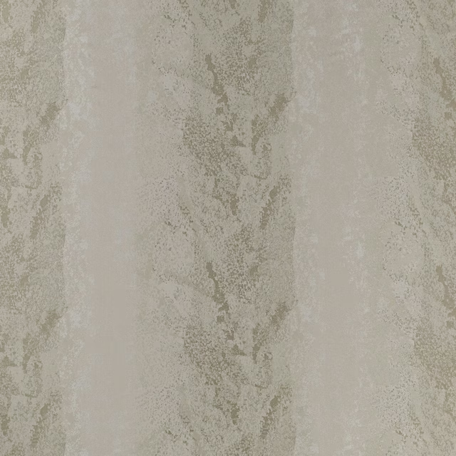
Constellation Earth
Constellation
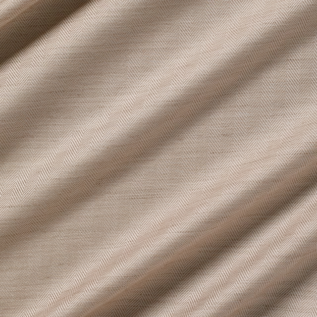
Highbury Sakura
Highbury
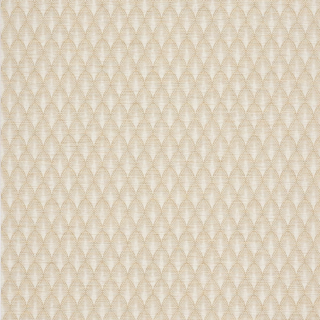
Melia Wallpaper Taupe
Melia Wallpaper
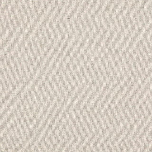
Theo Taupe
Theo
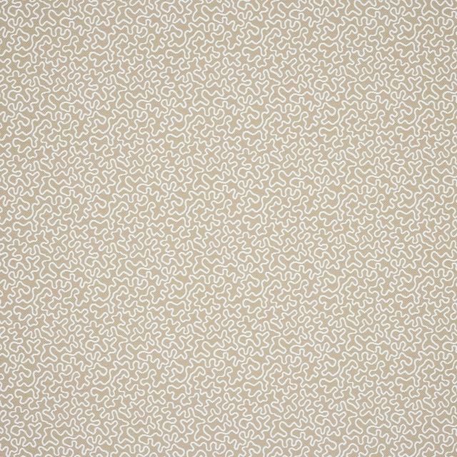
Corti Taupe
Corti
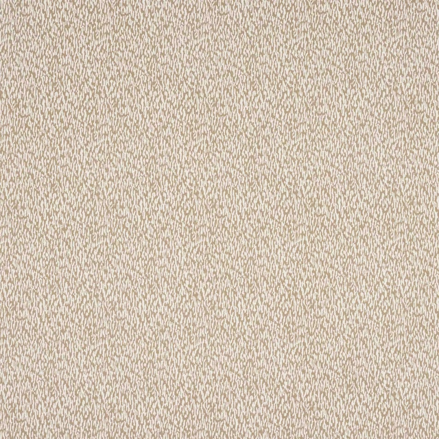
Buci Taupe
Domino
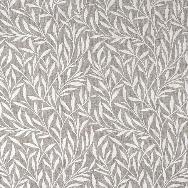
Mandu Taupe
Misc
Paint that goes with it
Two ways to take the room. Both colours are from houses we hold, so a pot can come off the same order as the cloth. Screens shift colour, so treat these as a direction and bring the cloth to the shelf before you buy the paint.
To sit quietly behind it
Dalston Chat
Coat Paints · #a7937a
To stand against it
David Rose
Coat Paints · #36393e
Other taupe fabrics
Across the houses we hold. See all 4,148.