
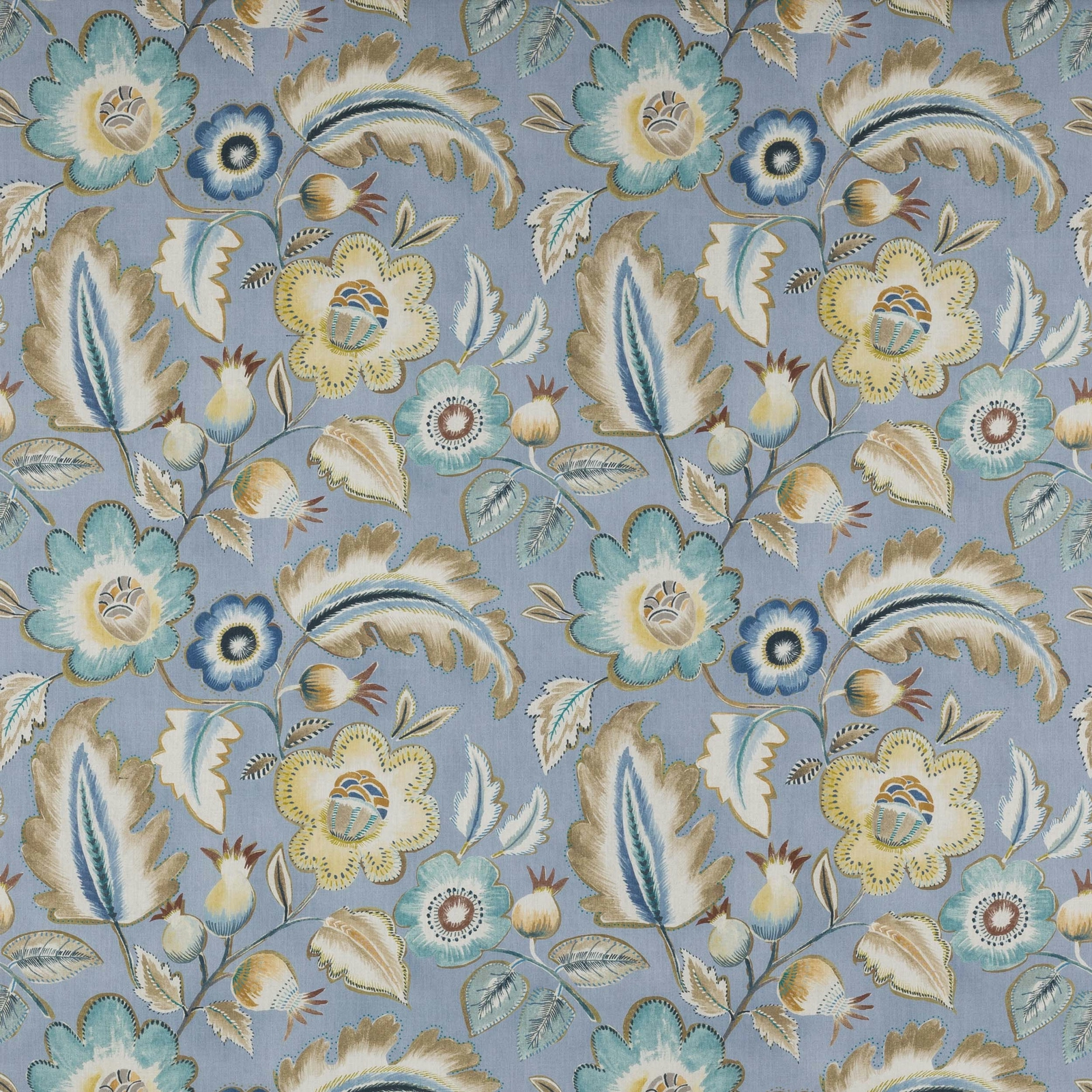

Tap the swatch to see it full screen. Hover it to magnify the weave. Colours on a screen are a guide, not a match, so come and feel the real cloth.
Scroll up or down to zoom in and out.
Piper Soft Blue
Kingswood FabricJ0133-04
Piper Soft Blue shows the Kingswood design on a cool powder-blue ground, with scrolling stems and stylised florals softened by cream, sage and pale gold detail. The overall effect is airy and elegant, with the motif reading clearly against the gentle blue background.
You have used your previews for today. Send one to Simon and you can carry on.
Your board
0 fabrics
See this fabric on Jane Churchill's own site, then order it through us.
See Piper Soft Blue in your own room
A photograph of the piece you want re-covered. Straight on is best, and daylight helps. It is used to make your picture and nothing else.
Looking at your room
We found things here Piper Soft Blue could go on. Tap one on the photograph, or choose below.
We could not see anything to re-cover
, s
Piper Soft Blue, on your
Drag to compare. AI impression, colours indicative: ask us for a cutting before you decide.
About this fabric
This colourway is printed on a fabric composed of 90% Cotton and 10% Viscose, giving the surface a softly handled, woven feel that suits decorative interiors. The repeat is substantial at approximately V 63cm and H 70cm, so the large floral and leaf pattern has room to breathe across wider drops or upholstered panels. In Piper Soft Blue, the background is a muted, chalky blue rather than a bright sky tone, which keeps the design calm and slightly antique in mood. Cream petals, dusky sage leaves and touches of gold and deeper blue add contrast without making the overall palette feel heavy. With a width of approximately 140cm and fire code √BM, it is a practical decorative fabric as well as a distinctly characterful one.
How to use it
Use Piper Soft Blue on a chair, ottoman or curtains where the soft blue ground can lighten the room and the large-scale botanical pattern can be properly seen. It sits especially well with pale timber, putty neutrals and brushed brass, where the cool blue and warm floral accents feel balanced.
A graceful powder-blue floral that lifts a room without feeling precious.
More from Kingswood
The same book, other colourways.
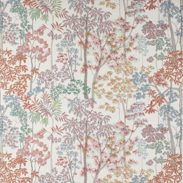
Kingswood Red
Kingswood
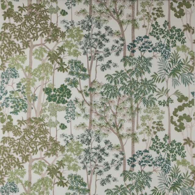
Kingswood Embroidery Green
Kingswood
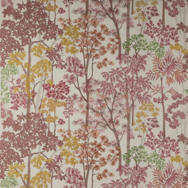
Kingswood Embroidery Red
Kingswood
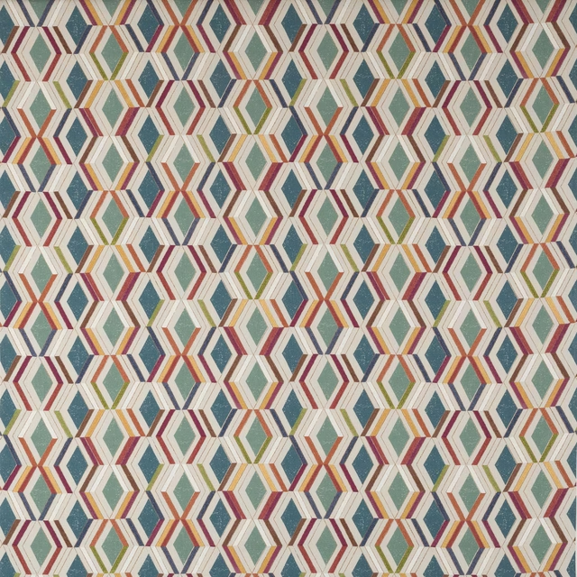
Luna Multi
Kingswood
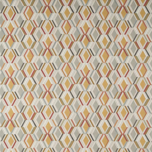
Luna Ochre/Grey
Kingswood
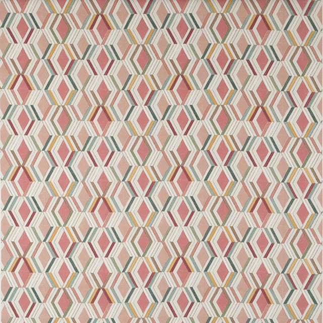
Luna Red/Pink
Kingswood
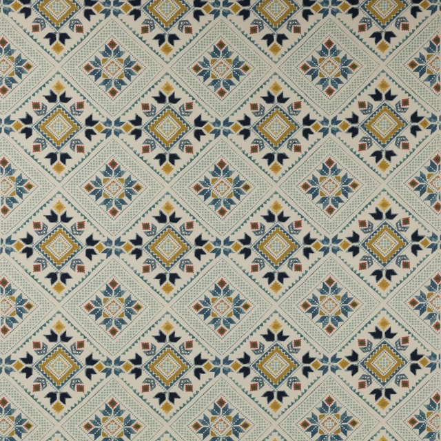
Minerva Blue/Ochre
Kingswood
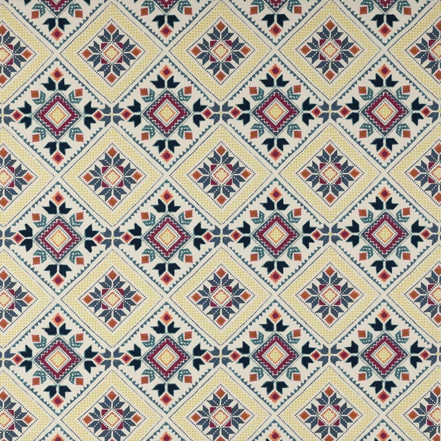
Minerva Multi
Kingswood
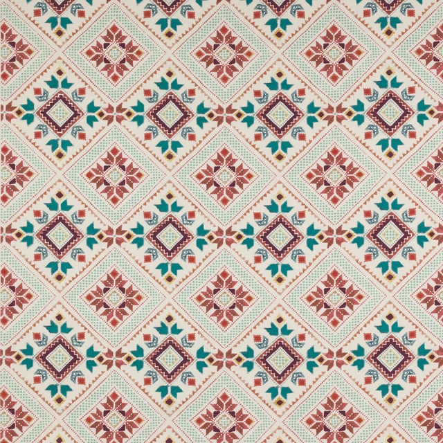
Minerva Red/Teal
Kingswood
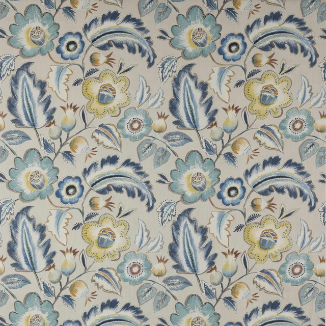
Piper Navy/Ochre
Kingswood
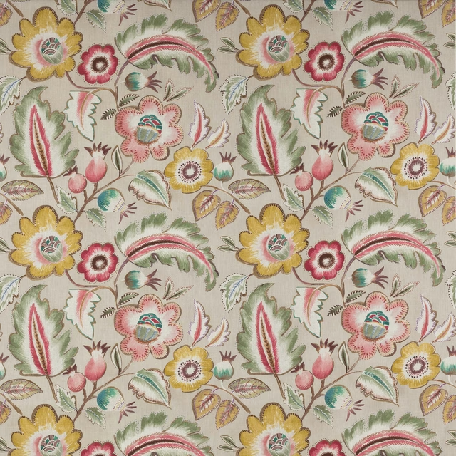
Piper Pink/Green
Kingswood
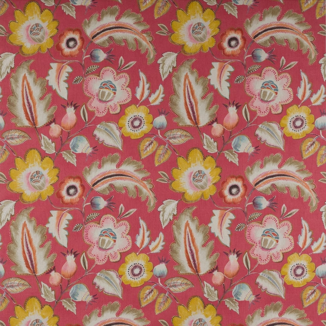
Piper Red
Kingswood
Pairs well with
A pattern needs somewhere for the eye to rest, so these are the plains and textures that sit beside Piper Soft Blue without fighting it. Mixed across the houses we hold, which is the part a single supplier's book cannot do.

Alaska Powder Blue
Alaska Collection

Eaton Plain Old Blue
Eaton Checks and Stripes
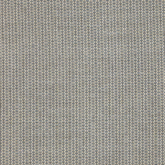
Laurie Blue
Irving
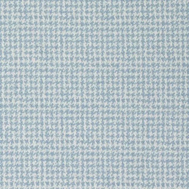
Estrela Sky
Lisbon Fabrics
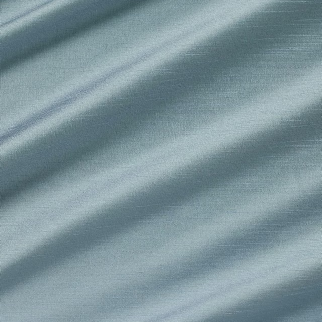
Astor Liberty
Astor
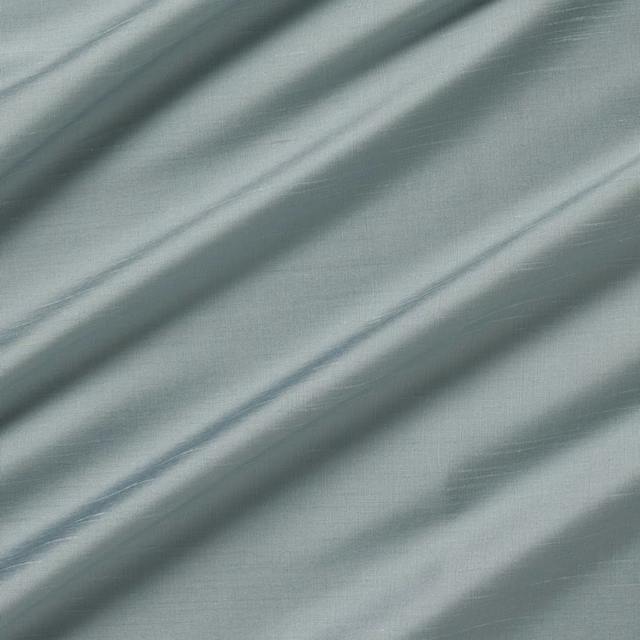
Astor Venice
Astor
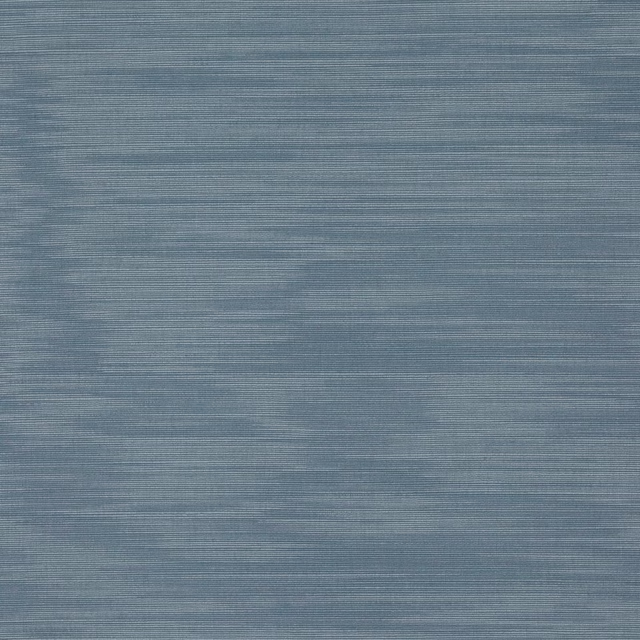
Iris Bleu Clair
Iris

Nura Ciel
Nura III
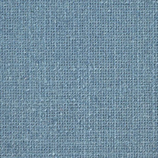
Tuscany II Cobalt
Tuscany II Weaves
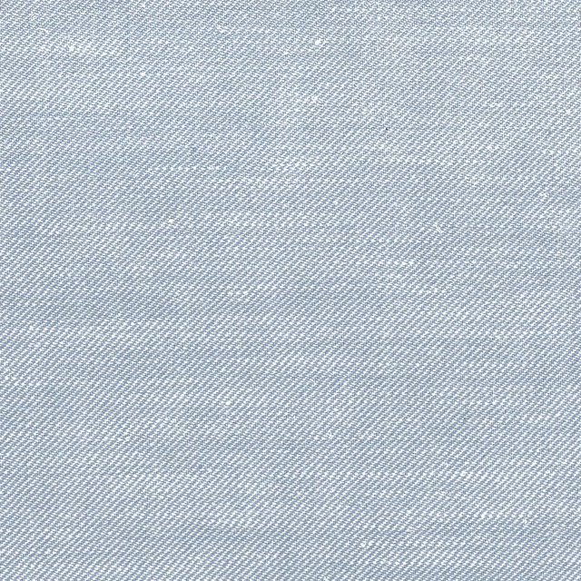
Queensway Powder
Queensway Silk Blend

Lana Sky
Lana

Porcelain
2026 Paint
Paint that goes with it
Two ways to take the room. Both colours are from houses we hold, so a pot can come off the same order as the cloth. Screens shift colour, so treat these as a direction and bring the cloth to the shelf before you buy the paint.
To sit quietly behind it
Aubusson
Zoffany · #9b9d9c
To stand against it
Córdoba
Little Greene · #493b3c
Other blue fabrics
Across the houses we hold. See all 7,566.
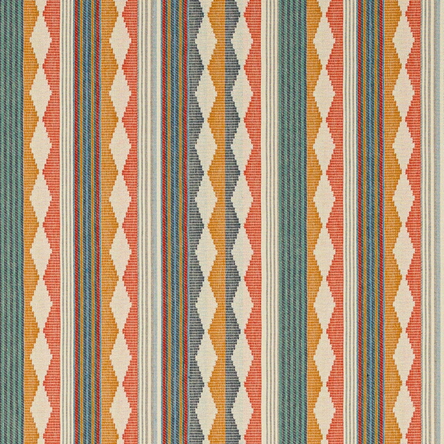
Ravi Stripe Indigo/Multi
Kansa Stripes
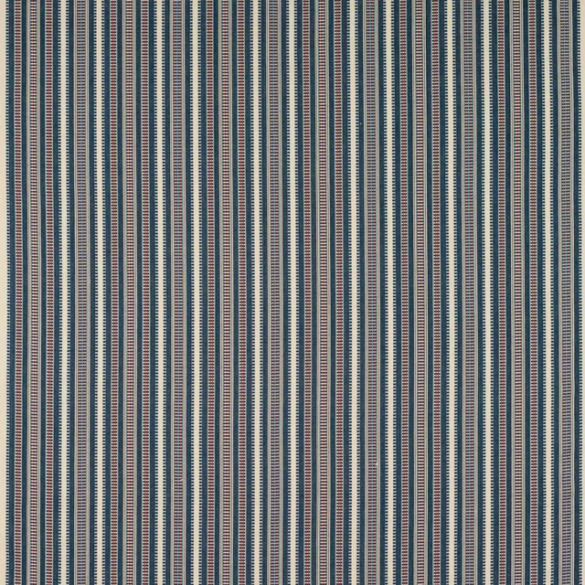
Yarra Stripe Indigo
Kansa Stripes

Kline Aqua
Kline
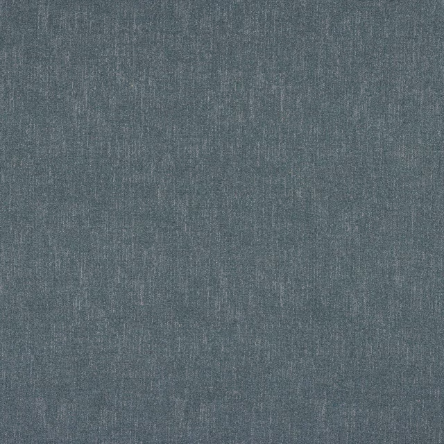
Kline Denim
Kline
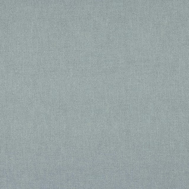
Kline Pale Blue
Kline
Lazula Blue
Lexi
Lazula Indigo
Lexi
Alda Stripe Blue
Linhope

Alda Stripe Sky Blue
Linhope
Arley Stripe Blue
Linhope
Arley Stripe Cornflower
Linhope

Arley Stripe Navy
Linhope