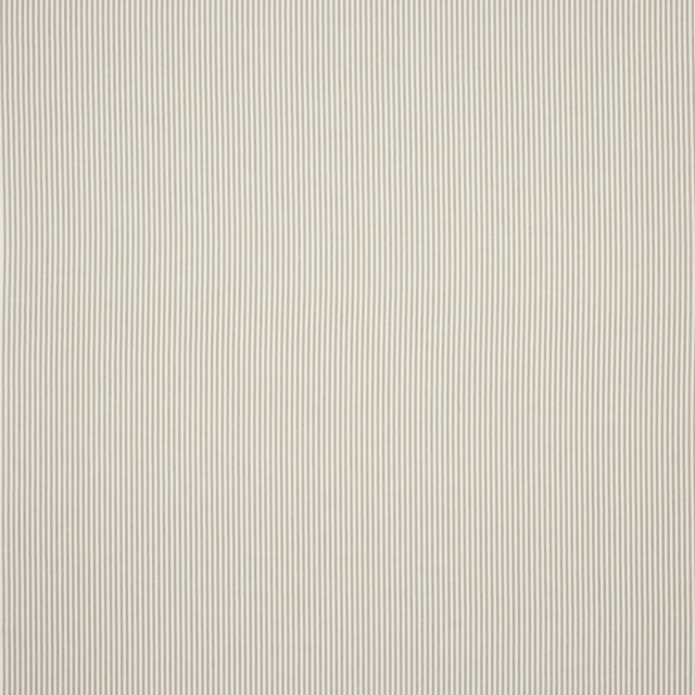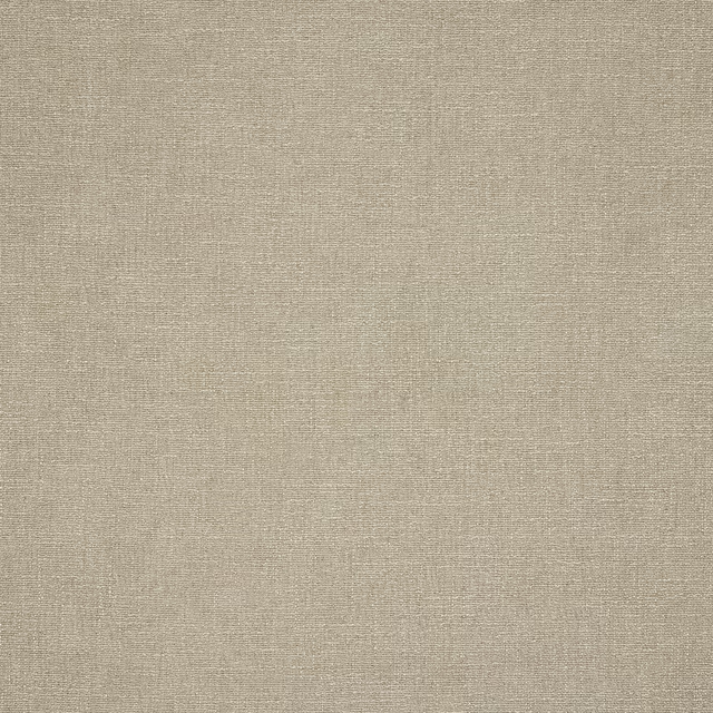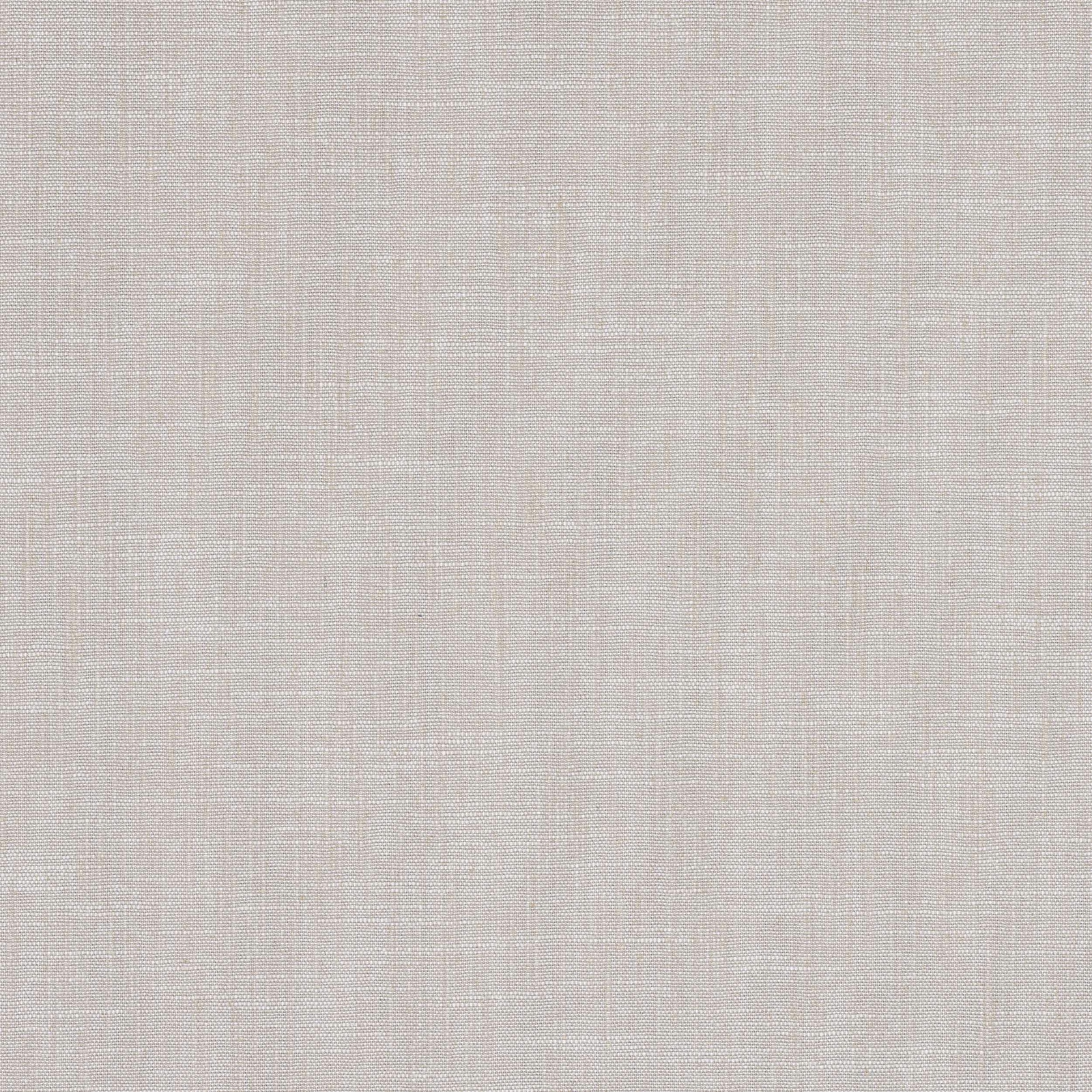

Tap the swatch to see it full screen. Hover it to magnify the weave. Colours on a screen are a guide, not a match, so come and feel the real cloth.
Scroll up or down to zoom in and out.
Prati Grege
Marco FabricM4162-02
Prati Grege is a softly muted greige with a calm, linen-led surface and a fine, natural-looking texture. The colour sits between beige and grey, giving it an understated warmth without reading yellow or cool.
You have used your previews for today. Send one to Simon and you can carry on.
Your board
0 fabrics
See this fabric on Manuel Canovas's own site, then order it through us.
See Prati Grege in your own room
A photograph of the piece you want re-covered. Straight on is best, and daylight helps. It is used to make your picture and nothing else.
Looking at your room
We found things here Prati Grege could go on. Tap one on the photograph, or choose below.
We could not see anything to re-cover
, s
Prati Grege, on your
Drag to compare. AI impression, colours indicative: ask us for a cutting before you decide.
About this fabric
This colourway has a powdery greige appearance, with the viscose and linen blend creating a dry, lightly slubbed look that feels relaxed but refined. At 144cm approx. wide, Prati Grege offers a practical width for both upholstery and drapery projects, while the 70% viscose and 30% linen composition gives it a soft sheen and a gentle, tactile grain. The plain surface and no-repeat design make the cloth feel especially versatile, with the pale neutral tone reflecting light in a subtle, matte way. Care code Q 8 + T 3 and fire code √BM are supplied for this exact fabric.
How to use it
Use Prati Grege to soften a room with oak, travertine and chalky off-whites, or as a quiet backdrop for deeper accents in olive, tobacco or charcoal. Its pale greige tone works particularly well where you want texture and restraint rather than strong colour.
A quietly elegant neutral that layers easily with pale woods, stone and putty tones.
More from Marco
The same book, other colourways.
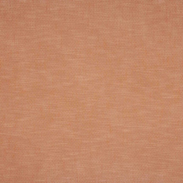
Monti Terre Cuite
Marco
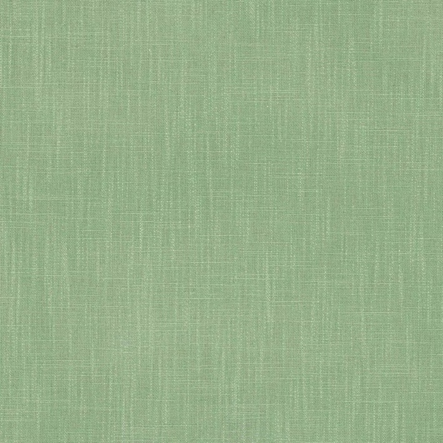
Prati Agave
Marco
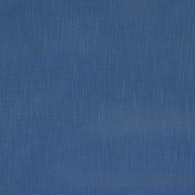
Prati Bleu de Chine
Marco
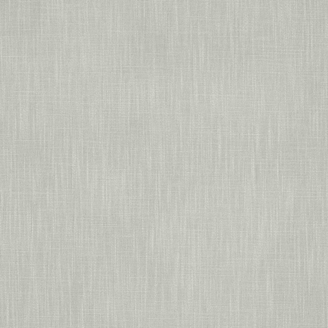
Prati Celadon
Marco
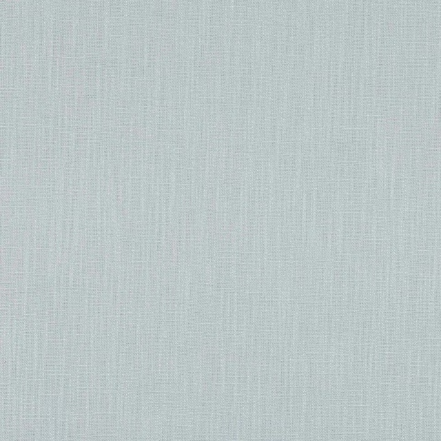
Prati Celeste
Marco
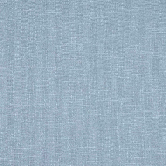
Prati Ciel
Marco
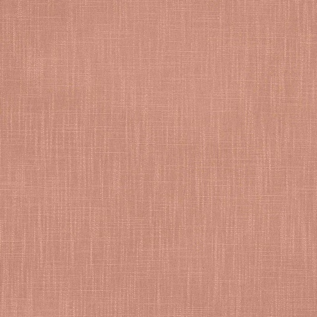
Prati Corail
Marco
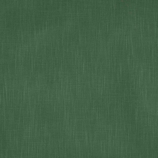
Prati Foret
Marco
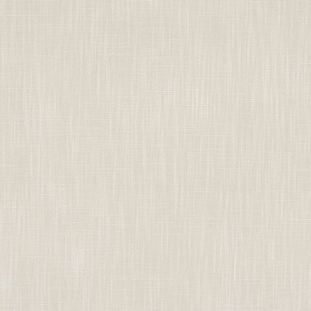
Prati Ivoire
Marco
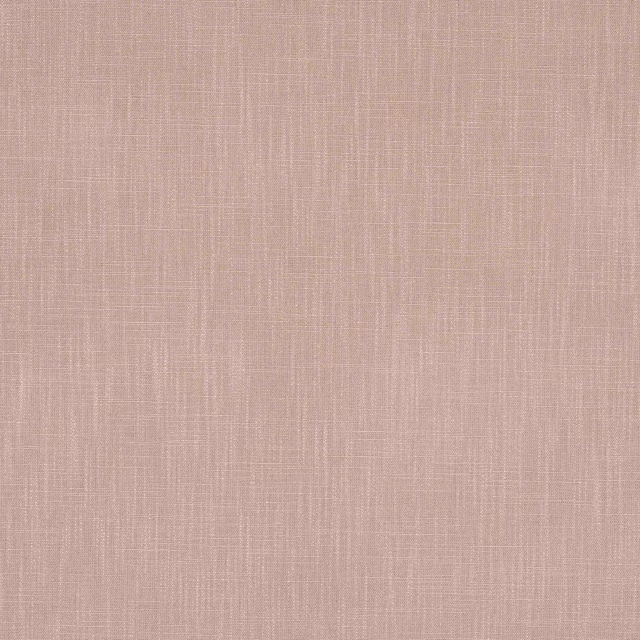
Prati Rose Poudre
Marco
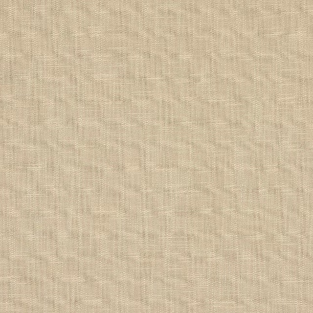
Prati Sable
Marco
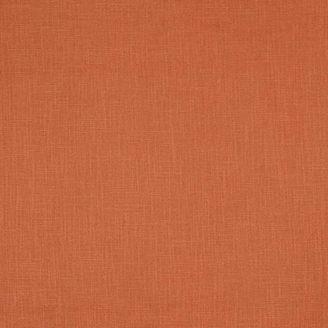
Prati Terre Cuite
Marco
Pairs well with
Prati Grege is a quiet cloth, so it carries a pattern beside it: one of these on the curtains and this on the chair. Mixed across the houses we hold, which is the part a single supplier's book cannot do.
Estrada Dove
Eden Collection

Argyle Platinum
Essential Weaves Vol 1
Abstract Malachite Multicolore Wallpaper
Lacroix Stravaganza Wallpaper
Plumis Charcoal/Linen
Botanica Fabric
Edison Charcoal/Natural
Edgeworth
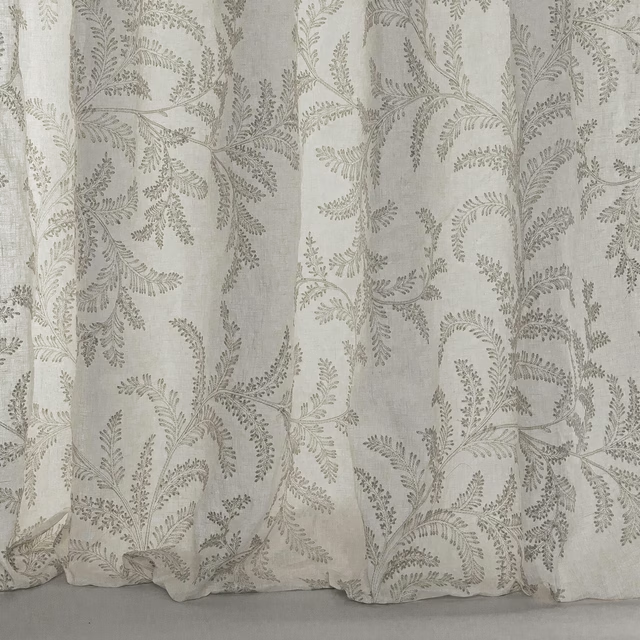
Melina Silver
Avril
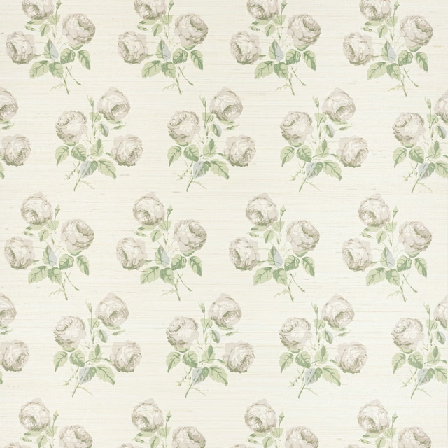
Bowood Sisal Wallpaper Silver Leaf
Belmont Wallcoverings
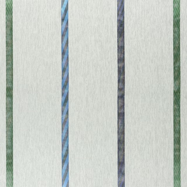
Mittsuami Turquoise
Amaya Fabrics
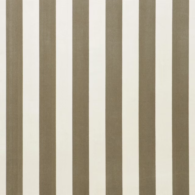
Brenta Alabaster
Cesano Fabrics
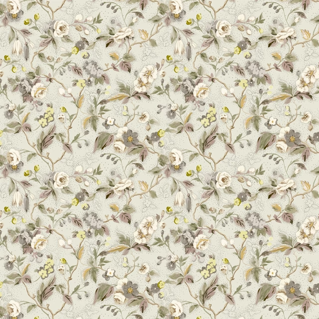
Craven Street Flower Birch
Heritage Prints
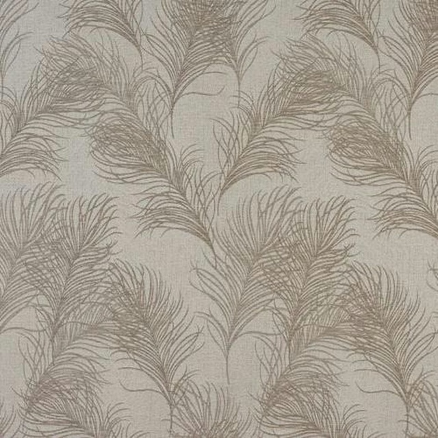
Feather Natural
Acacia
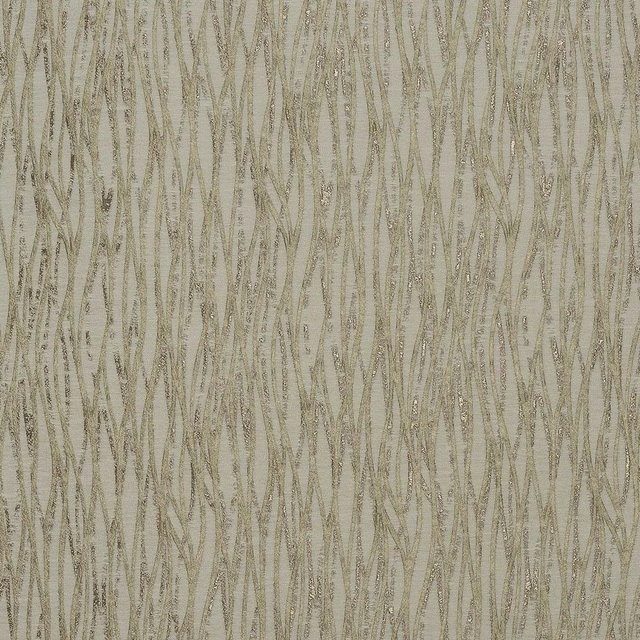
Linear Antique
Acacia
Paint that goes with it
Two ways to take the room. Both colours are from houses we hold, so a pot can come off the same order as the cloth. Screens shift colour, so treat these as a direction and bring the cloth to the shelf before you buy the paint.
To sit quietly behind it
Quarter Empire Grey
Zoffany · #cec9c3
To stand against it
Morris Trellis
Morris & Co. · #5c5f56
Other neutral fabrics
Across the houses we hold. See all 911.