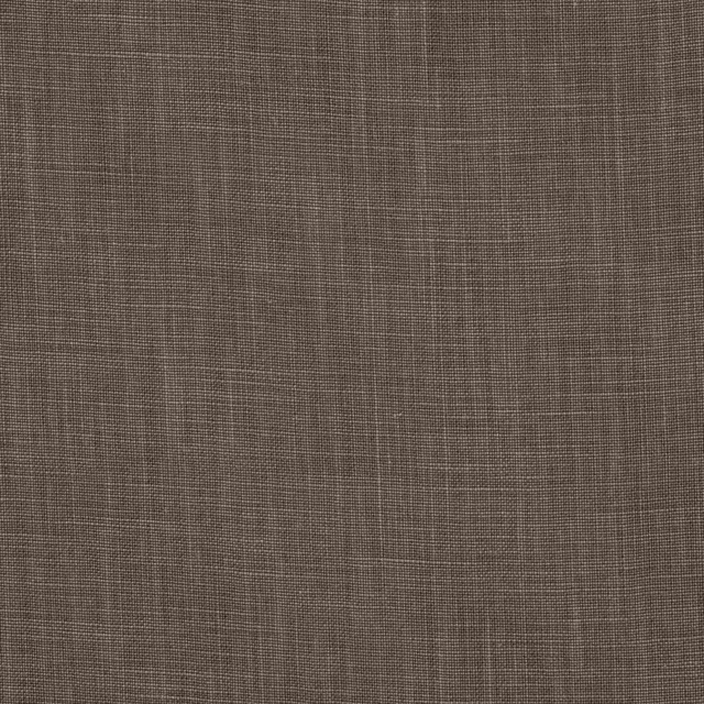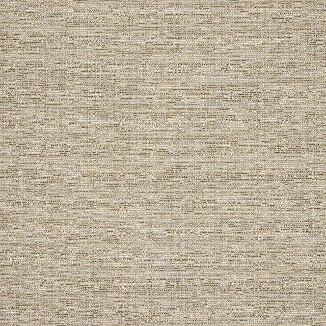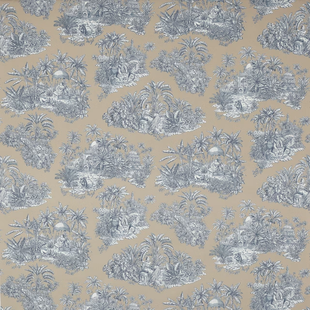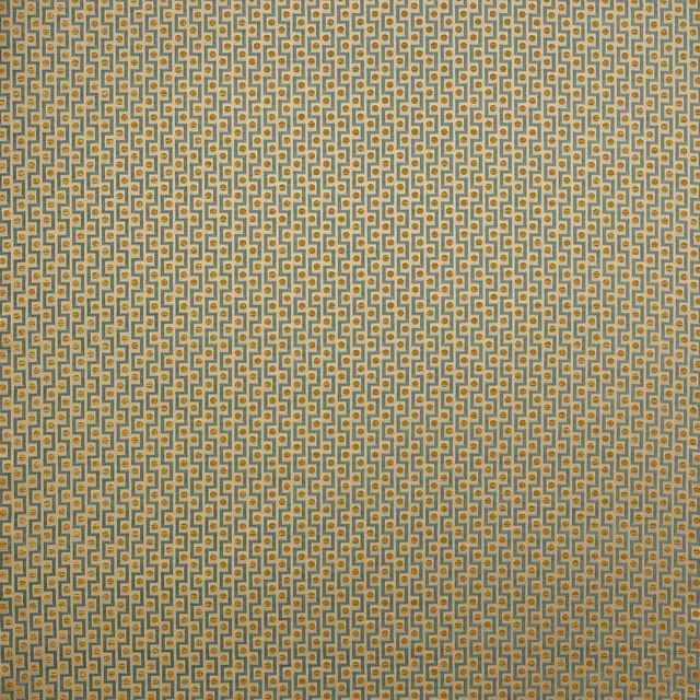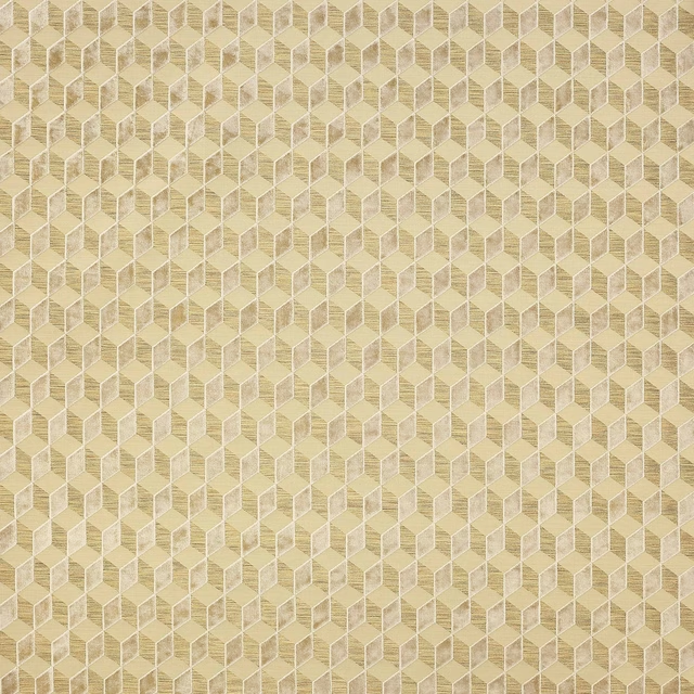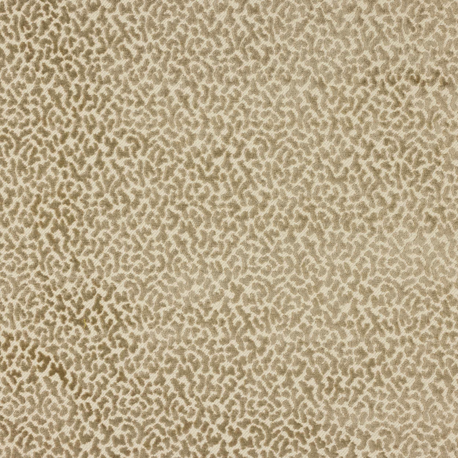

Tap the swatch to see it full screen. Hover it to magnify the weave. Colours on a screen are a guide, not a match, so come and feel the real cloth.
Scroll up or down to zoom in and out.
Tobago Greige
Palto FabricM4110-01
Tobago Greige shows a finely dappled, abstract pattern in soft beige and taupe tones, giving the swatch a calm, textured look. The overall effect is warm and understated, with the motif sitting gently across the surface rather than reading as high contrast.
You have used your previews for today. Send one to Simon and you can carry on.
Your board
0 fabrics
See this fabric on Manuel Canovas's own site, then order it through us.
See Tobago Greige in your own room
A photograph of the piece you want re-covered. Straight on is best, and daylight helps. It is used to make your picture and nothing else.
Looking at your room
We found things here Tobago Greige could go on. Tap one on the photograph, or choose below.
We could not see anything to re-cover
, s
Tobago Greige, on your
Drag to compare. AI impression, colours indicative: ask us for a cutting before you decide.
About this fabric
From the Palto collection by Manuel Canovas, Tobago Greige is a fabric with a repeat of approximately V 20cm / H 18cm and a width of approximately 140cm. Its 55% polyester, 45% viscose composition helps give the cloth a smooth, softly lustrous handle, while the surface in this colourway reads as a warm greige with sandy beige and muted taupe movement. The small abstract pattern is tightly scaled, so the design feels quietly detailed rather than bold, and the light catches the raised and recessed areas in a subtle, even way. With no performance features noted and a fire code of K, it is a versatile choice where a smart, tailored finish is wanted.
How to use it
Use this greige colourway to soften walnut, oak or stone interiors, where the warm taupe ground can bridge cool and warm finishes. It works especially well with linen neutrals, mossy greens or aged brass for a composed, layered scheme.
Its muted greige ground and softly contrasting pattern make it an easy choice for tailored upholstery or refined curtains.
More from Palto
The same book, other colourways.
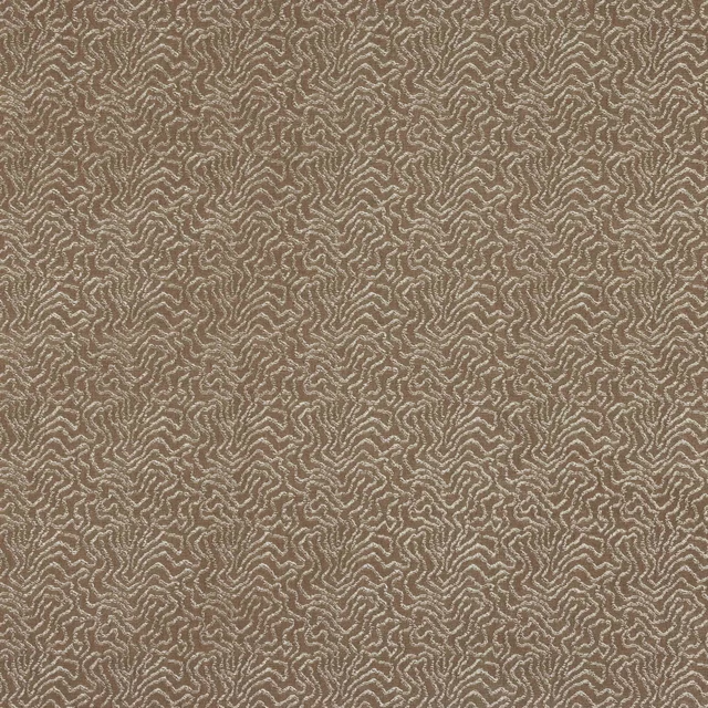
Titus Taupe
Palto
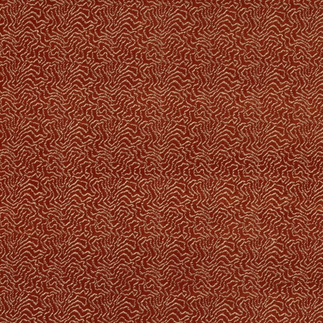
Titus Terre de Sienne
Palto
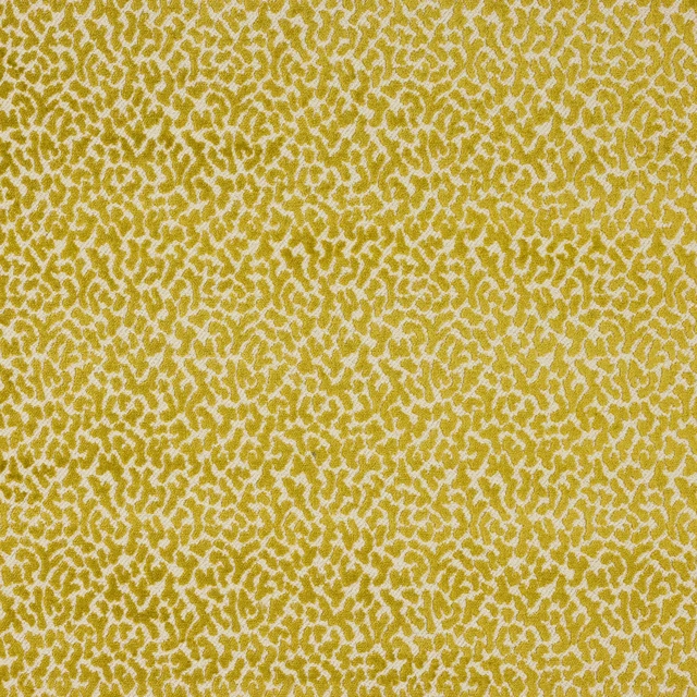
Tobago Anis
Palto
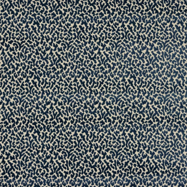
Tobago Bleu de Chine
Palto
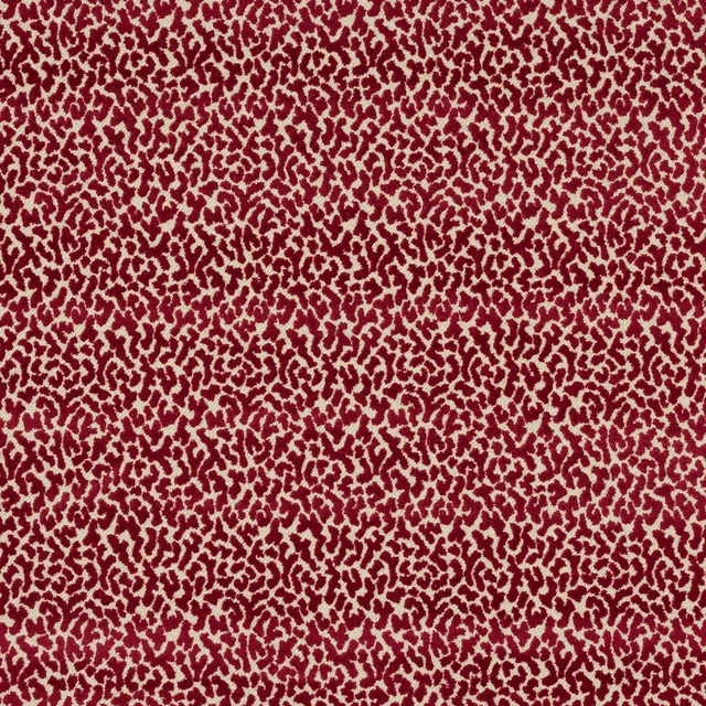
Tobago Bourgogne
Palto
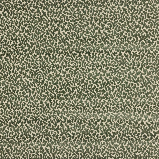
Tobago Celadon
Palto
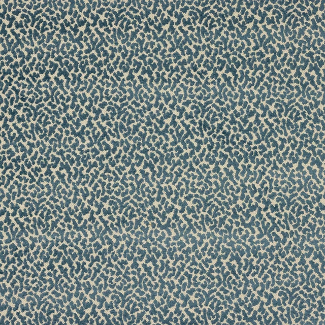
Tobago Celeste
Palto
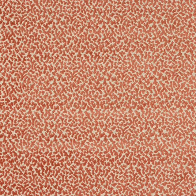
Tobago Corail
Palto
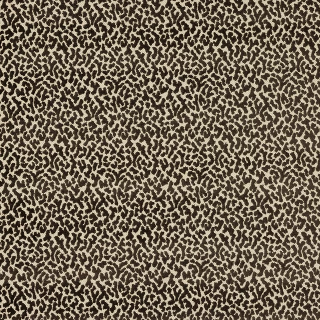
Tobago Ebene
Palto
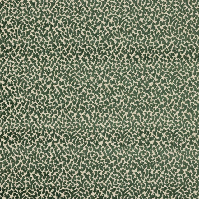
Tobago Foret
Palto
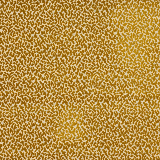
Tobago Or
Palto
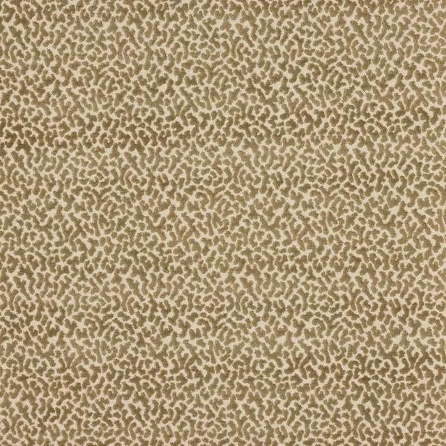
Tobago Taupe
Palto
Pairs well with
A pattern needs somewhere for the eye to rest, so these are the plains and textures that sit beside Tobago Greige without fighting it. Mixed across the houses we hold, which is the part a single supplier's book cannot do.
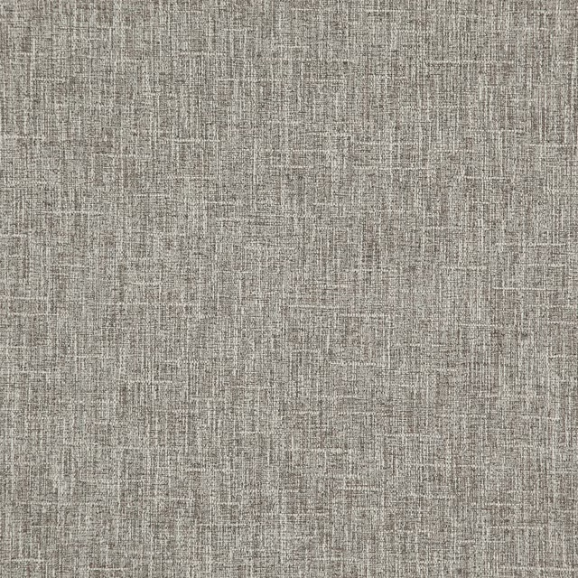
Torver Walnut
Mineral Weaves Fabrics

Barthou Pebble
Perreau Fabrics
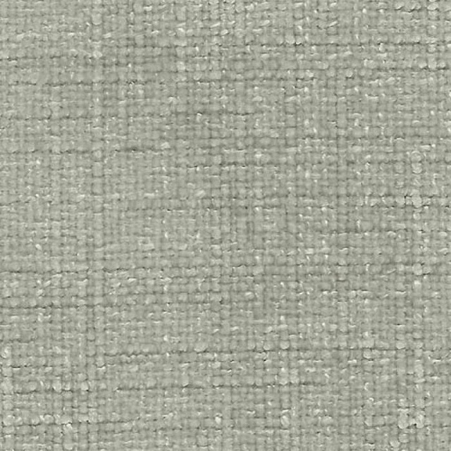
Bohemian Latte
Bohemian
Astor Wallcovering Barn
Astor Fr
Shagreen Silk Cowrie
Shagreen Silk

Nappa Arcus
Nappa Aquaclean
Amoret Performance Fossil
Luxury Plains
Brio 08
Weave
Sculpt Brazil
Sculpt

Elio Cobblestone
Elio
Kylo Osprey
Kylo
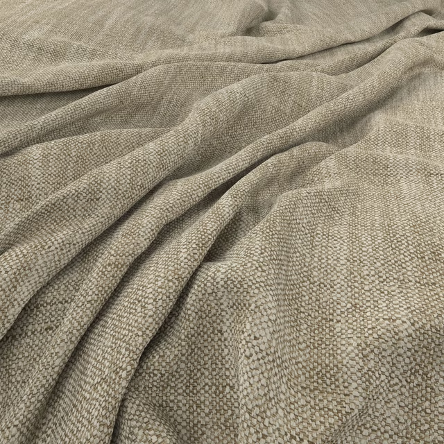
Lundby Fallow
Lundby
Paint that goes with it
Two ways to take the room. Both colours are from houses we hold, so a pot can come off the same order as the cloth. Screens shift colour, so treat these as a direction and bring the cloth to the shelf before you buy the paint.
To sit quietly behind it
Roman Plaster
Little Greene · #bfb08f
To stand against it
Barbed Berry
Morris & Co. · #a05456
Other taupe fabrics
Across the houses we hold. See all 4,148.