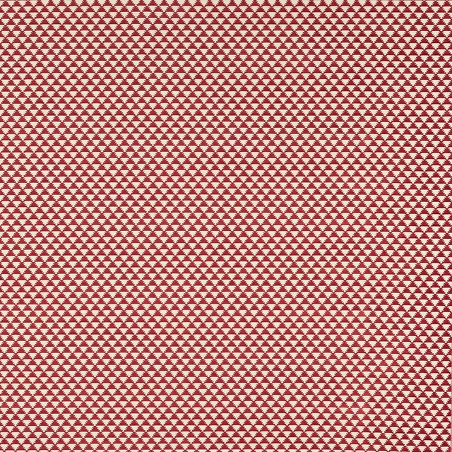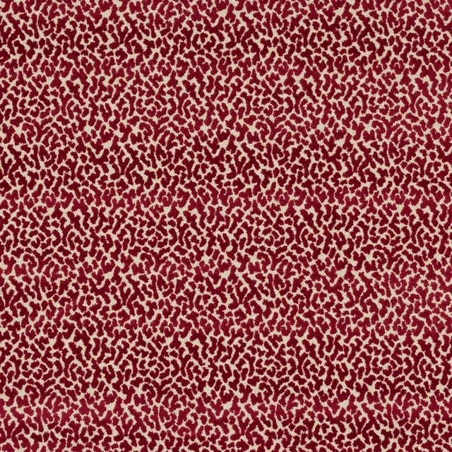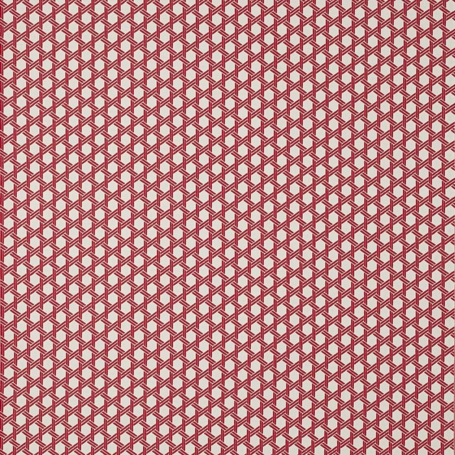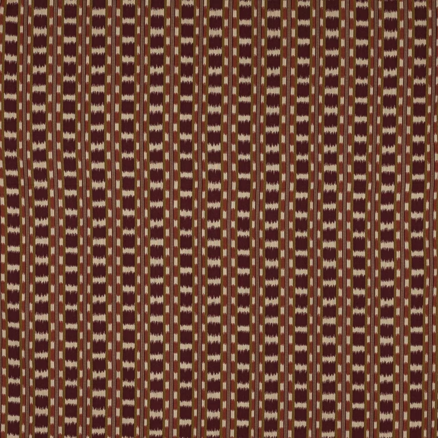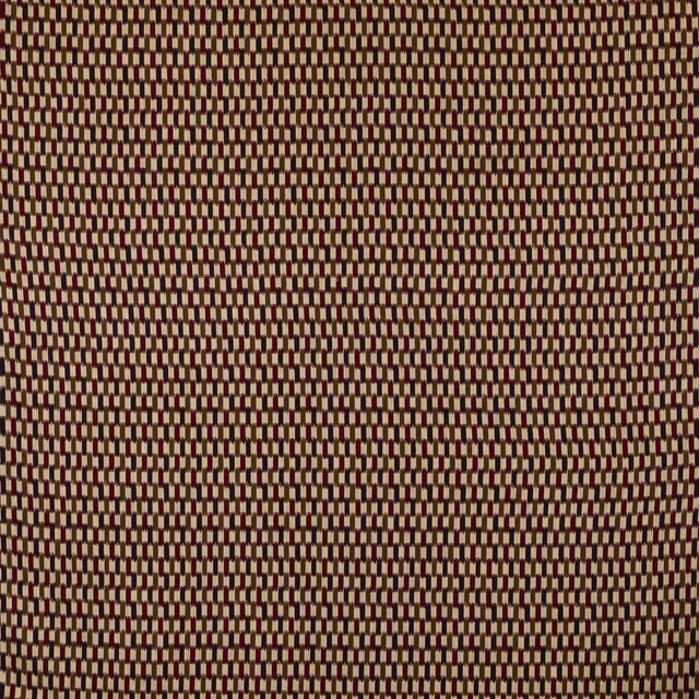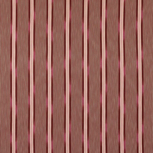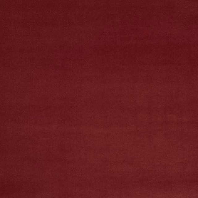

Tap the swatch to see it full screen. Hover it to magnify the weave. Colours on a screen are a guide, not a match, so come and feel the real cloth.
Scroll up or down to zoom in and out.
Rivoli Brique
Rivoli III Fabric04982-31
Rivoli Brique is a richly shaded plain fabric with a deep brick-red finish and a softly matte look. Its close weave gives the colour a smooth, even surface with quiet depth rather than sheen.
You have used your previews for today. Send one to Simon and you can carry on.
Your board
0 fabrics
See this fabric on Manuel Canovas's own site, then order it through us.
See Rivoli Brique in your own room
A photograph of the piece you want re-covered. Straight on is best, and daylight helps. It is used to make your picture and nothing else.
Looking at your room
We found things here Rivoli Brique could go on. Tap one on the photograph, or choose below.
We could not see anything to re-cover
, s
Rivoli Brique, on your
Drag to compare. AI impression, colours indicative: ask us for a cutting before you decide.
About this fabric
Woven in 93% cotton and 7% modal, Rivoli Brique has the natural handle and subtle softness you would expect from a cotton-rich fabric, with a gentle, brushed-looking depth in the cloth. The colour reads as a warm brique red: earthy, slightly brown-backed, and more tailored than bright, with the tone darkening beautifully in shadow. With an approximate width of 140cm and no visible repeat, it presents as a practical plain suitable for clean-lined upholstery schemes. The fine texture is visible in the swatch, giving the surface a calm, understated character that suits both classic and contemporary interiors.
How to use it
Pair this brick red with oat, camel, burnt oak or aged brass for a warm, composed scheme. It brings depth to armchairs, banquettes and cushions without overpowering the room.
Use with warm neutrals and dark timber to let the rich red-brown tone feel tailored.
More from Rivoli III
The same book, other colourways.

Rivoli Amaranthe
Rivoli III

Rivoli Ambre
Rivoli III

Rivoli Arctique
Rivoli III

Rivoli Aubergine
Rivoli III

Rivoli Baltique
Rivoli III

Rivoli Blush
Rivoli III

Rivoli Bronze
Rivoli III

Rivoli Brume
Rivoli III

Rivoli Cactus
Rivoli III

Rivoli Camel
Rivoli III

Rivoli Castor
Rivoli III

Rivoli Celadon
Rivoli III
Pairs well with
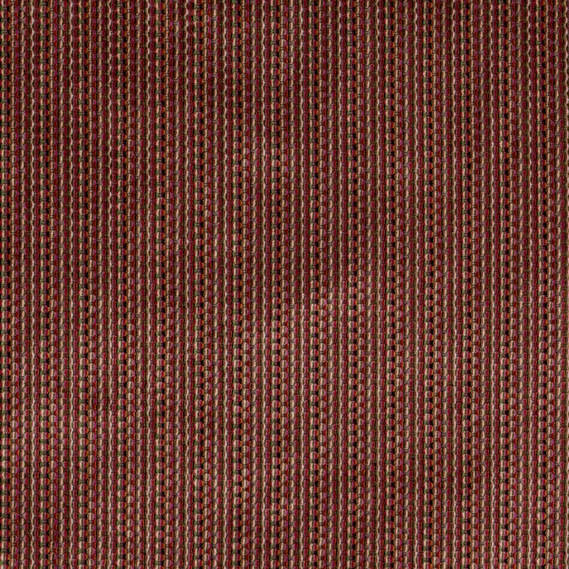
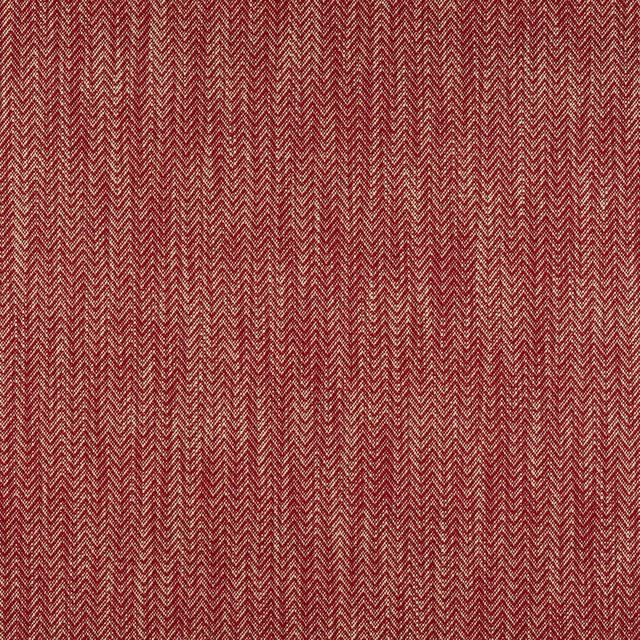
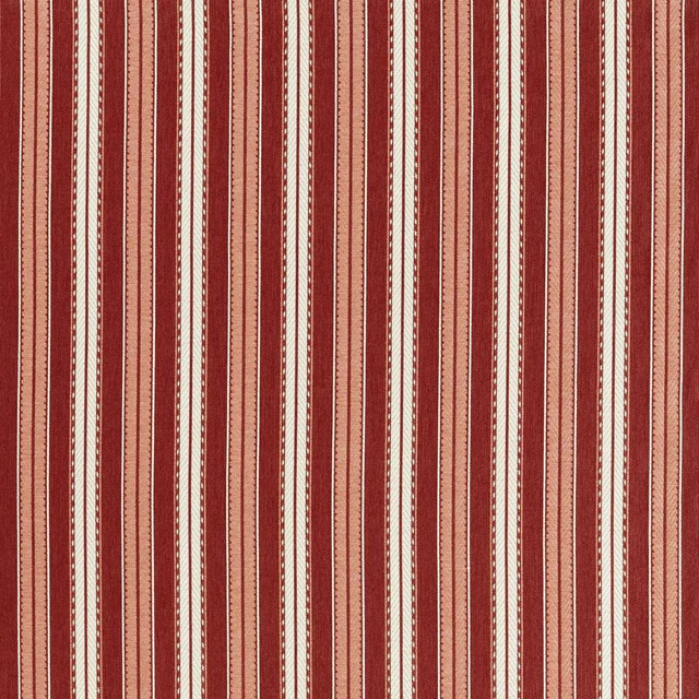
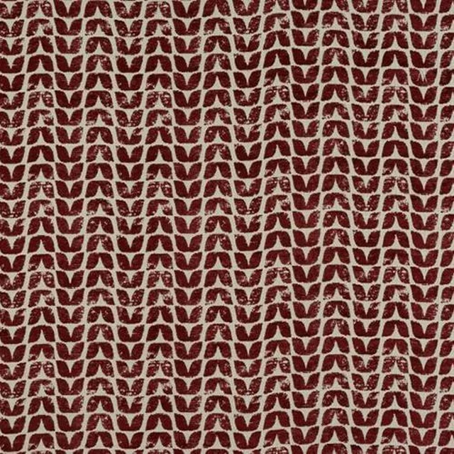
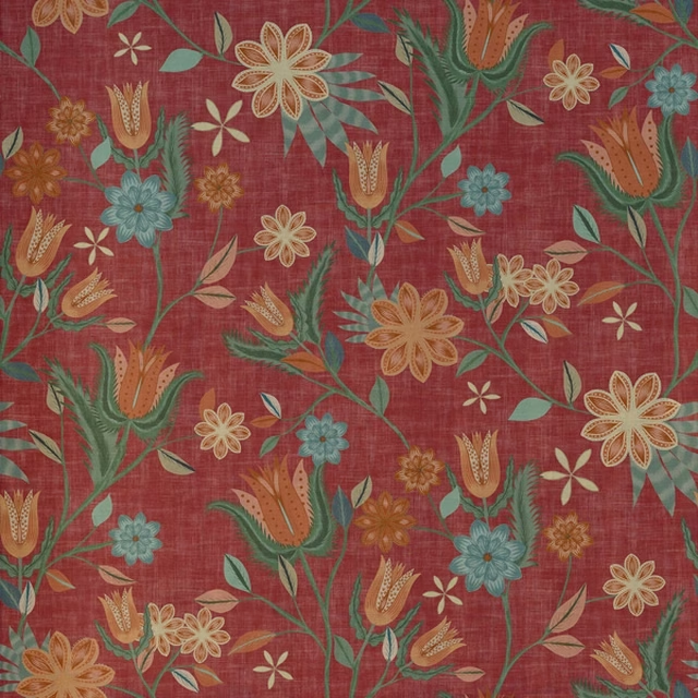
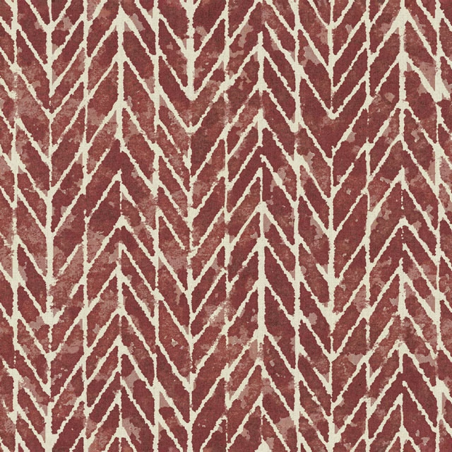
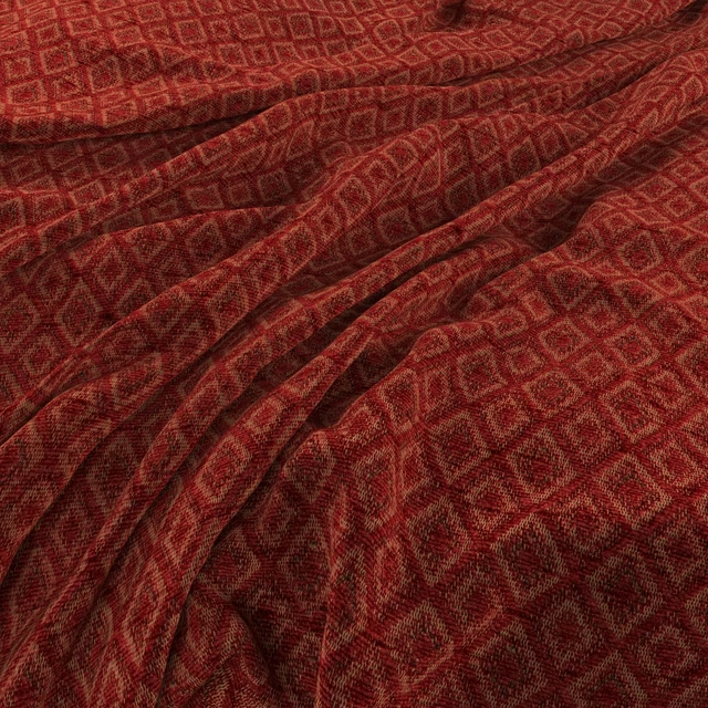
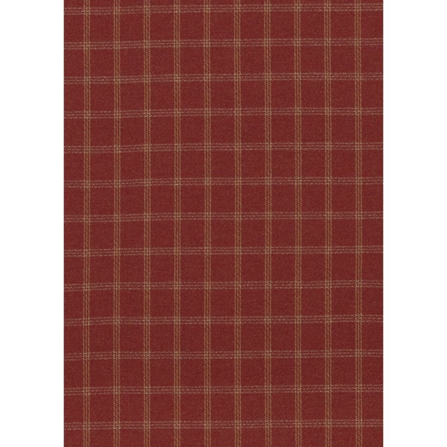
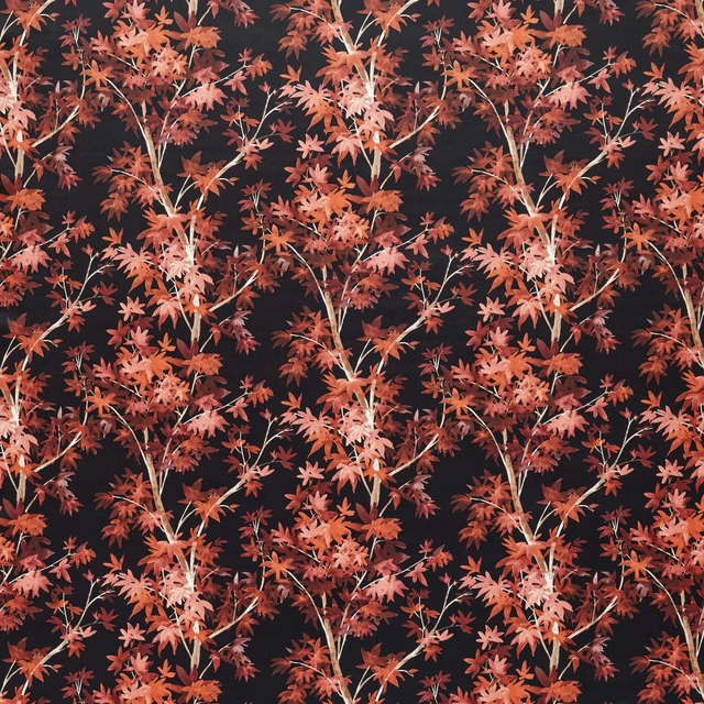
Rivoli Brique is a quiet cloth, so it carries a pattern beside it: one of these on the curtains and this on the chair. Mixed across the houses we hold, which is the part a single supplier's book cannot do.



Paint that goes with it
Two ways to take the room. Both colours are from houses we hold, so a pot can come off the same order as the cloth. Screens shift colour, so treat these as a direction and bring the cloth to the shelf before you buy the paint.
To sit quietly behind it
Baked Cherry
Little Greene · #611117
To stand against it
Trinket
Coat Paints · #786c74
Other red fabrics
Across the houses we hold. See all 2,196.