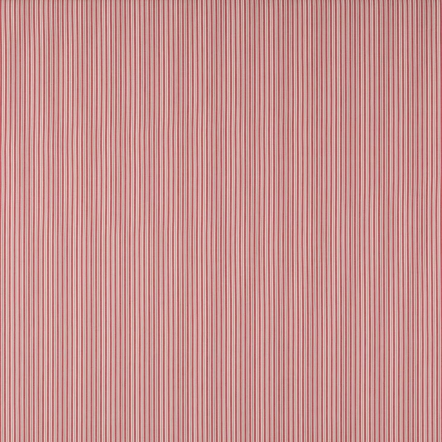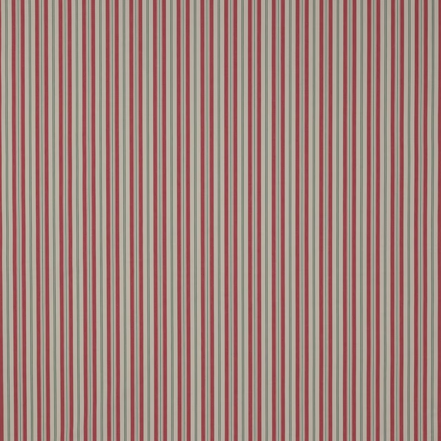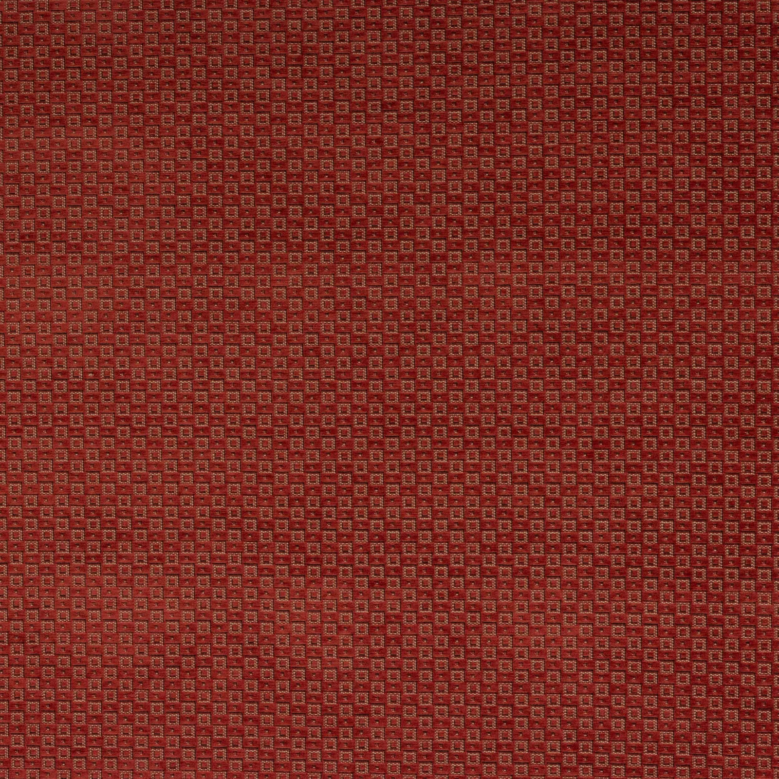

Tap the swatch to see it full screen. Hover it to magnify the weave. Colours on a screen are a guide, not a match, so come and feel the real cloth.
Scroll up or down to zoom in and out.
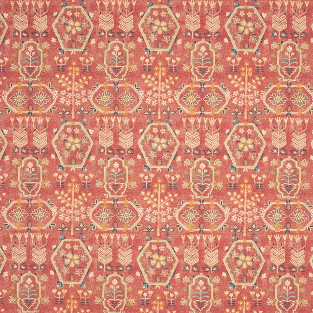
Fulmar Red
Gustav FabricJ0213-05
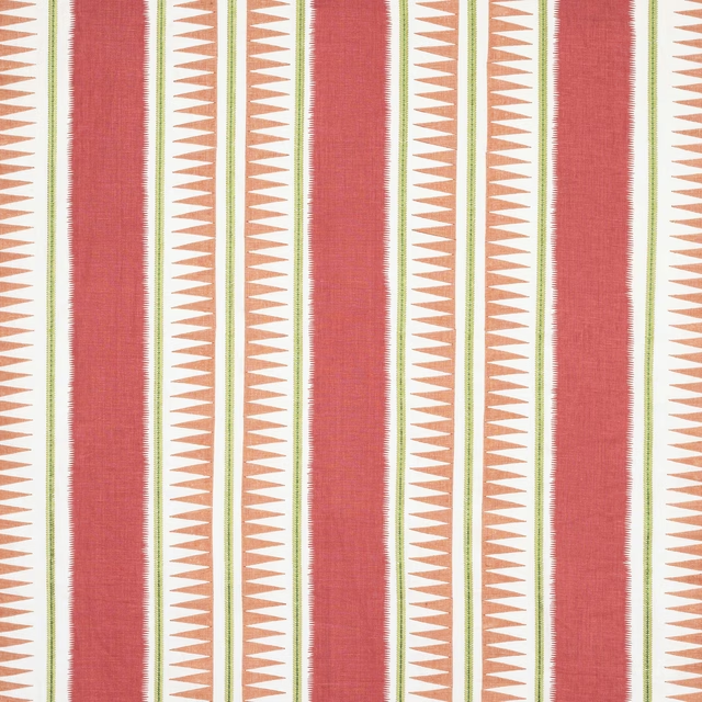
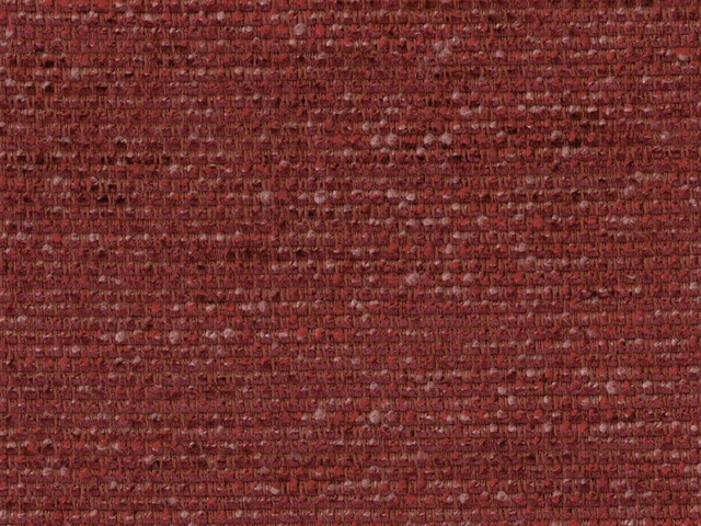
Fulmar Red shows the Gustav design in a warm, brick-toned red with a tiny, tightly packed geometric pattern. The surface reads as textured and tailored, with a subtle broken-light effect across the weave.
You have used your previews for today. Send one to Simon and you can carry on.
Your board
0 fabrics
See this fabric on Jane Churchill's own site, then order it through us.
See Fulmar Red in your own room
A photograph of the piece you want re-covered. Straight on is best, and daylight helps. It is used to make your picture and nothing else.
Looking at your room
We found things here Fulmar Red could go on. Tap one on the photograph, or choose below.
We could not see anything to re-cover
, s
Fulmar Red, on your
Drag to compare. AI impression, colours indicative: ask us for a cutting before you decide.
About this fabric
This colourway has a deep red ground softened by earthy terracotta and rust notes, so it feels rich rather than bright. The small repeat of approximately V 3cm / H 3cm gives the pattern a precise, almost tessellated look that suits close viewing on furniture or at window height. Made in a 138cm-wide composition of 43% viscose, 32% cotton and 25% polyester, it has the balance of handle and durability expected of a versatile decorative fabric. The compact weave and low-key sheen visible in the swatch help the red appear layered and slightly shadowed, which adds depth without making the design feel glossy. With BM fire compliance noted and no performance finish specified, it is a smart choice for schemes that want colour and structure in equal measure.
How to use it
Use Fulmar Red on an accent chair, ottoman or cushion where its small-scale pattern can sit against plain linens or darker woods. In a room with walnut, brass or muted olive, the brick-red tone will read warm and confident rather than overly vivid.
A compact geometric in warm brick red that brings tailored depth to upholstery or curtains.
More from Gustav
The same book, other colourways.

Fulmar Blue
Gustav

Fulmar Emerald
Gustav
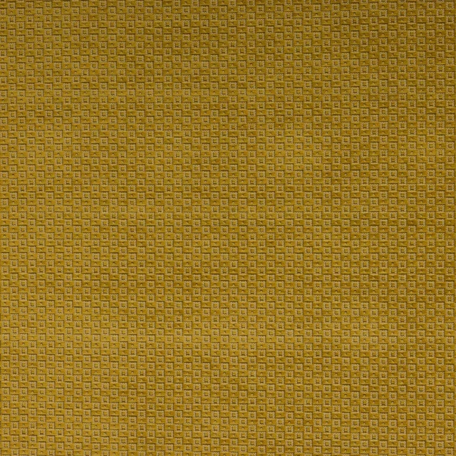
Fulmar Gold
Gustav
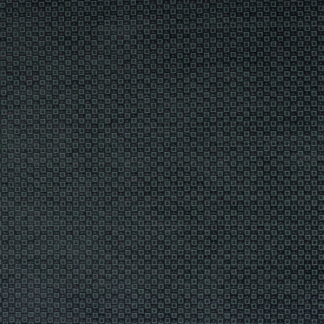
Fulmar Midnight
Gustav
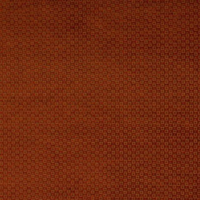
Fulmar Paprika
Gustav
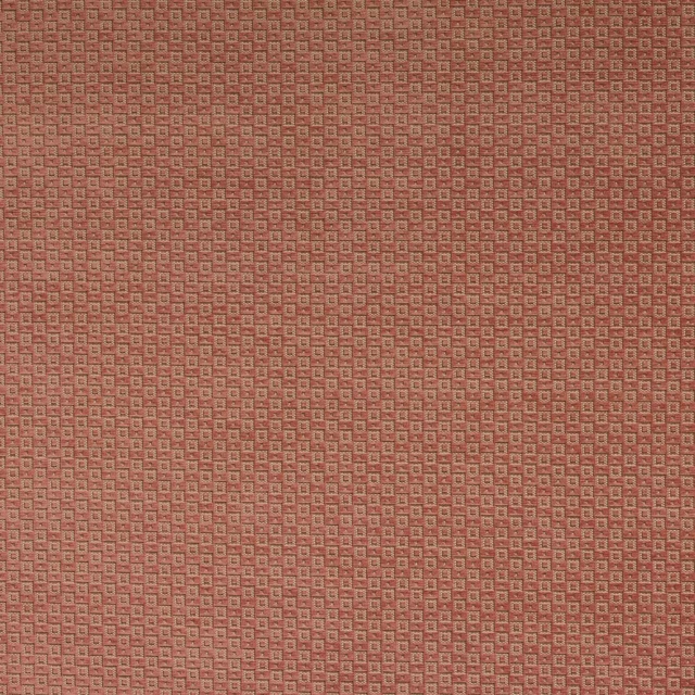
Fulmar Pink
Gustav

Gustav Multi
Gustav
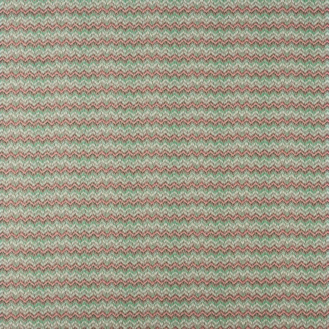
Gustav Pink/Green
Gustav

Gustav Silver/Blue
Gustav
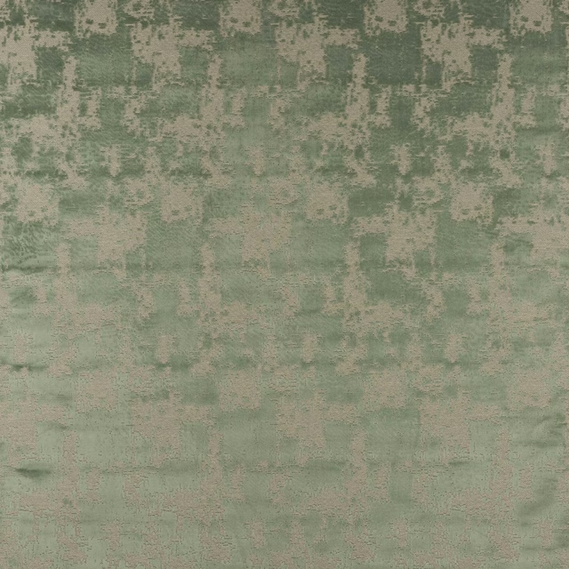
Lanius Aqua
Gustav
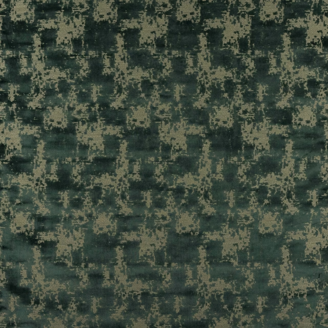
Lanius Forest
Gustav
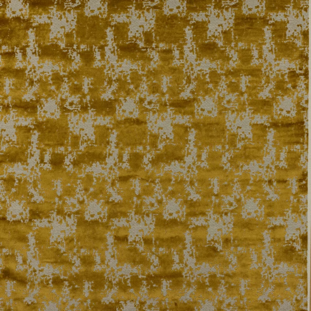
Lanius Gold
Gustav
Pairs well with
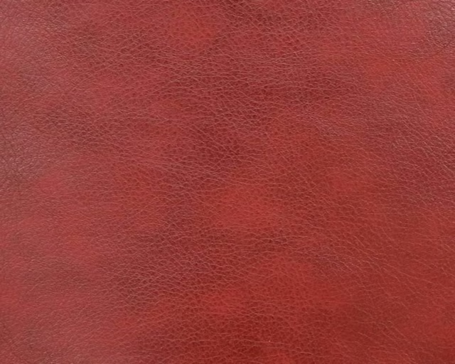
A pattern needs somewhere for the eye to rest, so these are the plains and textures that sit beside Fulmar Red without fighting it. Mixed across the houses we hold, which is the part a single supplier's book cannot do.








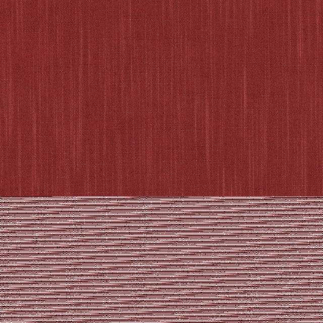

Paint that goes with it
Two ways to take the room. Both colours are from houses we hold, so a pot can come off the same order as the cloth. Screens shift colour, so treat these as a direction and bring the cloth to the shelf before you buy the paint.
To sit quietly behind it
Bronze Red
Little Greene · #6c2322
To stand against it
Amsterdam Green
Sanderson · #555553
Other red fabrics
Across the houses we hold. See all 2,196.