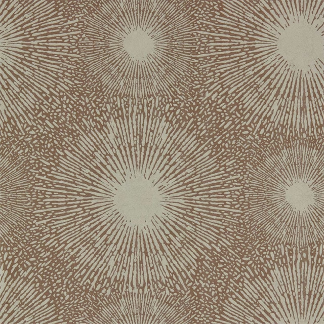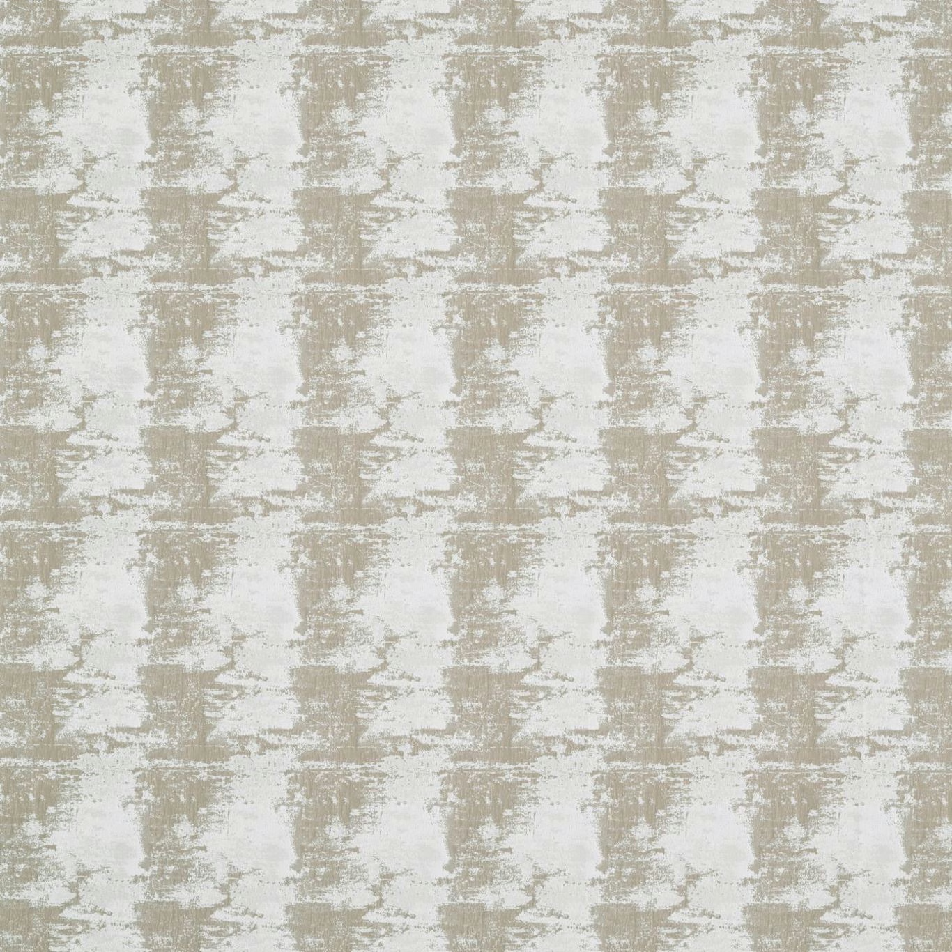

Tap the swatch to see it full screen. Hover it to magnify the weave. Colours on a screen are a guide, not a match, so come and feel the real cloth.
Scroll up or down to zoom in and out.
Pumice Sepia
Anthology Textures 01 FabricHAF0129-02
The house has discontinued this one. We are keeping the page so the link still works, but we can no longer order it. There are alternatives below, and if you have a cutting or a photograph we will help you match it.
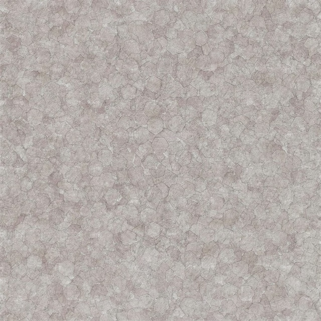
Pumice Sepia combines a chalky ivory ground with pale sepia-taupe marks arranged in an irregular, softly weathered grid. The broken brush-like texture gives the colourway a quiet, tactile depth rather than a flat neutral appearance.
Your board
0 fabrics
See this fabric on Harlequin's own site, then order it through us.
About this fabric
The design is built from horizontal and vertical blocks of sepia-taupe, with uneven edges and lighter interruptions that create a gently distressed surface. Its 25 cm vertical repeat and 40 cm horizontal repeat give the abstract motif a defined medium-scale rhythm without making the pattern feel rigid. At 212 gsm and 295 cm wide, it is a versatile mid-weight textile suited to both upholstery and drapery. The supplied construction specification records 142 threads per cm, supporting the fabric’s visibly compact, textured ground.
How to use it
Pair Pumice Sepia with warm ivory, limestone and pale timber to draw out its chalky lightness, or use it against deeper mushroom and walnut tones for more contrast. Its restrained taupe-and-ivory pattern is well suited to upholstered seating, full-length curtains or coordinated soft furnishings.
Use the pale taupe and ivory contrast to soften upholstery, curtains or layered neutral schemes.
Pairs well with
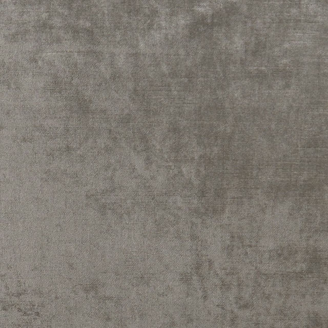
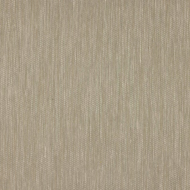
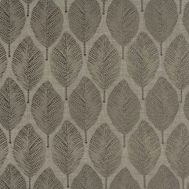
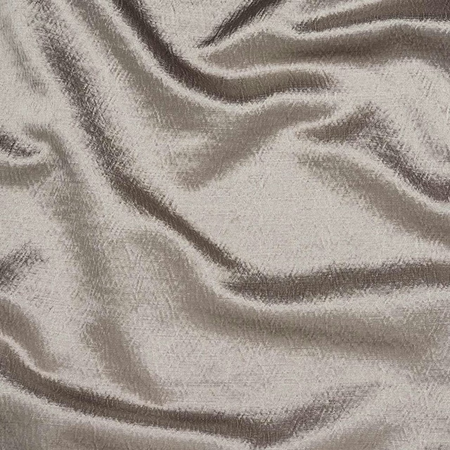
A pattern needs somewhere for the eye to rest, so these are the plains and textures that sit beside Pumice Sepia without fighting it. Mixed across the houses we hold, which is the part a single supplier's book cannot do.





Paint that goes with it
Two ways to take the room. Both colours are from houses we hold, so a pot can come off the same order as the cloth. Screens shift colour, so treat these as a direction and bring the cloth to the shelf before you buy the paint.
To sit quietly behind it
Platinum Grey
Zoffany · #cbcbc1
To stand against it
Emery Blue
Morris & Co. · #4f696a
Other taupe fabrics
Across the houses we hold. See all 4,100.