
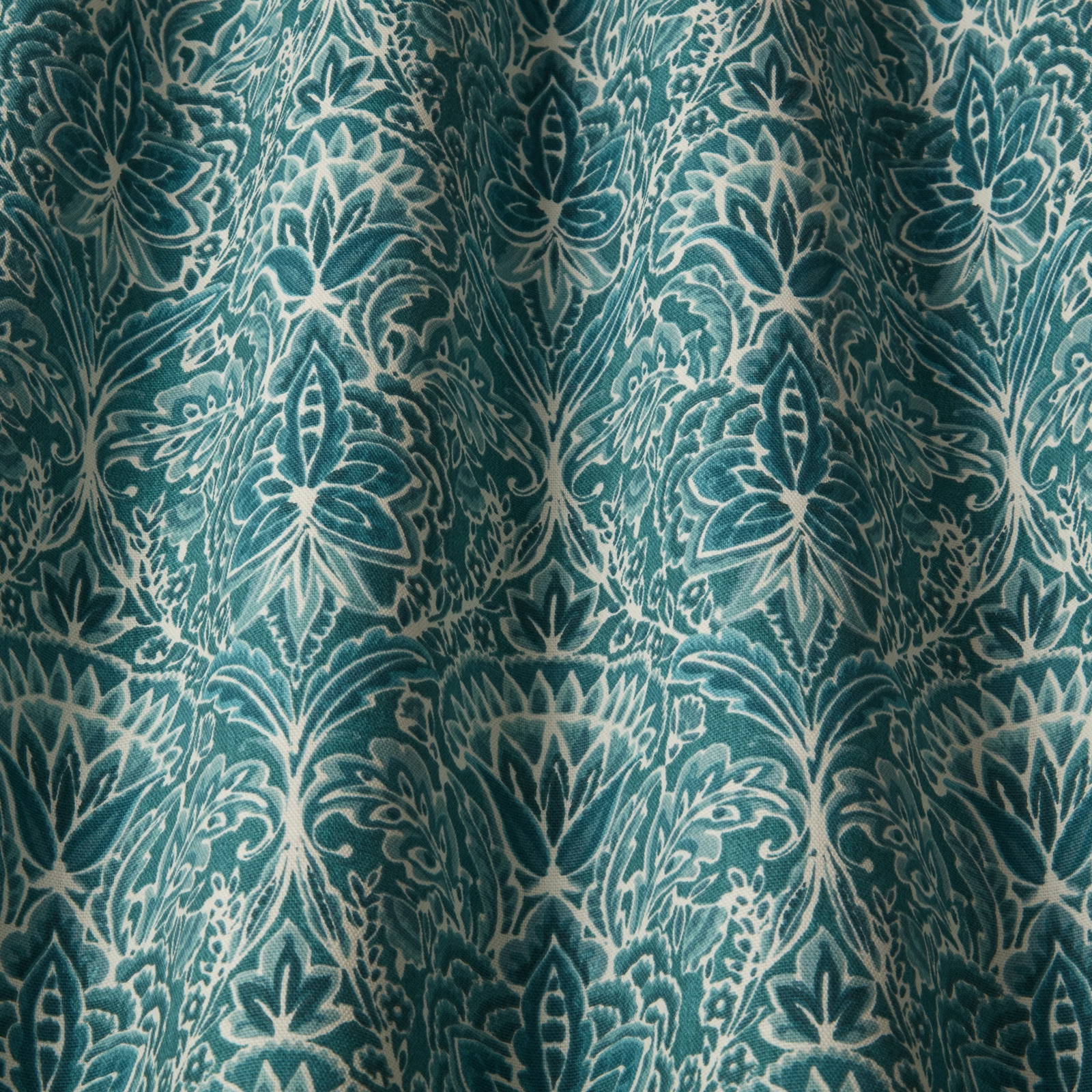

Tap the swatch to see it full screen. Hover it to magnify the weave. Colours on a screen are a guide, not a match, so come and feel the real cloth.
Scroll up or down to zoom in and out.
Rhapsody Seafoam Wavy
SS23 Images - Babooshka Fabric
Rhapsody Seafoam Wavy brings a rich seafoam teal ground to an ornate damask-style pattern with creamy outlines and a softly aged finish. The design reads cool and layered, with the motif standing out clearly against the deeper background folds.
You have used your previews for today. Send one to Simon and you can carry on.
Your board
0 fabrics
See this fabric on iliv's own site, then order it through us.
See Rhapsody Seafoam Wavy in your own room
A photograph of the piece you want re-covered. Straight on is best, and daylight helps. It is used to make your picture and nothing else.
Looking at your room
We found things here Rhapsody Seafoam Wavy could go on. Tap one on the photograph, or choose below.
We could not see anything to re-cover
, s
Rhapsody Seafoam Wavy, on your
Drag to compare. AI impression, colours indicative: ask us for a cutting before you decide.
About this fabric
Woven in 100% cotton, this fabric has a usable width of 140cm and a 17cm horizontal by 32cm vertical pattern repeat, giving the large-scale motif plenty of room to show. The 20,000 Martindale rating and General Domestic upholstery grade make it suitable for lighter seating as well as drapery, and it is treatable for FR drapery and upholstery. Visually, the seafoam shade sits in a blue-green range with a slightly muted depth, while the pale motif lines add contrast and definition without looking stark. The surface has a soft, cloth-like handle rather than a glossy finish, which keeps the pattern feeling tailored and refined. Better Cotton content adds to its appeal for projects that want a considered natural fibre cloth.
How to use it
Use it for a statement armchair, curtains or cushions where the cool teal ground can add colour without overwhelming the room. It works especially well with warm woods, linen whites and brushed brass details.
Pair with pale oak or chalky neutrals to let the cool teal pattern stay crisp and fresh.
More from SS23 Images - Babooshka
The same book, other colourways.
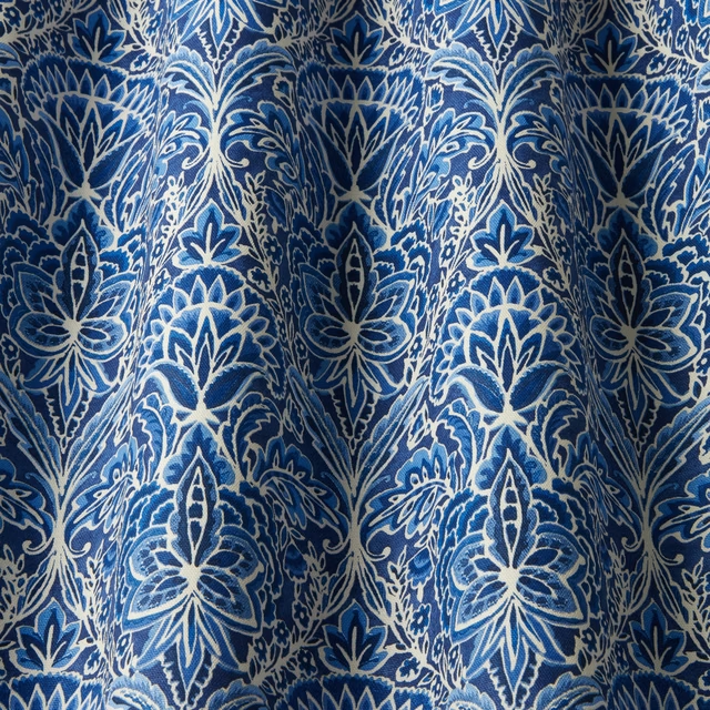
Rhapsody Midnight Wavy
SS23 Images - Babooshka
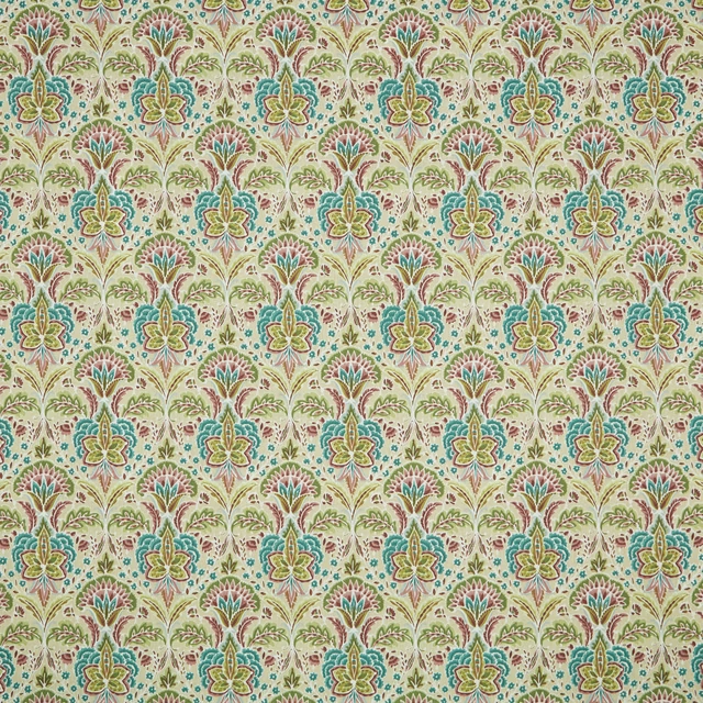
Rhapsody Orchid Flat
SS23 Images - Babooshka
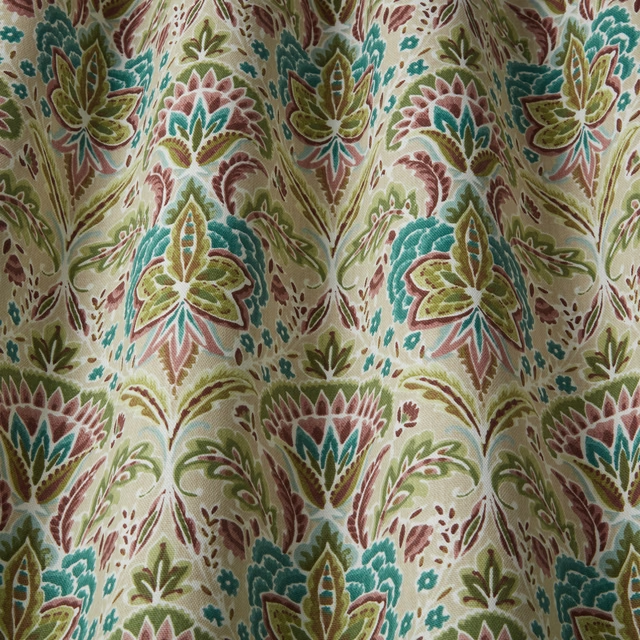
Rhapsody Orchid Wavy
SS23 Images - Babooshka
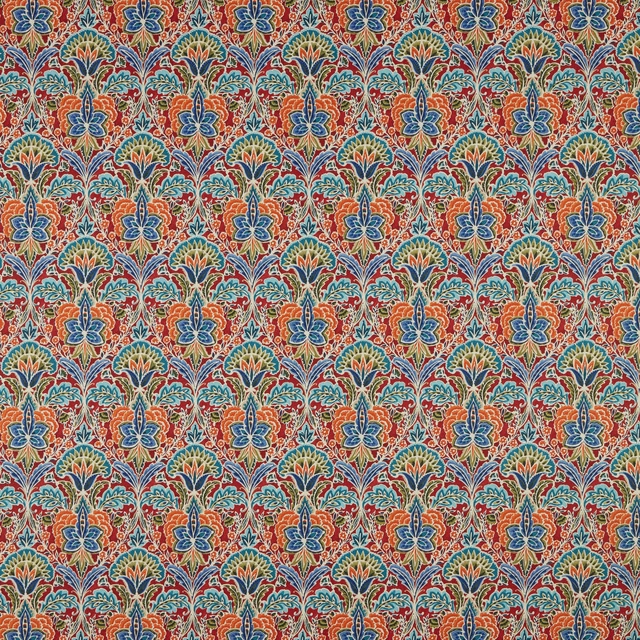
Rhapsody Ruby Flat
SS23 Images - Babooshka
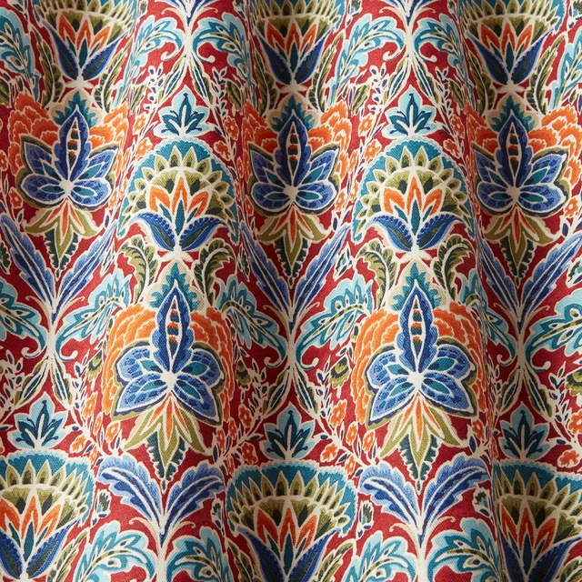
Rhapsody Ruby Wavy
SS23 Images - Babooshka
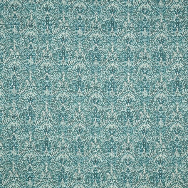
Rhapsody Seafoam Flat
SS23 Images - Babooshka
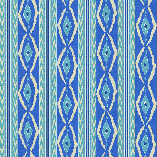
Santana Batik
SS23 Images - Babooshka
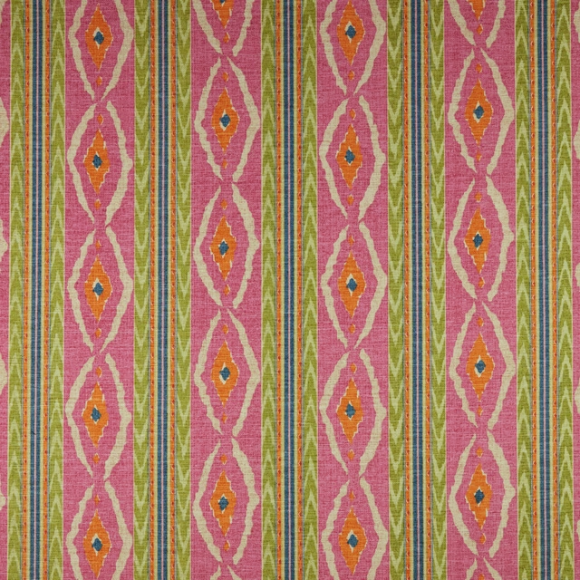
Santana Hot Pink Flat
SS23 Images - Babooshka
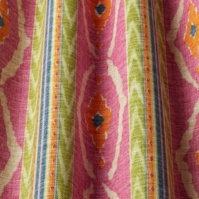
Santana Hot Pink Wavy
SS23 Images - Babooshka
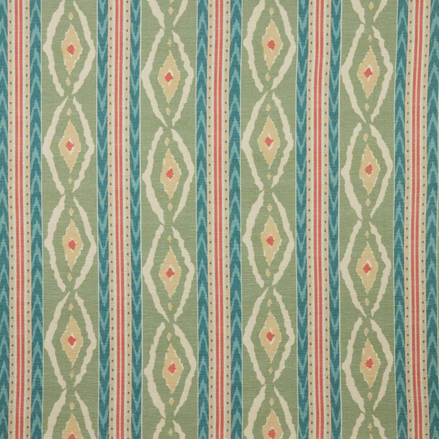
Santana Malachite Flat
SS23 Images - Babooshka
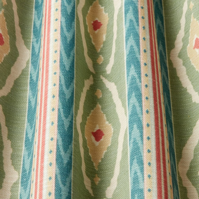
Santana Malachite Wavy
SS23 Images - Babooshka
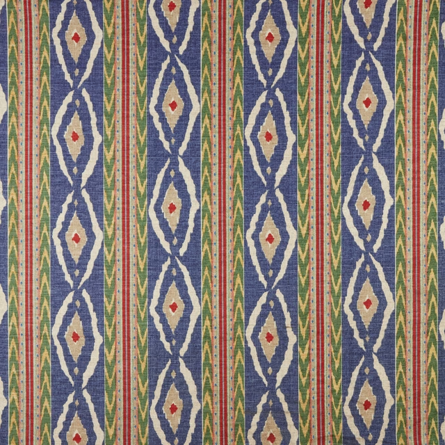
Santana Midnight Flat
SS23 Images - Babooshka
Pairs well with
A pattern needs somewhere for the eye to rest, so these are the plains and textures that sit beside Rhapsody Seafoam Wavy without fighting it. Mixed across the houses we hold, which is the part a single supplier's book cannot do.

Alaska Teal
Alaska Collection
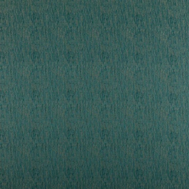
Alula Peacock
Comet Collection
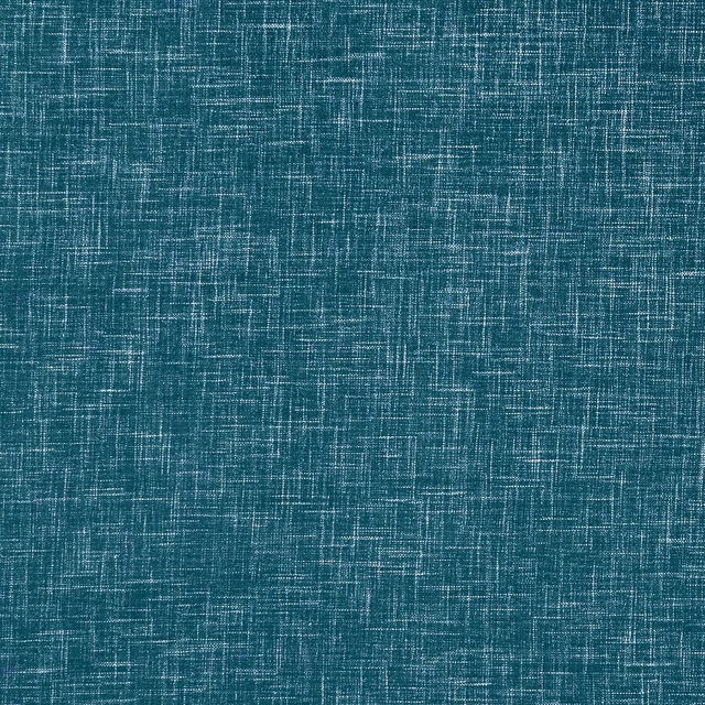
Albany Peacock
Albany and Moray
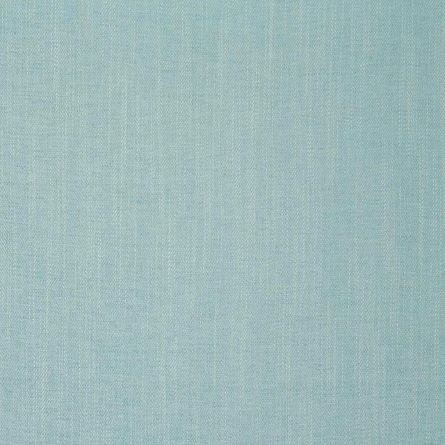
Moray Eau De Nil
Albany and Moray

Marldon Aqua
Albeck
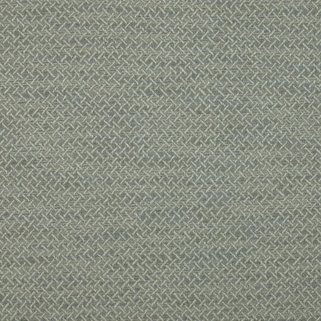
Medway Aqua
Brett Weaves
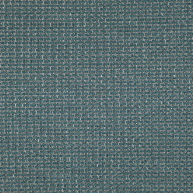
Barden Sea
Birkett easyclean Fabrics
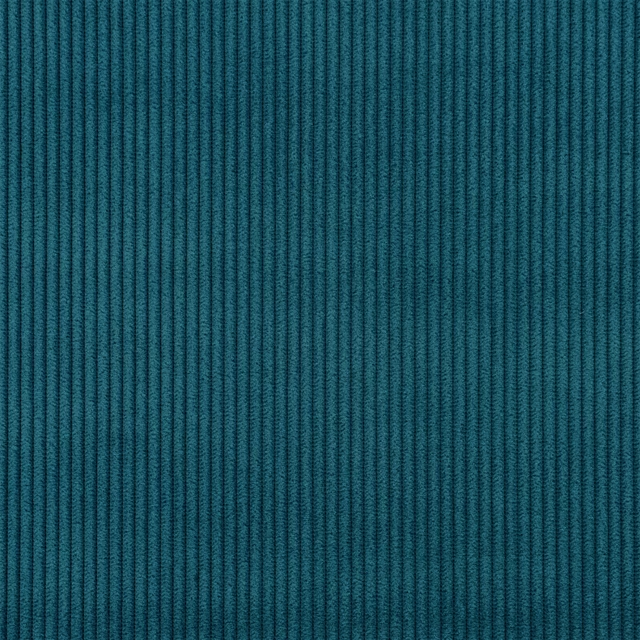
Corda FR SR Petrol
Corda FR SR
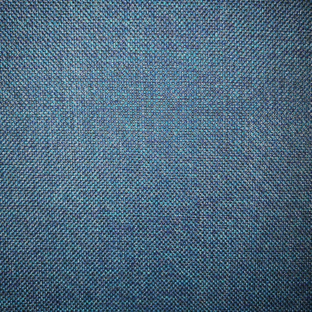
Arran FR Teal
Alderney

Naples FR Turquoise
Alderney
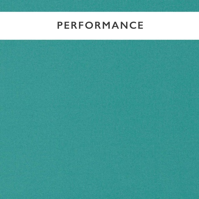
Allegra Lagoon
Allegra
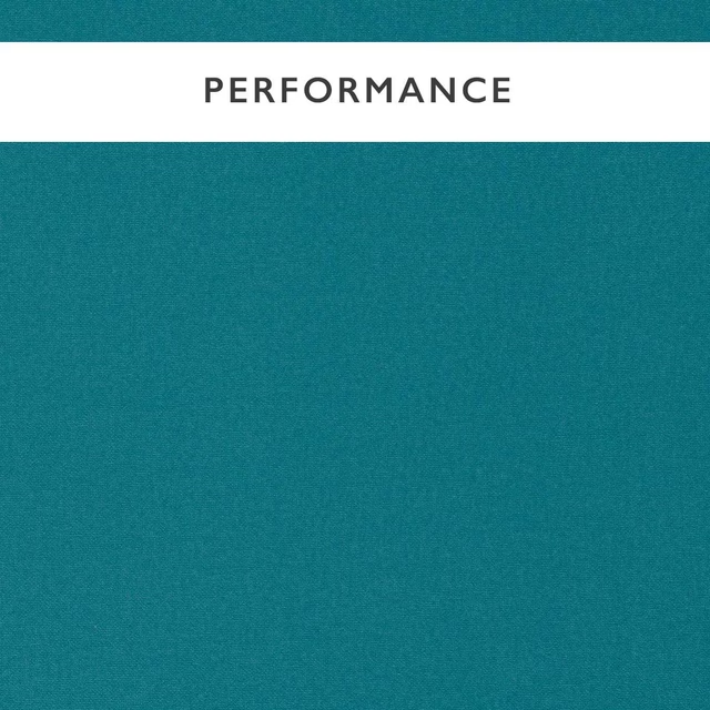
Allegra Mallard
Allegra
Paint that goes with it
Two ways to take the room. Both colours are from houses we hold, so a pot can come off the same order as the cloth. Screens shift colour, so treat these as a direction and bring the cloth to the shelf before you buy the paint.
To sit quietly behind it
Emery Blue
Morris & Co. · #4f696a
To stand against it
Lute
Little Greene · #cab49c
Other teal fabrics
Across the houses we hold. See all 2,990.
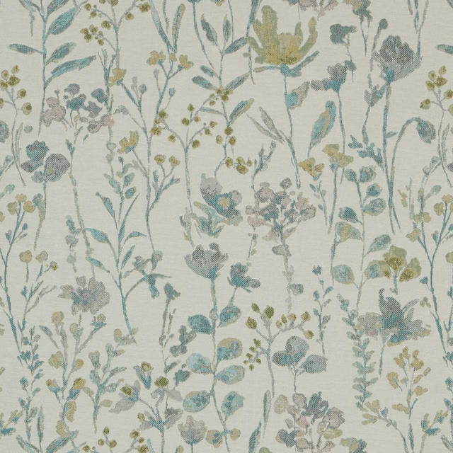
Water Meadow Pasture Jade Flat
SS22 Images - Enchanted Garden, Geometrica, Water Meadow & Portland
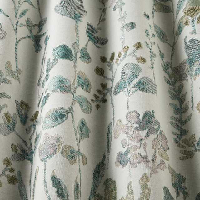
Water Meadow Pasture Jade Wavy
SS22 Images - Enchanted Garden, Geometrica, Water Meadow & Portland
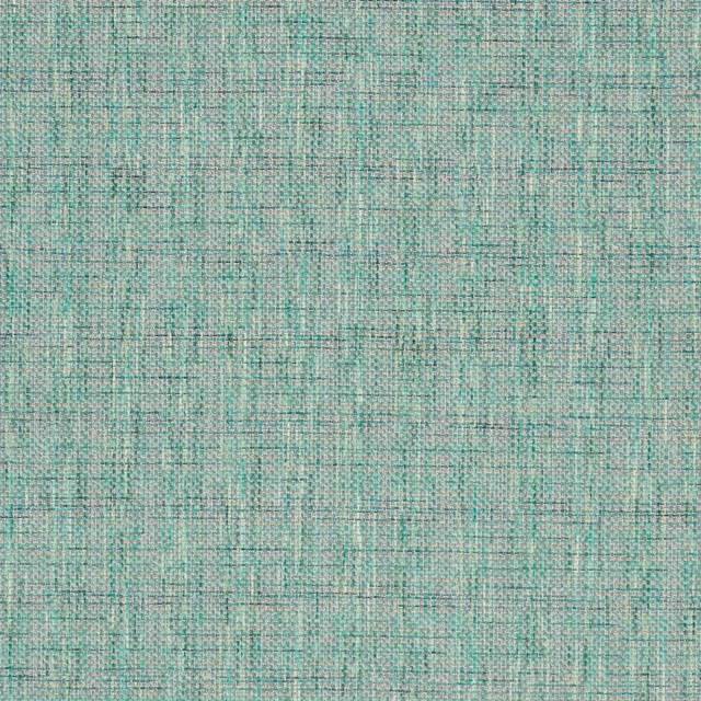
Water Meadow Zen Jade Flat
SS22 Images - Enchanted Garden, Geometrica, Water Meadow & Portland
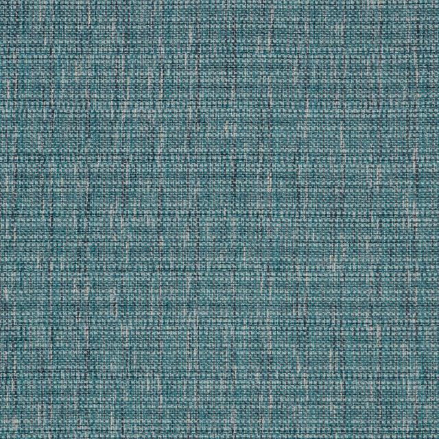
Water Meadow Zen Midnight Flat
SS22 Images - Enchanted Garden, Geometrica, Water Meadow & Portland
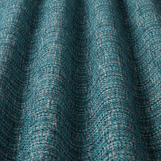
Water Meadow Zen Midnight Wavy
SS22 Images - Enchanted Garden, Geometrica, Water Meadow & Portland
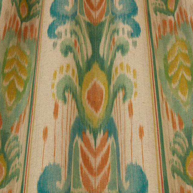
Jardine Incanto Jade Wavy
SS24 Images - Jardine, Luxoria & Orissa
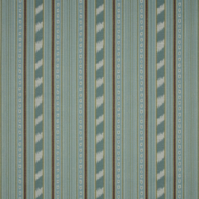
Jardine Lumiere Haze Flat
SS24 Images - Jardine, Luxoria & Orissa
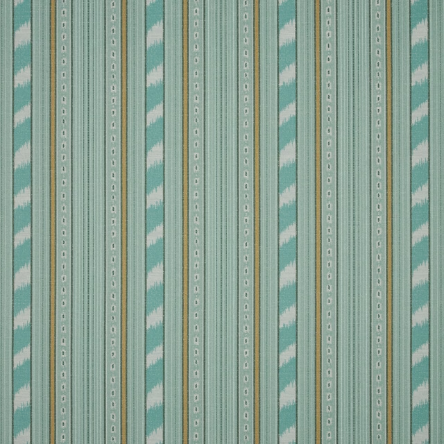
Jardine Lumiere Jade Flat
SS24 Images - Jardine, Luxoria & Orissa
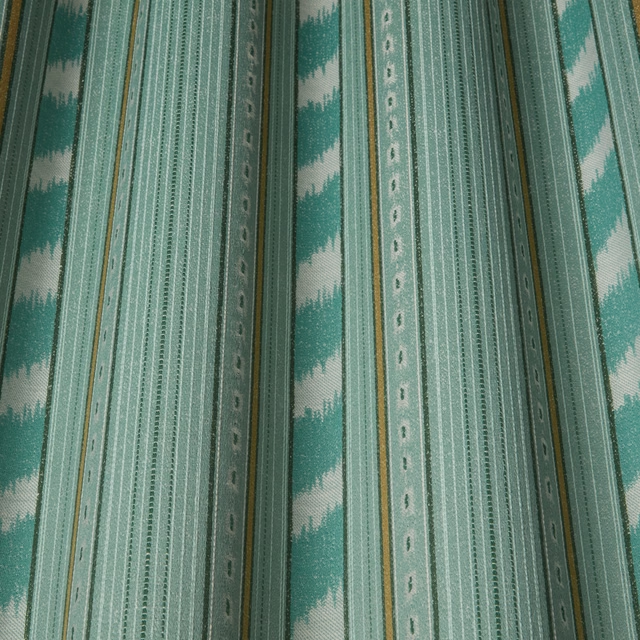
Jardine Lumiere Jade Wavy
SS24 Images - Jardine, Luxoria & Orissa
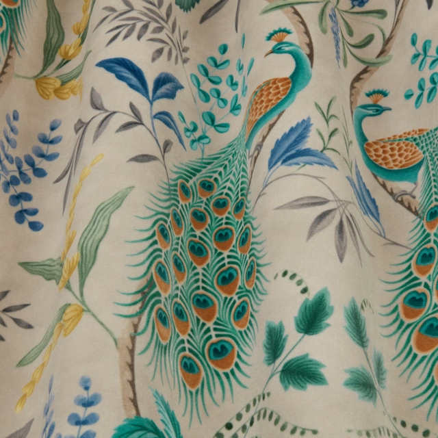
Jardine Parvani Delft Wavy
SS24 Images - Jardine, Luxoria & Orissa
Jardine Zen Jade Flat
SS24 Images - Jardine, Luxoria & Orissa
Jardine Zen Jade Wavy
SS24 Images - Jardine, Luxoria & Orissa