
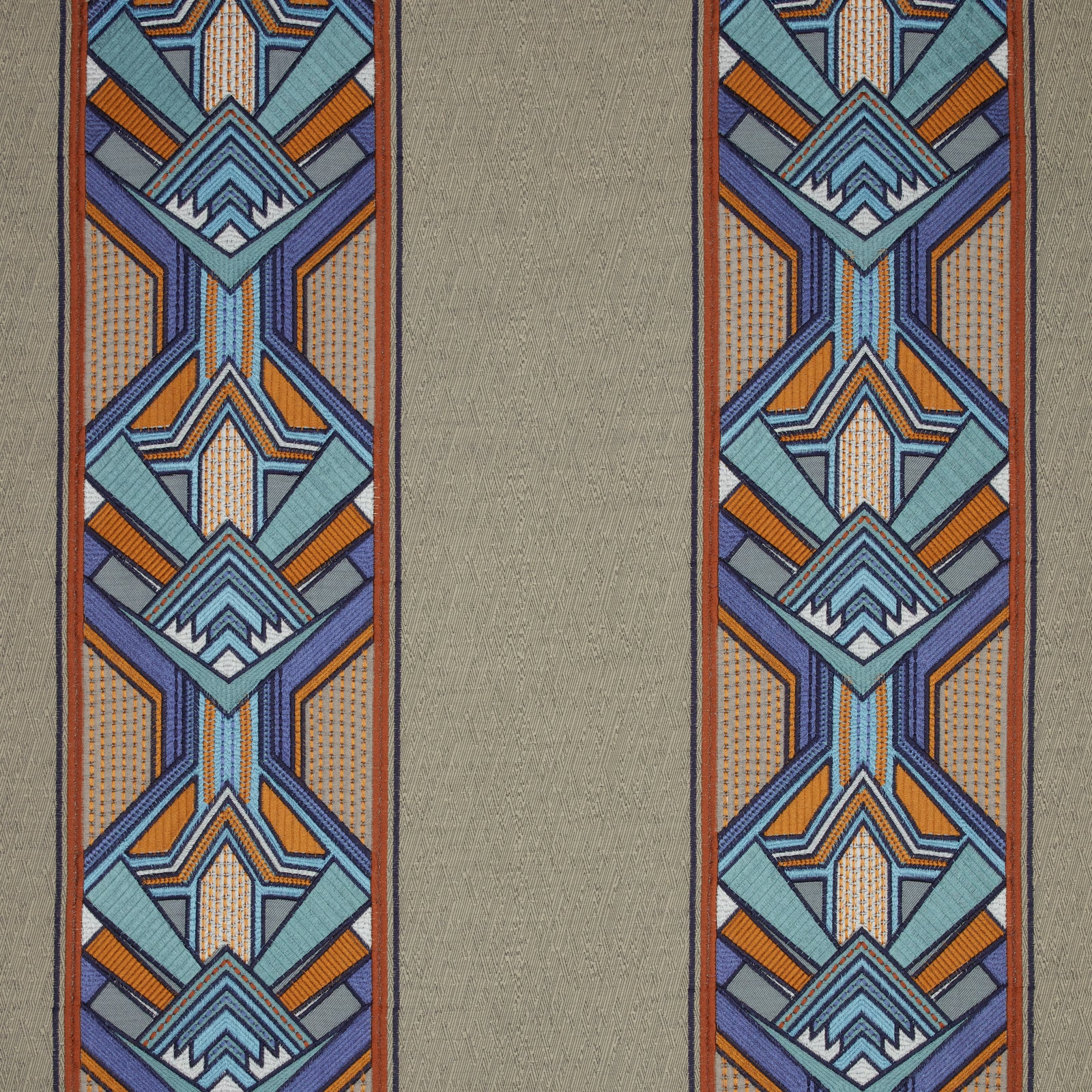

Tap the swatch to see it full screen. Hover it to magnify the weave. Colours on a screen are a guide, not a match, so come and feel the real cloth.
Scroll up or down to zoom in and out.
Luxoria Gatsby Moonlight Flat
SS24 Images - Jardine, Luxoria & Orissa Fabric
Luxoria Gatsby Moonlight Flat pairs a softly muted taupe centre with striking geometric borders in blue, teal, lilac and orange. The result is a contemporary Art Deco look with a calm ground and a lively, decorative edge.
You have used your previews for today. Send one to Simon and you can carry on.
Your board
0 fabrics
See this fabric on iliv's own site, then order it through us.
See Luxoria Gatsby Moonlight Flat in your own room
A photograph of the piece you want re-covered. Straight on is best, and daylight helps. It is used to make your picture and nothing else.
Looking at your room
We found things here Luxoria Gatsby Moonlight Flat could go on. Tap one on the photograph, or choose below.
We could not see anything to re-cover
, s
Luxoria Gatsby Moonlight Flat, on your
Drag to compare. AI impression, colours indicative: ask us for a cutting before you decide.
About this fabric
Woven in 53% cotton and 47% viscose, this fabric has the fluid handle and refined surface suited to curtains and accessories rather than upholstery, and it is treatable for FR drapery. The usable width is 144cm, with a 37cm horizontal repeat and 63cm vertical repeat, so the bold border motif will need careful pattern placement. In the photo, the central field reads as a quiet soft taupe with a subtly brushed, linen-like texture, which gives the brighter borders more contrast. The surrounding geometric stripes feel crisp and architectural, with cool aqua and blue tones lifted by small hits of orange for a sharper finish. Colour fastness is rated 6, supporting confident use in interiors where the fabric will be seen in natural light.
How to use it
This taupe and jewel-toned colourway works well in a scheme with walnut woods, brushed brass and smoky neutrals, where the border pattern can be the focal point. Use it for statement curtains, oversized cushions or trimmed accessories to bring graphic energy without overpowering the room.
Use this calm taupe base to let the vivid Art Deco-style border bring the drama.
More from SS24 Images - Jardine, Luxoria & Orissa
The same book, other colourways.
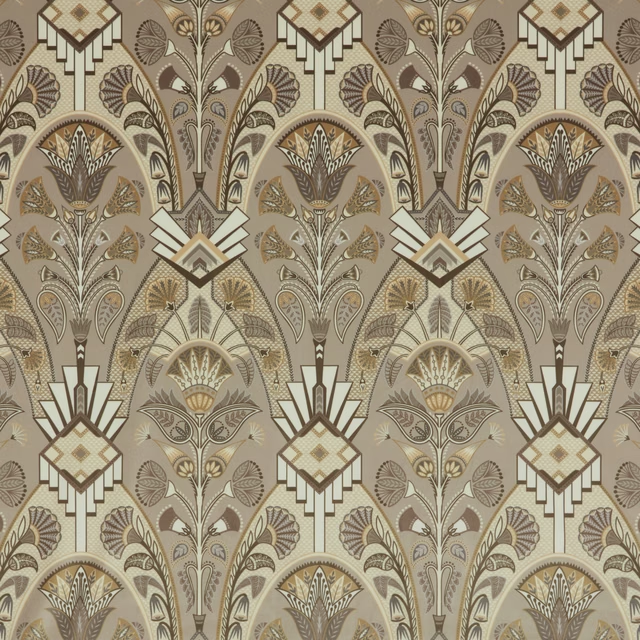
Luxoria Cabaret Opal Flat
SS24 Images - Jardine, Luxoria & Orissa
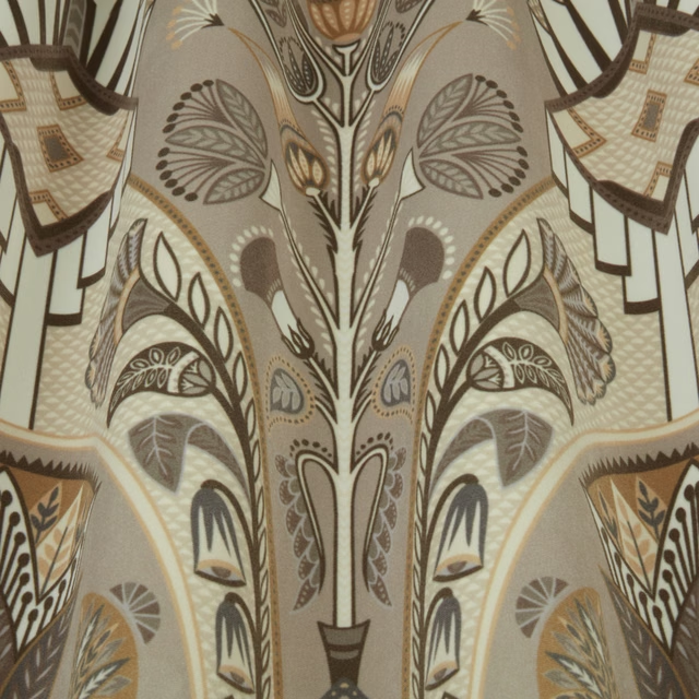
Luxoria Cabaret Opal Wavy
SS24 Images - Jardine, Luxoria & Orissa
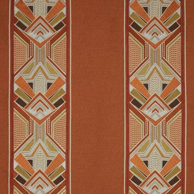
Luxoria Gatsby Amber Flat
SS24 Images - Jardine, Luxoria & Orissa
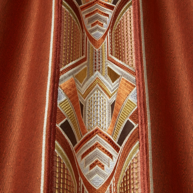
Luxoria Gatsby Amber Wavy
SS24 Images - Jardine, Luxoria & Orissa
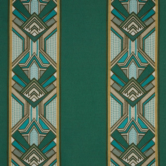
Luxoria Gatsby Emerald Flat
SS24 Images - Jardine, Luxoria & Orissa
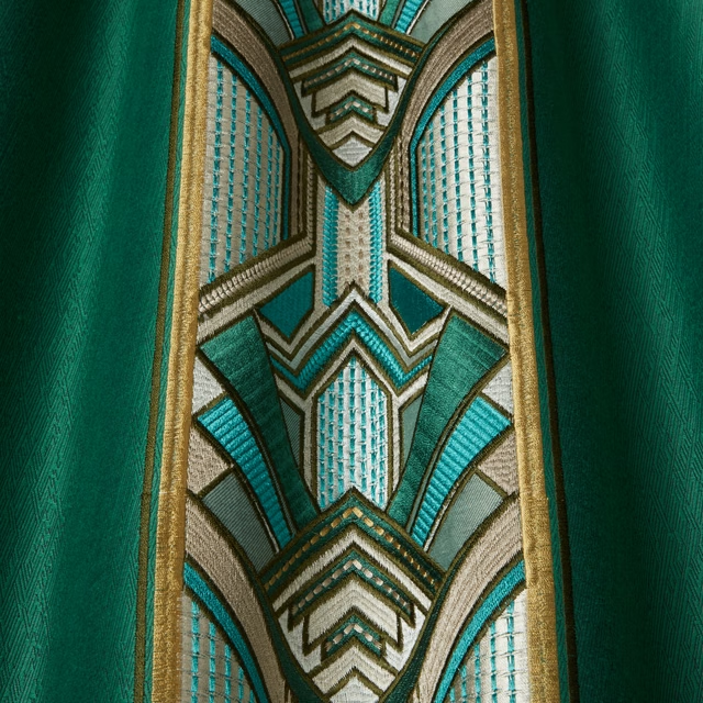
Luxoria Gatsby Emerald Wavy
SS24 Images - Jardine, Luxoria & Orissa
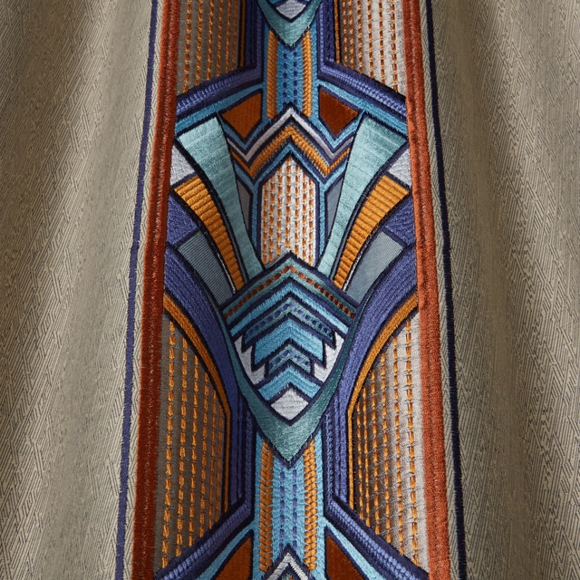
Luxoria Gatsby Moonlight Wavy
SS24 Images - Jardine, Luxoria & Orissa
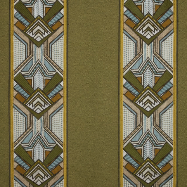
Luxoria Gatsby Moss Flat
SS24 Images - Jardine, Luxoria & Orissa
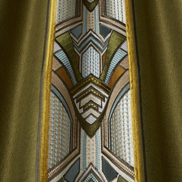
Luxoria Gatsby Moss Wavy
SS24 Images - Jardine, Luxoria & Orissa
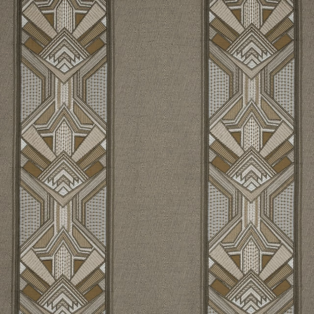
Luxoria Gatsby Opal Flat
SS24 Images - Jardine, Luxoria & Orissa
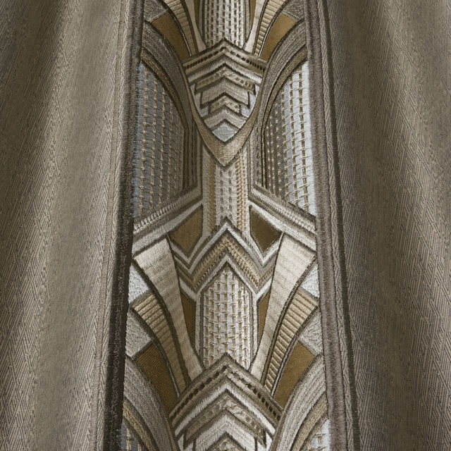
Luxoria Gatsby Opal Wavy
SS24 Images - Jardine, Luxoria & Orissa
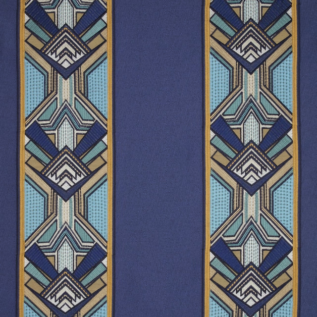
Luxoria Gatsby Sapphire Flat
SS24 Images - Jardine, Luxoria & Orissa
Pairs well with
A pattern needs somewhere for the eye to rest, so these are the plains and textures that sit beside Luxoria Gatsby Moonlight Flat without fighting it. Mixed across the houses we hold, which is the part a single supplier's book cannot do.

Alaska Mole
Alaska Collection

Alaska Otter
Alaska Collection
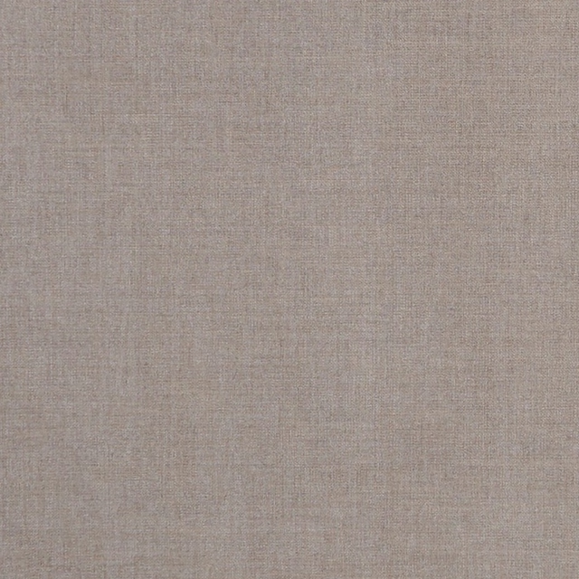
Albany Mink
Albany and Moray
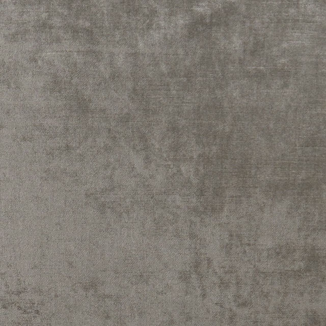
Allure Ash
Allure
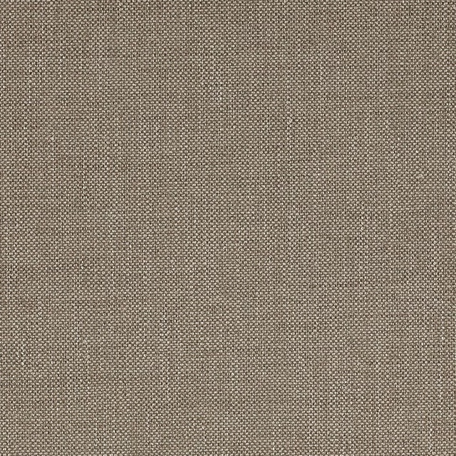
Marldon Taupe
Albeck
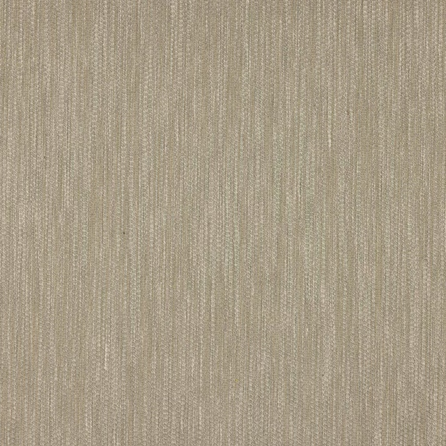
Croft Silver
Chester
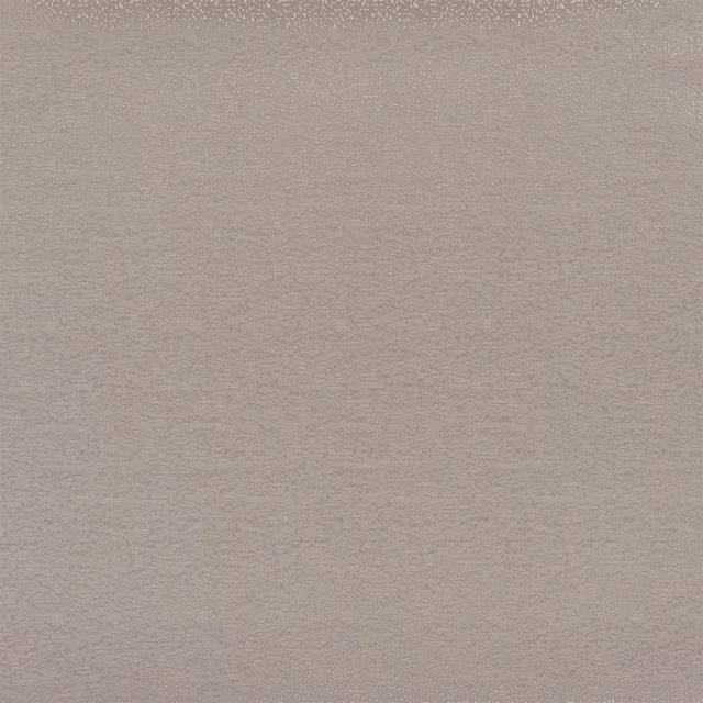
Marcello Cappuccino
Contract Essentials II Fabrics
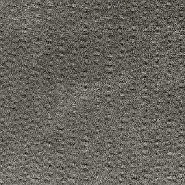
Sahara Zinc
Kalahari Fabrics
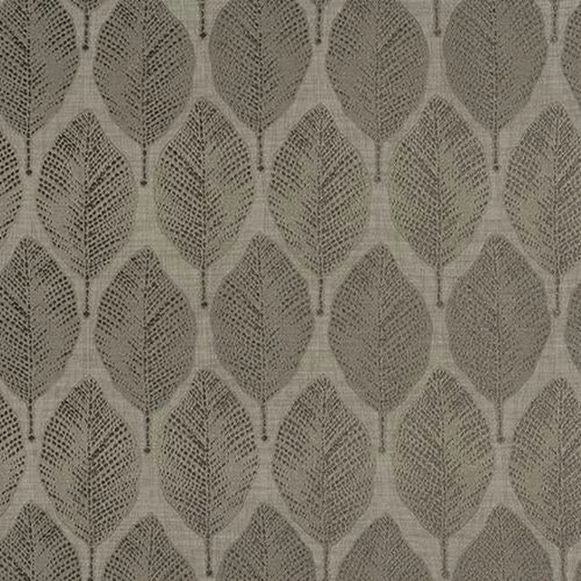
Acacia Taupe
Acacia
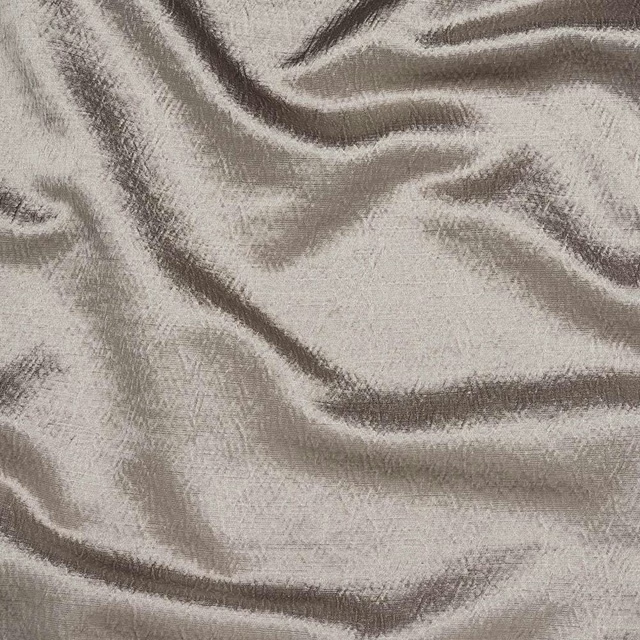
Alchemy Mushroom
Alchemy
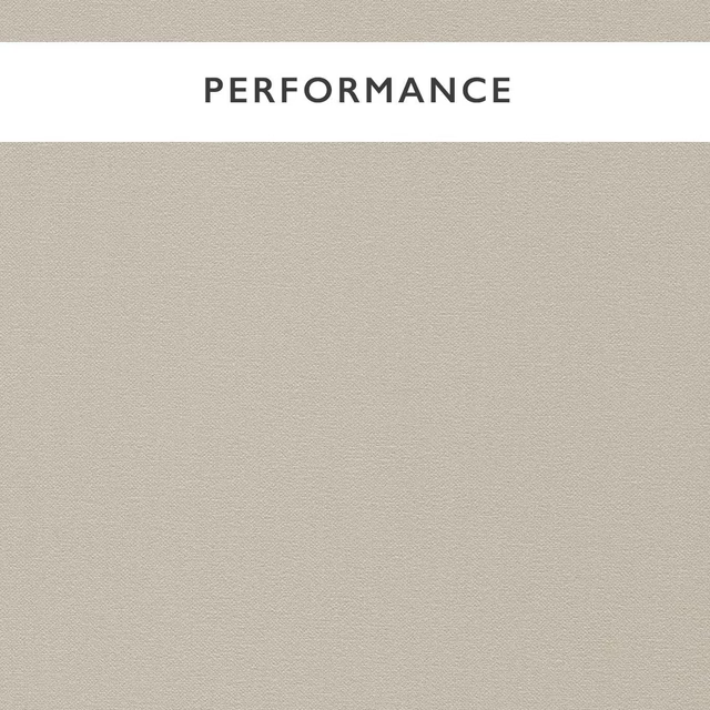
Allegra Avery
Allegra
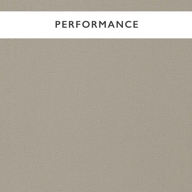
Allegra Fog
Allegra
Paint that goes with it
Two ways to take the room. Both colours are from houses we hold, so a pot can come off the same order as the cloth. Screens shift colour, so treat these as a direction and bring the cloth to the shelf before you buy the paint.
To sit quietly behind it
Raw Umber
Zoffany · #877d73
To stand against it
Granny Chic
Coat Paints · #eee0db
Other taupe fabrics
Across the houses we hold. See all 4,148.
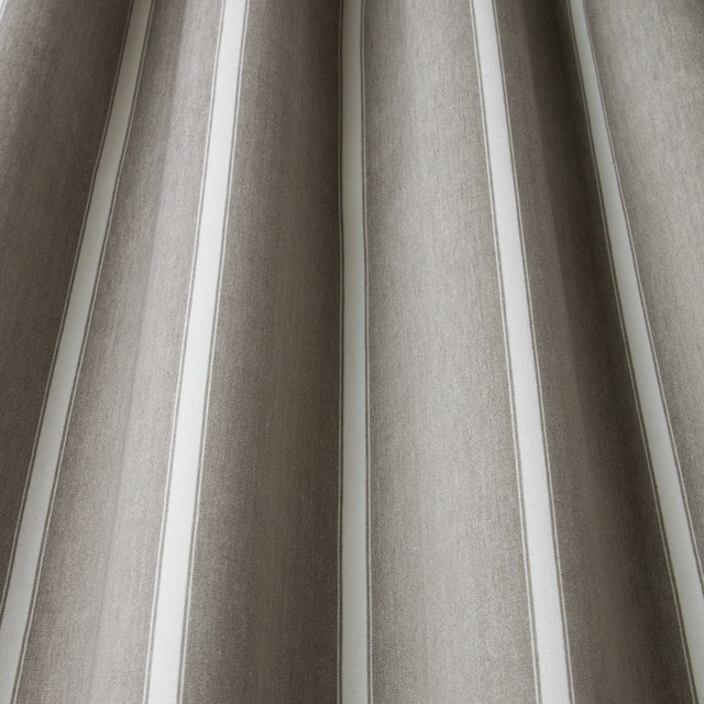
Portland Waterbury Flint Wavy
SS22 Images - Enchanted Garden, Geometrica, Water Meadow & Portland
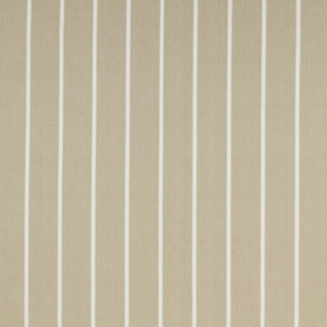
Portland Waterbury Taupe Flat
SS22 Images - Enchanted Garden, Geometrica, Water Meadow & Portland
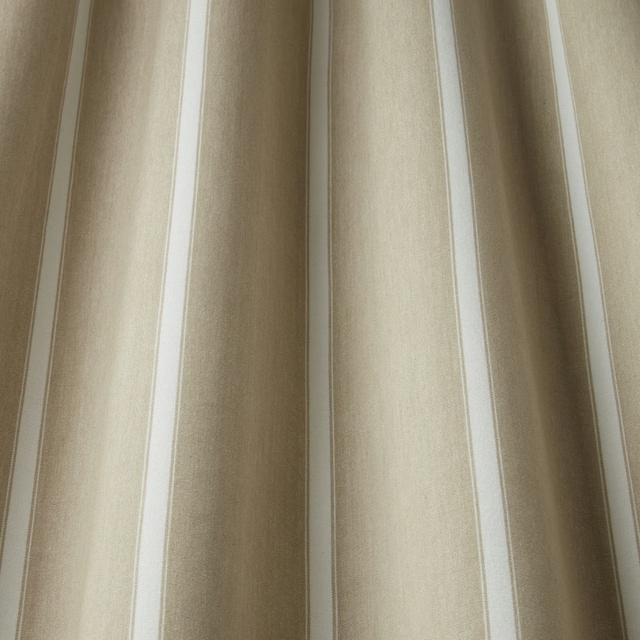
Portland Waterbury Taupe Wavy
SS22 Images - Enchanted Garden, Geometrica, Water Meadow & Portland
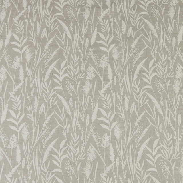
Water Meadow Wild Grasses Pebble Flat
SS22 Images - Enchanted Garden, Geometrica, Water Meadow & Portland
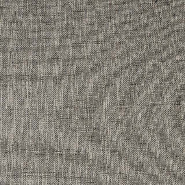
Water Meadow Zen Dove Flat
SS22 Images - Enchanted Garden, Geometrica, Water Meadow & Portland
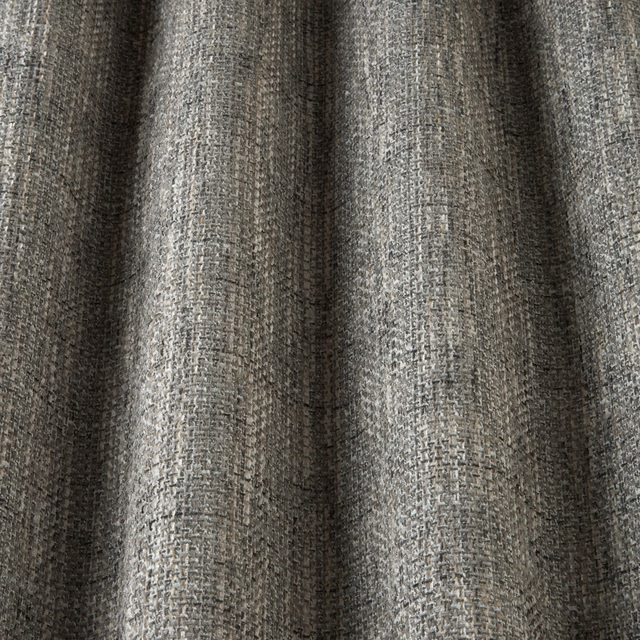
Water Meadow Zen Dove Wavy
SS22 Images - Enchanted Garden, Geometrica, Water Meadow & Portland
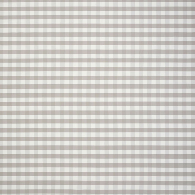
Botanical Archive Glenhaven Hessian
SS26 Images - Botanical Archive, Terrana & Hartland
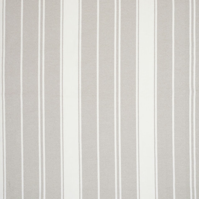
Hartland Lynton Sandstone
SS26 Images - Botanical Archive, Terrana & Hartland

Terrana Ashmere Putty
SS26 Images - Botanical Archive, Terrana & Hartland
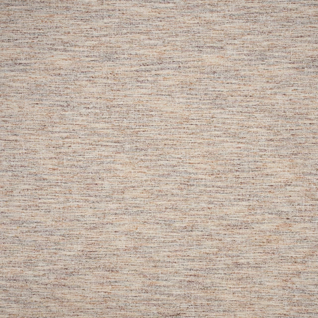
Terrana Ashmere Rosewood
SS26 Images - Botanical Archive, Terrana & Hartland
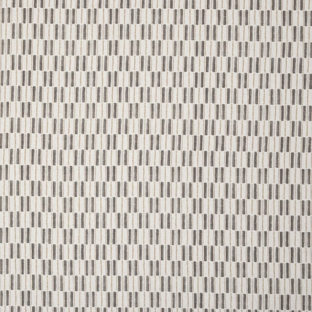
Terrana Fallow Pebble
SS26 Images - Botanical Archive, Terrana & Hartland
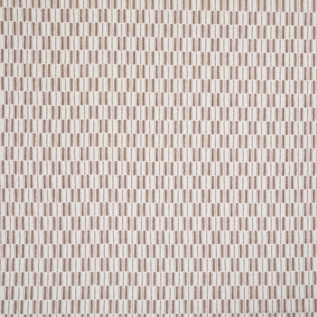
Terrana Fallow Rosewood
SS26 Images - Botanical Archive, Terrana & Hartland