Tap the swatch to see it larger. Hover it to magnify the weave. Colours on a screen are a guide, not a match, so come and feel the real cloth.
Scroll up or down to zoom in and out.
Carmine
Kheri Carpet
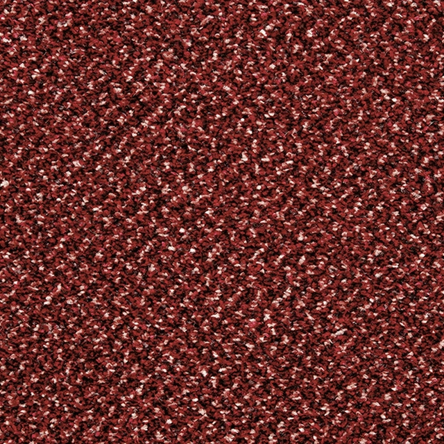
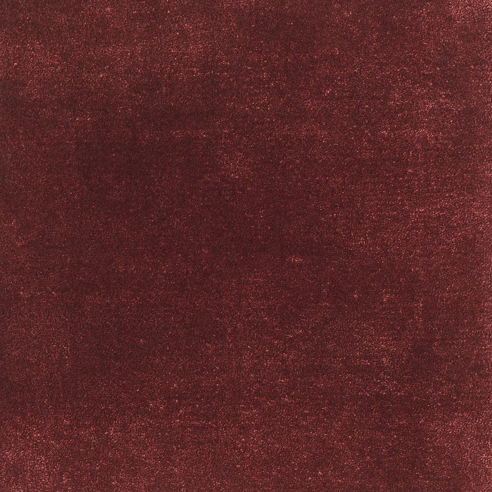
Kheri in Carmine reads as a deep, wine-red textile with subtle tonal movement across its surface. Fine scattered highlights give the colour a warm, softly luminous depth rather than a flat red appearance.
Your board
0 fabrics
See this fabric on Jacaranda's own site, then order it through us.
About this fabric
This Jacaranda colourway is catalogued as a carpet and has a dense, softly granular appearance suited to upholstery. The surface shifts between carmine, burgundy and darker russet-red tones, with tiny flecks catching the light across the image. Subtle vertical tonal variation adds depth without creating a visible repeat or overt motif. No performance features are noted for this exact fabric.
How to use it
Pair the rich carmine-red ground with dark timber, aged brass and warm neutrals for a dramatic, cocooning scheme. Its restrained texture works particularly well on a statement chair, ottoman or upholstered bench.
Use this deep, light-catching carmine on statement upholstery where its rich, softly mottled surface can provide depth.
More from Kheri
The same book, other colourways.
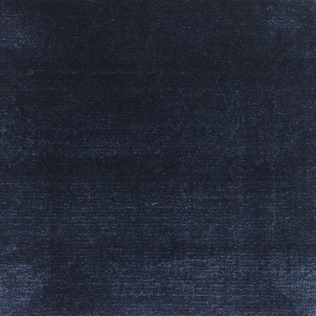
Navy
Kheri
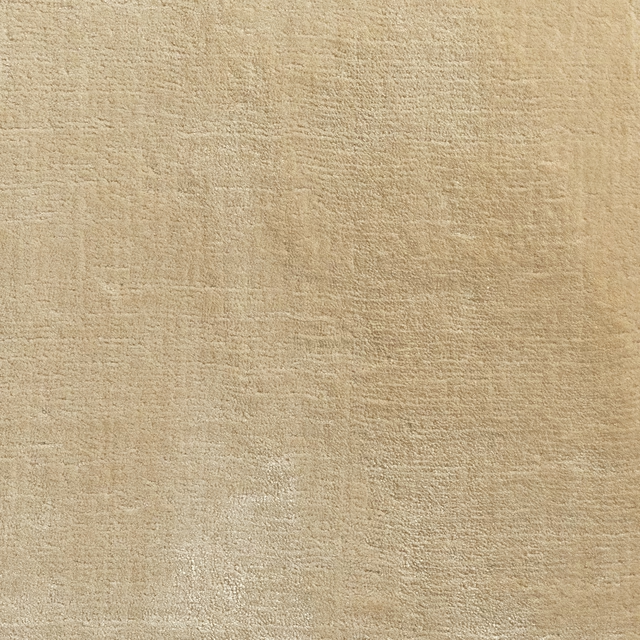
Wheat
Kheri
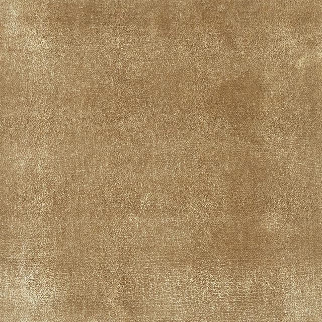
Camel
Kheri

Opal
Kheri
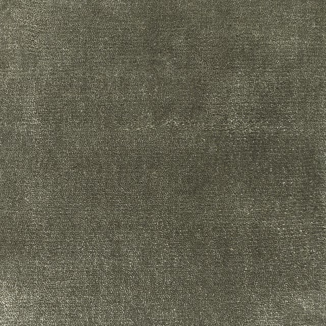
Lovat
Kheri
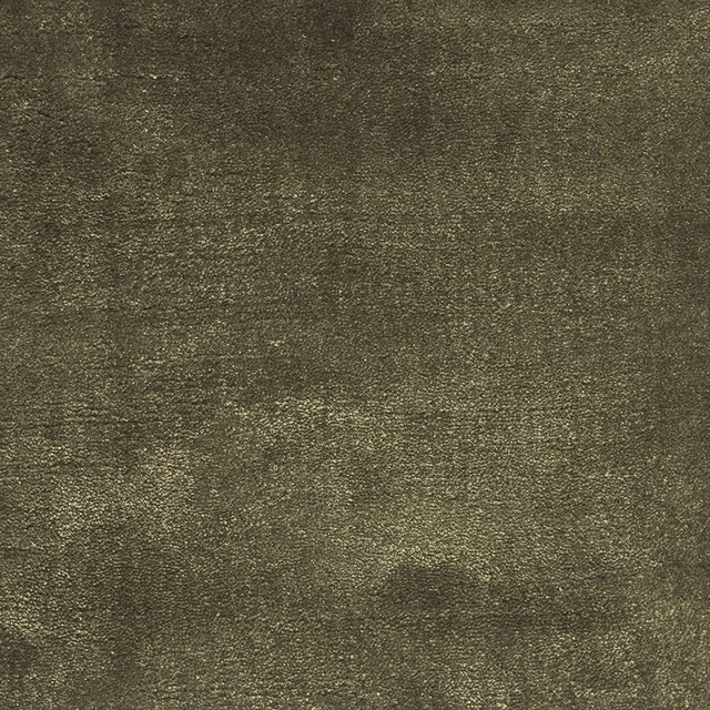
Caper
Kheri

Moonstone
Kheri

Nimbus
Kheri

Glacier
Kheri
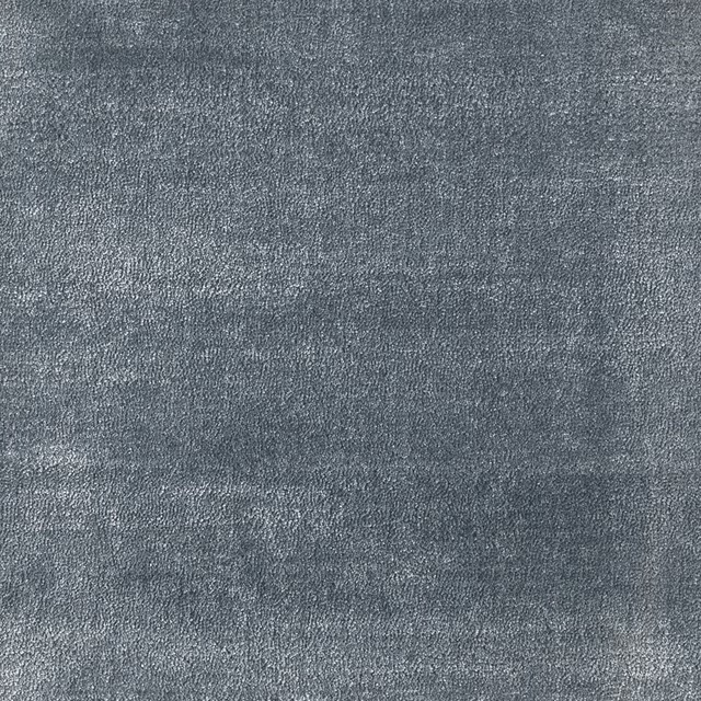
Cornflower
Kheri
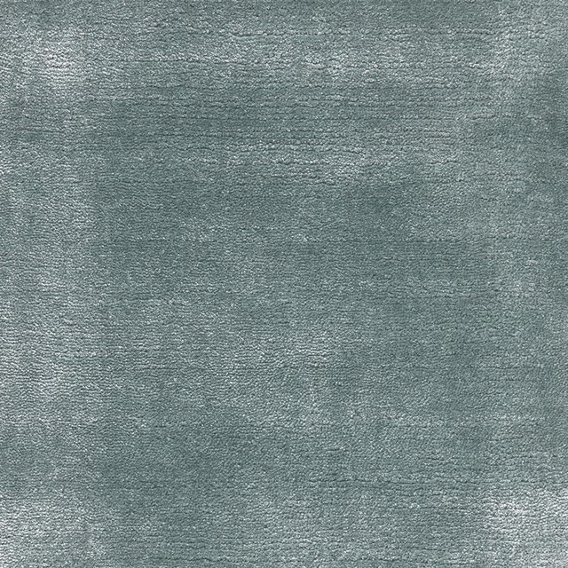
Duck Egg
Kheri
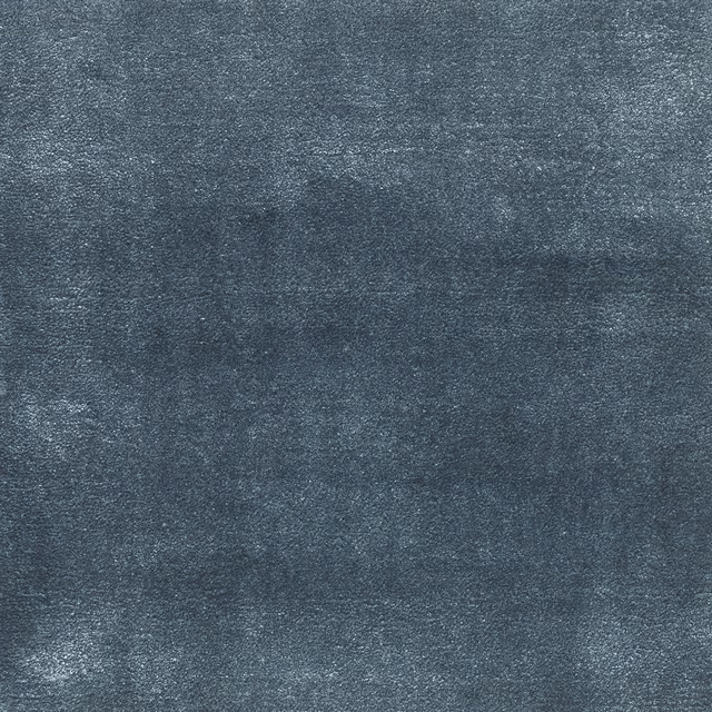
Sapphire
Kheri
Pairs well with
Carmine is a quiet cloth, so it carries a pattern beside it: one of these on the curtains and this on the chair. Mixed across the houses we hold, which is the part a single supplier's book cannot do.
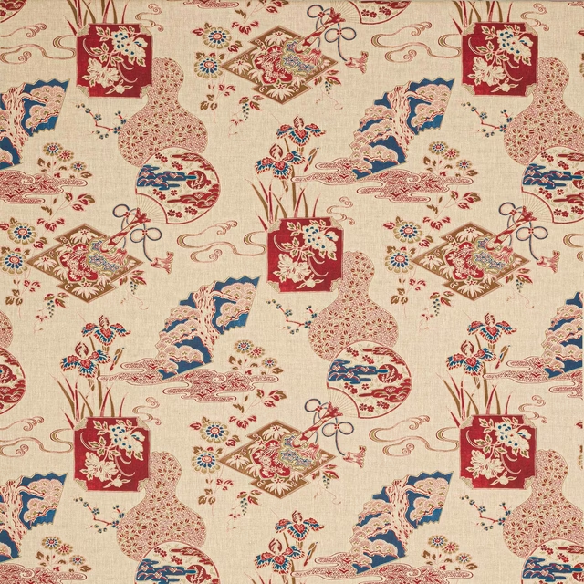
Imari Carmin
Marsan
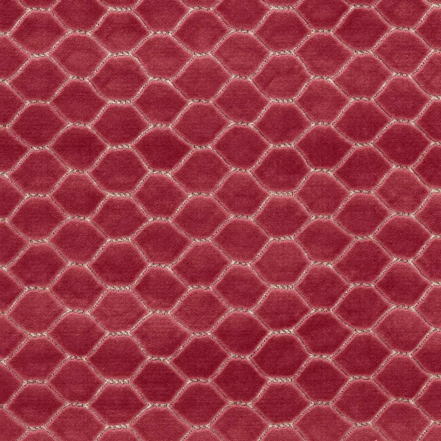
Faraday Velvet Carmine
Sanderson x Giles Deacon Faraday Velvets
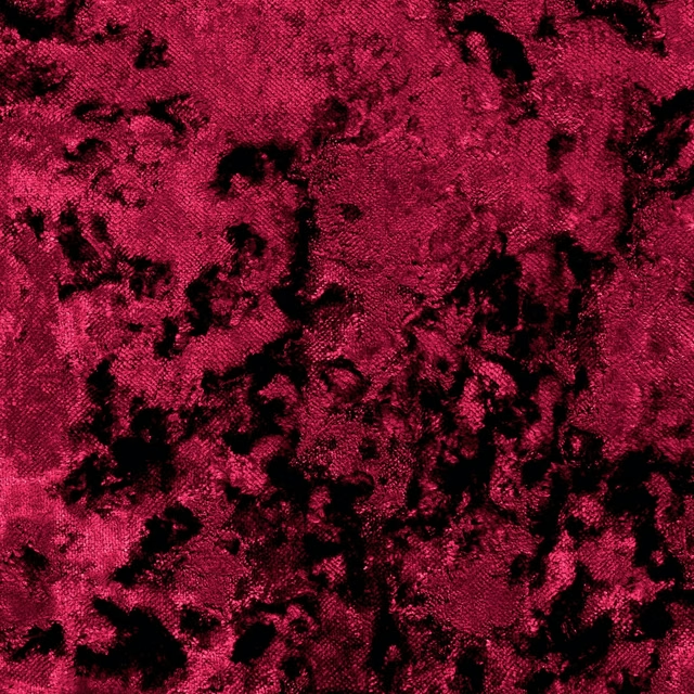
Crush Crimson
Crush
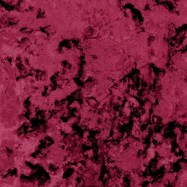
Crush Garnet
Crush
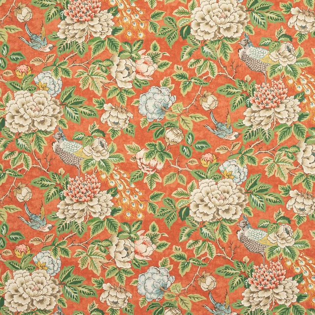
Chilgrove Red
Chilgrove
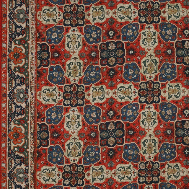
Perseus Antique Red
Chilgrove
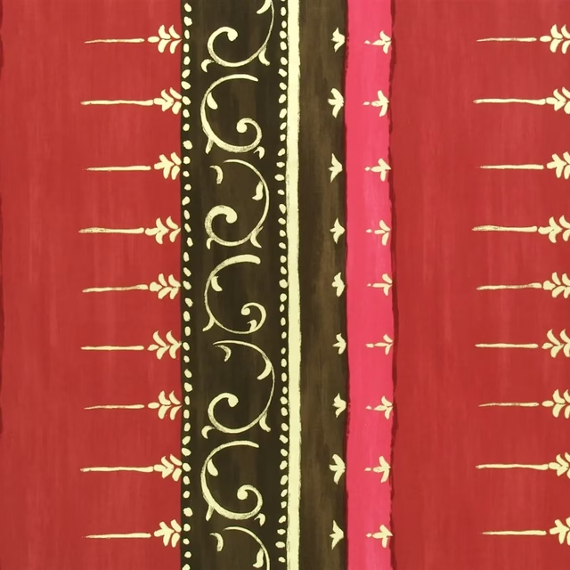
Kusumam Cranberry
Marinsky Fabrics
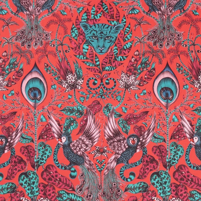
Amazon Red
Animalia Fabrics
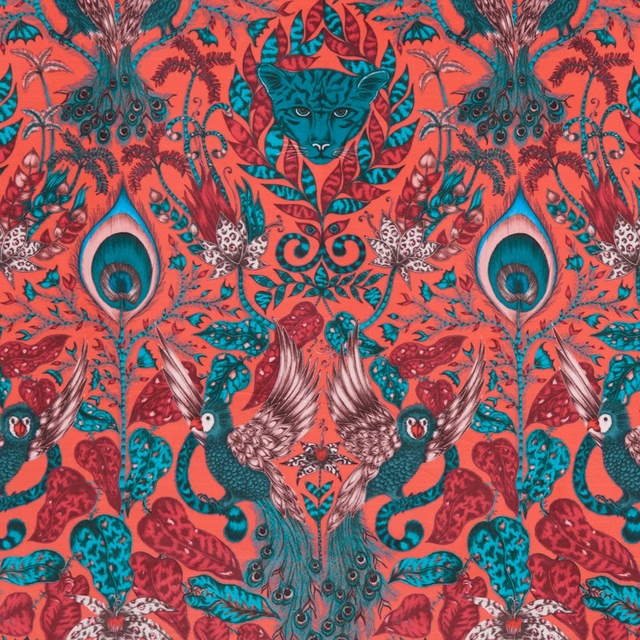
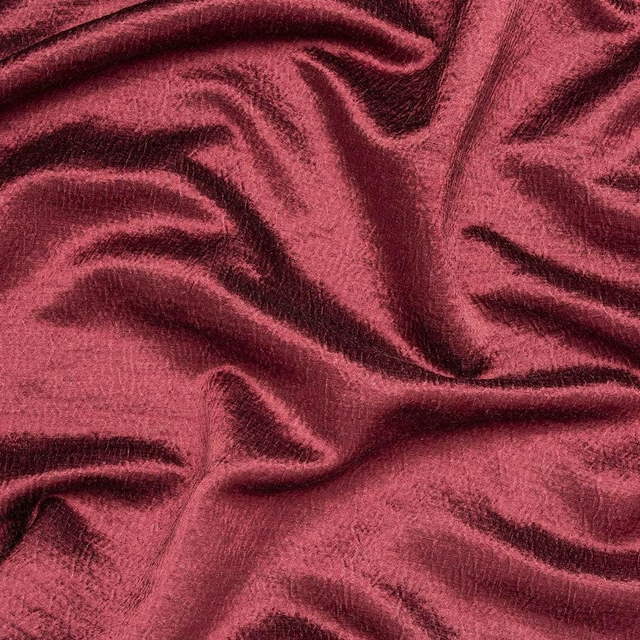
Amazon Velvet Red
Animalia Fabrics
Alchemy Mulberry
Alchemy
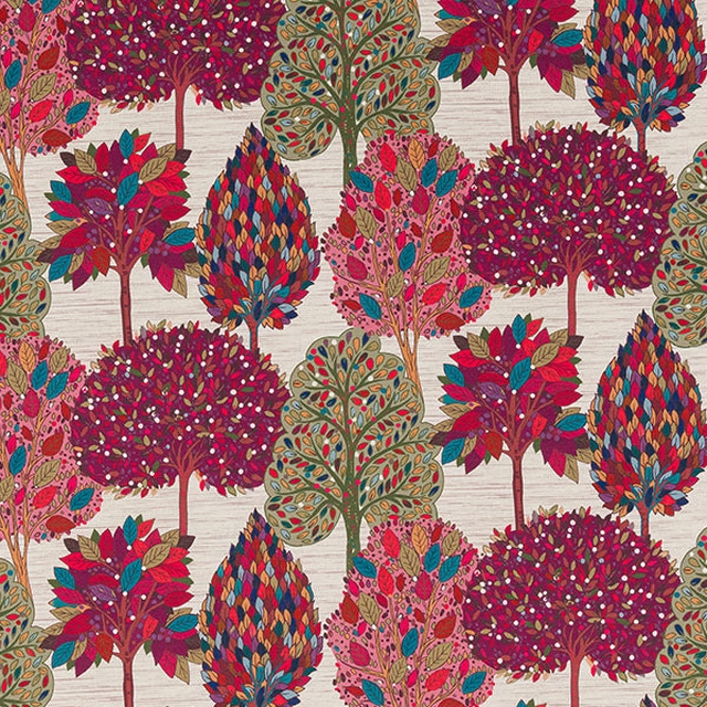
Arbre Mulberry
Digital Prints
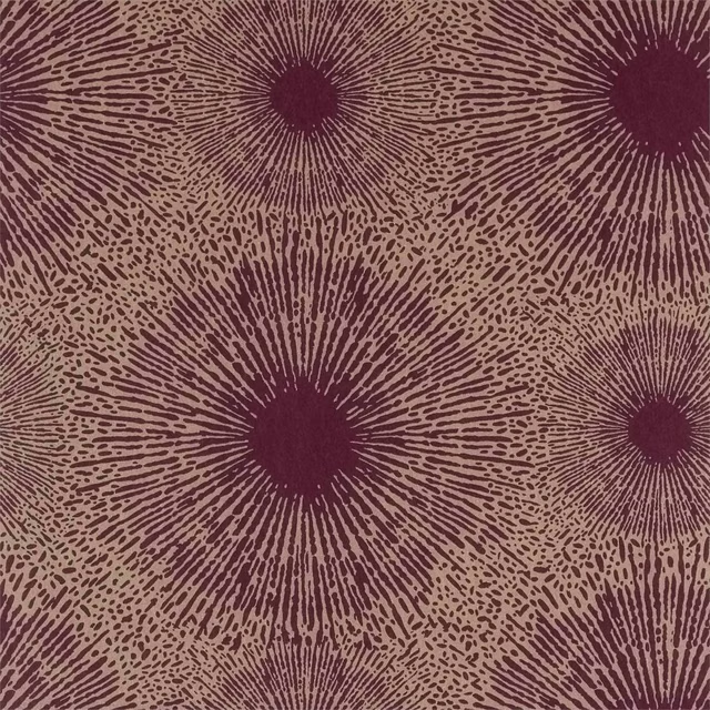
Perlite Wide Width Ruby / Antique Brass
Anthology 06
Paint that goes with it
Two ways to take the room. Both colours are from houses we hold, so a pot can come off the same order as the cloth. Screens shift colour, so treat these as a direction and bring the cloth to the shelf before you buy the paint.
To sit quietly behind it
Bordeaux
Zoffany · #643b41
To stand against it
Yacht Blue Light
Sanderson · #4a597a
Other red fabrics
Across the houses we hold. See all 2,240.