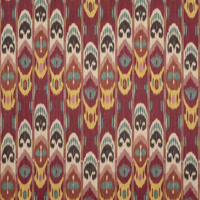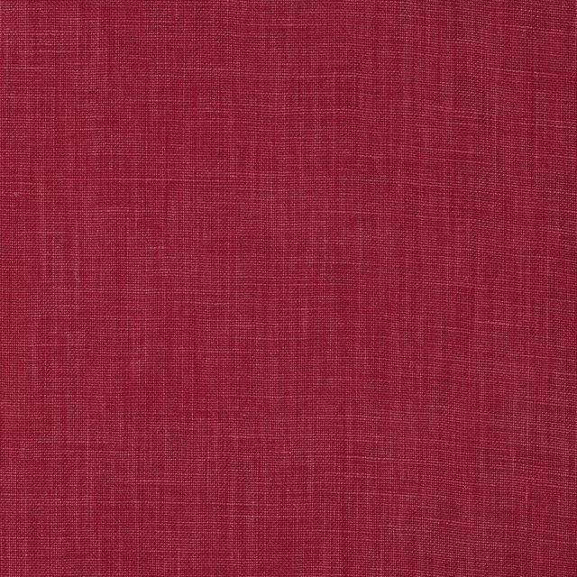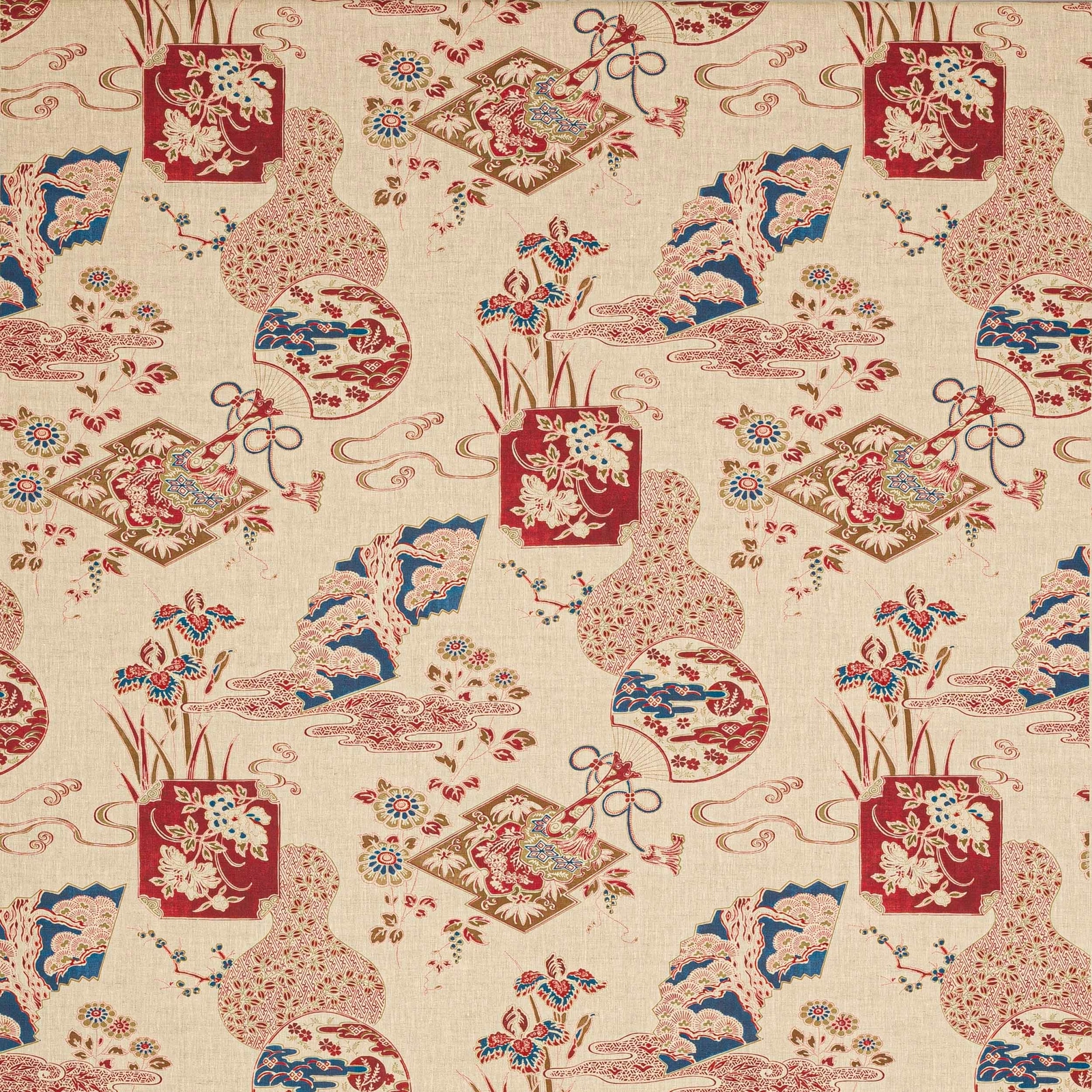

Tap the swatch to see it full screen. Hover it to magnify the weave. Colours on a screen are a guide, not a match, so come and feel the real cloth.
Scroll up or down to zoom in and out.
Imari Carmin
Marsan FabricM4116-03
Imari Carmin pairs a warm cream linen ground with bold carmine red motifs, lifted by touches of blue, blush and gold. The overall effect is decorative and vibrant, with a distinctly chinoiserie feel.
You have used your previews for today. Send one to Simon and you can carry on.
Your board
0 fabrics
See this fabric on Manuel Canovas's own site, then order it through us.
See Imari Carmin in your own room
A photograph of the piece you want re-covered. Straight on is best, and daylight helps. It is used to make your picture and nothing else.
Looking at your room
We found things here Imari Carmin could go on. Tap one on the photograph, or choose below.
We could not see anything to re-cover
, s
Imari Carmin, on your
Drag to compare. AI impression, colours indicative: ask us for a cutting before you decide.
About this fabric
Woven in 100% linen and measuring approximately 132cm wide, this fabric has the breathable character and relaxed handle expected of a linen cloth. The design is shown as a large repeat, with a vertical repeat of 90cm (half drop) and an approximate horizontal repeat of 132cm, which gives the pattern generous movement across a scheme. In this colourway, the carmine red reads deep and saturated against the natural ground, while the blue and blush details add contrast without cooling the fabric too much. The printed look and lightly textured surface give it a slightly artisanal finish rather than a flat, polished appearance.
How to use it
This colourway works beautifully in rooms with cream-painted joinery, dark timber and layered pattern, where the red can be echoed in lampshades or cushions. It would also make a striking curtain or occasional upholstery piece when you want a traditional motif with a bolder, richer mood.
Use as a statement fabric where the rich red accents can animate neutral upholstery or elegant curtains.
More from Marsan
The same book, other colourways.
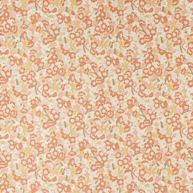
Fiorella Corail
Marsan
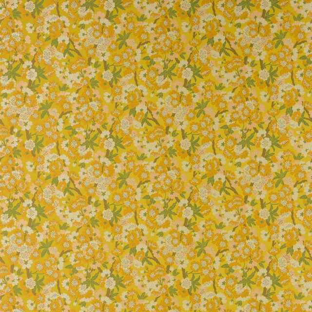
Fiorella Soleil
Marsan
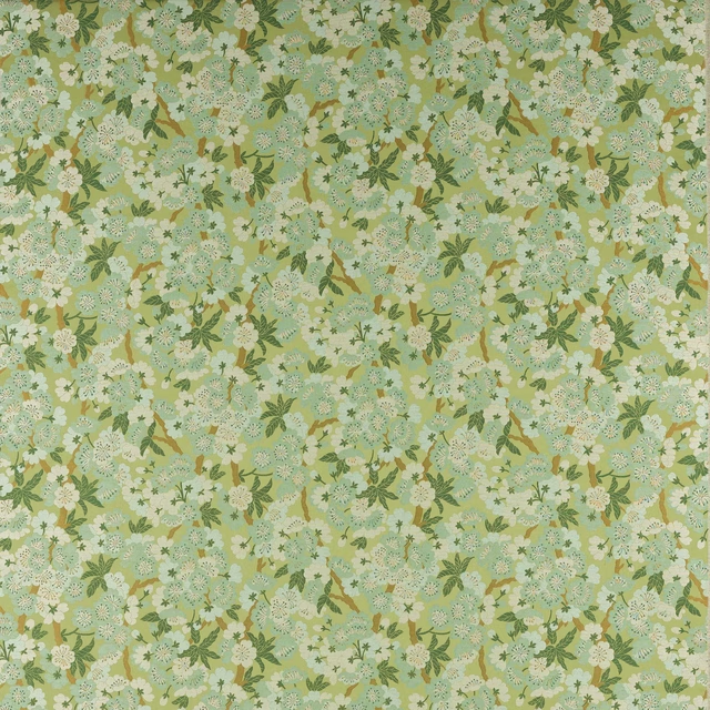
Fiorella Tilleul
Marsan
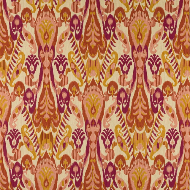
Hadi Epices
Marsan
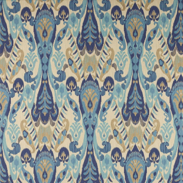
Hadi Indigo
Marsan
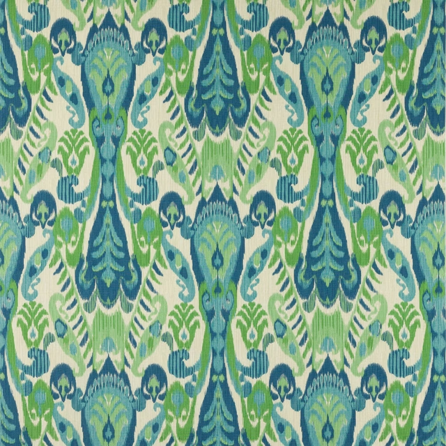
Hadi Prairie
Marsan
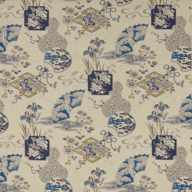
Imari Indigo
Marsan
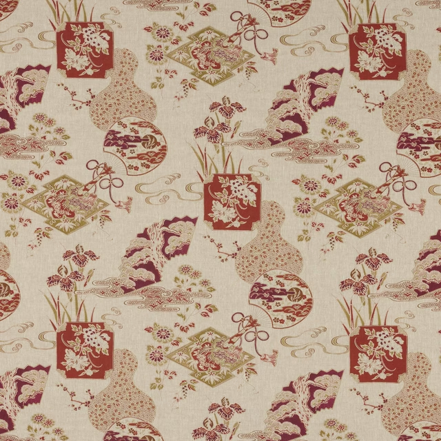
Imari Terracotta
Marsan
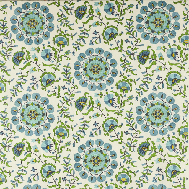
Koti Celeste
Marsan
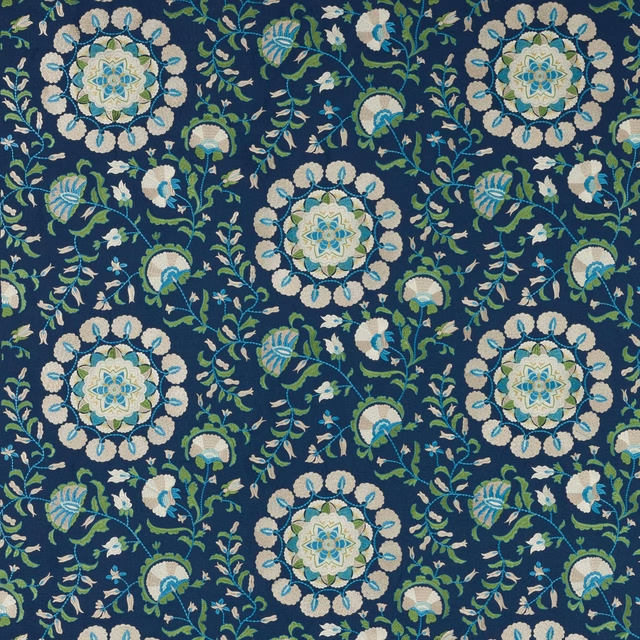
Koti Outremer
Marsan
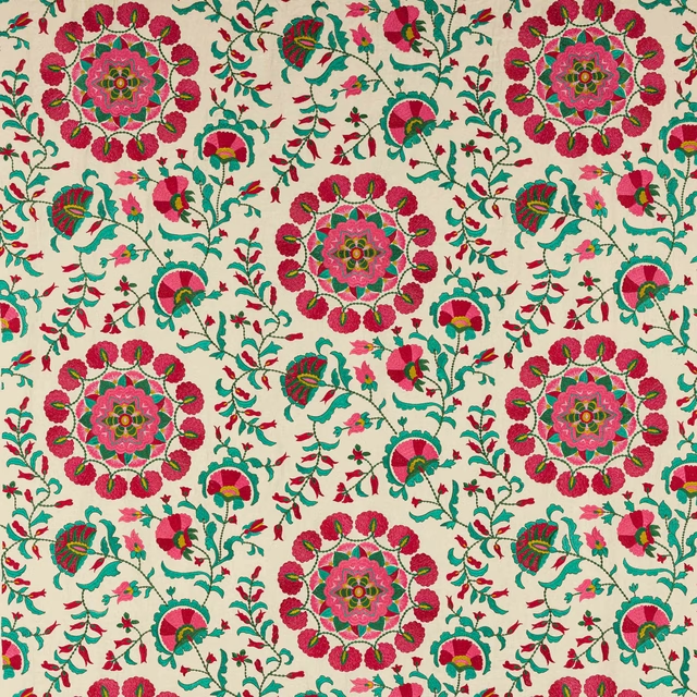
Koti Terracotta
Marsan
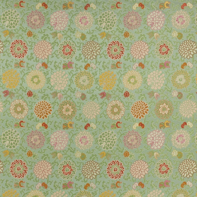
Liao Jade
Marsan
Pairs well with
A pattern needs somewhere for the eye to rest, so these are the plains and textures that sit beside Imari Carmin without fighting it. Mixed across the houses we hold, which is the part a single supplier's book cannot do.
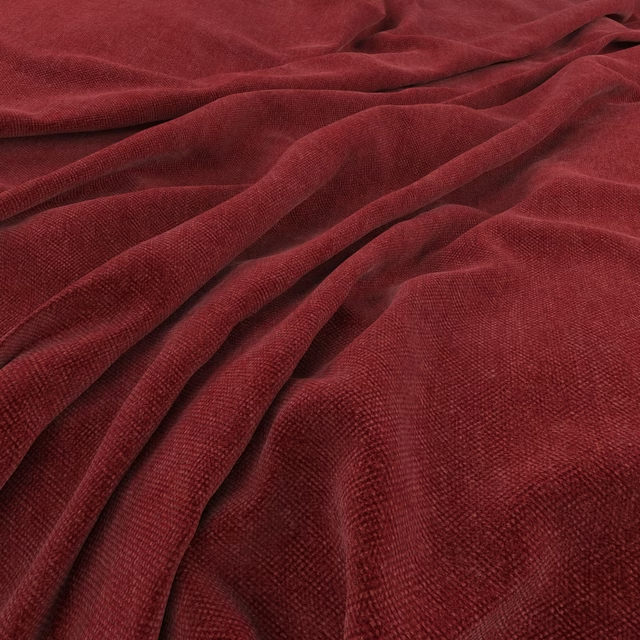
Manolo Carmine
Manolo
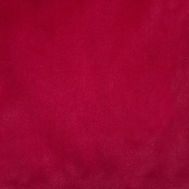
Alaska Scarlet
Alaska Collection

Alaska Wine
Alaska Collection
Monceau Sherry
Atelier Fabrics

Allure Claret
Allure
Allure Ruby
Allure

Dante Red
Dante Velvet

Dante Tomato
Dante Velvet

Ruzzini Scarlet
Ruzzini
Alchemy Rosso
Alchemy

Kensington Red
Brodsworth

Ore Rhodonite
Defined Momentum Velvets
Paint that goes with it
Two ways to take the room. Both colours are from houses we hold, so a pot can come off the same order as the cloth. Screens shift colour, so treat these as a direction and bring the cloth to the shelf before you buy the paint.
To sit quietly behind it
Sybil
Coat Paints · #c1a18c
To stand against it
Emery Blue
Morris & Co. · #4f696a