
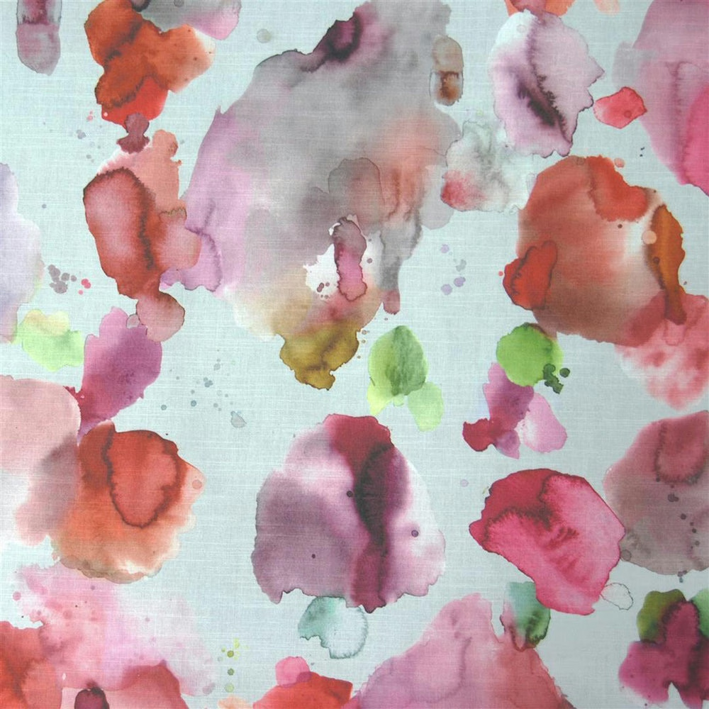

Tap the swatch to see it full screen. Hover it to magnify the weave. Colours on a screen are a guide, not a match, so come and feel the real cloth.
Scroll up or down to zoom in and out.
Cloudburst Russett
Diffusion Fabriccloudbu/fa1/rus
Cloudburst Russett brings a painterly scatter of coral, blush, lilac and moss over a pale ground, with the warm orange tones reading as bright, watercolour-like bursts. The loose, organic shapes give the fabric a light, artistic feel rather than a structured one.
You have used your previews for today. Send one to Simon and you can carry on.
Your board
0 fabrics
Part of the range we hold from Voyage Maison.
See Cloudburst Russett in your own room
A photograph of the piece you want re-covered. Straight on is best, and daylight helps. It is used to make your picture and nothing else.
Looking at your room
We found things here Cloudburst Russett could go on. Tap one on the photograph, or choose below.
We could not see anything to re-cover
, s
Cloudburst Russett, on your
Drag to compare. AI impression, colours indicative: ask us for a cutting before you decide.
About this fabric
Woven in 95% cotton and 5% linen, this 230gsm fabric has the body to hang neatly for curtains and blinds, with a soft handle that still feels textile-led rather than stiff. The visible ground is a washed pale blue-white, overlaid with blurred blooms of coral orange, raspberry pink, mauve and small flashes of green, so the overall effect is fresh but warm. The 140cm usable width makes it practical for larger window treatments, while the 70cm horizontal and 82.2cm vertical repeats show the motif is designed for a generous decorative drop. Dry clean only and iron safe, it is best treated as a decorative furnishing fabric rather than a hard-wearing upholstery cloth.
How to use it
Use Cloudburst Russett where you want colour without heaviness: it softens against white walls and looks especially lively with chalky pink, sage or pale oak finishes. The warm coral notes bring energy to a relaxed bedroom, reading room or layered curtain scheme.
Pair with soft neutrals and muted greens to let the painterly orange accents stand out.
More from Diffusion
The same book, other colourways.
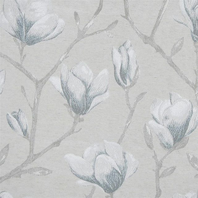
Chatsworth Dove
Diffusion
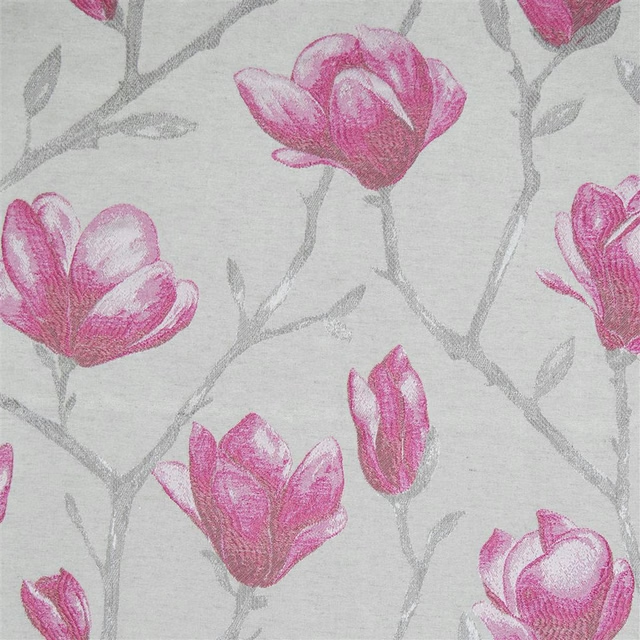
Chatsworth Peony
Diffusion
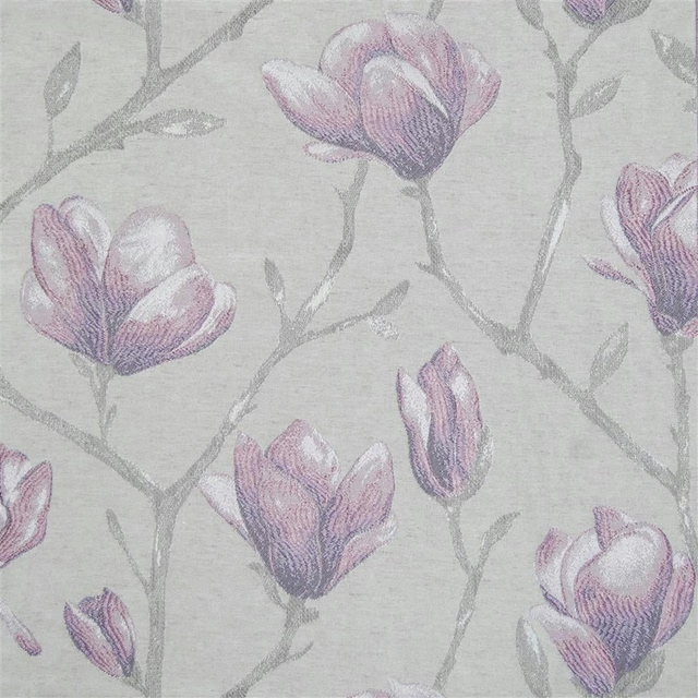
Chatsworth Fig
Diffusion
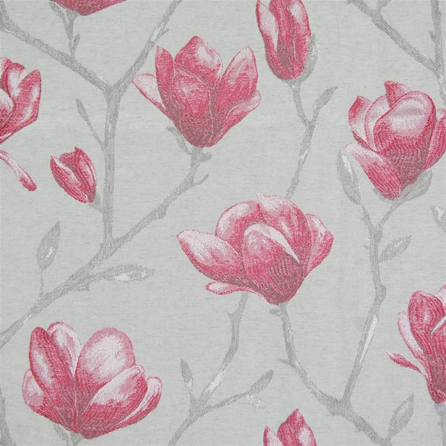
Chatsworth Poppy
Diffusion
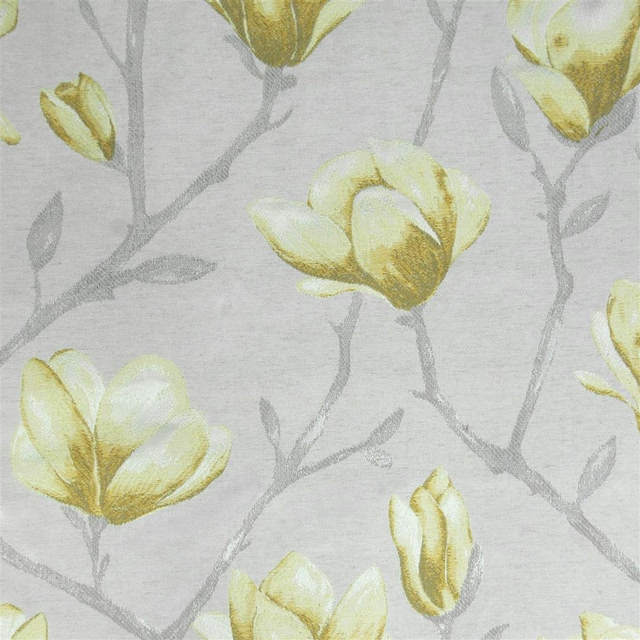
Chatsworth Daffodill
Diffusion
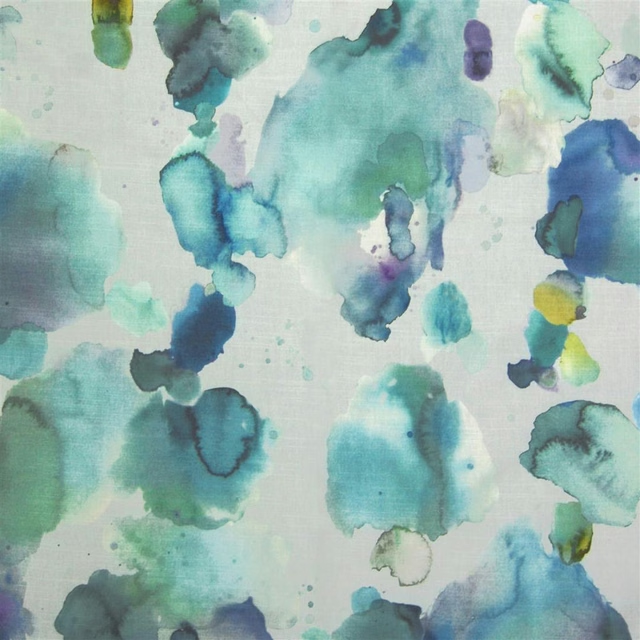
Cloudburst Pacific
Diffusion
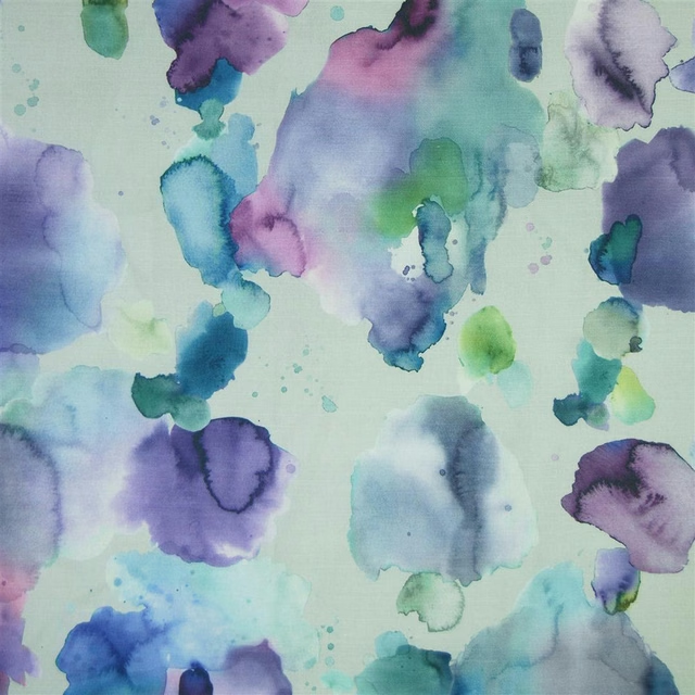
Cloudburst Damson
Diffusion
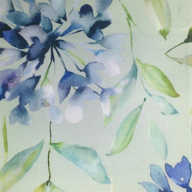
Clovelly Bluebell
Diffusion
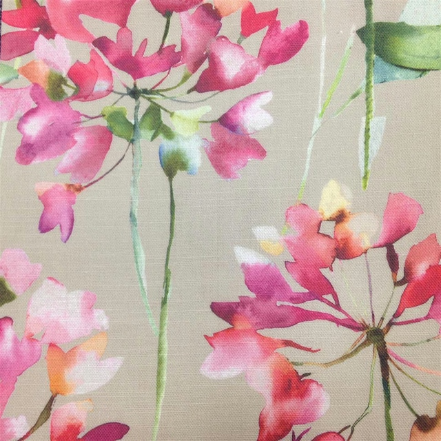
Clovelly Russett
Diffusion
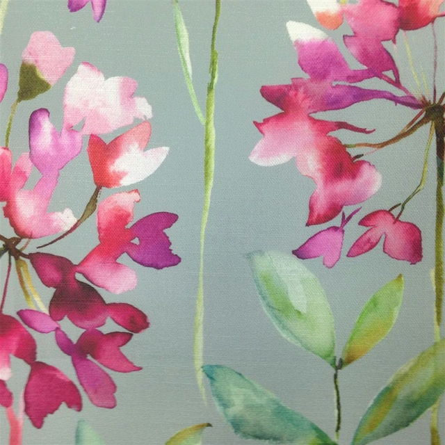
Clovelly Slate
Diffusion
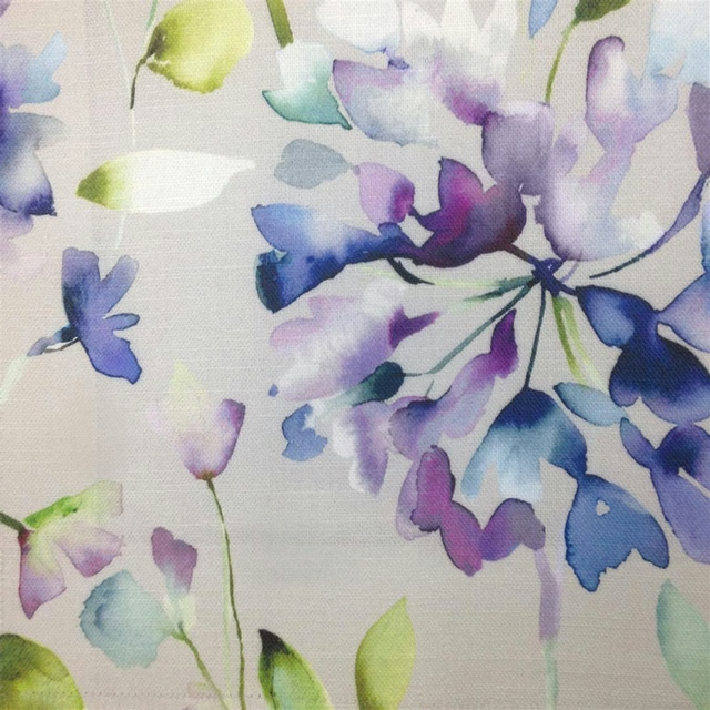
Clovelly Violet
Diffusion
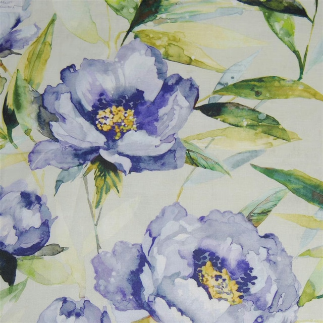
Earnley Bluebell
Diffusion
Pairs well with
A pattern needs somewhere for the eye to rest, so these are the plains and textures that sit beside Cloudburst Russett without fighting it. Mixed across the houses we hold, which is the part a single supplier's book cannot do.
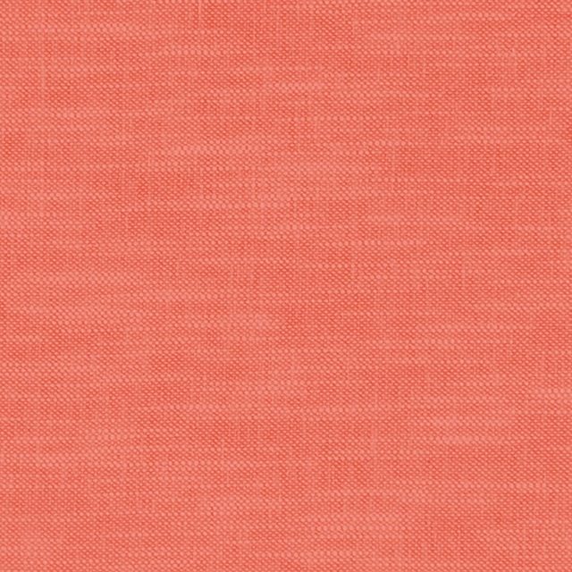
Amalfi Coral
Amalfi

Omega Velvet 4 Coral
Omega Velvet 4

Celino Koi
Celino
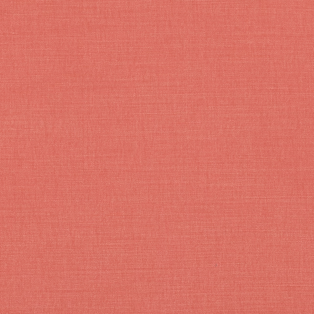
Linara Tiger Lily
Linara
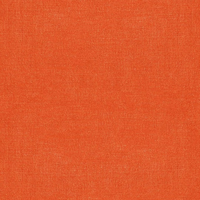
Whitewell Seville
Whitewell

Kit's Linen Clementine
G P & J Baker X Kit Kemp Kit's Linen
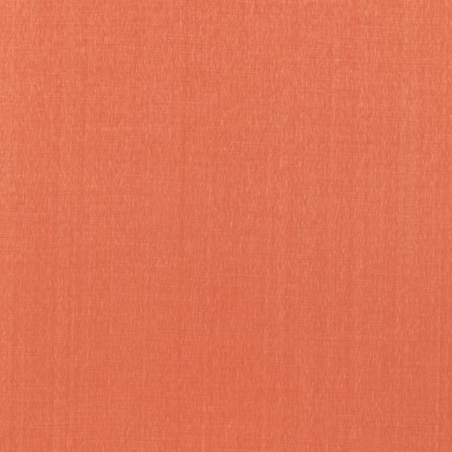
Stanton Linen Coral
Tetbury Linens
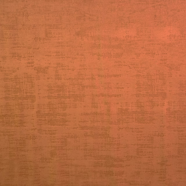
Dakota Saffron
Dakota Collection
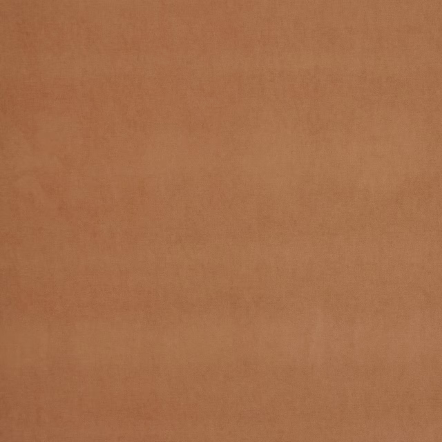
Arezzo Papaya
Portofino Collection
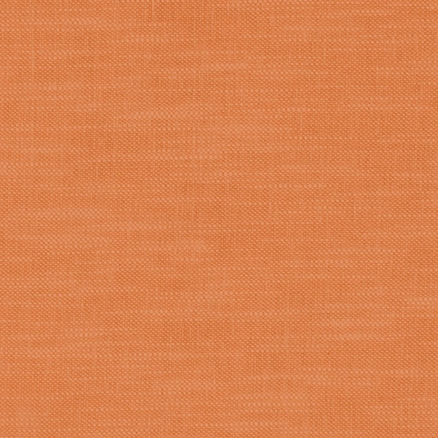
Amalfi Pumpkin
Amalfi
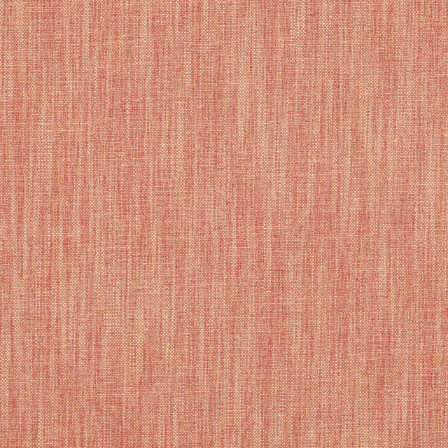
Carnforth Copper
Tarn
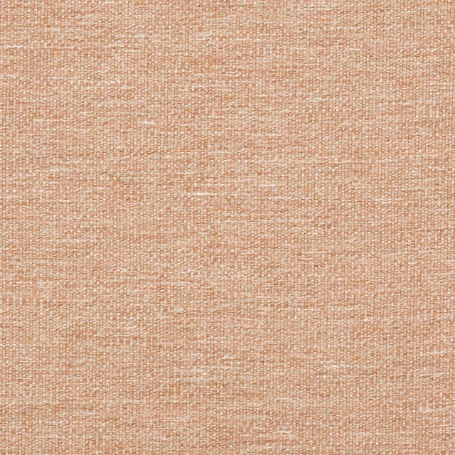
Kellen Sienna
Tarn
Paint that goes with it
Two ways to take the room. Both colours are from houses we hold, so a pot can come off the same order as the cloth. Screens shift colour, so treat these as a direction and bring the cloth to the shelf before you buy the paint.
To sit quietly behind it
Hellebore
Little Greene · #c8a5a3
To stand against it
Vermeer Yellow
Zoffany · #ddc379
Other orange fabrics
Across the houses we hold. See all 784.
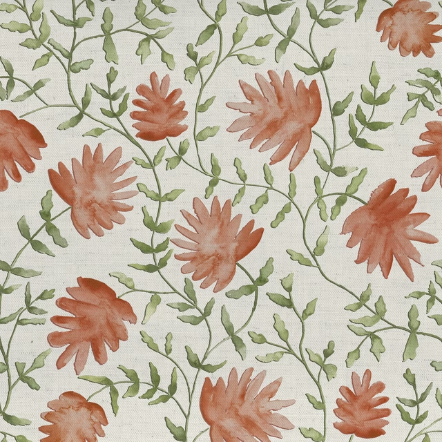
Elai Terracotta
Country Folk
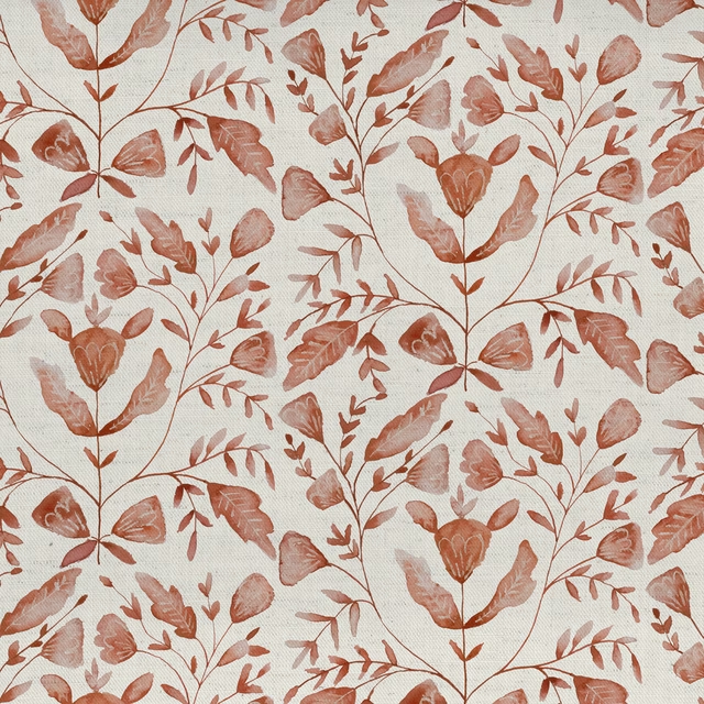
Juna Terracotta
Country Folk
Vali Terracotta
Country Folk
Countryhedgerow Autumn
Countryhedgerow
Hedgerow Autumn
Countryhedgerow
Braithwaite Russett
Countryimpressions
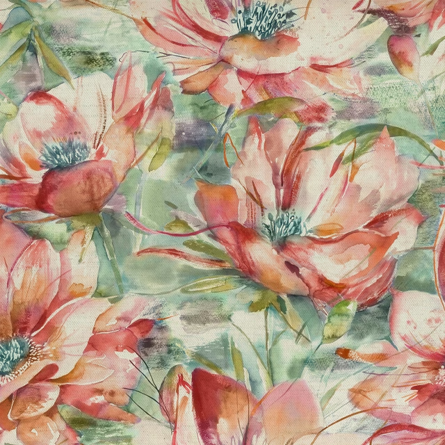
Duskyblooms Russett
Countryimpressions
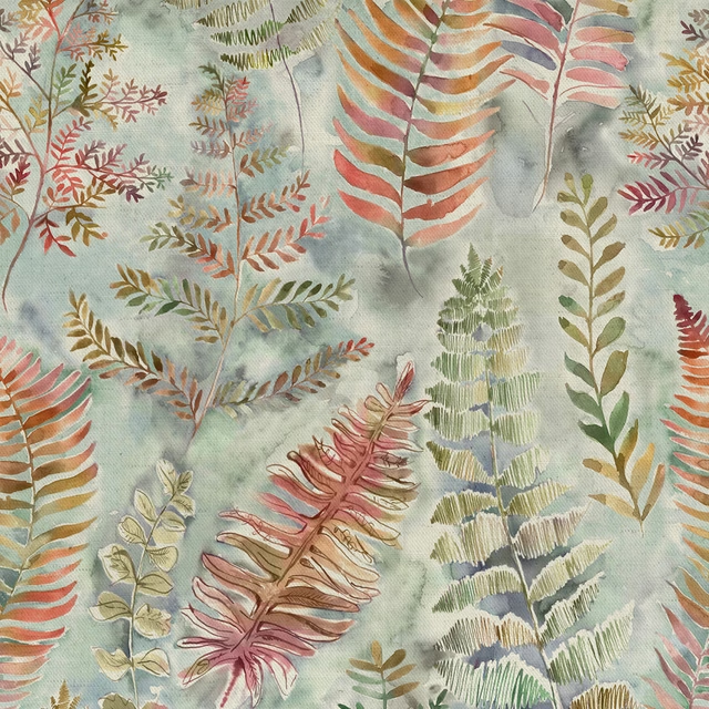
Honister Russett
Countryimpressions
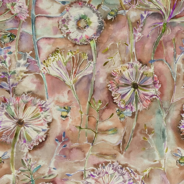
Langdale Russett
Countryimpressions
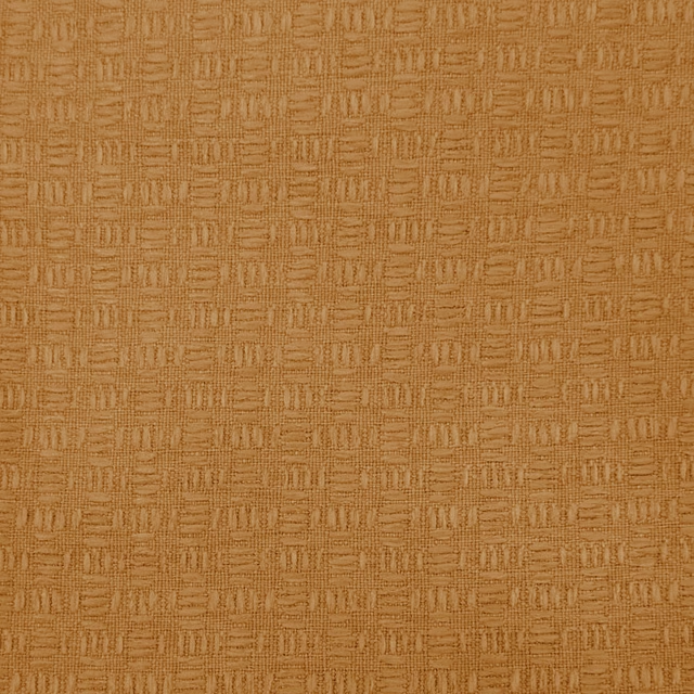
Nessa Mandarin
Countryimpressions
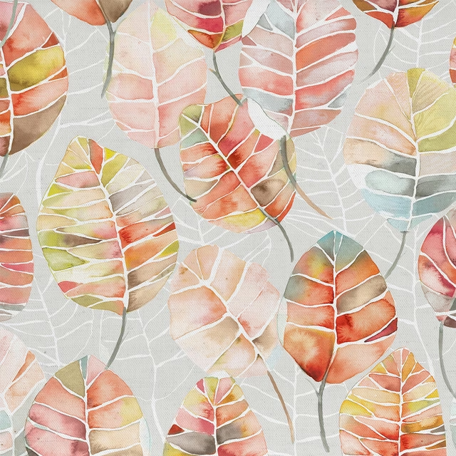
Cassava Cinnamon
Edenmuir
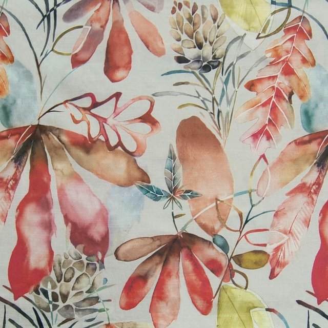
Conifer Cinnamon
Edenmuir