
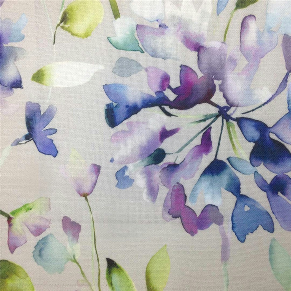

Tap the swatch to see it full screen. Hover it to magnify the weave. Colours on a screen are a guide, not a match, so come and feel the real cloth.
Scroll up or down to zoom in and out.
Clovelly Violet
Diffusion Fabricclovell/fa1/vio
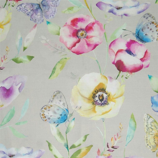
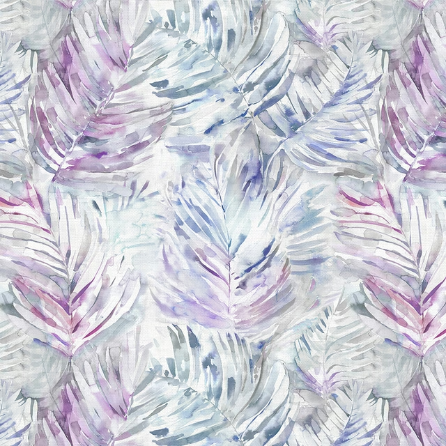
Clovelly Violet shows a painterly scatter of blossom-like leaves and petals across a pale ground, with violet, lavender and blue tones lifting from the cloth. The design feels airy and watercolour-led, with the colour concentrated in the larger floral clusters.
You have used your previews for today. Send one to Simon and you can carry on.
Your board
0 fabrics
Part of the range we hold from Voyage Maison.
See Clovelly Violet in your own room
A photograph of the piece you want re-covered. Straight on is best, and daylight helps. It is used to make your picture and nothing else.
Looking at your room
We found things here Clovelly Violet could go on. Tap one on the photograph, or choose below.
We could not see anything to re-cover
, s
Clovelly Violet, on your
Drag to compare. AI impression, colours indicative: ask us for a cutting before you decide.
About this fabric
Woven in 95% cotton and 5% linen, this fabric has a natural matte look that suits the soft-edged print and keeps the colours from appearing too glossy. The 230gsm weight gives it enough substance for curtains, blinds and soft furnishings, while still feeling versatile enough for lighter upholstery-style schemes. In this colourway, the lilac and purple notes read cool and slightly washed, with flashes of blue and small green accents that add freshness against the pale background. The usable width is 140cm, with a 46.6cm horizontal repeat and 68.5cm vertical repeat, so the larger floral motif has room to sit clearly across the fabric. It is dry clean only and iron safe.
How to use it
Use Clovelly Violet in a room with chalky whites, muted sage or pale oak to echo the cool lilac tones. It works particularly well in bedrooms and sitting rooms where the large-scale floral print can soften straight lines and window frames.
Pair with pale linens and painted wood to keep the painterly lilac palette light and fresh.
More from Diffusion
The same book, other colourways.
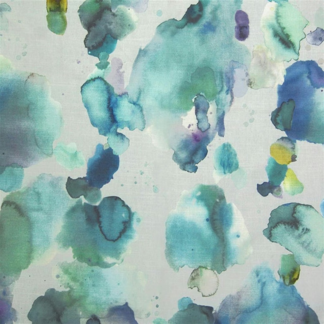
Cloudburst Pacific
Diffusion
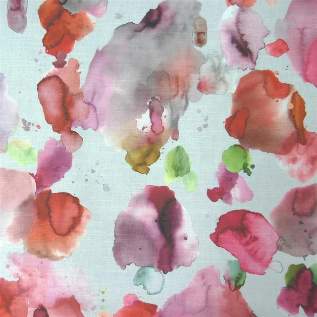
Cloudburst Russett
Diffusion
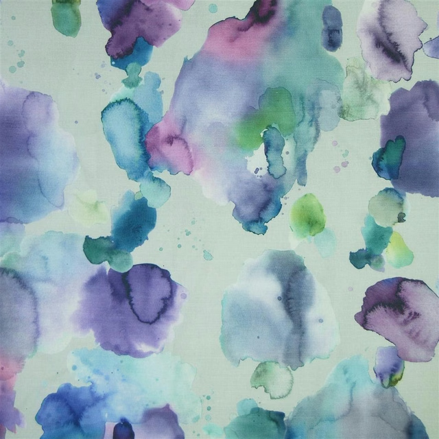
Cloudburst Damson
Diffusion
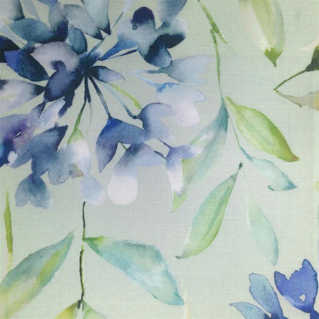
Clovelly Bluebell
Diffusion
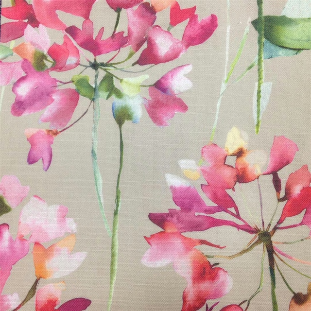
Clovelly Russett
Diffusion
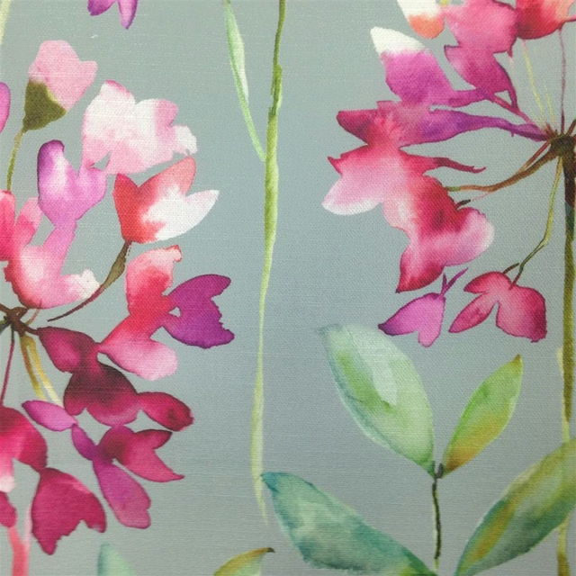
Clovelly Slate
Diffusion
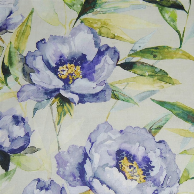
Earnley Bluebell
Diffusion
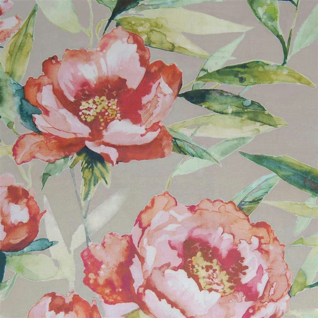
Earnley Stone
Diffusion
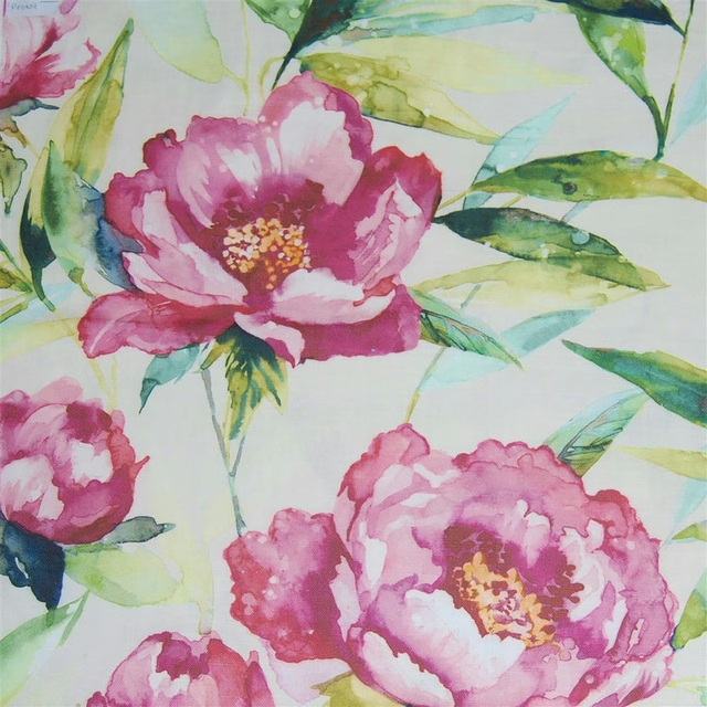
Earnley Peony
Diffusion
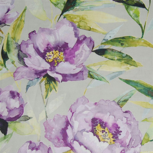
Earnley Orchid
Diffusion
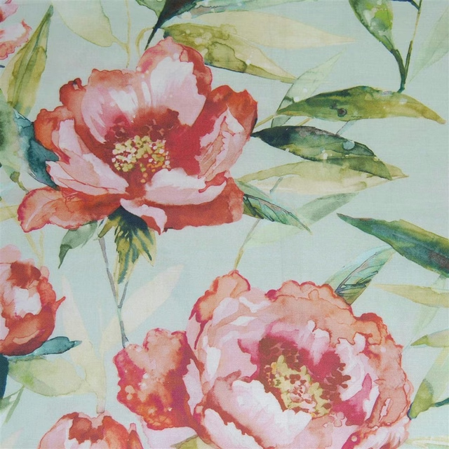
Earnley Duck Egg
Diffusion
Farfalla Lotus
Diffusion
Pairs well with
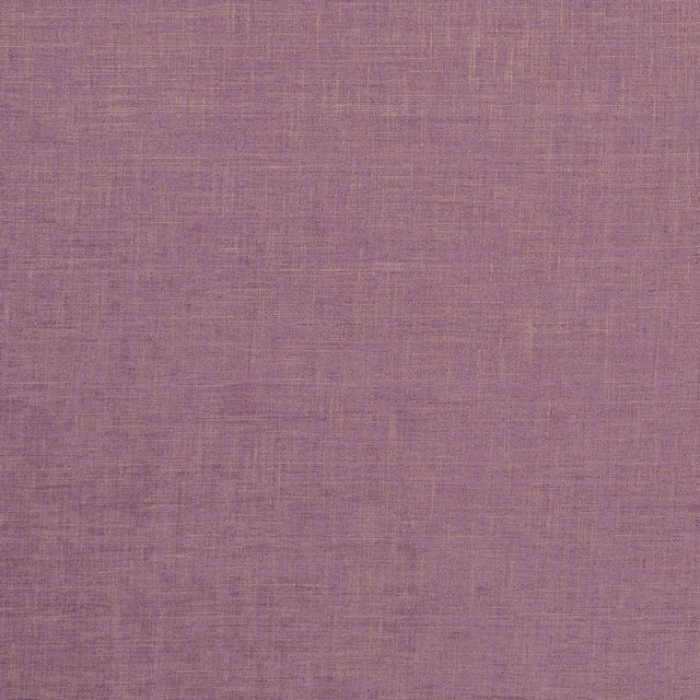
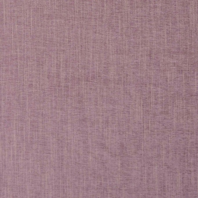
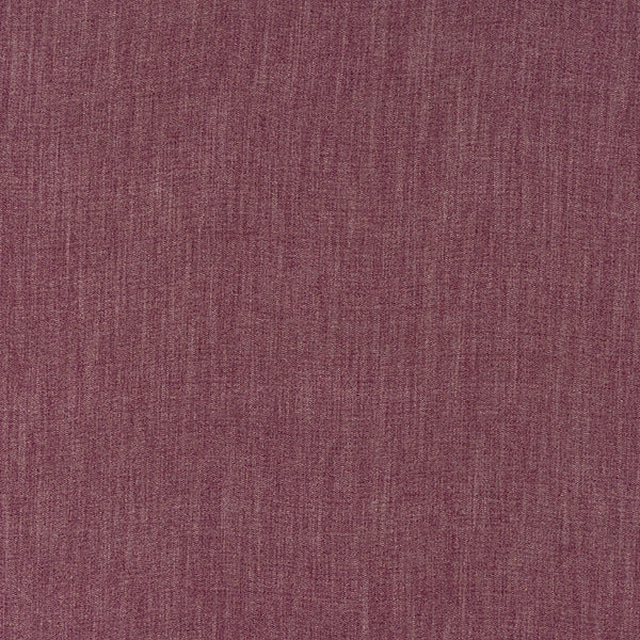
A pattern needs somewhere for the eye to rest, so these are the plains and textures that sit beside Clovelly Violet without fighting it. Mixed across the houses we hold, which is the part a single supplier's book cannot do.

Isla Thistle
Textures 2 Collection

Loire Lavender
Verona Collection
Albany Heather
Albany and Moray
Moray Heather
Albany and Moray
Monza Heather
Arezzo

Capri Recycled Heather
Eco -Friendly Ranges

Ario Lilac
Ario
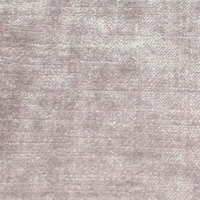
Carrera Lavender
Carrera
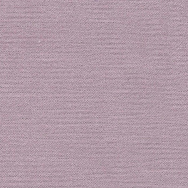
Cayman Lilac
Cayman
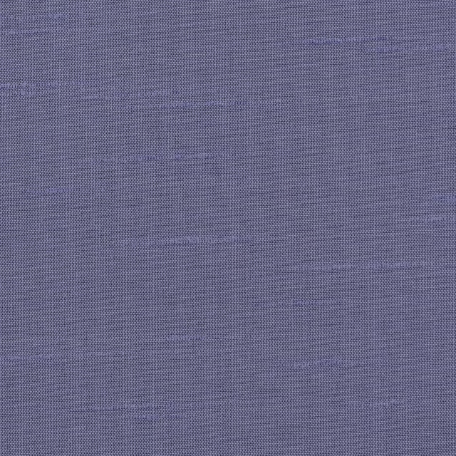
Astor Wallcovering Crocus
Astor Fr
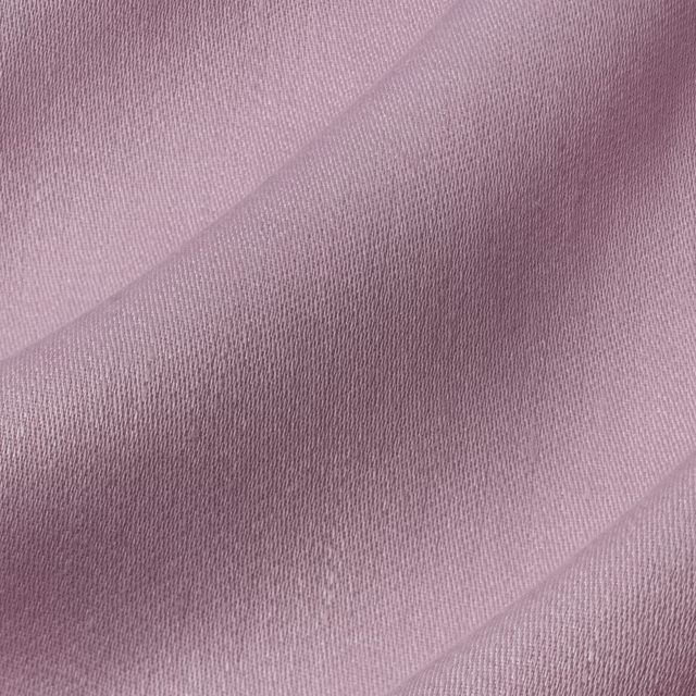
Iona Peony
Iona
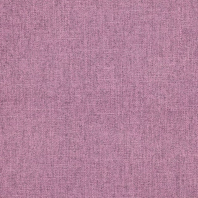
Asta Lilac
Asta
Paint that goes with it
Two ways to take the room. Both colours are from houses we hold, so a pot can come off the same order as the cloth. Screens shift colour, so treat these as a direction and bring the cloth to the shelf before you buy the paint.
To sit quietly behind it
Half Empire Grey
Zoffany · #b5b4b2
To stand against it
The Drink
Coat Paints · #3d5058
Other purple fabrics
Across the houses we hold. See all 1,094.
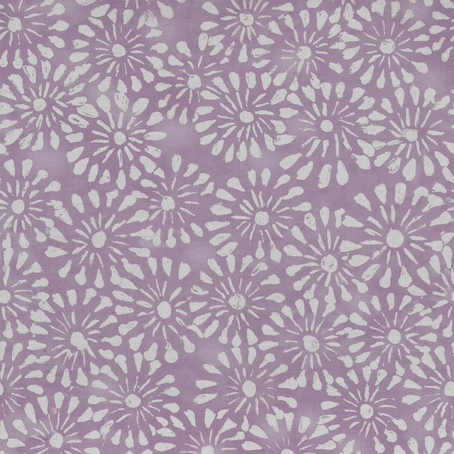
Chambery Mauve
Chambery
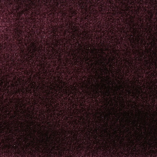
Chiaso Fig
Chiaso
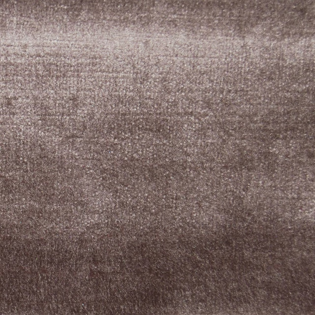
Chiaso Quartz
Chiaso
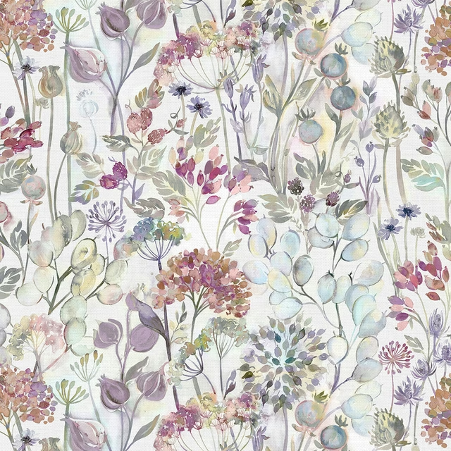
Countryhedgerow Bloom
Countryhedgerow
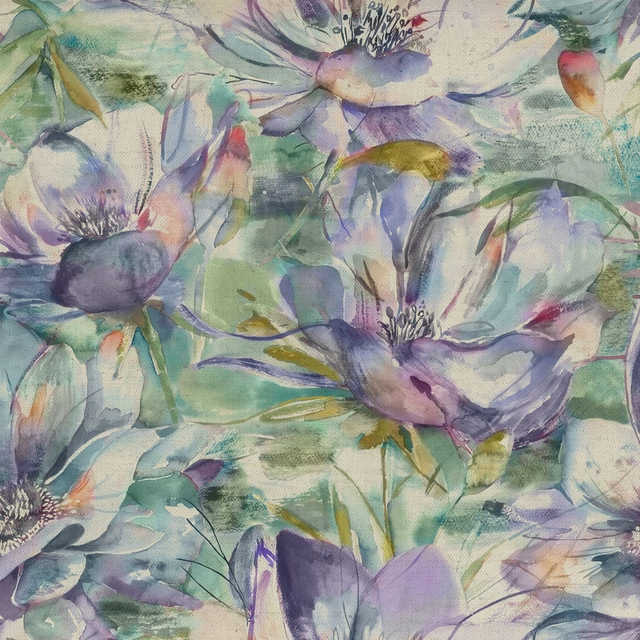
Duskyblooms Fig
Countryimpressions
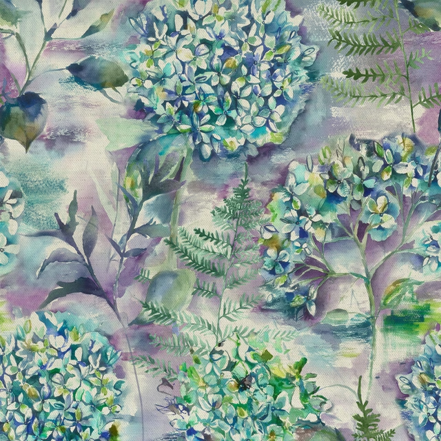
Flourish Teal
Countryimpressions
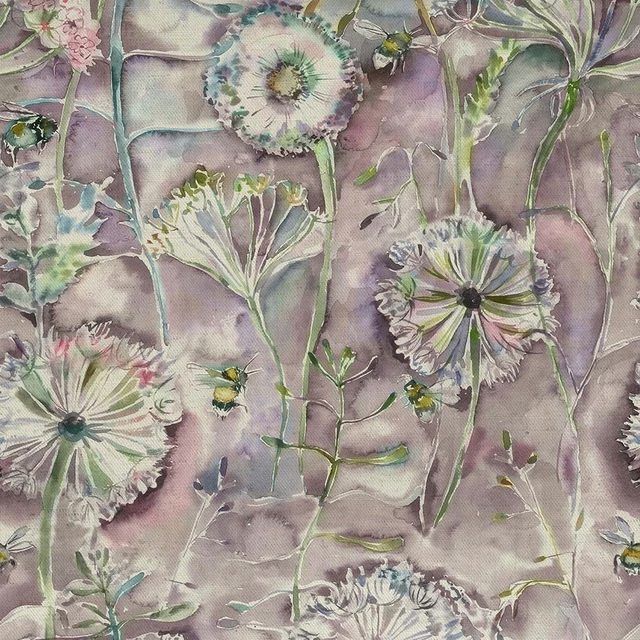
Langdale Fig
Countryimpressions
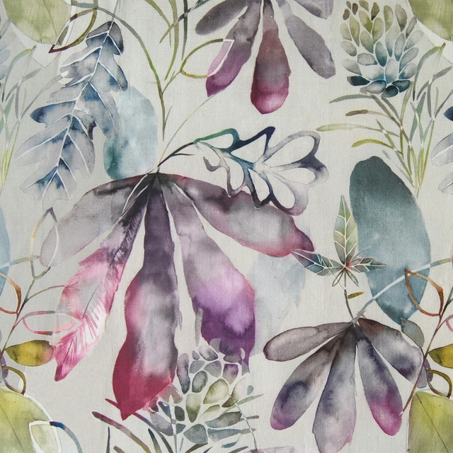
Conifer Sorbet
Edenmuir
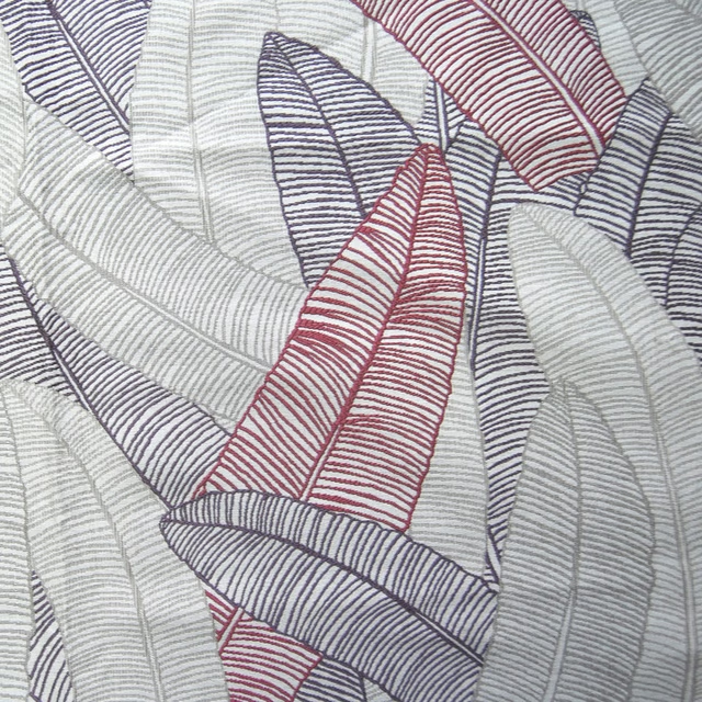
Daxby Iris
Edenmuir
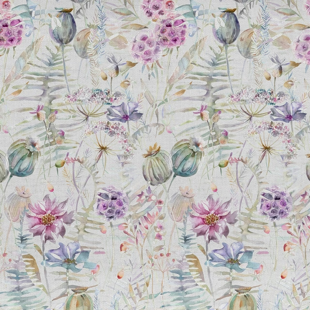
Edenmuir Raspberry Cream
Edenmuir
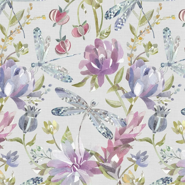
Volatus Sorbet
Edenmuir
Equador Violet
Equator