
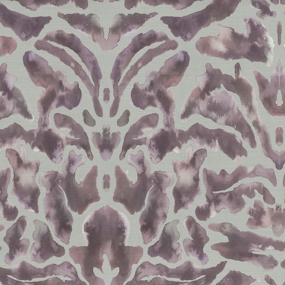

Tap the swatch to see it full screen. Hover it to magnify the weave. Colours on a screen are a guide, not a match, so come and feel the real cloth.
Scroll up or down to zoom in and out.
Nikko Tourmaline
Kyotogardens Fabricnikko/fa1/tou
Nikko Tourmaline shows a large damask motif in dusty mauve pink, softened against a pale ground with a lightly brushed, watercolour effect. The pattern feels decorative but muted, giving the cloth a calm, refined presence.
You have used your previews for today. Send one to Simon and you can carry on.
Your board
0 fabrics
Part of the range we hold from Voyage Maison.
See Nikko Tourmaline in your own room
A photograph of the piece you want re-covered. Straight on is best, and daylight helps. It is used to make your picture and nothing else.
Looking at your room
We found things here Nikko Tourmaline could go on. Tap one on the photograph, or choose below.
We could not see anything to re-cover
, s
Nikko Tourmaline, on your
Drag to compare. AI impression, colours indicative: ask us for a cutting before you decide.
About this fabric
Woven in 60% cotton and 40% viscose, Nikko Tourmaline has a substantial 467gsm handle and is suitable for curtains, blinds and soft furnishings. The design uses a large horizontal pattern repeat of 68cm and a vertical repeat of 56.5cm, which lets the mirrored damask shapes open out clearly across the cloth. Visually, the pink reads more like muted mauve and rosewood than a bright blush, with softened edges and a diffused finish that gives the surface depth. The pale background keeps the motif airy, while the heavier printed forms add contrast and a quietly luxurious feel. With a 60,000 Martindale rating, it is also a practical choice where decorative use and durability are both important.
How to use it
This colourway works well in rooms that need softness rather than sweetness, especially against warm wood, plaster pinks or pale grey walls. Use it for full-length curtains or an occasional chair to let the dusky mauve motif become the focal point.
Use for elegant statement curtains or upholstered accent pieces.
More from Kyotogardens
The same book, other colourways.
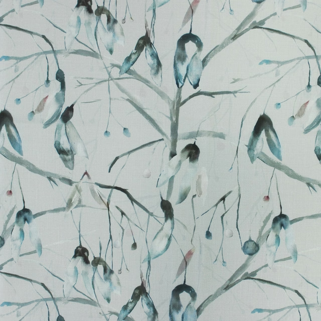
Nara Cobalt
Kyotogardens
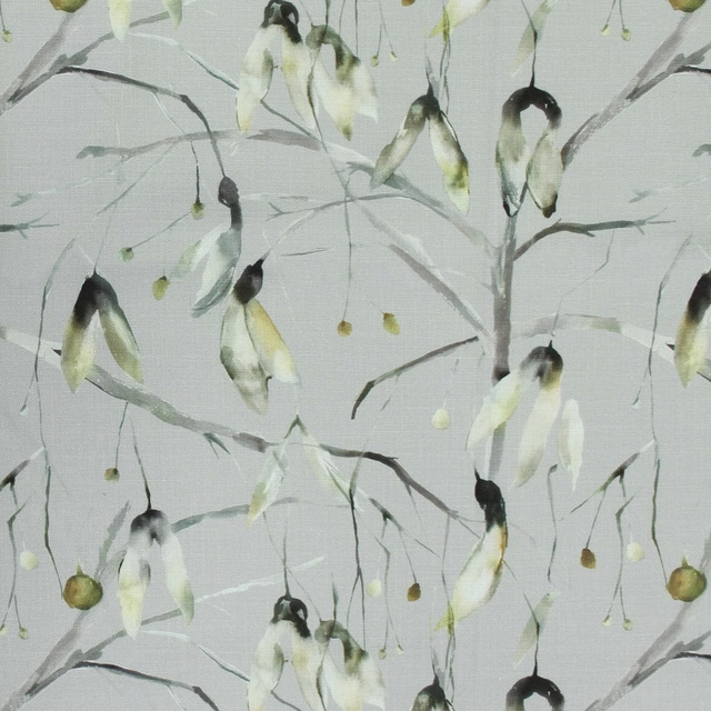
Nara Emerald
Kyotogardens
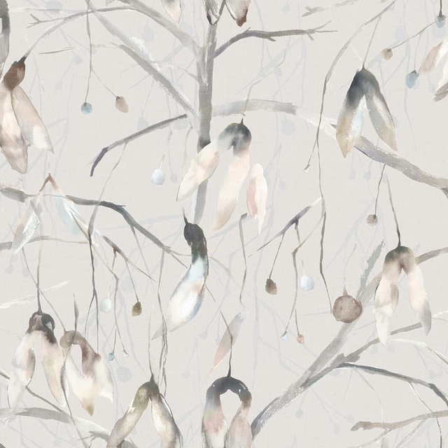
Nara Bamboo
Kyotogardens
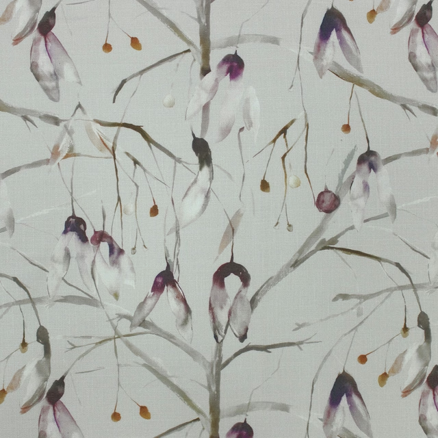
Nara Tourmaline
Kyotogardens
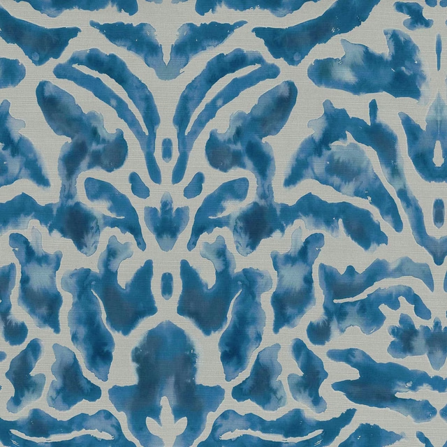
Nikko Cobalt
Kyotogardens
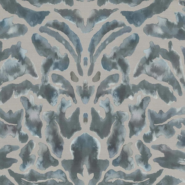
Nikko Bamboo
Kyotogardens
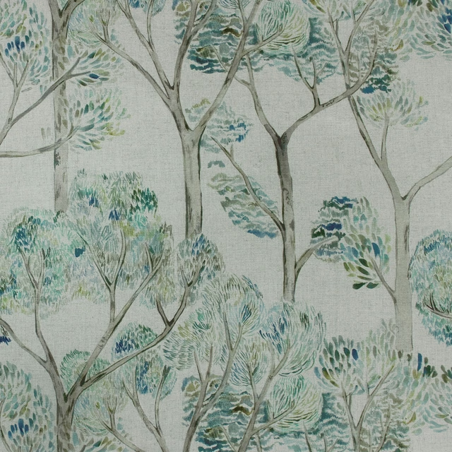
Nippon Emerald
Kyotogardens
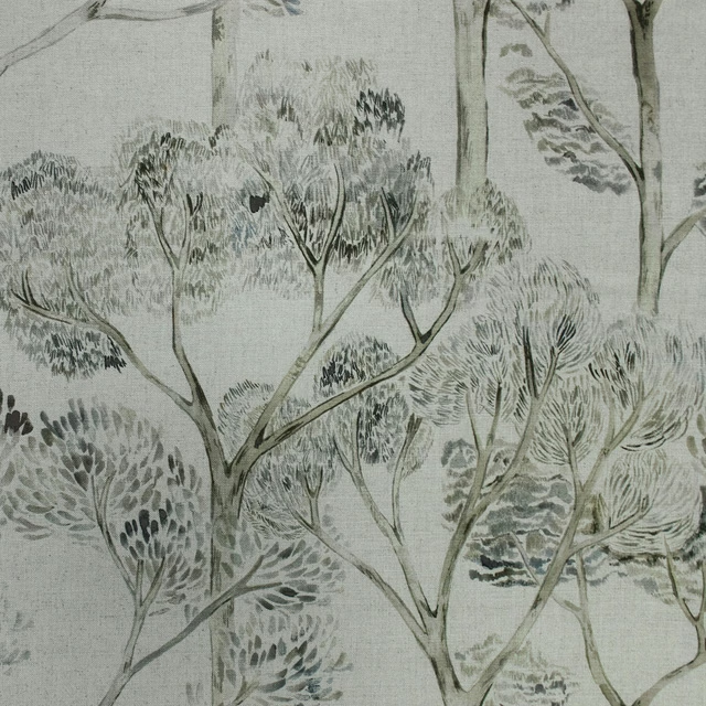
Nippon Bamboo
Kyotogardens
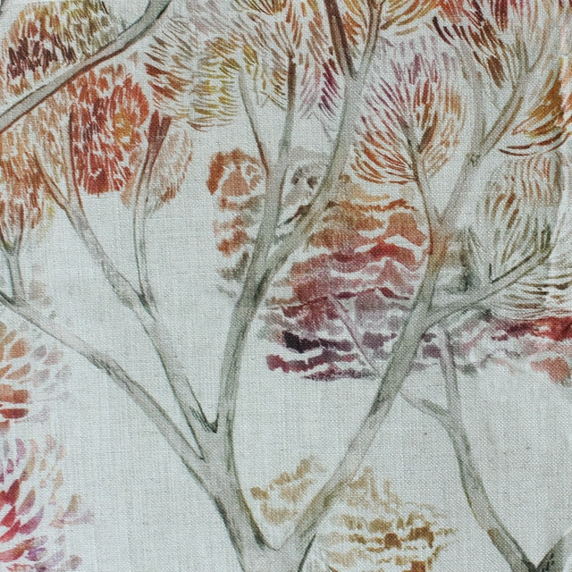
Nippon Tourmaline
Kyotogardens
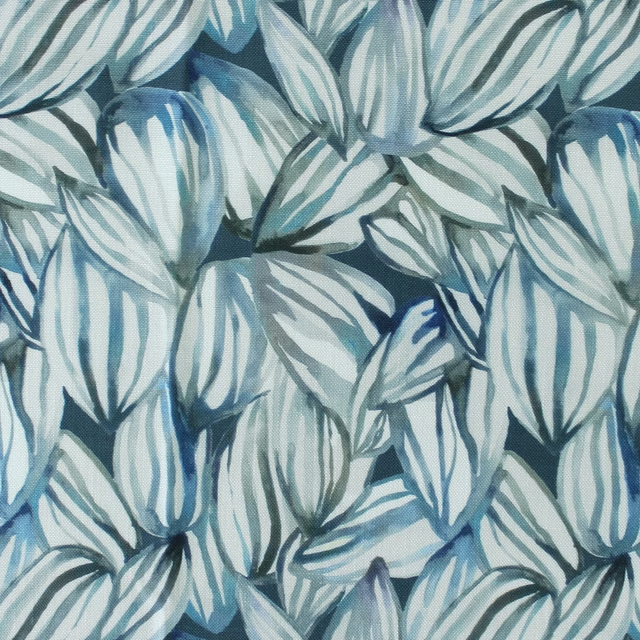
Topia Cobalt
Kyotogardens
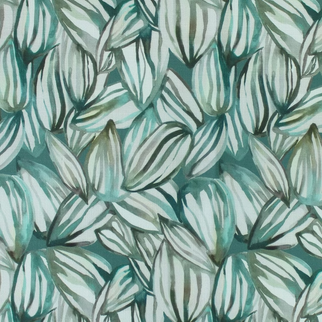
Topia Emerald
Kyotogardens
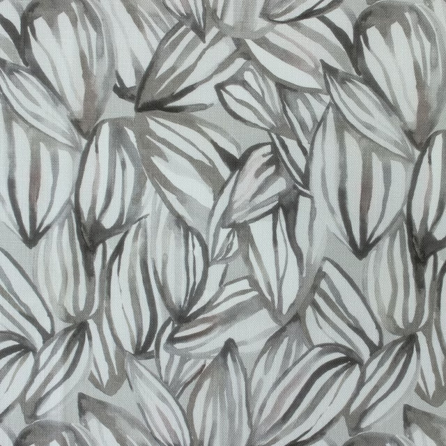
Topia Bamboo
Kyotogardens
Pairs well with
A pattern needs somewhere for the eye to rest, so these are the plains and textures that sit beside Nikko Tourmaline without fighting it. Mixed across the houses we hold, which is the part a single supplier's book cannot do.
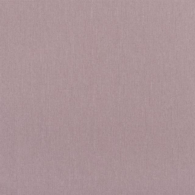
Spinelli Dewberry
Contract Essentials II Fabrics
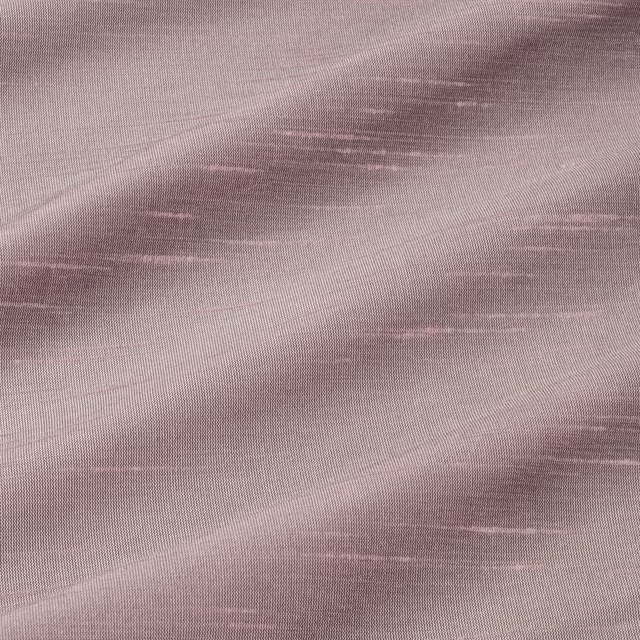
Astor Mallow
Astor
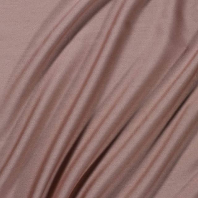
Connaught Silk Rosewater
Connaught Silk
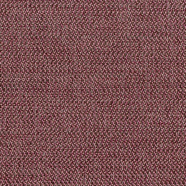
Baltic FR Heather
Baltic FR

Madison Damson
Madison FR Recycled Velvet

Duo 239
Weave
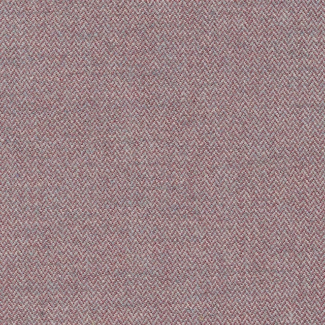
Tummel Sloe
Sloane Square

1116/40
Misc

Linara Foxglove
Linara
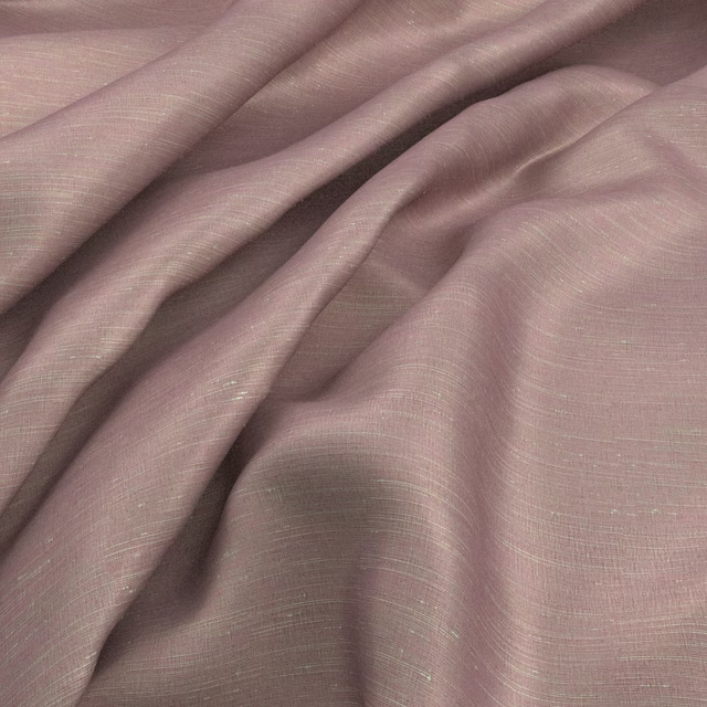
Sari Candy
Sari
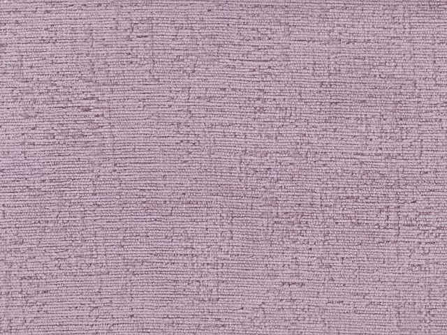
RIV2400
Riviera
Laswansonmu
Timeless Elegance Collection
Paint that goes with it
Two ways to take the room. Both colours are from houses we hold, so a pot can come off the same order as the cloth. Screens shift colour, so treat these as a direction and bring the cloth to the shelf before you buy the paint.
To sit quietly behind it
Nightshade
Sanderson · #9e9495
To stand against it
First Light
Little Greene · #fcf6d8
Other pink fabrics
Across the houses we hold. See all 2,519.
Olearia Fuchsia Linen
Hibbertiameadows
Dotty Blossom
Imaginations
Unicorndance Blossom
Imaginations
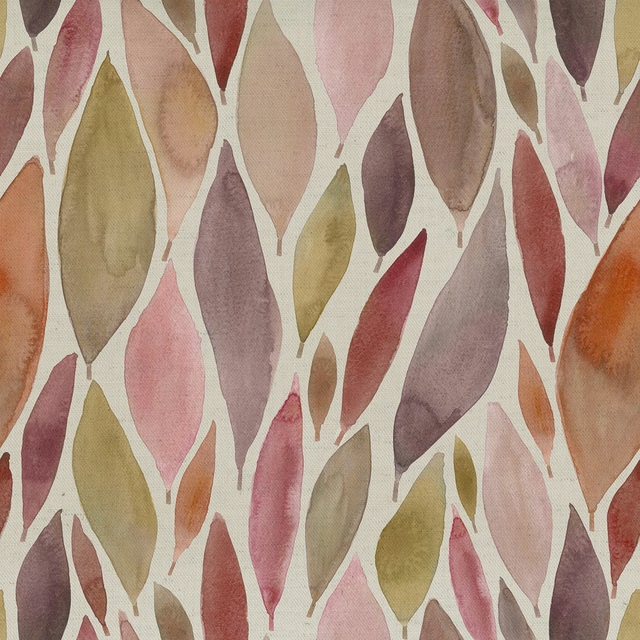
Koyo Mulberry
Katsura
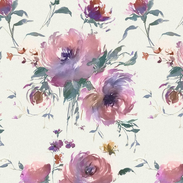
Mazurka Damson
Mazurka

Sereno Fuchsia
Midnightreflections
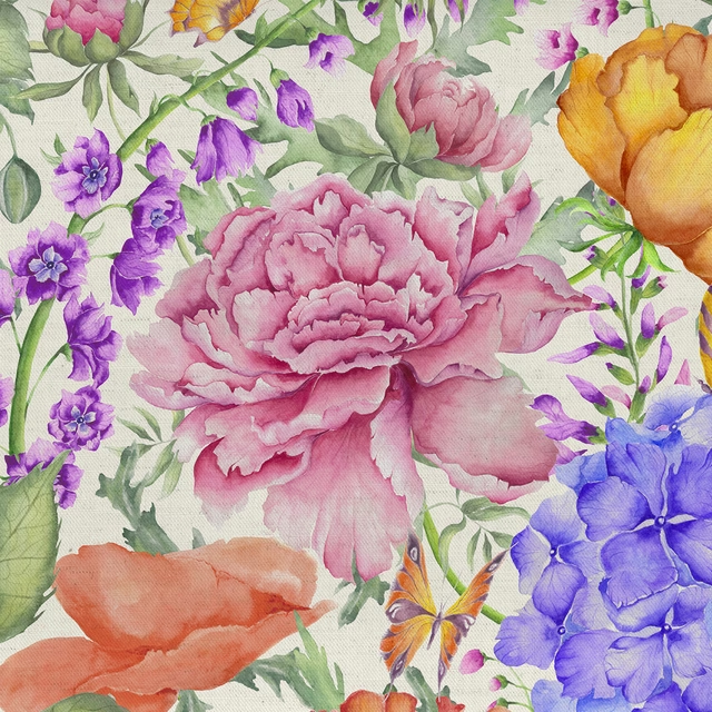
Idalia Fuchsia
Midsummer Meadows
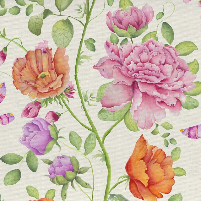
Maisie Fuchsia
Midsummer Meadows
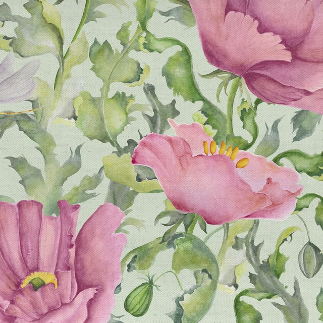
Valeria Sage
Midsummer Meadows
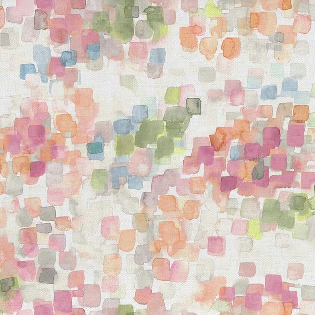
Cothay Coral
Misc

Cube Feather
Misc
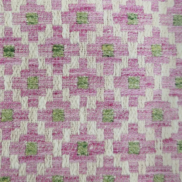
Elmore Blossom
Misc