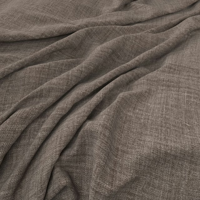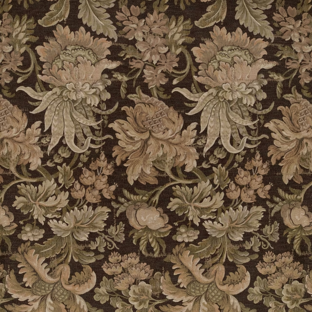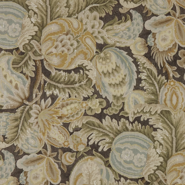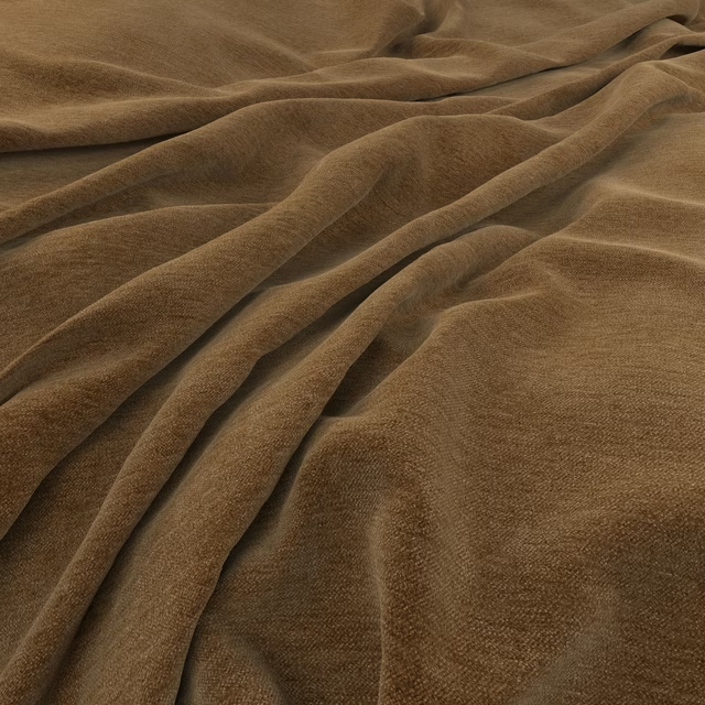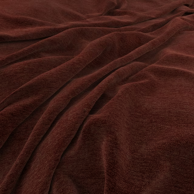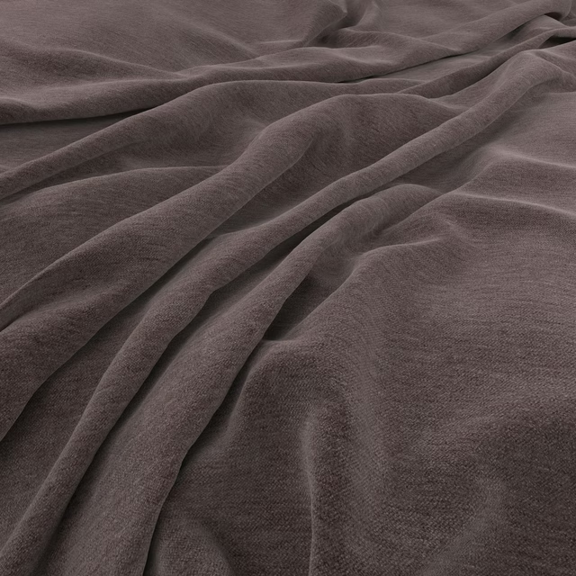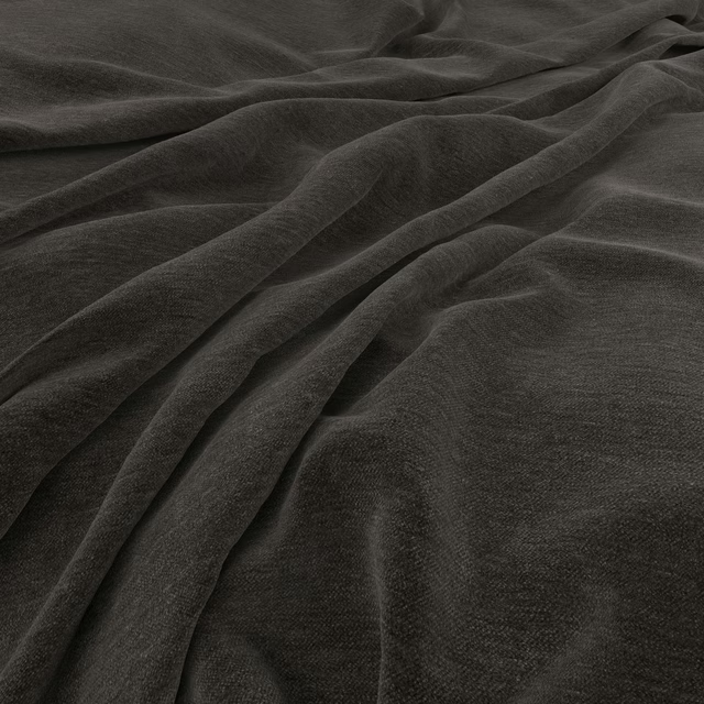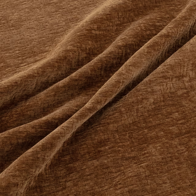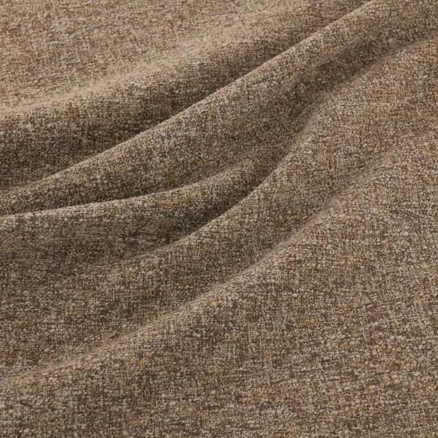

Tap the swatch to see it full screen. Hover it to magnify the weave. Colours on a screen are a guide, not a match, so come and feel the real cloth.
Scroll up or down to zoom in and out.
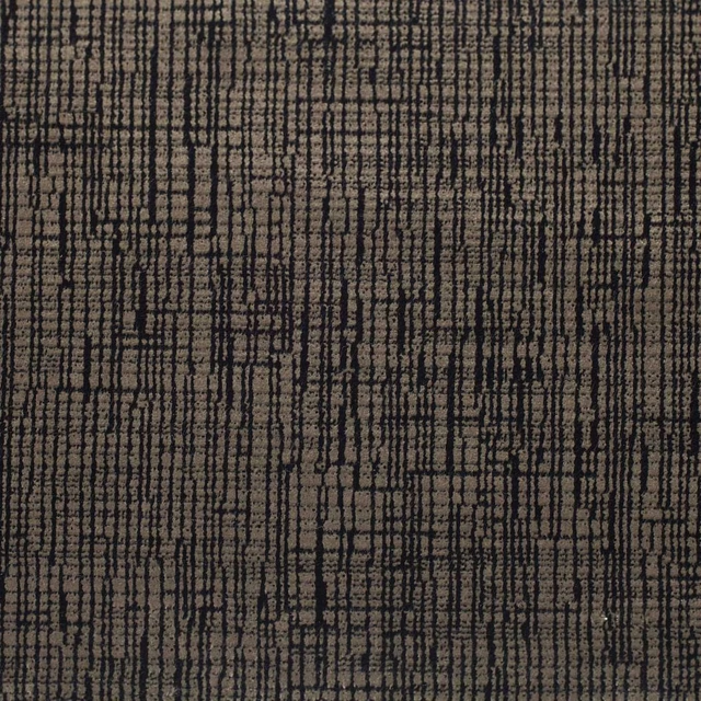
Colonial Copper
Colonial Fabric
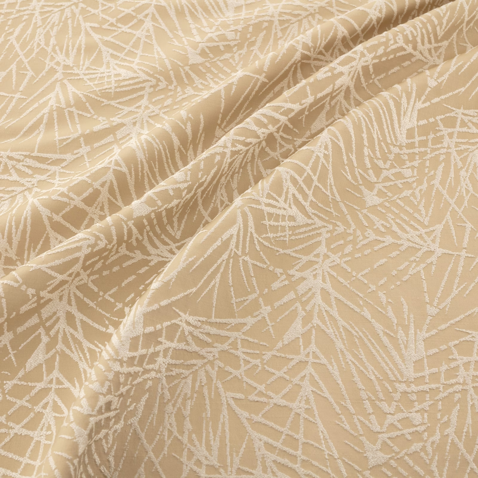
Colonial Copper combines a warm copper-beige ground with an ivory, loosely drawn linear motif. The folded swatch shows how the surface shifts between softly shaded copper tones and lighter highlights.
You have used your previews for today. Send one to Simon and you can carry on.
Your board
0 fabrics
See this fabric on Warwick's own site, then order it through us.
See Colonial Copper in your own room
A photograph of the piece you want re-covered. Straight on is best, and daylight helps. It is used to make your picture and nothing else.
Looking at your room
We found things here Colonial Copper could go on. Tap one on the photograph, or choose below.
We could not see anything to re-cover
, s
Colonial Copper, on your
Drag to compare. AI impression, colours indicative: ask us for a cutting before you decide.
About this fabric
The visible design is formed from overlapping, branch-like ivory lines, giving the fabric an organic pattern without a literal floral repeat. Its warm copper-beige ground has a muted, earthy depth rather than a bright metallic appearance, while the raised-looking pale pattern catches the light across the folds. The swatch has a softly textured woven appearance and enough visual body to suit both upholstery and drapery. No composition, width or rub-test figures are supplied, and no performance features are noted for this fabric.
How to use it
Pair Colonial Copper with warm ivory, oatmeal and muted timber tones to echo its pale linear motif, or use it as a gently patterned contrast against deeper rust and brown furnishings. Its warm copper cast is particularly effective on occasional upholstery, cushions or relaxed curtains.
Use this warm copper-beige colourway to bring softly patterned depth to upholstery, curtains or cushions.
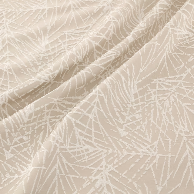
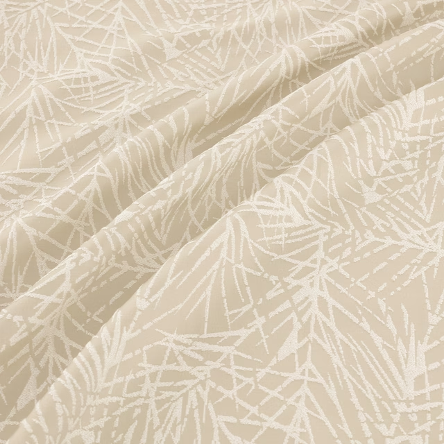
Pairs well with
A pattern needs somewhere for the eye to rest, so these are the plains and textures that sit beside Colonial Copper without fighting it. Mixed across the houses we hold, which is the part a single supplier's book cannot do.

Alaska Bark
Alaska Collection

Alaska Espresso
Alaska Collection
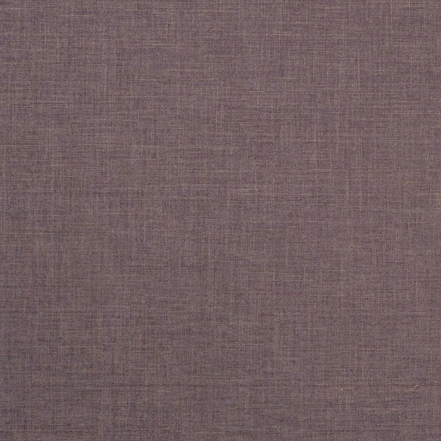
Albany Espresso
Albany and Moray
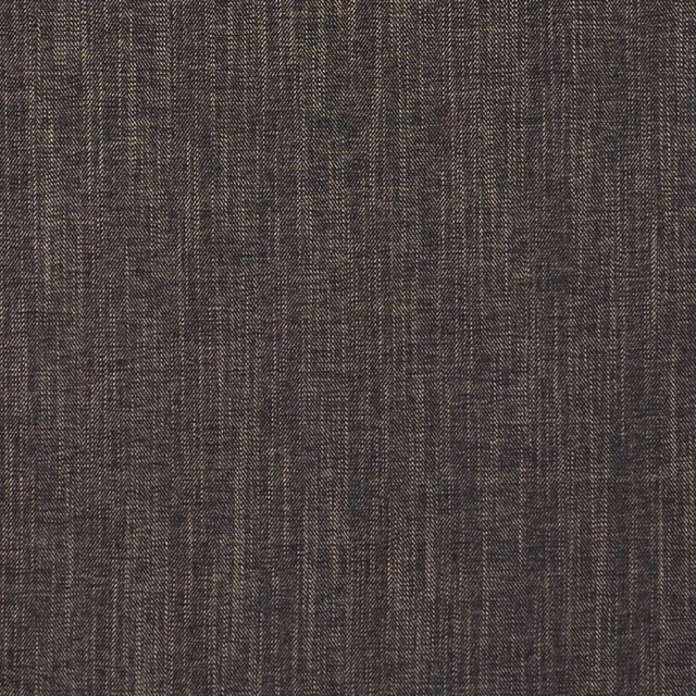
Moray Ebony
Albany and Moray
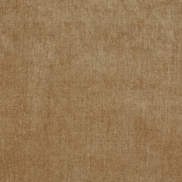
Mylo Biscuit
Cassian P/Bk

Cosima Clay
Cosima Velvet II

Brera Lino FR Walnut
Brera Lino FR

Brienz Cocoa
Lugano Plain Fabrics
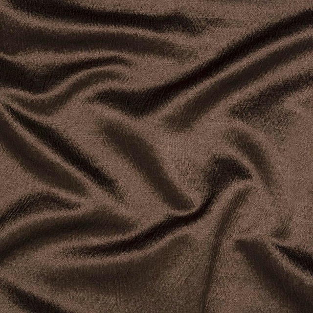
Alchemy Cocoa
Alchemy

Naples FR Linen
Alderney

Allegra Crumb
Allegra
Osamu Treacle
Colour 3 Fabrics
Paint that goes with it
Two ways to take the room. Both colours are from houses we hold, so a pot can come off the same order as the cloth. Screens shift colour, so treat these as a direction and bring the cloth to the shelf before you buy the paint.
To sit quietly behind it
Manilla
Zoffany · #c6b291
To stand against it
Wortle Light
Sanderson · #715c63
Other brown fabrics
Across the houses we hold. See all 2,063.