


Tap the swatch to see it full screen. Hover it to magnify the weave. Colours on a screen are a guide, not a match, so come and feel the real cloth.
Scroll up or down to zoom in and out.
Wortle Light
2026 Paint PaintSAP1152-74
Wortle Light is a subdued plum-grey from Sanderson that sits quietly between mauve and taupe. It gives walls and woodwork a composed, shaded colour without feeling too dark or too sweet.
You have used your previews for today. Send one to Simon and you can carry on.
Your board
0 fabrics
See this colour on Sanderson's own site, then order it through us.
See Wortle Light in your own room
A photograph of the piece you want re-covered. Straight on is best, and daylight helps. It is used to make your picture and nothing else.
Looking at your room
We found things here Wortle Light could go on. Tap one on the photograph, or choose below.
We could not see anything to re-cover
, s
Wortle Light, on your
Drag to compare. AI impression, colours indicative: ask us for a cutting before you decide.
About this colour
At #715C63, this shade reads as a cool-leaning plum with a grey base, so it softens rather than brightens a room. In north-facing light it can appear more smoky and reserved, with the mauve note receding slightly. In south-facing light the warmer side of the colour comes forward, giving it a fuller plum-brown depth while still keeping its grey restraint. On walls it absorbs a fair amount of light, which helps it feel calm and intimate beside pale linens, walnut, oak, and deeper berry or inky upholstery tones. In Active Emulsion or Waterbased Eggshell, it works well where you want a colour that feels tailored on walls or joinery.
How to use it
Use Wortle Light in a sitting room, bedroom, or library where you want a quieter, more enveloping backdrop. It sits well with painted woodwork in chalk white or deeper brown stains, and with upholstery in camel, charcoal, moss, or muted damson.
This colour gives walls a restrained plum-grey depth that feels settled rather than bold.
More from 2026 Paint
The same book, other colourways.
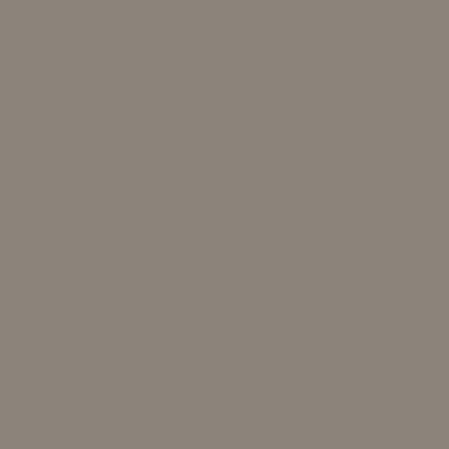
Field Mushroom
2026 Paint

Hosta Green
2026 Paint

Green Almond
2026 Paint

English Pear
2026 Paint

Grey Squirrel
2026 Paint

Soft Ivory
2026 Paint

Wheat
2026 Paint

Moonsprite
2026 Paint

Light Rose
2026 Paint

Lime Cloud
2026 Paint

Country Linen
2026 Paint

Harbour Blue
2026 Paint
Pairs well with
Wortle Light is a wall colour, so these are the cloths that sit against it: one of them on the curtains, the paint behind. Mixed across the houses we hold, which is the part a single supplier's book cannot do.
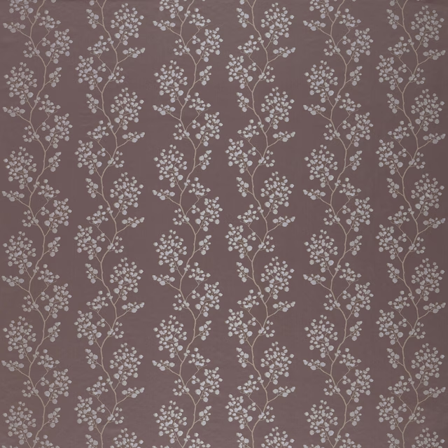
Blickling Vintage
Tatton Park Collection
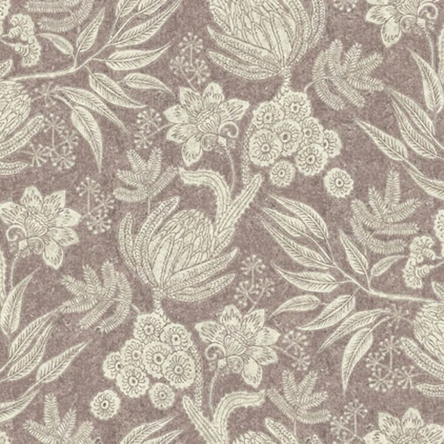
Isabella Colour 10
Brindisi
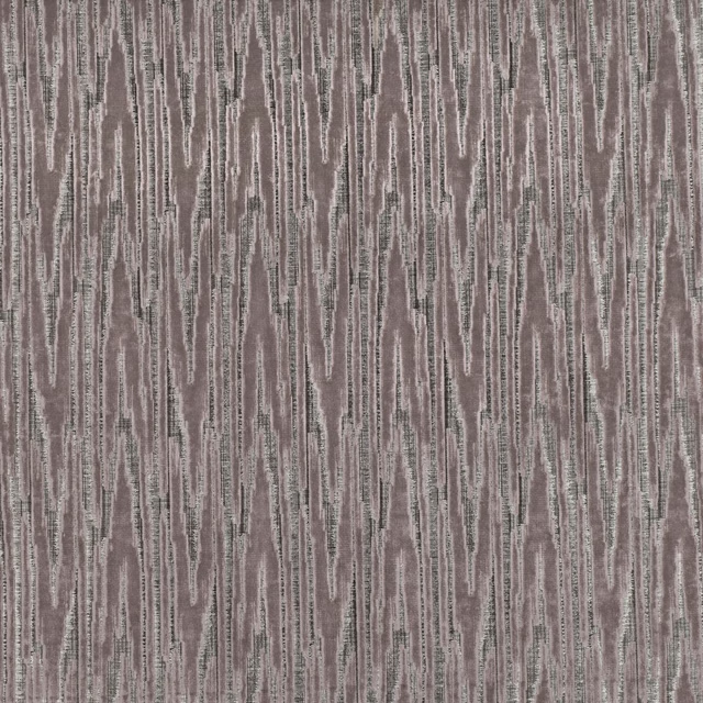
Zkara Malva
Zkara
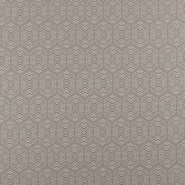
Scorpio Champagne
Comet Collection
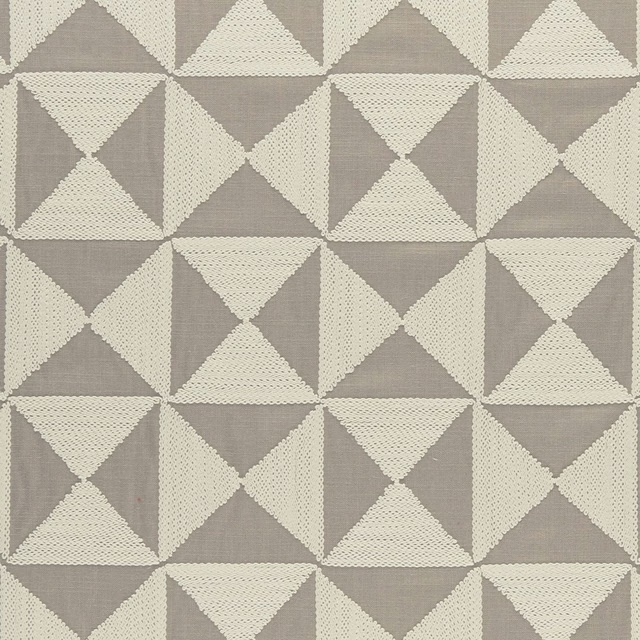
Adisa Taupe
Amara
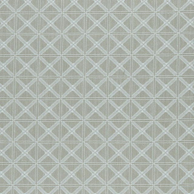
Makenzi Natural
Amara
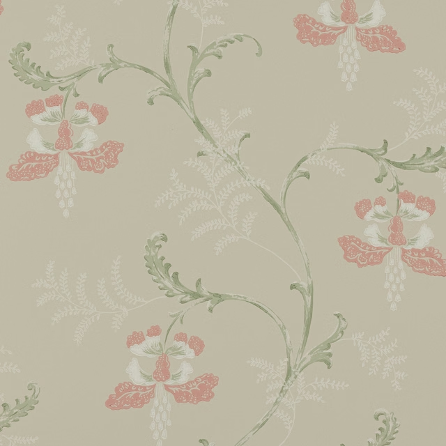
Bellflower Wallpaper Pink/Green
Ashdown Wallpaper
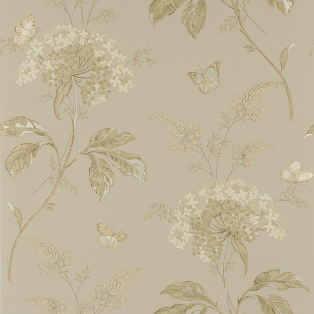
Messina Wallpaper Stone
Ashdown Wallpaper
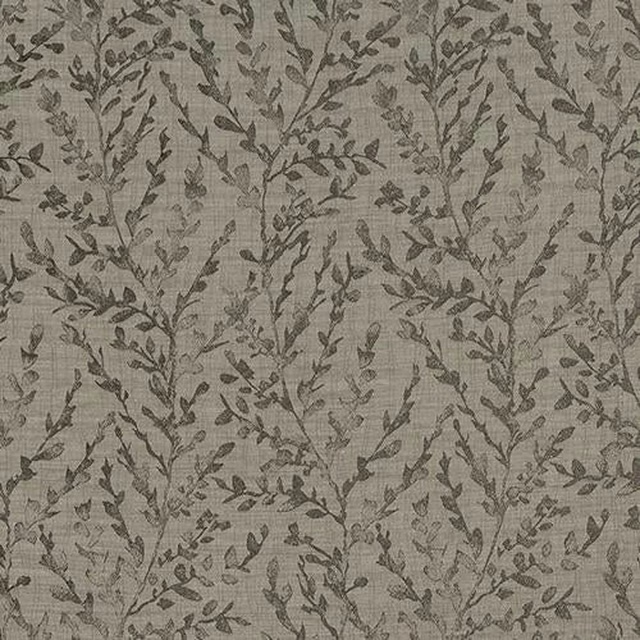
Fabio Taupe
Acacia
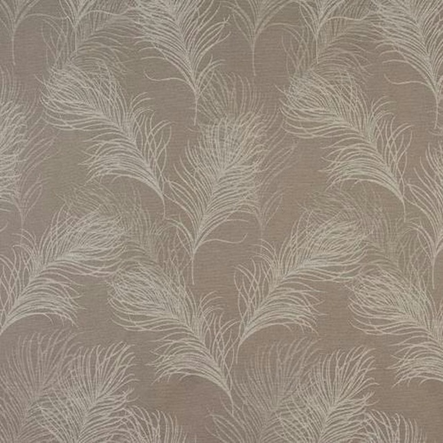
Feather Coffee
Acacia
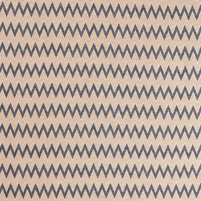
Akari Storm/Positano
Akari Weaves
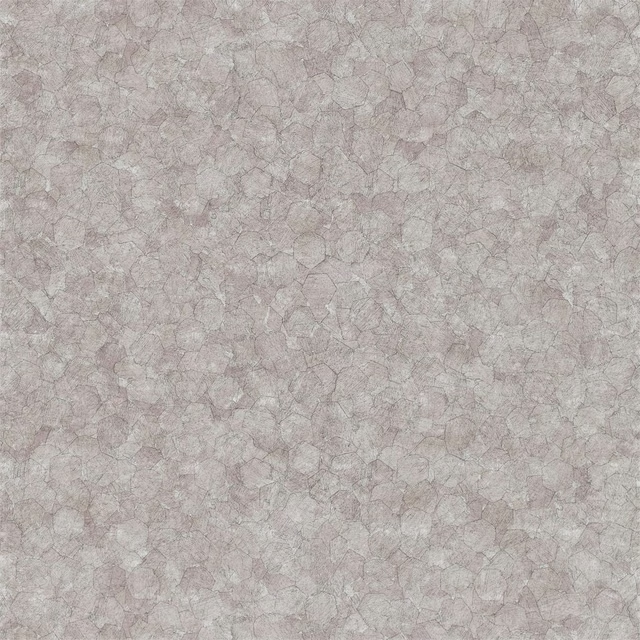
Kinetic Mink
Anthology 03
Other taupe fabrics
Across the houses we hold. See all 4,053.
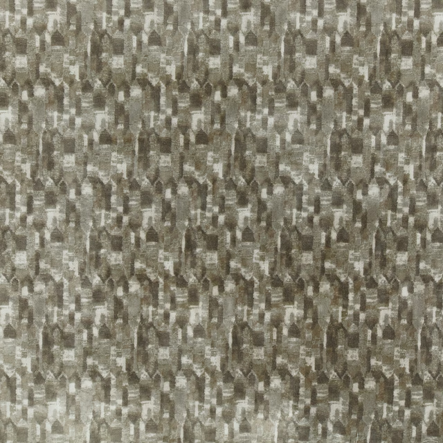
Ishi Stone
Oshibana Collection

Ksavonamo
Oshibana Collection
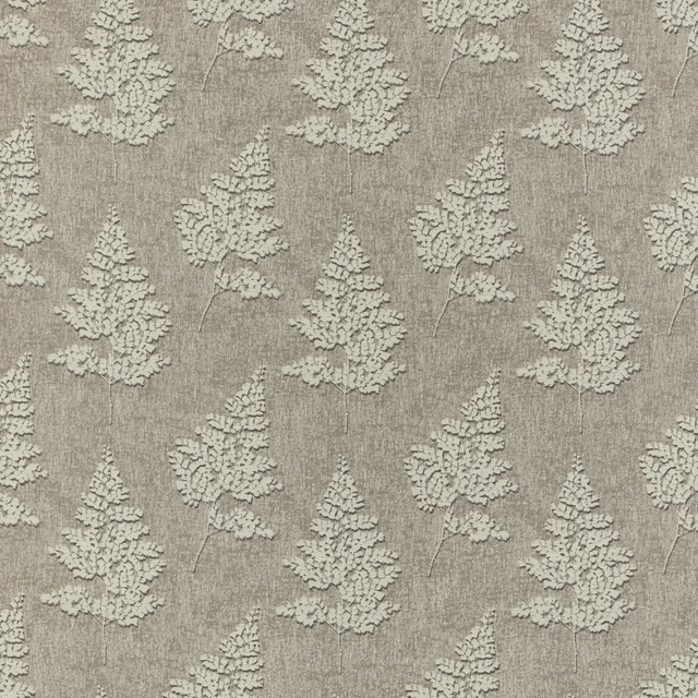
Shida Pebble
Oshibana Collection

Kokoro Walnut
Zen Gardens Collection
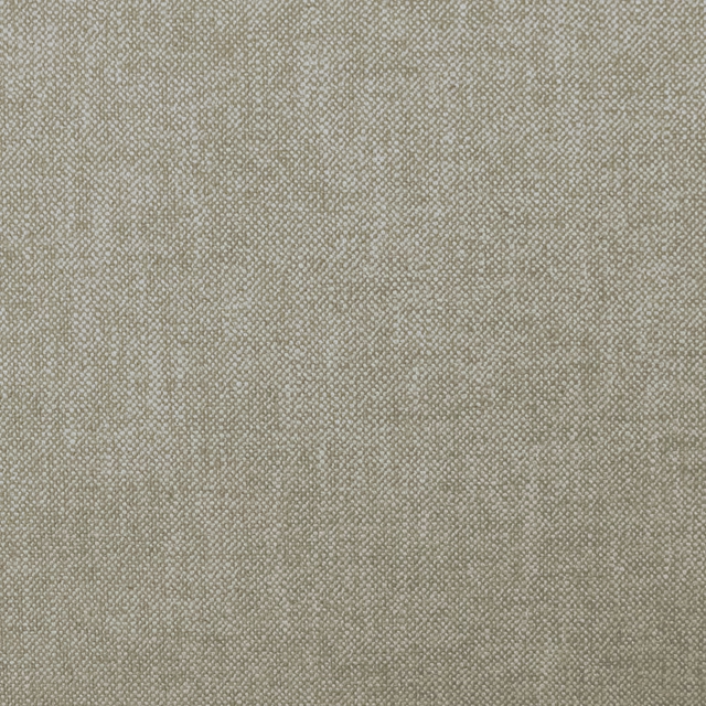
Olenka Shingle
Zen Gardens Collection
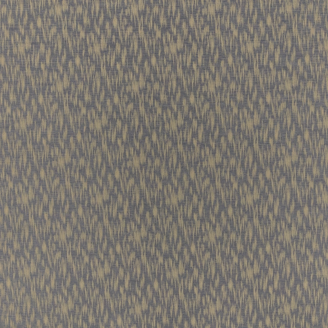
Airi Indigo
Zen Gardens Collection
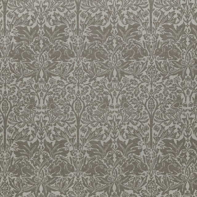
Brother Rabbit Boucle Truffle
Dovecote Vol I & II
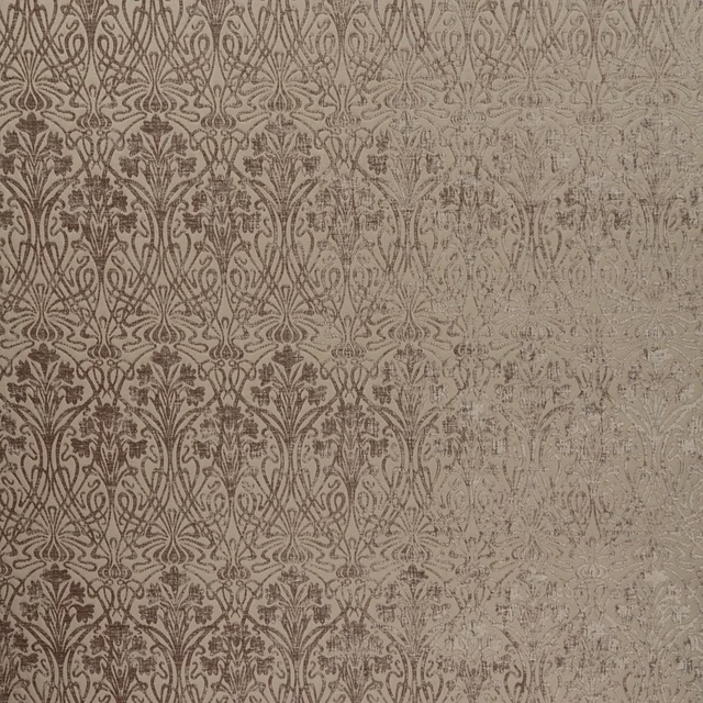
Tiverton Mink
Tiverton
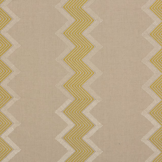
Farley Stripe Gilt
Cosmopolitan
Braddock Stone
Cosmopolitan
Netherton Taupe
Cosmopolitan

Trevone Mineral
Cosmopolitan