
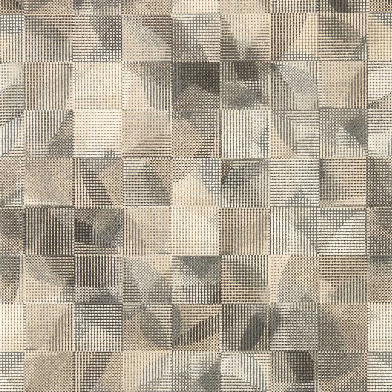

Tap the swatch to see it full screen. Hover it to magnify the weave. Colours on a screen are a guide, not a match, so come and feel the real cloth.
Scroll up or down to zoom in and out.
Impatto Charcoal/Linen
Vivido Wallpaper WallpaperCCW0100-01
Impatto Charcoal/Linen presents a layered geometric composition in cool charcoal, soft grey and pale linen tones. Fine linear details and small checked sections sit alongside broader angular blocks, giving the surface a distinctly graphic texture.
You have used your previews for today. Send one to Simon and you can carry on.
Your board
0 fabrics
Part of the range we hold from Clarke & Clarke.
See Impatto Charcoal/Linen in your own room
A photograph of the piece you want re-covered. Straight on is best, and daylight helps. It is used to make your picture and nothing else.
Looking at your room
We found things here Impatto Charcoal/Linen could go on. Tap one on the photograph, or choose below.
We could not see anything to re-cover
, s
Impatto Charcoal/Linen, on your
Drag to compare. AI impression, colours indicative: ask us for a cutting before you decide.
About this wallpaper
The visible design is built from irregular rectangular and angled panels, with charcoal areas interrupted by pale linen fields, grey shading and tightly drawn linework. Its restrained neutral palette has a cool, architectural feel, while the lighter sections keep the overall image from reading as flat or overly dark. This wallpaper is supplied at 52cm usable width in a standard 10.05m length, with a 64cm vertical pattern repeat. At 150gsm, it offers a lightweight wallcovering format for carrying the detailed, grid-like motif across a room.
How to use it
Use the charcoal-led colourway on a feature wall in a contemporary study, hallway or living space, pairing it with pale oak, black accents and warm off-white upholstery to echo the linen-toned sections. In a darker room, balance the deeper blocks with generous light-painted surfaces and soft neutral furnishings.
Use this cool charcoal-and-linen geometric design to give contemporary rooms layered tonal depth without introducing a bright accent colour.
More from Vivido Wallpaper
The same book, other colourways.
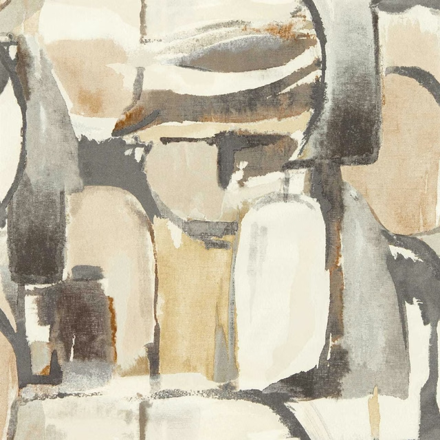
Figura Linen/Charcoal
Vivido Wallpaper
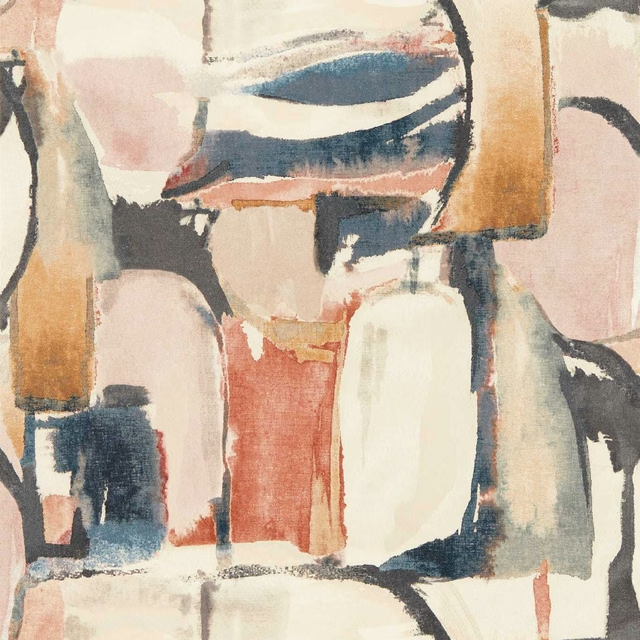
Figura Midnight/Spice
Vivido Wallpaper
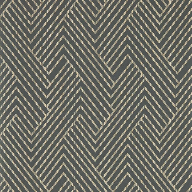
Grassetto Charcoal
Vivido Wallpaper
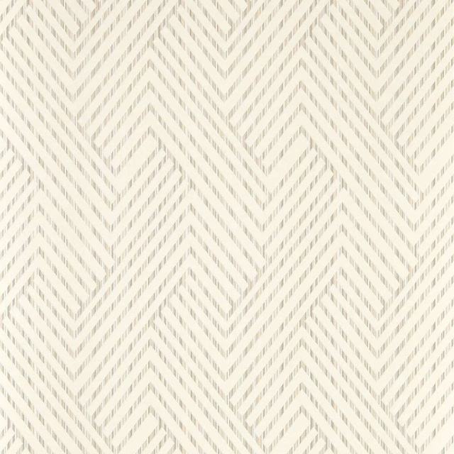
Grassetto Ivory
Vivido Wallpaper
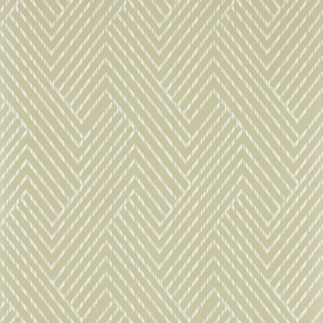
Grassetto Linen
Vivido Wallpaper
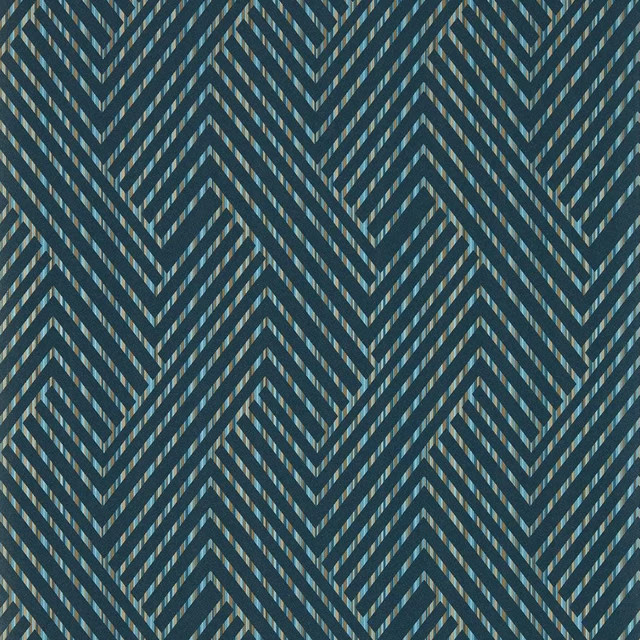
Grassetto Midnight
Vivido Wallpaper
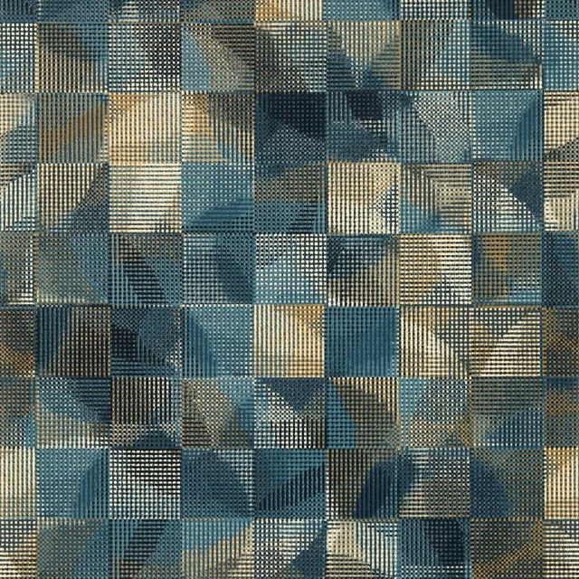
Impatto Midnight
Vivido Wallpaper
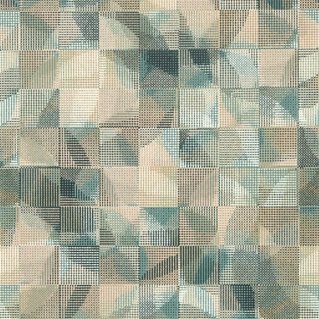
Impatto Mineral/Blush
Vivido Wallpaper
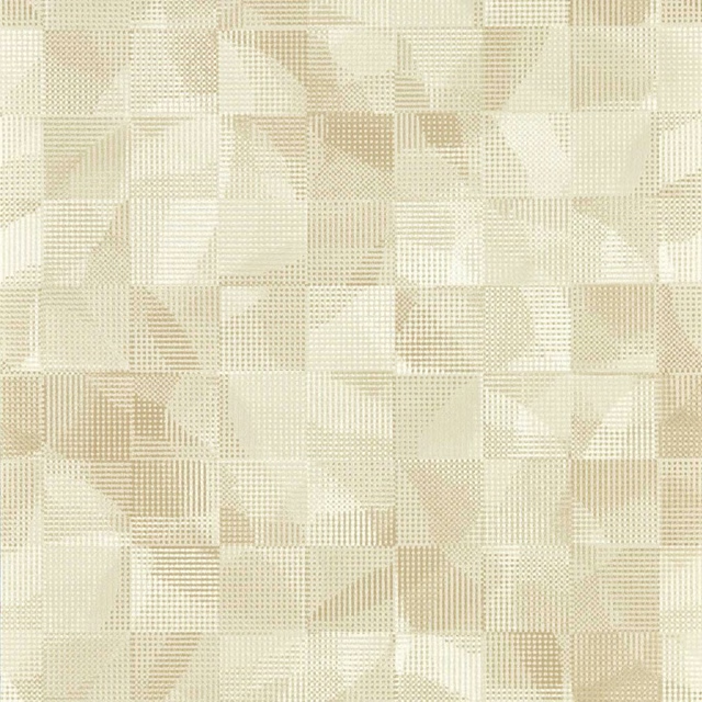
Impatto Natural
Vivido Wallpaper
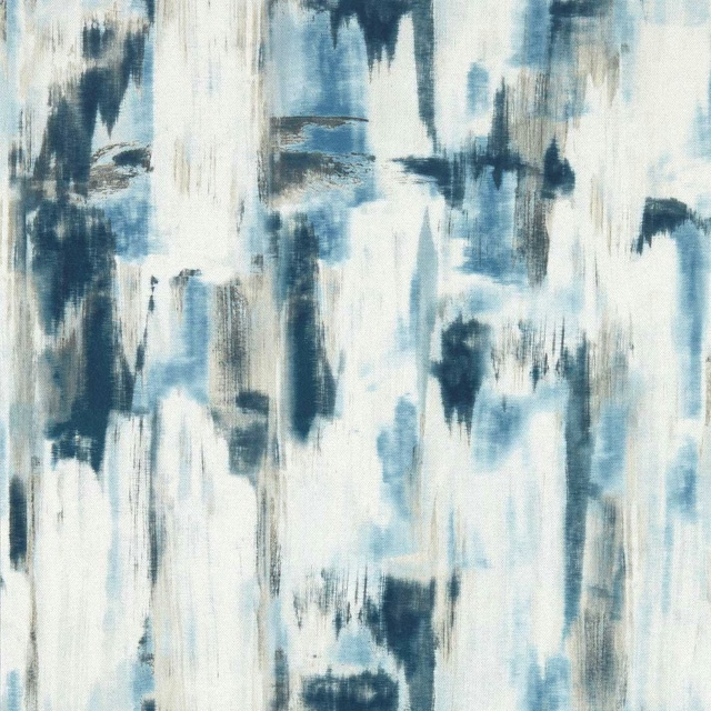
Lagna Midnight
Vivido Wallpaper
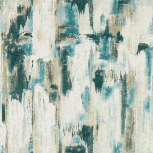
Lagna Mineral
Vivido Wallpaper
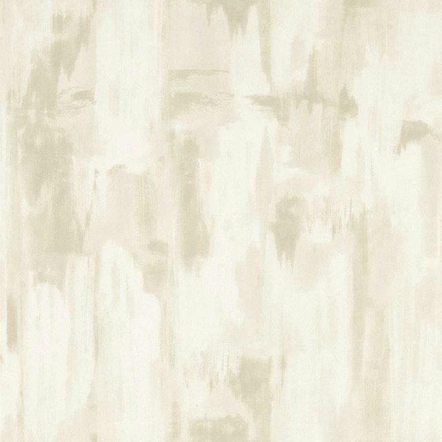
Lagna Natural
Vivido Wallpaper
Pairs well with
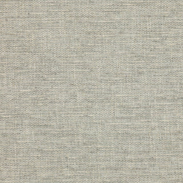
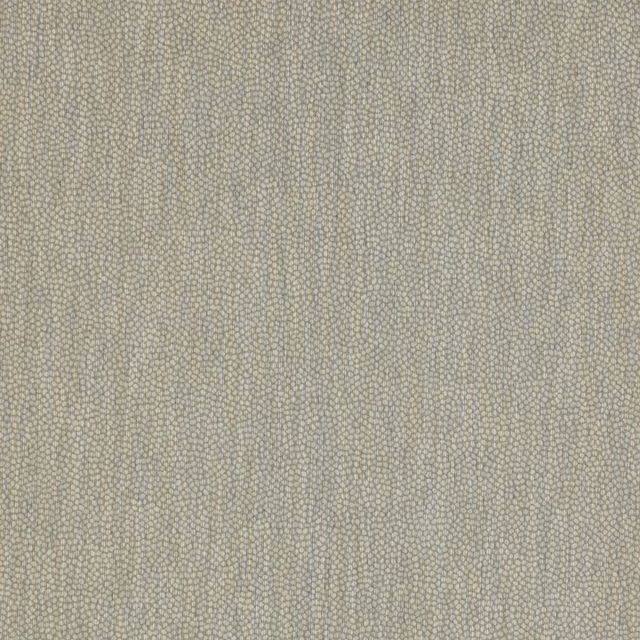
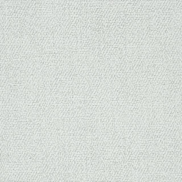
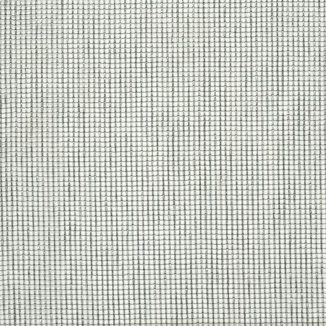
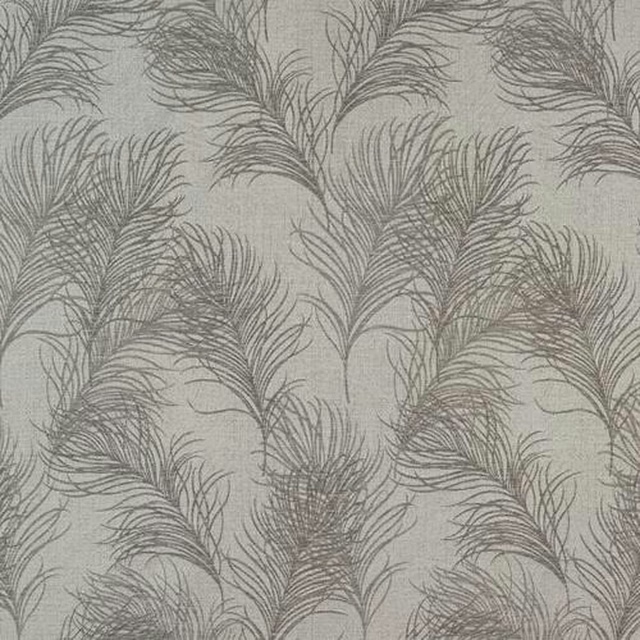
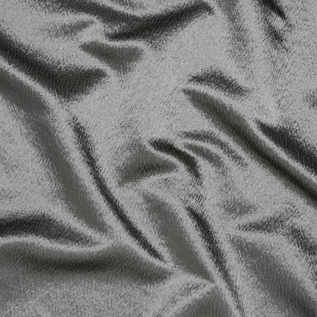
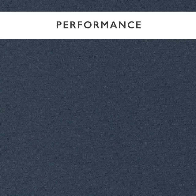
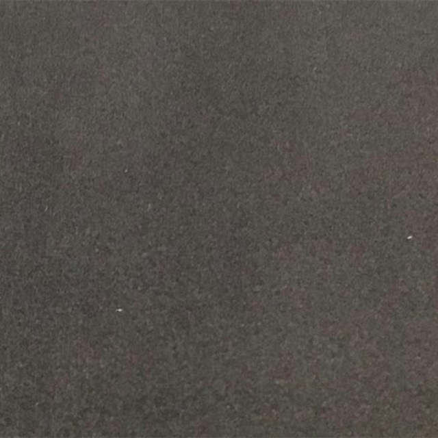
A pattern needs somewhere for the eye to rest, so these are the plains and textures that sit beside Impatto Charcoal/Linen without fighting it. Mixed across the houses we hold, which is the part a single supplier's book cannot do.



Paint that goes with it
Two ways to take the room. Both colours are from houses we hold, so a pot can come off the same order as the cloth. Screens shift colour, so treat these as a direction and bring the cloth to the shelf before you buy the paint.
To sit quietly behind it
Beech Grey
Sanderson · #b3aa99
To stand against it
Citrine
Little Greene · #777f2d
Other grey fabrics
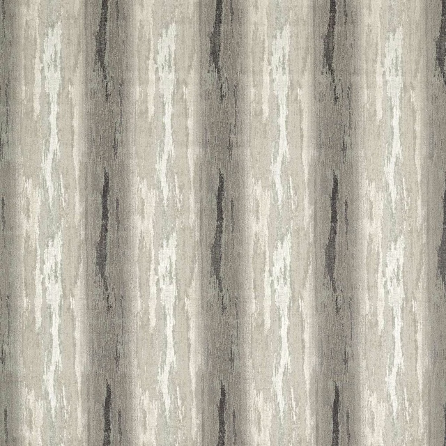
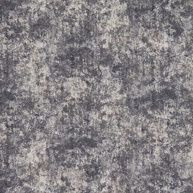
Across the houses we hold. See all 7,198.
Effetto Charcoal
Vivido Fabric
Pittura Charcoal
Vivido Fabric
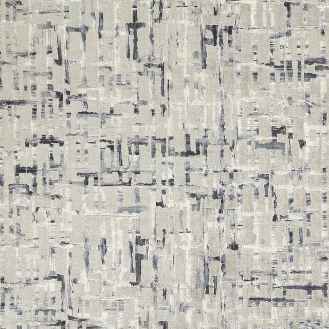
Quadrata Charcoal
Vivido Fabric

Ashdown Ebony
Whitworth Fabric
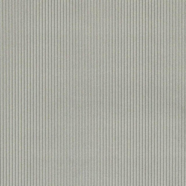
Ashdown Graphite
Whitworth Fabric
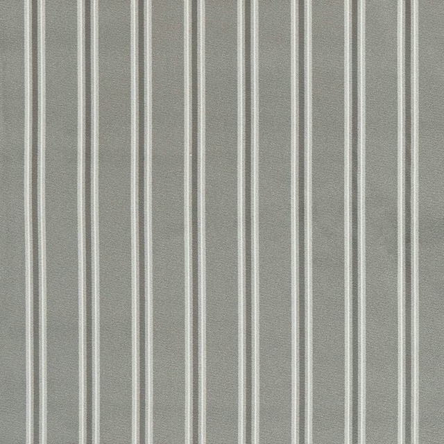
Bowfell Graphite
Whitworth Fabric
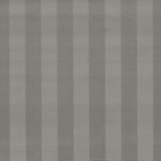
Haldon Graphite
Whitworth Fabric
Wilmott Graphite
Whitworth Fabric
Golden Lily Slate/Dove
William Morris Designs
Mallow Slate/Dove
William Morris Designs
Strawberry Thief Slate/Blush
William Morris Designs
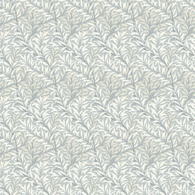
Willow Boughs Dove
William Morris Designs