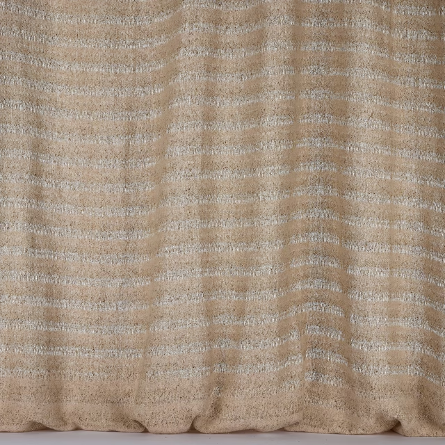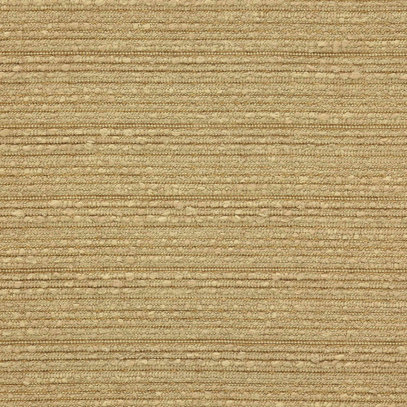

Tap the swatch to see it full screen. Hover it to magnify the weave. Colours on a screen are a guide, not a match, so come and feel the real cloth.
Scroll up or down to zoom in and out.
Sasaki Camel
Paxton FabricL9239-04
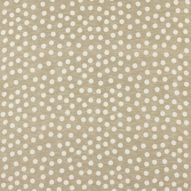
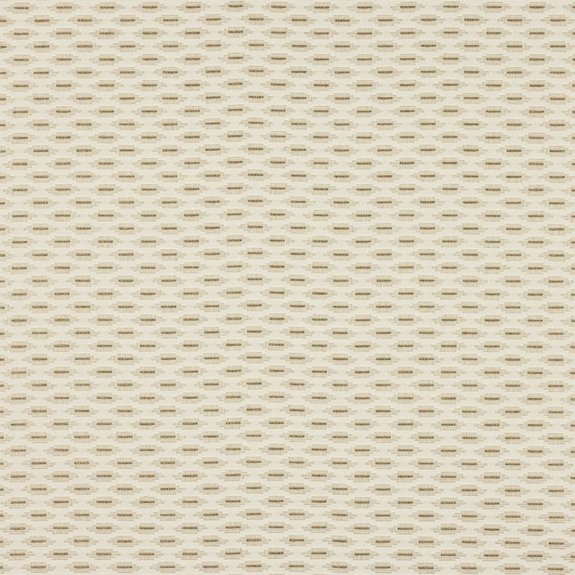
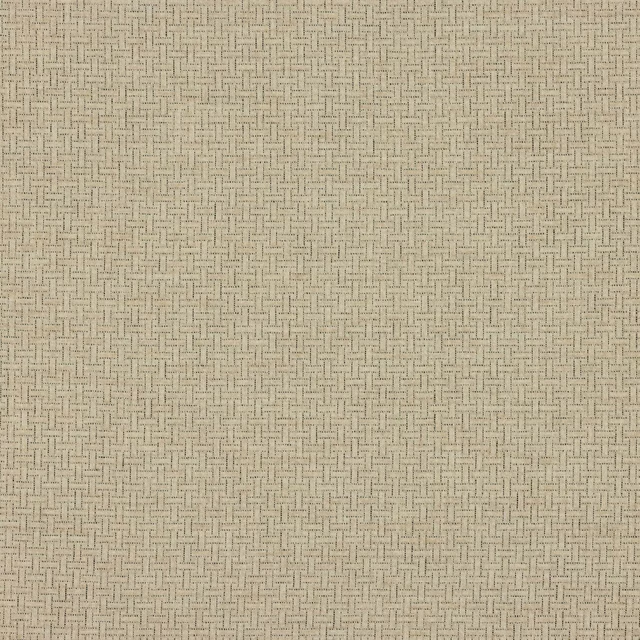
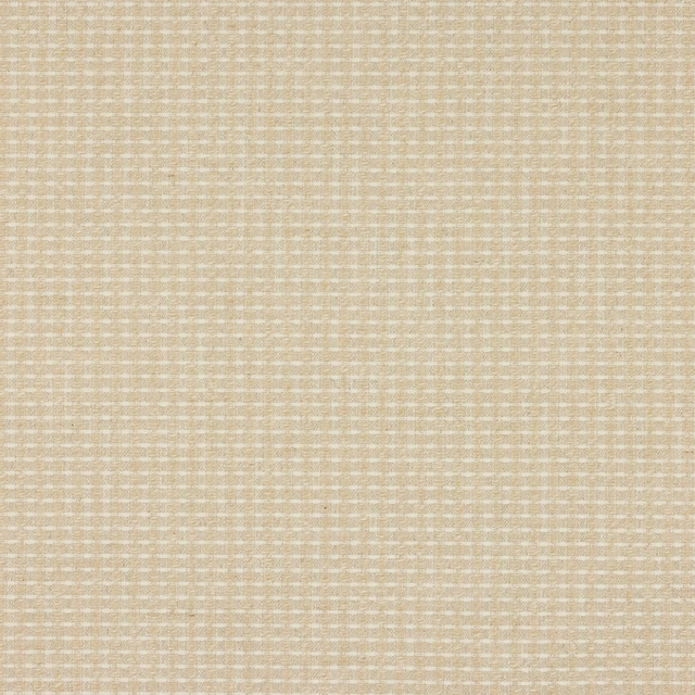
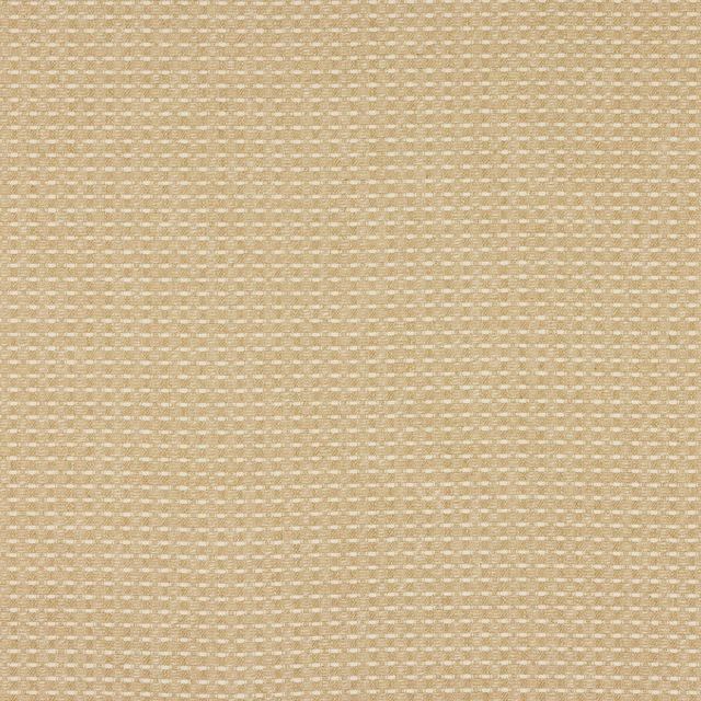
Sasaki Camel shows a softly textured, horizontal strié with a warm camel-beige ground and subtle tonal variation across the surface. The finish feels tailored rather than glossy, with a dry, tactile look that catches the light gently.
You have used your previews for today. Send one to Simon and you can carry on.
Your board
0 fabrics
See this fabric on Larsen's own site, then order it through us.
See Sasaki Camel in your own room
A photograph of the piece you want re-covered. Straight on is best, and daylight helps. It is used to make your picture and nothing else.
Looking at your room
We found things here Sasaki Camel could go on. Tap one on the photograph, or choose below.
We could not see anything to re-cover
, s
Sasaki Camel, on your
Drag to compare. AI impression, colours indicative: ask us for a cutting before you decide.
About this fabric
From Larsen’s Paxton collection, this fabric is composed of 61% Cotton, 38% Viscose and 1% Polyamide, with an approximate width of 134cm and a vertical repeat of 6cm. The weave reads as a low-contrast, gently ribbed stripe, built from small nubby yarns that give the surface depth without strong pattern contrast. In this colourway the camel tone is softened by beige and oat notes, so it feels warm and understated rather than bright or yellow. With care code Q 8 + T 3 and fire code √CM, it is a practical decorative textile with a refined, lightly textured hand.
How to use it
Use Sasaki Camel for upholstered pieces where a calm, warm neutral is needed, or as drapery in rooms that benefit from a softly structured stripe. Its muted camel tone pairs especially well with oak, tobacco leather and chalky off-whites.
A warm camel tone that softens the texture and works neatly across seating and curtains.
More from Paxton
The same book, other colourways.
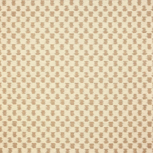
Paxton Birch
Paxton
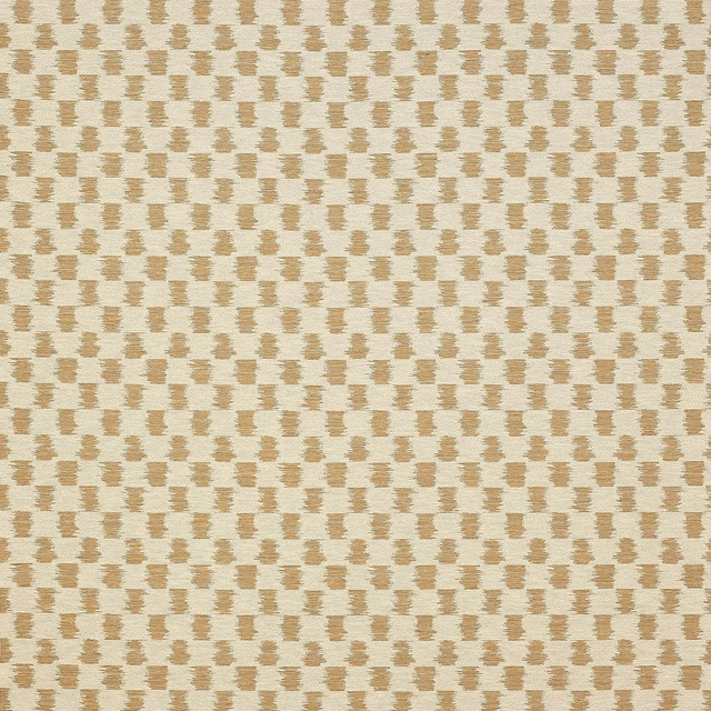
Paxton Camel
Paxton
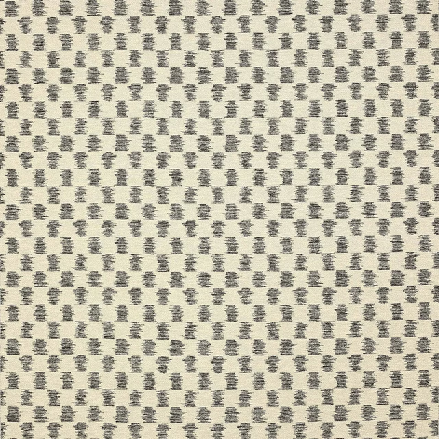
Paxton Charcoal
Paxton
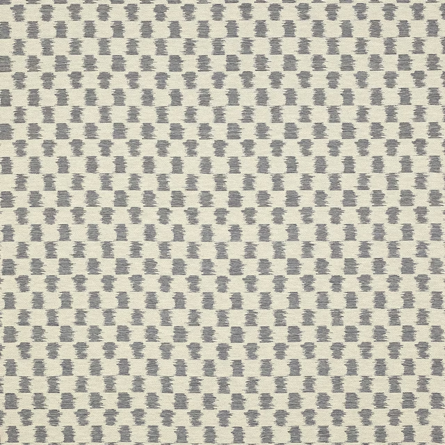
Paxton Denim
Paxton
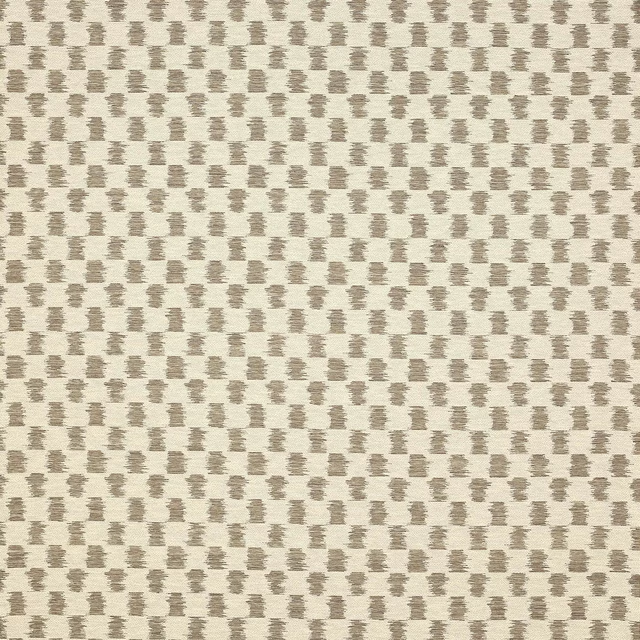
Paxton Smoke
Paxton
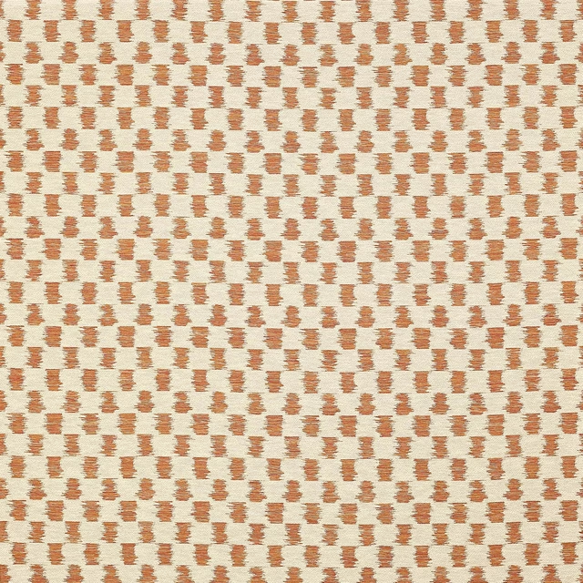
Paxton Spice
Paxton
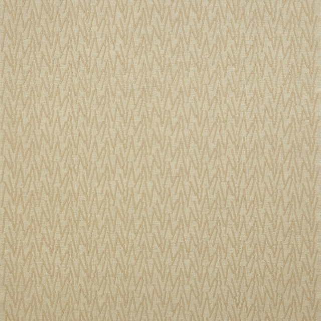
Reyes Clay
Paxton
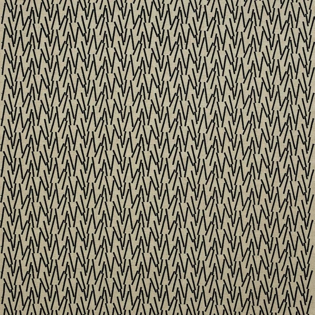
Reyes Ebony
Paxton
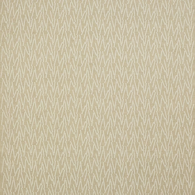
Reyes Pearl
Paxton
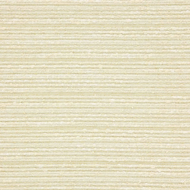
Sasaki Clay
Paxton
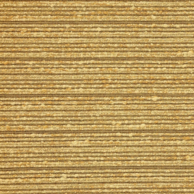
Sasaki Honey
Paxton

Sasaki Pearl
Paxton
Pairs well with
A pattern needs somewhere for the eye to rest, so these are the plains and textures that sit beside Sasaki Camel without fighting it. Mixed across the houses we hold, which is the part a single supplier's book cannot do.
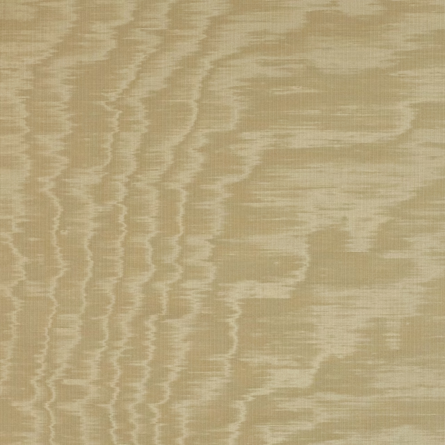
Eaton Plain Camel
Eaton Checks and Stripes
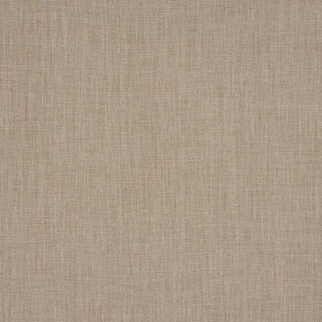
Flynn Camel
Flynn Linen
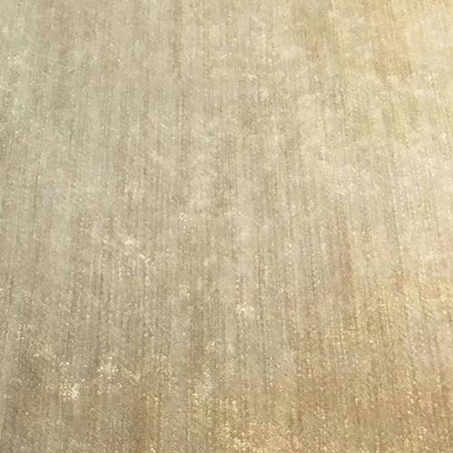
Modena Camel
Modena
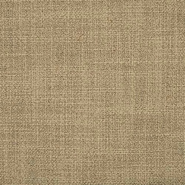
Olympia Camel
Olympia

Ortigia Camel
Corti
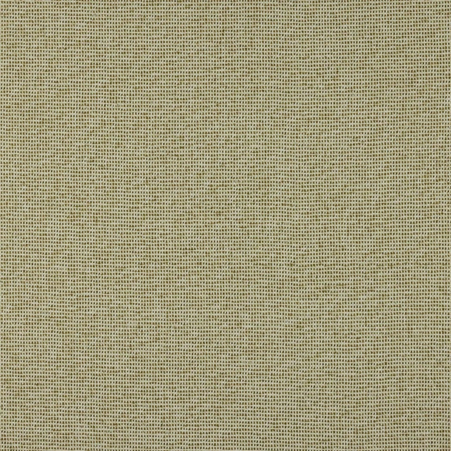
Menorca Camel
Faro
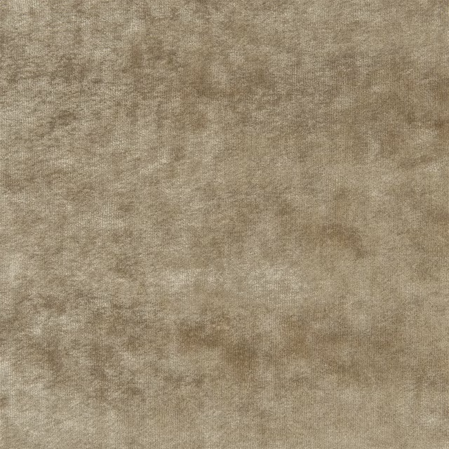
Artesia Velvet Patina
Neutral Book Fabrics

Sorsdal Maize
Sorsdal FR Recycled Velvet

Liso Cement
Liso Sateen

7861/X646
Misc

1116/21
Misc

Hide Eco Desert
Hideveganleathers
Paint that goes with it
Two ways to take the room. Both colours are from houses we hold, so a pot can come off the same order as the cloth. Screens shift colour, so treat these as a direction and bring the cloth to the shelf before you buy the paint.
To sit quietly behind it
Hessian Green
Zoffany · #b3a26e
To stand against it
Olive Colour
Little Greene · #42431f
Other beige fabrics
Across the houses we hold. See all 4,485.