
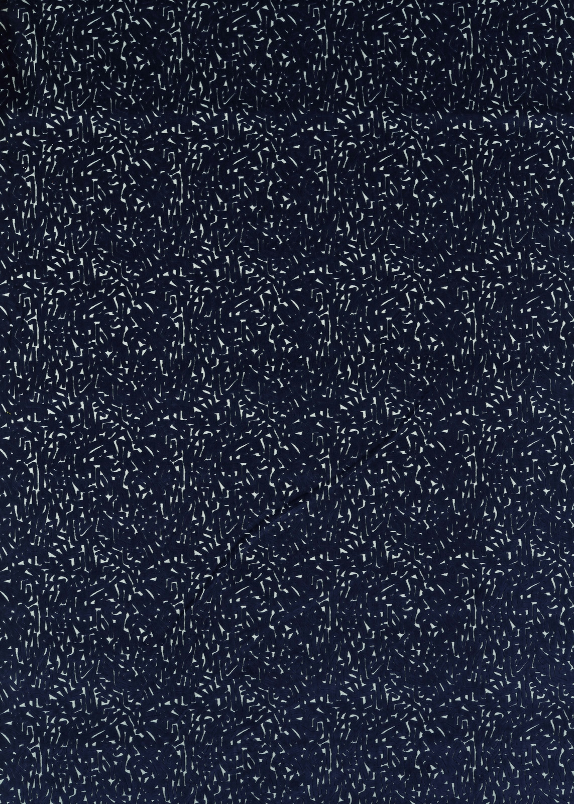

Tap the swatch to see it full screen. Hover it to magnify the weave. Colours on a screen are a guide, not a match, so come and feel the real cloth.
Scroll up or down to zoom in and out.
Lyrical Japanese Ink/Lagoon
Colour 2 Fabrics FabricHAF0455-04
Lyrical Japanese Ink/Lagoon presents a deep, almost black-blue ground scattered with fine lagoon and pale blue marks. The dense, short strokes create a richly textured appearance, with the lighter flecks sharpening the pattern against the dark base.
You have used your previews for today. Send one to Simon and you can carry on.
Your board
0 fabrics
See this fabric on Harlequin's own site, then order it through us.
See Lyrical Japanese Ink/Lagoon in your own room
A photograph of the piece you want re-covered. Straight on is best, and daylight helps. It is used to make your picture and nothing else.
Looking at your room
We found things here Lyrical Japanese Ink/Lagoon could go on. Tap one on the photograph, or choose below.
We could not see anything to re-cover
, s
Lyrical Japanese Ink/Lagoon, on your
Drag to compare. AI impression, colours indicative: ask us for a cutting before you decide.
About this fabric
This substantial fabric weighs 628gsm and has a 140.7cm usable width, making it particularly well suited to upholstery. Its surface is filled with irregular, short dash-like marks that read as a densely worked Japanese ink study rather than a conventional floral or geometric repeat. The cool ink navy ground gives the colourway a deep, quietly dramatic character, while lagoon accents catch the light as fine blue-green highlights. The pattern repeats every 34.6cm vertically and 35cm horizontally, offering a consistent rhythm across upholstered pieces.
How to use it
Use this cool ink-and-lagoon colourway on a tailored armchair, sofa or dining seat where its dense mark-making can act as the room’s graphic focal point. Pair it with washed timber, charcoal, soft grey or muted blue-green accents to draw out the lagoon flecks without losing the depth of the navy ground.
The deep ink ground and lagoon-coloured marks bring graphic depth to tailored upholstery, especially on contemporary seating.
More from Colour 2 Fabrics
The same book, other colourways.
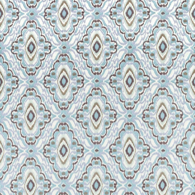
Ixora Sky/Seaglass/Sketched
Colour 2 Fabrics
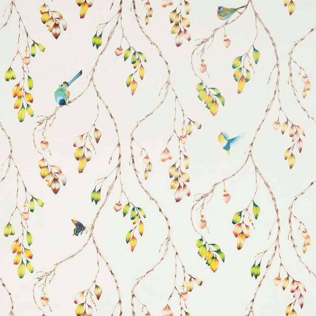
Iyanu Voile Paprika/Kiwi
Colour 2 Fabrics
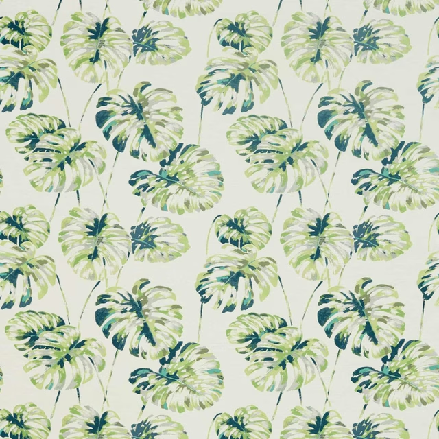
Kelapa Emerald/Zest
Colour 2 Fabrics
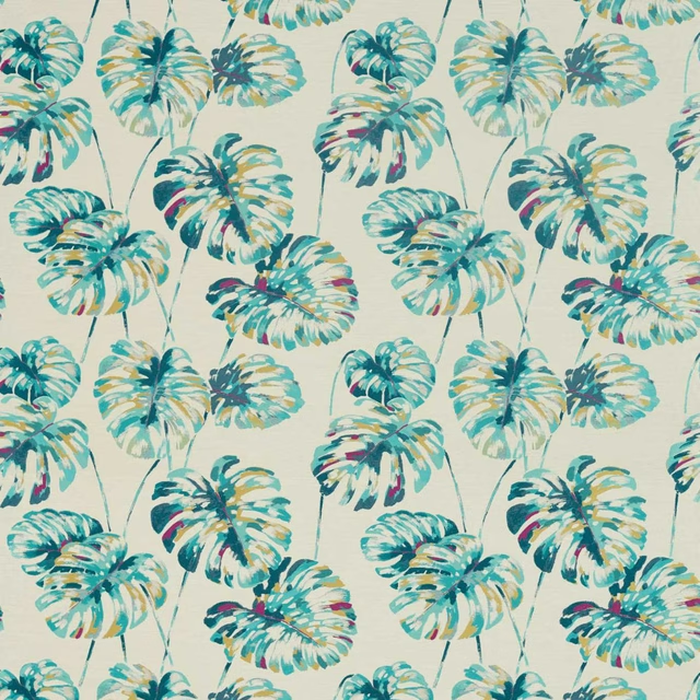
Kelapa Lagoon/Cerise
Colour 2 Fabrics
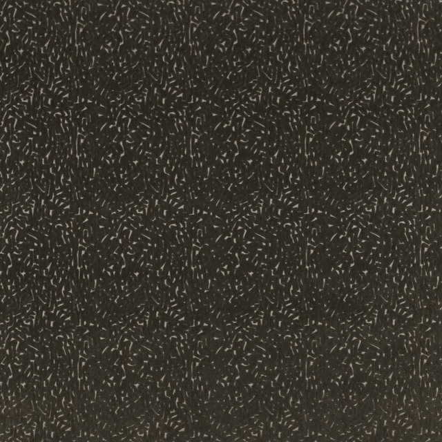
Lyrical Black Earth
Colour 2 Fabrics
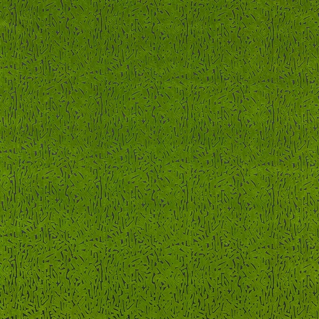
Lyrical Forest/Black Earth
Colour 2 Fabrics
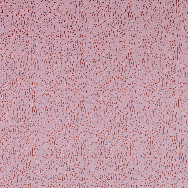
Lyrical Orchid/Brazilian Rosewood
Colour 2 Fabrics
Melodic French Ochre/Paper Lantern
Colour 2 Fabrics
Melodic Japanese Ink/Origami
Colour 2 Fabrics
Melodic Stone/Awakening
Colour 2 Fabrics
Orlena Powder Blue/Gilver
Colour 2 Fabrics
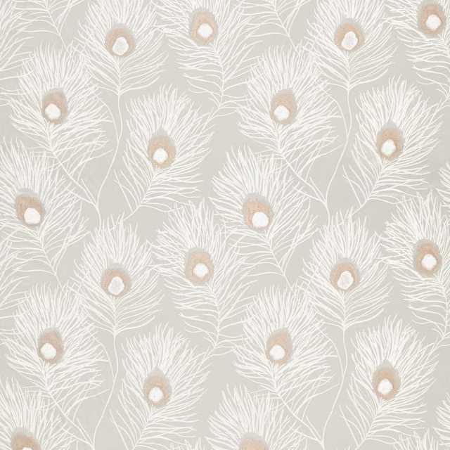
Orlena Rose Gold/Pearl
Colour 2 Fabrics
Pairs well with
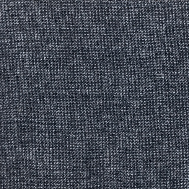
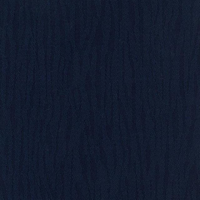
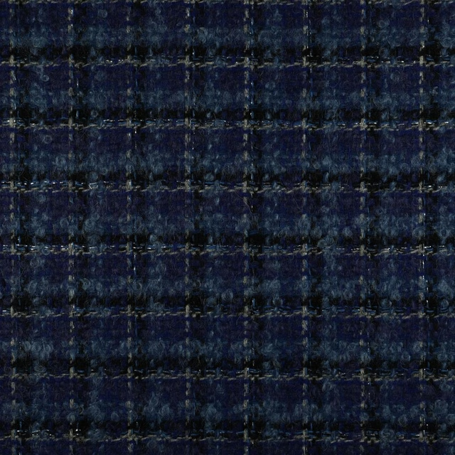
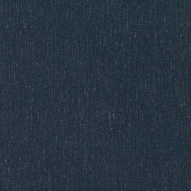
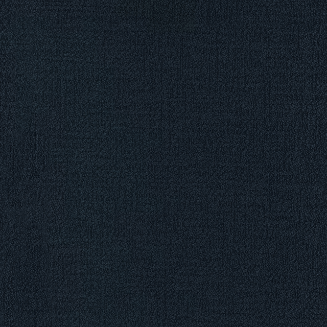
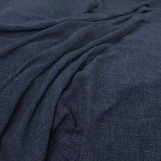
A pattern needs somewhere for the eye to rest, so these are the plains and textures that sit beside Lyrical Japanese Ink/Lagoon without fighting it. Mixed across the houses we hold, which is the part a single supplier's book cannot do.






Paint that goes with it
Two ways to take the room. Both colours are from houses we hold, so a pot can come off the same order as the cloth. Screens shift colour, so treat these as a direction and bring the cloth to the shelf before you buy the paint.
To sit quietly behind it
Dock Blue
Little Greene · #2e3742
To stand against it
Poison
Zoffany · #4d7666
Other blue fabrics
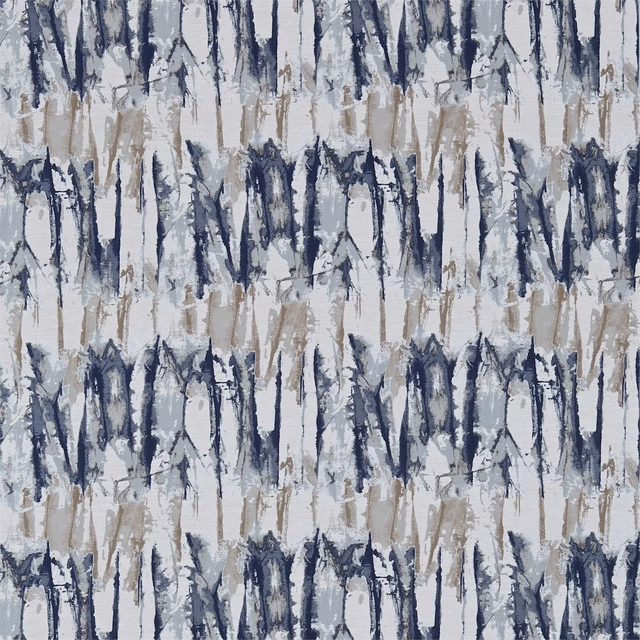
Across the houses we hold. See all 7,566.
Takara Indigo/Denim
Colour 1 Fabrics
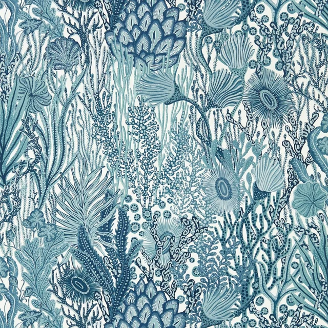
Acropora Wide Width Exhale/Murmuration
Colour 1 Wallpapers
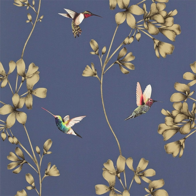
Amazilia Wide Width Indigo
Colour 1 Wallpapers
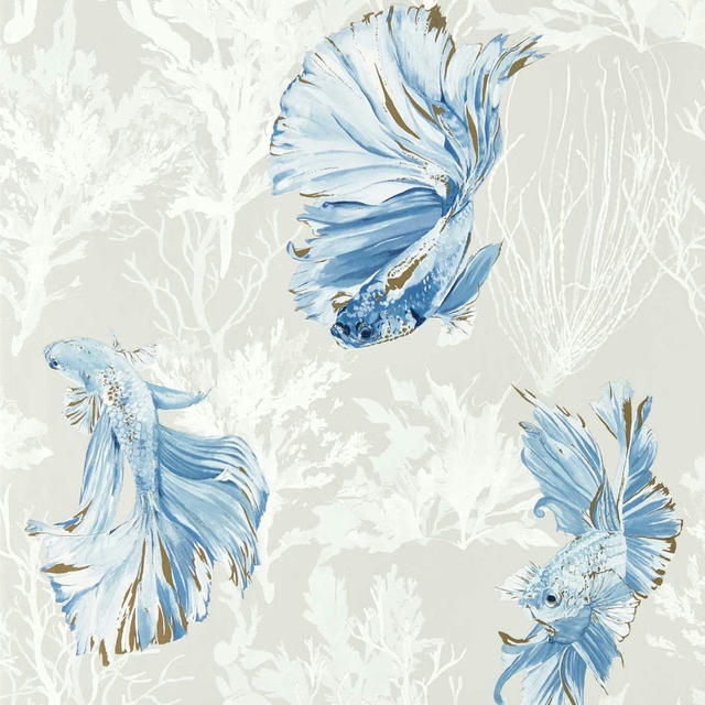
Halfmoon Stillness/Indigo
Colour 1 Wallpapers
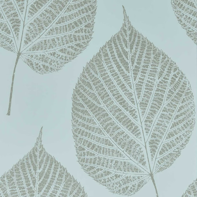
Leaf Sky/Gilver
Colour 1 Wallpapers
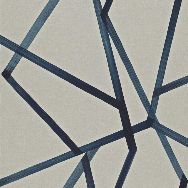
Sumi Wide Width Linen/Indigo
Colour 1 Wallpapers
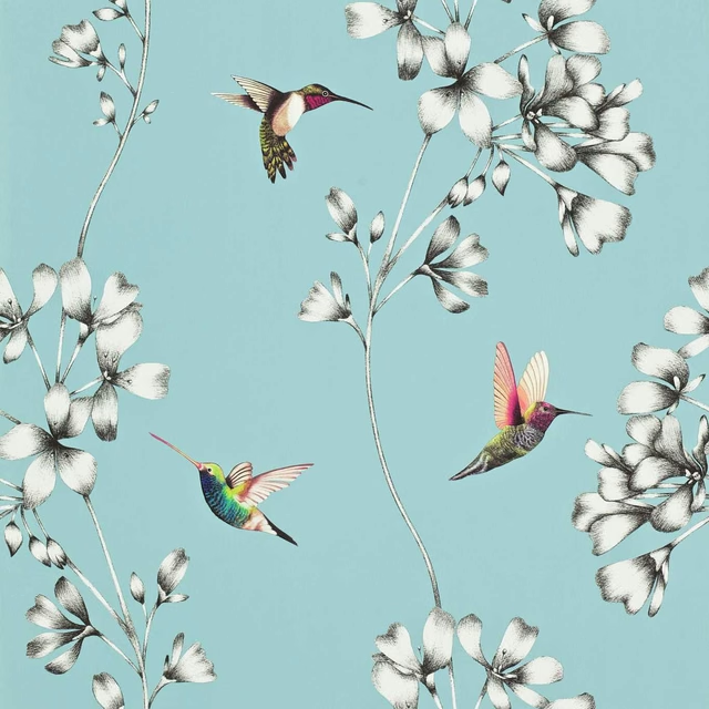
Amazilia Wide Width Sky
Colour 2 Wallpapers
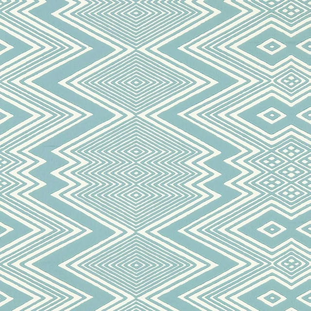
Ankara Sky/Awakening
Colour 2 Wallpapers
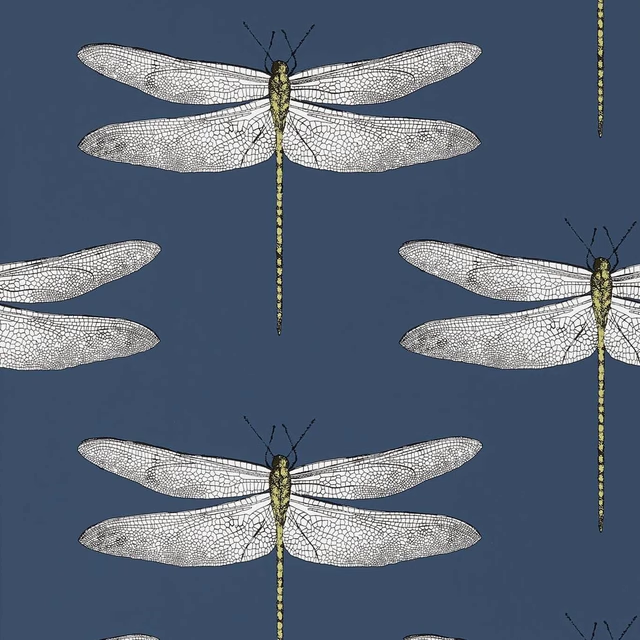
Demoiselle Ink/Chartreuse
Colour 2 Wallpapers
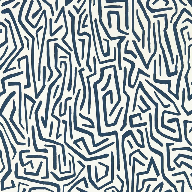
Melodic Wide Width Japanese Ink/Origami
Colour 2 Wallpapers
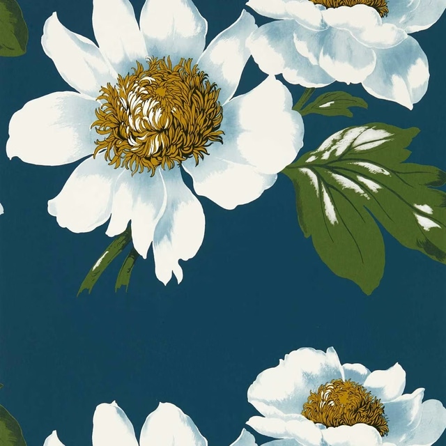
Paeonia Wide Width Azurite/Meadow/Nectar
Colour 2 Wallpapers
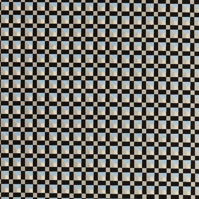
Blocks Cornflower/Black Earth
Colour 3 Fabrics