
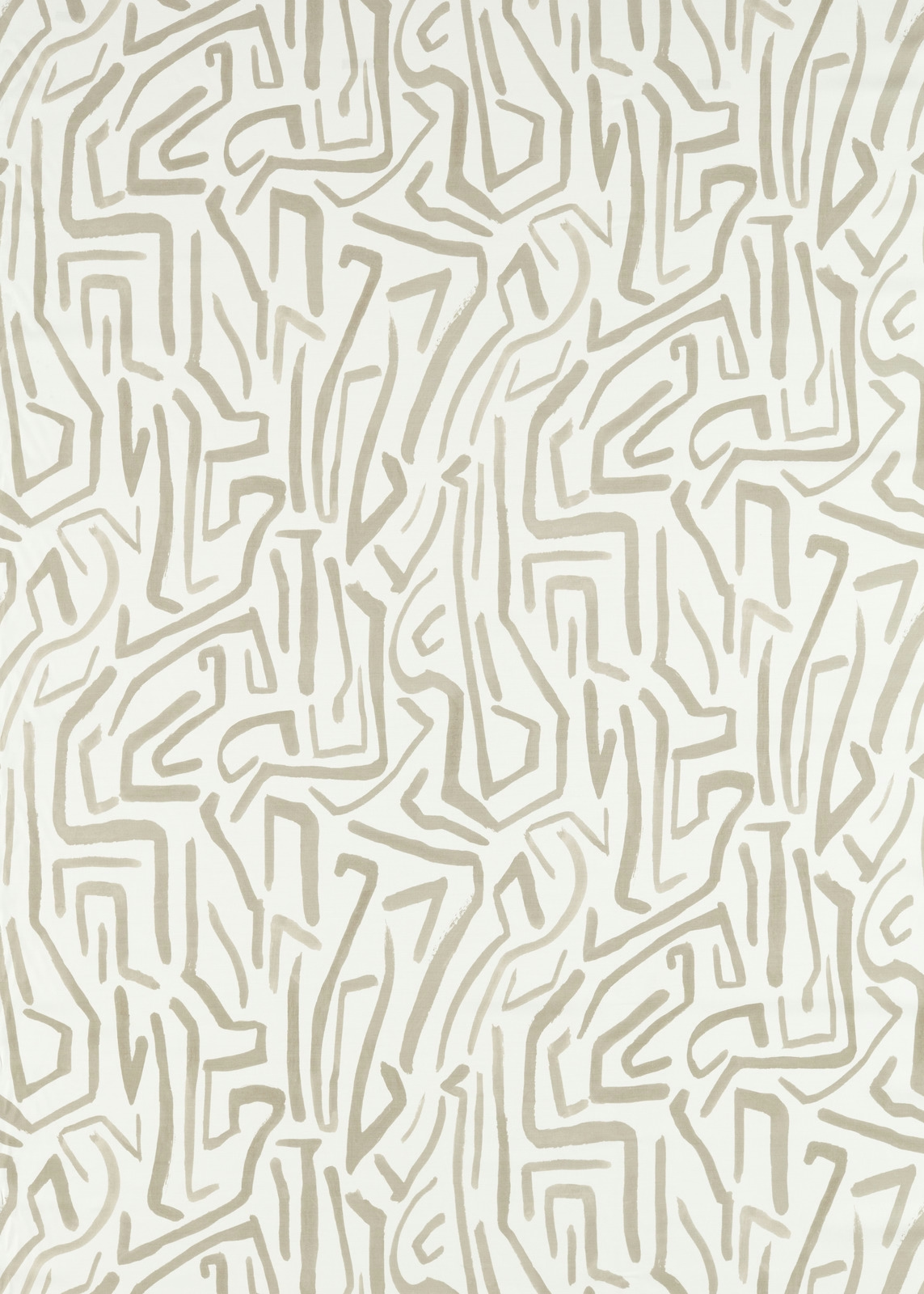

Tap the swatch to see it full screen. Hover it to magnify the weave. Colours on a screen are a guide, not a match, so come and feel the real cloth.
Scroll up or down to zoom in and out.
Melodic Stone/Awakening
Colour 2 Fabrics FabricHAF0456-02
Melodic Stone/Awakening pairs a warm ivory ground with softly contrasting stone-coloured lines that twist into an irregular, maze-like geometric pattern. The pale colourway keeps the design light and understated while the repeated linear drawing gives the surface visual movement.
You have used your previews for today. Send one to Simon and you can carry on.
Your board
0 fabrics
See this fabric on Harlequin's own site, then order it through us.
See Melodic Stone/Awakening in your own room
A photograph of the piece you want re-covered. Straight on is best, and daylight helps. It is used to make your picture and nothing else.
Looking at your room
We found things here Melodic Stone/Awakening could go on. Tap one on the photograph, or choose below.
We could not see anything to re-cover
, s
Melodic Stone/Awakening , on your
Drag to compare. AI impression, colours indicative: ask us for a cutting before you decide.
About this fabric
This 218 gsm woven fabric has a 139.5 cm usable width and a 38 threads-per-cm construction, giving the cloth a balanced mid-weight presence suited to both upholstery and drapery. Its 91 cm vertical repeat and 139.5 cm horizontal repeat create a broad, continuous field of angular pathways rather than a small-scale conventional motif. The stone lines read as muted taupe-grey against the ivory ground, with a softly chalky contrast that feels gentler than a high-contrast geometric. A 60 m standard length supports larger furnishing and window-treatment requirements.
How to use it
Use the warm ivory and restrained stone palette to soften a contemporary room, especially on an occasional chair, headboard or full-length curtains. Pair it with pale timber, chalky walls and textured neutrals so the maze-like linework supplies pattern without making the scheme feel busy.
A calm ivory ground and muted stone maze-like linework bring softly graphic definition to upholstery, curtains and blinds.
More from Colour 2 Fabrics
The same book, other colourways.
Lyrical Black Earth
Colour 2 Fabrics
Lyrical Forest/Black Earth
Colour 2 Fabrics
Lyrical Japanese Ink/Lagoon
Colour 2 Fabrics
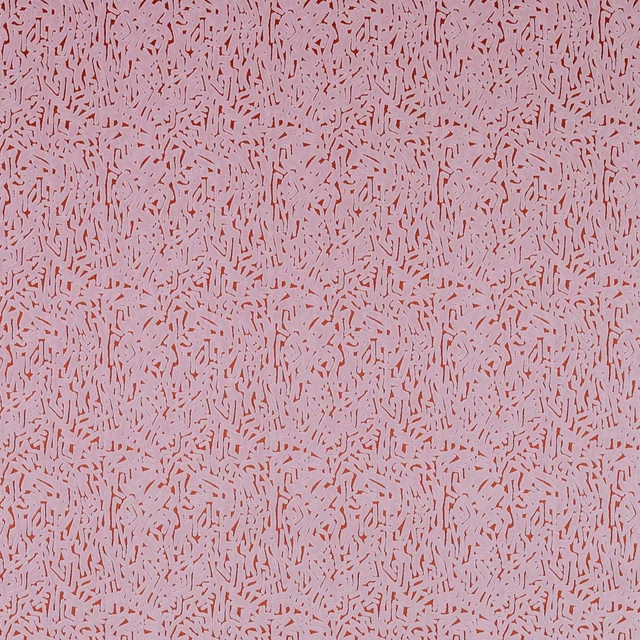
Lyrical Orchid/Brazilian Rosewood
Colour 2 Fabrics
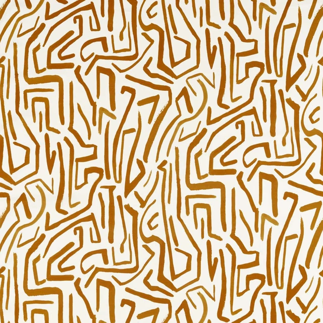
Melodic French Ochre/Paper Lantern
Colour 2 Fabrics
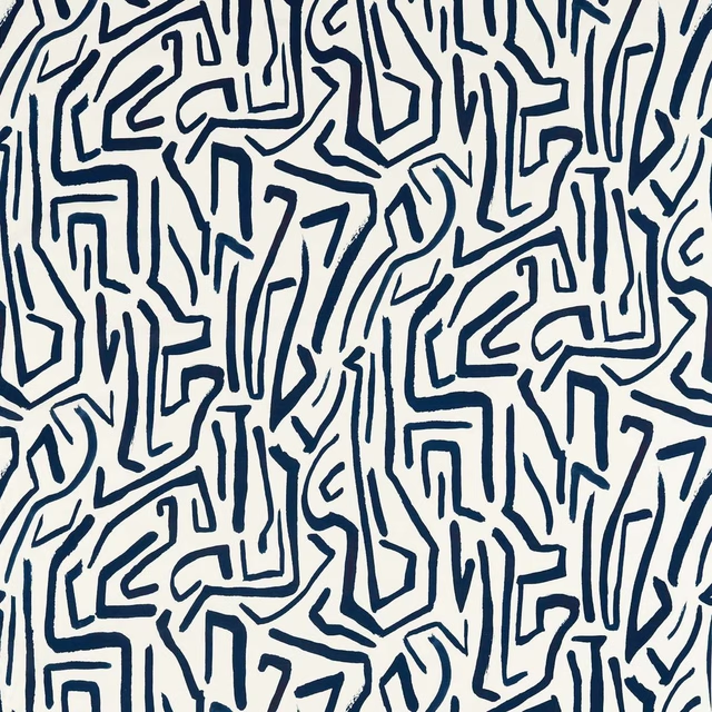
Melodic Japanese Ink/Origami
Colour 2 Fabrics
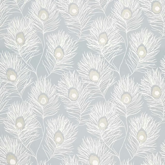
Orlena Powder Blue/Gilver
Colour 2 Fabrics
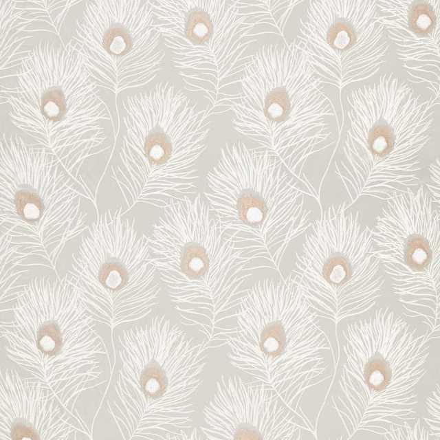
Orlena Rose Gold/Pearl
Colour 2 Fabrics
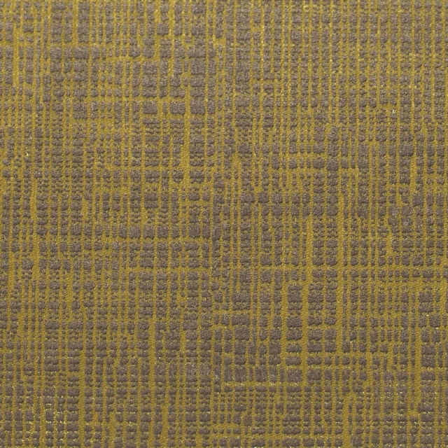
Osamu Mustard
Colour 2 Fabrics
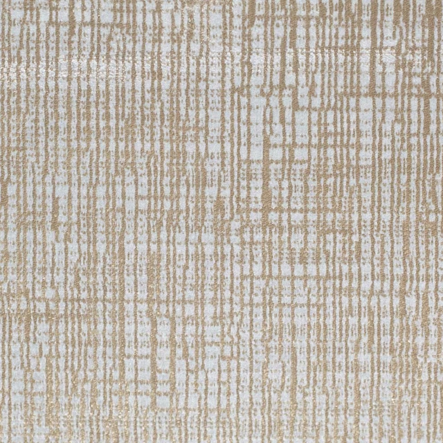
Osamu Oatmeal
Colour 2 Fabrics
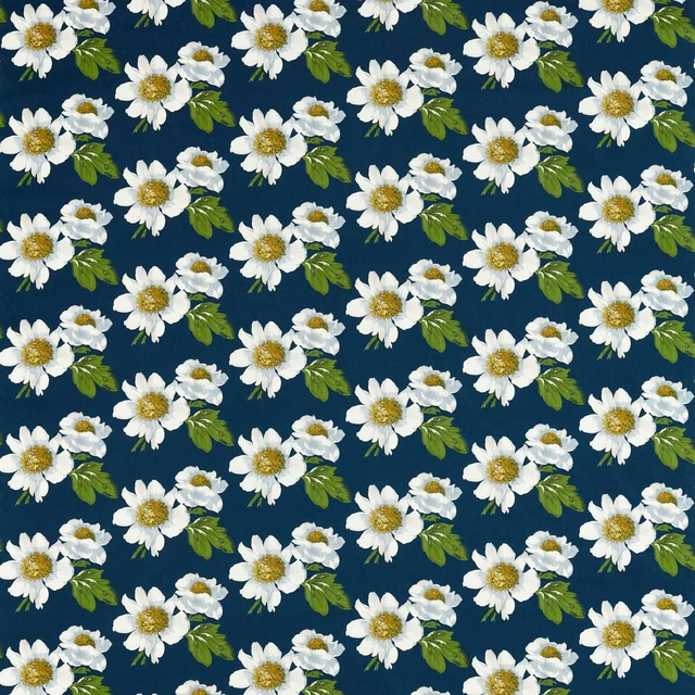
Paeonia Azurite/Meadow/Nectar
Colour 2 Fabrics
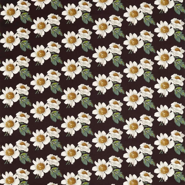
Paeonia Black Earth/Fig Leaf/Nectar
Colour 2 Fabrics
Pairs well with
A pattern needs somewhere for the eye to rest, so these are the plains and textures that sit beside Melodic Stone/Awakening without fighting it. Mixed across the houses we hold, which is the part a single supplier's book cannot do.

Alaska Mole
Alaska Collection

Alaska Otter
Alaska Collection
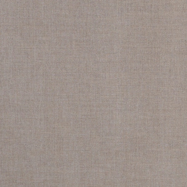
Albany Mink
Albany and Moray
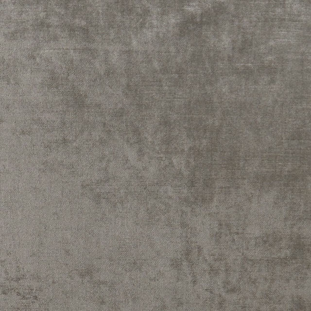
Allure Ash
Allure

Marldon Taupe
Albeck
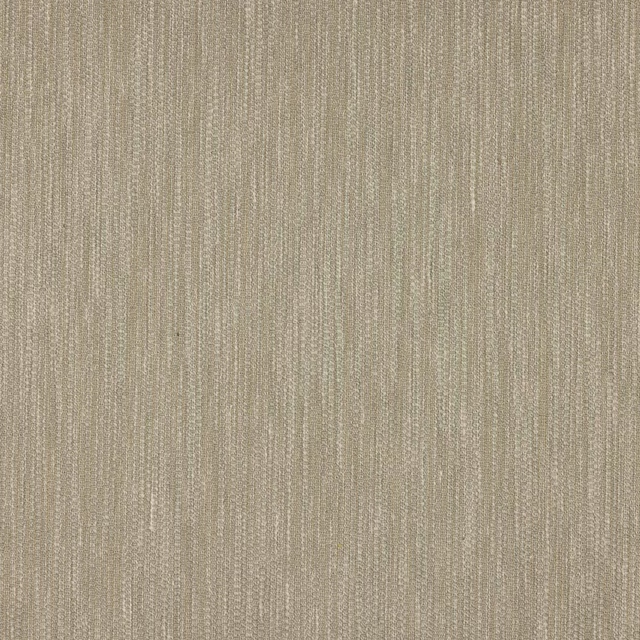
Croft Silver
Chester
Marcello Cappuccino
Contract Essentials II Fabrics

Sahara Zinc
Kalahari Fabrics
Acacia Taupe
Acacia

Alchemy Mushroom
Alchemy

Amalfi Cobblestone
Amalfi

Amalfi Regency Grey
Amalfi
Paint that goes with it
Two ways to take the room. Both colours are from houses we hold, so a pot can come off the same order as the cloth. Screens shift colour, so treat these as a direction and bring the cloth to the shelf before you buy the paint.
To sit quietly behind it
Kind Regards
Coat Paints · #e0e0d4
To stand against it
Grape
Zoffany · #857371
Other taupe fabrics
Across the houses we hold. See all 4,148.
Ardisia Diffused Light
Colour 1 Fabrics
Ascent Cappuccino And Chocolate
Colour 1 Fabrics
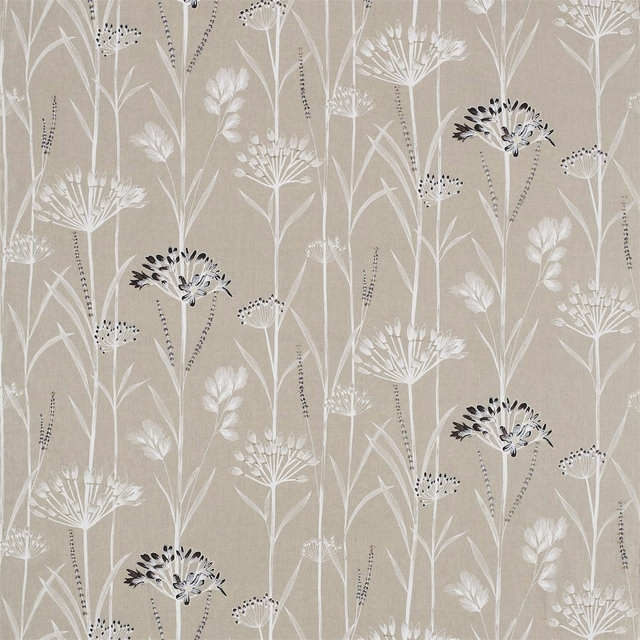
Gardinum Linen/Chalk/Ebony
Colour 1 Fabrics
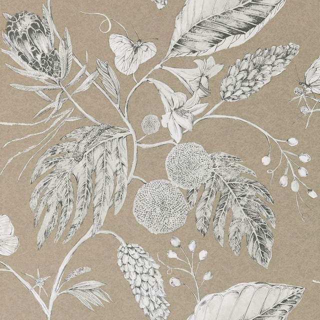
Amborella Wide Width Pebble
Colour 1 Wallpapers
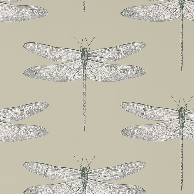
Demoiselle Jute/Slate
Colour 1 Wallpapers
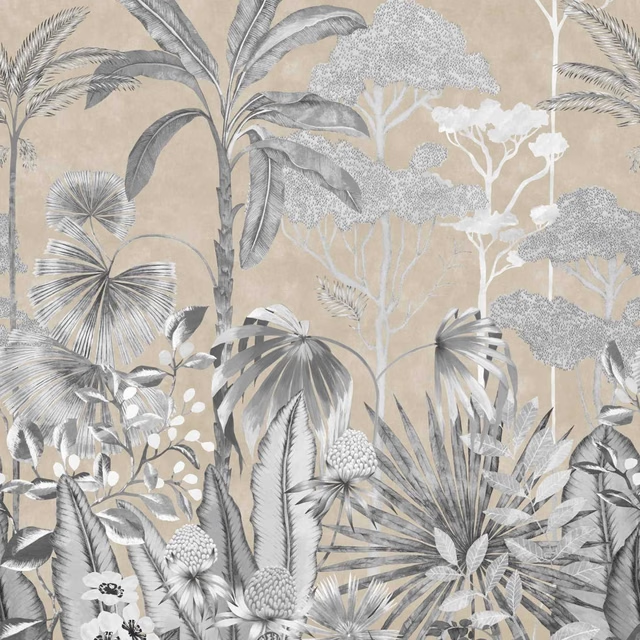
Floreana Black Earth/Tranquility
Colour 1 Wallpapers
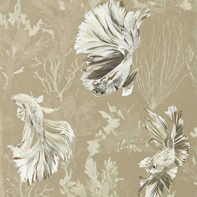
Halfmoon Gilver/ Tranquility
Colour 1 Wallpapers
Oralia Cupra
Colour 1 Wallpapers
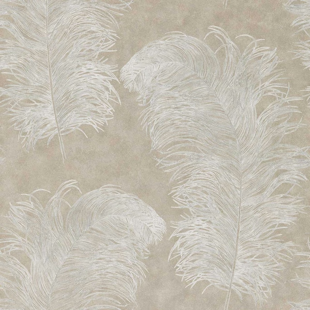
Operetta Wide Width Pebble
Colour 2 Wallpapers
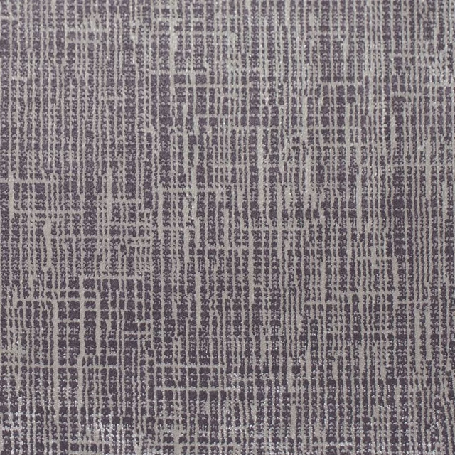
Osamu Hazelnut
Colour 3 Fabrics
Seri Wide Width Raffia
Colour 3 Wallpapers
Sumi Wide Width Hessian/Copper
Colour 3 Wallpapers